
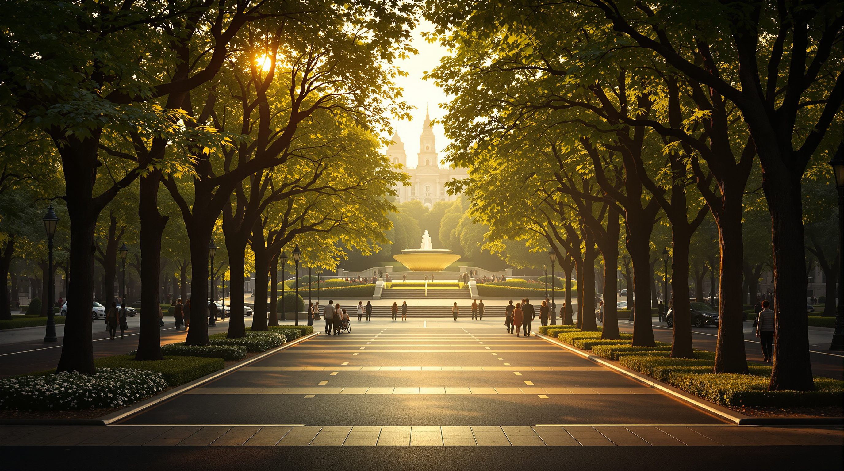
 Lesson 2.1
Lesson 2.1 · The Public Realm
Streets, Squares & Parks
The three great outdoor rooms of the city, and how design gives them shape
The city's rooms have no roof
Walk into a great square and you feel held, the way you feel in a well-proportioned room. Walk into a windswept plaza and you hurry across it. The difference is not decoration — it is design. Streets, squares and parks are outdoor rooms, and their walls, floors and proportions can be composed with the same rigour we give a building.
Ink the buildings black and the city tells you its secrets.
The void is the design
Beginning designers draw buildings and leave the space between them to chance. Urban designers invert this: the space between buildings is the primary material, and the buildings are the walls that shape it. This is the single most important mental flip in the whole discipline. A figure-ground plan — buildings inked black, everything else left white — makes the point instantly. In medieval Siena or the walled city of Jaipur the white space reads as a connected system of rooms and corridors: streets flow into squares, squares narrow back into streets. In a typical modern business park the black buildings float as isolated objects in an undifferentiated grey of parking and setback, and the white space has no shape at all. The lesson is not that old is good and new is bad. It is that public space either has form or it does not, and form is what lets people read, use and love it. When you design a block, you are also designing the street it faces, the square it might terminate, and the sky it frames. Treat the outdoor room as the client — because it is the part that belongs to everyone.
Streets: the workhorse public space
Streets are not merely conduits for cars; they are by far the largest category of public space a city owns — commonly a quarter or more of all urban land. Camillo Sitte, writing in 1889, warned against the straight, endless boulevard that lets the eye and the wind race to the horizon; he preferred the gently deflected street that keeps a terminating building in view and encloses the walker. A great street has continuous, active frontage at its edges — doors, windows, shopfronts — a floor scaled to people, and a width-to-height proportion that feels like a room rather than a runway. Think of the arcaded footpaths of a South Indian temple-town bazaar, or the colonnades of Connaught Place in Delhi, where a deep verandah mediates between the sun-struck carriageway and the cool shopfront. Compare that to a six-lane arterial with buildings set thirty metres back behind service roads: technically a street, experientially a barrier. The NACTO and Global Street Design Guides reframe the street as a place to linger, not only to move, allocating space to walking, dwelling, trees and drainage rather than to vehicle throughput alone. When you learn to see the street as a room with a floor and two long walls, you stop asking only how fast traffic flows and start asking whether anyone would want to stand still there. Jane Jacobs made the case sharply in 1961: it is the ordinary sidewalk, richly used and closely watched by the people whose windows and doors face it, that produces the safety and vitality we prize in cities — not the superblock's supervised open space. The busy street is self-policing because eyes are on it; the empty setback is dangerous because no one has reason to look. Every design move that puts front doors, shops and windows on the street, and every move that pushes them behind walls and parking, is therefore also a decision about safety and civic life.
Squares: enclosure and the art of standing still
If the street is the corridor, the square is the room where the city pauses. Sitte studied hundreds of European plazas and found their power lay in enclosure: buildings that form a nearly continuous wall, entered through streets that slip in at the corners rather than slicing straight across, so the sense of containment is never broken by a gap you can see out through. A cathedral or town hall anchors one edge; a fountain or statue sits off-centre, not marooned in the geometric middle where it would divide the usable floor. The Piazza del Campo in Siena, shell-shaped and tilted toward its town hall, is the canonical example — a room so complete that a whole city gathers in it for the Palio. Enclosure is measurable. A comfortable square keeps a ratio of roughly building height to width somewhere between 1:2 and 1:4: tight enough to feel held, open enough to admit sun and sky. Push wider than about 1:6 and enclosure dissolves into mere openness; the plaza becomes a place to cross, not to be. Delhi's Connaught Place, with its concentric Georgian-Palladian ring, holds a vast central park precisely because its continuous colonnaded wall gives the void an edge to push against.
Rob Krier's typology of urban space
In Urban Space (1979) Rob Krier argued that the seemingly infinite variety of European squares could be reduced to a small family of geometric types and their transformations. He began with three primary plan forms — the square (and rectangle), the circle, and the triangle — and then catalogued how each is modulated: angled, segmented, added to, overlapped, distorted, or interrupted by streets entering at corners or midpoints. A square can be closed and static, or opened along one edge to spill toward a monument or a view. Its section matters too: is it flat, stepped, sunken, or raised on a plinth? Krier's point was polemical. Modernism, he argued, had abolished the street and the square as spatial types, dissolving the city into free-standing slabs surrounded by leftover green. His typology was a call to recover a shared vocabulary — a grammar of urban form that designers could deploy consciously, the way a composer uses established musical forms. You do not have to accept his traditionalist politics to find the toolkit useful. When you sketch a new public space, run through the type-menu: is this a rectangle, a circle, an L-shaped forecourt, a triangular junction? Where do the streets enter, and does each entry protect or puncture the enclosure?
Parks: designed nature, from maidan to Bryant Park
Parks are the third great outdoor room, and the most misunderstood — often treated as mere quantity, a percentage of green to be met, rather than as designed place. The URDPFI Guidelines in India set open-space standards through a hierarchy: tot-lots and housing-cluster parks, neighbourhood parks, community and district parks, up to city-level regional parks, sized and spaced so that a child, a jogger and a festival crowd each find the scale they need. But the quality lesson comes from what happens inside the boundary. New York's Bryant Park was, by the 1970s, a drug-ridden void that people avoided; its 1990s revival, guided by William Whyte's observations and Project for Public Spaces, did almost nothing structural — it lowered hedges to open sightlines, added thousands of movable chairs, programmed the lawn with events, and put in a café and restrooms. Occupancy soared. The Indian maidan — Kolkata's vast Maidan, Mumbai's Oval and Azad Maidan — shows the opposite virtue: the great flat open ground that absorbs cricket, protest, prayer and picnic without prescribing any of them. And the riverfront ghat, from Varanasi to Ahmedabad's rebuilt Sabarmati steps, is a park in section — terraced ground that turns the meeting of city and water into a place to sit. Good park design is rarely about more green; it is about edges, seating, shade, programme and water.
The bazaar, the ghat and the maidan
India's traditional public realm did not copy the European square, and it would be a mistake to impose one. Its equivalents are the bazaar street, the temple or mosque forecourt, the stepped tank and ghat, and the maidan. The bazaar is a linear square — a room that is also a route, its enclosure formed by deep verandahs, jharokhas and cantilevered upper floors that shade the way and blur the line between shop and street. The chowk, where several bazaar streets meet, is the swelling in the corridor that acts as a node. Jaipur's Jantar-facing chowks and the crossings of its planned grid, or the galis widening into katras in old Delhi, show enclosure achieved not by monumental facades but by the fine grain and overhang of ordinary buildings. When you design public space in an Indian city, the reference library is local: the shaded arcade against the sun, the raised otla or plinth-seat at the shopfront, the tree as a room-maker, the tank as a cool sunken court. Enclosure, proportion and edge are universal principles; their materials and rituals are specific to place. Consider how the mandapa forecourt of a temple, or the sahn of a mosque, frames arrival with a change of level and a threshold before you enter the sanctum — the outdoor room as prelude. Consider how a peepal tree at a crossroads gathers a platform, a shrine and a tea-seller into an unplanned but deeply used square. These are lessons in placemaking a Vienna plaza cannot teach. Read your own city's rooms before you draw new ones — measure a bazaar's width, count the otlas, watch where the shade falls at noon — and let that fieldwork, not an imported pattern book, seed your design.
Reading and measuring an outdoor room
To design outdoor rooms you must first learn to measure them. Three quick tools take you a long way. First, the figure-ground: black out the buildings and see whether the public space reads as connected, shaped rooms or as leftover grey. Second, the enclosure ratio: on a section through the space, compare the height of the enclosing walls to the width of the void — anything between about 1:1 (intimate, canyon-like) and 1:4 (generous but still held) tends to feel like a room, while beyond roughly 1:6 the sense of enclosure fails. Third, the entry test, borrowed from Sitte: trace how streets enter the square, and check whether they slip in at corners (protecting enclosure) or drive straight through (destroying it). Add a fourth habit from Whyte and Gehl — count the sittable edge, the linear metres of ledge, step, wall and bench where a person can rest, because occupancy tracks seating more than any other single variable. With figure-ground, ratio, entry and seating you can diagnose why one square teems and another empties, and you can carry that diagnosis into your own design decisions.
URDPFI Guidelines (MoHUA/TCPO)
Hierarchy and standards for urban open space — tot-lots to regional parks
Use the hierarchy to size and space parks, but treat the numbers as a floor, then design for edge, shade and seating.
Master / Development Plan open-space provisions
Statutory reservation of parks and public open space at city scale
Reservations set aside land; design quality decides whether it becomes real public space. Defer to the local development authority on specifics.
NACTO / Global Street Design Guide
Streets as public space, allocating room to people, trees and stay
Reframes the street as an outdoor room, not only a traffic conduit.
Diagnose an outdoor room
Pick one square, chowk or park you can visit in your own city and dissect it as designed space.
Pen, tracing paper or a tablet, a base map from OpenStreetMap, comfortable shoes
Choose a space small enough to walk in ten minutes but busy enough to watch people use.
- 1Draw a quick figure-ground of the space and two blocks around it — buildings black, everything else white — and judge whether the void reads as a shaped room.
- 2Sketch one section across the space and calculate the enclosure ratio (wall height to void width) at its tightest and widest.
- 3Trace how every street enters: corner entries that protect enclosure, or straight-through cuts that break it.
- 4Walk the perimeter and measure the sittable edge in paces — every ledge, step, wall and bench — then note where people actually sit.
You’ll walk away with
A one-page diagnosis: figure-ground, one section with the ratio marked, an entry diagram, and a seating count, with one sentence on why the space works or fails.
Three altitudes on the same idea
Read the band that fits you — or all three.
Your building is a wall of an outdoor room whether you intend it or not. Hold the street line, put doors and windows on the public edge, and let the ground floor give the void an active face. The best gift a single building can give a city is a well-made edge to shared space.
As the urban designer you compose the void first and let buildings define it. Set frontage lines and heights to hold enclosure ratios between roughly 1:2 and 1:4, bring streets into squares at the corners, and specify the sittable edge and shade that turn a plaza into a place. You are drawing rooms whose ceiling is the sky.
Learn to see the white space, not the black. Do figure-ground sketches of a square you know, measure its enclosure ratio in section, and count where people actually sit. Once you can read an outdoor room, you can begin to design one.
“A public square is generous open space, so bigger and more open is always better.”
Do it yourself
Quick checks before you move on:
- 1Blacken the buildings on a plan of any square you know — does the leftover white read as a room or as scattered grey?
- 2Estimate the enclosure ratio of the space you are sitting in right now.
- 3Name one street near you that Sitte would have deflected, and say what it would gain.
Bringing it together
Peer-reviewed journals & authoritative standards
- 01Project for Public Spaces, What Makes a Successful Place and the Bryant Park turnaround — Project for Public Spaces, 2018.
- 02Rob Krier, Urban Space (Stadtraum), typologies of the square — Routledge, 1979.
- 03Global Designing Cities Initiative, Global Street Design Guide — Global Designing Cities Initiative, 2016.
- 04URDPFI Guidelines, open-space hierarchy and standards — Town and Country Planning Organisation, MoHUA, 2015.
If this lesson taught you to see and shape the room, the next asks how you fill it with life — the craft of placemaking.
The author
Amogh N P
Architect, interior designer, and creative polymath. Studio Matrx began in his notebooks — his vision of design made honest, useful, and open to everyone. Its Academy is written and taught in his memory, and free, forever.
More about Amogh →