
Making Room For Light
Daylight, materials and the spaces between work at The Violet Office
Nestcraft Architecture | Kozhikode, Kerala
An office begins with the practical requirements of work: a surface to draw on, a place for a screen, somewhere to meet, and room to keep objects that accumulate around a practice. Architecture gives these requirements a setting. The height above a desk, the position of a window, the distance to a shared table and the view at the end of a room all shape how that setting is organised. Light passes through this arrangement, making some relationships immediately apparent and allowing others to emerge gradually.
At The Violet Office in Kozhikode, Rohit Palakkal of Nestcraft Architecture brings professional work, conversation and informal gathering into a connected interior. Workstations, visitor seating and a meeting area occupy the ground floor. Mezzanines at opposite ends introduce another level of occupation. Between them, a taller central volume keeps the different parts of the office visually connected. The result is a workplace understood through several scales at once: the individual desk, the shared room and the building’s relationship with its surroundings.
The interior has a strong material presence. An exposed concrete ceiling extends above white walls, brickwork, timber, metal stairs and planted edges. Large glazed openings frame vegetation. Narrower apertures introduce strips of exterior light higher in the room. These elements do more than establish an appearance. They help explain the building’s organisation: where a platform begins, where the room opens upwards, where a person can look outside and where an activity finds its own place within the larger volume.
The Violet Office offers an opportunity to study daylight as part of that organisation. It focuses on the relationship between openings and occupation, especially where changes in level create different conditions within the same room. A window beside an upper workspace belongs to a different spatial situation from glazing beneath a mezzanine. A high opening above a wall introduces another relationship. Understanding the office means following these differences through the building, rather than applying a single description to its light.
Within Light & Celebration, the project also invites a broader reading of the workplace. The conversation seating, pantry, and outdoor edges make room for activities around the working day. They introduce settings for exchange and company alongside the principal work areas. Here, the idea of celebration can be considered through the architectural attention given to ordinary shared life: places where people can gather, pause and remain in conversation.
A personal workplace within a larger landscape
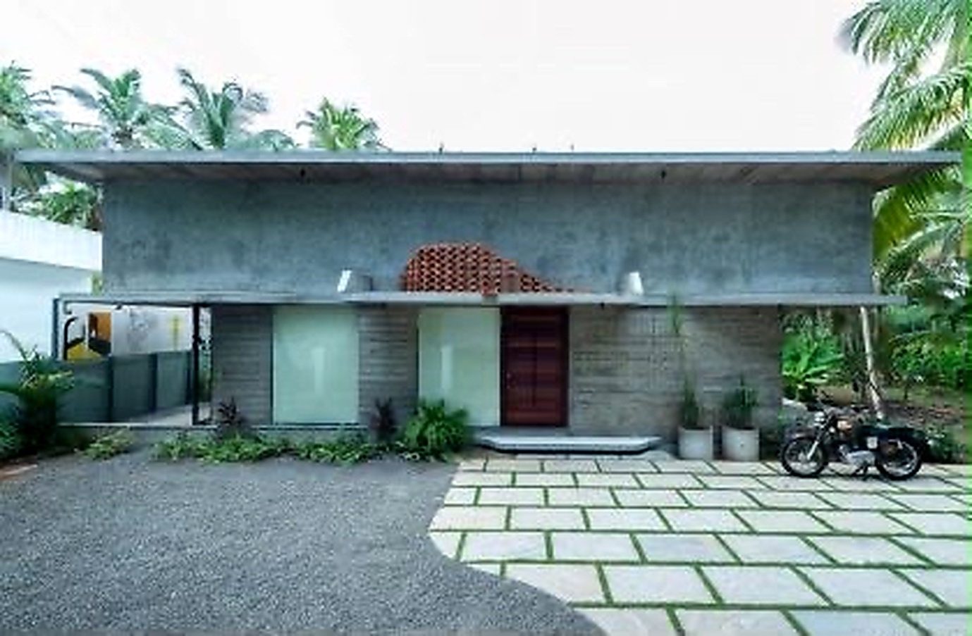
The office’s exterior presents a restrained composition. A broad concrete roof plane extends across the building, while the entrance, glazing and supporting elements establish a rhythm below. Planting occupies the edges and foreground. The building’s silhouette is legible, but its internal complexity becomes clearer only when the interior is considered alongside the facade.
This contrast between an immediately understandable exterior and a varied interior is important. The office contains several changes of level, two mezzanines, different seating forms and multiple stair arrangements. From outside, these elements are gathered within a continuous architectural envelope. From inside, they become the means by which the workplace is differentiated.
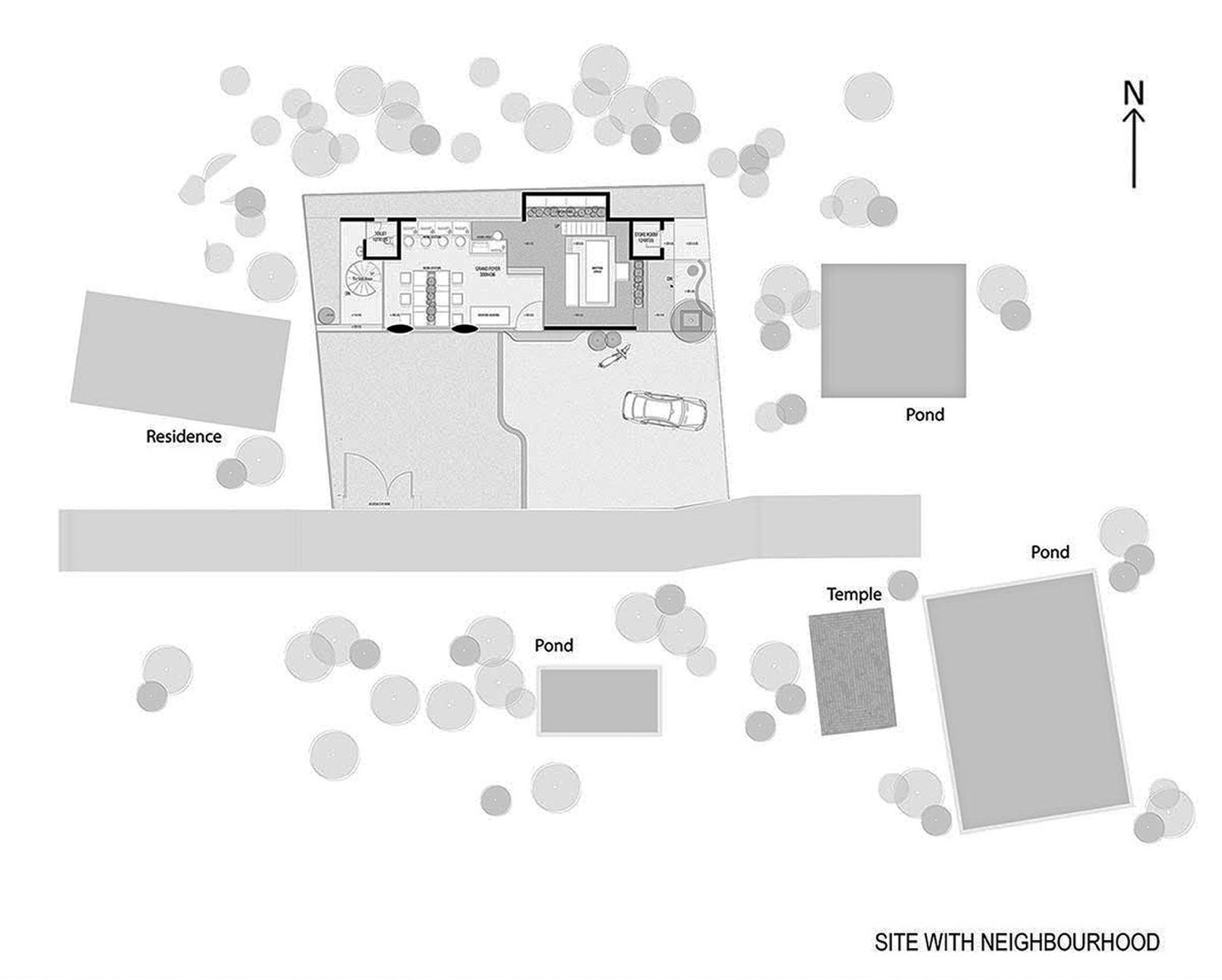
The site plan places the office among neighbouring buildings, trees and water bodies. Its north arrow shows the building’s orientation through the plans. The relationship between the approach, entrance and surrounding open areas can also be read at this scale. Before considering any individual window, the drawing establishes that the office occupies a particular position within a neighbourhood.
Orientation provides a starting point for understanding daylight, but the surrounding section is equally relevant. A neighbouring footprint does not describe the full height of a building, and a tree symbol does not explain the density of its canopy. Those distinctions are useful when moving between the site drawing and the exterior views. The plan locates the context; the photographs add information about the immediate relationship between the building, vegetation and open space.
The landscape is especially present at the glazed boundaries. Palm leaves, trunks, and other planting appear close to the interior. Through these openings, the room has an outward subject beyond the objects of work. The view is specific and layered, with elements near the glass and others farther away. This gives the glazing a role in the office's visual composition and its daylight strategy.
For a reader considering a home or workplace, this distinction is essential. An opening is never independent of what lies outside it. Its architectural value comes partly from how it relates to the site and partly from what happens on its interior side. The Violet Office can be read through that exchange: landscape, envelope and occupation brought into a single field of attention.
One interior, several places to occupy
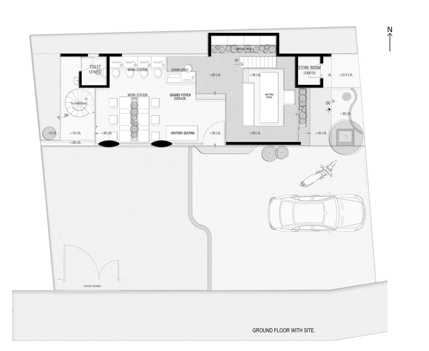
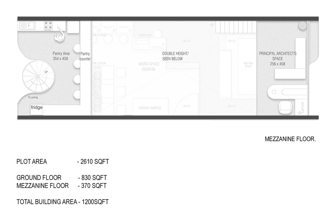
The ground-floor plan locates a series of activities within the office’s elongated form. Shared workstations occupy one part of the interior. The entrance and visitor seating create another point of occupation, while the meeting space forms a larger setting at the opposite end. Support spaces and circulation surround these principal areas.
The arrangement is open but not without distinctions. Furniture, levels and overhead construction create recognisable places. The workstation area has its own repeated elements and orientation. The conversation seating gathers around a central table. The entrance creates a threshold between the outside approach and the room within. These differences allow the office to accommodate several forms of interaction without turning every activity into a separate enclosed room.
This is one of the project’s most useful architectural qualities to examine. An open interior can become difficult to understand if openness is treated only as removing partitions. At The Violet Office, the plan gains definition through the placement of activities and their relationships. People can occupy different settings while remaining aware of the larger room.
The workstations establish a collective working area. Their arrangement gives the interior a regular pattern of desks and chairs, distinct from the less repetitive composition of the conversation space. This difference is visible even before considering the mezzanines. It changes the character of occupation within the ground floor.
The conversation seating introduces another scale. Its table and surrounding seats define a place through proximity and enclosure at furniture level. The seating connects to the main volume, yet its arrangement gives attention an immediate centre. It can be read as a room within the room, formed through its section and furnishings rather than a complete set of enclosing walls.
The office’s openness needs to be understood as a relationship between shared space and local definition. The larger interior provides continuity; individual arrangements provide focus. Daylight belongs to this relationship because the openings are encountered from different positions. The relevant question is not simply how much glazing the building contains, but what each place of occupation faces, sits beneath or looks towards.
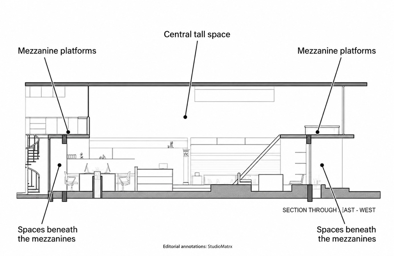
The section gives the office its depth
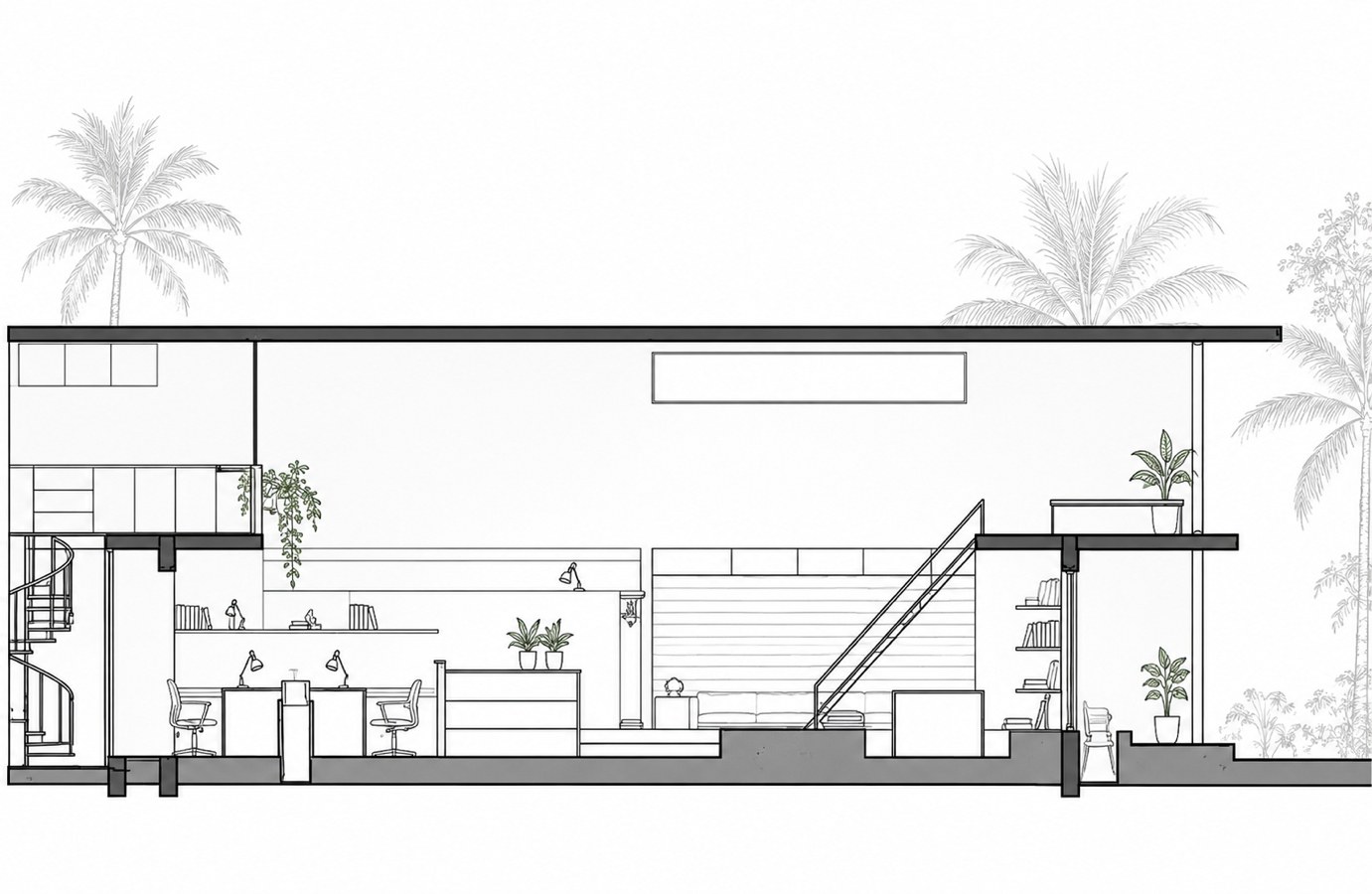
The east–west section highlights the building’s vertical organisation. Mezzanine platforms occupy the ends, while the centre remains open at a greater height. Beneath each platform is another occupied area. Above it is a space with a different relationship to the roof, glazing and surrounding walls.
This makes the section central to understanding the office. A plan can locate a desk and a window but cannot fully describe the construction above the desk or the height where the window begins. The section reveals these relationships. It shows where the room extends upwards and where an intermediate floor introduces a closer ceiling.
The distinction changes how the interior can be read. In the taller volume, the roof remains part of the immediate spatial experience. The eye moves from furniture and planting towards upper walls, openings and the concrete overhead. Beneath a mezzanine, the platform becomes the ceiling of a smaller setting. The space remains connected to the main room but its local enclosure is more pronounced.
These conditions do not need to be described as opposites. Their interest lies in their adjacency. The building brings a lower occupied area into contact with a taller volume, allowing the room’s scale to change along its length. A stair marks one of these changes, connecting the ground floor to the upper platform while remaining visible within the interior.
The section also prevents a common misunderstanding of open offices: that visual continuity means every part of the interior has the same relationship with daylight. At The Violet Office, different positions encounter different combinations of glazing, slab edges, wall surfaces and overhead space. Their connection within one room makes these differences more important to study, not less.
For students, this offers a clear lesson in architectural representation. The plan and section answer different questions. The plan establishes arrangement; the section explains vertical relationships. Their value increases when read together and then checked against the built views.
The office’s daylight strategy is expressed through several types and positions of openings. Larger glazed areas occupy the ends and edges of occupied spaces. Narrower apertures appear higher in the walls. Their relationship with the roof and intermediate floors gives the interior multiple connections to the exterior.
The end glazing is especially clear where upper and lower occupied areas are seen together. In the view towards the conversation area, the lower opening sits behind the seating and shelving, while glazing above serves the mezzanine space. The two levels share an outward direction, but the construction between them gives each its own boundary.
This arrangement makes the floor slab an important part of the window composition. From inside, the slab marks the division between upper and lower occupation. From outside, its projection helps articulate the facade. The opening is connected to a larger constructional relationship involving floor, wall and shelter.
The narrow high-level apertures introduce a different condition. They are separated from much of the furniture and relate to the upper walls and ceiling. Their presence directs attention to the full height of the room. The strip of exterior visible through them contributes to how the roof and wall are perceived as distinct planes.
The distinction between these openings is spatial before numerical. A large window beside a seat offers a particular outward view. A higher aperture connects the room to another portion of the exterior. An opening near a mezzanine must be understood in relation to that platform’s occupied level. The office gives these relationships a visible architectural form.
This also suggests why the size of a window cannot be the only basis for discussing its contribution. Its position matters alongside the depth and height of the space behind it. The surrounding construction determines which parts of the room connect directly to that opening and which are reached through a more complex spatial relationship.
Across the office, openings relate to different positions of occupation. End glazing sits beside upper and lower spaces, while higher apertures meet the taller volume. Their contribution becomes clearer when considered alongside the desks, seating and intermediate floors, each of which establishes a different relationship with the exterior.
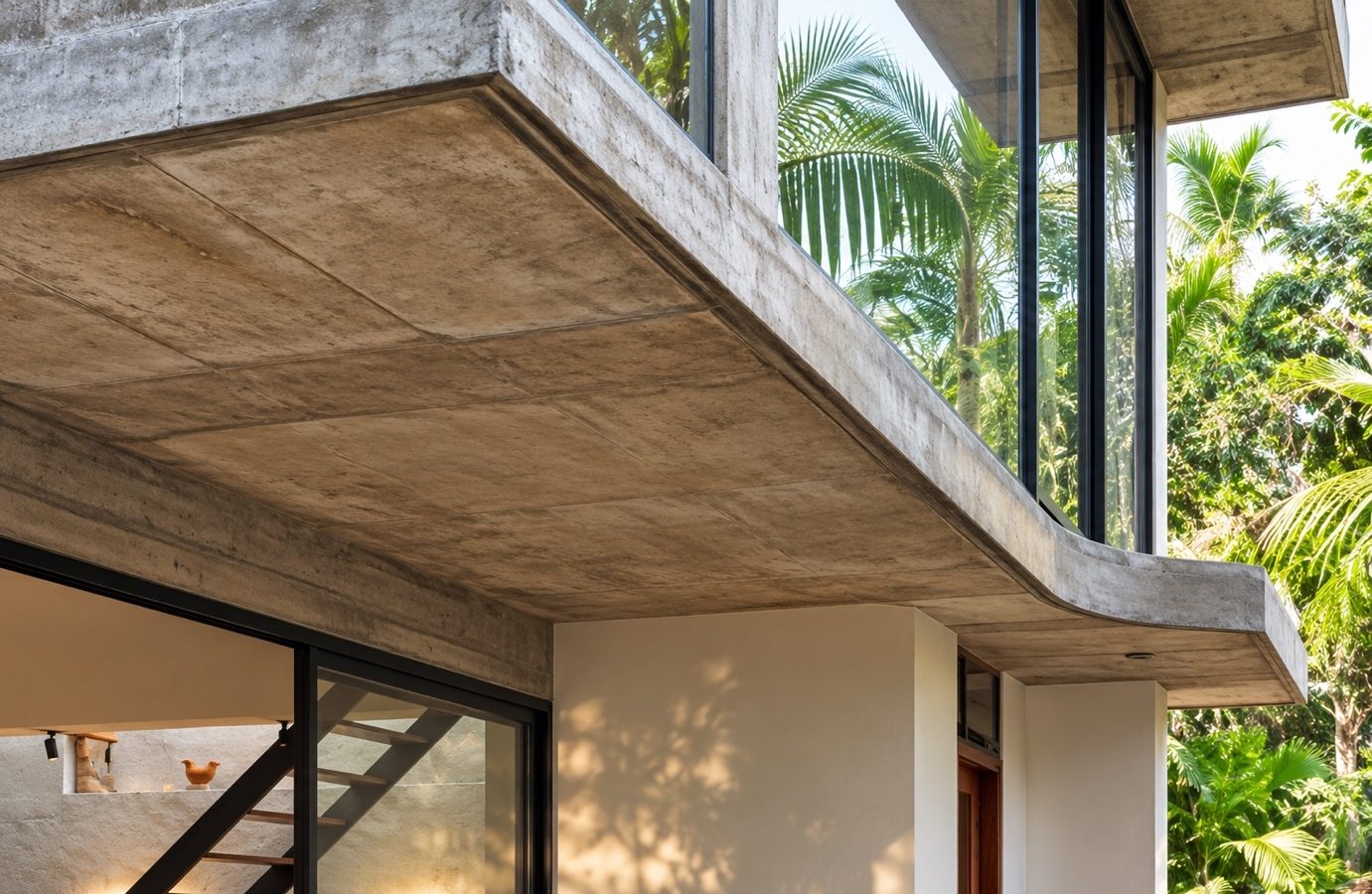
The exterior corner views add another layer to the study. They reveal the relationship between glazing and projecting concrete elements, including slab edges that frame the occupied spaces. From these viewpoints, the facade has depth. Glass, floor, roof and planting do not occupy a single flat surface.
That depth matters to how an opening is understood. A window beneath a projection has a different relationship with the exterior than glazing set directly into an exposed wall plane. The geometry of the projection becomes part of the opening’s environmental context, alongside orientation and surrounding obstructions.
Inside the office, these same elements are encountered differently. A projection that reads as an external shelter may appear from within as the edge above a view. The underside of a slab can mark the limit of a lower space. The relationship between inside and outside is therefore expressed through a sequence of surfaces rather than a simple division at the glass.
The external stair and adjacent planted edge reinforce this layered reading. Circulation sits close to the envelope, and movement between levels becomes part of the building’s exterior composition. The stair’s position can be understood in relation to the doorway, glazing, and overhanging construction around it.
The projecting slab connects the exterior composition with the interior section. Outside, its underside forms an overhang above the lower glazing. Inside, its edge marks the separation between the conversation area and the mezzanine. The same construction therefore provides external shelter while defining two levels of occupation.
For homeowners, this offers a practical way to discuss windows with a designer. The question can extend beyond the frame and glass to the space just outside: the depth of a roof edge, a sheltered sitting area, vegetation or another building. These are part of the setting within which the window operates.
What happens beneath a mezzanine
The areas beneath the upper platforms deserve attention. They are easy to overlook when the most expansive interior view becomes the main image of a project. The section refocuses on them by showing the relationship between the underside of the slab and the activities below.
A mezzanine has two architectural responsibilities here. Its upper surface supports occupation; its lower surface defines the space beneath. It also introduces an edge into the larger room. These three conditions—above, below and at the edge—must be considered together.
At The Violet Office, the lower spaces stay connected to the central volume, while the end glazing creates another relationship with the exterior. This combination is worth studying because enclosure does not come only from walls. A platform overhead can establish a sense of local definition even when the space opens laterally into a larger room.
The transition at the platform edge is equally important. The ceiling changes height, allowing the eye to move from the lower setting into the tall volume. In the interior composition, that edge becomes a point where the building’s different scales meet. The stair reinforces the connection by making movement between levels visible.
From a daylight perspective, these are specific geometric conditions to examine. Consider the direction and height of openings alongside the platform's location. The drawings can describe the arrangement accurately without assigning unverified light levels to the space below.
For professionals, the broader lesson concerns coordination. A mezzanine cannot be treated only as a way of gaining floor area. It changes the room's section, its relationship to openings, and the conditions around the activities beneath it. Those consequences belong to the design of the whole interior.
The concrete ceiling remains part of the room
The exposed concrete ceiling is a constant presence in the office interior. Its construction markings and surface variations remain visible above the occupied spaces. In wider views, the ceiling connects different parts of the room, continuing over furniture, circulation, and the upper volume.
Its importance is partly sectional. Because the centre is open to a greater height, the roof can be seen from across the ground floor. It is not experienced only as an overhead surface near a desk. It belongs to the room’s larger composition, where walls, glazing, and platforms meet.
The high-level openings give this upper interior particular interest. Their positions reveal the boundary between wall and roof. The ceiling’s surface character can be read alongside those openings, with visible differences across the plane contributing to its appearance.
This is a useful way to discuss material in a daylight feature. The ceiling is not simply an item in a finish schedule. It is a surface with a position, extent, and relationship to the room’s openings. Its architectural role comes from those relationships as much as from being concrete.
The same reasoning applies to the white wall surfaces. They provide a different visual character from concrete and brick, helping distinguish planes and boundaries in the interior.
Their presence can be discussed through the room’s composition without reducing the analysis to a general rule that one colour produces a particular lighting result.
Together, these surfaces establish a varied field for light and shadow to reveal. The room does not depend on a uniform finish to hold it together. Continuity comes from the overall volume and how construction and occupation are arranged within it.
Brick, timber and the scale of touch
Closer to occupation, brick and timber introduce another scale of material expression. Brickwork has a repeated pattern of units and joints. Timber appears in the entrance door, furniture and shelving, bringing grain, edges and crafted components into the interior. These elements can be read at the scale of a seated person and across the room.
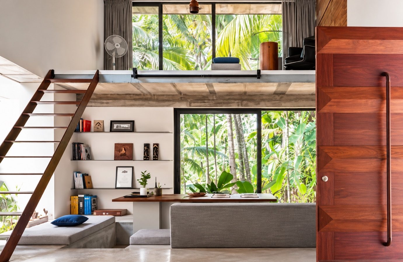
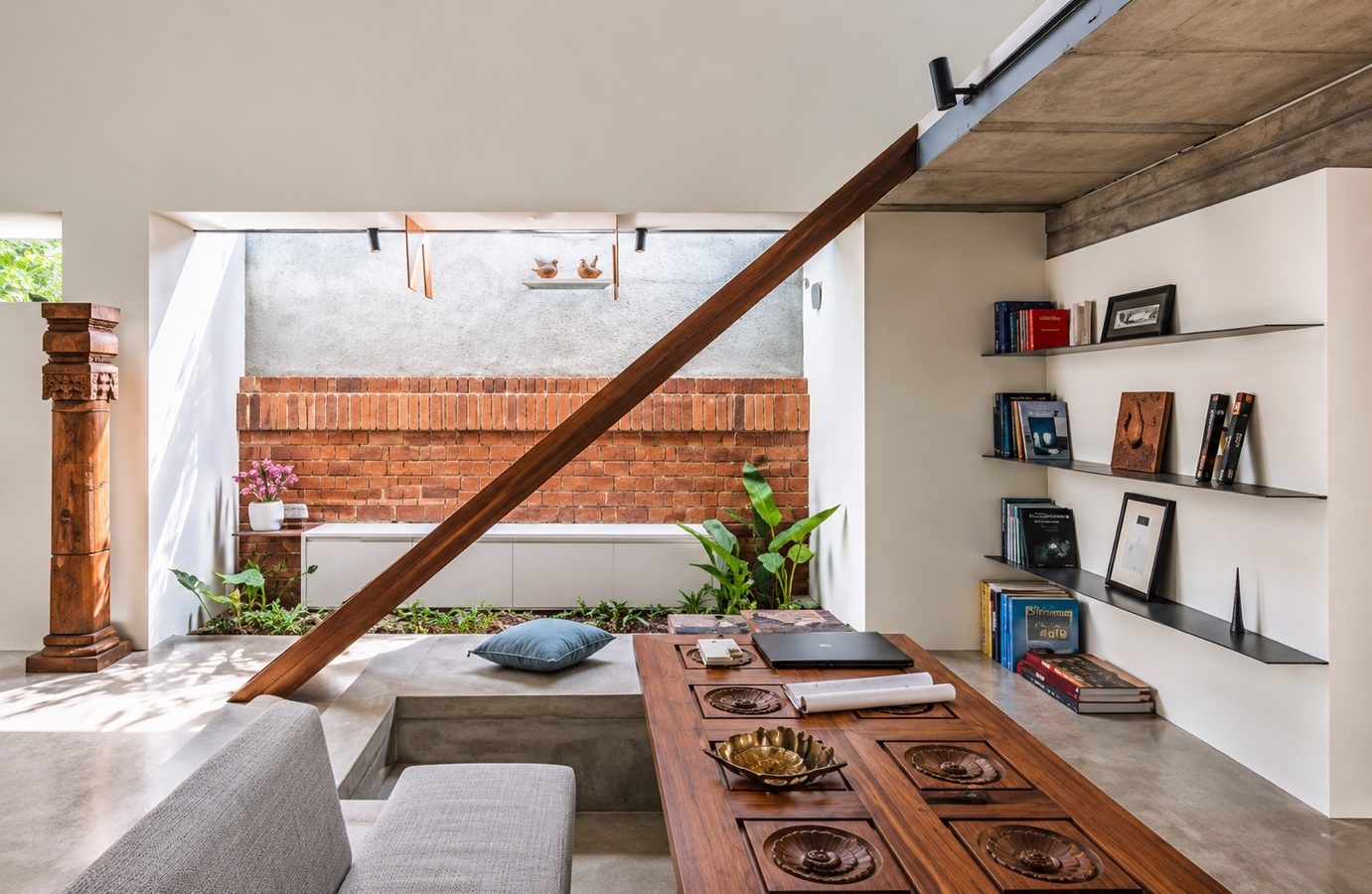
The conversation area brings several of them together. A table occupies the centre of the seating arrangement, shelving defines part of the surrounding wall, and the diagonal stair passes through the view. Brickwork appears beyond. The photograph contains several layers of attention: the immediate surface of the table, objects on shelves, the stair and the wall behind it.
This layered composition is significant because it shows how light is encountered through material and occupation together. The interior is not an empty volume receiving illumination. It contains objects, surfaces and edges that give the view its complexity.
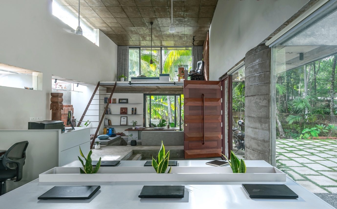
The timber entrance door has a different role. Its scale and colour make it a prominent element in the wider photograph, where it sits between the foreground workstations and the conversation area beyond. When open, it becomes part of the room’s composition and an element of access. The threshold is visible as an inhabited architectural edge, with planting and exterior space nearby.
The material discussion is strongest when it remains attached to these situations. It is more informative to explain the relationship between a door, seating and an opening than to describe every surface as warm, honest or natural. The Violet Office gives us specific arrangements through which to consider the materials.
Furniture gives the open room a working order
The workstation area provides a contrasting rhythm to the conversation setting. Repeated desks and chairs create a regular arrangement in this part of the office. Their collective presence is visible in the wider interior view, where the foreground work surfaces lead the eye toward the rest of the room.
That photograph is valuable because it holds several scales together. The desk is immediately present, while the entrance, lower seating, upper workspace, and ceiling remain visible beyond it. The composition makes the relationship between individual work and the shared interior clear without showing every part of the building at once.
Furniture also gives the daylight discussion a practical focus. A window belongs to an architectural envelope, but a working surface occupies a precise position within it. Reading the two together is more useful than discussing the opening independently of the desk.
The drawings locate the workstations, while the photographs reveal their relationship with surrounding surfaces and views. Together, they allow the layout to be discussed spatially. They do not establish every aspect of task lighting or screen use but show where those questions belong within the building.
The distinction matters for both domestic and professional settings. A room can contain several activities with different positions and orientations. The architectural study begins by identifying them. The Violet Office’s mix of desks, meeting surfaces, and conversation seating makes that variety visible within one project.
A table makes a place for conversation
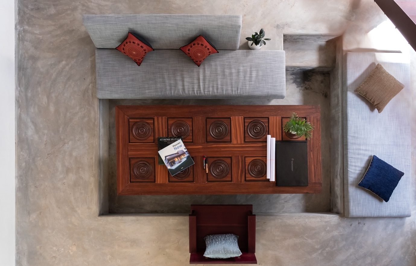
The conversation seating creates a recognisable centre within the office. Seen from above, the arrangement is clear: seats gather around a substantial table, giving the area a local order distinct from the workstations. The geometry of the gathering comes from the relationship between the seats and the shared surface.
At eye level, the same place belongs to the larger room. The stair, upper platform, glazing and shelving remain part of its surroundings. This combination gives the conversation area two scales. It has a centre for a small group while staying visually connected to the office around it.
This is an important architectural provision. A workplace requires spaces where attention can shift from an individual task to another person. A conversation table offers a different arrangement from a desk facing a screen, even when both are in the same building. The difference can be established through furniture, levels and orientation without needing a separate room.
The office’s wider purpose includes exchange, learning and gathering. The seating arrangement gives that intention spatial form. We can examine the provision directly: how seats face one another, where the table sits, and how the group relates to circulation and the rest of the interior.
The connection to celebration becomes credible at this scale. It lies in making room for shared time. A table where people can sit, a place to pause beside the working area and a setting for informal exchange are modest but meaningful architectural decisions. Their value belongs to the everyday life a workplace is intended to accommodate.
The pantry and the edges of the working day
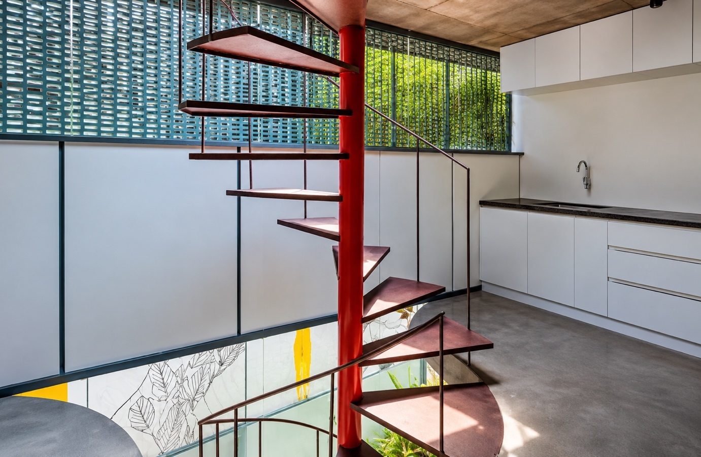
The pantry introduces another shared setting. Its fittings and work surface sit beside the spiral stair and the building’s screened edge. The relationship is compact and direct: a support function occupies a position within the office’s wider system of movement and occupation.
This part of the building deserves inclusion because the architecture of work extends beyond the desk. Making a drink, taking a break or preparing something to share requires space. A pantry belongs to that practical life of the office, and its position affects how it relates to other activities.
The photograph also gives the stair a different role from the diagonal stair in the main interior. The spiral form turns movement within a compact footprint, producing a repeated sequence of treads around a central support. In the exterior and pantry views, it becomes an easily identifiable element connecting the two levels.
At the outdoor edge, a chair and planting establish another place of occupation. The sheltered boundary remains close to the interior while opening towards the landscape. Its architectural interest lies in that position between the main working room and the surroundings.
These spaces should not be treated as incidental decorative additions. They explain the breadth of activities the office is designed to accommodate. The workstations provide one setting, the conversation seating another, and the pantry and outdoor edge extend the sequence further. Together, they make the workplace more varied than a single room filled with desks.
Understanding the climatic diagrams
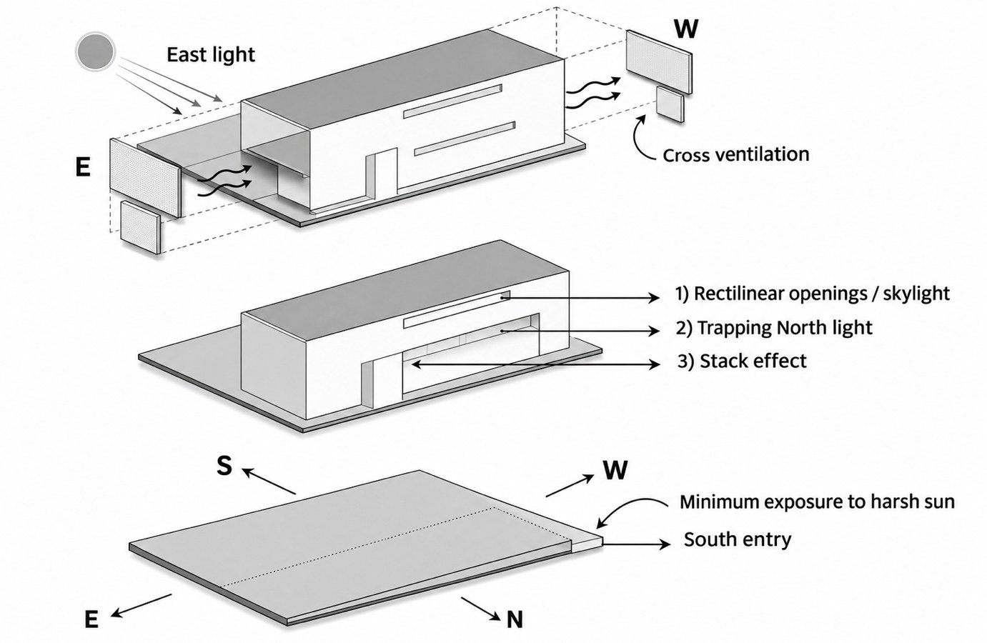
The climatic diagrams present the building’s environmental intentions in a simplified architectural form. Orientation, end openings, high-level apertures, and ventilation routes appear as related parts of a strategy. Their value is in making the design argument legible.
The diagrams can be read alongside the plans and section instead of as separate illustrations. An opening identified in the schematic can be located in the building drawing and then found in a photograph. This sequence links the simplified explanation with the actual geometry and construction of the office.
The distinction between an explanatory diagram and a performance study is important and can be stated simply. The schematic shows how the design is intended to work. It does not provide a numerical account of daylight at every position or a record of changing conditions throughout a day.
For the reader, a useful exercise is comparison. Where are the openings relative to the occupied areas? Which parts of the section do they address? What shelter sits outside them? How do the mezzanines alter the space behind them? These questions turn the diagram into a guide for reading the architecture.
The strongest environmental discussion remains tied to such relationships. Arrows alone cannot explain a building but can direct attention to decisions that deserve examination. At The Violet Office, those decisions are visible in the arrangement of the envelope, upper platforms, and central volume.
What homeowners can take from the office?
Although The Violet Office is a workplace, several of its architectural questions apply to a home. A living room may include a place to read, a table for gathering, a circulation route, and seating directed toward a view. Each activity occupies a different relationship with the room’s openings.
The project encourages considering those activities early. A window can be discussed in relation to the position of a chair or work surface, the construction overhead and the view outside. This makes the conversation with a designer more precise than starting only with the preferred appearance of the facade.
The office offers a useful way to think about shared space. Openness can accommodate several settings when furniture, levels and edges define them. A place for conversation does not always require a separate room, but it requires attention to how people sit, face one another and relate to movement around them.
The transferable lesson is a way of asking questions about space. Where does an activity happen? What can be seen from that position? What lies above it? Which opening relates to it? These architectural questions help a homeowner participate more clearly in design decisions.
What professionals can examine more closely?
For architects and interior designers, the project highlights the relationship between the plan and section. The upper platforms are part of the occupied layout but also reshape the spaces beneath them. The openings belong to the envelope, but their significance depends on those internal relationships.
This makes sectional coordination a central issue. A mezzanine edge, high-level aperture and projected slab are not independent design elements. Their relationship affects how the room is enclosed and how its positions meet the exterior. Reading them together allows the architectural discussion to move beyond isolated features.
The project demonstrates the value of representative viewpoints. A single wide photograph can introduce the office but cannot explain every occupied condition. Views from the workstations, conversation area and an exterior corner provide different information. The drawings connect them.
Material decisions can be approached the same way. The concrete ceiling, white walls, brickwork and timber elements have different positions and scales within the room. Their architectural contribution is better understood through those relationships than through a list of finishes detached from occupation.
What can students learn from the drawings?
For students, The Violet Office provides a clear exercise in moving between forms of architectural evidence. Start with one occupied position in plan. Locate the opening associated with it, find the relevant part of the section, then identify a photograph showing the built relationship.
This method helps separate what each source explains. The plan establishes arrangement and orientation. The section reveals heights and construction between levels. The photograph records the appearance of surfaces, furniture and views from a particular position. Together, they support a more complete reading than any one representation alone.
An analytical drawing should emerge from a question these sources help answer. It might identify spaces above and below a mezzanine, compare opening heights or connect photographed viewpoints to the plan. It should make the architecture easier to understand rather than decorate the article with another image.
The discipline is to preserve the distinction between explanation and invention. A labelled section can clarify the room’s organisation. A fabricated sun path or brightness gradient makes a different claim. The most useful student analysis is often the simplest one that reveals a relationship already present in the building.
Making room for shared life
The Violet Office brings together a range of architectural scales. Its continuous envelope contains work surfaces, conversation seating, upper platforms, circulation and support spaces. Larger openings frame the landscape while higher apertures connect the room to other exterior portions. Changes in level and ceiling height give the open interior a sequence of distinct settings.
Light provides one way to follow that sequence. It directs attention to the relationship between an opening and the space behind it, between an upper platform and the occupation below, and between a material surface and the surrounding volume. The project rewards this close reading because its elements remain connected without becoming spatially identical.
Its relevance to Light & Celebration lies in the relationship between that architecture and the shared life it is intended to accommodate. The office provides for concentration, conversation, learning, and pauses within the working day. The places between these activities deserve as much attention as the desks themselves.
A workplace gives architectural form to how people spend time together. At The Violet Office, that form reads through its openings, levels, material surfaces, and places to sit. Making room for light makes those relationships visible; making room for gathering gives them a human purpose.
PROJECT CREDITS
Architecture: Nestcraft Architecture
Lead architect: Rohit Palakkal
Location: Kozhikode, Kerala
Structural engineering: Maple Consultants
Project coordinator: Er Nivedita M
Draftsperson: Jithinlal G M
Photography: Redz Photography
Editorial study and interpretation: StudioMatrx