
A Bright Room Is Not Always a Well-Lit Room
The Room That Looked Bright Enough
Imagine entering a room where the ceiling is luminous, the walls appear pale, and a generous amount of light fills the space. Nothing suggests the lighting is inadequate. The room photographs well, its surfaces are clearly visible, and someone entering from a dimmer passage may describe it as exceptionally bright. Yet when a person sits down to examine a document, identify a subtle difference between materials, or view information on a glossy surface, the visual experience may change. The room may be bright, but the object you need to see may still be hard to distinguish.
This contradiction highlights a key distinction in architectural lighting. The impression that a space has plenty of light is not the same as the ability to see a particular object clearly, and neither guarantees visual comfort. These conditions overlap but are not interchangeable. An environment can seem bright because large surfaces or exposed sources fill much of the visual field. At the same time, the light reaching a specific task may be inadequate, poorly directed, or accompanied by reflections that interfere with visibility.
The distinction has a measurable foundation. The International Commission on Illumination, or CIE, defines illuminance as the luminous flux incident on a surface. This quantity is expressed in lux. It describes light arriving at a location, not directly how bright that surface appears to an observer. Luminance, expressed in candela per square metre, describes light in a particular direction from a surface or source. Spatial brightness, by contrast, is a characteristic of visual perception: the impression that an environment contains more or less light. One measures incident light, another concerns light directed toward the observer, and the third describes what a person perceives.
The distinction is not just terminological. It explains why a lighting specification can have an appropriate illuminance value while the actual visual environment remains unsatisfactory. A single measurement plane cannot describe every surface, line of sight, or reflection occupants encounter. Similarly, a bright photograph cannot establish the illuminance at a work surface. These two forms of evidence answer different questions.
This is recognised in contemporary technical guidance. ISO/CIE 8995-1:2025, which addresses indoor workplace lighting, treats lighting quantity and quality as related requirements. It identifies sufficient task illuminance alongside how light is delivered, glare, colour characteristics, and the visibility demands of the task. The standard is not a universal residential prescription, but its reasoning shows why competent lighting assessment cannot end with selecting one lux value. India’s revised National Lighting Code, SP 72:2025, also establishes a broader framework for lighting design and measurement across applications. The publicly available BIS overview alone does not establish the correct numerical requirement for any hypothetical room discussed here.
The question for an architect is therefore more demanding than whether a space contains enough light. Enough for what, falling where, reflected by which surface, and seen from whose position? These questions turn lighting from a decorative impression into a condition worth investigating.
What Thirty People Saw in Four Mock Offices
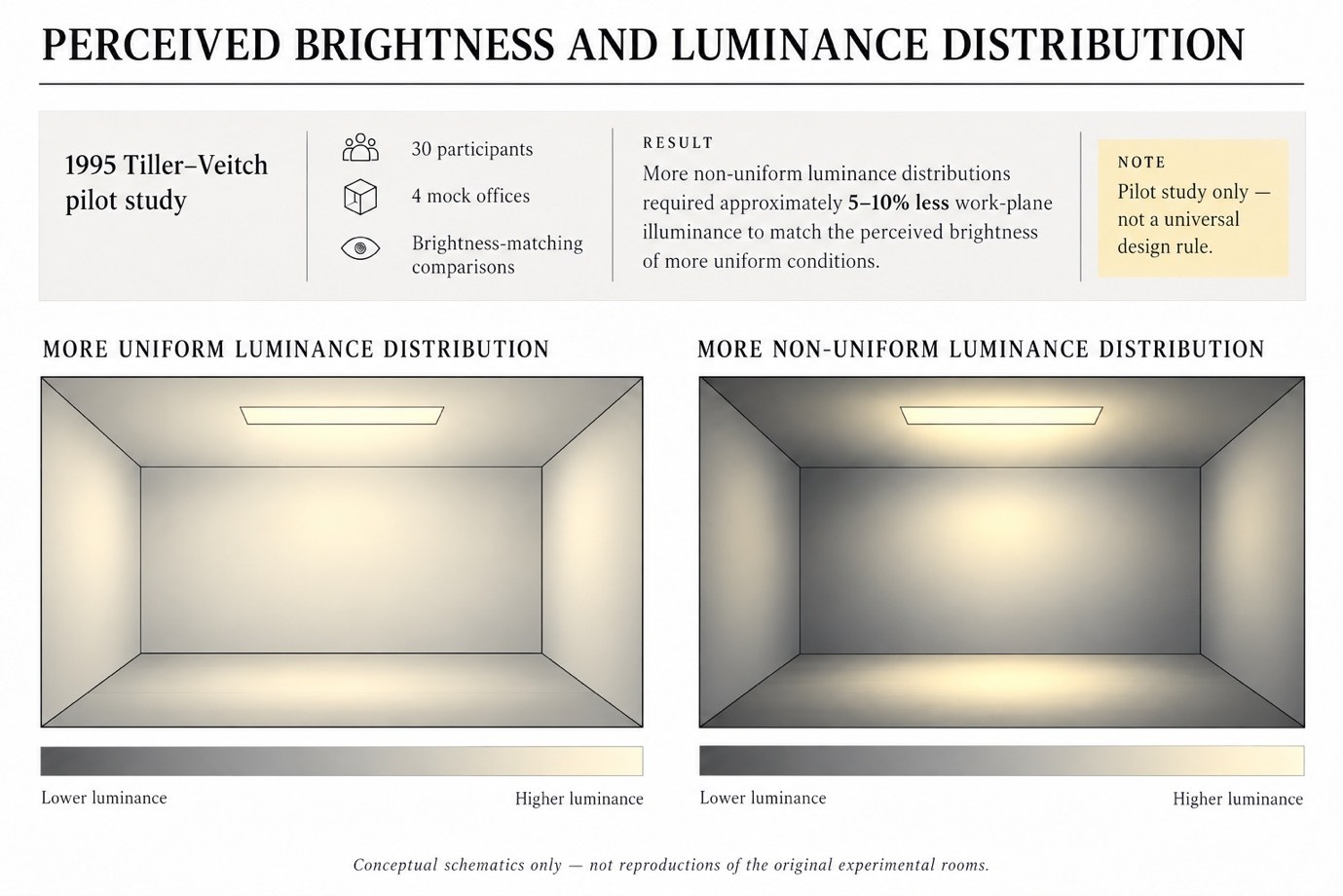
D. K. Tiller and J. A. Veitch published a revealing experiment in 1995 titled Perceived Room Brightness: Pilot Study on the Effect of Luminance Distribution. The researchers investigated whether the arrangement of light within an interior affected people’s judgments of overall room brightness. Rather than simply asking participants to prefer one decorative composition over another, the study had them compare specially prepared mock offices through a controlled brightness-matching task.
Thirty participants were involved. The researchers used four mock offices, two with relatively uniform luminance distributions and two with more non-uniform distributions produced through different luminaire optical arrangements. Participants adjusted lighting conditions to match their impressions of brightness between rooms. The experiment distinguished comparisons between similar luminance distributions from comparisons between different distributions, allowing the researchers to investigate the influence of the spatial arrangement of light.
The reported result is significant. In comparisons involving different distributions, mock offices with non-uniform luminance arrangements required about five to ten percent less work-plane illuminance to match the perceived brightness of rooms with more uniform distributions. In other words, light measured at the working plane alone could not predict participants’ brightness judgments. Luminance distribution within the visual environment also mattered.
This pilot study was conducted under controlled conditions and is not a universal rule for designing homes, offices, or public buildings. It does not establish that non-uniform lighting is always preferable, that a specific percentage reduction in illuminance is safe for every task, or that architects can automatically reduce installed lighting power by that amount. Those conclusions require evidence beyond this experiment. Its value lies in a narrower finding: people did not necessarily judge two spaces as equally bright simply because the relationship between measured illuminance and visual impression was assumed straightforward.
A further investigation published in 1996 in the Journal of Architecture and Planning by researchers including Shigeo Kobayashi and Yoshiki Nakamura examined how interior luminance distribution affects perceived brightness. Its findings also identified the importance of distribution, including cases where non-uniform lighting could make an interior seem darker. These observations are not a contradiction resolved by declaring uniform or non-uniform light superior. They show that the location, character, and organisation of luminance differences matter. The term non-uniform alone is too broad to describe the resulting perception.
Taken together, the studies challenge a common habit in lighting design: evaluating a room primarily through the amount of illumination available on a horizontal plane. That measurement can matter, particularly when assessing a defined task, but it does not fully describe the visible environment. A person entering a room sees its walls, ceiling, openings, objects and light sources from a particular position. The relationships among those elements contribute to the overall impression.
For professionals, this implies that a lighting plan should be considered alongside elevations, receiving surfaces, and expected viewing positions. For students, the research offers a methodological lesson: when comparing two lighting arrangements, document the conditions carefully to determine what actually changed. For homeowners, it explains why adding brighter lamps may not produce the expected improvement. The problem may concern distribution rather than total light quantity.
The Light That Arrives Is Not Always the Light We See
Why can illuminance and perceived brightness disagree? Part of the answer lies in the physical relationship between incoming light, the surfaces it encounters and the light returned toward the observer.
Imagine a dark matte sample and a light matte sample side by side under the same incident illumination. The two samples can receive comparable illuminance while returning different amounts of light toward the viewer. The light-toned material may appear brighter because its surface reflects more of the incident light under the conditions being considered. The darker material may remain visually dark even though the light arriving at its surface has not changed. This distinction does not prove that one material has received inadequate lighting; it shows that material response matters to what the observer sees.
Real surfaces can further complicate the relationship. A matte material tends to scatter reflected light across a broader range of directions, while a glossy surface may produce concentrated reflections that depend strongly on the positions of the source and viewer. Two objects with different finishes may look entirely different under the same luminaire. The visual result is therefore determined not only by the lighting equipment but also by the interaction among incident light, material and viewing geometry.
This is why luminance is direction-dependent. Light observed from one position may not match light observed from another, particularly when the surface exhibits directional reflection. A glossy object may show an intense reflected image of a luminaire from one viewpoint, while the same object appears comparatively subdued from another. Measuring the incident illuminance alone would not fully describe that difference.
The relationship also operates at the room scale. Light falling on a ceiling or wall may make that surface visually prominent. A bright vertical plane can contribute strongly to the impression of an illuminated environment, even when it tells us little about the amount of light reaching a particular work surface elsewhere in the room. Conversely, light directed carefully toward an object may improve its visibility without making every surrounding surface seem much brighter.
None of these observations means that a room should be organised around a permanently bright focal surface or that a particular reflectance value is universally preferable. High-luminance surfaces can become uncomfortable when they occupy an inappropriate position within the field of view. Darker materials can be essential to a visual composition, but they may demand a different assessment when important details must remain visible. The useful lesson is that surfaces participate in lighting. They cannot be treated as passive background elements after the luminaires have already been chosen.
A design review should therefore distinguish the amount of light delivered to a surface from the visual appearance that surface produces. That distinction is especially valuable when evaluating materials from photographs, showroom samples or digital renderings. An image may communicate the intended character of a finish, but it cannot establish how the actual material will appear under all relevant lighting and viewing conditions.
The Window That Wins the Competition
Consider a simple observation that can be made in many existing buildings. A person sits at a table facing an opening during daylight hours. The window occupies a prominent portion of the visual field, while a printed document lies on the tabletop. The room may feel bright because the window and nearby surfaces strongly suggest daylight. Yet the document may be less comfortable to read than expected if its details are difficult to distinguish against the much brighter surroundings.
The issue is not necessarily that the entire room lacks light. The problem may lie in the relationship between the visual task and the luminous environment against which it is seen. A bright opening can influence the observer’s state of visual adaptation. The CIE describes adaptation as the process through which the visual system changes in response to previous and current visual stimuli, including their luminance values and other characteristics. A large difference between an important task and its surrounding visual field can therefore affect how details are perceived.
The Canadian Centre for Occupational Health and Safety identifies glare, inappropriate contrast and poorly distributed light among common lighting problems. Its lighting guidance explains that an environment can contain adequate light in some regions while high-luminance sources or reflections interfere with the ability to distinguish details elsewhere. This is one reason it is important to examine lighting from the normal position of the person performing the task.
We can turn the window situation into a controlled editorial observation without pretending it has already been measured. We would keep the same table, chair, printed sample, and camera position. In the first condition, the opening remains in its ordinary daytime state. In the second, an adjustable blind or screen would alter the opening’s brightness while the task stays in the same location. The observer would record whether the printed details became easier or harder to distinguish, and would measure task-plane illuminance in both conditions using a suitable instrument.
The comparison must acknowledge that changing a blind can alter more than one variable. It may change the illuminance at the document, the window’s brightness, and the general light distribution within the room. If the task measurement also changes, you cannot attribute the improvement solely to reduced background brightness. The purpose of the observation is to document these relationships, not to manufacture evidence for a preferred outcome.
This is also why photographic comparison requires care. Automatic exposure may darken the interior when a bright window fills much of the frame, exaggerating differences between conditions. Alternatively, camera processing may brighten shadows and conceal difficulties a real observer experienced. Matching camera position and manually controlling exposure, white balance, and image processing can make the visual record more interpretable, but photographs alone cannot establish the full human experience or prove compliance with a lighting standard.
The architectural insight is straightforward: a room can contain a powerful source of daylight without that source automatically supporting every task performed within it. Consider the observer’s position, the opening's brightness, and the object's visibility together.
When More Light Erases the Information
A second problem may occur even when sufficient illumination reaches an object. Imagine examining a sheet with fine grey lines beneath an overhead light. Under one arrangement, the lines are clearly visible. Under another, a bright reflection appears across part of the surface, making the information difficult to distinguish. The measured illuminance on the sheet may remain adequate, but the reflection reduces useful visual contrast.
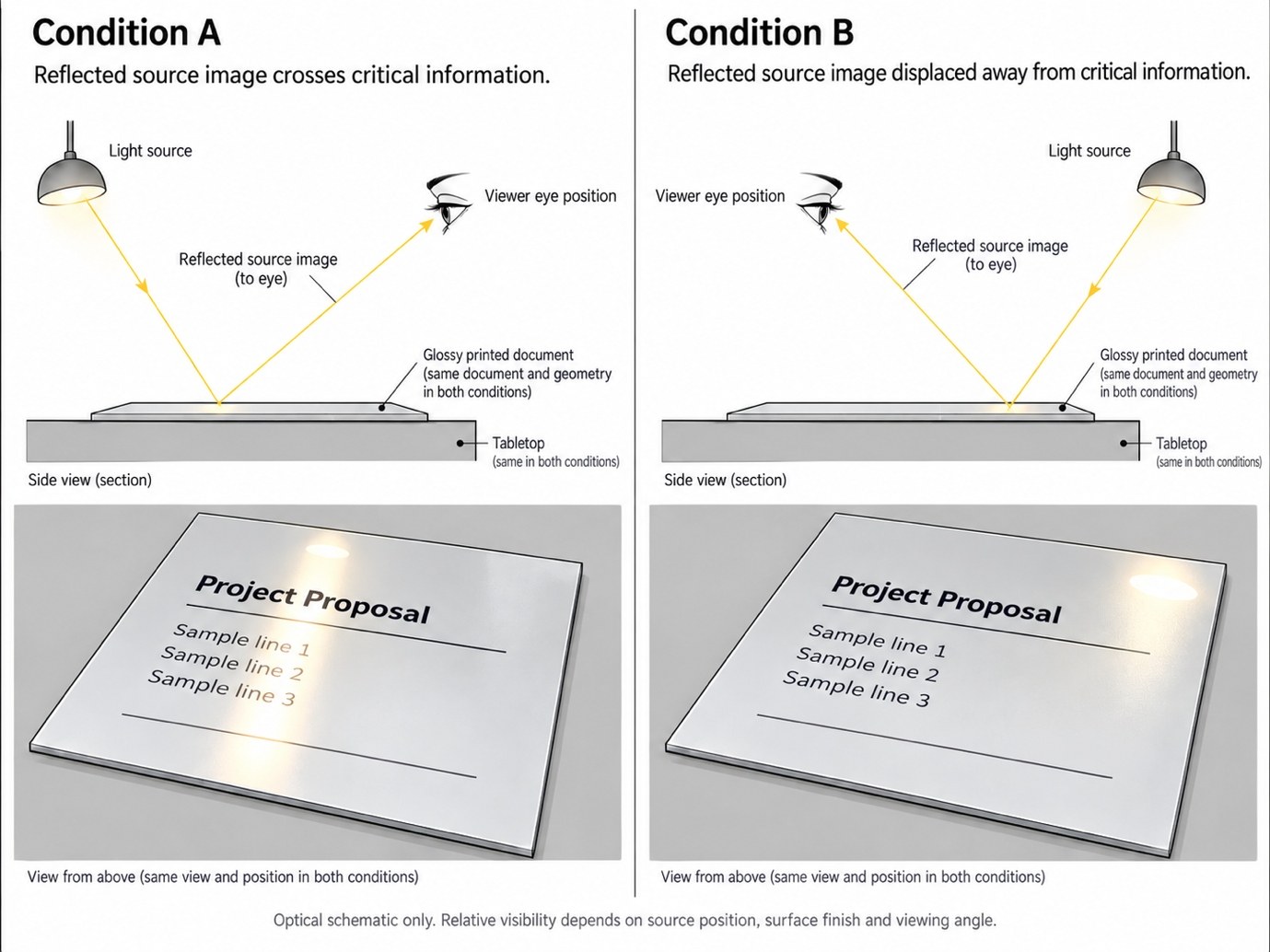
The Illuminating Engineering Society defines a veiling reflection as a regular reflection superimposed on an object's diffuse reflection, reducing contrast and potentially obscuring details. This is a more precise way of understanding a familiar problem. A glossy photograph, laminated drawing, reflective screen, or polished work surface can show a bright image of the light source exactly where someone needs to see information.
Increasing the output of the same poorly positioned source may not solve the problem. It may increase illumination at the surface while also strengthening an unwanted reflection. The person may tilt the document, lean to one side, or change viewing position. What seems like insufficient lighting quantity is actually connected to the geometry of the source, surface, and observer.
The most useful comparison here is not between a bright and a dark room. It is between two source positions relative to a fixed visual task. Imagine using the same light fitting, document, and tabletop, while repositioning the light so its reflected image moves away from important information. An observer may find fine details clearer even if the light delivered to the page does not increase. Whether that occurs in a particular setting must be tested; it should not be presented as a measured StudioMatrx result until the observation is carried out.
CCOHS offers a practical diagnostic principle in its lighting survey guidance: reflected glare may be investigated by observing whether details become easier to see when the offending light path is blocked or altered. That kind of observation does not replace a professional lighting assessment, but it can help distinguish a reflection problem from a simple shortage of incident light.
This lesson is especially important for architectural drawing and material assessment. A person reviewing a glossy sample may not be seeing the material’s colour and detail alone; they may also be seeing the image of a luminaire reflected by that material. A screen may be sufficiently bright on its own but become harder to read because of surrounding reflections. Information visibility depends on more than how much light reaches the surface.
The general principle extends beyond glossy materials. An object must remain distinguishable from its immediate background. If the distinction between the object and background is weak, increasing general brightness may achieve less than improving the visibility of the relevant detail. Lighting quality therefore cannot be separated from the information the observer needs to perceive.
Contrast Is Not the Enemy
It would be tempting to conclude from these examples that the best lighting is perfectly uniform, with minimal brightness differences throughout the visual field. That would replace one oversimplification with another. Variation is not automatically a fault, just as uniformity is not automatically a guarantee of comfort or visibility.
The eye often relies on differences to identify forms, boundaries, details and changes in surface. An object must be perceptually distinguishable from its background. If the two have similar visual characteristics, some details may become difficult to identify even when illumination is adequate. A small change in the relationship between the object and the background can improve visibility without making the entire space brighter.
The Canadian Centre for Occupational Health and Safety recognises contrast as an important factor in visual tasks, alongside the size of the object, available lighting and the demands of the work. Its guidance discusses improving the contrast of important information rather than treating higher illuminance as the only possible correction. These principles apply most directly to the occupational settings for which the guidance was developed, but they also offer a useful way to think about visibility in other architectural situations.
Imagine a simple sample containing a low-contrast marking against a similarly toned surface. In one condition, the marking may be difficult to distinguish. A second sample may use a clearer contrast between the marking and its background, making identification easier under otherwise similar lighting. This improvement partly comes from the information design itself. Lighting and graphic or material design are not independent when the purpose is to make something visible.
The third proposed StudioMatrx observation would compare two printed samples of the same size and content but with different text-to-background contrast. Both would be examined under the same lighting arrangement and from the same viewing position. Observers would be asked to identify particular details, with responses recorded without prompting them toward an expected answer. The goal would be to determine whether changing the visual information has a more noticeable effect than simply increasing overall brightness. Any result would depend on the actual samples, observers and procedure, so it cannot be assumed before the test takes place.
The crucial distinction is between useful contrast, which lets relevant information stand out, and problematic luminance relationships, which can interfere with comfort or visibility. A very bright source near a relatively dark task may distract or impair perception. A carefully differentiated object against its background may be easier to identify. These situations both involve differences in brightness, but they serve different visual purposes and have different consequences.
The architectural implication is that designing light is also a matter of deciding what needs to be recognised and what differences must remain legible. This does not mean turning every edge into a luminous outline or making every surface equally prominent. It means treating the visibility of actual information as a criterion of success.
A Lux Reading Cannot Describe the Whole Room
Measurement is essential when an architectural claim must be verified, but the selection of the measured quantity determines what can reasonably be concluded from the result. A lux meter measures illuminance at the sensor's location and orientation. If it is held horizontally on a work surface, the reading concerns light incident on that measurement plane. It does not directly report the luminance of an adjacent wall, the appearance of a bright source in the observer’s field of view or the contrast of a reflected image.
This limitation does not make illuminance measurement unreliable or unimportant. It means the measurement has a defined meaning. An appropriate illuminance value at a task can be necessary for the intended use, and a lighting assessment may need several measurements across an area to understand distribution. But even a carefully measured average cannot describe every aspect of the visual environment.
For this reason, a useful evaluation begins by identifying the actual claim. If the question is whether enough light reaches a document, task-plane illuminance is relevant. If the question is why a luminous panel causes discomfort from a particular seat, its luminance, apparent size, position and surrounding conditions become important. If the question is why one room appears brighter than another, the distribution of luminance across the visual field and the observer’s perception may be central. These questions overlap, but they require different forms of evidence.
The CIE’s work on glare reinforces the importance of viewpoint. Its technical report on discomfort glare in interior lighting discusses assessment methods that account for conditions including observer position and viewing direction. A lighting arrangement therefore cannot be evaluated fully from the luminaire catalogue alone. Even a product with suitable photometric data must be considered in relation to where it is installed and from where people will experience it.
The same reasoning applies to digital renderings and photographs. A rendering may show the distribution intended by the designer, but its appearance depends on the accuracy of the lighting model, material information, display settings and visualisation process. A photograph records the scene through a camera with particular exposure and processing characteristics. Neither should be treated as a substitute for site measurements or direct observation when the question demands that evidence.
A published reference value also differs from a project-specific assessment. India’s National Lighting Code and international standards provide relevant technical frameworks, but the correct requirements depend on the application, task and applicable edition. A value from a workplace document should not simply be applied to a living room, nor should a value from an illustrative magazine calculation be presented as a statutory minimum.
A good lighting report should therefore make its evidence traceable. It should say what was measured, where the measurement was taken, under what operating conditions, what instrument was used, what the relevant task was and which observations cannot be established through that measurement alone. The purpose of this documentation is not to make architectural work unnecessarily complicated. It prevents using a correct number to support a conclusion it cannot prove.
What Would Actually Change Our Judgment?
We can now return to the bright room described at the beginning. Its walls appeared light, its ceiling was luminous and its overall appearance suggested that plenty of illumination was available. We can no longer judge it adequately from that first impression alone. We would need to identify what people were trying to see, where they were positioned, which surfaces were involved, and whether the lighting arrangement supported the necessary visibility without producing distracting or uncomfortable conditions.
The published research does not justify the simplistic conclusion that brighter rooms are poorly lit. Many bright environments support their intended tasks and provide excellent visual conditions. Equally, darker or more restrained environments are not automatically comfortable or suitable. A room may appear calm and visually controlled while leaving important details insufficiently illuminated. The right balance of quantity, distribution, contrast, and comfort depends on what the space is meant to support.
This counterexample matters because architectural writing often replaces one fashionable assumption with another. If the previous expectation was that more brightness always meant better lighting, the opposite belief—that less light necessarily demonstrates greater design sophistication—would be equally unconvincing. Restraint can be meaningful, but it is not evidence of performance. The design must still support the people who use the space.
For StudioMatrx, the most productive conclusion is therefore a method of questioning rather than a preferred lighting appearance. Begin by observing the environment, distinguish the task from its surroundings, and decide what evidence is needed. A homeowner may notice that a space looks bright but that certain activities remain uncomfortable, and can describe that problem more precisely when discussing it with a designer. A professional can separate task-plane illuminance from the luminance distribution occupants experience and coordinate the surfaces, sources, and viewpoints that determine the result. A student can document two conditions, hold important variables constant and report what was observed without inventing numerical certainty.
The three proposed observations in this article—the window and reading surface, the reflective document and light-source position, and the contrast of printed information—are intended to make that method tangible. Their publication as photographic tests should follow actual observation, not precede it. Record the camera position, source conditions, samples, measurements, and limitations. A result that fails to support the initial expectation is still valuable evidence because it tells us something about the relationship being investigated.
This is where the distinction between a bright room and a well-lit room becomes more than a useful phrase. Brightness is part of how an environment is perceived; illuminance describes light arriving at surfaces; luminance and viewing conditions help explain what reaches the observer; and the visual task determines what must actually be distinguished. None of these can stand in completely for the others. A convincing lighting design brings them into an appropriate relationship and provides evidence that the relationship works.
The question is not whether the room appears sufficiently illuminated in a photograph or whether a particular lux reading has been achieved in isolation. It is whether the people using the space can see what matters, from the positions in which they actually use it, without unnecessary visual interference. That is the standard by which a bright room becomes well lit.
Sources & Technical References
Tiller, D. K., & Veitch, J. A. (1995). Perceived Room Brightness: Pilot Study on the Effect of Luminance Distribution. Lighting Research & Technology, 27(2), 93–101.
Kobayashi, S., Nakamura, Y., Kizu, T., & Inui, M. (1996). The Influence of Interior Luminance Distribution on Brightness. Journal of Architecture and Planning, 61(487), 33–41.
International Commission on Illumination (CIE). International Lighting Vocabulary (2020). Definitions of Illuminance, Luminance and Spatial Brightness.
ISO/CIE (2025). ISO/CIE 8995-1:2025 — Lighting of Work Places, Part 1: Indoor.
Bureau of Indian Standards (2025). SP 72:2025 — National Lighting Code of India, First Revision.
Canadian Centre for Occupational Health and Safety (CCOHS). Lighting Ergonomics — Survey and Solutions.
Illuminating Engineering Society (IES). Veiling Reflection — Technical Definition.
International Commission on Illumination (CIE). CIE 117:1995 — Discomfort Glare in Interior Lighting.
- News desk