
 Lesson 9.1
Lesson 9.1 · Tools, Data & Representation
GIS & Urban Data
How a designer reads the city through layered spatial data
The city as a stack of transparent maps
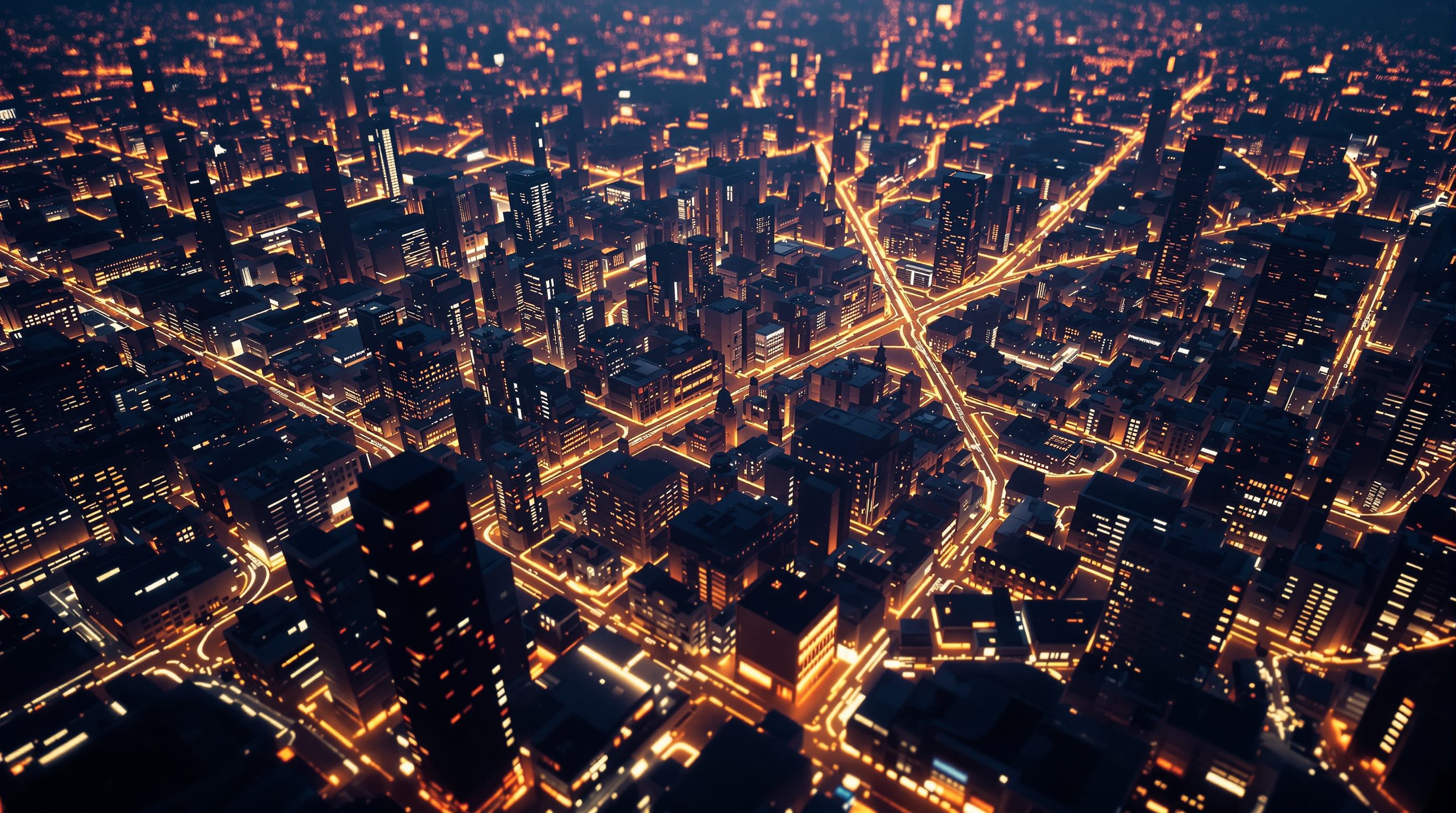
Imagine tracing the roads of your city onto one sheet of glass, its parks onto another, its people onto a third, then stacking the sheets and looking straight down. That stack is a Geographic Information System, and once you can read it, the city stops being a blur and becomes a set of questions you can answer.
A map you cannot question is just a poster. A map you can question is a city thinking out loud.
GIS is not a map, it is a way of asking the map questions
A paper map is a picture; a Geographic Information System is a database that happens to draw pictures. That distinction is the whole lesson in one sentence. When you open a GIS project you are not looking at a single fixed image but at a stack of independent layers, each holding a different kind of geographic thing, roads, buildings, wards, water, trees, bus stops, and each of those things carries a table of attributes behind it. A road is not just a line; it is a line that also knows its name, its width, its surface, its traffic count. Because every feature is both a shape and a record, you can interrogate the map the way you interrogate a spreadsheet: show me every plot within three hundred metres of a metro station, or every ward where density exceeds twenty thousand people per square kilometre, or every stretch of road without a footpath. The software then draws the answer. This is the leap that matters for a designer. A survey drawing tells you what is there; a GIS lets you ask what the arrangement means. Studio Matrx runs a full, dedicated GIS course for those who want to master the software, so this lesson stays deliberately at the designer's altitude: enough to make you dangerous with data, not enough to make you a technician. Our goal is that you can commission, read, and sanity-check spatial analysis, and do a fair amount yourself, without pretending to be a remote-sensing specialist.
Vector and raster: the two ways the world is stored
All spatial data comes in one of two flavours, and knowing which you are holding saves endless confusion. Vector data represents the world as discrete geometry: points, lines and polygons. A tree is a point, a road a line, a plot or a ward a polygon. Vectors are crisp at any zoom, small in file size, and carry rich attribute tables, so they are what you use for anything with a clear boundary or identity, cadastral parcels, administrative wards, the street network, land-use zones. The common vector formats you will meet are the old but universal shapefile and the cleaner, web-friendly GeoJSON. Raster data, by contrast, represents the world as a grid of cells, like a photograph, where each pixel holds a value. A satellite image is a raster; so is a digital elevation model where each cell stores a height, or a heat map where each cell stores a temperature. Rasters are how you handle continuous phenomena, terrain, temperature, rainfall, vegetation, light, that do not have neat edges. A useful rule of thumb: if the thing has a boundary you could walk along, store it as vector; if it varies smoothly across space, store it as raster. Real urban analysis constantly moves between the two. You might drape building footprints (vector) over a slope model (raster) to find plots too steep to build, or count how many green pixels (raster) fall inside each ward polygon (vector) to compare neighbourhood tree cover. The figure shows the same street corner in both models so the difference lands visually.
Layers, the coordinate system, and the base map
The power of GIS is that layers are independent yet perfectly aligned. You can switch the parks layer on, the traffic layer off, restyle the wards by population, and reorder what sits on top, all without touching the underlying data. What keeps every layer honest is the coordinate reference system, the CRS, the mathematical scaffolding that says where on the round earth a flat coordinate actually falls. The single most common beginner failure is mixing layers in different coordinate systems, so that your roads and your buildings, both correct, sit hundreds of metres apart or, worse, land in the ocean off West Africa where the zero-zero origin lives. For India you will usually work in a geographic system based on WGS 84 for global data or a projected system such as the relevant UTM zone when you need to measure real distances and areas in metres. Underneath your working layers sits the base map, the contextual backdrop, an aerial image, an OpenStreetMap tile layer, or a plain grey canvas, that orients the eye without adding data you must manage. A disciplined GIS habit is to name and group layers clearly, keep one project CRS, and treat the base map as scenery, not evidence. The figure renders this as a layer cake: the base map at the bottom, then terrain, then blocks and streets, then land use, then people, each transparent sheet contributing one dimension of the city to the composite you finally read.
Census, open data portals, and the Indian data landscape
A GIS is only as good as the data poured into it, and for the Indian city the richest single source is the Census of India, which reports population, households, literacy, work and amenities down to the ward and even enumeration-block level. Join that census table to a layer of ward boundaries and the city suddenly reveals its demographic geography, where the young live, where households are largest, where basic services thin out. Beyond the census, a growing constellation of open data exists: national and municipal open-data portals, the Smart Cities and AMRUT programmes that pushed many cities to publish spatial data, transit authorities releasing route and stop data, and utility maps of varying quality. The honest caveat is that Indian spatial data is uneven, cadastral records are often not digitised or not public, ward boundaries change between censuses, and a layer may be years stale, so a professional always records the source, the vintage and the licence of every layer, and never presents a stale map as current truth. Two disciplines separate the amateur from the professional here. First, provenance: know exactly where each layer came from and when. Second, joinability: data is only useful if it shares a key, a ward code, a plot number, a place name, with the geometry you want to attach it to. Much of real GIS work is the unglamorous labour of cleaning names and codes so that a spreadsheet from one office will marry the boundary file from another.
OpenStreetMap and the rise of crowd-sourced geography
For a designer starting a project in an Indian city today, OpenStreetMap is often the fastest route to a workable base of streets, buildings, water and amenities, and it deserves a section of its own. OpenStreetMap is a free, editable map of the world built by a global community of volunteers, the Wikipedia of geography, and its data is genuinely open to download and use. In many Indian cities its coverage of the road network, points of interest and building footprints now rivals or exceeds commercial sources, precisely because local mappers know the lanes that no survey recorded. You can pull OpenStreetMap data straight into QGIS, extract just the layers you need, roads, footpaths, shops, parks, and have a credible base map for analysis in an afternoon. Two cautions temper the enthusiasm. First, quality is uneven and unverified: because anyone can edit, coverage is superb in some neighbourhoods and thin in others, and a designer must ground-truth what matters. Second, completeness varies by feature: main roads are excellent, but footpaths, informal settlements and small lanes may be under-mapped, exactly the fabric an urban designer cares about most. The constructive response is to contribute back, adding the missing footpath or corrected street name you discover on site, so the commons you drew from grows richer. OpenStreetMap embodies a quietly radical idea, that the map of a city need not be the property of a state or a company but can belong to the people who live in it.
Satellite imagery and remote sensing for the designer
Some of the most powerful urban data now falls from the sky. Remote sensing, the science of measuring the earth from satellites and aircraft, gives the urban designer a synoptic, repeatable and comparable view no ground survey can match. At its simplest, high-resolution satellite imagery is a base map you can trace, reading built form, open space, tree canopy, water bodies and the tell-tale texture of informal settlements straight off the picture. But remote sensing goes far beyond pretty pictures, because satellites see wavelengths the eye cannot. Near-infrared bands reveal healthy vegetation, letting analysts compute a greenness index and map the city's living cover objectively. Thermal bands reveal surface temperature, exposing the urban heat island as glowing red arteries of tarmac and roof against the cool of parks and lakes, a decisive input for climate-responsive design. Because the same satellite passes overhead repeatedly, you can also detect change: comparing images across a decade shows a lake shrinking, a wetland being built over, a city's edge sprawling into farmland, evidence that is hard to argue with in a public hearing. For the designer, the discipline is to treat imagery as evidence, not decoration: note the date and resolution, understand that a shadow is not a wall and a blue roof is not a swimming pool, and confirm the critical readings on the ground. Used well, the view from above turns a site visit into a diagnosis of the whole territory the site belongs to.
QGIS, spatial joins and the analyses a designer actually runs
The good news for the not-for-profit-minded and the student alike is that the professional-grade tool is free. QGIS is a mature, open-source desktop GIS that does almost everything the expensive commercial packages do, and it has become the lingua franca of planning studios and NGOs across India. You do not need to master it to benefit from it; a handful of operations covers most of what design work demands. The spatial join marries two layers by location, tagging each bus stop with the ward it falls in, or counting how many schools sit inside each neighbourhood polygon. The buffer draws a zone of a given radius around features, the classic four-hundred-metre walk-shed around a station or a park, so you can see who it actually serves. The clip and intersect trim layers to a study boundary or find where two conditions overlap, say, flood-prone land that is also zoned residential. Thematic styling, colouring wards by density or plots by land use, turns a table into an argument the eye grasps instantly. And simple measurement, of area, length and count, answers the questions clients ask first: how much open space per person, how many metres of street without a footpath, how many homes within walking distance of transit. None of this requires programming; all of it requires clear questions. The professional habit is to start from the design question, choose the smallest analysis that answers it, and keep the map honest, one message, sourced layers, a legend a councillor could read, rather than a rainbow of data for its own sake.
Census of India
Population, household and amenity data down to ward and enumeration-block level
The foundational demographic layer for Indian cities; join its tables to boundary geometry to map the social geography of a district.
OpenStreetMap
Free, editable, community-built map of streets, buildings, water and amenities
Often the fastest credible base for an Indian city; verify coverage on site, and contribute corrections back to the commons.
QGIS (open-source GIS)
Free desktop software for viewing, joining, buffering, measuring and styling spatial data
The practical, no-cost tool for designers and students; covers the spatial joins, buffers and thematic maps most design work needs.
Smart Cities Mission / AMRUT open data
Municipal and mission spatial datasets published under national urban programmes
A growing source of Indian urban layers; always record each dataset's source, vintage and licence before relying on it.
Build a five-layer portrait of your neighbourhood
Assemble a small, honest GIS project that reads one real neighbourhood through stacked layers, then ask it one design question.
QGIS (free), internet access, OpenStreetMap, optionally a census table and ward boundary file
Choose a neighbourhood you know on foot, so you can ground-truth what the data claims.
- 1Install QGIS and add a base map (an OpenStreetMap tile layer or a recent satellite image), setting one project coordinate system.
- 2Download OpenStreetMap vector data for the area and extract at least three layers: roads, buildings and green space or amenities.
- 3Find and join one attribute layer, ward boundaries with a census figure such as population, matching on the ward code or name.
- 4Draw a four-hundred-metre buffer around the nearest park or transit stop and note how much of the neighbourhood it actually serves.
- 5Style one map to answer a single question (for example, colour streets by whether they have a mapped footpath) and write one sentence on what it reveals.
You’ll walk away with
A one-page map with a clear legend answering one spatial question, plus a short note listing each layer's source and vintage and one thing you had to ground-truth.
Three altitudes on the same idea
Read the band that fits you — or all three.
For the architect, GIS is the tool that lets your site drawing zoom out to its context and back without losing accuracy. Before you touch a plan, drape building footprints over terrain and sun, buffer the plot to see what lies within a comfortable walk, and read the census of the surrounding wards to understand who your building is really for. You do not need to be a GIS specialist; you need to ask sharp spatial questions and read the answers critically.
For the urban designer, GIS is the daily instrument for reading the public realm at scale: which streets lack footpaths, which neighbourhoods are starved of open space, where density and transit align or fail to. Master the spatial join, the buffer and thematic styling, and you can turn a hunch about a district into a mapped, defensible argument. Treat every layer's provenance and vintage as part of the design evidence, because a stale or mislabelled map quietly corrupts every decision downstream.
Think of GIS as transparent sheets of glass stacked over your city, each holding one kind of information, that you can switch on, recolour and question. To make it intuitive, install QGIS (it is free), pull your own neighbourhood from OpenStreetMap, and colour the streets by whether they have a footpath. That single exercise teaches vector data, layers, styling and the difference between having a map and asking it a question.
“GIS is just a fancier way to make a nice-looking map.”
Do it yourself
Quick checks before you move on.
- 1State the core difference between vector and raster data and give one urban example of each.
- 2Explain why two correct layers can appear hundreds of metres apart on the same screen.
- 3Name three sources you would combine to build a base for an unfamiliar Indian city.
Pulling it together
Peer-reviewed journals & authoritative standards
- 01Census of India, primary census abstracts and administrative geography — Office of the Registrar General and Census Commissioner, India, 2011.
- 02OpenStreetMap, the free editable map of the world — OpenStreetMap Foundation, 2024.
- 03QGIS, a free and open-source geographic information system — QGIS Project, 2024.
- 04Esri, GIS for urban and regional planning — Esri, 2024.
Data is only as useful as the questions you ask of it. The next lesson turns to the measures themselves, the metrics of density, connectivity and access that let you compare one piece of city with another.
The author
Amogh N P
Architect, interior designer, and creative polymath. Studio Matrx began in his notebooks — his vision of design made honest, useful, and open to everyone. Its Academy is written and taught in his memory, and free, forever.
More about Amogh →