
 Lesson 6.4
Lesson 6.4 · Remote Sensing for the Built Environment
Change Detection & Urban Sprawl Monitoring
Measuring how a city grew, one date against another
The city you planned for in 2005 is not the city that exists in 2025. By how much, and where?
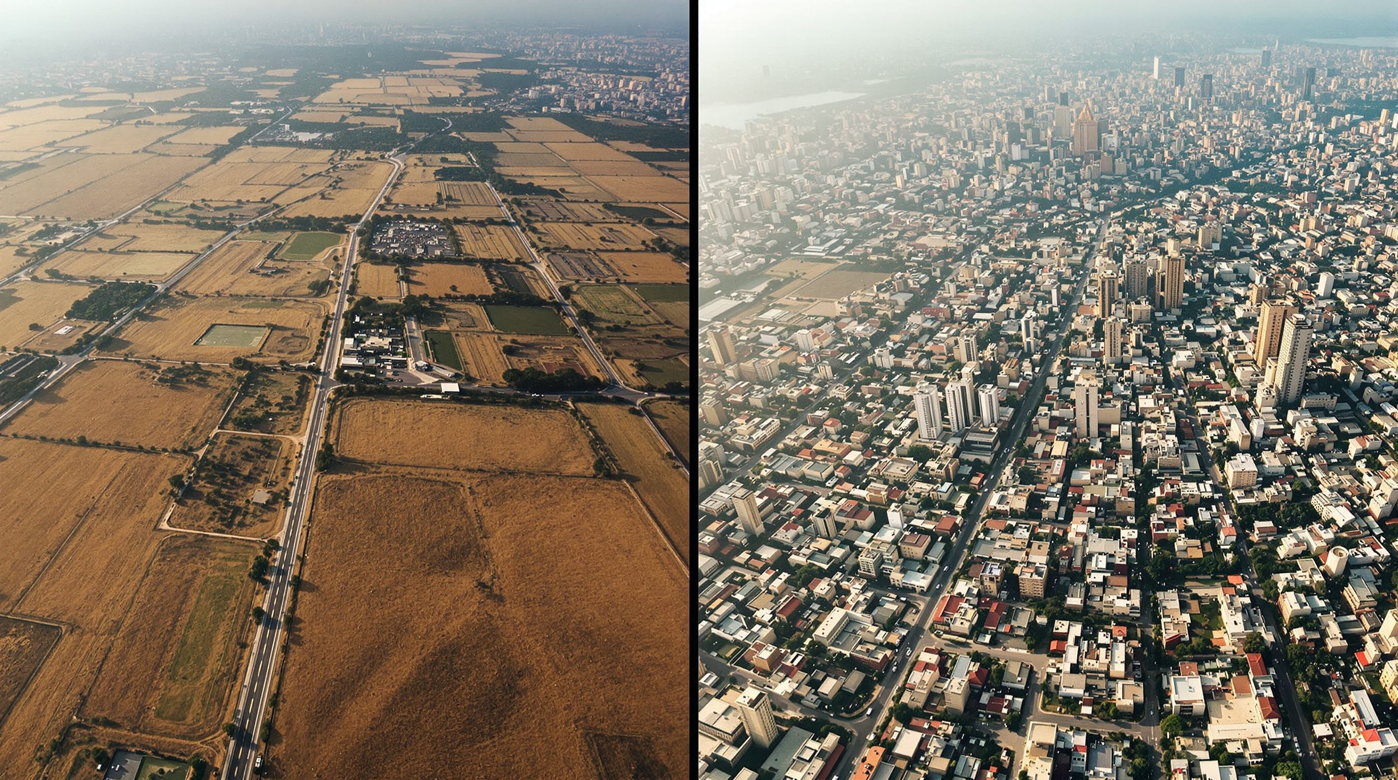
Every planner knows their city sprawled; few can say precisely how much farmland became flats, or which corridor grew fastest. The satellite archive holds the answer - decades of imagery of the same ground, waiting to be compared. Change detection lines up two dates and measures exactly what turned into what, converting a vague sense of runaway growth into hectares, maps and rates you can plan against.
'The city doubled' is a headline. 'It ate 3,000 ha of cropland, mostly leapfrog along NH-4' is a plan.
The core idea: same place, two times
Change detection rests on a simple premise: acquire imagery of the same area at two (or more) dates, and whatever differs between them is change. The art is making sure the difference you measure is real ground change, not an artefact. If the two images are in different coordinate systems, taken in different seasons, or one is hazy and one is clear, you will 'detect' change that is only misalignment, phenology or atmosphere. So the unglamorous first steps - precise co-registration, comparable seasons, atmospheric correction, cloud masking - are what make the result trustworthy.
The classic, most interpretable method is post-classification comparison: classify each date into land-cover classes (Lesson 6.1), then compare the two classified maps pixel by pixel. Its great virtue is that it tells you not just that a pixel changed but from what, to what - cropland to built-up, forest to bare - which is exactly what planning needs. Its weakness is that errors in either date's classification carry into the change result, so accuracy discipline matters twice over.
Half of all 'change' detected by beginners is really misregistration or a different season. Rule those out first.
Reading the change matrix
The output of a post-classification comparison is a change matrix (a 'from-to' or transition matrix): rows are the earlier classes, columns the later ones, and each cell holds the area that went from one to the other. The diagonal is everything that stayed put; the off-diagonals are the conversions - and those are the story. The cell where cropland meets built-up measures farmland lost to the city; forest-to-built measures encroachment; water-to-built is the most alarming line of all.
From this one table you get the headline numbers a report needs: total new built-up area, net loss of each class, and the dominant conversion. Divide by the years between dates and you have an annual rate. Because it is spatial as well as tabular, you can also map where each conversion happened - clustered infill, ribbon growth along a highway, or scattered leapfrog development that is the signature of sprawl.
Doing it at scale: Google Earth Engine
Comparing two small scenes is easy on a laptop. Comparing decades of imagery over a whole metropolitan region is not - the downloads alone are punishing. This is where Google Earth Engine (GEE) changes the game. GEE is a cloud platform holding a vast catalogue of satellite data (the full Landsat and Sentinel archives among them) with the compute sitting next to the data, so you filter, composite, classify and difference images on Google's servers and download only the small result. A multi-decade sprawl analysis that would choke a desktop runs in minutes.
The honest caveat is licensing. GEE is free for research, education and other non-commercial use, but commercial use is paid - so know which side of that line your project sits on before you build on it. It also asks for a little scripting (JavaScript or Python). For coursework and public-interest planning studies it is a superb, free-to-you tool; for a fee-paying consultancy deliverable, check the terms.
GEE gives you a planet of imagery for free - as long as your work is non-commercial. Read that clause, don't assume it.
From change map to sprawl insight - and its limits
Change detection becomes sprawl monitoring when you interpret the pattern, not just the total. Sprawl is not merely growth; it is a particular kind - low-density, fragmented, leapfrogging, consuming farmland and open space faster than population grows. Indian studies using remote sensing and GIS across mid-sized cities have quantified exactly this fragmented, farmland-consuming expansion, and the method is now standard practice. Read against master-plan boundaries, your change map shows how much growth happened outside the plan; read against roads, it shows growth chasing highways; read against a floodplain layer, it flags building where nobody should.
Stay honest about limits. Two-date comparison misses what happened in between and can be swamped by classification error, so report your accuracy. Coarse pixels miss thin, incremental fringe growth. And a change map explains what and where, never why - the drivers (policy, land price, migration) come from outside the imagery. Used with that care, change detection is one of the most powerful evidence tools a fast-urbanising country has.
USGS Landsat archive
Free imagery, ~30 m, reaching back decades
The backbone of long-term change and sprawl studies; consistent bands across missions. Via EarthExplorer.
Google Earth Engine catalog
Cloud archive + compute over Landsat, Sentinel and more
Runs multi-date analysis at scale; FREE for research/education/non-commercial, PAID for commercial.
AMRUT GIS-based Master Plans (TCPO/MoHUA)
India's GIS base + land-use maps for cities
The statutory land-use baseline to measure change against; a natural overlay for sprawl audits.
Copernicus Sentinel-2
Free 10 m optical for recent, fine-grained dates
Sharper recent end of a time series; pairs with Landsat's long history for change work.
Workshop — measure two decades of growth in your city
Compare two classified dates to quantify how much land became built-up and where. Do it on the desktop for two scenes, or in Google Earth Engine for the full time span.
QGIS (free) + SCP, or ArcGIS Pro + Image Analyst; two free Landsat scenes; optionally a free Google Earth Engine (non-commercial) account and your city's master-plan boundary.
Goal: a change map + a from-to matrix reporting new built-up area and cropland lost
Data: two Landsat scenes of your city, ~15-20 years apart (free, USGS/GEE)
Time: ~2 hours
- 1Assemble comparable dates. Get two low-cloud Landsat scenes of your city, same season, years apart, and confirm both share one CRS. In ArcGIS Pro: add both and check/define the coordinate system; co-register if needed.
- 2Classify each date. Produce a LULC classification for both scenes (built-up, cropland, vegetation, water) using QGIS + SCP, or the ArcGIS Pro Image Analyst classification tools - the exact workflow from Lesson 6.1. Note each date's accuracy.
- 3Compare them. In QGIS: use the Raster Calculator or SCP's land-cover-change tool to cross the two classified rasters into a change layer. In ArcGIS Pro: use Compute Change Raster (or a Combine/Con expression) to build the from-to result.
- 4Build the change matrix and map. Tabulate area per transition (the from-to matrix) and style the change layer to highlight cropland-to-built-up. In either tool, read off total new built-up area and divide by the years for an annual rate.
- 5(Scale up) In Google Earth Engine: filter the Landsat collection to your two date ranges, build cloud-free composites, classify or difference them, and export the change map - the same logic across the full archive, free for non-commercial use. Overlay the master-plan boundary to see growth inside versus outside the plan.
You’ll walk away with
A change map and from-to matrix quantifying built-up expansion and farmland loss over your chosen period - plus, if you used GEE, a reusable cloud script for the whole time series.
Three altitudes on the same idea
Read the band that fits you — or all three.
Change detection reveals a site's trajectory, not just its snapshot. Seeing how a plot's surroundings built out over twenty years tells you where the neighbourhood is heading - which open edges will likely close, where infrastructure and density are arriving - so your building is designed for the context that is coming, not only the one that is there today.
This is the audit tool for the statutory plan. Overlay measured change on the master-plan land-use map and you can report, in hectares, how much growth conformed and how much leapt outside it, which farmland was lost, and where enforcement failed. It is the evidence base for the next plan revision and for the AMRUT-era GIS master-planning process, arguing from measured change rather than anecdote.
Change detection exposes the _form_ of growth. Compact infill, ribbon development along corridors, or scattered leapfrog each demand a different public-realm response. Mapping which pattern your city is producing - and where - lets urban designers argue for the connected, walkable fabric that unmanaged sprawl erodes.
“If two satellite images look different, that difference is real ground change.”
Do it yourself
No software needed - think through a change study.
- 1List three things (besides real change) that can make two images of the same place look different, and how you would rule each out.
- 2In a from-to change matrix, where do you look to find farmland lost to the city - the diagonal or an off-diagonal cell?
- 3Why does post-classification comparison require you to be extra careful about accuracy on both dates?
- 4Your city grew from 6,000 to 9,000 ha of built-up over 15 years. What is the average annual rate of new built-up land?
- 5State one thing a change map can prove and one thing it can never explain on its own.
The one line to carry out
Peer-reviewed journals & authoritative standards
- 01Chettry, V. & Surawar, M. — Urban Sprawl Assessment in Eight Mid-sized Indian Cities Using RS and GIS — Journal of the Indian Society of Remote Sensing, 2021.
- 02Tobler, W.R. — A Computer Movie Simulating Urban Growth in the Detroit Region — Economic Geography, 1970.
- 03Lillesand, T., Kiefer, R.W. & Chipman, J. — Remote Sensing and Image Interpretation, 7th ed. — Wiley, 2015.
- 04Remote Sensing — MDPI, ongoing.
- 05Bhuvan — Indian Geoportal of ISRO — ISRO / NRSC, ongoing.
You can now see, measure and monitor the built environment from space - next, Module 7 brings GIS down to the plot to serve architecture directly, from site selection to sun and views.
The author
Amogh N P
Architect, interior designer, and creative polymath. Studio Matrx began in his notebooks — his vision of design made honest, useful, and open to everyone. Its Academy is written and taught in his memory, and free, forever.
More about Amogh →