
 Lesson 6.3
Lesson 6.3 · Remote Sensing for the Built Environment
Urban Heat Island Mapping
Reading a city's heat from thermal and optical bands
The new district is measurably hotter than the old one - can you prove it, block by block?
On a summer afternoon the glass-and-concrete business district feels several degrees hotter than the tree-lined old quarter a kilometre away. That gap has a name - the urban heat island - and it is not a feeling: it is a physical, mappable surface. A satellite's thermal band lets you measure land-surface temperature across an entire city in a single pass, so you can see where heat concentrates, tie it to sealed and dark surfaces, and target the cooling where it will matter most.
North is a decision; so is your rural baseline. An unstated baseline makes any heat-island number arguable.
Why cities cook: the heat island effect
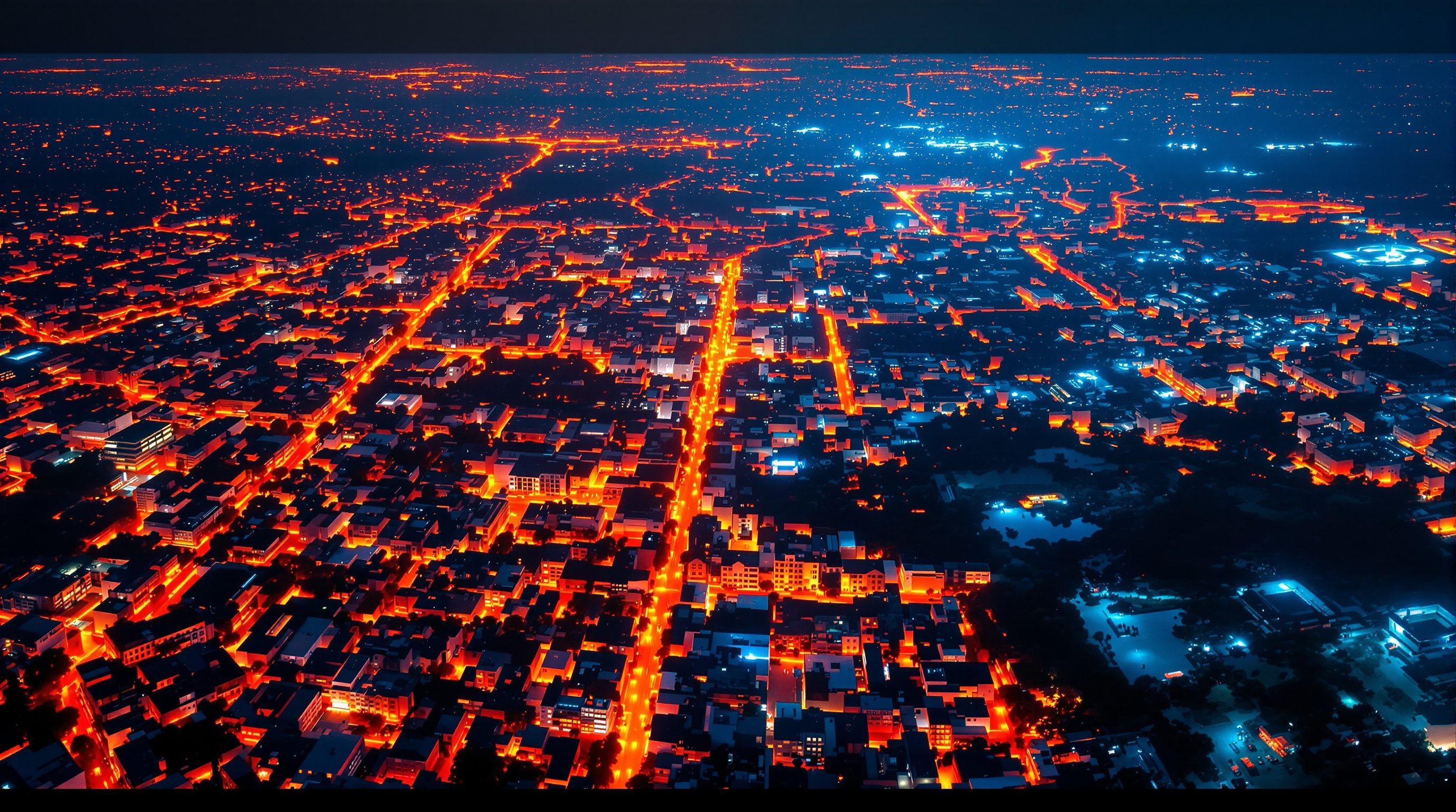
Replace fields and trees with concrete, asphalt and metal and you change the surface energy balance. Dark, dense, sealed materials absorb solar radiation through the day and release it slowly into the night; buildings trap heat in street canyons; and paving that sheds rainwater leaves little moisture for the evaporative cooling that vegetation and soil provide. The result is the urban heat island (UHI): built-up areas measurably warmer than their rural or vegetated surroundings, with the peak over the densest, most sealed fabric and cool dips over parks and water.
Two distinctions matter. First, surface UHI (skin temperature, what a satellite measures) is not the same as air UHI (what a thermometer at head height feels), though they are related. Second, UHI is a relative statement - city warmer than its surroundings - so any UHI map depends on where you draw the rural baseline. Say which baseline you used.
A satellite reads the skin of the city, not the air you breathe. Related, not identical - say which you mean.
From a thermal band to land-surface temperature
Optical bands record reflected sunlight; a thermal infrared (TIR) band records emitted heat - the longwave radiation a surface gives off because of its own temperature. Landsat carries such thermal bands, and they are the free workhorse for city-scale land-surface temperature (LST). The catch is that the thermal band is coarser than the optical bands, so LST is a neighbourhood-scale signal, not a per-building reading.
Getting from raw thermal data to LST is a short, honest chain. You convert the band's recorded values to brightness temperature (the temperature a perfect emitter would need to give off that much radiation), then correct for emissivity - how efficiently a real surface radiates heat, which differs between water, vegetation and concrete. Emissivity is commonly estimated from NDVI (greener pixels get a vegetation emissivity), which is why the last lesson feeds directly into this one. The output is a temperature raster you can map, contour and compare.
Explaining the pattern: imperviousness and green
A heat map on its own is striking but shallow - it shows where it is hot, not why. The explanation usually lies in two layers you already know how to make. Imperviousness - the share of ground sealed by roofs, roads and paving - tracks LST closely: the more sealed a neighbourhood, the hotter it tends to run. NDVI works the other way: greener, moister surfaces run cooler through evaporative cooling and shade.
Overlay LST with imperviousness and NDVI and the causal story becomes visible and defensible: this hot ridge is the sealed industrial belt; that cool notch is the lake and its park. You can quantify it - mean LST per land-cover class, or a plot of temperature against percent-sealed - and turn a dramatic map into an argument for specific, located interventions. Global built-up products such as the GHSL can supply imperviousness where you lack a local layer.
'It's hot here' is a map. 'It's hot here because it is 90 percent sealed and has no canopy' is a plan.
Honest limits, and how to use LST well
Thermal remote sensing rewards humility. LST is a surface skin temperature at the satellite's overpass moment (often late morning), not the 3 p.m. air temperature a resident endures, and not a night-time value unless you use a night scene. Its coarse resolution means you read districts and corridors, not individual plots. Clouds block thermal sensing entirely, and a single date can be unrepresentative - averaging several clear summer scenes gives a steadier picture.
Used within those limits, LST is invaluable. It reveals heat corridors and hotspots at a scale no ground survey could cover, flags the neighbourhoods most exposed during heatwaves, and provides a baseline to test whether cool roofs, tree cover or a new park actually lowered surface temperature. In Indian cities facing rising heat stress, that city-wide, repeatable view is exactly the evidence heat-action planning needs.
USGS Landsat 8/9
Free imagery with thermal infrared band(s) for LST
The standard free source for city-scale land-surface temperature; via EarthExplorer.
Copernicus Sentinel-2
Free 10 m optical for NDVI and land cover
Supplies the emissivity (from NDVI) and green-cover layers that explain the heat pattern.
Global Human Settlement Layer (GHSL)
Open built-up surface & settlement grids
A ready imperviousness/built-up proxy where no local sealed-surface layer exists (EU JRC).
ISRO Bhuvan
India geoportal; imagery & thematic layers
Indian context imagery and land layers to frame and validate the heat surface. bhuvan.nrsc.gov.in
Workshop — map your city's summer heat and explain it
Derive a land-surface-temperature map from a free Landsat scene, then overlay NDVI and a built-up layer to explain the pattern. This is a raster-math exercise with a strong planning payoff.
QGIS (free) with Raster Calculator / SCP, or ArcGIS Pro; one free warm-season Landsat scene; a green (NDVI) and a built-up layer.
Goal: an LST raster + a short read of hot/cool zones against green and sealed cover
Data: one clear, warm-season Landsat 8/9 scene (free, USGS EarthExplorer)
Time: ~90 minutes
- 1Get a clear summer scene. Download a low-cloud Landsat 8/9 scene for your city from USGS EarthExplorer (free). In ArcGIS Pro: add the same scene, or access Landsat via an image service.
- 2Compute brightness temperature. In QGIS: use the Raster Calculator (or the SCP thermal/LST tool) to convert the thermal band to brightness temperature per the sensor's coefficients. In ArcGIS Pro: use Raster Functions / Raster Calculator with the same conversion.
- 3Correct to LST with emissivity. Compute NDVI (as in the previous lesson), derive an emissivity estimate from it, and apply the emissivity correction to get land-surface temperature - in the QGIS Raster Calculator/SCP or ArcGIS raster functions.
- 4Style and read the heat surface. Apply a temperature colour ramp (cool blue to hot red) and identify the hottest corridors and coolest dips, in either tool.
- 5Explain it. Overlay your NDVI layer and a built-up/imperviousness layer (local, or the GHSL). In QGIS: use Zonal Statistics to get mean LST per land-cover class. In ArcGIS Pro: Zonal Statistics as Table. Confirm hot = sealed/dark, cool = green/wet.
You’ll walk away with
A land-surface-temperature map of your city, a short evidenced note linking hot zones to sealed cover and cool zones to green, and a baseline you can re-measure after cooling interventions.
Three altitudes on the same idea
Read the band that fits you — or all three.
LST places your site inside its thermal context. It shows whether the plot sits in a heat corridor or beside a cool green lung, and which surrounding surfaces radiate heat back at your facades - evidence for orientation, shading, cool/reflective roofs and planting. Keep the scale honest: LST guides site strategy and material choices, it does not resolve one building's roof temperature.
Heat mapping is the spatial backbone of heat-action and green-infrastructure planning. An LST surface, read against imperviousness and population, locates the wards where heat and vulnerability overlap - so cooling investment, tree budgets and open-space priorities go where they save the most. It also gives a repeatable baseline to evaluate whether those interventions worked.
LST turns comfort into a design variable at street scale. Cross-referenced with block form, canopy and materials, it shows which streets and squares bake and which stay liveable, guiding shade structures, tree lines, lighter paving and water features - then lets you re-measure the public realm you cooled.
“A satellite land-surface temperature map tells me the air temperature people feel on the street.”
Do it yourself
No software needed - reason about heat and thermal data.
- 1List three physical reasons a dense concrete district runs hotter than a park a kilometre away.
- 2Explain the difference between surface (skin) temperature and air temperature, and which one a satellite thermal band measures.
- 3Why is NDVI needed on the way to a good land-surface-temperature map?
- 4You have one cloudy scene and one clear scene from the same week. Which do you use for LST, and why is the other useless here?
- 5Name two overlay layers that turn a 'where is it hot' map into a 'why is it hot' explanation.
The one line to carry out
Peer-reviewed journals & authoritative standards
- 01Lillesand, T., Kiefer, R.W. & Chipman, J. — Remote Sensing and Image Interpretation, 7th ed. — Wiley, 2015.
- 02Jensen, J.R. — Remote Sensing of the Environment: An Earth Resource Perspective, 2nd ed. — Pearson, 2007.
- 03Remote Sensing — MDPI, ongoing.
- 04Landscape and Urban Planning — Elsevier, ongoing.
- 05Journal of the Indian Society of Remote Sensing — Springer (Indian Society of Remote Sensing), ongoing.
Heat and green are snapshots of a city today - but cities change fast, and next we compare images across years to detect that change and measure urban sprawl.
The author
Amogh N P
Architect, interior designer, and creative polymath. Studio Matrx began in his notebooks — his vision of design made honest, useful, and open to everyone. Its Academy is written and taught in his memory, and free, forever.
More about Amogh →