
 Lesson 8.1
Lesson 8.1 · Placemaking, Heritage & Culture
Identity & Sense of Place
Genius loci, imageability and why some places feel like somewhere
Somewhere, not anywhere
Step off a train in one city and you know instantly where you are; step off in another and you could be in any airport-retail nowhere on earth. That difference is not decoration or nostalgia. It is identity, the hard, designable quality that makes a place feel like itself, and this lesson is about how to read it, protect it and build it.
Ask a stranger to draw your city from memory. Whatever they leave out is the part with no image yet.
Space becomes place when it means something
Begin with a distinction that runs through all of urban design: the difference between space and place. Space is the abstract, measurable extent that a plan draws, so many metres of frontage, so many square metres of plaza. Place is what that space becomes once people invest it with meaning, memory, ritual and belonging. A stairway is space; the ghat steps where a city bathes, gossips, mourns and celebrates are place. The Norwegian architect Christian Norberg-Schulz revived the old Roman idea of the genius loci, the spirit of place, to name this quality, arguing that every location has a distinct character made of its landscape, its light, its materials and the human life it has gathered over time, and that the architect's deepest task is not to impose a form but to make that latent character visible and to let people dwell within it. To dwell, in his phenomenological sense, is to belong somewhere you understand and can orient within. This is why identity is not a soft or optional concern. A place with a strong, legible character orients us, roots us and gives us something to be loyal to; a place without one leaves us anxious, transient and indifferent, and indifferent citizens do not defend, maintain or love their surroundings. Identity, in short, is the emotional infrastructure of a city, and like any infrastructure it can be surveyed, damaged, protected and built.
Lynch and the imageable city
The single most useful tool for making identity operational came from Kevin Lynch, whose 1960 book The Image of the City, published by MIT Press, remains the field's touchstone. Lynch asked ordinary residents of Boston, Jersey City and Los Angeles to draw maps of their cities from memory and to describe their journeys, and from these mental maps he distilled a startling finding: people carry an image of their city, and cities differ enormously in how vivid and shareable that image is. He called this quality imageability, the capacity of a physical environment to evoke a strong, structured mental picture, and he argued it rests on five elements that recur in almost everyone's map. Paths are the channels along which we move, streets, transit lines, canals, and they are usually the dominant element because we experience the city while moving through it. Edges are linear boundaries that are not paths, a river, a rail line, a city wall, a shoreline, which hold districts apart or together. Districts are medium-to-large areas with a recognisable common character that you can mentally enter and leave. Nodes are strategic points you can travel to and into, junctions, squares, transit interchanges, concentrations of activity. Landmarks are point references you do not enter but navigate by, a tower, a dome, a hill, a distinctive tree. The genius of the scheme is that these five are not a style but a vocabulary: any city can be read through them, and, crucially, any city can be designed to strengthen them. The figure lays out the five elements on a single diagram.
Legibility: a city you can hold in the mind
Lynch's core value was legibility, the ease with which a city's parts can be recognised and organised into a coherent pattern. A legible city is one you can find your way through, tell stories about and describe to a stranger, because its paths connect clearly, its districts have character, its nodes are memorable and its landmarks stand where you need them. Legibility is not merely convenient wayfinding, though it is that too; it is a precondition for feeling secure and free in a city, for the child and the newcomer as much as the resident. Consider how legibility works in real cities. Jaipur's eighteenth-century walled city is intensely legible: a clear grid of chaupars and bazaar streets, gates in the wall as edges and portals, the palace complex as a central node, and the whole rendered in a single pink that makes the district unmistakable. Manhattan's numbered grid makes the island navigable to someone who arrived that morning, its avenues and streets a coordinate system, Central Park a vast edge-and-district, the skyline supplying landmarks. Contrast the sprawling, repetitive peripheries of many fast-growing cities, where identical towers along identical arterial roads produce an environment almost impossible to hold in the mind, where residents navigate by shop signs and phone maps because the built form itself offers no structure. Legibility can be deliberately strengthened: by terminating important streets on landmarks, by giving districts distinct materials or sections, by making nodes generous and active, and by keeping edges permeable rather than blank. The designer who thinks in Lynch's terms is always asking whether a move makes the city easier or harder to read.
The moving eye: townscape and serial vision
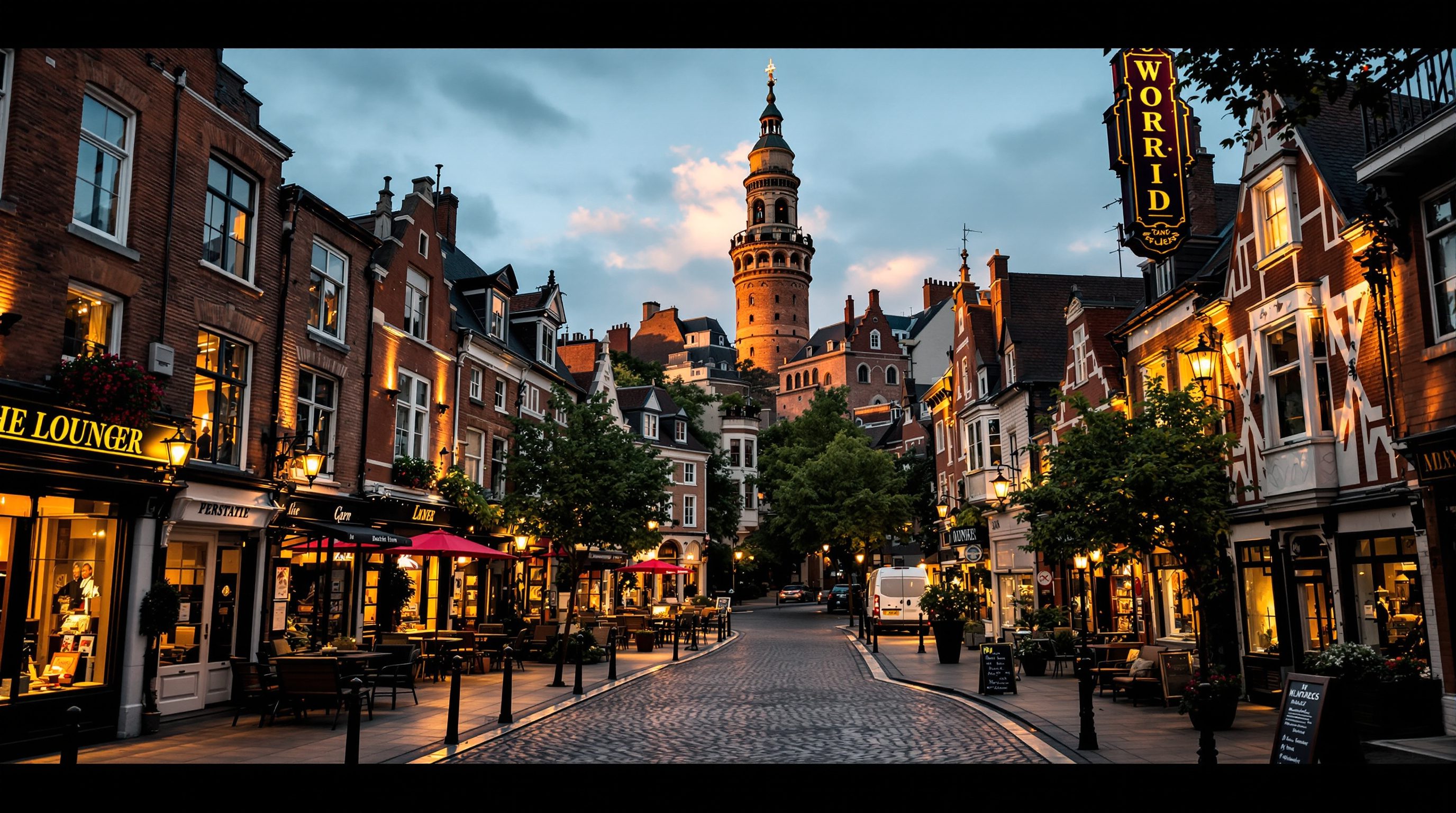
Lynch mapped the city as a whole; the English tradition of townscape, above all Gordon Cullen's work, complements him by attending to the city as it unfolds to a person walking through it. Cullen coined serial vision to describe how a street reveals itself as a sequence of framed views, each corner offering a fresh picture, a glimpse of a tower, a narrowing, a sudden opening into a square. Identity, in this reading, lives not only in the plan but in the choreography of the walk: the compression of a covered bazaar giving way to the release of a chowk, the surprise of a temple gopuram framed at the end of a lane, the enclosure of a courtyard entered through a low gate. This is why so many beloved historic quarters, the lanes of Varanasi, the medieval cores of Italian towns Camillo Sitte drew, the pols of Ahmedabad, feel rich despite being built of ordinary materials: their character is made by sequence, enclosure, contrast and the framing of incident. Cullen also named the qualities that give streets presence, enclosure, the sense of being comfortably contained by building fronts; hereness and thereness, the pull between where you stand and where you are drawn; and the small punctuations, a bollard, a tree, a shrine, that make a place particular. For the designer this is a reminder that identity is experienced at eye level and in motion, and that a plan legible on paper can still be dead on the ground if the sequence of spaces offers the walking eye nothing to discover.
Placelessness and the rise of generica
If identity can be built, it can also be erased, and the geographer Edward Relph gave the erasure a name in his 1976 book Place and Placelessness: placelessness, the casual production of environments that have no relationship to their setting and could stand anywhere. We see it everywhere now, the interchangeable glass office park, the mall whose interior is identical from Gurugram to Guangzhou, the arterial strip of the same franchises, the gated enclave whose Tuscan or Georgian styling has nothing to do with the soil it sits on. Critics call this generica or the geography of nowhere: a landscape assembled from catalogue parts, oriented to the car and the brand rather than to the place and its people. The causes are structural, not merely aesthetic: global capital that demands standardised, de-risked products; construction systems and codes that reward repetition; car-dependence that dissolves the fine grain in which local character lives; and a planning culture that measures floor area and parking but rarely character. The danger is not that new buildings look modern, modern buildings can have intense local identity, but that they look nowhere, severing the thread of memory and belonging that makes a city loved. The remedy is not pastiche or a freeze on change; a living place absorbs new layers, as Delhi has absorbed the Sultanate, Mughal, colonial and modern in turn. The remedy is design that reads the genius loci, respects the local grain and climate, and adds a genuine new layer rather than a generic one. Identity is lost not by building the new but by building the anonymous.
Designing with, not against, the spirit of a place
So how does a designer act on all this? The method begins with reading before writing. Before proposing, survey the place: walk it at different hours, map its Lynchian elements, note where its image is strong and where it dissolves, ask residents what they would show a visitor and what they fear losing. This reveals the identity you are working with, the materials and colours the place already speaks, the landmarks it navigates by, the edges and nodes that structure it, the rituals its public spaces host. Then design to strengthen that structure rather than overwrite it: reinforce a weak node, protect a sightline to a landmark, extend a district's grain into new development, keep the section and enclosure that make its streets legible, use materials and shade appropriate to its climate and craft. This is not conservatism; it is contextualism, the discipline of adding a confident new layer that belongs. The Sabarmati Riverfront in Ahmedabad, whatever one thinks of its trade-offs, tried to turn a neglected edge into a legible public front for the city; Barcelona's steady work on its plazas and streets strengthened an already vivid image. The professional's stance is humility before the genius loci and boldness in serving it, and the test of any proposal is simple: after it is built, will this place feel more like itself, or more like anywhere?
Lynch, The Image of the City (imageability framework)
The five elements and the concept of legibility
The foundational method for surveying and strengthening a city's mental image; use it to audit any site or scheme.
URDPFI Guidelines / local Development Plan character areas
Identification and protection of areas of distinct character
Indian plans increasingly designate special or heritage character areas; check whether your site sits within one and what controls apply.
Urban Design Group / Project for Public Spaces placemaking guidance
Practice guidance on reading and strengthening local distinctiveness
Professional resources on surveying character and designing public space that reinforces identity.
Map the image of a place you know
Turn Lynch's method into a working survey of a real neighbourhood, then propose one move that strengthens its identity.
Pen, tracing paper or a printed base map, a camera or phone, optionally OpenStreetMap for the base
Choose a walkable area you can visit, ideally about a kilometre across, that you can spend an hour in on foot.
- 1From memory, before you go, sketch the area marking its paths, edges, districts, nodes and landmarks; this is your mental map.
- 2Walk the area slowly and correct the sketch, noting where the image is strong (a clear landmark, a vivid district) and where it dissolves (a confusing junction, a blank edge, a placeless stretch).
- 3Ask two or three people what they would show a first-time visitor and what they would miss most if it went; record their answers against your map.
- 4Identify the single weakest point in the image and propose one concrete move, terminating a street on a landmark, activating a dead node, opening a blank edge, that would strengthen it.
You’ll walk away with
An annotated Lynch-style map of the area plus a one-paragraph proposal for the single move that would most strengthen its sense of place.
Three altitudes on the same idea
Read the band that fits you — or all three.
For the architect, identity is decided at the scale of the single building's relationship to its street. Your facade, its materials, its rhythm and its ground floor either reinforce the local grain and the sightlines that structure the district, or they puncture them. Read the genius loci of the site before you draw: the colours the place already speaks, the landmark your street terminates on, the section that gives it enclosure. A confident contextual building adds a new layer that belongs; a catalogue object could stand anywhere and quietly erases the place.
As the urban designer you hold the very elements Lynch mapped. You decide whether paths connect legibly, whether districts keep a coherent character, whether nodes are generous and active, whether edges are permeable, and whether important streets terminate on landmarks. Design the public realm to strengthen the city's mental image: protect sightlines, choreograph the serial vision of the walk, and resist the placeless standardisation that dissolves fine grain. Your medium is the structure of the whole image, not any one building.
Grasp the core idea by drawing your own city from memory, as Lynch's subjects did. What paths, edges, districts, nodes and landmarks did you draw, and what did you leave out? The gaps are the parts of your city with a weak image. Then walk a place you love and a place that feels like nowhere, and list what makes the difference. That comparison will teach you sense of place faster than any definition.
“Sense of place is a vague, nostalgic feeling; you either have an old, historic city or you do not, and it cannot really be designed.”
Do it yourself
Quick checks before you move on.
- 1Name Lynch's five elements of the city image and give a real example of each from a city you know.
- 2Explain the difference between space and place in one sentence, using the idea of genius loci.
- 3Define placelessness and name one structural cause of the generica landscape.
Pulling it together
Peer-reviewed journals & authoritative standards
- 01Kevin Lynch, The Image of the City — MIT Press, 1960.
- 02Edward Relph, Place and Placelessness — Routledge, 1976.
- 03Project for Public Spaces, What Makes a Successful Place — Project for Public Spaces, 2018.
- 04Urban Design Group, guidance on local distinctiveness and character — Urban Design Group (UK), 2021.
If identity is worth protecting, some of it is embodied in old fabric we choose to conserve. The next lesson turns to heritage and conservation areas, why and what we keep, and how.
The author
Amogh N P
Architect, interior designer, and creative polymath. Studio Matrx began in his notebooks — his vision of design made honest, useful, and open to everyone. Its Academy is written and taught in his memory, and free, forever.
More about Amogh →