
 Lesson 1.4
Lesson 1.4 · Light — The Foundation
Mood & Atmosphere with Light
Golden hour, overcast, night, drama and story - matching light to the message
The geometry is fixed. The feeling isn't. Light is where you decide what the image means.
By now you can light a scene correctly. This lesson is about lighting it on purpose - not just believably, but to make a viewer feel something specific. The same building can read as hopeful at dawn, serene under cloud, or dramatic at night, and you choose which.
That choice is not decoration. It is the last and most powerful lever in this module, because mood is what a client actually remembers. An image that nails the feeling of a space out-persuades a technically superior one that feels like nothing.
Realism gets you believed. Mood gets you remembered. Write the feeling first, then light towards it.
Every image carries a message - light delivers it
Before you choose a time of day or touch a contrast slider, ask the question that should govern the whole image: what is this render supposed to make the viewer feel and understand? A family home wants warmth, safety and belonging. A civic building wants gravitas and permanence. A retail space wants energy and desire. A quiet retreat wants calm. That intended feeling is the message, and light is the single most powerful way to deliver it.
This reframes mood from a nice-to-have into a design decision. You are not picking golden hour because golden hour is pretty; you are picking it because this image needs to feel warm and hopeful. You are not going dark and moody for effect; you are doing it because this space is about drama and focus. When the light matches the message, an image becomes persuasive in a way the viewer feels but cannot quite explain - which is exactly the point. When it fights the message - a cosy family kitchen rendered in cold, flat, even light - the image can be technically perfect and still leave everyone cold, because the light is telling the wrong story.
So the professional habit is to decide the message first, in a sentence, and then let every lighting choice serve it. Mood is not the finish you apply at the end; it is the brief you light towards from the start.
Notice that this is the opposite of how beginners usually work. The temptation is to render first and find a mood afterwards by pushing sliders until something looks nice. But a mood discovered by accident is fragile and generic, while a mood chosen in advance is coherent and specific. Deciding the feeling first costs you a single sentence and saves you a dozen aimless test renders - and it is the habit that most reliably separates an image that merely looks fine from one that actually lands.
Decide the feeling in one sentence FIRST. Then light towards it. Mood is the brief, not the garnish.
The moods and what each one says
A handful of lighting conditions carry most of the emotional range, and knowing what each one says lets you reach for it deliberately.
Golden hour - the low, warm light of just after sunrise or before sunset - is the workhorse of aspirational architecture. It is warm, it rakes across surfaces to reveal texture, and its long shadows add depth and drama. It reads as hopeful, human, calm, premium. It flatters almost anything, which is why so many hero shots live here.
Overcast turns the whole sky into one huge soft light. Shadows nearly vanish, contrast drops, colours stay true. It reads as calm, neutral, honest, contemporary - and it is genuinely useful, both for a cool modern mood and for honestly showing form and material without dramatic shadows hiding things. Do not think of it as bad weather; think of it as the softest, most even light there is.
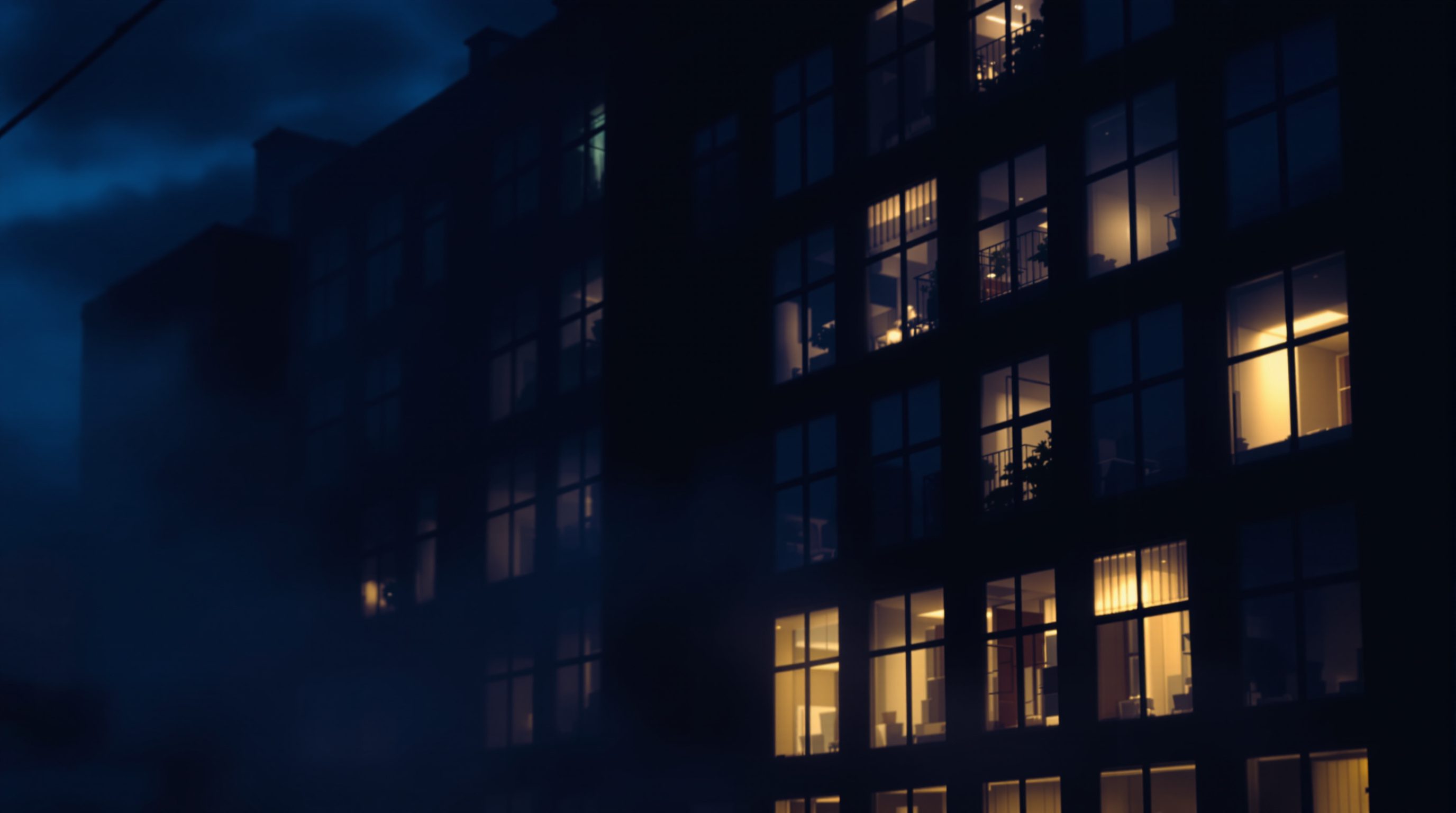
Night and dusk flip everything. The building becomes a dark mass and the light comes from inside - glowing windows, lit interiors, pools from fittings. It is inherently dramatic, aspirational and focused, because the eye goes straight to the light. It is also the hardest to balance, which is exactly why a good night render is so impressive. And midday sun - bright, high, hard - reads as energetic, honest, even stark; it has its place for crisp modern work, though it is rarely the romantic choice. Learn what each says, and you can pick the mood the message needs.
Between these named conditions sit the transitional moments that professionals prize. Blue hour - the short window after sunset when the sky is a deep, even blue but not yet black - is a gift for night-ish shots, because the sky still holds enough light to read the building's form while the interiors glow warm against the cool. Twilight more generally lets you balance a still-luminous sky against artificial light, which is exactly why so many premium exterior hero shots are made in that narrow band rather than in full dark. Learning to reach for these in-between moments, and not only the obvious noon or midnight, is a large part of what it means to direct light rather than accept it.
Contrast and atmosphere: the volume knob of drama
Within any of those conditions, the amount of contrast - the ratio between the brightest and darkest parts of the image - is your dial for drama. High-key lighting keeps contrast low: everything is bright, shadows are gentle, the mood is airy, open and soft. It suits clean commercial interiors, calm minimal spaces, anything that wants to feel light and easy. Low-key lighting widens the contrast: bright highlights against deep shadows, with much of the frame allowed to fall dark. It reads as moody, sculptural, cinematic and intense, and it is how you make a space feel dramatic and important. Neither is better - they are different emotional registers, and choosing where you sit on that scale is choosing how dramatic the image feels.
On top of contrast, atmosphere adds the final layer of mood and depth. A touch of haze or fog softens the distance and separates foreground from background. Volumetric light - visible shafts and god-rays where light catches dust or mist - is pure drama and instantly draws the eye. A subtle glow or bloom around bright sources reads as photographic. Used with restraint these effects are magic; overused they turn an image into soup, so the rule is a little goes a long way. Reach for atmosphere when the message wants mystery, depth or drama, and leave it off when the message wants clarity and honesty.
Contrast is the drama dial. High-key = airy and calm; low-key = moody and cinematic. Choose on purpose.
Matching light to the message - a working method
Bringing the whole module together, here is a method you can run on any image. First, write the message in one sentence - this render should make a young family feel this home is warm and safe, or this civic hall should feel monumental and calm. Everything else serves that sentence.
Second, choose the condition that fits - golden hour for warmth and hope, overcast for calm honesty, night for drama and focus, midday for crisp energy. Third, set the contrast to match the intensity of the feeling - high-key for gentle and open, low-key for dramatic and important. Fourth, add atmosphere only if the message wants it - a little haze or a volumetric shaft for mystery and depth, nothing if the message wants clarity. Finally, check exposure and colour so the whole thing holds together, warm where it should be warm, cool where it should be cool.
The discipline is that every one of these choices points the same way - towards the sentence you wrote first. When they do, the image feels inevitable and persuasive. When they contradict each other - warm mood but cold colour, dramatic intent but flat contrast - the viewer senses something is off even if they cannot name it. This is the whole point of the light module: not just to make an image believable, but to make it say something.
A final check keeps the method honest: look at the finished frame and ask whether anything in it is fighting the message. A warm, hopeful brief undone by a cold blue shadow; a dramatic low-key intent flattened by an over-bright ambient fill; a calm, honest overcast scene cluttered with a theatrical volumetric shaft. Mood fails most often not because one choice is wrong in isolation, but because two choices pull in opposite directions. When every element - time, contrast, colour, atmosphere, exposure - points at the same sentence, the image reads as inevitable; when they argue, the viewer feels the discord even if they can never quite name it. Get there and you are no longer producing renders - you are directing them.
Golden hour / time of day
Warm low-angle light for mood
The most reliable aspirational look; warm, raking, long shadows. Set via the sun's time-of-day control.
Contrast ratio (high-key / low-key)
The bright-to-dark range of the image
Low contrast reads airy and calm; high contrast reads moody and cinematic. Your main drama dial.
Volumetric light / fog
Visible light shafts and atmospheric haze
Adds depth, mystery and drama - powerful but easy to overdo. A little goes a long way.
Colour grading
Warming, cooling and tuning the final image
Post-stage that locks the mood in; supported in every engine and in Lightroom/Photoshop. Detailed in the post-production module.
Workshop - three moods from one scene
You will render a single space three ways to feel how completely light alone changes meaning - and practise stating a message and lighting towards it.
Any real-time or offline renderer with time-of-day, exposure and basic atmosphere/fog controls (Twinmotion, Enscape, Lumion, D5, V-Ray or Corona).
Goal: prove that light, not geometry, carries the mood
Inputs: any renderer + one finished scene you already have (interior or exterior)
Time: ~50 minutes
- 1Take ONE scene you will not otherwise change - no moving geometry, materials or camera. Write three different one-line messages for it, e.g. 'warm and hopeful', 'calm and honest', 'dramatic and intimate'.
- 2Render version one - golden hour, warm colour, gentle contrast - to serve the hopeful message. Balance the exposure so it glows without blowing out.
- 3Render version two - overcast or soft daylight, neutral colour, low contrast - to serve the calm, honest message.
- 4Render version three - night or dusk, low-key high contrast, a touch of atmosphere and glowing interior light - to serve the dramatic message.
- 5Put the three side by side. For each, write one line: does the light match its stated message? Which is most persuasive, and why?
You’ll walk away with
One scene rendered in three deliberate moods, each with a stated one-line message, plus a short reflection on which lighting best delivered its message.
Three altitudes on the same idea
Read the band that fits you — or all three.
Mood is where your design intent becomes emotion. The feeling you meant a building to give - shelter, monumentality, calm - can be delivered or betrayed by the light in a single image. Decide the message before you render, and make every lighting choice serve it. A render that makes people feel the idea wins the room faster than one that merely documents it.
Clients buy a feeling, and light is how you sell it. The difference between a room that photographs as cold and one that glows with welcome is mood, not furniture. Golden warmth, gentle overcast calm, or an intimate evening scene - match the light to the life your client wants in that room and the render does your persuading for you.
A portfolio full of technically-correct-but-flat images loses to one with genuine mood. Reviewers respond to feeling. Practise stating a one-line message and lighting towards it - warm and hopeful, calm and honest, dark and dramatic. Showing you can direct mood, not just achieve realism, is what marks you as an image-maker rather than a button-pusher.
“A photorealistic render will automatically feel powerful and persuasive.”
Do it yourself
Think about the feeling first.
- 1Why should you decide the message of an image before choosing the light?
- 2What emotion does golden hour typically deliver, and why?
- 3What is the difference between high-key and low-key lighting?
- 4When is overcast the right choice rather than a compromise?
- 5Why can a less photoreal image out-persuade a more photoreal one?
The one line to carry out
Peer-reviewed journals & authoritative standards
- 01Architectural Photography - overview — Wikipedia, 2026.
- 02Lumion - Support & Documentation — Lumion, 2026.
- 03Adobe Lightroom - colour and tone reference — Adobe, 2026.
- 04Chaos - V-Ray & Corona documentation hub — Chaos, 2026.
That closes the light module - the foundation the whole course stands on. Light shows form and mood, but what your surfaces are actually made of is the next layer of believability. Module 2 turns to materials and texturing.
The author
Amogh N P
Architect, interior designer, and creative polymath. Studio Matrx began in his notebooks — his vision of design made honest, useful, and open to everyone. Its Academy is written and taught in his memory, and free, forever.
More about Amogh →