
 Lesson 1.3
Lesson 1.3 · Light — The Foundation
Interior & Artificial Lighting
Fixtures, IES profiles, colour temperature and layering ambient, task and accent
A great interior render is rarely one big light. It's several small ones, each doing one job.
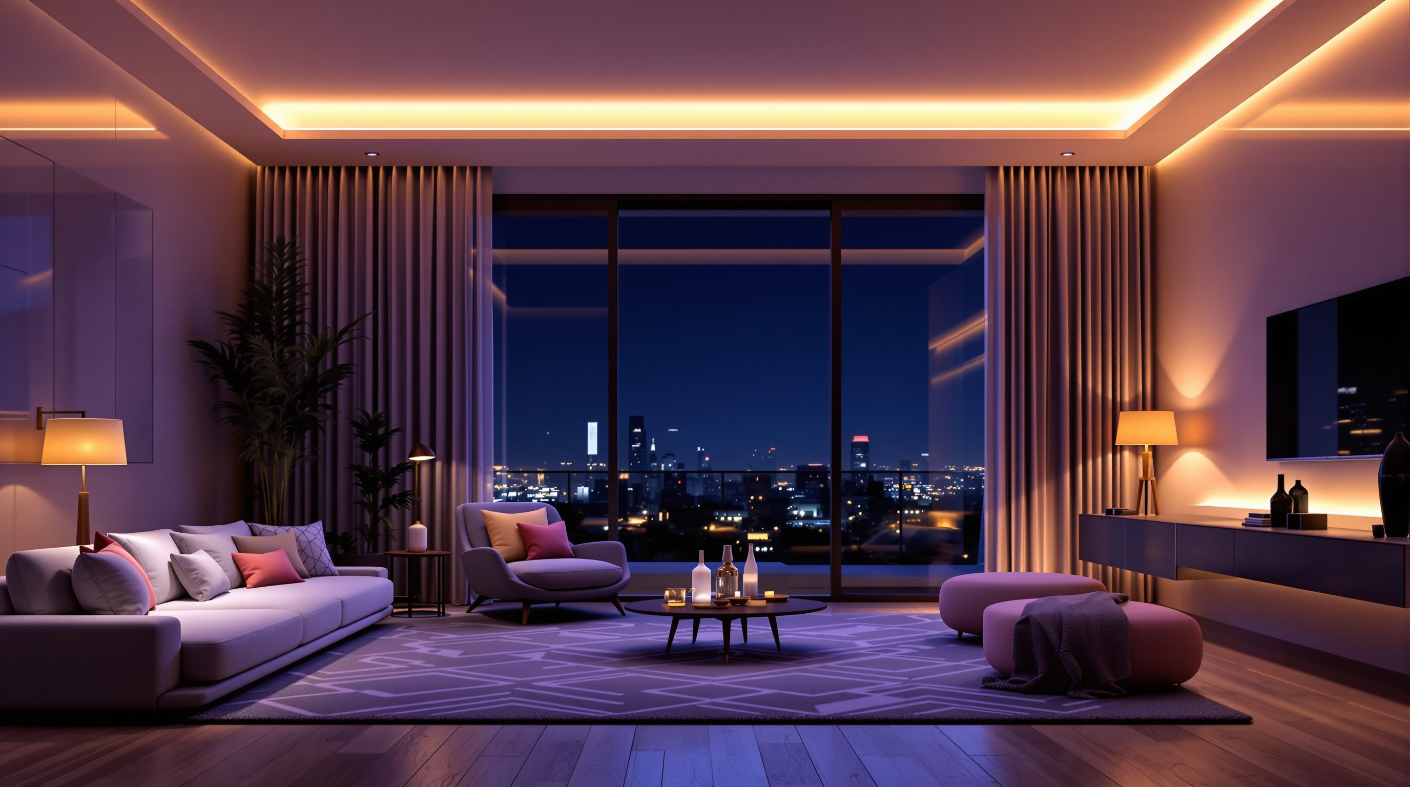
Daylight is generous and does much of the work for free. Interiors at dusk and night are the opposite - every bit of light is one you chose to place, which is exactly why interior lighting is where visualization starts to feel like real craft.
The secret is not brighter lights. It is layered lights: a soft base, focused pools where they are needed, and a few accents for sparkle - each with the right colour and, crucially, all balanced against a single exposure so the room reads warm and real rather than muddy or blown out.
Ambient, task, accent. Warm against cool. One exposure. That's an interior that reads as lived-in.
Fixtures are sources with shape, direction and falloff
When you place an artificial light in a scene you are adding a source with its own character. The basic types map onto real fittings. A point / omni light radiates in all directions, like a bare bulb - good for a rough fill but rarely realistic on its own. A spot light throws a cone in one direction with a soft or hard edge, like a downlight or a track fitting - the workhorse of interior lighting. An area light emits from a surface rather than a point, like a softbox, a lit ceiling panel or a glowing lampshade - and because it has real size, it casts the soft, believable shadows that make interiors feel photographed. A linear / strip light runs along a line, standing in for LED strips, coves and under-cabinet lighting.
Two properties matter for all of them. Intensity is how much light the fixture emits, and real fittings vary enormously - a reading lamp is nothing next to a ceiling grid. Falloff is how the light fades with distance: real light obeys an inverse-square law, dropping off fast, which is why a lamp lights its own pool brightly and the far wall barely at all. Fighting that natural falloff - trying to make one lamp light a whole room evenly - is a classic beginner mistake. Work with falloff: many modest sources, each owning its own patch, always beat one heroic light trying to do everything.
A useful habit is to think in terms of real fittings, not abstract lights. If the room in life would have six downlights, two table lamps and a strip under the cabinets, model roughly that - it is far easier to balance a believable set of real fixtures than to invent arbitrary glowing points floating in space. It also keeps your render honest as a design tool: the lighting you show is lighting that could actually be installed, throwing the light it would really throw, rather than a flattering fiction that falls apart on site.
One bare bulb lights nothing well. Several small sources, each owning a patch, light a room beautifully.
IES profiles: real fixtures throw real patterns
Look at a wall washed by a good downlight and you do not see a flat circle - you see a soft-edged scallop, brighter in the middle, fading at the edges, shaped by the physical reflector inside the fitting. That shape is a fixture's photometric distribution, and manufacturers publish it as an IES profile: a small file that describes exactly how that real luminaire throws light in every direction.
Load an IES profile onto a light in your render and it stops behaving like a generic bulb and starts behaving like that specific fitting - the same beam angle, the same scallops on the wall, the same pools on the floor. This is one of the highest-return, lowest-effort upgrades in interior rendering. Uniform, characterless light is one of the biggest tells of an amateur interior; the subtle, shaped pools that IES profiles produce are a big part of what makes a professional interior read as real. Lighting manufacturers offer IES files for their products for free, precisely because designers and visualizers want to show their actual fittings. Every serious real-time and offline engine can load them. You do not need one on every light, but on the key architectural fittings - the downlights grazing a wall, the spots on a feature - they are transformative.
Colour temperature: warm, cool, and mixing on purpose
Every light has a colour, described by its colour temperature in Kelvin - and getting this right is half of why one interior feels cosy and another feels like an office. Counter-intuitively, lower numbers are warmer: a 2700K lamp glows orange like an evening tungsten bulb, a 3000K fitting is the warm-white of most homes, 4000K is a neutral white, and 6500K is the cool blue-white of midday daylight or a harsh workspace.
The amateur move is to leave every light at a flat default white. The professional move is to choose colour temperatures deliberately, and often to mix them on purpose. Real interiors are full of warm-cool contrast: cosy 2700K lamps glowing inside a room while cool 6000K daylight spills through the windows, or a warm living zone reading against a cooler kitchen. That contrast is not an error to correct - it is a large part of what makes a space feel real, layered and alive, because that is how our eyes actually see mixed light. The discipline is to mix intentionally: decide which light is warm and which is cool and why, rather than letting a random assortment of defaults fight each other. A coherent warm interior against cool exterior blue is one of the most reliable ways to make an evening render sing.
There is a companion control worth knowing: white balance. The camera decides which colour counts as neutral white, and shifting it warms or cools the entire image at once. This is different from the temperature of an individual light - white balance is a global read, a single fitting's Kelvin is local. Used together they are powerful: set your fittings to their real temperatures, then use white balance to decide the overall cast of the room. Let them fight each other by accident, though, and you get a muddy, colour-confused interior - so always change one knowing exactly what the other is doing.
Lower Kelvin = warmer. Mix warm interior against cool window light on PURPOSE - that contrast reads as real.
Layering: ambient, task, accent - balanced to one exposure
The organising idea that ties everything together is borrowed straight from real lighting design: build the room from three layers. Ambient is the soft, even base that lifts the whole space so no corner falls to black - bounced daylight, a large area light, or a general fill. It should be present but never the star. Task is bright, focused light where something actually happens: over a desk, a kitchen counter, a reading chair. It earns its brightness by doing a job. Accent is the smallest, most decorative layer - a spot grazing a stone wall, an uplight on a plant, a strip under a cabinet - adding sparkle, depth and focus. A room with all three has range and life; a room with only a flat ambient fill looks like a showroom under fluorescent tubes.
But layering only works if it is balanced against a single exposure. This is the step beginners skip. You set an exposure that reads the room correctly, and then you tune each layer's intensity relative to that exposure so nothing blows out and nothing dies. If the task lights are screaming and the ambient is invisible, the answer is usually not more ambient - it is dialling the task lights down until the balance is right, then confirming with the exposure. Think of it as mixing sound: you are not making everything loud, you are setting levels so each layer sits where it belongs. Get the three layers and one exposure working together and an interior stops looking rendered and starts looking lived-in.
One more layer often does quiet work: the practical and emissive sources that appear in the shot - the glowing shade of a visible lamp, a strip of light along a shelf, the screen of a television. These read as light sources to the viewer's eye and sell the scene as inhabited, even when their actual contribution to lighting the room is small. Include them, but hold them to the same discipline of balancing against a single exposure: a practical lamp that blows out to featureless white breaks the illusion faster than one sitting just a stop or two above its surroundings. Kept in check, they are what make an interior look like a room someone lives in rather than an empty stage set.
IES profile
A manufacturer's real photometric light distribution
Load onto spots and downlights so they throw the real fixture's beam and scallops - a huge, cheap realism upgrade.
Colour temperature (Kelvin)
The warm-to-cool colour of a light
2700-3000K warm/home, 4000K neutral, 6500K cool/daylight. Mix warm and cool on purpose for real-feeling interiors.
Area / emissive light
Light emitted from a surface, not a point
Casts soft, believable shadows because it has real size; ideal for panels, lampshades and hidden coves.
Exposure balance
Setting light levels relative to one camera exposure
Tune each layer against a fixed exposure rather than chasing brightness; the step that separates rich interiors from muddy ones.
Workshop - light one room in three layers
You will light a single interior from black, adding one layer at a time, so you feel exactly what ambient, task and accent each contribute - and how exposure ties them together.
Any real-time or offline renderer that supports IES profiles and colour temperature (Enscape, D5, Lumion, V-Ray or Corona all do). One free IES file from a lighting manufacturer.
Goal: build a layered, warm interior deliberately
Inputs: any renderer + a simple interior room (living room, kitchen or bedroom) with a window
Time: ~50 minutes
- 1Start with the room nearly dark. Add ONLY an ambient layer first - a soft fill or a large area light - and set an exposure that reads the room without blowing anything out. Screenshot it: this is your base.
- 2Add the TASK layer - a focused downlight or lamp over the main activity area (counter, desk, reading chair). Use an IES profile on at least one fitting and notice the shaped pool it throws. Screenshot again.
- 3Add the ACCENT layer - one spot grazing a wall or an uplight on an object. Keep it subtle. Screenshot.
- 4Now set colour temperatures on purpose: warm (2700-3000K) for the interior fittings, and if a window is visible, a cooler daylight coming through. Rebalance each layer's intensity against your fixed exposure.
- 5Compare your four screenshots (ambient / +task / +accent / +colour). Write one line on what each layer added and how the warm-cool mix changed the feel.
You’ll walk away with
One interior lit in visible stages - ambient, then task, then accent, then colour-tuned - with four screenshots and a short note on what each layer contributed.
Three altitudes on the same idea
Read the band that fits you — or all three.
Lighting layout is part of your drawing set, so render it as you specified it. Placing real fittings with IES profiles lets a render double as a check on your reflected ceiling plan - do the downlights actually wash that wall, does the cove read? Show the client the lit scheme, not a generic glow, and the render earns its keep as a design tool.
This is the heart of your craft - interiors are made of layered light. Ambient, task and accent, warm against cool, real fittings with real throw: this is exactly the vocabulary of interior lighting design, now visible before anything is installed. Nail the three-layer balance and your renders will convey the warmth and mood that wins the room.
Interior lighting is where you show real skill. Anyone can flood a room with one bright light; layering ambient, task and accent, using an IES profile, and mixing colour temperatures on purpose signals that you understand light as a designer. Practise the three-layer build on one small room until it is second nature - it shows immediately in a portfolio.
“If an interior render looks dark or dull, I should raise the brightness of all the lights.”
Do it yourself
Reason it through first.
- 1Name the three lighting layers and the job each one does.
- 2What does an IES profile give a light that a generic source lacks?
- 3Is a 2700K light warmer or cooler than a 6500K light?
- 4Why is it often realistic to mix warm and cool light in one interior?
- 5An interior looks dull - why is turning every light up usually the wrong fix?
The one line to carry out
Peer-reviewed journals & authoritative standards
- 01Enscape - Documentation & Knowledge Base — Enscape (Chaos), 2026.
- 02D5 Render - real-time ray tracing renderer — D5 Render, 2026.
- 03Filament - Physically Based Rendering guide — Google, 2026.
- 04Adobe Lightroom - colour and tone reference — Adobe, 2026.
You can now light a space honestly by day or by night. The last step is the most expressive: using all of it - daylight, artificial light, exposure and colour - to direct mood and tell a story. That is the next lesson.
The author
Amogh N P
Architect, interior designer, and creative polymath. Studio Matrx began in his notebooks — his vision of design made honest, useful, and open to everyone. Its Academy is written and taught in his memory, and free, forever.
More about Amogh →