
 Lesson 3.3
Lesson 3.3 · The Camera & Composition
Depth of Field & Exposure
What is sharp and how bright - aperture, focus, exposure and white balance for architecture
Two sliders - aperture and exposure - decide whether your render looks photographed or looks like a screenshot.
You have set the lens and composed the frame. What remains is the pair of controls that most make an image read as a photograph: how much of it is in sharp focus, and how bright it sits. Depth of field and exposure are where a render stops looking like a 3D screenshot and starts looking real - or, misused, where an otherwise-good architectural image quietly falls apart.
This lesson demystifies aperture and depth of field, shows you how to judge exposure by the histogram rather than by eye, covers white balance, and - most importantly for architecture - teaches when a shallow, blurry background helps and when it actively harms the shot.
Histogram for brightness. Deep focus for spaces. Blur only a real hero object. Whites neutral unless you mean warmth.
Aperture and depth of field
Depth of field is the range of distance in a scene that appears acceptably sharp. A shallow depth of field has only a thin slice in focus with everything nearer and farther blurred; a deep depth of field keeps the whole scene, front to back, crisp. The control that sets it is the aperture, expressed as an f-stop (f/1.8, f/4, f/11, and so on). Counter-intuitively, a small f-number means a wide aperture opening and a shallow depth of field, while a large f-number means a narrow aperture and a deep one.
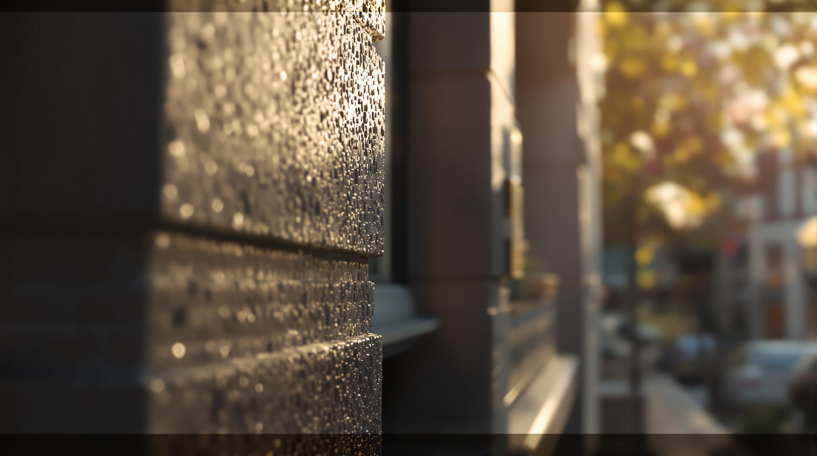
So f/1.8 gives you a dreamy, shallow focus where a single object pops against a soft blur, and f/11 or f/16 keeps an entire room sharp from the foreground table to the far window. The soft out-of-focus quality itself has a name - bokeh - and photographers prize its smoothness. In a renderer, depth of field is off by default (everything is perfectly sharp) and you enable it on the camera, then set both an aperture value and a focus distance telling the software what plane should be sharp.
Understanding the mechanism matters because it lets you reach for the effect deliberately rather than leaving it on by accident. Physically, the wider the aperture and the closer the subject, the shallower the sharp band; the narrower the aperture and the farther the subject, the deeper it goes. Longer focal lengths also render shallower depth of field than wide lenses at the same aperture, which is why detail shots taken with a longer lens blur their backgrounds so readily. Every physically-based renderer models this faithfully - Enscape, Twinmotion, D5 and V-Ray all expose aperture and focus as camera settings - so the same intuitions you would use with a real camera carry straight across. Know which way the f-stop runs and you control exactly how much of your architecture stays crisp.
Small f-number = wide opening = shallow blur. Big f-number = tiny opening = everything sharp.
Focus: putting the sharp plane where it counts
Once depth of field is on, you must tell the camera where to focus - the focus distance or focal plane. Everything at that distance is razor sharp; things fall progressively out of focus as they sit nearer to or farther from it. Get this wrong and the effect backfires: a shallow shot focused on empty floor while the subject blurs is worse than no depth of field at all.
The rule is simple - focus on the subject, the thing the composition is about. In a detail shot of a beautiful tap or a chair, focus precisely on it and let the room dissolve behind. In a portrait-style shot of a single feature, focus there. Most renderers let you click directly on the object in the viewport to set focus, or type an exact distance; use the click-to-focus and then verify by zooming in that the intended element is genuinely sharp, because a focus that is off by even a little reads as a mistake rather than a style.
There is a subtlety worth internalising: sharpness is where the eye assumes importance. Viewers read the sharp part of an image as the point, and the blurred parts as context. So focus is not merely technical - it is a compositional statement about what matters. If you blur the very thing the client came to see, you have told them, wordlessly, that it is not the point. This is also why, for most architectural work, you want the freedom of deep focus: a building is usually 'about' the whole space, not one object, and you do not want to force the viewer's attention onto a single plane. Reserve selective focus for when there genuinely is a single hero object, and the rest of the frame is supporting context you are happy to soften.
Exposure and white balance: brightness read from the histogram
Exposure is how bright or dark the overall image is - the render equivalent of how much light the camera lets in. Set it too low and shadows crush to featureless black; too high and highlights blow out to featureless white. Both extremes throw away detail you cannot recover, because clipped areas hold no information. The single most useful habit here is to stop judging exposure by how the picture looks on your screen - which varies with monitor and ambient light - and start reading the histogram, the graph of how many pixels fall at each brightness from black on the left to white on the right.
A well-exposed architectural image usually has its tones spread across the middle of the histogram without a tall spike jammed against either edge. A spike hard against the left means clipped, detail-less shadows; a spike against the right means clipped highlights, most often blown-out windows. You will not always avoid both - a bright window against a dim interior exceeds what one exposure can hold - but the histogram tells you honestly what you are sacrificing, so you can decide on purpose rather than by accident. In renderers this connects to tone mapping, which maps the scene's huge real range of light down to a displayable image; adjusting exposure and tone mapping together is how you place the tones where you want them.
White balance governs the image's colour temperature - whether the light reads warm (orange), neutral or cool (blue), measured in Kelvin. Set it so whites look neutral unless you deliberately want warmth (a cosy evening interior) or coolness (a crisp morning). A render with a colour cast - everything faintly orange or blue by mistake - looks amateur, while correct white balance with an intentional slight warmth is one of the quiet markers of a professional image. Judge exposure by the histogram, set white balance with intent, and your render gains the tonal credibility of a real photograph.
When depth of field helps a shot - and when it hurts
Here is the judgement that separates people who have a depth-of-field slider from people who know how to use it: for most architectural images, you should keep the depth of field deep and the whole space sharp. Architecture is usually about the space and its relationships, and a client or juror wants to see it all clearly. A blurry background in a room shot hides the very thing they are trying to evaluate, and worse, heavy depth of field is a classic beginner tell - it is often reached for to disguise a weak or unfinished background, and experienced eyes read it exactly that way.
Depth of field helps in a narrow set of cases: genuine detail shots where there is a single hero object - a designer tap, a joinery detail, a chair, a material sample - and the rest of the frame is context you are content to soften. It also helps a little for realism in atmospheric, cinematic shots, where a subtle blur on the extreme foreground or far background mimics how a real camera behaves and nudges the image toward 'photographed'. The key word is subtle: a light touch that a viewer barely notices, not a smeared background that screams for attention.
Depth of field hurts whenever it blurs information the image exists to convey - the layout of a room, the far end of a corridor, the relationship between spaces - and whenever it is strong enough to look like an effect rather than a photograph. The failure modes are a wide-open aperture on an interior that softens half the room, or a mis-set focus that sharpens nothing important. So the working rule: default to deep focus for spaces, reach for shallow focus only for true detail shots or a whisper of cinematic realism, and always ask whether the blur is hiding something the viewer needs. Sharpness is a choice about meaning - spend it where the meaning is.
Spaces: keep it all sharp. Detail shots: blur the background. Never use blur to hide a weak scene.
Aperture (f-stop)
The opening that sets depth of field
Small f-number (f/1.8) = wide opening = shallow, blurred focus; large f-number (f/11-f/16) = deep, all-sharp. Exposed on the physical camera in Enscape, Twinmotion, D5 and V-Ray.
Depth of field & focus distance
Which plane is sharp and how thin the sharp band is
Off by default; enable and set focus on the subject. Deep for spaces, shallow only for true detail shots - blur is a statement about what matters.
Exposure / EV & histogram
Overall brightness, judged by the tone graph not the screen
Keep tones off both clipped edges. Works with tone mapping to place the scene's range into a displayable image.
White balance (Kelvin)
Colour temperature - warm, neutral or cool
Set whites neutral unless you want intentional warmth or coolness. An accidental colour cast is a classic amateur giveaway.
Workshop - expose by the histogram, focus with intent
You will practise reading exposure objectively and using depth of field as a deliberate choice, not a default. Any renderer with a physical camera and depth of field works (Enscape, Twinmotion, D5, V-Ray).
Any renderer with a physical camera and depth of field - Enscape, Twinmotion, D5 or V-Ray. Optionally Photoshop or Lightroom to inspect the histogram of the exported image.
Goal: control brightness and sharpness on purpose
Inputs: any interior with a window and at least one clear foreground object
Time: ~35 minutes
- 1Open the histogram (in the renderer or by checking the exported image in Photoshop/Lightroom). Adjust exposure until tones spread across the middle with no tall spike jammed against the black or white edge; note what the window does.
- 2Set white balance so a neutral surface looks neutral, then deliberately nudge it warmer and cooler and observe how the mood shifts. Return to a neutral-with-slight-warmth setting.
- 3Turn depth of field ON, open the aperture wide (small f-number), and focus on a single foreground object - a detail shot. Verify the object is genuinely sharp and the background softly blurs.
- 4Now render the WHOLE room: close the aperture (large f-number) or turn depth of field off so the entire space is sharp. Compare the two - which serves a room, which serves a detail.
- 5Write two lines: what exposure the histogram told you was right, and which shot (deep vs shallow) belonged to the space versus the detail.
You’ll walk away with
A correctly-exposed room render judged by histogram, a warm/cool white-balance comparison, and a matched pair of shallow (detail) and deep (whole-room) focus shots with a short note on when each is right.
Three altitudes on the same idea
Read the band that fits you — or all three.
For you, exposure and focus are honesty controls. A clipped, blown-out window or a crushed shadow hides part of the building; a mis-placed shallow focus tells the viewer the wrong thing is important. Keep spaces in deep focus so the whole design reads, judge brightness by the histogram, and reserve selective focus for the rare shot that genuinely has one hero object.
White balance is your mood dial and your credibility check at once. A faint accidental colour cast reads as amateur; a deliberate, gentle warmth reads as a cosy, considered room. Use shallow depth of field for the hero material or fixture detail your client is buying, but keep the whole-room shots sharp - clients want to see the space they are paying for, not an artful blur.
Two quick wins for your portfolio: learn the histogram, and resist the blur. Reading exposure from the histogram instead of your possibly-miscalibrated screen instantly fixes the too-dark and blown-out images that plague student work. And the urge to add heavy depth of field to look 'cinematic' usually just signals inexperience - keep spaces sharp, and your renders read as confident and professional.
“Adding lots of depth of field (blurry background) makes a render look more professional and cinematic.”
Do it yourself
No render needed - reason it through.
- 1Which gives a shallower depth of field: f/1.8 or f/11? Explain in one line.
- 2What is the safest way to judge whether a render is correctly exposed?
- 3What does a tall spike jammed against the right edge of the histogram tell you?
- 4For a whole-room architectural shot, should you generally use deep or shallow focus, and why?
- 5Name one situation where shallow depth of field genuinely helps an architectural image.
The one line to carry out
Peer-reviewed journals & authoritative standards
- 01Depth of field - overview — Wikipedia, 2026.
- 02Exposure (photography) - overview — Wikipedia, 2026.
- 03Adobe Lightroom - colour & tone user guide — Adobe, 2026.
- 04Tone mapping - overview — Wikipedia, 2026.
You now command every technical camera control - lens, frame, focus and exposure. The final step is to point all of it at a purpose: choosing the one view that tells the design's story. Next: the storytelling shot.
The author
Amogh N P
Architect, interior designer, and creative polymath. Studio Matrx began in his notebooks — his vision of design made honest, useful, and open to everyone. Its Academy is written and taught in his memory, and free, forever.
More about Amogh →