
 Lesson 3.1
Lesson 3.1 · The Camera & Composition
Camera Fundamentals & Focal Length
The lens is a design decision - focal length reframes a space before you move an inch
Before you move the camera or touch a light, the focal length has already decided how the space feels.
Two renders of the same room can feel like two different buildings - one generous and calm, one cramped and warped - and the only thing that changed was a number in millimetres. Focal length is the most under-used design control in visualization.
Most beginners leave the lens on whatever the software opened with, usually a wide angle, and then wonder why their spaces look distorted and untrustworthy. This lesson hands you the lens back as a deliberate tool: what it does to perspective, why wide angles both flatter and lie, and how to keep a building looking like a building.
Lens, verticals, height. Set those three first, every single shot - then worry about light.
Focal length is a design decision, not a default
Focal length - measured in millimetres - describes how much of a scene the lens takes in and how strongly it renders perspective. A short focal length (a wide angle, roughly 16-28mm on a full-frame reference) gathers a very wide field of view and pushes near objects apart from far ones; a long focal length (a telephoto, 85mm and up) sees a narrow slice and compresses distances so front and back feel stacked together. In between, around 35-50mm, sits the normal range that reads closest to unaided human vision - which is why images shot there feel natural and honest.
The crucial point is that changing focal length from a fixed camera position does not just zoom in; it changes the geometry of the picture. A wide lens makes a small room look palatial and a corridor look endless. A normal lens shows the room roughly as a visitor's eye would register it. A long lens flattens a facade into an almost elevation-like, graphic read and lets you isolate one bay or one detail from across a courtyard.
So the first habit to build is to choose the focal length for the story, not accept the software default. Ask: do I want this space to feel intimate and truthful (normal), expansive and immersive (moderately wide), or graphic and compressed (long)? In every real renderer - Enscape, Twinmotion, D5, V-Ray - the camera exposes this as a focal length or field-of-view control, and it is the first slider you should reach for, well before you start placing lights or tuning materials. Treat the number in millimetres as a sentence about how you want the viewer to feel in the space, and half the composition battle is already won.
Wide = 'this space is huge'. Normal = 'this is what it feels like'. Long = 'look at this one thing'.
Perspective distortion and the wide-angle trap
Wide-angle lenses are seductive because they solve an immediate problem: in a real room you often cannot step back far enough to fit everything in, and a wide lens fits it in anyway. That is exactly why estate agents and quick-turnaround renders lean on them - and exactly why they lie. A wide angle exaggerates perspective: whatever is near the camera balloons in size, whatever is far shrinks away, and the space reads far larger and more dramatic than it is.
The cost is distortion. Near a wide frame's edges, straight objects stretch and smear - a sofa in the corner looks unnaturally long, a round table turns oval, a person at the edge looks bent. Lines that should be calm start to bow. The viewer may not name the problem, but they feel that something is off, and in a professional context that quietly erodes trust: a client senses the image is selling rather than showing.
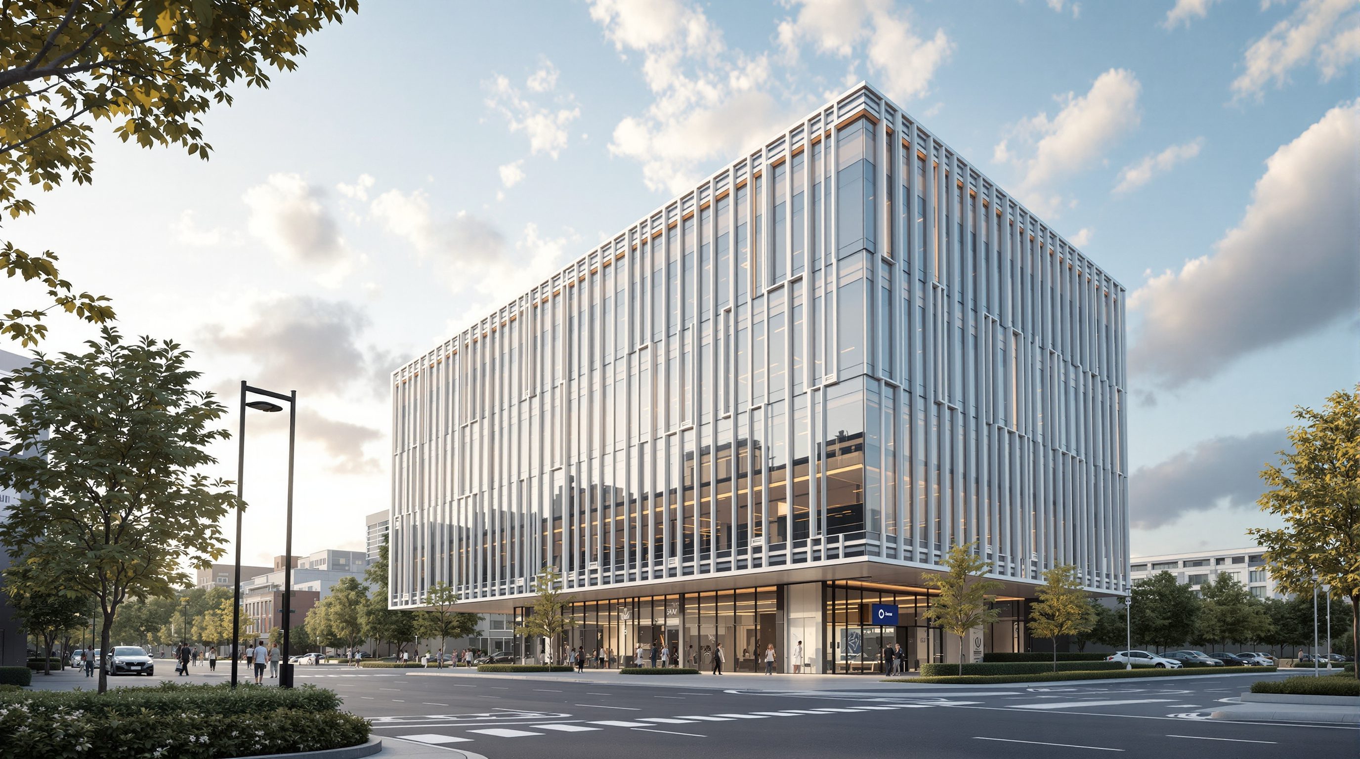
The wide-angle trap is reaching for an ever-wider lens to cram more in, until the space is technically all visible but no longer believable. The professional move is the opposite: use the narrowest lens that still tells the story, and if you cannot fit the shot, move the camera back (even through a wall, which you can do in a 3D model but never in a real room) rather than widening further. As a working rule, keep interiors in the 24-35mm range and only go wider for a deliberate, dramatic hero shot where you accept the exaggeration as a stylistic choice. Reserve the very wide lenses for exteriors with space around them, where there is no near corner to warp. Restraint here is what separates a render that documents a design from one that merely flatters it.
Keeping verticals vertical: two-point perspective
Point a camera straight ahead and vertical edges - door jambs, columns, the corners of a building - stay vertical and parallel in the image. Tilt that same camera up to catch the top of a tall space or a facade, and those verticals start to lean inward toward a point in the sky. This convergence is called keystoning, and while the eye tolerates it a little in casual snapshots, in architecture it looks amateur and unstable: the building seems to topple backward.
The fix is a long-standing architectural-photography convention: keep verticals parallel. Traditionally a tilt-shift lens shifts the lens up relative to the sensor so you can include the top of a building without tilting the camera; in 3D, every serious renderer offers the equivalent as a two-point perspective or vertical lock toggle. Switch it on and the software forces all vertical lines to stay strictly vertical, no matter where you aim - the result reads as calm, upright and professional, the way we expect buildings to stand.
This is the single most recognisable marker of a considered architectural image. Enscape, Twinmotion and D5 all expose a two-point / vertical-correction switch, and V-Ray offers it through the physical camera. Turn it on for almost every exterior and for any interior where you are looking noticeably up or down. The one caveat: forcing verticals parallel while aiming far off-axis can stretch the frame's corners, so combine it with a not-too-wide lens and a camera height that does not demand a huge tilt in the first place.
It helps to understand why the convention exists at all. Our brains know that buildings stand vertically, so when an image shows their edges leaning, we read instability and unease even without naming it - the same discomfort a spirit-level-off shelf gives you. Straight verticals, by contrast, feel settled and authoritative, which is precisely the impression a design presentation should make. That is why architectural photographers went to the expense of tilt-shift lenses for decades, and why every viz engine now bakes the equivalent in for free. Get vertical lock into your default setup and your renders immediately stop looking like phone snaps and start looking like architecture.
Buildings stand up straight. If your verticals lean, flip on two-point / vertical lock.
Camera height: stand where a person would
The last fundamental is the simplest and the most ignored: how high off the floor is the camera? Software often drops the default camera at an arbitrary height - sometimes floating near the ceiling, sometimes down at knee level - and beginners render from wherever it lands. But camera height silently sets the viewer's relationship to the space. Placed at roughly eye level - about 1.5 to 1.6 metres - the image reads as a real person standing in the room, and the scale feels immediately trustworthy.
Raise the camera and you get a slightly detached, overview quality; drop it low and ordinary furniture looms heroically, which can be a deliberate, monumental choice for a grand lobby but looks strange for a domestic kitchen. A camera up near the ceiling makes rooms feel like dollhouses and quietly signals 'this is a computer model'. So the default professional stance is human eye level, adjusted with intent: a touch lower to make a ceiling feel grand, a touch higher to explain a plan or show a countertop's surface.
Height also interacts with everything above. Standing at eye level means you rarely need to tilt far up or down, which keeps verticals honest and reduces the keystoning you would otherwise have to correct away. It naturally invites a normal-ish focal length rather than an extreme wide one. And it puts the horizon where a visitor's horizon really sits, so leading lines and thirds (the next lesson) behave predictably. The discipline is small but the payoff is large: before you judge a render's light or materials, plant the camera where a human would actually stand and look. Do that, keep the lens sane and the verticals locked, and the image is already speaking the truth about the space.
Focal length (mm) / Field of view
How wide the lens sees and how strongly it renders perspective
The first control to set. Roughly 24-35mm for interiors, 35-50mm for a natural read, 85mm+ to isolate a detail. Every renderer exposes it as focal length or FOV.
Two-point perspective / vertical lock
Forcing vertical lines to stay parallel
The architectural-photography convention that keeps buildings from looking like they topple. On by default in Enscape, Twinmotion and D5; the physical-camera equivalent in V-Ray.
Camera height (~1.5-1.6m)
The viewer's eye level in the scene
Sets the sense of scale and trust. Human eye level is the default; move it with intent, not by accident.
Workshop - one room, three lenses
You will feel focal length in your hands by rendering the same space three ways from one spot, then fixing the verticals. Any real-time renderer with a camera (Enscape, Twinmotion, D5, or the free tier of any of them) works.
Any renderer with a camera - Enscape, Twinmotion or D5 (free tiers are enough). No lights or materials work needed; this is purely about the lens.
Goal: internalise how focal length and vertical lock change a space
Inputs: any interior model (a single room is plenty) in a renderer with a camera
Time: ~30 minutes
- 1Place the camera at eye level (about 1.6m) in a corner of the room and do not move it for the next three shots. Note the focal length / FOV control.
- 2Render or screenshot the view at three focal lengths from the SAME position: a wide (about 18-20mm), a normal (about 45mm), and a longer one (about 70mm). Save all three.
- 3Compare them side by side. Notice how the wide one balloons the space and warps the near corner, while the normal one reads like standing there and the long one flattens and isolates.
- 4Now tilt the camera up to include the ceiling with vertical lock OFF, then toggle two-point perspective / vertical lock ON. Save both and see the leaning verticals snap upright.
- 5Write one line naming which focal length best told the truth about this room, and why - that judgement is the lesson.
You’ll walk away with
Three side-by-side renders from one camera position at three focal lengths, plus a before/after pair showing vertical correction, and a one-line verdict on the honest lens for that space.
Three altitudes on the same idea
Read the band that fits you — or all three.
For you, the lens is where design intent survives or dies in the image. A space you proportioned carefully can be misrepresented by a careless wide angle - or communicated faithfully by a normal lens at eye level with verticals locked. Treat focal length and camera height as extensions of the design decisions you already made, not as afterthoughts handed to whoever operates the software.
Interiors are where the wide-angle trap does the most damage. A too-wide lens stretches your carefully chosen sofa, warps the rug and oversells the room's size - and clients feel the dishonesty even if they cannot name it. Stay around 24-35mm, keep the camera at seated or standing eye level, and let the materials and light you laboured over read at their true proportion.
This is the fastest upgrade your portfolio can get. Most student renders look 'off' for one reason: a default wide lens tilted upward with the camera floating near the ceiling. Fix those three things - sane focal length, vertical lock on, eye-level height - and your images jump from student to professional overnight, before you have learned a single lighting trick.
“A wider lens is better because it fits more of the room into the shot.”
Do it yourself
No render needed - reason it through.
- 1In one sentence, what does focal length change beyond how much of the scene fits in frame?
- 2Why does a very wide lens make a small room look larger than it is?
- 3What is keystoning, and which camera setting corrects it?
- 4Roughly what camera height reads as a real person standing in the space?
- 5Give the working focal-length range you would keep most interior renders within.
The one line to carry out
Peer-reviewed journals & authoritative standards
- 01Focal length - overview — Wikipedia, 2026.
- 02Architectural photography - overview — Wikipedia, 2026.
- 03Enscape - Documentation & Knowledge Base — Enscape (Chaos), 2026.
- 04Twinmotion - Official Documentation — Epic Games, 2026.
With the lens set honestly and the camera standing where a person would, you have a frame you can trust. Now we decide what goes _inside_ that frame - how to arrange the space with thirds, leading lines and depth. Next: composition for architecture.
The author
Amogh N P
Architect, interior designer, and creative polymath. Studio Matrx began in his notebooks — his vision of design made honest, useful, and open to everyone. Its Academy is written and taught in his memory, and free, forever.
More about Amogh →