
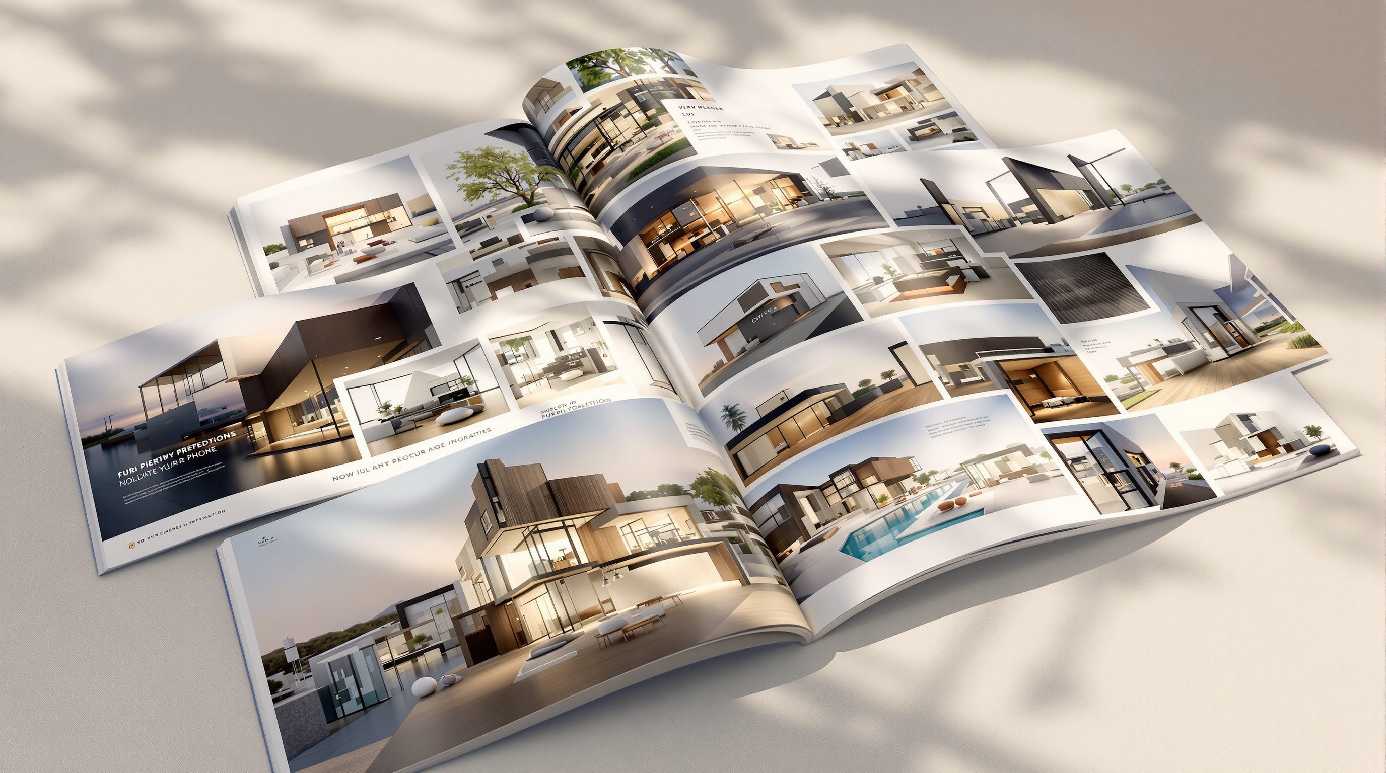
 Lesson 10.3
Lesson 10.3 · Practice & Portfolio
Building an Archviz Portfolio
What studios want to see - quality over quantity, presentation, breakdowns, and the common mistakes that sink a portfolio
Your portfolio is judged by its weakest image, not its best. Cut anything you would apologise for.
You have the skills and you are building a signature. The thing that actually gets you hired or commissioned is how you present that work - the portfolio. It is the single most important artefact in an archviz career, and most people build it backwards.
The fatal instinct is to show everything: every render you have ever made, proof of how much you have done. But a portfolio is not an archive - it is a curated argument for your level. Studios decide in seconds, they judge you by your floor not your ceiling, and quality beats quantity every single time. This lesson is how to build one that works.
Six to ten, all finished, best one first, one breakdown, honest captions. If you would apologise for it, cut it.
What studios actually look for
Before you arrange a single image, understand what the person on the other side is looking for, because it is narrower and more specific than beginners assume. A studio reviewing portfolios is not counting images or admiring effort - they are answering one question in a few seconds: can this person produce work at our level, reliably? Everything in your portfolio either supports that answer or dilutes it.
Concretely, they are reading three things. First, can you make a believable image - the fundamentals this whole course teaches: is the light right, do the materials read, is the composition considered, is it finished? A reviewer clocks a wrong exposure or a plastic material instantly, because that is their job. Second, do you have a point of view - is there a consistent voice across the work, the signature from the last lesson, or is it a random assortment that could be anyone's? A body of work with a through-line signals maturity; a grab-bag signals a beginner still finding their feet. Third, can you be trusted on a real project - which is why context matters: a line saying what the brief was, what you were responsible for, and what tools you used tells a studio you understand production, not just render buttons.
What they are not impressed by is volume, tutorial reproductions, or technical showing-off that serves no image. A portfolio of forty competent-but-unfinished renders reads as weaker than eight finished, considered ones, because the forty tell the reviewer your standard is inconsistent. The mental model to adopt is that you are not showing what you can do - you are showing what you reliably will do. Every image you include is a promise about your floor. That reframing decides everything about what goes in and, more importantly, what stays out.
They are not asking 'how much have you made?' They are asking 'can I trust this person on a real job?' Answer that.
Quality over quantity: the ruthless cut
If there is one rule that governs portfolios above all others, it is this: quality over quantity, without exception. Six to ten genuinely strong images beat thirty mixed ones every time, and the reason is mathematical as much as aesthetic. A viewer's impression of your level is anchored by your weakest visible image, not your best - so every mediocre piece you include actively drags down the average impression your strongest work created. Adding a weak image does not add to your portfolio; it subtracts from it.
This makes curation the real skill, and it is a harder, more emotional discipline than rendering. You have to look at an image you spent days on and ask honestly: is this at the level of my best work, or am I keeping it because it cost me effort? Effort is not a reason to include something - the viewer cannot see your hours, only the result. The professional test is brutal and simple: would you apologise for this image, or explain it away, if a reviewer landed on it? If yes, it is out. If you find yourself mentally adding 'this one was just a study' or 'the client rushed me', cut it. A portfolio should contain zero images that need an excuse.
Curating down also forces the quality up in a second way: with only eight slots, each one has to earn its place, which pushes you to finish images to a higher standard rather than settling. The discipline compounds. And a tight, strong set respects the reviewer's time - they can absorb your level in a minute and come away with a clear, high impression, rather than wading through volume and leaving with a muddy one. If you are unsure whether an image makes the cut, it does not. The strongest portfolios are almost always shorter than their owners first wanted them to be, and cutting is what made them strong.
Presentation and the breakdown that proves it is yours
A strong set of images still needs to be presented well, because presentation is itself evidence of judgement. Lead with your single best image first - the hero - because reviewers decide fast and you want your peak setting the anchor before anything else. Then sequence the rest so the quality never dips: no weak image between two strong ones, a rhythm that holds attention, and enough variety to show range without breaking your signature - a day exterior, a dusk shot, an interior, so a studio can see you handle different light and briefs. Present the images large and clean, on a simple background that does not fight them, with readable crops rather than tiny dark thumbnails that hide your work.
Context turns images into evidence. A short line under each - the project or brief, your role, the tools - tells a studio you operated in a real production context, not just a bedroom experiment. This is especially important when work was collaborative: being honest about what you did on a team project is far stronger than implying you did all of it, because studios can tell and dishonesty is disqualifying.
The single most persuasive element you can add is a breakdown. Pick one image and show how it was made: the raw clay-render or grey model, then the lit and textured version, then the render passes, then the final graded result - or simply a clean before-and-after of the render versus the post. A breakdown does something no finished image alone can: it proves the work is really yours and demonstrates that you understand the pipeline, not just how to press render. It answers the reviewer's quiet suspicion - could they actually do this, or did they get lucky with an asset pack - with unarguable evidence. One good breakdown in a portfolio is worth more than three extra finished images, because it converts admiration into trust, and trust is what gets you hired.
Best image first. Every piece finished. One breakdown that proves you built it. Context under each. That is the whole formula.
The common mistakes that quietly sink good work
Most portfolios fail not from a lack of skill but from a handful of avoidable mistakes, and knowing them lets you audit your own before a studio does. The biggest is volume over curation - showing everything, diluting strong work with filler, and letting the weakest image set your level. The fix is the ruthless cut from earlier: if in doubt, leave it out. Close behind is including unfinished or tutorial work - renders that were exercises rather than finished pieces, or reproductions of a course scene that a reviewer will recognise. Tutorial reproductions prove you can follow instructions, not that you can make decisions; own scenes with your own choices are the only thing that counts.
A cluster of presentation mistakes quietly costs people interviews. Muddy, dark thumbnails that hide the work; inconsistent quality that reads as an unreliable floor; no context or role, so the reviewer cannot tell what you actually did; and no variety - ten versions of essentially the same shot, which shows one trick rather than range. Each is easily fixed once named: bright readable crops, a hard quality floor, a one-line caption per image, and a deliberate spread of light and brief across the set.
There are two deeper mistakes worth flagging. One is no point of view - a technically fine but characterless set that could belong to anyone, which is exactly why the signature from the last lesson matters here: a consistent voice is what makes a portfolio memorable rather than merely competent. The other is dishonesty - overstating your role, hiding heavy use of purchased assets, or passing off study pieces as commissioned work. Studios are unforgiving of this because it predicts how you will behave on a project, and the whole point of a portfolio is to build trust. Audit your portfolio against this list before you send it anywhere: cut the filler, finish or remove the unfinished, brighten the crops, add the context, ensure the variety, sharpen the voice, and be scrupulously honest. Do that and a competent body of work becomes a hireable one - the same images, presented like a professional.
Hero image
Your single strongest render, shown first
Reviewers decide in seconds; open on your peak so it anchors the whole impression.
Breakdown / process shot
Clay -> lit -> passes -> final, or before/after post
Proves the work is genuinely yours and that you understand the pipeline - often worth more than an extra finished image.
The ruthless cut
Curating to only your strongest 6-10 images
Quality over quantity; the weakest image sets your level, so if in doubt, leave it out.
Context caption
One line: brief, your role, tools used
Turns an image into evidence of real production work and honest collaboration.
Workshop - cut your work to a portfolio and build one breakdown
You will practise the hardest and most valuable portfolio skill - ruthless curation - then create the single most persuasive element a portfolio can carry: a breakdown that proves the work is yours.
Your existing renders, an image editor to build the breakdown strip and adjust crops, and a simple layout (a folder, a PDF, a Design Ideas board or a portfolio site).
Goal: a curated 6-10 image set with one breakdown and context
Inputs: every render you have made + one image you can reconstruct in stages
Time: ~75 minutes
- 1Lay out every image you have made. For each, ask the brutal question: would I apologise for or explain this if a reviewer landed on it? If yes, it is out. Cut down to your strongest 6-10 only.
- 2Order the survivors: your single best image FIRST, then sequence so quality never dips and there is variety of light and brief (a day exterior, a dusk shot, an interior). Remove anything that breaks your consistent voice.
- 3Write a one-line context caption for each surviving image: the brief, your role (be honest on team work), and the tools used.
- 4Pick ONE image and build a breakdown: export the clay/grey model, the lit-and-textured version, and the final graded result - or at minimum a clean before/after of render versus post. Lay them out as a strip.
- 5Audit the whole set against the common mistakes: any filler, unfinished or tutorial work, muddy thumbnails, missing context, or lack of variety? Fix each. Write one sentence on what your portfolio now argues about your level.
You’ll walk away with
A curated 6-10 image portfolio led by your hero, each image captioned with context, plus one process breakdown - and a one-sentence statement of the level your portfolio now argues for.
Three altitudes on the same idea
Read the band that fits you — or all three.
For a practice, the portfolio is business development - it wins the next commission. The same rules apply: lead with your best project, show finished work with a consistent voice, and include a breakdown or process board that demonstrates rigour. Curate hard; a practice page cluttered with weak visuals undersells the strong ones and the work itself.
Your portfolio is where mood and material do the selling. Present interiors that convey warmth and finish, keep a consistent palette and grade across the set so it reads as one taste, and cut anything muddy or unresolved. A tight, richly-lit selection with one before-and-after breakdown will win more clients than a large mixed gallery.
This is the artefact that gets you your first job, so build it with more care than any single render. Studios judge students on their floor: six to ten finished, consistent images beat a folder of coursework. Include one breakdown to prove the work is yours, add a line of context to each, and never show a tutorial reproduction as if it were your own.
“The more work I show, the stronger my portfolio looks - it proves how much I can do.”
Do it yourself
Reason it through before you build.
- 1What is the single question a studio is trying to answer as it reviews your portfolio?
- 2Why is a portfolio judged by its weakest image rather than its best?
- 3How many strong images is a typical portfolio better built around, and why not more?
- 4What does a breakdown prove that a finished image alone cannot?
- 5Name three of the common mistakes that quietly sink an otherwise good portfolio.
The one line to carry out
Peer-reviewed journals & authoritative standards
- 01Architectural Photography - overview of presentation and framing — Wikipedia, 2026.
- 02Akenine-Moller, T., et al. - Real-Time Rendering (production context and pipeline) — realtimerendering.com, 2026.
- 03Adobe Photoshop - User Guide (building breakdowns and clean crops) — Adobe, 2026.
- 04Poly Haven - free HDRIs, textures and models (assets, and disclosing their use honestly) — Poly Haven, 2026.
A portfolio that argues for your level opens doors - and the last lesson is where those doors lead: the archviz career itself, in-house, studio or freelance, its rates, its global market, and how to keep the whole skill current.
The author
Amogh N P
Architect, interior designer, and creative polymath. Studio Matrx began in his notebooks — his vision of design made honest, useful, and open to everyone. Its Academy is written and taught in his memory, and free, forever.
More about Amogh →