
 Lesson 5.2
Lesson 5.2 · Materials, Light & Atmosphere
Lighting & Mood in AI Renders
Directing time of day, direction and quality of light to author feeling on purpose
Change nothing but the light, and you change everything the image says.
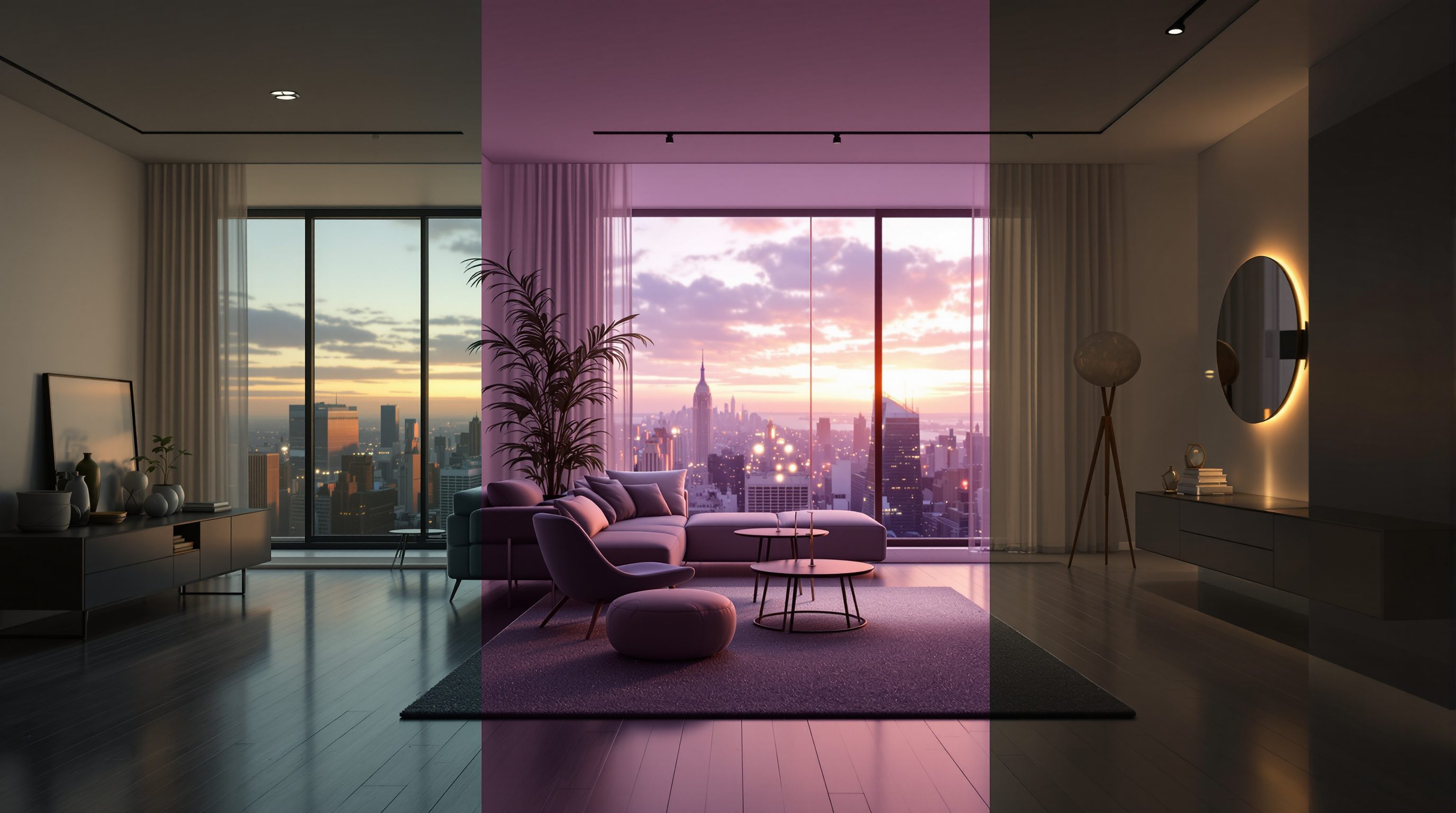
The same courtyard at cold noon reads as institutional; at golden hour it reads as home; at blue-hour dusk with warm lamps inside, it reads as sanctuary. Not one wall moved. Light is the single most powerful mood lever in a render, and it is entirely yours to set - but only if you stop letting the model default to flat midday and start naming direction, quality and colour on purpose. This lesson gives you a photographer's vocabulary so you author feeling instead of accepting it.
Cold noon = institution. Golden hour = home. Blue-hour lamps = sanctuary. Same walls, different sentence.
Time of day is a mood switch, not a clock
When you write golden hour you are not really setting a time - you are setting a whole package the model has learned from millions of photographs: a low warm sun, long soft shadows, amber highlights, a hazy glow. Midday brings the opposite package - a high white sun, short hard shadows, flat even light, honest but cold. Blue hour and dusk bring cool ambient skies against warm interior lamps, the classic real-estate glow that makes a building look inhabited.
So choose the time of day for the feeling you want, not the hour on a clock. Selling warmth and welcome? Golden hour or a lamplit dusk. Showing a material honestly for a client to judge? Overcast midday, which flatters nothing and hides nothing. Drama and silhouette? Backlit sunrise. The strip of times is really a strip of moods, and naming one is the fastest atmosphere decision you can make.
Be aware of the trap: golden hour is so flattering that it can sell an unresolved design on charm alone. Use it when you mean to persuade, and switch to neutral light when you or your client need to actually judge the architecture.
There is also a regional dimension worth naming. The 'golden hour' the model learned is largely a temperate, Western one - long, low, honeyed. A high tropical sun at noon in Chennai, the flat white glare of a Delhi summer, the soft grey of a Bengaluru monsoon sky are all different lighting realities, and if the mood you want is true to place you may need to say so: harsh tropical midday sun, hard short shadows or overcast monsoon light, soft and grey. Choosing the time of day is therefore two decisions at once - the feeling you want, and the honesty of the climate you are depicting. A render lit in a light the site never sees is a small lie the eye eventually catches.
You are not setting a clock. You are choosing which feeling the sun is allowed to have.
Direction: where the light comes from
Direction is the dial most beginners never touch, and it changes an image more than colour does. There are four you should be able to call on purpose:
Front light - source behind the camera. Flat, few shadows, everything legible but a little lifeless. Good for a clear catalogue read, weak for drama.
Side light (raking) - source low and to one side, skimming across surfaces. This is the texture-maker: it throws long shadows, and every brick joint, board mark and stone rib pops. When you want a material's texture to read, rake it.
Back light - source behind the subject. Silhouettes, rim glow, halos of haze - the most dramatic and the most dangerous, because it hides detail. Reach for it to make a mood, not to show a finish.
Top light - source overhead. Even, calm, museum-like; a skylight or an overcast sky. Serene interiors and galleries live here.
Name the direction explicitly - raking side light from the left, backlit against the sky - and you take control of where shadows fall. Leave it blank and the model usually defaults to bland front-ish light. Direction and the material lesson meet here: a raking light is what makes a wire-brushed or board-formed surface earn its texture words.
Direction is also how you model form itself, not just texture. A cube lit flat from the front looks like a flat square; the same cube lit from one side reveals its three faces in three different values and instantly reads as solid. This is why massing studies and facades come alive under side light and go dead under front light - the shadows are what tell the eye about depth, recess and projection. When a render of a nicely-articulated facade looks strangely flat, the fault is almost always the light direction flattening the very modelling you designed in. Move the sun to one side and the reveals, the deep window heads, the projecting fins all return.
Quality and colour temperature: the other two dials
Quality is the softness of the light and therefore of its shadows. Hard light - direct sun, a bare bulb - gives crisp, sharp-edged shadows and high contrast: energetic, harsh, dramatic. Soft light - an overcast sky, a large diffuser, north light - gives gentle, feathered shadows and low contrast: calm, flattering, gentle. Say soft diffused light, overcast for serenity; say hard direct sunlight, strong shadows for punch. Quality is how you set the emotional volume of the scene.
Colour temperature is the warmth or coolness of the light, borrowed from photography's Kelvin scale. Warm (around 2700K - candlelight, tungsten, sunset) feels cosy, intimate, human. Cool (around 5500 to 6500K - noon daylight, overcast, shade) feels clean, clinical, calm or cold. You rarely need the numbers; the words carry it - warm tungsten glow, cool north light, neutral daylight. Mixing temperatures is where richness lives: the estate-agent classic is a cool blue dusk sky against warm interior lamplight, a contrast the eye reads as 'lived-in'.
Run all three dials together and you have described a mood, not a lamp: raking golden-hour light, soft and warm, long shadows is a complete atmosphere. The model has seen these exact phrases attached to exactly these looks, so the words behave like faders on a lighting desk.
The three dials also explain most 'my lighting looks off' problems, because a wrong render is usually one dial mis-set. An image that feels harsh and unwelcoming? The quality is too hard - soften it. One that feels flat and clinical when you wanted cosy? The temperature is too cool - warm it. One that feels dull and shapeless? The direction is too frontal - rake it. Rather than rewriting the whole prompt in frustration, isolate which of the three dials is carrying the wrong value and move only that one. This is the same single-variable discipline from Module 1, applied to atmosphere: change one dial, see what it does, and build a reliable feel for how each contributes to the whole.
Direction + quality + temperature. Three faders. Push them on purpose and mood stops being an accident.
Borrowing the vocabulary of cinema and photography
Because the models learned from captioned photographs and film stills, the richest lighting control comes from photographic and cinematic terms. These are not vague adjectives - they are learned packages that pull the image toward a whole lighting setup at once.
Chiaroscuro and dramatic low-key lighting bring deep shadow and a single carved light, the mood of a Tadao Ando interior. High-key, bright and airy brings the opposite - flooded, shadowless, optimistic, the mood of a Scandinavian showroom. Volumetric light, god rays, hazy atmosphere brings shafts of visible light through dust or mist. Rim lighting traces a glowing edge around a form. Practical lights (lamps and fixtures visible in shot) make an interior feel switched-on and real.
Name the atmosphere you want the way a cinematographer would brief it: moody, low-key, single warm source, deep shadows, volumetric haze. But keep one architect's caution: cinematic light is a persuader. It can make a mediocre space look transcendent, which is wonderful for a competition board and misleading for a design review. Match the drama to the honesty the moment requires - and remember the next lesson, on context and entourage, is what makes that beautifully-lit scene believable rather than staged.
A useful way to hold all of this is to think in sources. Real scenes almost always have more than one light doing different jobs: a key light that models the main form, a fill that softens the shadows so they do not go black, and often a rim or a practical that separates the subject from its background or adds sparkle. You will rarely prompt each explicitly, but naming even two - warm key light from the window, cool ambient fill from the sky - gives the model a far richer, more photographic setup than a single undifferentiated 'nice lighting'. Thinking in layered sources is the habit that lifts a render from lit to photographed.
The three dials: direction / quality / temperature
A tool-agnostic checklist for lighting any render
Direction (front/side/back/top), quality (hard/soft), temperature (warm/cool). Set all three and you have described a mood, not a lamp.
Time-of-day packages (golden hour, blue hour, overcast)
Learned phrases that set colour, shadow and feeling at once
Choose for feeling, not the clock. Golden hour persuades; overcast midday judges honestly.
Cinematic terms (chiaroscuro, high-key, volumetric, rim light)
Photographic vocabulary the model maps to whole lighting setups
The richest controls, because the models learned from captioned photos and film stills. Powerful persuaders - use with honesty.
Practical + ambient layering
Mixing a daylight base with visible warm lamps
The 'lived-in' look: a cool sky against warm interior lights. Especially vital for interiors.
Workshop - one room, four moods
You will take a single space and relight it four ways, changing nothing but the light, to feel how completely mood is yours to set. Use any text-to-image tool, and fix the seed if you can so only the light varies.
Any text-to-image tool (Midjourney, Stable Diffusion, Adobe Firefly, or Studio Matrx DesignAI). Seed-locking helps but is not required.
Base scene: `a small living room with a large window, sofa, timber floor`
Hold constant: subject, layout, camera, seed
Vary only: the lighting phrase
Time: ~30 minutes
- 1Generate the base scene with NO lighting words. Note what the model defaulted to - almost always flat, front-ish, neutral daylight. This is your control.
- 2Version A - warmth: add
golden hour, warm low sun, soft long shadows, raking from the window. Regenerate. - 3Version B - honesty: add
overcast midday, soft even north light, neutral white. This is the version to judge materials by. - 4Version C - drama: add
dramatic low-key lighting, single warm source, deep shadows, volumetric haze. Notice how much the same room now hides. - 5Version D - lived-in: add
blue hour dusk, cool sky, warm interior lamps switched on, practical lights. Then line up all four and write one line on what mood each light created and which you would use for a client review versus a competition board.
You’ll walk away with
A four-up board of the same room in four lights, captioned with the three-dial description used and the mood it produced - plus a note on which light you would trust for an honest design decision.
Three altitudes on the same idea
Read the band that fits you — or all three.
Lighting is where an AI render becomes persuasive - use that power with judgement. Golden hour and low-key drama will sell a scheme, but they also flatter unresolved decisions, so keep a neutral, overcast version of any key view for design reviews where you and the client need to judge form honestly. When you do reach for atmosphere, name direction, quality and temperature explicitly so the mood is authored, not lucky, and repeatable across a set of views.
For interiors, light IS the design half the time. The same room in warm 2700K lamplight versus cool 5000K daylight is two different products, and clients feel the difference before they can name it. Learn to prompt layered light - a cool daylit base plus warm practical lamps - because that mix is what makes a room feel lived-in. Use raking light to make your chosen materials read, and always show at least two times of day so the client understands the space across a real day.
Learning lighting vocabulary teaches you to see light in the real world. Once you can name raking, high-key, chiaroscuro and colour temperature, you start noticing them in buildings, films and photographs - and that eye is what separates an atmospheric render from a flat one. Build a swipe file: for each mood you admire, write the three-dial description that would reproduce it. That library transfers straight into practice and into every render tool you will ever use.
“Lighting is just a finishing touch - I will sort out the mood after the design is right.”
Do it yourself
Name the light before you name the mood.
- 1Give the three-dial description (direction, quality, temperature) for a calm, serene gallery.
- 2Which light direction makes a rough stone wall's texture read, and why?
- 3What is the 'estate-agent glow', and which two light sources create it?
- 4Name one honest-light and one persuasive-light choice, and when to use each.
- 5Rewrite
nice lightinginto a real cinematic brief for a dramatic entrance hall.
The one line to carry out
Peer-reviewed journals & authoritative standards
- 01Saharia, C., et al. - Photorealistic Text-to-Image Diffusion Models with Deep Language Understanding (Imagen) — Advances in Neural Information Processing Systems (NeurIPS), 2022.
- 02Rombach, R., Blattmann, A., Lorenz, D., Esser, P., & Ommer, B. - High-Resolution Image Synthesis with Latent Diffusion Models — IEEE/CVF Conference on Computer Vision and Pattern Recognition (CVPR), 2022.
- 03Midjourney - Official Documentation (parameters, stylize, image prompts) — Midjourney, Inc., 2024.
- 04Ramesh, A., Dhariwal, P., Nichol, A., Chu, C., & Chen, M. - Hierarchical Text-Conditional Image Generation with CLIP Latents (DALL-E 2) — arXiv preprint, 2022.
You can now make a space feel any way you choose. But a beautifully-lit building floating in a void still looks like a render, not a place. What sells belief is the world around it - sky, ground, planting, people at the right scale. Next: context and entourage, added with restraint.
The author
Amogh N P
Architect, interior designer, and creative polymath. Studio Matrx began in his notebooks — his vision of design made honest, useful, and open to everyone. Its Academy is written and taught in his memory, and free, forever.
More about Amogh →