
 Lesson 5.3
Lesson 5.3 · Materials, Light & Atmosphere
Context, Entourage & Environment
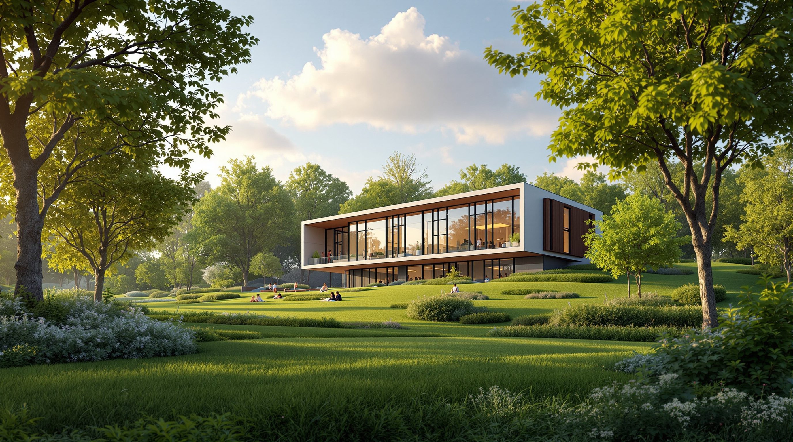
Grounding a building in a believable world - sky, landscape, people and scale - without clutter
The render looked fake for one reason: the building had no world to stand in.
A perfect facade, perfectly lit, floating on a grey gradient, always reads as an image - never as a place. What convinces the eye is the world around the building: a real sky, a grounded landscape, a person at the door for scale, a soft figure walking past. Context is what turns a render into a photograph of somewhere that exists. But the same tools that add belief add clutter just as fast, so this lesson is equally about restraint - naming the world in layers, then holding most of them quiet.
Fewer, quieter, softer. Three words that keep the crowd from stealing your building.
Why a building needs a world
Left to itself, a text-to-image model will often park your building on a bland gradient or an over-busy stock scene, because 'context' was the part of your prompt you left blank. Neither serves you. An empty background signals 'unfinished render' to any viewer; a random busy background distracts from the very thing you are presenting.
Context does three jobs. First, it establishes scale - a doorway means nothing until a person stands beside it, a plaza reads as huge or intimate only against something of known size. Second, it establishes place - native planting, a particular quality of sky, a recognisable ground plane tell the viewer where this is, which is half of what makes architecture specific rather than generic. Third, it establishes depth - foreground, middle-ground and background layers give the eye somewhere to travel, and depth is most of what separates a flat render from a convincing photograph.
So context is not decoration you add if there is time. It is structural to belief. The skill is to author it deliberately - and, crucially, sparingly - rather than accept whatever the model reaches for.
Context also does a quieter fourth job: it tells the viewer what kind of image they are looking at. A building set against a soft studio backdrop reads as an object, a product to be admired; the same building set in a lived street with weather and wear reads as a piece of a city, something used. Neither is wrong, but they make different arguments, and letting the model choose for you means letting it choose your argument. Decide whether you are presenting an object or a place, and let the context follow that decision - the amount of world you draw is itself a statement about how the building wants to be seen.
A building with no world is a model on a turntable. Give it ground, sky and one human, and it becomes a place.
The four layers of context
Think of a render as a stage set built in layers, and name each one:
1. Sky - never let it default. Clear pale sky with high thin cloud, dramatic overcast, soft dusk gradient - the sky sets the top third of most exterior images and interacts with your lighting choice from the last lesson. A named sky instantly lifts a render out of 'unfinished'.
2. Landscape / setting - the ground plane and its planting: native grasses and gravel court, mature trees, dappled shade, coastal rock and scrub, dense urban street. This is where you make the site specific - Indian projects read as Indian when the planting, paving and boundary walls belong to the place, not to a generic Western suburb.
3. Entourage - the moving life: people, cars, cycles, birds. This is the layer that adds believability and destroys it in equal measure, so it comes with the strictest rules (next section).
4. Foreground / scale figures - the nearest layer, which frames the shot and, critically, sets scale. A single figure at the entrance, a branch across a corner, a low wall in front - these give depth and a size reference.
Name the layers you want and the model composes a world; leave them blank and it improvises one, usually badly. You do not need all four in every image, but you should decide each one rather than inherit it.
Order matters as much as content. The layers read back-to-front - sky farthest, foreground nearest - and the eye trusts an image whose layers stack in a believable depth. When a render feels 'pasted together', it is usually because two layers are fighting for the same plane: a sharp foreground tree the same size and focus as a background building, so the depth cue collapses. Naming the layers by their distance - distant hills, middle-distance trees, a low wall in the near foreground - gives the model the depth ladder to hang the scene on, and the image gains the quiet coherence of a real photograph rather than a collage.
The discipline of entourage: fewer, quieter, softer
Entourage - the people and props that populate a scene - is where most AI renders go wrong, in two directions at once. Add too little and the building feels sterile and unvisited. Add too much and a crowd of sharply-rendered figures, all staring at camera, steals every scrap of attention from the architecture you are trying to show. And AI people bring their own failure modes: extra fingers, melted faces, impossible poses, and the well-documented problem that models often default to non-diverse, non-local figures unless you specify otherwise.
Three rules keep entourage honest:
Fewer. A believable architectural photograph usually has a handful of people, not a festival. Ask for a few people or one or two figures, never crowds, unless a crowd is the point.
Quieter. People should be doing ordinary things - walking, sitting, pausing - not posing. People walking, going about their day, not looking at camera reads as candid life; posed figures read as a stock-photo insert.
Softer. Push entourage back and blur it. Softly blurred figures in the middle distance hides the model's anatomy errors and keeps the eye on the building. The nearer and sharper a person is, the more the model's mistakes show and the more they compete with the design.
And for Indian and regional projects specifically: name the people, because an unspecified model tends to populate a Bengaluru courtyard with people who do not belong there. Indian people in everyday clothing is not optional politeness; it is accuracy.
Cover the people with your thumb. If the image still reads, your entourage is doing its job.
Scale figures and the honesty test
A scale figure is the humble, essential job entourage does even when you want no 'life' in the shot: it tells the viewer how big the building is. Without one, a model of a house and a model of a museum look identical. One well-placed person at the door, a car in the drive, a bench of known size - any of these lets the eye calibrate the whole image. In an interior, a chair, a kitchen counter, a doorway all double as scale references, which is why an empty room is so hard to read.
Place the scale figure where it clarifies the thing that matters - at the entrance to show door height, in the plaza to show its breadth, on the stair to show the rise. And keep it simple and single: one clear figure reads as scale; six blurry ones read as clutter.
Then run the honesty test, which ties this whole module together. Cover the entourage with your thumb: does the image still communicate the design? It must. Entourage, sky and landscape are there to support the architecture, never to carry a weak scheme. A render that only works because of a gorgeous sky and a wandering couple is hiding something. Add context to make a good design believable and specific - and if you find yourself adding context to make a dull design interesting, the problem is not the render.
One more discipline separates the amateur render from the professional one: let context recede in sharpness with distance. Real cameras hold the subject sharp and let the background soften; AI models, left alone, often render every layer at the same crisp focus, which is one of the subtle tells that an image is synthetic. Ask for shallow depth of field, background softly out of focus and the sky, the distant trees and the far entourage all drop back, the building steps forward, and the eye is guided exactly where you want it. Depth of field is entourage control by another name - it is how you keep the four layers in their proper order of attention. The next lesson, on photoreal versus conceptual output, decides how much of this world you even want to draw at all.
The four context layers (sky / landscape / entourage / foreground)
A tool-agnostic checklist for building a believable world
Decide each layer rather than inherit it. Sky and landscape make a render specific; foreground sets depth and scale.
Entourage rules: fewer, quieter, softer
The discipline that keeps people from stealing the shot
A handful of figures, doing ordinary things, softly blurred in the middle distance. Blur hides the model's anatomy errors.
Scale figures
A single known-size element that calibrates the whole image
One clear person or object at the entrance or in the space. Essential even when you want no 'life' - without it, size is unreadable.
Regional / diverse specification
Naming who belongs in the scene
Models default to non-local, non-diverse people. For Indian and regional projects, specify the people explicitly - it is accuracy, not decoration.
Workshop - ground a building in the world
You will take a building floating in a void and add context one layer at a time, then practise cutting back to restraint. Any text-to-image tool works; keep the building and light constant so you isolate the context.
Any text-to-image tool (Midjourney, Stable Diffusion with ControlNet if you want to hold the building fixed, Adobe Firefly, or Studio Matrx DesignAI).
Base scene: `a two-storey courtyard house, warm afternoon light` on a plain background
Hold constant: the building and the light
Add, then subtract: the four context layers
Time: ~35 minutes
- 1Generate the building with no context words - a plain or gradient background. This is your 'render floating in a void' control. Note how it reads as an image, not a place.
- 2Add layers one at a time, regenerating: SKY (
clear pale sky, high thin cloud), then LANDSCAPE (native grasses, gravel court, distant trees- make it local to your project), then FOREGROUND (a low wall in the near foreground). - 3Now add entourage the WRONG way on purpose:
a large crowd of people, all facing the camera. Observe how the building disappears and how many anatomy errors appear. - 4Fix it with the three rules: replace the crowd with
one or two people walking, going about their day, softly blurred, not looking at camera- and for a regional project, name them (Indian people in everyday clothing). Add one clear scale figure at the entrance. - 5Run the honesty test: cover the people and ask whether the image still communicates the design. Write one line comparing the void version, the over-populated version and the restrained version.
You’ll walk away with
A short sequence - void, over-cluttered, and restrained-with-scale-figure - annotated with what each layer added and where 'more' started subtracting.
Three altitudes on the same idea
Read the band that fits you — or all three.
Context is where a render proves it understands the site. Specify the real sky, the real planting, the real neighbouring grain - and for regional work, the real people - so the image reads as this place, not a generic elsewhere. Use scale figures deliberately to communicate size honestly, and resist the temptation to bury an unresolved massing under a beautiful landscape. If the design only works with the entourage covering it, the review needs to happen before the render does.
Interiors need context too - it is just closer in. A styled room reads as real when it has the small life of occupation: a book left open, a coat on a chair, the view through the window doing the work of your sky and landscape. Keep props few and quiet for the same reason exterior entourage stays soft - too much styling and the eye stops seeing the space. Use a person or a familiar object as a scale reference so proportions read true, and make the window's world match the mood.
Learning to compose context teaches you photographic seeing. Foreground, middle-ground, background; scale, place, depth - these are the bones of every good architectural photograph, not just AI ones. Practise the honesty test on published renders: notice which ones survive their entourage being covered and which collapse. Building the discipline of restraint now - fewer, quieter, softer - will make your images read as confident rather than desperate, and that judgement shows in a portfolio.
“More people, cars and life will always make my render look more real and impressive.”
Do it yourself
Compose the world before you render it.
- 1Name the four layers of context and what each one contributes.
- 2State the three entourage rules in three words each.
- 3Why must you specify the people for an Indian or regional project?
- 4What is the honesty test, and what does failing it tell you about the design?
- 5Describe the context you would add to make a small pavilion read as a real place, in one sentence.
The one line to carry out
Peer-reviewed journals & authoritative standards
- 01Zhang, L., Rao, A., & Agrawala, M. - Adding Conditional Control to Text-to-Image Diffusion Models (ControlNet) — IEEE/CVF International Conference on Computer Vision (ICCV), 2023.
- 02Podell, D., et al. - SDXL: Improving Latent Diffusion Models for High-Resolution Image Synthesis — arXiv preprint, 2023.
- 03Adobe - Adobe Firefly FAQ (commercially safe training, generative tools) — Adobe Inc., 2024.
- 04Midjourney - Official Documentation (parameters, stylize, image prompts) — Midjourney, Inc., 2024.
You now have every ingredient of atmosphere - material, light and a believable world. The last decision of the module is how _real_ to make it look at all. A photoreal render and a loose conceptual sketch serve completely different conversations, so next we learn to steer between photorealism and the diagrammatic on purpose.
The author
Amogh N P
Architect, interior designer, and creative polymath. Studio Matrx began in his notebooks — his vision of design made honest, useful, and open to everyone. Its Academy is written and taught in his memory, and free, forever.
More about Amogh →