
 Lesson 5.4
Lesson 5.4 · The Digital Twin
Visualization & Dashboards
Making a twin usable - designing for the operator who relies on it, not the demo that sells it
A twin that nobody can read is a twin that nobody uses. The interface is where all the sensors, protocols and models finally meet a human - or fail to.
You can build a flawless data model, wire it to perfect live data and run clever analytics - and still fail, because the person who needs it cannot make sense of the screen. The interface is not decoration; it is where value is delivered or lost.
Good twin visualization is a design discipline in its own right: dashboards, spatial views, KPIs and alerts, arranged so a busy operator sees what matters and knows what to do. The enemy is not too little information - it is too much, badly ordered. This lesson is about designing for the person, not the demo.
Interface delivers the value. Hierarchy + few KPIs + right view + ranked alerts. Operator, not demo.
Dashboards, KPIs and the information hierarchy
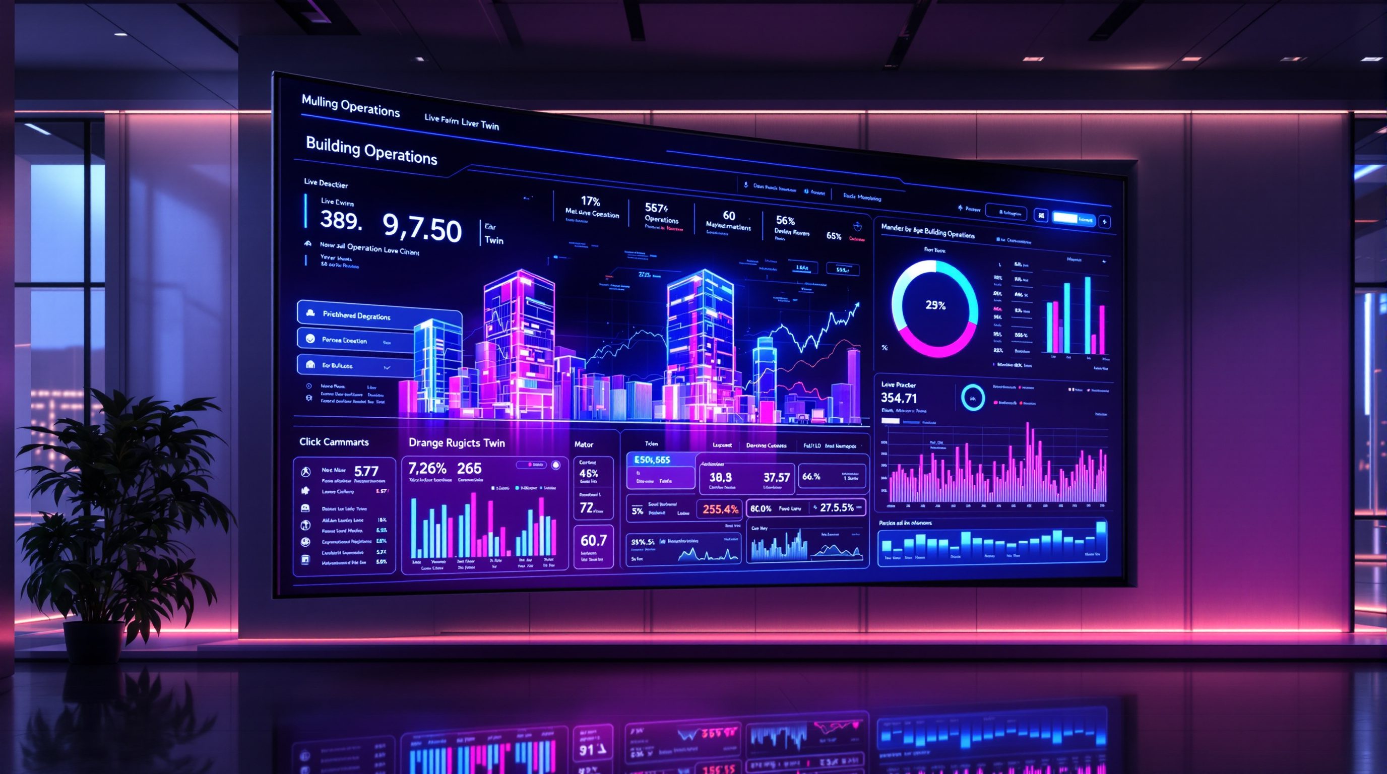
The workhorse of a twin's interface is the dashboard: a screen that summarises the building's state and performance at a glance. The single most important design principle is hierarchy - the most important information, biggest and first; supporting detail, smaller and later; everything else, one click away. A dashboard where every number is the same size is a dashboard with no priorities, and a reader with no idea where to look.
That top layer is usually a small set of KPIs (key performance indicators) - the handful of numbers that actually express whether the building is doing well: energy use, comfort or air quality, open faults, maybe cost. Choosing them is a discipline in itself. A good KPI is tied to a decision or a goal; if a number changing would not change anyone's behaviour, it is decoration, not a KPI. Five well-chosen KPIs beat fifty gauges every time.
Below the KPIs sit the supporting views: time-series trends (how a value has moved over hours or days, which is often far more informative than a single instantaneous reading), comparisons and benchmarks, and breakdowns by floor or system. The art is arranging these so the eye travels naturally from how are we doing (KPIs) to what is going on (trends and breakdowns) to what needs attention (alerts) - a path, not a wall.
Good dashboards also respect a few quieter craft rules that separate a usable screen from a pretty one. Give a number context, not just a value: 640 ppm of CO2 means little on its own, but coloured against a healthy threshold it reads instantly as fine or not. Use colour sparingly and consistently - reserve red for genuine problems so it keeps its urgency, rather than painting the whole screen in a rainbow that signals nothing. Label units and time ranges so no one has to guess whether a figure is today or this month. And design for the glance: an operator should grasp the building's state in a couple of seconds, then dig deeper only where something invites it. These are small disciplines, but together they are the difference between a screen people rely on and one they learn to squint past.
Hierarchy first. 5 KPIs > 50 gauges. A KPI must be tied to a decision, or it is decoration.
Spatial and 3D views: when they earn their place
The most eye-catching part of a twin interface is the spatial or 3D view - a floor plan or model with live data painted onto it, so you see where things are happening. Colour a plan by temperature and an over-cooled zone jumps out; place fault markers on a model and an operator finds the right room in seconds. When location matters, spatial views are genuinely powerful, and they communicate to non-technical people in a way tables never will.
But apply the same honesty as the anatomy lesson: spatial views earn their place only when the question is spatial. For a portfolio energy comparison, a plain bar chart beats a rotating building every time. A common failure is a beautiful 3D twin that looks spectacular in the boardroom and is useless at the operator's desk, because finding a number takes ten clicks through a 3D scene that a simple list would have shown instantly.
So choose the representation by the task. Use spatial views for locating and for communicating extent; use charts and tables for comparing and quantifying; use trends for understanding change over time. The best interfaces mix them, letting a user move from a spatial overview to a specific asset to its history. The 3D is a tool for certain questions, not a mandatory centrepiece - and treating it as compulsory is how interfaces get slow, heavy and unloved.
3D earns its place only when the question is WHERE. To compare, use a chart. Task chooses the view.
Alerts that get acted on - not ignored
An alert is where a twin stops being passive and asks a human to do something - which makes alert design one of the highest-stakes parts of the interface. Get it wrong and you cause alarm fatigue: so many alerts, so many of them trivial or false, that operators start ignoring all of them, including the one that mattered. A flood of alerts is functionally the same as no alerts.
Good alerting follows a few hard-won rules. Prioritise ruthlessly - not everything is critical; rank by severity and consequence so the important few are not buried under the trivial many. Make each alert actionable: it should say what is wrong, where, how serious, and ideally what to do - AHU-1 filter pressure high, replace filter beats a bare code. Tune the thresholds so you are not crying wolf; an alert that fires ten times a day for nothing trains people to dismiss it. And route alerts to the right person by the right channel, so they reach someone who can act.
The deeper principle is that alerts should be decision-shaped, not data-shaped. The twin's job is not to tell the operator everything that is happening; it is to tell them the few things that need a decision, clearly enough to act on. That is a very different design goal from a dashboard that shows all the data - and confusing the two is how twins drown their own users.
Alerting also improves when it is treated as something that gets tuned over time, not set once and forgotten. Every alert that fires should, in effect, be auditable: did anyone act on it, and was the action worth the interruption? Alerts that fire constantly and are always dismissed are candidates for a higher threshold or deletion; conditions that hurt but never alerted are candidates for a new rule. Some teams add a simple acknowledgement step, so an operator marks an alert as seen and handled, which both prevents duplicate chasing and creates a record of what the building actually demanded attention for. Over months this feedback loop is what keeps an alert list lean and trusted rather than letting it silt up into noise - and a trusted alert list is worth far more than an exhaustive one.
Rank, make actionable, tune, route. Too many alerts = no alerts (alarm fatigue).
Design for the operator, not the demo
Threaded through all of this is one principle worth stating on its own: design the twin for the person who uses it every day, not for the person you are selling it to. These are different audiences with opposite needs. The demo audience wants spectacle - a swooping 3D fly-through, dense screens full of live numbers, everything moving. The daily operator wants the opposite: calm, clarity, the few things that matter, and fast answers to real questions. Optimise for the demo and you get a twin that wins the pitch and gathers dust.
So design from the user and the task backwards. Ask who will actually sit in front of this - a facilities manager, an energy analyst, a tenant, a portfolio owner - and what decisions they make, because each needs a different view. A facilities manager needs faults and locations; an energy manager needs consumption and trends; an executive needs a few portfolio KPIs; a tenant needs simple comfort and control. One-size-fits-all dashboards serve none of them well; role-based views serve each.
And test it the only way that counts: can a real user answer their real question, quickly, without a guide standing next to them? If not, it is a demo, not a tool - however impressive it looks. The whole course has built toward a twin that serves a decision; the interface is where that promise is kept or broken. A modest dashboard that operators actually use beats a dazzling twin they quietly abandon.
Different users, different views. Test: can a real user answer their real question, alone, fast?
KPI (key performance indicator)
The headline numbers that express how the building is doing
A good KPI is tied to a decision or goal; if changing it would not change behaviour, it is decoration, not a KPI.
Information hierarchy
Ordering a screen by importance
Most important biggest and first, detail one click away; a design discipline borrowed straight from graphic and UX design.
Alarm / alert management
Prioritising and tuning what the twin asks a human to act on
Poorly tuned alerts cause alarm fatigue - too many alerts is functionally the same as none. Ranking and thresholds are essential.
Role-based views
Different dashboards for different users
Facilities, energy, executive and tenant users need different views; one-size-fits-all serves none of them well.
Workshop - critique and redesign a dashboard
You interact with dashboards constantly - a car, a phone, a smart-home app, a fitness tracker. This exercise sharpens the design eye you will bring to a twin by critiquing a real dashboard and redesigning one screen around a single user and decision.
Any dashboard you already use, and paper and pen. The dashboard-layout figure in this lesson is a useful template.
Goal: turn a data dump into a decision-shaped screen
Inputs: any dashboard you use, plus paper for a redesign
Time: ~30 minutes
- 1Pick a dashboard you actually use (a car display, a smart-home or energy app, a fitness tracker) and name the one user and the one main decision it should serve.
- 2Critique it against hierarchy: is the most important thing the biggest and first, or is everything the same weight? Mark what you would shrink, move, or remove.
- 3Find its KPIs: which numbers are truly tied to a decision, and which are just there because the data existed? Cross out the decoration.
- 4Judge its alerts or warnings: are they prioritised and actionable, or is there alert clutter that trains you to ignore them?
- 5Sketch a redesigned single screen for one user: a few decision-relevant KPIs at the top, one supporting trend or spatial view, and at most one or two ranked, actionable alerts. Nothing that does not serve that user's decision.
You’ll walk away with
A one-page critique of a real dashboard plus a hand-sketched redesign of one screen, built around a single named user and decision, with a clear hierarchy and only decision-relevant KPIs and alerts.
Three altitudes on the same idea
Read the band that fits you — or all three.
Visualization is a design problem, and design is your discipline. The instinct to organise information by hierarchy, to choose the right representation for a question, to resist clutter - these are the same judgements you bring to a drawing or a facade. Bring them to the twin interface, and push back when a client asks for a spectacular 3D twin that will serve nobody at the operator's desk. Advocate for the calm, usable dashboard over the dazzling demo.
This is squarely your territory: experience design applied to data. Information hierarchy, visual clarity, designing for a specific person and task - these are exactly the skills interior design trains. Occupant-facing twin views (comfort apps, air-quality displays, simple controls) live where your craft meets the twin, and are often the parts occupants actually touch. A well-designed occupant view can do more for how a building feels than a great deal of hidden plant.
Good dashboard and visualization design is a rare, portable skill. Plenty of engineers can pipe data to a screen; far fewer can make that screen genuinely usable - prioritised, glanceable, decision-shaped. Learn the principles here (hierarchy, KPIs tied to decisions, actionable alerts, designing for the operator) and practise them on real dashboards, and you bring something to a twin project that the pure-data people often miss. It is a craft you can start building today, with nothing but a critical eye.
“The best twin interface shows the operator as much live data as possible, all on one screen.”
Do it yourself
Design it in your head - then defend it.
- 1What is the single most important principle in dashboard design, and why?
- 2What makes a number a real KPI rather than decoration?
- 3When does a 3D or spatial view earn its place, and when is a chart better?
- 4What is alarm fatigue, and give two rules that prevent it.
- 5Why should you design a twin for the operator rather than the demo audience?
The one line to carry out
Peer-reviewed journals & authoritative standards
- 01Digital twin — Wikipedia, 2026.
- 02Building management system — Wikipedia, 2026.
- 03ENERGY STAR Portfolio Manager (benchmarking) — US EPA, 2026.
- 04Time series database — Wikipedia, 2026.
That completes the twin: seeded from BIM, built from five parts, sized to the right fidelity, and made usable through its interface. Next, Module 6 turns to what runs behind these dashboards - analytics and AI that find faults, learn a building's behaviour and benchmark its energy.
The author
Amogh N P
Architect, interior designer, and creative polymath. Studio Matrx began in his notebooks — his vision of design made honest, useful, and open to everyone. Its Academy is written and taught in his memory, and free, forever.
More about Amogh →