
 Lesson 10.3
Lesson 10.3 · Workflow, Portfolio & Career
Building a Computational Portfolio
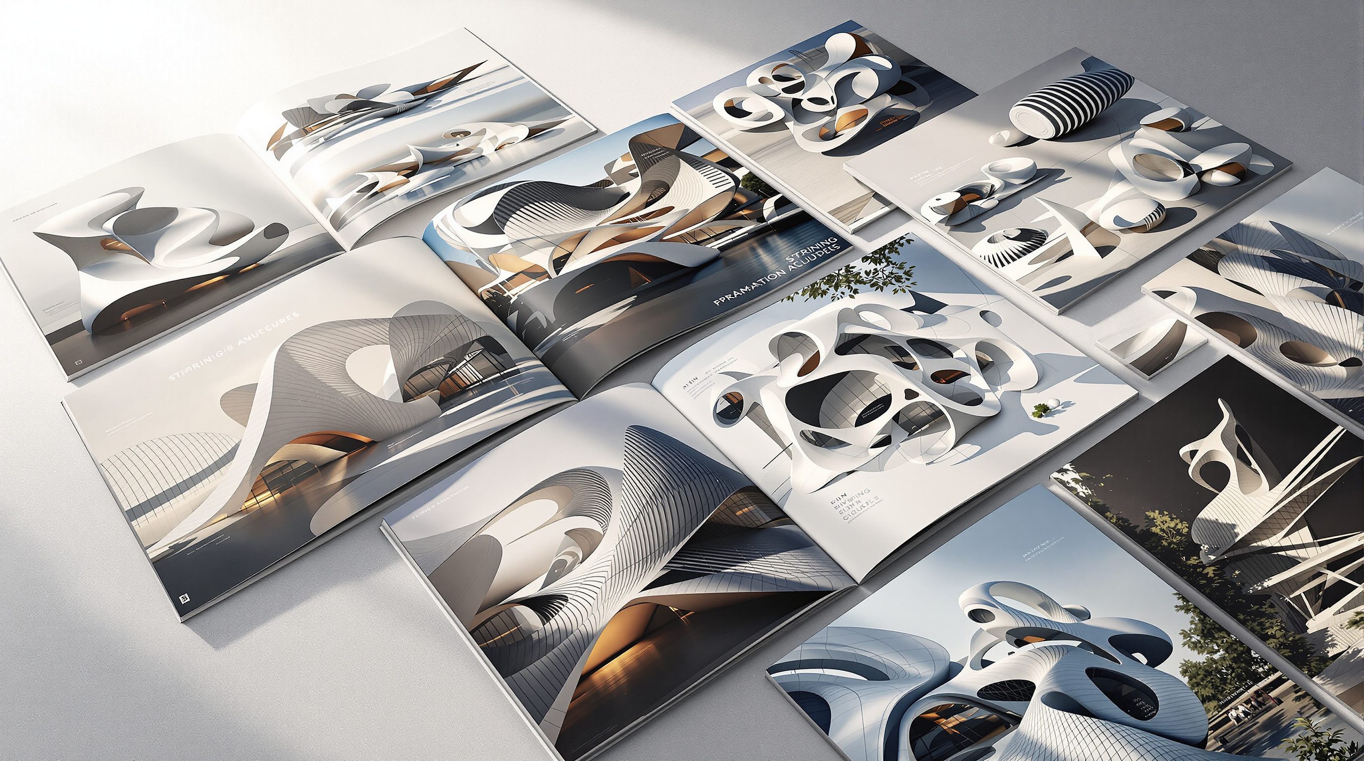
Show the logic, not just the render - the process diagram, a range of variations, a real problem solved
The render gets you a second glance. The logic behind it gets you the job. A computational portfolio has to show how you think, not just what you made.
A beautiful image proves you can push a definition to a nice output. It does not prove you understand what you built - and that understanding is exactly what a studio is buying. Reviewers who hire for computational roles have seen a thousand glowing renders; what stops them is a page that shows a mind at work.
This lesson is about presenting your work so the logic is visible: the driving idea, the process, the range of options it produced, and a real constraint it solved. And it is about ruthless curation - because two or three strong projects said clearly will beat ten weak ones every time.
Logic over renders. Diagram it, vary it, solve a real problem. Then cut everything weak.
What studios actually want to see
Put yourself in the reviewer's chair. They are not choosing wallpaper; they are trying to answer one question: can this person think computationally and be useful on Monday? A final render, however gorgeous, is weak evidence for that. It shows the destination but hides the journey - and the journey is the skill. A page that shows only the pretty output can even read as a warning: maybe they downloaded a definition and turned a slider.
What reviewers look for is the logic. What was the design idea? What were the driving parameters? How does the system work, and why is it a system rather than a one-off shape? The strongest computational portfolios read almost like case studies: here was a problem, here is the parametric logic I built to attack it, here is the range it produced, here is the version I chose and why. Renders belong in that story - as the payoff - but they are never the argument. Show the thinking and the render becomes proof of competence; show only the render and it is just a picture.
It helps to know how little time you actually get. A reviewer screening a stack of portfolios spends seconds, not minutes, on each project before deciding whether to slow down. In those seconds they are pattern-matching for signals of real understanding: a clear problem statement, a diagram they can read, evidence of iteration, a number. A wall of atmospheric renders offers none of those signals, so the eye slides off. A page that leads with a crisp problem and a legible process diagram stops the scroll, because it answers the reviewer's real question - can this person think? - in the first glance. Design your pages for that reader on that clock, not for a patient admirer who does not exist.
Reviewers are buying your THINKING. A render alone hides exactly the thing they want to see.
Show the logic: the process diagram
The single most valuable page in a computational portfolio is often a process diagram - a clear, designed graphic that explains how your system works. Not a screenshot of the Grasshopper canvas (that is illegible spaghetti to a reviewer), but a redrawn, abstracted diagram: inputs on the left, the key logical moves in the middle, geometry on the right, with the driving parameters labelled. It is the same left-to-right story you learned to document in the last lesson, translated into portfolio graphics.
A good process diagram does two jobs at once. It proves you understand your own definition well enough to explain it simply - which is harder, and more impressive, than building it. And it makes your project legible in the five seconds a reviewer actually spends. Pair the diagram with a one-line statement of the rule ('opening size follows solar exposure') and a couple of small geometry snapshots at key steps. Designers who can diagram their logic clearly signal that they can also communicate on a team, mentor juniors and hand work over - all the things the last two lessons were about. The diagram is where your computational thinking becomes visible.
Redraw the logic as a clean diagram. NEVER paste a raw GH canvas screenshot.
A range of variations proves a system
One image shows a shape; a range of images shows a system - and a system is what parametric skill actually is. So one of the most persuasive things you can put on a page is a grid of variations: the same definition run with different parameter values, producing a family of related-but-distinct results. Instantly, the reviewer sees that you did not model one object - you built an engine that generates many, and you can steer it.
This is where the design-space work from Module 8 pays off in your portfolio. Show a sweep across a key parameter, or a small Pareto set from an optimization, laid out as a clean matrix with the varying value labelled under each. It demonstrates three things at once: that your model is genuinely parametric, that you explored rather than settled, and that you exercised judgement by selecting a final version from the field. Crucially, annotate the choice - 'chosen for the best daylight-to-glare balance' - so the range is not just a pretty contact sheet but visible reasoning. A variation grid plus one sentence of why you picked what you picked is often more convincing than the hero render it sits beside.
A grid of variations proves you built an ENGINE, not a shape. Then label why you chose one.
A real problem, actually solved
Novelty impresses for a moment; a solved problem earns respect. The projects that land are the ones where the computational approach was not decoration but the reason the thing works. Frame each strong project around a real constraint: a facade that had to hit a shading target on a hot west elevation, a roof that had to span with minimum material, a layout that had to fit a hundred units to daylight and circulation rules. Then show how the parametric logic met it - ideally with the numbers, because a measured result ('cut peak solar gain 34 percent versus the flat baseline') is far more credible than an adjective.
This narrative also inoculates you against the biggest risk in a computational portfolio: looking like you made complexity for its own sake. Reviewers are wary of blobs that solve nothing. A clear problem-and-solution arc proves the opposite - that you reach for computation when it earns its keep, and that you can tie geometry to performance. It does not need to be a real commission; a well-framed studio project or self-set brief works, as long as the constraint is genuine and the response is measured. Problem, logic, evidence, result: that is the shape of a project page that gets remembered.
A quick anatomy of one strong page makes it concrete. Top: one payoff render, captioned with the project in a sentence. A band beneath it: the problem, stated plainly - 'the west elevation overheated; a fixed brise-soleil blocked the view the client wanted'. Then the redrawn process diagram: attractor at the view, opening size mapped inversely to west-facing solar exposure, output panels. Then the variation grid, four to six versions across the shading parameter, the chosen one marked. Then the evidence line: 'chosen variant cuts peak west-facade radiation 34 percent while keeping 80 percent of the view cone'. That is one page, and it tells a reviewer more about your competence than a folder of renders ever could, because every element answers a question they were already asking.
Frame every project as a solved constraint - with a number, not an adjective.
Curate: two or three strong beats ten weak
The final and most-broken rule: ruthless curation. A portfolio is judged by its weakest included project, not its best, because every filler page dilutes attention and invites doubt. Two or three deeply developed projects - each with its idea, process diagram, variation range, solved problem and payoff render - beat ten thin ones every single time. Depth reads as competence; breadth of half-finished experiments reads as a beginner.
So choose your two or three, and go deep. For each, tell the whole story: the problem, the logic (diagrammed), the exploration (variations), the decision (annotated), the result (measured), the image (as proof). Cut everything that does not earn its place, however fond you are of it. Keep the sequence tight and the visual language consistent so the work reads as one confident voice. And remember what all of this is really demonstrating - not that you know a lot of components, but that you can take a design problem, build a system to solve it, explore it with judgement and communicate the result. That is the entire course, presented. A portfolio built this way does not just show projects; it shows a computational designer.
Judged by your WEAKEST page. Cut filler. Go deep on two or three.
Process diagram
A redrawn, abstracted graphic of how your system works
Inputs, key logical moves, output - labelled. Never a raw Grasshopper screenshot. Proves you understand your own definition, not just built it.
Variation grid
The same definition run across a range of parameter values
A matrix of related results that proves your model is genuinely a system, and that you explored rather than settled on one shape.
Problem-solution narrative
The real constraint the project answered, with a measured result
A number ('34 percent less peak gain') beats an adjective. Inoculates against 'complexity for its own sake'.
Curation
Ruthless selection down to your strongest work
A portfolio is judged by its weakest page. Two or three deep projects beat ten thin ones. Cut filler however fond you are of it.
Workshop - build one portfolio-grade project page
Take your single best computational project and build the page a reviewer would actually respond to. One project, done to the standard, teaches the whole approach - and you keep the page.
Rhino + Grasshopper for the captures; any layout tool (InDesign, Figma, even slides) for the page. Optional: the analysis plug-in you used for the measured result.
Goal: turn one project into a page that shows logic, range and a solved problem
Inputs: one parametric project of yours; its definition; any analysis you ran
Time: ~2 hours
- 1Write the one-line problem and the one-line rule: what real constraint did this answer, and what is the design logic in a sentence ('perforation follows solar exposure to balance view and shading')?
- 2Redraw the logic as a clean process diagram - inputs, two or three key moves, output, driving parameters labelled. Do not screenshot the Grasshopper canvas; abstract it into designed graphics.
- 3Produce a variation grid: run the definition across one key parameter and capture four to six consistent snapshots, labelled with the value, laid out as a tidy matrix.
- 4Add the evidence: one measured result comparing your chosen version to a baseline (area, shading, span, daylight - whatever the problem needed), and annotate which variant you chose and why.
- 5Compose the page: problem statement, process diagram, variation grid, the annotated choice, one payoff render, in a consistent visual language. Then cut anything that does not add to the argument.
You’ll walk away with
One finished portfolio page: a stated problem, a redrawn process diagram, a labelled variation grid, a measured result with an annotated design choice, and a single payoff image - all in one consistent visual voice.
Three altitudes on the same idea
Read the band that fits you — or all three.
Present projects as arguments, not galleries. For each, lead with the constraint, show the parametric logic as a redrawn diagram, prove exploration with a variation range, and close with a measured result. A portfolio that ties geometry to performance signals exactly the judgement a practice wants leading its computational work.
Your systems - a parametric screen, a reactive tiling, CNC joinery - are strong portfolio material when you show the logic. Diagram how the pattern responds, lay out a range of variations, and note the real driver (privacy, acoustics, a focal point). It proves you design systems of rhythm and detail, not just single pretty objects.
This page is where your studies convert into a job. Do not pad with ten renders; pick two or three projects and go deep - idea, process diagram, variations, a solved problem, the payoff image. A single well-narrated parametric project that shows your thinking will out-perform a fat folder of glossy but silent pictures.
“The best portfolio is the one with the most impressive final renders.”
Do it yourself
Judge your own work like a reviewer would.
- 1Why is a final render weak evidence of computational skill on its own?
- 2What is a process diagram, and why should it never be a raw Grasshopper screenshot?
- 3What does a grid of variations prove that a single image cannot?
- 4How does framing a project around a solved problem protect you from the 'complexity for its own sake' criticism?
- 5Why do two or three strong projects beat ten weak ones - what is a portfolio judged by?
The one line to carry out
Peer-reviewed journals & authoritative standards
- 01Woodbury, R. - Elements of Parametric Design — Routledge, 2010.
- 02Autodesk - Generative design in AEC — Autodesk, 2026.
- 03Mode Lab - The Grasshopper Primer (Third Edition) — grasshopperprimer.com (free online edition), 2020.
- 04food4rhino - Grasshopper plug-ins ecosystem — Robert McNeel & Associates, 2026.
A portfolio that shows how you think is your entry ticket to the field. The final lesson maps that field - the roles, where it is heading, and how to keep growing as a designer who happens to compute.
The author
Amogh N P
Architect, interior designer, and creative polymath. Studio Matrx began in his notebooks — his vision of design made honest, useful, and open to everyone. Its Academy is written and taught in his memory, and free, forever.
More about Amogh →