
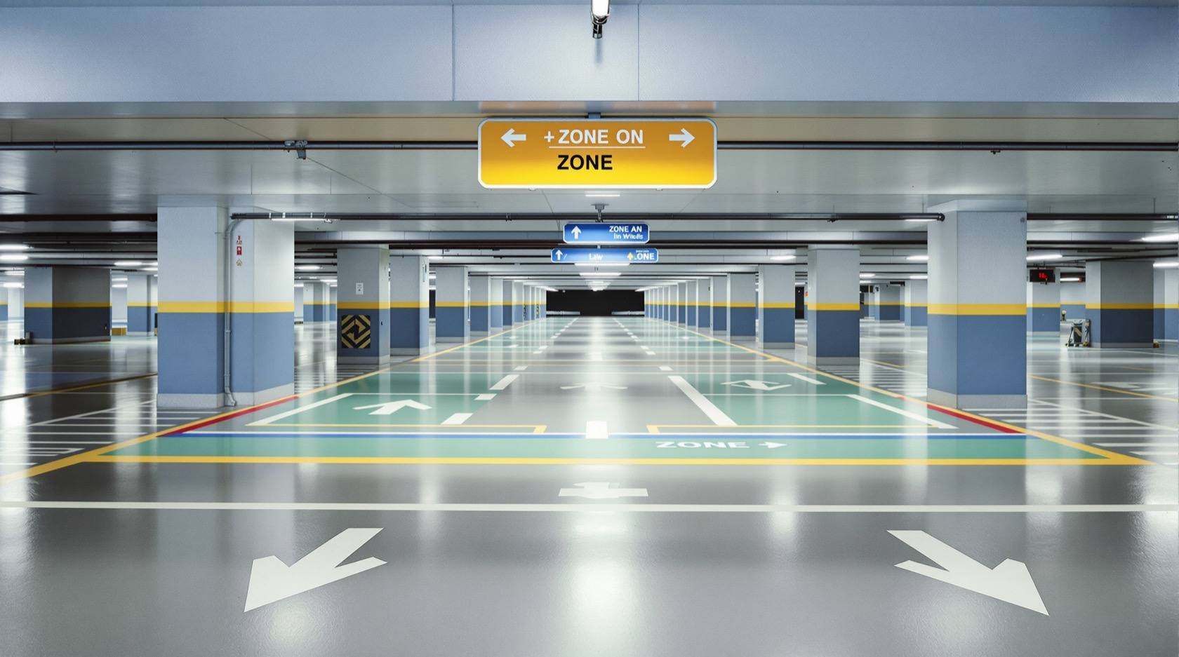
Parking Signage and Wayfinding in India: Directional, Bay and Safety Signs (2026)
How signs and floor markings guide a stranger through an Indian car park without stress — the approach and entry signs, directional and one-way arrows, level and zone identity, bay numbering, and the safety signs (fire exit, keep-clear, speed, accessible and EV bays) that a fire officer and the NBC govern.
A good car park is legible in the dark, at speed, and to a driver who has never been there before. The test of parking signage and wayfinding is simple and human: a stranger under stress should never get lost — not the visitor circling a mall basement for a vacant bay, not the wheelchair user hunting for the accessible route, and above all not the person trying to find the fire staircase when the smoke alarm sounds. Signs, arrows and painted floor markings are the language that tells every one of them where to go before they have to ask.
This is the signage and wayfinding guide for the Parking and Garage Design hub. It sets out the sign hierarchy — approach and entry, directional and circulation, level and zone identity, bay numbering, and the safety signs — and shows how floor markings and lighting do half the wayfinding work. It sits alongside commercial parking design, the layout and aisle design guide that fixes the one-way circulation your arrows must follow, and accessible parking design for the barrier-free bays and routes those signs must serve.
Scope & how to read this. Every sign height, colour convention and placement here is typical and indicative to help you plan and brief a signage designer — confirm the exact requirements against NBC (SP 7:2026) and your local development-control regulations / municipal bye-laws. Statutory safety signage — fire exit, staircase, keep-clear for the fire tender, and emergency egress — follows your licensed fire consultant and the fire officer / AHJ, not this guide. You plan and decide; professionals design, certify and maintain the life-safety signage.
The sign hierarchy: from the street to the bay
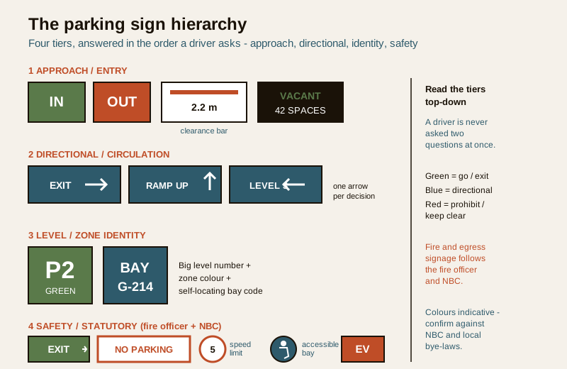
Wayfinding works because signs answer questions in the order a driver asks them. Approach and entry signs answer "can I go in, and will I fit?" long before the barrier. Directional signs answer "which way now?" at every decision point. Identity signs answer "where am I, and how will I find my car again?" once inside. Safety signs answer "how do I get out?" at all times. Design the hierarchy top-down and the reader is never handed two questions at once.
| Sign tier | Answers the question | Read from |
|---|---|---|
| Approach / entry | Can I enter? Will I fit? Is it full? | The street, before the ramp |
| Directional / circulation | Which way do I go now? | Moving, at each junction |
| Level / zone identity | Which floor and zone am I on? | The aisle, on arrival and departure |
| Bay numbering | Exactly where is my car? | Standing at the bay |
| Safety / statutory | How do I get out safely? | Everywhere, always |
Approach and entry signs
At the mouth of the car park the driver needs to make three decisions without slowing traffic behind them. Give each its own clear sign:
- IN and OUT. Separate, unambiguous entry and exit signs so no one drives up the wrong ramp. Where one opening serves both, the one-way discipline from the layout and aisle design guide must be spelled out on the ground and overhead.
- Height / clearance bar. A physical goalpost bar plus a sign stating the clearance stops a tall vehicle wedging in the ramp — the vertical limit comes from the headroom and clearance guide. The bar is a courtesy that saves a very expensive mistake.
- Full / Vacant (space guidance). Even a simple manually-flipped "PARKING FULL" board saves visitors a pointless descent; a counted vacancy display does it live (more below).
- Tariff and operator information where relevant, kept off the decision line so it never competes with the directional signs.
Directional and circulation signs
Inside, the driver is moving and cannot read paragraphs. Directional signs are arrows plus one or two words, placed at the decision point, not after it. The golden rules:
- One arrow per decision. Do not stack four destinations on a pole at a junction where the driver has half a second to read.
- Confirm the one-way loop. Every arrow must agree with the physical circulation; a sign that contradicts the paint or the ramp direction is worse than no sign.
- Repeat, do not assume. Re-state the direction to the exit at every level and every major junction — a first-time visitor has no mental map.
- Point continuously to the EXIT and the RAMP UP / RAMP DOWN, because the question a lost driver asks most is "how do I get out?"
Level and zone identity: how people find their car again
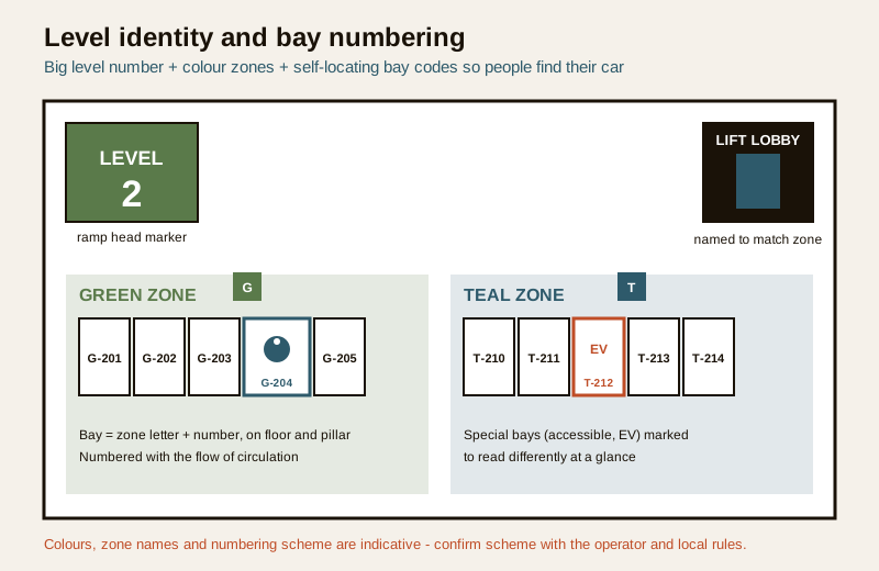
The single most common car-park misery is forgetting where the car is. Identity signage solves it with redundant, memorable coding so a distracted shopper can recall "Level 2, Green zone, bay G-214" or simply photograph the pillar.
- Level identity. Big, unmissable level numbers or letters at every ramp head, lift lobby and stair core — the number a person sees when they arrive is the one they must see when they return.
- Zone / colour coding. Splitting a large floor plate into named or colour-coded zones (Red, Green, Blue; or A, B, C) gives a coarse "which part of the floor" memory that a bay number alone cannot. Paint the pillars, theme the lighting, and name the lift lobby to match.
- Themed levels. Malls often theme each level (a fruit, an animal, a colour) precisely because a picture is remembered where a number is forgotten — universal, language-neutral, and kind to children and elderly visitors.
- Bay numbering. A logical, gap-free sequence stencilled on the floor at the head of each bay and repeated on the pillar face, so the number is visible both from the aisle and from a returning pedestrian's eye line.
Bay numbering that actually helps
- Number with the flow of circulation, not randomly, so the sequence is predictable.
- Prefix the bay with its zone or level (G-214, not just 214) so the number is self-locating.
- Reserve a clear, consistent marking scheme for the special bays — accessible, EV, visitor, two-wheeler — so they read differently at a glance.
- Keep the stencil at the head of the bay and on the pillar, in a colour that survives tyre scuffing and low light.
Floor markings and line-painting as wayfinding
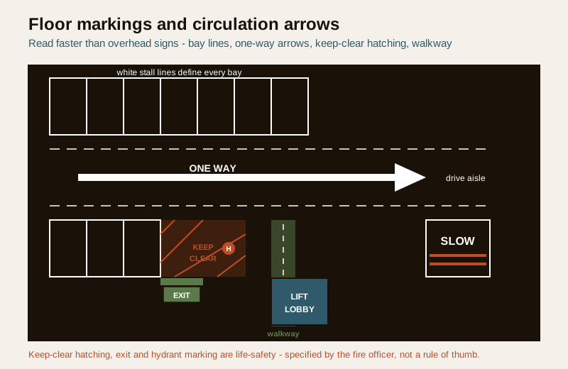
Half of good wayfinding is on the ground, not overhead. Floor markings are read faster than signs because the driver is already looking at the road, and they survive when a hanging sign is blocked by a tall vehicle.
- Bay lines. Crisp white (or yellow) stall lines define every bay; double-lines or a hatched buffer give the door-swing and walk-around room the car parking dimensions guide argues for.
- Directional arrows on the deck. Large painted arrows carry the one-way loop at eye-down level; they are the primary circulation cue in a busy basement.
- Keep-clear hatching. Bold hatched zones (often yellow) mark what must never be parked on — the fire-tender path, the ramp toe, the front of a hydrant or exit, the turning square.
- Pedestrian routes. A painted, sometimes coloured, walkway from the lift lobby to the bays tells people on foot where it is safe to walk in a space built for cars — a genuine safety measure, not decoration.
- Speed and threshold markings. "SLOW", rumble strips and painted give-way triangles at blind junctions and ramp heads calm speed where sightlines are worst.
Safety signage: fire, keep-clear, speed and the vulnerable
This is the tier where the stakes change. Everything above is convenience; this is life-safety, and it is consultant-led. Plan for it, insist on it, but let your fire consultant and the fire officer specify and certify it.
Fire and egress signage — fire-officer-led
- Fire exit and staircase signs. Illuminated / photoluminescent green running-man signs mark every exit and escape stair so they are found in smoke or a power cut. Their type, spacing and illumination follow NBC (SP 7:2026) and the fire officer — not a rule of thumb.
- Fire equipment marking. Extinguishers, hose reels, hydrants and the fire-command point are signed and kept visible; the floor in front is hatched keep-clear.
- Emergency lighting and exit routes are part of the same fire-safety design; treat the signage and the lighting as one system, specified together.
Keep-clear and emergency-access signage
- NO PARKING / KEEP CLEAR on the fire-tender path, the ramp toe, the turning head and in front of every exit and hydrant — reinforced by floor hatching so it reads even when a sign is blocked.
- Ambulance / emergency route kept legible in hospitals and large complexes, tying into hospital and institutional parking where minutes matter.
Speed, pedestrians and the vulnerable
- Speed limit signs (a low car-park crawl) at entry and repeated on long runs, backed by the physical calming above.
- Pedestrian crossing / walkway signs where the painted route meets a drive aisle, and at the lift lobby.
- Accessible-bay marking. The wheelchair symbol on the bay floor and an upright reserved sign, on the shortest step-free route — never treated as spare capacity. The bay, transfer aisle and route are set out in accessible parking design; this guide only makes sure they are signed and reserved.
- EV-bay marking. Clear "EV CHARGING" bay marking and an upright sign so charging bays are found and not blocked by non-EVs; the charging side is covered in apartment EV charging and the Electrical Knowledge Hub.
Lighting and digital guidance
Lighting for legibility
A sign is only as good as the light on it. Even, glare-free lighting — brightest at the ramp transitions where eyes adjust from daylight to gloom — is what makes signs, floor arrows and bay numbers readable, and it is a security measure too. The lighting design and its role in surveillance live in the Parking and Garage Security library; coordinate the signage and the lighting so no sign sits in a dark pocket and no pillar number is lost in shadow.
Digital and vacancy guidance (planning level)
At scale, dynamic guidance turns "circle until you find a gap" into "follow the count":
- Entry vacancy display — a live "X SPACES" board at the entrance so visitors know before they commit to the ramp.
- Per-level and per-zone counters at each ramp head, so the driver is steered to the floor that has room.
- Bay-level indicators (a green / red lamp over each bay) in premium malls and airports, readable down a whole aisle.
- App and pre-booking guidance for larger operators.
Treat these as a layer on top of clear static signage, never a replacement: the power fails, the phone dies, the system glitches — and the painted arrow to the EXIT must still be there. Specify the digital system with your MEP and ELV consultants; keep the static hierarchy complete on its own.
What to specify and confirm
| Item | Specify | Confirm against |
|---|---|---|
| Sign hierarchy | Approach, directional, identity, safety tiers | Signage designer + local rules |
| Entry signs | IN / OUT, clearance bar, full/vacant | Local rules + headroom guide |
| Directional signs | One arrow per decision, exit always shown | The one-way circulation plan |
| Level / zone identity | Numbering + colour/name coding scheme | Design judgement + operator brief |
| Bay numbering | Zone-prefixed, flow-ordered, on floor + pillar | Layout plan |
| Floor markings | Bay lines, arrows, keep-clear, walkways | Local rules |
| Fire / egress signs | Exit, stair, equipment, emergency lighting | NBC (SP 7:2026) + fire officer |
| Keep-clear / access | Fire-tender path, hydrants, exits, ambulance | Fire officer / AHJ |
| Accessible & EV bays | Symbol on floor + upright reserved sign | RPwD Act 2016 + local rules |
| Lighting for legibility | Even, glare-free, bright at transitions | MEP + security lighting design |
| Digital guidance | Vacancy counts, per-level, bay indicators | ELV / MEP consultant |
How it connects
- Sits under the Parking and Garage Design hub and serves the commercial parking design, parking for shopping malls and office and IT-park parking guides where wayfinding matters most.
- Follows the one-way circulation fixed in parking layout and aisle design and the vertical limits in parking headroom and clearance.
- Signs and reserves the barrier-free bays and routes designed in accessible parking design, and the charging bays in apartment EV charging.
- Coordinates with the lighting, CCTV and access control in the Parking and Garage Security library and the wiring in the Electrical Knowledge Hub; crisp bay lines depend on the surface in parking area flooring.
- Size the scheme these signs guide with the parking capacity calculator.
Key takeaways
- The test of wayfinding is human: a stranger under stress should never get lost — a first-time visitor, a wheelchair user, or someone finding the fire stair.
- Design the sign hierarchy top-down — approach/entry, then directional, then identity, then safety — so a driver is never asked two questions at once.
- Identity signage (big level numbers plus colour/zone coding and self-locating bay numbers) is what lets people find their car again; redundancy beats cleverness.
- Floor markings do half the work — bay lines, painted one-way arrows, keep-clear hatching and pedestrian walkways are read faster than overhead signs.
- Safety signage is life-safety and consultant-led — fire exit, staircase, keep-clear, hydrant and emergency lighting follow NBC (SP 7:2026) and the fire officer, not a rule of thumb.
- Accessible and EV bays must be signed and reserved, never treated as spare capacity, on the shortest step-free route.
- Lighting and digital guidance amplify signage but never replace it — the painted arrow to the EXIT must survive a power cut.
References
- National Building Code of India, NBC (SP 7:2026), Bureau of Indian Standards — exit, egress, fire-safety signage and parking circulation provisions.
- Local development-control regulations / municipal bye-laws — parking signage, wayfinding and marking requirements (city-specific).
- The Rights of Persons with Disabilities Act 2016 and the Harmonised Guidelines / accessibility standards — accessible-bay marking, reserved signs and step-free routes.
- IS codes and BIS guidance on safety signs, colours and symbols for the built environment.
- Fire service / AHJ requirements — fire-tender access, keep-clear marking, exit signage and emergency lighting, confirmed with the local fire officer.
All sign heights, colour conventions, placements and guidance here are indicative planning aids only; confirm the governing requirements against NBC (SP 7:2026), your local development-control regulations / municipal bye-laws and the accessibility standards, and have a licensed fire and signage professional design, certify and maintain the statutory safety signage.
Export this guide
Related Guides — Deep-dive reading
Exit Signage in India (2026): Guiding Everyone to the Nearest Way Out
How illuminated and photoluminescent exit signs, the language-neutral running-man pictogram and directional arrows lead any visitor to the nearest safe exit - fast, even in smoke or a power cut.
SecurityAccessible Parking Design in India: Barrier-Free Bays and Routes (2026)
The barrier-free parking guide for Indian buildings — who accessible parking serves and why it is a legal right under the Rights of Persons with Disabilities Act 2016, the wider bay plus shared transfer aisle, the step-free route to the lift or entrance, kerb ramps and level thresholds, the international symbol and signage, how many bays to provide, and the universal-design thinking that helps everyone.
ParkingParking Security Lighting in India (2026): Lighting Basement, Stilt and Open Parking So Nothing Hides in the Dark
How to light apartment and commercial parking so vehicles, people and number plates are clearly seen, cameras can actually read the scene, and the space stops being a soft spot for theft and lurking, without ever compromising the emergency lighting on the escape route.
SecurityRelated Tools — Try Free
Acoustic Privacy (STC) Visualizer
Indian healthcare acoustic visualizer — compare wall assemblies and noise sources, see received SPL after STC attenuation, and check FGI 2018 / IS 1950 / NABH speech-privacy compliance with live dual-canvas waveform.
Acoustic ToolAccess-Control Battery-Backup Calculator
Size the standby battery so an access system keeps running through a power cut, with an egress life-safety note.
Battery BackupCross-Ventilation Analyzer
Estimate airflow and air changes per hour (ACH) from room size, window areas, layout, and local wind — with NBC 2016 Part 8 compliance check.
Ventilation Calculator