
Vastu Colors for Home — A 2026 Working Reference for Indian Homes
Five elements · Room-by-room palette · Direction-aligned colors
Vastu colors for home are one of the most-Googled vastu topics in India in 2026 — and the most-misunderstood. Walk into any Asian Paints showroom in Bengaluru or Mumbai, ask the in-store consultant for the "vastu shade card", and you will be handed a glossy fan of 40 colors with no explanation of why pink belongs in the south-west bedroom but never in the south-east kitchen, why pure white works in the pooja niche but kills warmth in a living room, or why grey — the most-Pinterest-loved color of the early 2020s — is the single most-regretted paint choice of the decade in Indian homes. This guide is the working reference we wish every homeowner had before they walked into that showroom: color carries elemental energy, each direction has a ruling element, each room has a function, and vastu color is the discipline of matching all three.
This is a 22-minute reference — built for the homeowner who is about to paint a 2-3 BHK apartment, who has read three contradictory vastu blogs already, and who wants the working logic underneath the rules so they can adapt instead of obey blindly. If you also need to verify your home's directional layout, open Vastu Compass in another tab and run a parallel diagnostic with Vastu Compliance before you finalise the palette.
Vastu color is not paint shopping — it is matching the elemental energy of a direction to the function of a room. Soft pink in the master bedroom calms cortisol the same way navy in a kitchen kills appetite. The classical system and modern color psychology converge more often than either school admits.

What Vastu Color Actually Means
Vastu color is the application of panch tatva (five-element) theory to interior surfaces. The premise: every direction in your home is governed by an element (fire, water, earth, air, sky), and color is the most accessible lever for either reinforcing or fighting that element. A kitchen in the south-east (fire zone) painted in saffron reinforces the digestive-energy purpose of the room; the same kitchen painted in deep navy fights it. A master bedroom in the south-west (earth zone) painted in soft peach reinforces the rest function; the same bedroom in saturated red elevates cortisol and degrades sleep.
This is not religious prescription. It is a 2,000-year-old observational system about how color affects mood, function and biological rhythm — a system that pre-dates modern color psychology by twenty centuries but, as we will show in Section 6, often arrives at the same conclusions Faber Birren, Eva Heller and contemporary environmental-psychology research reach today.
What vastu color is not:
- It is not about pleasing a deity by painting a wall a particular shade.
- It is not a guarantee of wealth, marital harmony, or career success.
- It is not a substitute for ventilation, daylight, layout fixes or structural sense — which always matter more.
- It is not absolute; the colour family is what matters, not the exact hex code.
What it is: a discipline for choosing colors that align with how a room is used, how light moves through it during the day, and how the elemental character of the direction shapes its mood. If you treat it as a structured set of defaults — not as superstition — you will arrive at color decisions that are coherent, restful, and tend to age well. For the larger contemporary context, read Vastu for Modern Homes and Vastu House Plan India.
The Five Elements and Their Color Families
The panch tatva — fire, water, earth, air, sky — is the foundation of every vastu color choice. Memorise this single mapping and 70% of your color decisions become obvious.

| Element | Direction | Color family | Function | Modern paint reference |
|---|---|---|---|---|
| Fire / Agni | South-East (SE) | Red, saffron, marigold, orange, brick | Digestion, energy, transformation | Asian Paints Saffron 7787, Royale Mango Mojito |
| Water / Jal | North-East (NE) | Pure white, silver, pale sky blue, ivory | Purity, clarity, wisdom, prayer | Asian Paints Lily White 7986, Pearl White |
| Earth / Prithvi | South-West (SW) | Yellow ochre, brown, beige, terracotta, sand | Stability, rest, weight, relationships | Dulux Wholewheat, Berger Soft Salmon |
| Air / Vayu | North-West (NW) | Pale green, silver-grey, soft cream, sage | Movement, breath, circulation, guests | Berger Mint Mist, Dulux Cool Cucumber |
| Sky / Akasha | Centre (brahmasthan) | Pale blue, lavender, off-white, powder grey | Openness, expansion, consciousness | Asian Paints Lily White, Royale Atmos Sky |
The cardinal directions extend this map. North (ruled by Kuber, deity of wealth, and Mercury) prefers green + pale yellow + soft blue — the prosperity corner. East (Indra, sun, sunrise) prefers light blue + white + soft green — the learning and focus corner. South (Yama, strength, Mars) prefers coral + warm ochre — the decision-making corner. West (Varuna, gains, Saturn) prefers blue + grey + white — kids, study, and evening relaxation.
The single most useful heuristic: once you know the direction, the element follows; once you know the element, the color family follows. What you then choose inside the family is taste.
Room-by-Room Color Palette
The cleanest way to translate elemental theory into a paint order is to go room by room. Below is a working palette for an Indian 2-3 BHK, with three-tone palettes, hex codes, and the closest shade from Asian Paints, Berger and Dulux.

| Room | Direction | Element | Three-tone palette | Why this works |
|---|---|---|---|---|
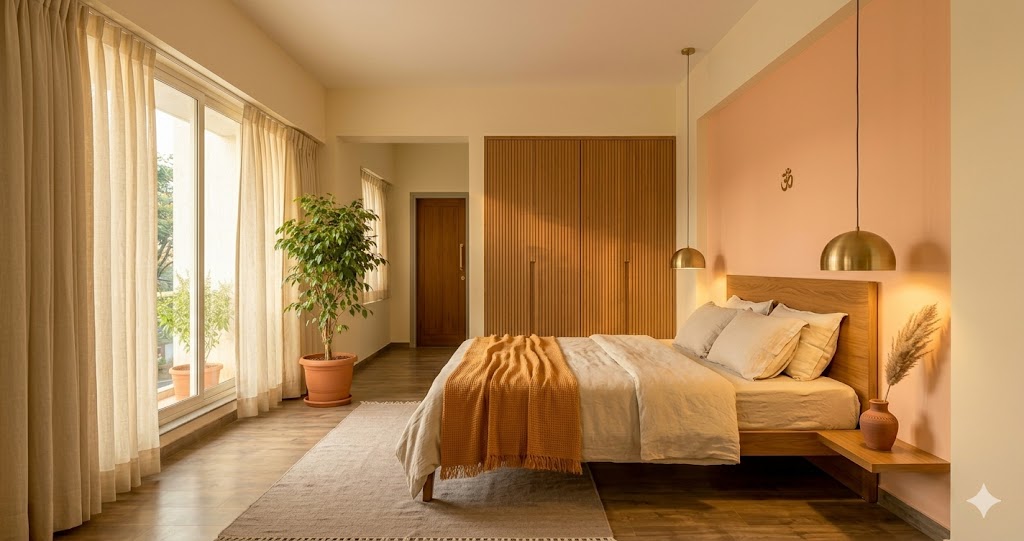
| Master bedroom | SW | Earth | Soft pink + peach + cream | Earth-element calm; lowers cortisol; supports REM |
| Kids room | W | Saturn / Mercury | Light blue + mint + cream | Focus + calm hyperactivity; lower visual fatigue |
| Kitchen | SE | Fire | Saffron + warm yellow + cream | Stimulates appetite, digestion, cooking energy |
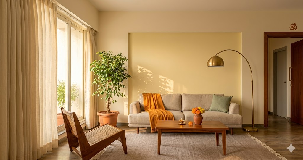
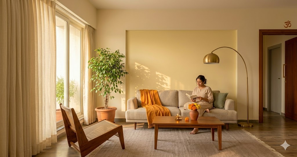
| Living room | N or E | Wealth / Sun | Pale yellow + warm white + honey | Welcoming, prosperity-aligned, photographs well |
| Dining room | NW | Air | Soft green + silver-grey + cream | Supports digestion, conversation, sociability |
| Bathroom | NW or W | Water / Air | Soft blue + cream + white | Water-aligned cleansing; avoids fire clash |
| Pooja room | NE | Water / sattvic | Pure white + off-white + ivory | Devotion, clarity, intentional sattvic emptiness |
| Study / WFH | E or N | Sun / Wealth | Light blue + soft green + warm white | Focus, cognition; lowers anxiety in long sessions |
| Foyer / entrance | varies | Welcome | Saffron + gold + cream | Auspicious welcome; warm first impression |
For the deeper room-level treatment of each zone, follow the companion guides: kitchen colors and layout are unpacked in Vastu for Kitchen, bedroom-specific guidance in Vastu for Bedroom, and entrance-zone palette in Entrance Vastu.
Color by Direction (Eight Directions)
If you do not yet know which room is in which zone, use the directional table — it works for any room independent of function. (Run Vastu Compass to confirm directions accurately; a 15-degree error invalidates the whole exercise.)
| Direction | Element / Deity | Recommended colors | Avoid |
|---|---|---|---|
| North (N) | Kuber, Mercury, wealth | Green, pale yellow, soft blue | Black, deep red, saturated grey |
| North-East (NE) | Water, Jupiter, devotion | Pure white, silver, pale blue, ivory | Any saturated color, dark red, navy |
| East (E) | Indra, Sun, sunrise | Light blue, white, soft green | Dark red, black, saturated orange |
| South-East (SE) | Fire, Venus, energy | Red, saffron, marigold, brick | Deep blue, black, pink, dark grey |
| South (S) | Yama, Mars, strength | Coral, warm ochre, terracotta | Pure black, deep blue |
| South-West (SW) | Earth, Rahu, stability | Pink, peach, cream, beige, ochre | Black, dark red, navy, gloss white |
| West (W) | Varuna, Saturn, gains | Soft blue, grey, white, pale green | Saturated pink, deep red, all-yellow |
| North-West (NW) | Air, Moon, guests | Pale green, silver-grey, cream | Dark red, saturated orange, black |
The reading rule: pick the room's direction first, then cross-check against function. If the recommendations conflict — say, a study that happens to fall in the south-east (fire) zone — function wins for the wall colors and direction wins for accents and ceiling. A study in SE works best with warm cream walls (function-led) and a single saffron-yellow accent piece (direction-honouring).
Eight Colors to Avoid (and the Replacements)
These are the eight most-common color mistakes Indian homeowners made between 2020 and 2026. Each fights either the element, the function, or both — and each has a clean replacement that keeps the aesthetic intent.

| # | Mistake | Why it fights vastu | Recommended replacement |
|---|---|---|---|
| 1 | Pure black walls in living or bedroom | Saturn dominance; absorbs warmth; disrupts melatonin | Deep charcoal accent on max 1 wall + warm wood |
| 2 | Saturated dark red bedroom | Red raises pulse + cortisol; degrades sleep | Soft peach or pink + cream (earth element calm) |
| 3 | All-grey contemporary scheme | Saturn + Rahu; energy-draining; cold in Indian daylight | Warm beige + cream + one wood tone |
| 4 | Dark blue bedroom ceiling | Water pressing down on rest; psychological weight | Pale peach or cream ceiling stays light |
| 5 | Mirror-finish / high-gloss everywhere | Reflects energy chaotically; visual noise; ages badly | Matte or eggshell finish on walls |
| 6 | All-white sterile / hospital scheme | Water-element overdose outside pooja; cold | Warm white + 1 grounding cream / beige per room |
| 7 | Bright pink kitchen | Soothes when SE needs to fire up digestion | Saffron + warm yellow + cream (true fire palette) |
| 8 | Yellow bathroom | Fire-water clash; bathroom feels "off" | Soft blue + cream + white (water-aligned) |
The pattern is consistent: the mistakes mostly stem from prioritising Instagram aesthetics over functional fit. Each replacement keeps 80% of the intended mood while removing the element-function clash.
How Vastu Color Maps to Modern Color Psychology
This is the section every sceptical homeowner asks about. Does any of this hold up to modern color research? The honest answer: more often than you would expect.

| Vastu pairing | Classical reasoning | Modern color psychology equivalent |
|---|---|---|
| Red / saffron in kitchen | Fire (agni) rules digestion + transformation | Birren (1961): red raises pulse + stimulates appetite |
| Yellow / gold in north | Mercury, Kuber, treasury, wealth | Heller (2000): yellow strongest for cognition + memory |
| Green in east | Indra, sunrise, growth, new life | Wavelength 510-540nm = lowest visual fatigue; hospital walls |
| Soft blue in west / bath | Varuna, water, evening relaxation | Mehta & Zhu (2009): blue improves creativity + slows pulse |
| Pink / peach in SW master | Earth, stability, relationship harmony | Schauss (1979): Baker-Miller pink lowers aggression + cortisol |
| White in pooja (NE) | Sattvic purity, water, clarity | Ulrich (1984): white + daylight = measurable stress reduction |
| Avoid black walls | Saturn weighs energy down | Birren: black absorbs 95% light, degrades alertness |
The convergence is not coincidental. Both systems started from the same observation — that humans live in coloured environments and the environment changes the human — and arrived at similar conclusions about which colors restore, which stimulate, and which oppress. Vastu encoded the conclusions in cosmological language; modern psychology encoded them in measurable units (lux, beats per minute, cortisol levels). The systems disagree on causation but agree on application about 70-80% of the time. If you are sceptical of vastu but trust evidence-based design, you will end up at almost the same palette anyway.
Lighting and Color Temperature Interaction
A vastu-perfect color picked under the showroom's 4000K cool-white LED will look completely different in your apartment at 7 pm under 2700K warm bulbs. Color temperature is the single biggest under-recognised variable in vastu color planning.
| Surface color | Read at 2700K (warm) | Read at 4000K (neutral) | Read at 5000K+ (cool) |
|---|---|---|---|
| Soft peach #fed7aa | Warm, romantic, salmon | True peach | Washed out, slightly grey |
| Pale yellow #fef9c3 | Honey-glow, welcoming | True pale yellow | Greenish-yellow, off |
| Cream #fef3c7 | Buttery, warm | True cream | Sterile, hospital |
| Soft pink #fda4af | Rose, intimate | True pink | Cold, almost lavender |
| Pale blue #bae6fd | Greenish-grey | True pale blue | Crisp, true cool blue |
| Warm white #fafaf9 | Champagne, glowing | True warm white | Slightly blue, clinical |
Practical rule: paint vastu warm-family colors (red, saffron, yellow, peach, pink, cream, ochre) for rooms lit at 2700-3000K. Paint vastu cool-family colors (blue, white, mint, silver-grey) for rooms lit at 3500-4000K. The pooja room is the exception — pure white + cool 3500K daylight is the sattvic combination, even though every other room reads warmer.
Test paint at three times of day before committing: morning daylight, late-afternoon warm sun, and evening artificial lighting. A swatch board taped to the wall for a full 24-hour cycle is the cheapest insurance against repaint regret.
Three Application Tiers
Not every homeowner wants to repaint a full apartment. There are three legitimate intervention levels — pick the one that matches budget and conviction.
| Tier | Scope | Cost (2-3 BHK) | Best for |
|---|---|---|---|
| Tier 1 · Accent wall only | 1 wall per room repainted in the vastu-aligned color, rest stays current | Rs. 12,000 - 35,000 | Renting, low-commitment, testing the idea |
| Tier 2 · Full room palette | 2-3 priority rooms (master bedroom, kitchen, pooja) fully repainted to vastu palette | Rs. 60,000 - 1.8 L | Existing homeowners doing a refresh |
| Tier 3 · Whole apartment | All rooms repainted to the full vastu-aligned palette, ceilings and trim included | Rs. 2.2 - 4.5 L | New possession, renovation, full reset |
Tier 1 is the most common starting point. Repaint the bedroom in soft peach, the kitchen in cream + saffron accent, the pooja in pure white — three rooms, one weekend of work, immediate impact. If you live in the apartment for six months and feel the difference, escalate to Tier 2 the following year.
Tier 2 is the sweet spot for most homeowners. The three priority rooms are master bedroom (rest), kitchen (energy) and pooja (calm) — these are the rooms where you spend either the most concentrated time or the most charged time, so they reward the most attention.
Tier 3 is justified when you have just taken possession of a new flat, or when you are doing a full interior renovation anyway. Adding the vastu logic costs almost nothing extra at this stage and means every room is coherent from day one.
Indian Paint Brand References
Asian Paints, Berger, Dulux and Nerolac all publish vastu-aligned shade collections. The shade names change every 18-24 months as collections are refreshed — what matters is the colour family, not the exact catalogue number.
| Room | Asian Paints | Berger | Dulux | Nerolac |
|---|---|---|---|---|
| Master bedroom | Peach Glow 8101, Soft Salmon, Royale Atmos Pink | Silk Glamor Soft Salmon, Silk Peach Whisper | Velvet Touch Wholewheat, Peach Macaron | Impressions Eco Clean Peach |
| Kitchen | Saffron 7787, Royale Mango Mojito | Silk Glamor Marigold, Silk Saffron | Velvet Touch Mango Mojito, Honey Glow | Impressions Saffron |
| Living room | Cream Glow 7948, Royale Atmos Cream | Silk Pale Cream, Silk Soft Ivory | Velvet Touch Wholewheat, Cream Whisper | Impressions Cream Glow |
| Pooja room | Lily White 7986, Pearl White, Royale Atmos White | Silk Pure White, Silver Lining | Velvet Touch Brilliant White, Pristine | Impressions Pure White |
| Bathroom (NW/W) | Sky Blue 7421, Royale Atmos Sky | Silk Pearl White, Pale Blue Whisper | Velvet Touch Powder Blue, Misty Morning | Impressions Sky Blue |
| Kids room | Sky Blue 7421, Mint 7546, Lily White 7986 | Silk Mint Mist, Silk Pale Blue | Velvet Touch Mint Macaron, Powder Blue | Impressions Mint Mist |
| Dining (NW) | Mint 7546, Royale Sage | Silk Mint Mist, Silk Pearl Silver | Velvet Touch Mint Macaron, Sage Whisper | Impressions Mint |
| Study (E/N) | Sky Blue 7421, Mint 7546 | Silk Sage, Silk Pale Mint | Velvet Touch Cool Cucumber, Powder Blue | Impressions Sage |
Finish guidance: matte (Royale Atmos, Silk Glamor, Velvet Touch) is the default vastu-aligned choice — it absorbs and softens light, reads warmer, and ages better. Reserve gloss and high-gloss for kitchen splashbacks, bathroom wet zones, and trim. Eggshell is acceptable for high-traffic walls in kids rooms and hallways.
Specification standard: paints in India are governed by IS 5410 for cement primer and IS 15489 for plastic emulsion. Vastu does not override IS specification — choose a vastu-aligned color within the right product class for the substrate (interior emulsion for walls, enamel for trim, exterior emulsion for terrace/balcony).
When Strict Vastu Color Doesn't Make Sense
This guide is written by people who use vastu pragmatically, not religiously. There are cases where strict vastu color is the wrong choice — and refusing to adapt is the actual mistake.
- Rental apartments: you do not control the layout, so chasing perfect element-direction-color alignment is wasted effort. Pick neutral warm palettes (cream, beige, warm white) and let one accent piece per room carry the vastu signal.
- Heritage and conservation properties: heritage homes often have non-cardinal orientations and historical colour palettes (Goa Portuguese, Chettinad, Pol house) that carry their own vastu logic. Honor the heritage palette; do not retrofit modern vastu over it.
- Compact 1 BHK / studio apartments: when one room serves four functions, no single vastu color can satisfy all of them. Pick the dominant function (usually sleep) and let everything else live around it.
- Mixed-direction rooms: many Indian apartments have rooms that straddle two zones (e.g. a living-dining that runs N-E to S-W). Apply the dominant-direction palette to walls and ceiling; let the secondary direction's palette show up in furnishing and accents.
- Strong existing aesthetic: if you have just spent 35 lakhs on a warm minimal or earthy palette interior that you love, retrofitting strict vastu colors over it is usually destructive. The warm-minimal and earth-palette schemes already overlap heavily with vastu earth-element logic — you have probably been 80% vastu-aligned without realising it.
The practical rule: vastu color is a default; deviations need a reason. If you can articulate why a non-vastu colour serves the room better, the deviation is valid.
Where to Go Next
- For the direction-by-direction breakdown of a full floor plan, read Vastu House Plan India.
- For the broader contemporary application of vastu — including layout, light, ventilation, and the modern apartment constraints — read Vastu for Modern Homes.
- For the kitchen-specific deep dive (cooking direction, sink-stove placement, palette extensions), read Vastu for Kitchen.
- For sleep-direction, bed orientation, and the master bedroom palette extension, read Vastu for Bedroom.
- For door-direction, threshold treatment and the welcome zone, read Entrance Vastu.
- For homes that happen to face north (statistically the most asked-about orientation in India), read North-Facing House Vastu.
- For aesthetic neighbours where the palette logic overlaps strongly with vastu earth element, see Warm Minimal Interiors and Earthy Interior Palette.
- For diagnostic tools, use Vastu Compliance (room-by-room scoring) and Vastu Compass (directional reading).
References
1. Varahamihira (6th century CE). Brihat Samhita, Chapters 52-56 on construction, colour, and directional governance — translated by M. Ramakrishna Bhat (Motilal Banarsidass, 1981).
2. Mayamatam (c. 9th-12th century CE). Translated by Bruno Dagens, Mayamatam: Treatise of Housing, Architecture and Iconography, Indira Gandhi National Centre for the Arts + Motilal Banarsidass, 1994 — Chapter 9 on colour and direction.
3. P. K. Acharya. Vishwakarma Vastu Shastra — translated edition, Oriental Books Reprint, on direction, element and colour mapping in classical Indian architecture.
4. Khushdeep Bansal. Vastu: A Beginner's Guide to the Ancient Art of Vastu Shastra — modern practical synthesis of colour-direction-element pairings for the Indian home (Hay House India).
5. Anupama Mohanlal. Vastu: A Practical Guide to Harmony in the Home and Workplace — contemporary application of vastu colour theory across Indian residential typologies.
6. Faber Birren. Color Psychology and Color Therapy: A Factual Study of the Influence of Color on Human Life (Citadel Press, 1961, reissued 1992) — foundational text on color and physiology.
7. Eva Heller. Wie Farben wirken / Psychology of Color: How Colours Affect Emotion and Reason (Droemer Knaur, 2000) — empirical survey of colour associations across cultures.
8. Alexander Schauss (1979). "Tranquilizing Effect of Color Reduces Aggressive Behavior and Potential Violence," Journal of Orthomolecular Psychiatry — the Baker-Miller pink study.
9. Ravi Mehta and Rui (Juliet) Zhu (2009). "Blue or Red? Exploring the Effect of Color on Cognitive Task Performances," Science 323 — modern empirical work on blue and red environments.
10. Roger Ulrich (1984). "View Through a Window May Influence Recovery from Surgery," Science 224 — environmental colour and stress recovery research applied to the white-and-daylight pooja parallel.
11. Asian Paints Royale Atmos Vastu Collection technical sheet (2025-2026) — shade card and finish specifications for Indian-market vastu-aligned paints.
12. Bureau of Indian Standards. IS 5410: Specification for Cement Primer Paint; IS 15489: Plastic Emulsion Paint, Interior. New Delhi: BIS — applicable Indian paint specifications.
13. National Institute of Design (NID) Ahmedabad — research notes on Indian color preference, regional palette traditions, and the convergence of folk colour symbolism with vastu prescription.
14. Stephen Kaplan (1995). "The Restorative Benefits of Nature: Toward an Integrative Framework," Journal of Environmental Psychology — colour-wavelength and visual-fatigue research underlying the green-in-east pairing.
Author's note. Vastu color is best understood as a system that aligns traditional Indian aesthetic sensibilities with what modern color psychology research keeps re-discovering — that red stimulates, blue calms, green restores, white opens, pink soothes, yellow focuses. It is not a religious prescription, and it is not magic. Treat it as a 2,000-year-old well-tested default for choosing colors that fit how a room is used and how the body responds to colour — and the recommendations stop feeling mystical and start feeling sensible. Use it where it helps your home feel right; deviate where it does not. Both are valid.
Disclaimer. This guide is a working reference, not a religious or astrological consultation. Color affects mood and biology, but no paint choice — vastu-aligned or otherwise — substitutes for ventilation, daylight, structural soundness, or layout coherence. Outcomes from any colour scheme depend on lighting, finish, brand-batch variation, ambient material palette, and personal physiology. Confirm directions accurately using a magnetic compass (or Vastu Compass) before applying any direction-keyed recommendation — a 15-degree orientation error invalidates the whole exercise. For deep interventions, consult an interior designer who understands both colour theory and the vastu tradition.
Last verified: May 2026 · Next verify: May 2028
Export this guide
Related Guides — Deep-dive reading
How Good Architecture Reduces Stress
The measurable ways your home calms or strains your nervous system — and how to design for calm
Design EducationJapandi Apartment — A 2026 Style Guide for Compact Indian Homes
Japanese restraint × Scandinavian function · Low furniture · Two-wood discipline
Design StylesThe Architectural Psychology of Comfortable Spaces
Why some rooms feel right and others never do — the science of space and the human mind
Design EducationRelated Tools — Try Free
Circadian Light Meter
Patient-centric circadian lighting visualizer for Indian healthcare design — time-of-day × intensity → CCT, melanopic lux (EML / mEDI), melatonin suppression, and an alertness curve. Calibrated against WELL v2 L03 Circadian Lighting Design, CIE S 026:2018, Brainard 2001, and Lucas et al. 2014.
Circadian ToolCross-Ventilation Analyzer
Estimate airflow and air changes per hour (ACH) from room size, window areas, layout, and local wind — with NBC 2016 Part 8 compliance check.
Ventilation CalculatorPainting Prep & Quality Checklist
Painting audit — 10 categories, 65+ checkpoints across surface prep, putty, primer, emulsion coats, enamel, external, ceilings, defects, final QC.
Painting QC