
Earthy Interior Palette — A 2026 Style Guide for Indian Homes
Rooted · Regional · Biophilic · Indian craft-anchored
Earthy interiors are the rooted, regional, biophilic counterweight to global minimalism — and the dominant alternative style for Indian homes in 2026. Where warm minimalism strips ornament and adds back warmth through material, earthy interiors go further: they pull the colour palette directly out of Indian soil — mud, clay, terracotta, rust, ochre, walnut, olive — and anchor the whole apartment in craft regions that exist within a day's drive of where the homeowner lives.
This is a 22-minute working reference for homeowners and interior designers building earthy interiors in Indian apartments. It covers the five structural principles, a fifteen-tone working palette with hex codes and Indian paint references, room-by-room application across a 2-3 BHK, three budget tiers from ₹3 L DIY to ₹65 L bespoke, ten common pitfalls, a craft-cluster sourcing map, and how earthy differs from adjacent styles.
Earth tones are not just a colour story. They are a gravity story. The room must feel anchored to the ground — heavier at the floor, lighter at the ceiling, materially honest at every level. Get the gravity wrong and the palette collapses into either beige-on-beige or ethnic-restaurant kitsch.
For complementary depth see Warm Minimal Interiors, Japandi Apartment Interior Guide, Sustainable Interiors India Guide, Wardrobe Finish Ideas, and Modular Kitchen Design Guide.
This guide refreshes every 12 months — craft sourcing leads and pigment trends shift annually. Last verified: May 2026 · Next verify: May 2027.
What an Earthy Palette Is

An earthy interior palette is the deliberate choice to pull every colour, material, and finish in the apartment from the soil, plant, and pigment vocabulary of India itself. Not "neutral" — neutral is the abstract decorator language of grey, greige and taupe. Earthy is specific: this beige is mud from Kutch, this red is the iron oxide that fires Khurja terracotta, this olive is khadi dyed with indigo and turmeric in a Bengaluru studio.
The core idea: every tone is named for a real material. A homeowner standing in the room should be able to point at any surface and name the soil, fruit, or pigment that it came from. Mud plaster wall. Terracotta floor tile. Rust khadi cushion. Ochre block print throw. Walnut coffee table. Olive linen drape. Six grounded, biographical, regional surfaces — instead of six abstract "warm neutrals" from a decorator deck.
Five things an earthy palette is NOT
1. Not "beige interior" — Beige walls + grey sofa is the negation of an earthy palette. Earthy requires named-pigment surfaces (mud plaster, rust khadi, ochre block print) — not abstract neutral colour.
2. Not "ethnic" or "boho" — Boho throws every craft tradition into one room. Earthy is the opposite: one craft geography per zone, edited tightly, never a global souk effect.
3. Not warm minimalism — Warm minimal is restraint-first, with earth tones used sparingly as a 5-10% accent. Earthy is the inverse: earth tones are 80-90% of the palette, with restraint applied to object count, not pigment.
4. Not Wabi-Sabi — Wabi-Sabi celebrates imperfection and asymmetry explicitly. Earthy is more composed and intentional, even when the surfaces are hand-troweled.
5. Not "rustic" — Rustic implies a country-house, beam-and-stone idiom. Earthy works equally in an apartment, a heritage haveli, a hill-station retreat, or a Bandra terrace.
The Five Principles That Make an Earthy Palette Work

1. Earth-pigment hierarchy
Three tiers, with mathematical discipline. Base earth tones (mud, sand, clay, ochre, oat) occupy 60-65% of the palette — these go on walls, ceilings, large textiles, and the biggest furniture pieces. Accent earths (terracotta, rust, burnt sienna, deep brick, olive) occupy 20-25% — these are the cushions, the rugs, the single accent wall, the pottery. Grounding deeps (dark walnut, slate clay, midnight earth, charcoal terracotta, ink olive) occupy 10-15% — these anchor the room and prevent the palette dissolving into mush. Break the hierarchy and the room reads either washed-out or theatrical.
2. Biophilic instinct
Every material must feel like it came from the ground. Soil — mud plaster, lime plaster, tadelakt, terracotta tile, kota stone, Jaisalmer sandstone. Fibre — khadi, linen, jute, sisal, wool, cotton dhurrie. Wood — solid teak, sheesham, walnut, mango, Channapatna-lacquered native species. Plant dye — vegetable-dyed Kutch textile, indigo, turmeric, madder, pomegranate. Stone — Indian quartzite, limestone, basalt. Never PU leather, melamine veneer, acrylic carpet, polyester drape, plastic-edged laminate. The diagnostic test: walk the room and for every surface, name the plant, soil, or rock it came from. If you cannot name three in a row, the room has slipped into synthetic.
3. Layered tonal depth
The single most common failure of earthy interiors is using two earth tones instead of five or six. Mud walls + beige sofa is not an earthy palette; it is a beige room. The discipline: every zone needs at least four named earth tones in close visual range — mud wall + sand drape + rust cushion + walnut frame + ochre block-print throw + olive plant pot. Each tone earns its own tactile fingerprint and its own pigment identity. Beige-on-beige is the visual equivalent of speaking in a monotone.
4. Daylight modulation
Earth tones shift more dramatically across the day than any other palette. Ochre at 8 am reads as warm gold; at 1 pm as flat mustard; at 5 pm as deep brick; at 7 pm as amber. Terracotta does the same — orange-pink at sunrise, brick-red at noon, plum at dusk. Indian light is itself warm and golden, which amplifies the shift. The rule: never specify an earthy paint from a paper swatch under shop fluorescent lighting. Paint a 1 m × 1 m sample on the actual wall, photograph it at 8 am, 1 pm and 6 pm, then decide. The colour you commit to is the colour at the time of day you most use the room.
5. Regional craft anchoring
One craft geography per zone is the discipline. The living room can be Auroville ceramic + Pondicherry terracotta + Kerala coir — a single south-coast harmony. The bedroom can be Channapatna lacquered + Bangalore-Mysore silk + Athangudi tile — a Dravidian craft family. Mix five or six unrelated craft regions in one room — Kutch rug + Jaipur block + Channapatna table + Bastar dhokra + Madhubani painting — and the room reads as a souvenir shop. One geography per zone; at most two geographies per apartment. Coherent regional narrative beats accumulated diversity every time.
The Working Colour Palette — Fifteen Tones with Hex Codes

Base earth tones — 60-65% of palette
| Tone | Hex | Use | Indian paint reference |
|---|---|---|---|
| Mud Beige | #D8C4A4 | Walls, large surfaces | Asian Paints 8516 · Dulux Mud Pack |
| Sand Oat | #E7D5B6 | Ceilings, soft trim, drape | Asian Paints 8484 · Berger Desert Sand |
| Clay Tan | #C9A878 | Lime/clay plaster wall | Bauwerk Clay · Tadelakt India |
| Light Ochre | #CAA057 | Accent wall, archway | Asian Paints 7849 · Dulux Inca Gold |
| Soft Oat | #ECDFC5 | Bedding, raw cotton | Asian Paints 8485 · Fabindia khadi base |
The base earth test: paint a 1 m × 1 m sample on the actual wall — never on a panel held up to the wall — and watch it across morning, noon and evening light for at least 24 hours before committing. Earthy tones are the most light-sensitive in the entire interior palette and shop swatches consistently misrepresent them.
Accent earths — 20-25% of palette
| Tone | Hex | Use | Indian craft source |
|---|---|---|---|
| Terracotta | #C66B4A | Pottery, tile, accent textile | Pondicherry · Khurja pottery |
| Rust | #A3502A | Cushion, rug, leather | Kutch vegetable-dye textiles |
| Burnt Sienna | #8C3E1F | Single piece anchor | Channapatna lacquerware |
| Deep Brick | #722D18 | Statement art, vase | Jaipur block print red |
| Olive Earth | #6B6A3E | Drape, throw, plant pot | Indigo+turmeric khadi dye |
The accent earths are where the palette earns its identity. Use them as deliberate moments — one terracotta wall in the living, one rust khadi cushion stack on the master bed, one ink-olive panel behind the study desk — not as a uniform layer. Four to six accent-earth moments per apartment, not forty.
Grounding deeps — 10-15% of palette
| Tone | Hex | Use | Sourcing notes |
|---|---|---|---|
| Dark Walnut | #3C2418 | Floor, frame, table | American black walnut or smoked teak |
| Slate Clay | #4F3A2B | Bathroom wall, niche | Tadelakt or microcement |
| Midnight Earth | #2B1D12 | Frame, leather, art | Aged bronze ironwork, oxblood leather |
| Charcoal Terracotta | #4A1F12 | Niche, pooja wall | Lime + iron oxide pigment |
| Ink Olive | #33361E | Library wall, study | Khadi grain dye, dark plaster |
Grounding deeps are the structural anchors. Without them, an earthy palette dissolves into a soft, indistinct beige blur. With them, the palette holds shape and reads three-dimensional. The rule: every zone needs at least one grounding-deep surface or object — a walnut coffee table, a slate-clay accent niche, a charcoal terracotta pooja wall.
What to avoid completely
- Cool grey in any saturation — kills the earth-pigment story on contact
- Pure white #FFFFFF — too clinical against earthy textures, no undertone bridge
- Chrome / polished steel — visually cold, breaks the brass/iron metal family
- High-gloss laminates — reflect cold light and defeat the matte plaster vocabulary
- Saturated jewel tones (navy, emerald, magenta) — they belong to dramatic modern, not earthy
Room-by-Room Application — Indian 2-3 BHK Apartment

Living room — the anchor zone
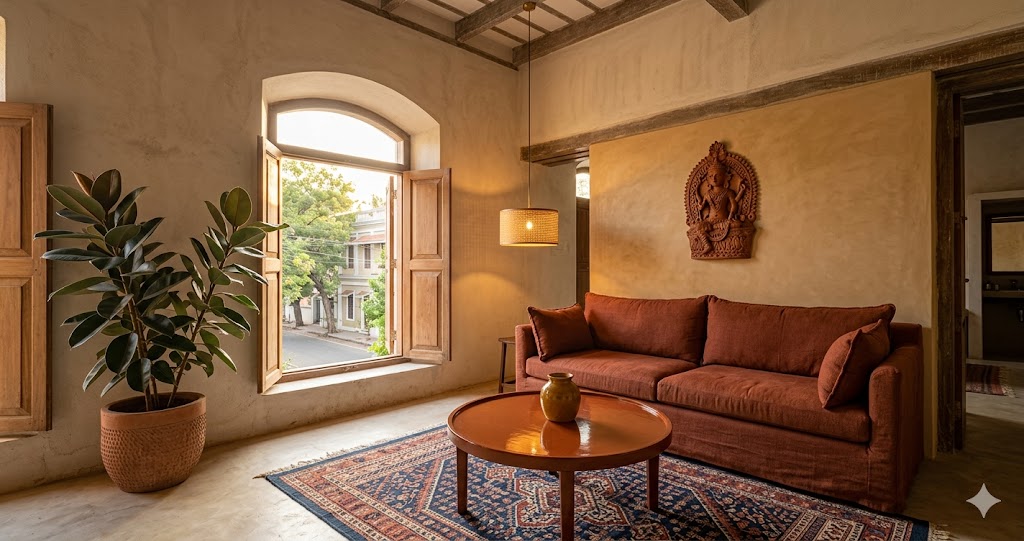
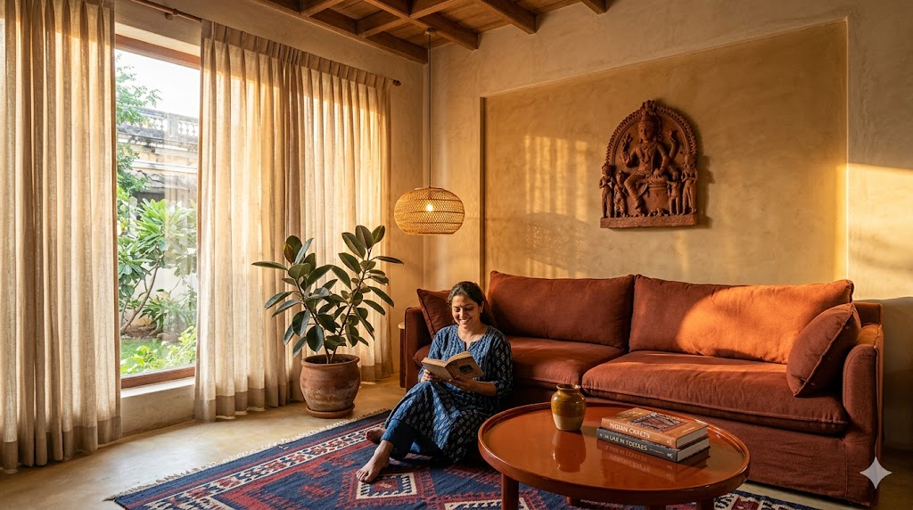
The living room sets the earthy register for the whole apartment. Floor is kota stone, Jaisalmer sandstone, or terracotta tile from Pondicherry — never polished marble or vitrified granite. Walls are mud-tone lime plaster (Bauwerk Clay, Tadelakt India, or a Hunnarshala-trained applicator) with one ochre accent wall behind the sofa. Sofa is rust-khadi or oat linen, low-slung (seat height 38-42 cm), deep enough to fold into — never PU leather or polyester velvet.
Coffee table is a Channapatna-lacquered round in burnt sienna, or a solid teak slab on aged-iron base. Lighting: one cane-and-brass pendant at 2700K over the seating, two jute-shade floor lamps each end of the sofa, brass wall sconces flanking any art. No recessed downlight grid — they flatten the lime plaster and kill the daylight modulation that makes the palette breathe. Accent layer: one large Khurja or Auroville stoneware vessel, one Kutch dhurrie (6 × 9 ft minimum), and a stack of two craft-focused books on the table.
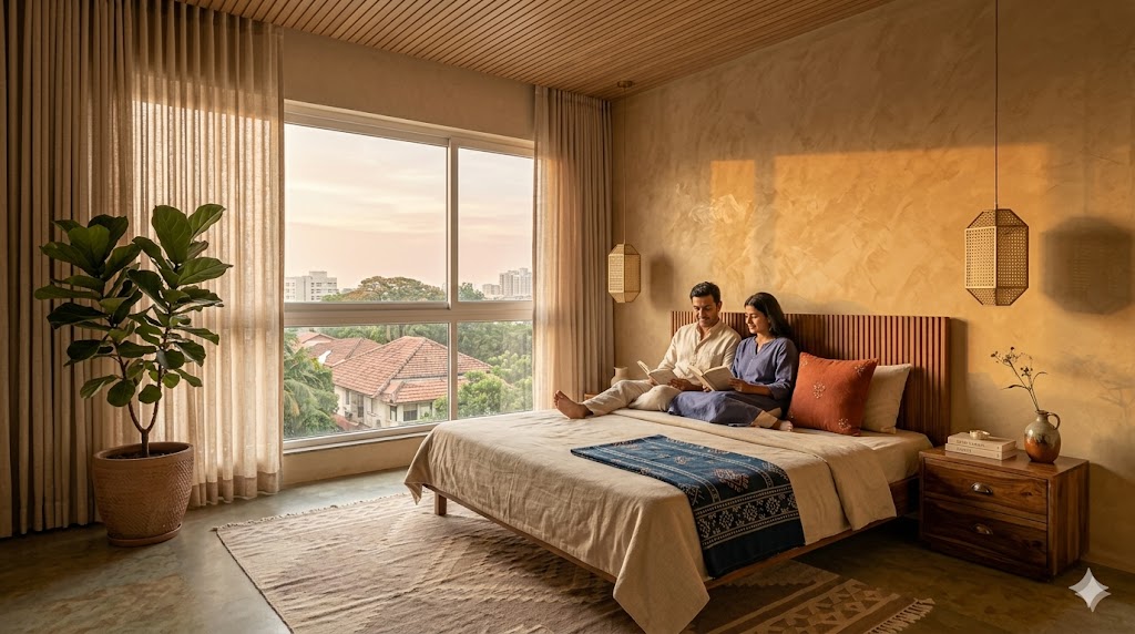
Master bedroom — the rest zone
Bed is a low-slung teak headboard with oat-khadi bedding layered with rust throws and Kutch-block accent pillows. Wall behind the bed is either mud plaster, tadelakt clay panel, or a full-height fluted teak feature wall with shadow-gap joinery. Side tables are solid sheesham bedside drawers with aged-brass cup pulls. Wardrobe is floor-to-ceiling in matched warm teak veneer with shadow-gap divisions — never a contrasting laminate.
Lighting: two bedside cane-shade pendants (suspended from the ceiling, saves table real estate) plus two brushed-brass wall sconces flanking the bed for reading. All bedroom lighting at 2700K, dimmable to 10%. Floor is a generous jute or wool dhurrie over kota or oak.
Kitchen — the most-touched zone
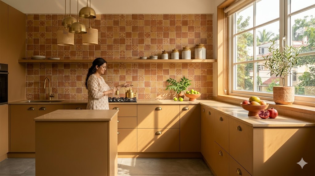
Cabinets in clay-tone matte laminate (Greenlam SwitchSuede Mud, Merino Soft Matte Sand) or warm teak veneer for premium. No high-gloss white anywhere — it reflects kitchen LED and reads cold-clinical against the earth tones. Counter is kota stone, Indian limestone, or a clay-tone quartz; never a black galaxy granite. Backsplash is Athangudi handmade cement tile from Chettinad, terracotta zellige from Pondicherry, or a single slab of warm sandstone to ceiling.
Hardware is aged brass cup pulls or push-to-open in upper cabinets (Hettich Veosys, Häfele systems in brass finish). Lighting is 2700K under-cabinet linear (CRI 90+, never the default 4000K kitchen strip) plus a warm brass-and-cane pendant cluster over the island. Open shelf is one teak ledge above the counter — for four to six Khurja jars in a row, never twelve mixed objects.
Bathroom — the daily ritual zone
Floor and walls in kota stone, tadelakt (the traditional Moroccan lime polish, applied by trained applicators), or microcement in clay tone. Vanity is solid teak with a stone-slab basin or a Khurja ceramic vessel basin. Tap is aged brass or oil-rubbed bronze — never chrome. Mirror is arched, brass-framed, with warm 2700K backlight (never the 4000K vanity-strip default). Accents: a terracotta soap dish, a khadi waffle towel rail, a small Auroville stoneware vase with a single eucalyptus stem.
Study / WFH corner — the focus zone
Desk is a solid walnut or teak slab on an aged-iron base. Chair is a cane-back with leather seat (Sage Living or Phantom Hands) or an oxblood Eames-style. Shelf is a single floating teak ledge with curated books and one hand-thrown vessel. Wall behind the desk is ink olive or charcoal terracotta — a single grounding-deep panel that anchors the focus zone. Lighting is a brass Anglepoise-style task lamp at 3500K plus warm ambient and generous daylight if possible.
Dining and pooja niche — the ritual zone
Dining table is a solid teak or sheesham 8-seater with a rustic edge — not a polished mirror finish. Chairs are Phantom Hands Wegner-cane reissues or a matched solid teak set. The pooja niche folds into the dining or living wall as a tadelakt arched recess with a single brass diya and one idol — never as a separate carved teak temple unit. Wall art is one original Madhubani, Pattachitra, or Warli piece commissioned through Dastkar, Mojarto, or a direct cluster co-operative. Lighting: a brass-and-cane pendant 600 mm over the table at 2700K.
Universal rules across all rooms
- One craft geography per zone — never mix Kutch + Channapatna + Jaipur in one space
- Anchor each room with one solid dark-wood piece — prevents the palette dissolving
- Ceilings always stay light (sand oat or warm white) — never accent the fifth wall in earth tone
- Curtains always floor-to-ceiling, oat or rust khadi/linen, S-fold or pinch pleat
- Hardware in aged brass or oil-rubbed bronze only — never polished chrome or steel
- Plants in terracotta or stoneware pots, never in plastic or glazed white pots
- Switches in matte brass or warm cream — never polished chrome plate
The Indian apartment adaptation layer
- Pooja zone: fold into a tadelakt arched niche with a single brass diya — not a separate carved teak temple
- Servant's entry: same teak veneer as the main door — never a second contrasting laminate
- Balcony: terracotta floor tile + mud-plaster wall + cane chair + rubber plant or curry leaf — extends earthy outdoors
- Vastu alignment: earth tones in the south-west (Prithvi), wood pieces in the east (wood element), water elements in the north-east — earth-pigment hierarchy naturally supports Vastu
- AC outdoor unit: hide behind a clay-tone fluted teak panel — never expose a raw grey metal box on an earthy balcony
- Pet zone: jute or sisal rug instead of wool — survives Indian pet traffic far better, retains the earthy register
Indian Craft Sourcing Guide

Pottery and ceramic
- Auroville pottery studios — hand-thrown stoneware and terracotta, contemporary forms with traditional clay bodies
- Khurja pottery (UP) — affordable stoneware jars, vessels, dinnerware; the workhorse source
- Sanjhi pottery (Mathura) — traditional craft, increasingly contemporary forms
- Mai Hauus — Auroville-school modern ceramic
- Andretta Pottery (HP) — studio ceramics, signature artist pieces
- Claymen Studio (Delhi) — sculptural contemporary ceramic, premium tier
Textiles — rugs, drapery, upholstery
- Jaipur Rugs — hand-knotted wool, fully custom sizing, vegetable-dye options
- Obeetee — premium wool and silk, large bespoke pieces
- Hands Carpets (Bhadohi) — knotted, mid-premium, reliable lead times
- Kala Raksha (Bhuj) — Kutch vegetable-dye co-operative, direct artisan margin
- Anokhi — Jaipur block-printed cotton, throws and bedding
- Fabindia — affordable khadi and linen drapery and bedding
- Good Earth — premium textiles, ceramic, lifestyle (luxury tier)
- Raw Mango — premium handloom for accent throws
Wood — joinery and furniture
- Phantom Hands (Bangalore) — Hans Wegner reissues in solid teak; the gold standard for earthy-modern joinery
- Sage Living (Mumbai) — earthy joinery, contemporary Indian forms
- Beyond Designs (Delhi NCR) — premium bespoke, lime plaster expertise
- Channapatna craft co-operatives (KA) — lacquered native wood, direct sourcing
- Wakefit — entry-tier solid sheesham and mango wood
- The Wishing Chair — mid-tier curated solid wood with craft sensibility
Plaster and wall finish
- Bauwerk Colour — Australian limewash, premium, with certified Indian applicators
- Tadelakt India — Moroccan-tradition clay polish; small but skilled applicator base
- Marrakech Design — Italian lime plaster import
- Domus Innova — Spanish microcement, applicator network in metros
- Auroville Earth Institute — CSEB blocks and traditional mud plaster
- Hunnarshala (Bhuj) — vernacular plaster crafts, training-led applicators
Tile and stone
- Athangudi tiles (Chettinad, TN) — handmade cement tiles, pattern and plain
- Bharat Floorings (Mumbai) — handmade tile, heritage-quality
- Pondicherry terracotta tile works — floor tile, planters
- Kota / Jaisalmer / Dholpur stone — quarried direct or via Rajasthan stone aggregators
- Stonex / R K Marble — Indian limestone, sandstone, quartzite at scale
Lighting
- Klove Studio — sculptural pendants, premium tier
- Beem Light Atelier (Bangalore) — contemporary cane-and-brass
- Sahil & Sarthak — Indian craft-rooted lighting
- Oorjaa (Bangalore) — natural fibre and bamboo pendants
- White Teak — mid-tier, decent earthy range
Hardware
- Hettich (German engineering, Indian assembly) — workhorse, aged brass and oil-rubbed bronze available
- Häfele — premium tier, full earthy hardware range
- Ozone — mid-tier, good brass finishes
- Blum — Austrian, premium hinges and drawer systems
Three Budget Tiers — All-in Estimates
Entry tier — ₹ 3-6 L for a 2 BHK (900-1,100 sft)
DIY-led with select trades. Keep existing flooring; pivot through clay paint, textiles, and select joinery. Save on: kitchen (retain carcass, change shutter laminate to clay tone), floor (retain), paint brand (premium emulsion in mud tones is enough). Splurge on: one good Khurja pottery cluster, one Jaipur Rugs jute or wool dhurrie, two cane pendants.
Typical mix: premium emulsion clay-tone paint walls with one Bauwerk-feel limewash accent wall (achievable with limewash-effect paint at this tier), clay-matte laminate wardrobes, partial kitchen rework with new aged-brass cup pulls, rust khadi sofa from Fabindia or Pepperfry, solid mango wood coffee table, Khurja pottery cluster of 5-7 pieces, Jaipur Rugs jute dhurrie 6 × 9, oat khadi ready-made curtains, 2700K bulb replacement throughout, two cane floor lamps, one Madhubani print. Lead time 8-12 weeks DIY-led.
Mid tier — ₹ 10-18 L for a 2 BHK (1,000-1,400 sft)
Designer-led, mix of bespoke and brand. Lime or clay plaster on at least one full room, kota or terracotta floor in living and dining, designer khadi or linen sofa (Phantom Hands, Sage Living, Beyond Designs), Channapatna-lacquered coffee table, full teak-veneer wardrobes with aged-brass hardware, modular kitchen in clay-tone matte laminate with Athangudi backsplash, layered tier-3 lighting plan, one Oorjaa or Beem statement pendant, S-fold oat khadi drapes throughout, hand-thrown Auroville ceramic clusters.
Save on: hardware brand (Hettich brass works as well as Häfele at half the price), ceramic source (direct from Auroville or Khurja saves 40-60% over retail), wall art (commission direct via cluster co-operatives). Splurge on: lime/clay plaster (skilled labour is the differentiator), teak veneer quality (Indian teak veneer reads warmer than Vietnamese), the one statement craft pendant, one Kutch vegetable-dye dhurrie. Lead time 14-20 weeks designer-led.
Premium tier — ₹ 28-65 L for a 3 BHK (1,400-2,200 sft)
Bespoke joinery, certified plaster, commissioned craft. Mud or tadelakt plaster in four rooms (Hunnarshala-trained or Tadelakt India applicators), Bauwerk limewash accents, solid teak or smoked walnut floors in living, honed Indian limestone in entry, solid teak with fluted wardrobes, Bulthaup-spec or local-equivalent kitchen with Athangudi backsplash, Phantom Hands sofa pair, Channapatna-lacquered round coffee table, solid sheesham bespoke bed, DALI dimming with scene control, Klove or Oorjaa pendants, Belgian linen + Kutch vegetable-dye textiles in tandem, hand-thrown Auroville and Andretta ceramic and original Madhubani / Pattachitra / Warli art.
Save on: imported lighting (a single statement Oorjaa or Klove rivals an imported Apparatus at one-third the price). Splurge on: mud/tadelakt plaster application (it is the signature wall finish), solid teak joinery (it is the warmth anchor for the next 25 years), the commissioned art programme (it is what differentiates earthy-bespoke from earthy-curated). Lead time 26-38 weeks bespoke.
Hidden costs to budget for
- Mud/lime plaster skilled labour: ₹ 200-380 per sft applied (material alone is ₹ 90-160; the labour is the cost)
- Tadelakt application: ₹ 600-1,100 per sft applied — needs a trained applicator, not a regular painter
- Bespoke teak joinery: typically 35-50% of total interior bill, not 15-20%
- Direct craft sourcing freight: budget ₹ 25-60k for crating and shipping pottery from Khurja or Auroville to a metro
- Vegetable-dye textile MOQ: Kutch co-operatives often have 40-60 metre minimums for custom colour runs; plan ahead
- Solid wood lead time: 8-14 weeks from order to delivery for bespoke teak or sheesham
- Athangudi tile lead time: 8-12 weeks from order; each batch is hand-poured, no off-the-shelf inventory
Ten Common Pitfalls That Kill the Style
1. Beige-on-beige flatness. Using two earth tones instead of five reads as a beige room, not an earthy palette. Fix: layer at least 4-6 named earth tones — mud + sand + ochre + terracotta + walnut + olive.
2. Cool grey contamination. Any cool grey on walls, sofa, or rug reads industrial against earth tones. Fix: scrub cool grey out completely; warm grey-beige is the closest acceptable neutral.
3. Chrome hardware. Chrome breaks the brass/iron metal family and reads as a hotel bathroom. Fix: aged brass or oil-rubbed bronze throughout.
4. Plastic-pot plants. Plants in glossy white or plastic pots break the soil-fibre-stone vocabulary instantly. Fix: terracotta or unglazed stoneware pots only.
5. Five craft regions in one room. Kutch rug + Jaipur block + Channapatna + Bastar + Madhubani in one space reads as souvenir shop. Fix: one craft region per zone, two per apartment maximum.
6. High-gloss laminate kitchen. Gloss reflects light and breaks the matte plaster vocabulary. Fix: clay-tone matte or suede laminate, or warm teak veneer.
7. PU leather / leatherette sofa. Telegraphs as synthetic, cracks in 18 months, kills the biophilic story. Fix: khadi, linen, raw cotton, or genuine vegetable-tanned leather only.
8. 4000K+ cool-white LEDs. Cool LEDs strip the warmth out of earth tones and read greenish on terracotta. Fix: 2700-3000K throughout, CRI 90+.
9. Single-source overhead downlight grid. Flattens lime plaster and kills the daylight modulation that earthy palettes depend on. Fix: layered tier-3 lighting plan, minimum five sources per room, all dimmable.
10. Souvenir-shop accumulation. Too many small ethnic objects on every surface reads as theme-restaurant, not earthy interior. Fix: ruthless edit — one large statement craft piece per zone, not five small ones.
The diagnostic question
Walk into your room with all lights off, only daylight from the window. If you can immediately name the soil, plant, or pigment for at least three surfaces within arm's reach, and the room reads as grounded and biographical — you have an earthy interior. If you read "beige interior" or "ethnic theme," you have either a neutral box or an over-curated souvenir room. The naming test predicts the style match more reliably than any photograph.
How an Earthy Palette Differs from Adjacent Styles
| Style | Palette | Wood | Pattern density | Best for |
|---|---|---|---|---|
| Earthy | Mud, terracotta, rust, ochre, olive, walnut | Teak, sheesham, walnut, Channapatna | Medium — craft patterns layered carefully | Heritage homes, regional anchoring, biophilic-minded |
| Warm Minimal | Oat, beige, warm white + earth accent | Oak, teak, walnut, cane | Low — restraint is the discipline | Premium urban apartments seeking calm |
| Japandi | Off-white + black + smoked wood | Smoked oak, walnut, dark cane | Very low — geometric restraint | Compact urban, dual influences |
| Wabi-Sabi | Earth tones + raw textures | Reclaimed, weathered | Low but irregular | Heritage, slow-life sensibility |
| Mediterranean Modern | Warm white + terracotta + olive | Olive, oak, cane | Low — clean curves dominate | Coastal climates, sea-leaning |
| Indian Eclectic | Anything goes | Anything goes | High — accumulation is the point | Joint-family homes, maximal collectors |
| Boho | Earth + jewel + global pattern | Reclaimed, mixed | Very high — multi-region pattern | Renters, travelers, casual-creative |
The closest cousin is Wabi-Sabi (similar earth palette, similar matte textures) — earthy is essentially the regionally-anchored Indian adaptation of the Wabi-Sabi instinct, but more composed and intentional. The closest competitor is warm minimal — warm minimal uses earth tones as 5-10% accent against a 70% oat-beige base; earthy inverts the ratio and uses earth tones as 60-80% of the palette.
When an Earthy Palette Is Wrong For You
An earthy palette is the right answer for ~30-35% of Indian homes. It is the wrong answer for:
- Homeowners with a strong preference for cool palettes — if you genuinely prefer blues, greys, and crisp whites, an earthy palette will read as "warm and heavy" instead of "grounded and biographical"
- Compact studio apartments under 450 sft — earthy palettes need at least one accent wall and one grounding-deep piece, which can feel oppressive in very small spaces (consider Compact Luxury Apartment Guide or Space Efficient Homes)
- Homes with very low natural light — earth tones depend on daylight modulation; in a dim north-facing apartment, they can flatten into mud
- Homeowners who travel a lot and want low-maintenance finishes — lime plaster and tadelakt require gentler cleaning than emulsion paint
- Buyers seeking resale optimisation in mainstream markets — earthy is a strong personal choice; buyers who want broad resale appeal often prefer warm minimal or contemporary neutral
If any of the above describes you, consider Warm Minimal Interiors (the closest neighbour, more universally appealing), Japandi Apartment Interior Guide (lower-key, more compact-friendly), or Budget Luxury Interiors (broad resale-friendly baseline).
Where to Go Next
- For the closest neighbour style — Warm Minimal Interiors
- For Japandi fusion adaptation — Japandi Apartment Interior Guide
- For sustainable craft-led sourcing — Sustainable Interiors India Guide
- For tight-budget earthy — Budget Luxury Interiors
- For AI-assisted earthy palette visualisation — AI-Powered Interiors
- For fluted teak wall detail — Fluted Panel Design Guide
- For storage in earthy apartments — Smart Storage Interiors
- For compact apartment adaptation — Compact Luxury Apartment Guide
- For space-efficient earthy layouts — Space Efficient Homes
- For wardrobe finish specifics — Wardrobe Finish Ideas
- For kitchen scope — Modular Kitchen Design Guide
- For false ceiling planning — False Ceiling Design Guide
- For waterproofing earthy bathrooms — Waterproofing Guide
- For RERA and project approvals — RERA Guide
References
1. Bawa, G. + Robson, D. (2002). Geoffrey Bawa — The Complete Works. Thames & Hudson. (Tropical earthy regional reference; foundational Indian-subcontinent influence.)
2. Vervoordt, A. (2010). Wabi Inspirations. Flammarion. (Material depth and earth-tone restraint — closest adjacent vocabulary.)
3. Doshi, B. V. (2019). Balkrishna Doshi — Architecture for the People. Vitra Design Museum. (Mud and earth in Indian modern architecture.)
4. Correa, C. (1996). Charles Correa — A Place in the Shade. Thames & Hudson. (Indian climate-rooted material thinking.)
5. Rewal, R. (2013). Raj Rewal — Innovative Architecture and Tradition. Om Books. (Sandstone and Indian craft in contemporary form.)
6. Pallasmaa, J. (2012). The Eyes of the Skin — Architecture and the Senses. Wiley. (Tactility theory underlying earthy material logic.)
7. Zumthor, P. (2006). Atmospheres. Birkhäuser. (Atmospheric warmth without ornament.)
8. Bhatia, G. (1994). Punjabi Baroque and Other Memories of Architecture. Penguin India. (Indian material vernacular criticism — useful counterpoint.)
9. Tillotson, G. (1989). The Tradition of Indian Architecture. Yale University Press. (Material vocabulary lineage.)
10. Auroville Earth Institute (2018). Earthen Architecture Manual. AVEI Press. (Mud plaster and CSEB technical reference.)
11. Bauwerk Colour Application Guide (2024). Limewash and lime plaster application standards.
12. Tadelakt India Specification Sheet (2025). Tadelakt application standards for Indian humidity zones.
13. Indian Standard IS 712:1984. Building Limes — specification. (Lime plaster baseline.)
14. Indian Standard IS 2046:1995. High-Pressure Decorative Laminates. (For matte laminate specification.)
15. Crafts Council of India. Living Crafts Directory. Regularly updated. (Cluster-by-cluster contact and lead-time reference.)
Author's note: An earthy palette is the style I would specify for ~30% of new Indian apartment commissions in 2026 — and for nearly all heritage retrofits, farmstays, boutique hotels, and homes in Pondicherry, Goa, Auroville, the hill stations, and the western desert. The reason is rootedness — the palette comes from where the home actually is. A warm minimal apartment in Bangalore could just as easily be in Lisbon or Melbourne. An earthy apartment with Khurja pottery, Kutch dhurries, and Channapatna lacquerware can only be in India — and only in this particular India. That biographical specificity is the longest-life design choice an Indian homeowner can make today. The styles that don't survive a decade are the ones that lean on imported trend. The styles that survive — and gain patina over time — are the ones built on regional material truth. Earthy, executed with discipline, is one of those.
Disclaimer: Material costs, brand sources, craft cluster lead times and paint references are 2026 indicative and shift with currency, import duties, raw material availability and cluster co-operative capacity. Verify sourcing with current vendor and cluster quotes. Hex codes are approximate references — always confirm against a physical paint swatch under the room's actual daylight at 8 am, 1 pm and 6 pm before committing, as earth tones shift more across the day than any other palette. Vendor and craft cluster mentions are illustrative; Studio Matrx has no commercial relationship with any brand named. Studio Matrx, its authors and contributors are not responsible for procurement or installation outcomes based on this guide.
Export this guide
Related Guides — Deep-dive reading
Japandi Apartment — A 2026 Style Guide for Compact Indian Homes
Japanese restraint × Scandinavian function · Low furniture · Two-wood discipline
Design StylesWarm Minimal Interiors — A 2026 Style Guide for Indian Homes
Restraint with warmth · Oat & oak & linen · Curated negative space
Design StylesCompact Luxury Apartment — A 2026 Working Reference for Premium 1-2 BHK Indian Homes
Four-pillar discipline · Ten signature moves · Three budget tiers ₹22-90L
Room PlanningRelated Tools — Try Free
Cross-Ventilation Analyzer
Estimate airflow and air changes per hour (ACH) from room size, window areas, layout, and local wind — with NBC 2016 Part 8 compliance check.
Ventilation CalculatorCircadian Light Meter
Patient-centric circadian lighting visualizer for Indian healthcare design — time-of-day × intensity → CCT, melanopic lux (EML / mEDI), melatonin suppression, and an alertness curve. Calibrated against WELL v2 L03 Circadian Lighting Design, CIE S 026:2018, Brainard 2001, and Lucas et al. 2014.
Circadian ToolFalse Ceiling Cost Estimator
Live ₹/sqft across 8 ceiling types — POP, gypsum, designer, metal, PVC, wooden — with cove and spot lighting for 20 Indian cities.
Cost Calculator