
Space Planning Mistakes That Make Homes Feel Smaller
The layout and planning errors that shrink your home — and the fixes that win back square feet
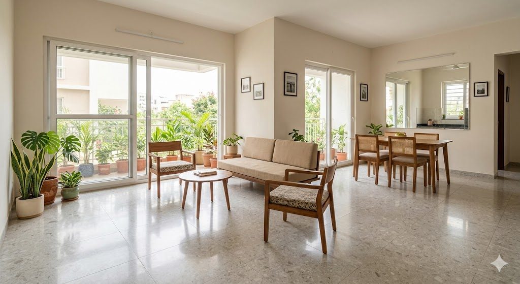
Priya and Karthik moved into their new 1,150 sq ft 3BHK in Whitefield, Bengaluru, expecting it to feel like the show flat. It didn't. The corridor ate the centre, the L-shaped sofa they had bought for their old rental swallowed the living room, the kitchen felt like a tunnel, and every evening the home felt darker and tighter than the brochure ever did. The carpet area was almost identical to the unit two floors up that felt airy and generous. Same walls, same square feet — completely different feeling.
That gap between the area you paid for and the space you actually feel is almost never about the number on the sale deed. It is about planning. The way circulation is routed, where furniture lands, whether your eye can travel across the home, how light falls, and how the floor reads — these decisions decide whether a 1,150 sq ft flat feels like 1,000 or 1,400. If you are still in the planning or buying stage, read the pillar guide on planning your dream home before the architect first; this spoke zooms into the specific mistakes that shrink a home and the fixes that win the square feet back.
The core idea: perceived size is a design output, not a fixed property of your carpet area. You cannot easily add floor, but you can almost always recover the feeling of more floor — by fixing circulation, sightlines, scale, light and tone. This guide is mistakes-first and homeowner-facing. For the professional planning discipline behind it, see our companion space planning principles guide.
Why two identical flats feel different
Two units with the same carpet area can feel a full size category apart. The reason splits into two buckets, and it helps to know which one you are fighting.
The first bucket is real wasted area — square feet you paid for that you cannot live in. A dead corridor, a door that swings into the only usable corner, a buffer space between two over-walled rooms. This is physical loss, and the only cure is a better plan.
The second bucket is perceived loss — area that is technically usable but reads as smaller because the eye is stopped short, the room is dark, the floor is chopped up, or the furniture is fighting the walls. This loss costs you nothing to recover beyond decisions and a weekend of rearranging.

The map above plots the common mistakes by both axes. The green cluster — clutter, flat lighting, dark finishes — is pure perception and cheap to fix. The red cluster — corridor-led circulation, too many small rooms, blocked sightlines — is baked into the plan and must be caught early, ideally before a wall is built or a flat is bought. The whole game is to fix the perception levers tonight and design out the plan-level mistakes before they are poured in concrete.
The twelve mistakes, ranked by what they cost you
Here is the full list before we go deep on each. Read it as a triage: the top three are plan-level and expensive to undo, the bottom ones are finishing-level and free to fix.
| # | Mistake | Why it shrinks the home | The fix | Typical gain |
|---|---|---|---|---|
| 1 | Corridor-heavy circulation | 10-15% of floor lost to passage only | Absorb movement into rooms; open the core | 100-140 sq ft back |
| 2 | Too many small rooms | Walls, swings and buffers steal area | Open-plan the public zone; keep bedrooms cellular | 60-120 sq ft feel |
| 3 | Blocked sightlines | No visual depth; the eye stops at a wall | Align doors, glaze partitions, frame a diagonal view | Feels 1 size bigger |
| 4 | Oversized / mis-placed furniture | Floor and sightlines swallowed | Scale to the room; float pieces off walls | 30-50 sq ft feel |
| 5 | Door swings clashing | Usable corners become no-go zones | Sliding/pocket doors; re-hang swings | 8-15 sq ft per door |
| 6 | Mismatched flooring | Chopped floor reads as many small bits | One continuous floor through public areas | Feels noticeably bigger |
| 7 | Blocked / undersized windows | Dark rooms feel boxed and heavy | Free up windows; size them to NBC daylight | Feels brighter, larger |
| 8 | Flat, single-source lighting | No depth; walls and corners go grey | Layer ambient, task and accent light | Feels deeper |
| 9 | Dark, heavy materials in small rooms | Surfaces advance; edges close in | Light, low-contrast palette; reflective accents | Feels airier |
| 10 | No vertical thinking | Wasted height; storage spills onto floor | Build to the ceiling; full-height curtains | More floor stays clear |
| 11 | Cluttered surfaces | Visual noise reads as crowding | Closed storage; clear 80% of surfaces | Instant, free |
| 12 | Ignoring the entrance | A cramped threshold sets a small tone | Give the door a breath of space and light | Sets the whole mood |
1. Corridor-heavy circulation — the biggest, quietest thief
Circulation is the area you walk through but never live in. In a poorly planned Indian flat, a long internal corridor connecting bedrooms can swallow 10-15% of the carpet area while doing nothing but ferrying you from door to door. On a 1,000 sq ft flat that is 100-150 sq ft — an entire small bedroom's worth — paid for and unlivable.
The fix is to stop treating circulation as a dedicated space and start absorbing it into rooms. Open-plan the living-dining-kitchen public zone so that movement threads along the edges of a usable room instead of down a sealed passage. Push bedroom doors off a shared lobby pocket rather than a long spine. The before/after below shows the same 1,000 sq ft slab planned both ways.

A dedicated corridor is the most expensive square footage in your home — you pay full price per square foot and you can never put a single thing in it. Design it down to near zero and the room budget gets larger for free.
If you are still choosing between flats, count the corridors when you tour a unit. Our guide to evaluating a builder floor before buying and the floor-plan reading guide both walk you through spotting wasted circulation on a brochure plan before you sign.
2. Too many small rooms versus open planning where it fits
The Indian instinct is to compartmentalise — a separate formal living, a separate family living, a separate dining, a separate puja, all walled off. Each wall is roughly 4-6 inches thick, each doorway needs a swing buffer, and each small room needs its own circulation. Chop a 350 sq ft public zone into three 110 sq ft boxes and you lose area to walls and gain three rooms that each feel cramped.
The fix is not to knock down every wall — privacy still matters. The rule of thumb: open-plan the public, social, daytime zone (living-dining-kitchen) and keep the private, night-time zone (bedrooms, toilets) cellular. An open public core reads as one generous volume; cellular bedrooms keep acoustic and visual privacy where you actually need it. This is exactly the discipline our space planning principles guide formalises for professionals.
A caveat for Indian kitchens: fully open kitchens fight tadka smoke and oil. The middle path is a half-open kitchen with a sliding glass partition or a breakfast counter that keeps the sightline open while containing the cooking. You keep the spacious read without the greasy living-room sofa.
3. Blocked sightlines and no visual depth
Perceived size is mostly about how far your eye can travel. Walk into a flat and if your gaze stops two metres away at a blank wall, the home feels small no matter the carpet area. If you can see diagonally across the home to a window or a far corner, the same flat feels expansive.
The fixes are cheap and powerful:
- Align openings. Position the front door, internal doorways and a far window so they line up — the eye runs straight through to daylight.
- Frame a diagonal. The longest line in any room is the diagonal. Place the sofa and TV so the main view runs corner-to-corner, not wall-to-wall.
- Glaze or lower partitions. Where you must separate, use a half-height divider, a fluted-glass partition or an open shelf unit instead of a solid wall. Borrowed light and a partial view keep the depth.
- Mirror the depth. A mirror on the far wall of a short room visually doubles the sightline. Place it to reflect a window, never a clutter zone.
This single lever — visual depth — is often the difference between a flat that feels one size larger and one that feels one size smaller. Our make apartments feel bigger guide goes deeper on sightline tricks for rentals and compact flats.
4. Oversized furniture and furniture against every wall
Priya and Karthik's L-shaped sofa was bought for a 4BHK rental and dragged into a 1,150 sq ft flat. It is the single most common shrinking mistake in Indian homes: furniture scaled to the old place, not the new one. An oversized sofa swallows floor, blocks the path and cuts the sightline in half.
Two principles fix most of it:
- Scale to the room, not the showroom. In the showroom everything looks small under double-height ceilings and acres of floor. Measure your room, tape out the furniture footprint on your floor, and leave at least 90 cm of clear walkway around the main path. A 2-seater plus two slim chairs often beats a giant 3+2 set in a real living room.
- Float the furniture; do not line every wall. The Indian default is to push every piece against the perimeter, leaving a dead pool in the middle. Pulling the sofa a few inches off the wall, choosing pieces with visible legs, and letting the floor show under and around furniture all read as more space. Visible floor equals perceived floor.
Plan the layout before you buy. Our layout planner and furniture layout designer let you test furniture footprints and walkways against your real room dimensions, so you discover the oversized-sofa problem on screen instead of after the delivery truck leaves.
5. Doors and swings eating usable area
Every hinged door sweeps a quarter-circle of floor that you cannot furnish. In a tight bedroom, the door swing plus the wardrobe shutter swing plus the toilet door swing can sterilise 15-25 sq ft and create clashes where two doors fight for the same air.
The fixes:
- Re-hang the swing. A door hinged on the other side or opening outward into a circulation space instead of into the room can free a whole corner.
- Go sliding or pocket. Sliding wardrobe shutters save the entire swing depth. A pocket door (sliding into the wall cavity) for a toilet or utility recovers a usable quarter-circle.
- Audit clashes on the plan. Before construction, draw every door swing on the plan and look for overlaps and dead corners. This is a five-minute check that saves years of an awkward room.
6. Mismatched flooring that chops the floor visually
A continuous floor reads as one large plane; a floor broken into different materials and patterns reads as several small ones. Many Indian homes change flooring at every doorway — vitrified in the living, a different tile in the dining, granite in the kitchen, a wooden-look in the bedroom — and the eye registers each patch as a separate, smaller zone.
The fix is the simplest high-impact move in the book: run one continuous floor through the connected public areas. Same large-format tile or same finish flowing from the entrance through living and dining, with no thresholds or border bands, makes the whole public zone read as a single generous space. Keep wet areas (kitchen, toilets, balconies) appropriately different for function, but stop the decorative borders and inlays that slice the floor into postage stamps. Larger tiles (600x1200 mm and up) with thin, colour-matched grout further dissolve the joints.
7. Blocked and undersized windows killing light
A dark room always feels smaller, heavier and more enclosed than a bright one of the same size. Two things steal daylight: undersized windows (some builder units provide the bare minimum) and blocked windows (a wardrobe parked across a window, heavy dark curtains, a stacked store room on the sill).
The fixes:
- Free the window. Move furniture and storage off the window wall. Never block a window with a tall wardrobe — that one move can darken an entire room.
- Size windows to daylight. If you are building, the National Building Code 2016 sets minimum window-to-floor ratios for habitable rooms (broadly around one-tenth of floor area for light); aim above the minimum on the sunlit faces.
- Dress windows tall and light. Hang curtains from ceiling to floor and wider than the frame, in light sheer fabric. The window reads larger and more light enters.
If your home feels gloomy despite decent windows, our dedicated why your home feels dark guide diagnoses the usual culprits room by room.
8. Flat, single-source lighting
One tube light or one ceiling fixture flattens a room. With a single overhead source, the corners and walls fall into shadow, the room reads as a grey box, and the eye has no depth to travel. Layered light does the opposite — it pushes the walls back and gives the room dimension.
The fix is three layers in every important room:
| Layer | What it does | Examples |
|---|---|---|
| Ambient | General fill | Cove / recessed / soft ceiling light |
| Task | Where you work | Under-cabinet, reading, study lamp |
| Accent | Adds depth, lifts corners | Wall washers, picture lights, floor lamps |
Lighting the corners and walls — not just the centre — is what makes a room feel larger. A wall washer that grazes light up a far wall reclaims that wall from shadow and adds perceived depth at the cost of one fixture.
9. Dark colours and heavy materials in small rooms
Colour and material change how close a surface feels. Dark, saturated, glossy or heavily textured surfaces advance toward you and close the room in; light, matte, low-contrast surfaces recede and open it up. A small room finished in dark teak panelling and a deep accent wall will feel like a cave; the same room in warm off-white with one restrained accent feels airy.
The fix is not a sterile all-white box. It is a light, tonal palette — walls, large furniture and floor in a close family of light, warm neutrals so the edges between surfaces soften and the room reads as one continuous volume. Reserve dark and dramatic for large rooms or small accent doses (a single chair, cushions, art). Add reflective touches — a mirror, a glass-topped table, a polished surface — to bounce light. This is the same restraint our compact luxury for small homes guide uses to make tight footprints feel rich rather than cramped.
10. No vertical thinking — wasted height and low storage
Most Indian flats have 2.9-3.1 m of height and almost everyone ignores the top third. Storage stops at 7 feet, leaving a dead band above; meanwhile possessions overflow onto floors and surfaces because there is not enough storage. Both problems are solved by going up.

The vertical fixes:
- Build storage to the ceiling. Wardrobes and units that run full height add a loft of storage and, by drawing the eye up, make the ceiling feel higher.
- Hang curtains at the ceiling, not the window top. Full-height drapes lift the perceived ceiling and the perceived window.
- Use the dead band over doors. Loft cabinets above doors and passages store the once-a-year items off your living floor.
Getting storage right is half the battle against a cramped home — see our smart storage ideas and the deeper why wardrobes become inefficient for the storage planning that keeps floors clear.
11. Cluttered surfaces and visual noise
A room with every surface covered — the dining table doubling as a dump zone, the kitchen counter buried, the TV unit crowded with objects — reads as crowded and therefore small, even when the floor plan is generous. Visual noise is interpreted by the brain as spatial crowding.
The fix is free and immediate: closed storage and clear surfaces. Aim to keep about 80% of horizontal surfaces clear. Give every category of object a home behind a shutter so it lands there instead of on a counter. One open shelf styled with three objects reads calmer and bigger than ten shelves crammed full. This is the central theme of our why Indian homes feel cluttered guide, which is worth reading alongside this one.
12. Ignoring the entrance and transition
The entrance sets the emotional scale for the whole home. Walk straight from a corridor into a tight, dark, shoe-strewn pocket and the brain files the home as small from the first second. A threshold with a breath of space, a spot of light and a clear sightline into the home does the opposite.
The fix does not need much area — it needs intent. Keep the first two metres uncluttered. Add a slim console or a wall niche for keys and shoes instead of a pile. Place a light and, if possible, a long sightline so that the moment you step in, your eye is pulled into the depth of the home rather than stopped at a coat hook.
The perceived-size levers, in one table
When you cannot add a single square foot, these are the levers that buy back the feeling of more. Pull the top two or three and a tight flat can feel a category larger.
| Lever | Mechanism | Effort | Where it wins most |
|---|---|---|---|
| Long sightlines | Eye travels far, depth reads as size | Plan + layout | Open public zones |
| Natural light | Bright corners push walls back | Free up windows | Every room |
| Continuous floor | One plane reads as one big space | Material choice | Living-dining |
| Right-sized furniture | Visible floor equals perceived floor | Buy / rearrange | Living, bedrooms |
| Vertical thinking | Eye lifts, floor stays clear | Joinery | Storage-heavy rooms |
| Light tonal palette | Soft edges dissolve, surfaces recede | Paint / finish | Small rooms |
Before and after, in plain logic
It helps to hold the contrast in your head as you plan or renovate.
| Aspect | Feels smaller | Feels bigger |
|---|---|---|
| Circulation | Dedicated corridors | Movement absorbed into rooms |
| Layout | Many small walled rooms | Open public zone, cellular bedrooms |
| Sightlines | Eye stops at a wall | Diagonal view to a far window |
| Furniture | Oversized, lining every wall | Scaled, floated, legs visible |
| Doors | Hinged, swings clashing | Sliding / pocket where tight |
| Floor | Chopped into materials | One continuous surface |
| Light | One flat overhead source | Layered ambient + task + accent |
| Palette | Dark, heavy, high-contrast | Light, tonal, low-contrast |
| Storage | Low, floor-bound, overflowing | Full-height, ceiling-reaching |
| Surfaces | Cluttered, every surface full | 80% clear, closed storage |
Get it right, in order
Work top-down — the early, plan-level moves are the ones you cannot redo later, so spend your attention there first.
1. Audit circulation first. On the plan, mark every metre you only walk through. If a dedicated corridor exceeds about 10% of carpet area, redesign it before anything else.
2. Decide open versus cellular by zone. Open-plan the living-dining-kitchen public zone; keep bedrooms and toilets cellular for privacy. Add a sliding partition where smoke or sound matters.
3. Plan the longest sightlines. Align the entry, doorways and a far window. Frame the main room around its diagonal.
4. Check every door swing. Draw them all; eliminate clashes and dead corners with re-hung, sliding or pocket doors.
5. Choose one continuous floor for the connected public areas, with large tiles and matched grout.
6. Size and free the windows; plan three layers of light in every important room.
7. Scale and float the furniture; tape the footprints before you buy, leaving clear walkways.
8. Go vertical with storage and curtains, and keep 80% of surfaces clear with a light, tonal palette.
Working through this list by hand is doable, but it is faster with a plan to react to. DesignAI — Studio Matrx's AI design tool — can take your carpet area, room dimensions and brief and draft a circulation-efficient layout, flag corridor waste and door clashes, suggest furniture scaled to each room, and generate a brief and BOQ you can hand to a designer or contractor. It is the quickest way to test the fixes in this guide against your real floor plan before you commit money to walls or furniture.
References
1. National Building Code of India 2016 (NBC 2016), Bureau of Indian Standards — Part 8 (Building Services) and Part 3 on lighting, ventilation and minimum room/window provisions for habitable spaces.
2. Francis D. K. Ching, Architecture: Form, Space and Order — on circulation, spatial sequence, datum and the perception of depth and scale.
3. Real Estate (Regulation and Development) Act, 2016 (RERA) — carpet area definition and disclosure norms relevant to understanding what area you actually own.
4. Bureau of Indian Standards, IS codes on residential planning and anthropometric clearances for circulation and furniture spacing.
5. Council of Architecture (CoA), India — guidance on residential space standards and the role of planning in liveable homes.
6. Christopher Alexander et al., A Pattern Language — patterns on light on two sides of a room, intimacy gradient and the feel of interior space.
Keep planning a home that lives larger than its plan: read the pillar on planning before the architect, the professional space planning principles, make apartments feel bigger, compact luxury for small homes, why Indian homes feel cluttered and why your home feels dark.
Export this guide
Related Guides — Deep-dive reading
Space-Efficient Homes — A 2026 Working Reference for Compact Indian Apartments
Five spatial multipliers · Floor plan tricks · Dual-purpose furniture
Room PlanningStorage Planning Before Interior Design
Why storage must be planned first — audited, budgeted and given its floor area — before a single layout, colour or sofa is chosen. The homeowner's plan-it-first master guide for Indian homes.
StorageStorage Design for Small Apartments
How to build real storage into a 1RK, 1BHK or 2BHK builder flat from the layout stage — not by buying more boxes, but by designing for height, dead space and double-duty furniture.
StorageRelated Tools — Try Free
Cross-Ventilation Analyzer
Estimate airflow and air changes per hour (ACH) from room size, window areas, layout, and local wind — with NBC 2016 Part 8 compliance check.
Ventilation CalculatorAcoustic Privacy (STC) Visualizer
Indian healthcare acoustic visualizer — compare wall assemblies and noise sources, see received SPL after STC attenuation, and check FGI 2018 / IS 1950 / NABH speech-privacy compliance with live dual-canvas waveform.
Acoustic ToolApartment Furniture Size Chart
Standard furniture dimensions for Indian apartments — sofas, beds, tables, dining, storage.
Reference Chart