
Compact Luxury: Designing Small Homes That Feel Expensive
How small Indian homes — flats and independent houses — can feel genuinely luxurious through proportion, light and material discipline
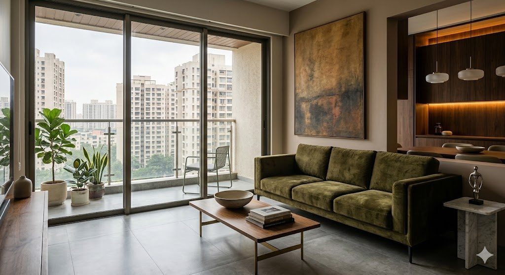
Priya and Karthik bought a 1,150 sq ft 2BHK in a tower off Sarjapur Road, Bengaluru. On the day of possession they walked their friend Meghna through it, apologising the whole way: "It is small, we know, we will manage." Six months and one good designer later, Meghna came back for dinner and stopped in the doorway. "Wait," she said. "This is the same flat? It feels twice the size. It feels like a hotel suite." Nothing structural had moved. No wall was demolished. The carpet area on the sale deed was identical. What changed was every decision about light, material, proportion and what stayed off the surfaces — and those decisions, not the square footage, are what made a small home read as expensive.
This guide is about that gap: why a small home can feel either cramped and cheap or generous and luxurious on exactly the same floor plan. It covers the universal principles that make small feel expensive — spatial generosity, light, material discipline, proportion, concealment, the entrance moment, reflection and indoor-outdoor connection — and it covers the cheap-cues to ruthlessly avoid. It is deliberately broad: it applies to small flats, but also to small independent houses, narrow plots, row houses and compact villas, because the same physics of perception governs all of them. This is one of the deep dives in our home-planning pillar guide, and it pairs with the early-stage decisions you make before you ever meet an architect.
The core idea is this: luxury is not square footage. Luxury is the quality of decisions — and small homes, with fewer surfaces and fewer rooms to get right, are arguably easier to make feel expensive than large ones, because every rupee and every choice lands somewhere visible. A 900 sq ft home where five things are done beautifully will out-feel a 2,400 sq ft home where forty things are done indifferently.
"Small" and "luxurious" are not opposites
We have been trained — partly by builder marketing, partly by Instagram — to equate luxury with size: the bigger the carpet area, the higher the lift count, the grander the lobby, the more "premium" the home. But walk into any genuinely luxurious small space — a well-designed boutique-hotel room, a Japanese ryokan, a tightly planned European city flat — and the feeling is unmistakable: calm, considered, expensive. None of them are large.
Luxury, properly understood, is about three things, none of which require floor area:
- Quality — the materials, finishes and joinery are good, and they are allowed to be seen.
- Restraint — there are fewer things, fewer colours, fewer competing elements, so the eye can rest.
- Consideration — every decision looks deliberate, because it was: the light, the proportion, the sightlines, where storage hides.
A small home actually has an advantage here. A 2,000 sq ft home tempts you to fill it; a 900 sq ft home forces you to choose. Constraint is a design gift. The discipline a small footprint imposes is exactly the discipline that reads as luxury. The trick is to lean into the smallness rather than apologise for it.
A small home where five things are done beautifully will always out-feel a large home where forty things are done indifferently. Luxury is the quality of decisions, not the count of square feet.
If your home is specifically a city apartment, our compact luxury apartment guide goes deep on flat-specific moves — fluted partitions, builder-floor constraints, society approvals, room-by-room application — and we will defer that depth to it. This guide stays broader: the universal principles that work whether you are in a tower flat, a 20×30 site house in Mysuru, a row house in Pune or a compact villa on the edge of Hyderabad.
The levers that make small feel expensive
Not every move costs the same or delivers the same. Some give you an enormous shift in "feel" for very little money; others are expensive and only marginally move the needle. The single most useful mental model is to rank your levers by feel-per-rupee.

1. Light — the single biggest multiplier
If you do only one thing, fix the light. Nothing else moves "feel" as far per rupee. A small room flooded with good natural light and layered with warm artificial light at night reads as expensive almost regardless of what is in it. The same room under a single cool-white tube-light reads as a hostel — even with expensive furniture in it. We have an entire guide on why your home feels dark and how to fix it; here are the small-home essentials.
Maximise natural light. Keep window walls clear. Use the lightest, sheerest possible day curtains (or none, with a roller blind that fully retracts). Do not block a window with a tall wardrobe. Paint window reveals the same colour as the wall so the opening feels larger. If you are building or renovating an independent small house, the highest-leverage move you can make is light: a courtyard, a light well, a stairwell skylight, or full-height glazing onto a terrace will transform a tight plan.
Layer artificial light. The cheap-feeling home has one fixture per room on one switch — flat, shadowless, institutional. The expensive-feeling home has three layers:
| Layer | What it does | Typical small-home fittings |
|---|---|---|
| Ambient | Soft fill, no glare | Cove/recessed warm LED, or a dimmed central source |
| Task | Light where you work | Under-cabinet kitchen strip, reading lamp, mirror light |
| Accent | Drama, depth, focus | Picture light, a single pendant, a corner floor lamp |
Two non-negotiables for a small home: warm colour temperature (2700K–3000K, never 6500K cool-white in living spaces) and dimmers on the main circuits. A dimmer is the cheapest luxury upgrade in existence — perhaps ₹800–₹2,500 per circuit — and instantly turns a flat-lit room into an evening room.
2. Sightlines and spatial generosity
The brain judges size by the longest line it can see, not by the floor area on paper. A 110 sq ft room you can see all the way across feels bigger than a 140 sq ft room chopped by a half-wall. The whole game in a small home is to give the eye long, uninterrupted runs.
- Open-plan the public zone. Merge living, dining and kitchen into one visually continuous space wherever the structure allows. You are not adding area; you are removing the walls that were slicing the area you have into small, separately-perceived boxes.
- Protect the longest sightline. Identify the longest diagonal in your home — usually from the entrance through to a far window or balcony — and keep it clear. That single uninterrupted view does more for perceived size than any amount of "space-saving furniture".
- Borrow space. A balcony, terrace, courtyard or even a well-framed corridor read as part of the room if you treat them continuously: same floor where possible, glazing instead of solid wall, a view kept open. The balcony becomes a borrowed room (more on this below).
- Use ceiling height. Floor area is fixed; volume is not always. If you have any height to give — a double-height living space in an independent house, an exposed slab, a taller-than-standard floor-to-ceiling in a villa — use it. Even in a flat, drawing the eye up with a tall curtain (rod near the ceiling, not at the window top) or a vertical fluted panel adds perceived volume.
Getting the moves vs the mistakes right here is half the battle — our companion guide on space-planning mistakes that make homes feel smaller catalogues the most common ones, and our space-efficient homes guide and make apartments feel bigger go deeper on the layout mechanics.

3. Material discipline — fewer, better, continuous
Cheap-feeling homes have too many materials fighting: a printed-marble floor here, a wood-laminate there, a stone-tile feature wall, a glossy acrylic kitchen, three different door finishes. The eye reads the busyness as low quality even when the individual items were not cheap. Expensive-feeling homes do the opposite — a tight, restrained palette of two or three materials, repeated.
- Continuous flooring. This is the highest-impact material decision in a small home. Run one floor finish — large-format vitrified tile, or engineered wood, or microtopping/IPS — wall to wall across the whole public zone, with no thresholds, no border tiles, no change of material at every doorway. The unbroken plane reads as one large space. Large tiles (800×800 or 1200×600) with thin, colour-matched grout beat small tiles with dark grout every time, because fewer visible lines mean a calmer, larger-reading surface.
- Tonal restraint. Pick a quiet, mostly-neutral palette — warm whites, greiges, a wood tone, a stone tone — and let texture do the work instead of colour. A monochrome-ish small home reads larger and more expensive than a colourful one, because the walls, floor and ceiling blur into a continuous envelope rather than a set of competing surfaces.
- One statement, not five. Restraint does not mean boring. Pick exactly one element to be the hero — a single large artwork, one beautiful pendant light, a stone-clad feature wall, one bold rug — and keep everything around it quiet. Five statements in a small room cancel each other out and read as clutter; one statement in a calm room reads as confidence.
4. Proportion and scale of furniture
The most common small-home mistake is furniture that is the wrong scale: too many small bulky pieces. A clutter of little chairs, side tables, stools and cabinets makes a room feel smaller and cheaper than a few correctly-proportioned pieces.
- Fewer, better, bigger. Counter-intuitively, one properly-sized sofa often makes a small living room feel larger than two small ones plus chairs. Fewer legs on the floor, fewer edges for the eye to catch.
- Low-slung. Lower furniture leaves more wall and more air above it, which the brain reads as ceiling height and openness. Low sofas, low beds, low media units — the horizon stays low and the room breathes.
- Bespoke fit. This is where a small home earns its luxury. Off-the-shelf furniture rarely fits a small Indian room's exact dimensions, leaving awkward dead gaps. A piece built to the millimetre — a wall-to-wall TV unit, a bench seat tucked into a bay, a bed with the exact headboard width — looks tailored and expensive, and usually stores more. Our guide on bespoke furniture explains when custom is worth it. Use the layout planner to test furniture sizes against your real dimensions before you buy or commission anything.
- Float, do not line the walls. Pushing every piece flat against the walls (the default Indian instinct) actually makes a room feel smaller and more like a waiting room. A little breathing gap behind a sofa, with the longest view preserved, reads as generosity.
5. Concealment — clear surfaces, hidden clutter
The fastest way to make any home look cheap is visible clutter; the fastest way to look expensive is clear surfaces. In a small home this is everything, because there is nowhere for mess to hide unless you design hiding places in.
- Design storage as architecture, not as furniture. Full-height, flush, handleless storage that reads as a wall — push-to-open, no protruding knobs — disappears, while a row of mismatched cabinets shouts. Build storage into otherwise-dead zones: under the bed, under the stair, above doors, the full height of the entrance wall.
- One landing zone. Give every category of stuff a home so surfaces stay clear: a drawer for keys and chargers near the door, a charging shelf inside a cabinet, a tall pantry pull-out in the kitchen. Our guides on smart storage ideas and storage solutions for compact apartments go deeper.
- Hide the tech. Visible wires, the back of a router, a tangle of set-top boxes and a dozen chargers are the single most reliable cheap-cue. Route wires in conduit, recess the TV, put the router and modem inside a ventilated cabinet, and keep the chargers in a drawer.
The feel-expensive lever table
| Lever | What it does to the feel | Typical cost (small home, 2026) |
|---|---|---|
| Warm dimmable layered lighting | Biggest single multiplier; turns flat into expensive | ₹40,000–₹1,50,000 |
| Continuous large-format flooring | Reads as one large calm plane | ₹350–₹900 / sq ft installed |
| Open-plan / protect longest sightline | Free depth; the eye reads it as size | ₹0 (planning) to ₹60,000 (remove a non-load wall) |
| Tonal, restrained palette | Surfaces blur into one envelope | Cost of paint — effectively free |
| One statement element | Confidence, not clutter | ₹15,000–₹1,50,000 (art / pendant / feature wall) |
| Bespoke, low-slung, fewer pieces | Tailored fit, more air, more storage | Varies; often same total spend, better placed |
| Flush concealed storage | Clear surfaces; clutter disappears | ₹1,200–₹2,200 / sq ft of carcass |
| A large well-placed mirror | Doubles light and depth | ₹6,000–₹35,000 |
| Indoor-outdoor connection | A borrowed extra room | ₹0 (keep open) to ₹1,50,000 (decking / glazing) |
The entrance moment
First impressions are disproportionate. The feeling someone forms in the first three seconds at your door colours how they read the entire home. A small home with a considered entrance moment punches far above its size; a small home where you walk straight into a shoe pile and a switchboard feels cramped from the first breath.
You do not need a foyer. You need a moment: a small console or floating shelf, one piece of art or a mirror, a single warm light, a clear floor, and a defined spot for shoes that is closed, not a heap. Even 60 cm of considered transition — a change in floor inlay, a warm accent light, one beautiful object — tells the visitor "this home was thought about." It is one of the cheapest luxury upgrades available.
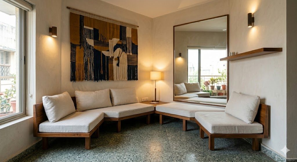
Mirrors, reflection and light-bouncing surfaces
A well-placed mirror is the closest thing to free square footage. Reflection does two things at once: it visually doubles the depth of the space, and it bounces daylight deeper into the home.
- Place a mirror to reflect a window or the longest view, not a blank wall or, worse, the clutter. A tall mirror opposite a balcony effectively gives you a second balcony.
- Go big and architectural, not small and decorative. One large mirror reads as luxury; a gallery of little mirrors reads as a salon. A full-height mirror at the end of a corridor makes the corridor read as twice as long.
- Use subtly reflective finishes elsewhere — a polished stone counter, a glass-front cabinet, a satin (not high-gloss) lacquer — to keep light moving. Avoid mirror overload, though: too much becomes disorienting and cheap.
Indoor-outdoor connection — the balcony, terrace or courtyard as a room
Every square foot of outdoor space you own is potential extra "felt" area, if you treat it as part of the home rather than a utility ledge for the washing machine and the broom.
- In a flat: a balcony with the same or continuous flooring, a couple of low chairs, plants and a warm light becomes a borrowed room that the living room reads as part of. Keeping the balcony glazing clear and the threshold flush is what makes the eye flow out. (Our balcony design ideas for Indian apartments guide goes deeper.)
- In a small independent house, row house or compact villa: this is your superpower. A small internal courtyard, a deck off the living space, a terrace garden, or full-height glazing onto a side margin can make a tight plan feel expansive and bring light and ventilation into the deepest part of the home. A courtyard is the single most luxurious move available to a small Indian house, and it is climate-smart: shade, stack ventilation and daylight all in one. See which house plan suits your climate zone for how to orient it.
The connection only works if the outdoor space is genuinely usable and genuinely continuous with the inside. A balcony you can only stand on, or one cluttered with junk, subtracts rather than adds.
What makes small feel cheap — and how to avoid it
Just as a handful of moves make small feel expensive, a predictable set of cues make it feel cheap. Most cost nothing to avoid; some are about removing, not adding. If you only audit your home against this list, you will already be most of the way there.

| Reads cheap | Reads expensive |
|---|---|
| One flat cool-white tube light, dead corners | Layered warm light, lamps, dimmers, accent pools |
| Six materials and finishes fighting | Two or three materials, repeated, restrained |
| Glossy printed-marble or fake-stone everything | Matte, honest texture; one real material as hero |
| Many small, bulky, mismatched pieces | Fewer, low-slung, correctly-scaled, bespoke pieces |
| Busy patterns and many colours | Tonal palette; one statement |
| Cluttered counters, visible wires and tech | Clear surfaces; everything has a concealed home |
| Furniture lining every wall | Pieces floated; longest sightline protected |
| Small tiles with dark grout, borders at doorways | Large-format continuous flooring, thin matched grout |
| Builder-grade handles, hollow flush doors left as-is | Solid hardware and a few upgraded touch points |
| Short curtains hung at the window top | Floor-to-ceiling curtains hung near the ceiling |
The deepest insight here is that most cheap-cues are additive and most expensive-cues are subtractive. Cheapness comes from having too much — too many materials, too many small objects, too many light sources of the wrong kind, too much visible stuff. Expense comes from editing it down. This is why our guide on why Indian homes feel cluttered is, quietly, also a guide on how to make them feel expensive.
A do / don't summary:
| Do | Don't |
|---|---|
| Fix the light first — warm, layered, dimmable | Light the whole home with one cool-white source |
| Run one continuous floor across the public zone | Change floor material at every doorway |
| Keep the longest sightline open | Block the long view with tall furniture |
| Pick one hero element per zone | Make five things compete for attention |
| Buy fewer, better, low-slung pieces | Fill the room with many small bulky ones |
| Conceal storage flush and handleless | Leave clutter, wires and tech on display |
| Borrow the balcony/terrace as a room | Treat outdoor space as a utility ledge |
| Spend on touch points and one statement | Spread thin gloss over everything |
What a compact-luxury small home costs in 2026
You can land "feels expensive" at very different budgets, because the levers that matter most (light, sightlines, restraint, concealment) are not the most expensive ones. These are indicative full-interior bands for a small home or flat of roughly 600–1,200 sq ft carpet, 2026, metro pricing — fit-out and furnishing, excluding the cost of the home itself. Use the style and budget calculator and budget allocation tool to model your own split.
| Tier | What you get | Indicative band (small home, 2026) |
|---|---|---|
| Considered-essential | Warm layered lighting + dimmers, continuous flooring, restrained paint, a few well-scaled pieces, flush storage in 1–2 zones, one statement | ₹8,00,000–₹15,00,000 |
| Compact-luxury (the sweet spot) | The above plus bespoke joinery throughout, large-format flooring, a feature wall, quality hardware at touch points, good kitchen + wardrobes, a large mirror, balcony done as a room | ₹15,00,000–₹30,00,000 |
| Premium small | Stone, veneer and solid-surface materials, architectural lighting design, fully bespoke everything, smart-home concealed tech, courtyard/terrace landscaping | ₹30,00,000–₹55,00,000+ |
Two things to note. First, the jump from "cheap-feeling" to "expensive-feeling" mostly happens within the first tier — it is about decisions, not budget. Second, in a small home you can afford to spend more per square foot on the things that matter precisely because there are fewer square feet to cover; a stone counter or a beautiful pendant that would blow the budget across 2,400 sq ft is entirely affordable across 900.
Get it right, in order
1. Fix the light first. Plan warm, layered, dimmable lighting (ambient, task, accent) and maximise every window and any chance for a skylight, light well or courtyard. This is your biggest multiplier — do it before anything decorative.
2. Find and protect the longest sightline. Open-plan the public zone if the structure allows, and keep the long diagonal from entrance to far window clear of tall obstructions.
3. Choose one continuous floor. Run a single large-format finish wall to wall across the public area with thin, colour-matched grout and no thresholds.
4. Set a restrained, tonal palette of two or three materials and a quiet colour story — then pick exactly one statement element per zone.
5. Right-size the furniture. Fewer, lower, bespoke-to-fit pieces; float them, do not line the walls; test every size in the layout planner first.
6. Design concealment in. Full-height flush handleless storage, a landing zone for daily clutter, and a plan to hide every wire and device.
7. Make an entrance moment and place one big mirror to reflect light and the best view.
8. Treat your outdoor space as a room — same or continuous floor, clear glazing, two chairs, plants, one warm light.
Planning a small home and want the decisions made in the right order, with a budget and a brief that protect the high-leverage moves? DesignAI drafts a tailored layout, a material and lighting plan, a concealed-storage strategy and an indicative BOQ for your exact carpet area and budget — so your small home is designed to feel expensive from the first sketch, not rescued after possession. Bring your floor plan and your budget; it will show you where every rupee should land.
References
- Bureau of Indian Standards — National Building Code of India (NBC) 2016, Part 8 (Building Services) on lighting and ventilation levels for residential occupancies.
- Francis D. K. Ching — Architecture: Form, Space and Order — on proportion, scale, light and the perception of spatial volume.
- IS 3646 (Code of Practice for Interior Illumination) and IS 4347 — guidance on lighting layers and recommended levels for Indian interiors.
- Council of Architecture (CoA), India — guidance on engaging a registered architect for layout and natural-light planning in residential projects.
- Real Estate (Regulation and Development) Act, 2016 (RERA) — on carpet-area definitions, the difference between carpet, built-up and super built-up area that small-home buyers must understand.
- Christopher Alexander et al. — A Pattern Language — patterns on light on two sides, alcoves, and the human scale of rooms.
Continue with space-planning mistakes that make homes feel smaller, the compact luxury apartment guide, space-efficient homes, make apartments feel bigger and why your home feels dark — or return to the home-planning pillar.
Export this guide
Related Guides — Deep-dive reading
How to Make Apartments Feel Bigger
Perceived space is cheaper than real space — the design levers that make a flat read larger
Apartment LivingThe Design Decisions With the Biggest Cost Consequences
A cost-leverage map of Indian home interiors — the handful of decisions that swing your total budget the most, so you spend your attention where a single choice has an outsized rupee impact.
Cost & MoneySpace Planning Mistakes That Make Homes Feel Smaller
The layout and planning errors that shrink your home — and the fixes that win back square feet
Home PlanningRelated Tools — Try Free
Cross-Ventilation Analyzer
Estimate airflow and air changes per hour (ACH) from room size, window areas, layout, and local wind — with NBC 2016 Part 8 compliance check.
Ventilation CalculatorWindow Size Calculator
Get the right window size, glazing area and openable area for any room using NBC daylight rules.
Window ToolApartment vs Villa Interior Planning Guide
Compare ceiling height, structural flexibility, lighting, storage, and services between apartments and villas.
Planning Guide