
Don't Be a Slave to the Magazine: Why Design Principles Beat Copied Examples
Pinterest rooms and readymade house plans are someone else's answer; learn to read the principle behind an image you love and re-apply it to your own plot, light, climate and family.
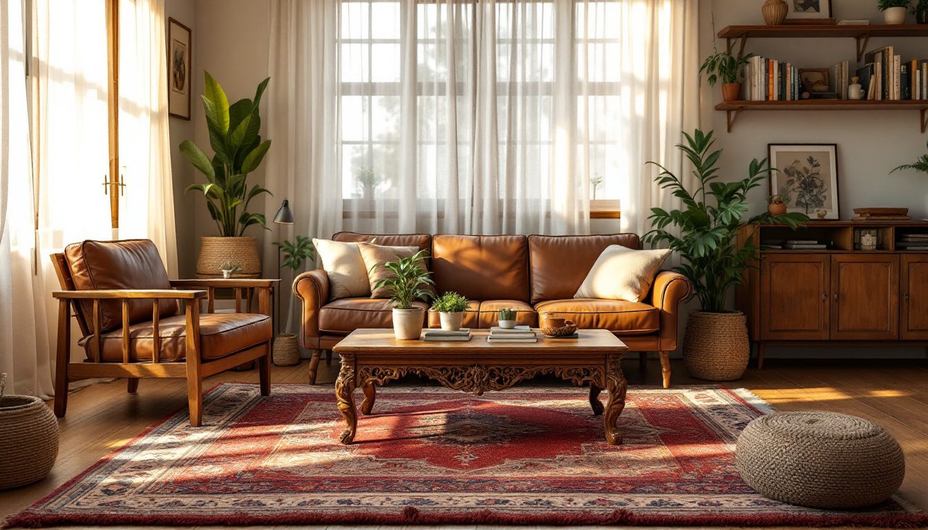
You saved the photograph months ago — a Pinterest living room, a glossy magazine spread, a showroom corner. Fluted teak, a curved bouclé sofa, a sculptural floor lamp, a wall the shade of weak coffee. You sent it to your contractor and said, more or less, make me this. He did his honest best. And the room he delivered is somehow wrong — too dark by four in the afternoon, the sofa floating in the middle of nowhere, the lamp blocking the path to the kitchen, dust settling into the flutes within a week and never leaving. You copied the answer and still failed the exam.
This is the most common and most expensive mistake in Indian home-making, and it has nothing to do with taste. The picture you loved was the correct answer to somebody else's question — their plot, their orientation, their light, their budget, their family, their rituals. You borrowed their answer and applied it to your question, and answers do not transfer. The thing that transfers is the reasoning behind the answer. That reasoning has a name in every design tradition on earth: it is called a principle.
A copied example is frozen — it was solved once, for someone else, and it cannot adapt to your home; a principle is portable — it travels into any plot, any light, any budget, any family, because it is a rule about why something works rather than a snapshot of one place where it happened to work. Learn to read the principle behind the image you love, and you will never again be a slave to the magazine.
The trap of the borrowed answer
Scroll any design feed and you are looking at a museum of answers with the questions removed. The Scandinavian-minimal flat shot in flat northern light, where pale grey walls glow softly. The Balinese villa with open-to-sky bathrooms that would flood in a Mumbai monsoon and fill with mosquitoes by week two. The all-white kitchen photographed the morning it was installed, before a single tarka splattered turmeric across the backsplash. These rooms are real and beautiful. They are also solutions to constraints you do not share.
The "1,000 readymade house plans" industry runs on the same illusion. A plan drawn for a 30-by-50 plot facing north in Bengaluru is sold, unchanged, to a buyer with a 25-by-40 plot facing west in Jaipur. The pooja room that sat correctly in the north-east of the original lands in a service corner of the copy; bedrooms that caught the morning breeze now bake in the afternoon western sun. A good answer, now in the wrong house, answering a question nobody asked.
| What gets copied | Why it worked there | Why it fails here |
|---|---|---|
| All-white minimalist kitchen | Low-spice cuisine, soft diffuse light, daily help | Turmeric and tadka staining, harsh light glare, high upkeep |
| Open-to-sky / open bathroom | Dry resort climate, no neighbours overlooking | Monsoon flooding, mosquitoes, privacy from facing flats |
| Floating central sofa island | Large room, single-axis viewing, nuclear family | Wastes wall storage, blocks circulation, no room for joint-family seating |
| Dark moody accent walls | North-light climate where you crave warmth | Already-dim Indian interiors made gloomier; shows dust |
| Imported low-storage "clean" look | Few possessions, large basement/loft | Joint-family belongings, festival ware, no place for it all |
Every copied failure is a constraint mismatch — the answer assumed a context that is not yours. The cure is not a better picture but a habit: asking, of any image you love, one question — why does this work?
Principles travel; examples don't
The whole of classical design education, from Vitruvius to the Bauhaus to Christopher Alexander, rests on one idea: beneath every successful room lies a small set of repeatable, transferable rules. Alexander made this explicit in his 1977 book A Pattern Language, which catalogues 253 "patterns" — each a principle stated as a problem and its resolution, written so it could be re-applied in a Rajasthani courtyard house or a Tokyo apartment alike. A photograph of a good room is almost useless; the pattern that generated it is priceless.
Principles travel because they are statements about human perception and human bodies, which do not change from Stockholm to Salem. A focal point works because the eye, faced with equal stimuli, hunts for a place to rest — Gestalt psychology, documented since the 1920s. Proportion pleases through relationships our visual system reads as harmonious, the ones the Greeks chased and Le Corbusier systematised in his Modulor. Scale comforts because rooms either fit the body or fight it. None of this is fashion. Fashion is the colour of the year; principle is why a room feels right in any year.
A photograph shows you what someone built. A principle tells you why it stood up. You can hang the photograph on your wall, but only the principle can build your home.

A worked example. You love a magazine bedroom: a bed centred under a tall arched window, matching brass sconces, symmetrical nightstands. The slave to the magazine buys the same sconces and window — then discovers his wall faces the lift lobby, has no window, and the sconces light nothing. The reader of principles sees the rule at work — symmetry creating restfulness around a focal point — and re-applies it: he makes the bed the focal point with a tall upholstered headboard, flanks it with identical reading lights, and balances the composition with matching art instead of a window. Same principle, different objects, a room just as resolved — because he copied the reasoning, not the props.
How to read the principle behind an image you love
Decoding an image is a learnable skill, and the single most valuable habit in this guide. Interrogate the photograph until it confesses its rules, then strip away everything specific to that place and keep only what is portable.
Ask what your eye does first. Where does it land, and why? If it goes straight to a fireplace, a view or a bold artwork, you have found a focal point — the room organises itself around one dominant pull, a principle that can move into your home even if you have no fireplace. Ask what makes it feel calm or energetic. Calm usually means symmetry, repetition and restrained contrast; energy means asymmetry, diagonals and bold colour. Ask how big things are relative to a body. A low-slung sofa under a high ceiling, a generous three-foot doorway — scale is doing quiet work. Ask what the materials are doing beyond looking nice: reflecting light into a dark corner, absorbing sound, hiding dust, ageing gracefully.
Then translate — the step where Indian reality enters and where most copied rooms would have been saved.
| Decode the image (the portable principle) | Translate to your home (your real constraints) |
|---|---|
| The eye rests on one strong focal point | Choose your own anchor — a jaali screen, a deity niche, a single bold textile |
| Light makes the pale palette glow | If your light is harsh or dim, adjust tone and sheen, do not copy the colour |
| Symmetry makes it feel serene | Re-balance with whatever objects you actually own, not the exact pair shown |
| Materials are tactile and low-glare | Pick local stone, kota, teak, terracotta that suit heat, dust and humidity |
| Furniture is scaled to leave generous paths | Size to your room and your joint-family traffic, not the photo's footprint |
This is where the right tools earn their place. Before committing to a layout you saw in a picture, our home lifestyle quiz helps you name the question your home must answer — how you cook, who lives with you, how you receive guests — so you translate a principle onto a real brief, not a borrowed one. The companion guide a home that feels right goes deeper into why this felt-sense matters more than any single look.
Why imported looks break in the Indian home
India imposes an unforgiving set of constraints that most photographed interiors — shot in Europe, Bali, or air-conditioned studio sets — do not account for. Ignore them and the most beautiful copied room betrays you within a season.
Heat and light. Much of India lives in harsh, high-angle sun for most of the year. Looks designed for soft northern light — large unshaded glass, dark walls, glossy surfaces — produce glare, heat gain and gloom here. The principle of daylighting is sound; the execution must invert. Where the magazine wants a bare window, your home wants a shaded, deep-set or jaali-filtered one. Dust. Indian air carries dust most of the year, so the intricate fluting and open shelving that look crisp in a studio become daily chores; choose textures that shed dust rather than trap it. Monsoon and humidity punish materials imported looks take for granted: timber that warps, metals that rust, fabrics that mildew.
Joint family and storage reality. This is the deepest mismatch. Most aspirational interiors are shot as minimalist, single-couple spaces, while the Indian home holds three generations, hosts large festival gatherings, and stores an enormous quantity of things — steel utensils, festival crockery, seasonal bedding, the good china used twice a year. A "clutter-free" copied look has nowhere to put any of it, so the clutter reappears and defeats the image. Visual calm survives — it just has to be achieved through generous concealed storage, not by pretending the belongings do not exist. Rituals and Vastu. A copied plan rarely respects pooja placement, kitchen orientation or entrance logic — considerations folded into our broader space-planning principles.

| Indian constraint | What the copied look assumes | The principle, re-applied for India |
|---|---|---|
| Harsh overhead sun | Soft diffuse northern light | Shade, deep reveals, jaali; daylight without glare |
| Year-round dust | Studio-clean air | Dust-shedding finishes, closed storage, washable surfaces |
| Joint-family belongings | Minimalist single couple | Abundant concealed storage achieving the same calm |
| Festivals and rituals | Secular open plan | Pooja, kitchen and entry placed with intent |
The nine principles, and the home they build
"Design principles" is not one rule but a small, memorisable family of them. Master these nine and you can decode almost any image and re-apply it to your own home with confidence. Each links to its own deep guide; together they form a map to return to whenever a picture tempts you to copy.

- Scale and human comfort — whether a room and its furniture fit the human body or fight it; the first thing you feel and the easiest thing to get wrong by copying a photo of a differently sized space.
- The golden mean and proportion — the dimensional relationships the eye reads as harmonious, from the golden ratio to practical ratios you can apply with our scale and proportion calculator.
- Focal points and intentional rooms — giving the eye one clear place to rest, the Gestalt principle behind almost every photograph you admire.
- Symmetry, asymmetry and balance — the two ways to make a room feel resolved: the formal calm of the mirror, or the lively equilibrium of unequal weights.
- Sequential progression through spaces — how a home unfolds as you move through it; the choreography of arrival, compression and release no single photograph can show.
- Details that define a home — the joinery, edges, hardware and transitions that separate a resolved room from a roughly assembled one.
- Zones of retreat, rest and privacy — Jay Appleton's prospect-and-refuge theory made domestic: places to see from and places to hide in, vital under one joint-family roof.
- Angles, curves and breaking the pattern — when to honour the grid and when to break it; the deliberate exception that gives a disciplined room life.
- Nostalgia and what makes a home feel like home — the memory, ritual and belonging no showroom can sell and no copied image can carry.
These nine are not a checklist but lenses. Any image you love uses several at once, and naming which ones is exactly the decoding skill above.
A method you can use this week
Principles are only useful if they change what you do, so here is the loop, reduced to something you can practise on the next picture that catches your eye.
1. Collect, then interrogate. For each loved image, write one sentence answering "why does this work?" If you cannot, you have found the surface, not the principle.
2. Name the principles in play. Run the image past the nine above. Focal point plus symmetry? Scale plus proportion? Usually two or three do the heavy lifting.
3. Strip the place-specific. Delete everything true only of that photo — its colour, its furniture, its window, its light. What remains is portable.
4. Re-state as your brief. Translate the surviving principle onto your real constraints — your light, plot, family, storage, budget. This is where the home lifestyle quiz and the broader space-planning principles do their work.
5. Test before you build. Mock it up, measure it, walk it. Better a flawed sketch on paper than a flawed wall in concrete.
The difference between the two readers we met — the one who bought the brass sconces and the one who understood symmetry — is nothing more than this loop. It costs no money, and it prevents the most expensive mistakes. The slave to the magazine copies the objects, fails when context differs, buys the year's trend, and ends with someone else's home. The reader of principles copies the reasoning, adapts because the rule is portable, builds something that ages well, and ends with a home unmistakably theirs.
What this means for your home
The takeaway is liberating, not restrictive. You do not have to stop loving the magazines, the feeds and the showrooms — they are a wonderful library of solved problems. You only have to stop copying their answers and start stealing their reasoning.
When the next image stops your scroll, ask why it works. Find the principle. Test it against your light, plot, dust, family, festivals and budget. Then re-apply it with the objects, materials and dimensions that suit your question — and watch a room that could never have been photographed anywhere else come quietly right. It will not look like the magazine. It will look like you, which is the only thing a home is for.
Begin with the principle that governs the others — a home that feels right — then move through the nine spokes in any order your curiosity takes you. Each turns a vague "I like this" into a tool you can use on any plot, in any light, for any family.
How Studio Matrx helps. This is precisely the gap our platform closes. A readymade plan or copied render sells you someone else's answer; DesignAI does the opposite — it takes your brief (plot, orientation, light, family size, storage and rituals) and applies design principles to it, generating spaces solved for your question rather than someone else's. Hand it the principle you admired in an image and see it adapted to your own walls. Principles travel; with DesignAI, they travel straight into your home.
References
1. Alexander, C., Ishikawa, S. & Silverstein, M. (1977). A Pattern Language. Oxford University Press — 253 transferable design patterns; the canonical argument that principles, not examples, generate good buildings.
2. Wertheimer, M., Köhler, W. & Koffka, K. (1920s). Foundational Gestalt psychology — the laws of perceptual organisation that explain focal points and visual rest.
3. Appleton, J. (1975). The Experience of Landscape — prospect-and-refuge theory, the basis for zones of retreat.
4. Le Corbusier (1948 / 1955). The Modulor — a proportional system linking the golden ratio to the human body.
5. Ching, F. D. K. Architecture: Form, Space, and Order — scale, proportion, balance and the perceptual reading of space.
6. Bureau of Indian Standards. National Building Code of India 2016 — habitability, ventilation and daylighting requirements that constrain how imported looks must be adapted.
7. Pallasmaa, J. (2005). The Eyes of the Skin — materiality, atmosphere and the felt, memory-laden experience of home that underlies nostalgia.
Part of the Studio Matrx Design Principles series — the pinned thesis for the cluster. Continue with scale and human comfort, focal points and intentional rooms, symmetry, asymmetry and balance, and nostalgia and what makes a home feel like home.
Export this guide
Related Guides — Deep-dive reading
Orientation, Light & Views: Designing With Your Space, Not Against It
How reading your plot's sun, breeze and views — and placing each room on the right face — gives an Indian home that is cooler, brighter and quietly right, instead of one that fights its site forever.
Design PrinciplesHow to Design a Home That Feels Right — Beyond Just Looks
The invisible design decisions — order, scale, light, craft and memory — that make a home feel like home, not a showroom
Design EducationThe Architectural Psychology of Comfortable Spaces
Why some rooms feel right and others never do — the science of space and the human mind
Design EducationRelated Tools — Try Free
Apartment Interior Planning Checklist
51-item checklist across structural, ceiling, lighting, furniture, storage, electrical, kitchen, bathroom.
ChecklistCross-Ventilation Analyzer
Estimate airflow and air changes per hour (ACH) from room size, window areas, layout, and local wind — with NBC 2016 Part 8 compliance check.
Ventilation CalculatorVastu Window Planner
Vastu guidance for window placement and size by wall direction and room — rating and remedies.
Vastu