
The Golden Mean: The Secret Proportion Behind Beautiful Rooms
How the golden ratio, the rule of thirds and classic room proportions make a space feel resolved — and how India's vastu mandala and talamana traditions solved the same problem.
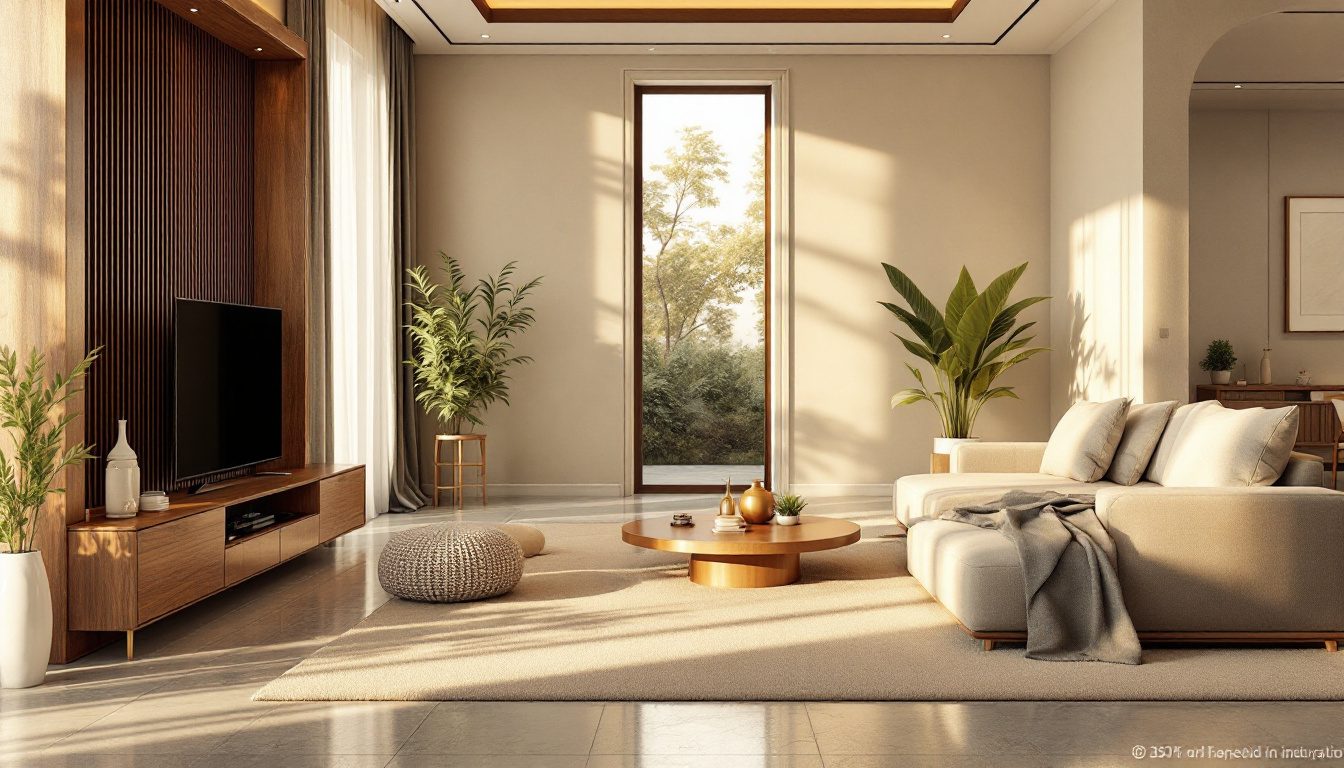
Stand a coffee table that is exactly as long as the sofa behind it, push it tight against the seat, and the room looks wrong before you can say why. Shrink that same table to roughly two-thirds the sofa's length, float it a hand's-width away, and the arrangement suddenly looks settled — composed, deliberate, right. Nobody reached for a tape measure. Nothing about the furniture changed except the ratio between two things. And that ratio is the quiet engine behind almost every room you have ever walked into and loved.
This guide is about proportion: not how big things are, but how their sizes relate to one another and to the room around them. It is the sibling of scale (how big a thing is relative to your body) and the cousin of balance — and of the three, proportion is the one that designers have chased for two and a half thousand years, from Euclid's geometry to the carved canon of a Chola bronze. We will meet the famous golden ratio and separate its real mathematics from the myths, borrow the photographer's rule of thirds for a blank wall, learn the classic room ratios that make a plan feel resolved, and look at India's own proportional traditions — the vastu purusha mandala and the talamana system — which solved the same problem with a different grammar.
Proportion is the relationship between the sizes of things — and a room feels beautiful not when its parts are large or expensive, but when those parts are sized in pleasing ratio to each other and to the whole. Learn a handful of these ratios and you can compose a resolved room with furniture you already own.
Proportion is not scale — and why the difference matters
It is worth fixing the vocabulary first, because the two words get used interchangeably and they are not the same thing. Scale is the size of an object measured against a fixed reference, almost always the human body — is this sofa right for a person to sit on, is this doorway right to walk through, does this pendant hang too low over the table. Our sibling guide on scale and human comfort is entirely about that body-to-object relationship.
Proportion is internal and relational. It asks how the parts of a thing relate to each other and to the whole, regardless of absolute size. A window can be perfectly proportioned — a pleasing ratio of height to width — whether it is a tiny attic light or a tall hall window. A bookshelf is well-proportioned when the gaps between its shelves relate sensibly to each other and to the shelf width, no matter how big the unit is. You can shrink a beautifully proportioned facade to a postage stamp and it stays beautiful; you can blow up an ugly one to a billboard and it stays ugly. Scale travels with the body. Proportion travels with the ratio.
Why does the difference matter practically? Because the two go wrong in different ways and you fix them differently. A scale problem is solved by changing one object's size — a smaller chair, a lower light. A proportion problem is solved by changing a relationship — re-spacing the shelves, re-sizing the rug against the seating, dividing a too-blank wall into thirds. Most rooms that feel "off" despite being full of nice things have a proportion problem, not a scale problem, which is why throwing money at better furniture rarely fixes them.
The golden ratio: the real history, and the real myths
No idea in proportion is more famous, or more abused, than the golden ratio — the number 1.618, written with the Greek letter phi. It is genuinely beautiful mathematics. Divide a line so that the whole is to the longer part exactly as the longer part is to the shorter, and you get this single ratio, which Euclid recorded around 300 BCE in his Elements as the "extreme and mean ratio." A rectangle whose sides are in this ratio has a remarkable property: slice off a square from one end and the rectangle that remains has the same proportions as the original. Keep slicing and the nested squares trace the elegant logarithmic curve we call the golden spiral.

Phi is also knit into the Fibonacci sequence — 1, 1, 2, 3, 5, 8, 13, 21 — where each number is the sum of the two before it. Divide any term by the one before it and the answer creeps closer and closer to 1.618. This is the famous reason phi turns up in nature: the spiral of a sunflower's seeds, a pine cone's scales, a nautilus shell, the branching of leaves all follow Fibonacci packing, because it is an efficient way for a living thing to grow. That part is real botany, first described by Leonardo of Pisa (Fibonacci) in 1202.
Now the honest part, because an evidence-aware designer owes you this. Much of what you have read about the golden ratio is folklore. The popular claims that the Parthenon, the Great Pyramid and the Mona Lisa were deliberately built on phi are, on careful measurement, not supported — you can draw a golden rectangle over almost anything if you are loose about where the edges go, and that is exactly what enthusiasts did, retrospectively. The mathematician George Markowsky catalogued these "misconceptions about the golden ratio" in a well-known 1992 paper, and design historians have repeatedly shown the Parthenon attribution was invented in the nineteenth century, long after the building. There is also no robust psychological evidence that people reliably prefer golden rectangles over nearby ratios; the classic preference experiments, going back to Gustav Fechner in the 1870s, give muddy results that later studies could not cleanly reproduce.
The golden ratio is a designer's tuning fork, not a law of beauty. It gives you a sane starting ratio when you have nothing else to go on — and that, not mysticism, is its real value.
So treat phi as one useful heuristic among several. A 1.6-ish ratio is a reliably comfortable place to start dividing a wall, sizing a rug, or proportioning a window — not because the universe demands it, but because it sits in the broad, agreeable zone between "too square and static" and "too stretched and thin." Use it as a default, then trust your eye.
| The proportional toolkit | The ratio | Where it helps in a room |
|---|---|---|
| Square | 1 : 1 | Static, formal, restful — a courtyard, a symmetrical alcove, a tiled grid |
| Root-two (paper) | 1 : 1.414 | Calm and slightly active — A-series paper, framed prints, panel doors |
| Golden ratio (phi) | 1 : 1.618 | The classic "resolved" rectangle — walls, facades, table-to-sofa |
| Two-thirds | 2 : 3 | Friendly, common — rug to seating, coffee table to sofa, window pairs |
| Three-fifths | 3 : 5 | A Fibonacci ratio close to phi — shelf divisions, cabinet fronts |
| Double square | 1 : 2 | Long, generous, a little formal — a hall plan, a console wall |
The rule of thirds: composing a blank wall
The golden ratio's friendly, practical younger sibling is the rule of thirds, borrowed straight from photography and painting. Divide any field — a wall, a window, a tabletop — into three equal parts horizontally and vertically, and you get a grid with four intersection points. Place the important things on those lines or at those crossings rather than dead-centre, and the composition comes alive. Centre everything and it goes static and bland; the eye has nowhere interesting to land.
This is the single most useful trick for the problem everyone faces: a large blank wall and no idea where to put the art. Instead of hanging one picture in the geometric middle, think in thirds. Hang the art so its centre sits on the upper third line — roughly at eye level, about 145 to 150 cm to the centre, which museums and galleries treat as standard. Anchor a console or low cabinet so its mass occupies the lower third. Let sconces or a tall plant break the vertical thirds. The result reads as composed rather than placed.

The rule of thirds is really a humane approximation of the golden ratio — the one-third / two-thirds split (roughly 1 : 2) brackets the golden 1 : 1.618 closely enough that your eye cannot tell, and it is far easier to do by hand. This connects directly to balance, which is why our sibling guide on symmetry, asymmetry and balanced interiors leans on the same grid: thirds give you a structured way to be asymmetrical without being chaotic.
A few field rules that flow from thinking in thirds:
- Art should relate to the furniture below it, not the wall behind it. A picture or arrangement that spans about two-thirds to three-quarters of the sofa or console width looks anchored; a small frame marooned over a long sofa looks lost.
- Hang to the furniture, leaving a hand's gap. Keep roughly 15 to 25 cm between the top of the sofa back and the bottom of the art, so the two read as one group.
- Group small pieces into one larger rectangle. Several small frames arranged to fill a single well-proportioned block behave, to the eye, like one correctly sized artwork.
Classic room ratios: when a plan feels resolved
Long before phi was fashionable, builders carried proportional rules of thumb for the plan of a room — its length-to-width ratio seen from above — because some rectangles simply feel better to be inside. A perfect square room can feel static and oddly directionless; a very long, thin room feels like a corridor. The agreeable zone sits in between, and it clusters around the same familiar ratios.
| Room length : width | How it reads | Good for |
|---|---|---|
| 1 : 1 (square) | Static, formal, can feel undirected | Pooja room, a formal symmetrical study, a courtyard |
| 1.2 : 1 to 1.3 : 1 | Calm, gently rectangular | Bedrooms, where the bed sets a clear axis |
| 1.5 : 1 (the 2 : 3) | Comfortable, versatile, the workhorse | Living rooms, dining, most habitable rooms |
| 1.618 : 1 (golden) | Generous, resolved, slightly formal | Living-dining, a drawing room, a long verandah |
| 1.67 : 1 (the 3 : 5) | Lively, with room to zone | Open-plan living-dining you want to split into areas |
| 2 : 1 or longer | Reads as a passage or a hall | Galleries, narrow site-driven rooms, run of utilities |
The classical architect Andrea Palladio, in his Four Books of Architecture (1570), set out a famous shortlist of "the most beautiful and proportionable" room shapes — the circle, the square, and rectangles of 1 : 1.33, 1 : 1.5, 1 : 1.6 and 1 : 2. Notice the family resemblance to the table above: five centuries on, these are still the ratios that feel right, which is a stronger argument than any single mystical number. The vertical dimension belongs to this conversation too — a room's height-to-width ratio is what makes it feel boxy, lofty or cavernous, the subject of our science of ceiling heights guide.
In the Indian context, two everyday forces push against these clean ratios, and both are worth naming. First, the apartment plan is rarely yours to set — you inherit whatever the developer's structural grid produced. Second, the joint-family living room often has to be long to seat a large gathering, which pushes it past the comfortable 1.5 : 1 toward the 2 : 1 corridor feeling. The fix is not to rebuild the room but to divide it proportionally — break a long living-dining into a seating zone and a dining zone whose footprints are themselves in a pleasing ratio (say two-thirds living, one-third dining), so the eye reads two good rectangles instead of one stretched one. That zoning logic is exactly what the layout planner and our space-planning principles guide are built around.
Proportion in furniture and groupings
This is where proportion earns its keep day to day, because furniture relationships are the ones you can change this weekend with no budget. The principle throughout is the same: size each piece in ratio to its neighbour and to the space it sits in.
The coffee table to the sofa. The reliable rule is roughly two-thirds the sofa's length — close to the golden ratio, and the single most common proportion mistake in Indian living rooms, where a small table sits adrift in front of a large three-seater. Leave about 40 to 45 cm of leg room between them, and set the table top a little below the seat cushion so the two relate comfortably.
The rug to the seating. A rug that is too small makes a whole arrangement shrink and float. The proportional rule: the rug should be large enough that at least the front legs of every seat rest on it, and ideally it extends about 15 to 20 cm beyond the sofa on each side. The rug, in other words, should be proportioned to the group, not bought to a standard 5 × 7 size and hoped for.
Shelf spacing. Evenly spaced shelves look mechanical; subtly graduated ones look composed. A classic move is to make the lower shelves a little taller than the upper ones — a Fibonacci-flavoured progression, where each gap relates to the next by roughly the 3 : 5 ratio — which also happens to be practical, since heavier books and objects live low. The shelf depth and the gaps should themselves relate: deep shelves want taller gaps.

| Relationship | Proportional rule of thumb | Why it works |
|---|---|---|
| Coffee table : sofa length | About 2 : 3 (two-thirds) | Reads as a deliberate pair, not a stranded object |
| Rug : seating group | Front legs on the rug; +15–20 cm past the sofa | Anchors the whole group into one composition |
| Artwork : furniture below | About 2 : 3 to 3 : 4 of the width | Art and furniture read as a single unit |
| Pendant : table below | About 1 : 2 to 1 : 3 of the table width | Light feels sized to the surface it serves |
| Shelf gaps (top to bottom) | Graduated, roughly 3 : 5 progression | Composed and practical — weight sits low |
| Console : wall span | About 2 : 3 of the wall it sits against | Furnishes the wall without crowding it |
When you are unsure, you do not have to guess. Our scale and proportion calculator takes a sofa or wall dimension and returns the comfortable size range for the table, rug, art or pendant that should sit with it, so the ratio work is done for you. It is the fastest way to settle the "is this too small?" argument before you buy.
India's own proportional traditions
It would be a narrow story to suggest proportion arrived from Greece and Renaissance Italy. India developed its own rigorous proportional systems, older in places than Euclid, and they governed everything from the plan of a house to the modelling of a deity's face.
The vastu purusha mandala is, at heart, a proportional grid. The site is conceived as a square divided into a smaller grid of equal cells — most commonly the 9 × 9 (81-cell) paramasayika or the 8 × 8 (64-cell) manduka mandala — onto which the cosmic figure of the Vastu Purusha is mapped. Functions are then assigned to zones by their position in the grid: the kitchen to the south-east (Agni), the water and treasury to the north-east (Ishana), the heavy mass to the south-west. Strip away the cosmology for a moment and what remains is a modular proportional planning system — a way of keeping every part of a building in fixed ratio to the whole through a disciplined grid, exactly the role a structural module plays in modern planning. It is codified in texts such as the Manasara and Mayamata (the Vastu Shastra and Shilpa Shastra corpus). Where vastu genuinely informs your plan, it does so as a proportional and orientational grammar as much as a ritual one — a thread we pick up in our broader home-that-feels-right guide.
The talamana system governs proportion in sculpture and, by extension, in temple architecture. Tala is a unit — classically the length of the face or the palm — and a figure is built up in whole multiples of it: the dasatala canon, for instance, makes a standing deity ten faces tall, with every limb and feature specified as a fraction of that module. A Chola bronze is so resolved precisely because nothing in it is sized freely; every dimension is a ratio of the tala. This is the same idea as the Western "canon of proportion" — Vitruvius's man in a circle, later Leonardo's Vitruvian Man — and it predates or parallels them.
| Tradition | The proportional unit | What it governs | Western parallel |
|---|---|---|---|
| Vastu purusha mandala | The grid cell (pada) | Building plan, zoning, orientation | The structural module / Renaissance bay |
| Talamana | The tala (face or palm) | Sculpture, deity figures, temple form | Vitruvian canon of the body |
| Golden ratio / phi | The 1 : 1.618 division | Rectangles, facades, compositions | (itself) |
| Modulor (Le Corbusier) | Human height + phi + Fibonacci | Mid-century furniture and buildings | A modern synthesis of both |
The modern bridge between these worlds is Le Corbusier's Modulor, a proportional system he published in 1948 and 1955 that combined the human body, the golden ratio and the Fibonacci sequence into a scale of measurements meant to govern everything from a door handle to a city block. Corbusier built the Modulor into his work in India — most famously at Chandigarh — which makes it a fitting emblem here: a twentieth-century attempt to do, with phi and the metric body, what the talamana and the mandala had done for centuries with the face and the grid. None of these systems is magic. All of them are the same human instinct, expressed in different grammars: keep the parts in honest ratio to the whole, and the thing will feel resolved.
What this means for your home
1. Diagnose before you spend. When a room feels "off," ask whether it is a scale problem (one thing the wrong size for the body) or a proportion problem (things the wrong size relative to each other). The second is far more common and free to fix.
2. Size the coffee table to the sofa, not the floor. Aim for about two-thirds the sofa's length. This one change rescues more living rooms than any new purchase.
3. Buy the rug to the group. Get the front legs of every seat onto it and let it run past the sofa by a hand's width. A too-small rug shrinks everything around it.
4. Compose blank walls in thirds. Centre art at about 150 cm, let it span two-thirds of the furniture below, and use the third-lines for sconces and verticals rather than dropping everything dead-centre.
5. Aim for the 1.5 : 1 to 1.6 : 1 zone in rooms you can shape. And where a long room is forced on you, divide it proportionally into two good rectangles rather than living with one stretched one.
6. Use phi as a starting ratio, then trust your eye. It is a tuning fork, not a rulebook. The famous monuments were mostly not built on it, and your home does not need to be either.
7. Let the calculator do the arithmetic. For the table-to-sofa, art-to-wall and pendant-to-table sizing, the scale and proportion calculator turns these ratios into specific centimetre ranges for what you actually own.
How Studio Matrx helps
Proportion is the hardest principle to judge from a brochure photo and the easiest to get right once you can see the alternatives. DesignAI lets you visualise your own room at different furniture proportions — a longer table against the sofa, art sized to the wall in thirds, a rug scaled to the seating group — so you can feel which ratio reads as resolved before you spend a rupee, and carry the numbers straight to a carpenter or a store.
References
1. Euclid (c. 300 BCE). Elements, Book VI — the "extreme and mean ratio," the original definition of the golden section.
2. Fibonacci, Leonardo of Pisa (1202). Liber Abaci — introduces the Fibonacci sequence to the Latin West.
3. Markowsky, G. (1992). "Misconceptions about the Golden Ratio." The College Mathematics Journal, 23(1), 2–19 — debunks the Parthenon, Pyramid and Mona Lisa attributions.
4. Palladio, A. (1570). I Quattro Libri dell'Architettura (The Four Books of Architecture) — the canonical list of beautiful room proportions.
5. Le Corbusier (1948, 1954). The Modulor: A Harmonious Measure to the Human Scale, Universally Applicable to Architecture and Mechanics — the human-plus-phi-plus-Fibonacci proportional system, applied at Chandigarh.
6. Acharya, P. K. (trans.). Manasara and Mayamata — Vastu Shastra and Shilpa Shastra treatises on the vastu purusha mandala and talamana proportional canons.
7. Ching, F. D. K. Architecture: Form, Space, and Order — chapters on proportion, the golden section, classical orders and regulating lines.
8. Livio, M. (2002). The Golden Ratio: The Story of Phi, the World's Most Astonishing Number — a measured history separating the mathematics from the myth.
Part of the Studio Matrx Design Principles series. Continue with scale and human comfort, symmetry, asymmetry and balanced interiors, the home that feels right, and the cluster pillar on design principles over magazine examples.
Export this guide
Related Guides — Deep-dive reading
Why Scale Matters: Keeping Rooms Comfortable for Humans
How sizing furniture, art and lighting to the human body — not the showroom — keeps small Indian flats from feeling crushed and large halls from feeling empty.
Design PrinciplesLiving Room Design in India: Built Around How You Actually Live
Resolving the three competing focal points, sizing to people not floor area, the double-height trap, and the formal-vs-family living room question
Room PlanningHow to Design a Home That Feels Right — Beyond Just Looks
The invisible design decisions — order, scale, light, craft and memory — that make a home feel like home, not a showroom
Design EducationRelated Tools — Try Free
Apartment Furniture Size Chart
Standard furniture dimensions for Indian apartments — sofas, beds, tables, dining, storage.
Reference ChartInterior Layout Planner — Printable Graph Grid
Printable graph grid to sketch room layouts to scale before committing to furniture placement.
Layout ToolScale & Proportion Calculator
Check whether a room's shape or a window's proportion feels right, using the golden mean (1:1.618).
Design Tool