
Angles, Curves and Breaking the Pattern Intentionally
Why an Indian home should mostly stay a grid of right angles — and how a single deliberate curve, angle or arch, placed where it eases circulation, resolves an awkward plot or breaks a rhythm, becomes the most powerful move in the room.
Look closely at almost any home you have ever lived in and you will find it is built of right angles. The walls meet the floor at ninety degrees, the rooms are rectangles, the doors are upright slots, the windows are squared, the wardrobes are boxes pushed flat against boxy walls. This is not a failure of imagination. The right angle is the most efficient, most buildable, most furnishable shape we know — bricks are rectangular, plywood comes in flat sheets, sofas have straight backs, and a rectangular plan packs into a rectangular plot with almost no waste. The orthogonal grid is the workhorse of architecture for very good reasons, and most of your home should stay loyal to it.
And yet the rooms that stop you in your tracks — the curved sweep of a heritage hotel stair, the chamfered corner of a colonial bungalow that opens to the breeze, the gentle arc of a reception desk that pulls you toward it — almost always contain one deliberate departure from the grid. A single angle. A single curve. Not everywhere, not as decoration, but placed exactly where it earns its keep. The skill is not knowing how to draw a curve. It is knowing the one place a curve is worth the trouble, and having the discipline to keep everything else straight.
The right angle is the correct default for a home — efficient to build, easy to furnish, frugal with space — but the occasional curve or angle, placed where it genuinely resolves a problem rather than where it merely looks dramatic, is one of the most powerful moves in design; the test is always whether the departure does work the grid could not.
Why the grid is right almost all the time
Before we praise the curve we have to defend the right angle, because nine times out of ten it is the correct answer and the curve is an expensive mistake. The orthogonal grid is not a stylistic choice the way a colour is; it is a response to how buildings are actually made and lived in.
Start with construction. The fundamental building units of the Indian home are rectangular: the brick, the concrete block, the plywood sheet, the granite slab, the ceramic tile, the steel section. A straight wall is laid by any mason in the country without a drawing. A curved wall must be set out with a string and a centre point, built with cut or specially moulded blocks, plastered by a skilled hand working to a template, and finished by a carpenter who can no longer use a standard sheet of anything. Every curve multiplies labour, wastes material in offcuts, and concentrates risk on the few craftsmen who can execute it well. A diagonal wall is gentler than a curve but still throws every junction off the grid and creates rooms with acute corners that are awkward to use.
Then consider furniture. Almost everything you will ever buy is built to stand against a straight wall: the wardrobe, the kitchen platform, the bookshelf, the bed, the sofa, the dining sideboard. Push a straight-backed sofa against a curved wall and you get a crescent of dead, unreachable space behind it — the curved-wall-straight-sofa problem that quietly defeats so many "feature" curves. The same fight repeats with every rectangular object the room has to hold. In a compact Indian flat where storage is precious and the joint family stretches every square foot, a curve that creates unfurnishable space is not a flourish, it is a tax.
Finally, the grid packs. A rectangular room tiles into a rectangular floor plate with almost no leftover, and rectangular floor plates stack cleanly into a building. The geometry that wastes the least space, on a plot you have paid lakhs per square foot for, is the boring one. Francis D. K. Ching, in his standard text Architecture: Form, Space, and Order, treats the regular orthogonal grid as the baseline ordering system precisely because it is so economical and so legible. The break from it has to buy back everything it costs.
| What the orthogonal grid gives you | Why it matters in an Indian home |
|---|---|
| Cheap, fast, low-risk construction | Standard bricks, blocks, plywood sheets; any mason can build it |
| Furnishable walls | Wardrobes, beds, platforms, sofas all sit flush, no dead space |
| Efficient packing of area | No waste on a plot costing lakhs per square foot |
| Easy cleaning and maintenance | Square corners, flat planes, no curved skirting to dust |
| Legibility | The eye and body read a rectangular room instantly |
When a curve or an angle actually earns its place
If the grid is so good, when is it worth breaking? The honest answer is: only when the break does a job the grid cannot. There are a handful of situations where a curve or an angle is not decoration but the better engineering, and learning to recognise them is the whole game.
Easing a circulation pinch. The clearest case for a curve is movement. Where two paths meet at a sharp internal corner — the turn from an entry passage into a living room, the elbow of an L-shaped kitchen, the corner you bump every single day — a chamfered or rounded corner lets the body flow around it instead of catching on it. The curve here is not pretty-first; it is ergonomic, and it happens to be pretty as a result. This is the same logic that governs good spatial flow through a home: the path wants to be smooth, and a hard corner fights the path.

Resolving an awkward site. Indian plots are frequently not rectangles. A corner plot, a plot on a curved road, a plot with a splayed boundary or a diagonal access, a plot narrowing to a point — these defeat a pure grid. An angled wall that runs parallel to a skewed boundary recovers the triangle of land a rectangular room would have abandoned, or aligns a window with a view or a breeze the grid would have missed. Here the angle is generated by the site, not imposed on it, and that is exactly what makes it feel inevitable rather than arbitrary.

Safety and flow at the body's edges. A rounded corner on a kitchen platform or a low coffee table removes the hip-height edge that bruises adults and the face-height edge that injures small children — a real consideration in homes with toddlers and elders. A curved counter on an island invites people to gather around it rather than queue along it. These are functional curves that pay for themselves in comfort and safety.
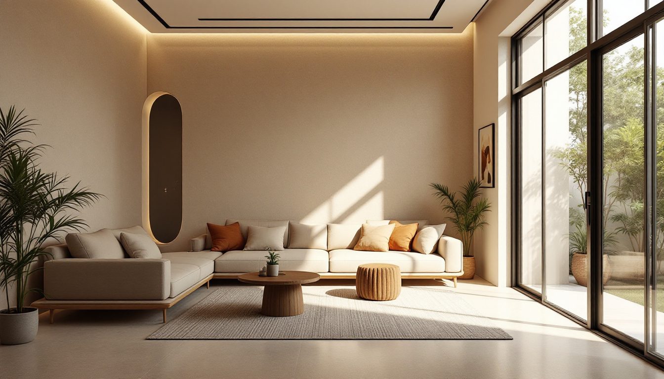
Genuine drama where drama belongs. Some rooms are allowed to perform — the entrance, the stair, the one wall everyone sees on arrival. A sweeping curved stair or a single arched opening can give a sense of occasion the grid never will. But this is the rarest and most disciplined use, closely related to choosing a single focal point a room is built around: the curve becomes the figure precisely because everything around it stays straight ground.
A curve is not generous because it is soft; it is generous because it does something a straight line could not. The moment it stops working — the moment it only looks expensive — it has become the most costly mistake in the room.
| The break | Earns its place when… | Becomes a mistake when… |
|---|---|---|
| Curved wall | It eases a real circulation pinch or follows a curved boundary | It is added "for interest" and creates dead space behind furniture |
| Chamfered corner | It opens a tight junction or catches a view / breeze | It clips a corner with no path or view to justify it |
| Angled wall | It follows a non-rectangular plot or aligns to a vista | It tilts a room off-grid leaving acute, unusable corners |
| Rounded counter / table | It removes a hazard edge or invites gathering | It is curved everywhere, defeating storage and worktop area |
| Arched opening | It marks one threshold of importance | It is repeated on every door until it reads as a theme park |
The cost ledger: what a curve really takes
Because the curve is seductive in a magazine photograph, it helps to lay out plainly what it costs before you commit, so the decision is made with open eyes rather than on a render.
A curved wall costs more to build, as we saw, in labour, material waste and craft risk. It costs more to furnish, because almost nothing flat sits against it. It costs more to clean, because curved skirting and rounded plaster collect dust in ways a square junction does not. It often costs floor area, because the dead crescent behind a curve is space you have paid to build and cannot use. And it costs flexibility for the life of the home — the next owner, or you in five years, cannot simply slide a new wardrobe along that wall. The same applies, in gentler form, to the angled wall, which yields awkward acute corners, and to the chamfered corner, which sacrifices a sliver of room area for the eased path.
None of this argues against curves. It argues for spending them deliberately, the way you would spend a limited budget — on the one or two places where the return is real. A useful discipline before committing to any non-orthogonal move is to weigh it against the straight alternative honestly, the kind of explicit comparison our design trade-off helper is built to force, and to test the furniture against it in plan using the layout planner before a single block is laid. If a sofa, a bed or a wardrobe cannot sit comfortably against the new shape, the curve is failing its first duty.
| Cost of a curve | How it shows up | How to limit it |
|---|---|---|
| Construction | More labour, special blocks, plaster templates, skilled craft | Use it once, not throughout; keep the radius generous and simple |
| Furniture | Dead crescent behind straight furniture | Reserve curves for walls you will not furnish (circulation, display) |
| Floor area | Unusable space inside or behind the curve | Curve walls along paths, not along storage runs |
| Cleaning | Dust traps at curved junctions | Detail the junction cleanly; avoid ornate curved mouldings |
| Flexibility | Future furniture and layouts constrained for life | Limit curves to permanent, non-changing elements |
Pattern, rhythm and the power of the intentional break
There is a second, quieter way that angles and curves create interest, and it has nothing to do with the shape itself and everything to do with breaking a repeated rhythm. This is one of the oldest principles of design and one of the most reliable.
When the eye meets a regular, repeating pattern — a row of identical columns, a run of identical cabinet fronts, a grid of identical windows, a line of matching pendant lights — it relaxes into the rhythm and stops paying attention. Repetition reads as calm, order, background. Then, if exactly one element in that sequence is different — a single arched opening in a row of square ones, one tall window among many short, one curved panel in a run of flat fronts — the eye snaps to it instantly. The break becomes the most powerful spot in the composition precisely because everything around it is the same. The Gestalt psychologists, who established how the mind organises what it sees into figure and ground, would call this the law of similarity at work: we group the alike and instantly notice the one that differs.

The practical lesson is that you do not need to curve a whole room to create interest — you need a regular field and a single, deliberate exception within it. A wall of straight built-in storage with one arched niche for the mandir. A run of identical kitchen shutters with one with a different texture. A row of square windows and one round one over the stair. Crucially, the break only works if the pattern around it is genuinely regular and the exception is genuinely singular. Break the rhythm twice and you have two competing notes; break it everywhere and you have noise, not rhythm. This is the same discipline that governs balance between symmetry and asymmetry: order first, then one considered departure from it.
The biophilic case for curves: why we like them
There is real science behind our pull toward contoured forms, and it is worth knowing because it explains why a curve, used well, feels good in a way that is hard to articulate.
Studies in environmental psychology and neuroaesthetics have repeatedly found that people prefer curved and contoured shapes to sharp, angular ones, and that the preference is fast and largely unconscious. The most cited work is by Moshe Bar and Maital Neta, whose experiments showed that people judge objects with sharp angles as more threatening and rate curved contours as more pleasant — a bias the researchers connect to a deep, protective wariness of sharp edges. Oshin Vartanian and colleagues, using brain imaging, found that curvilinear interior spaces activate reward-related regions of the brain more strongly than rectilinear ones, and that people are more likely to call curved rooms beautiful. The architect and theorist Nikos Salingaros has argued at length, in works such as A Theory of Architecture, that the human nervous system is tuned to the curved, fractal, layered geometry of the natural world and is subtly stressed by the bare, hard rectilinear surfaces of much modern building.
This is the heart of biophilic design — the idea, popularised by Edward O. Wilson's "biophilia hypothesis" and developed for buildings by Stephen Kellert, that we are happiest among forms and patterns that echo nature, where right angles are rare and the curve is the rule. It dovetails with Jay Appleton's prospect-refuge theory: contoured, enveloping forms can read as the embrace of a refuge in a way a hard box does not.
But the science cuts both ways, and reading it carelessly leads people astray. The preference for curves is a preference for some curvature in the visual field, not for curving everything. A room curved on all sides is as monotonous as a room squared on all sides, and far harder to live in. The lesson environmental psychology actually supports is the one this whole guide has been building toward: a predominantly straight, efficient, furnishable home with a deliberate curve or two where it counts gives you the best of both — the buildability of the grid and the warmth the nervous system craves.
The Indian inheritance: grid and curve, both deeply ours
India did not have to import either the right angle or the curve; it has lived with the tension between them for millennia, and the resolution our ancestors reached is exactly the disciplined one this guide argues for.
On the side of the grid stands vastu shastra, which is, at its core, a rectangular ordering system. The vastu purusha mandala is a square grid divided into regular padas, the cardinal directions are orthogonal, and the ideal plot and room are squares or rectangles aligned to the compass. Much of the practical wisdom of vastu — like the practical wisdom of modern space planning — pushes toward the regular, the aligned, the right-angled, and it shares the grid's virtues of efficiency and legibility. The rectangular furniture-friendly room that vastu favours is the same workhorse room that furnishes and cleans easily.
On the side of the curve stands an equally deep tradition. The arch entered Indian architecture forcefully with Indo-Islamic and Mughal building — the pointed and scalloped arches of Fatehpur Sikri and the Taj Mahal, the curved chhatris crowning a skyline, the jharokha, the projecting curved-canopied balcony of Rajasthani havelis that catches breeze and frames a view. Jaali screens turn geometry itself into a play of pattern and break, often weaving curved arabesque into a strict grid. The shikhara of a North Indian temple and the curved gopuram silhouette of the South are sacred forms that are anything but rectangular. Even the humble domestic mandir is often given a rounded or arched crown to mark it as the one element in the home that is not ordinary. Across all of this the rule holds: the building is mostly orthogonal and load-bearing-rectangular, and the curve is reserved for the threshold, the screen, the canopy, the sacred — the places that are meant to be felt.
| Indian element | Geometry | What the break is doing |
|---|---|---|
| Vastu purusha mandala | Strict square grid | The ordering baseline — efficiency and alignment |
| Mughal / Indo-Saracenic arch | Pointed, scalloped curve | Marking an important threshold or opening |
| Jharokha balcony | Curved canopy projection | Catching breeze, framing a view, signalling status |
| Jaali screen | Curved pattern within a grid | Filtering light and air; ornament that is also function |
| Temple shikhara / gopuram | Curved sacred silhouette | Sacred occasion, vertical aspiration |
| Domestic mandir crown | Arched or rounded top | The one non-ordinary element in a rectangular home |
The takeaway for your own home is reassuring and very Indian: keep the bones rectangular for all the reasons the grid is wise, and reserve your curve or angle for the threshold, the mandir, the one wall of arrival, or the genuine problem on a non-rectangular plot. That is not a compromise between two traditions; it is what both have been saying all along.
What this means for your home
1. Default to the grid, and make the curve prove itself. Assume every wall is straight until a specific problem — a circulation pinch, a skewed plot, a hazard edge, a single arrival moment — demands otherwise. The burden of proof is on the curve, never on the straight line.
2. Curve the walls you will not furnish. Reserve curves and angles for circulation, display and threshold walls. Keep every wall that has to hold a wardrobe, bed, kitchen platform or sofa dead straight, or you will inherit the curved-wall-straight-sofa problem for the life of the home.
3. Let the site generate your angles. On a corner plot, a curved road or a splayed boundary, an angled wall that follows the boundary recovers wasted land and aligns to views and breeze. An angle that comes from the site feels inevitable; one imposed on a regular plot rarely does.
4. Use one break, not many. Interest comes from a regular rhythm with a single deliberate exception. One arched niche in a run of square storage; one round window over the stair. Break the pattern twice and you have noise.
5. Round the edges that meet bodies. A rounded counter corner or coffee-table edge is a cheap, functional curve that protects toddlers and elders — pure return, almost no cost.
6. Test the furniture before you build the curve. Lay your real furniture against the proposed shape in plan with the layout planner and weigh the move honestly with the design trade-off helper. If the sofa or wardrobe cannot sit comfortably, the curve has failed its first duty.
7. Save the drama for the threshold and the sacred. Follow the Indian inheritance: rectangular bones, and a curve or arch reserved for the entrance, the stair, the mandir, the one wall of arrival.
If you want to see how a single curve or angled wall changes the feel of a room before you commit a rupee to construction, DesignAI can visualise your space both ways — the efficient orthogonal version and the version with one deliberate break — so you can judge whether the curve truly earns its place or is only borrowing the magic of a render.
References
1. Bar, M. & Neta, M. (2006). "Humans Prefer Curved Visual Objects." Psychological Science, 17(8), 645–648. (The unconscious preference for curved over sharp contours.)
2. Vartanian, O. et al. (2013). "Impact of Contour on Aesthetic Judgments and Approach-Avoidance Decisions in Architecture." Proceedings of the National Academy of Sciences, 110(Suppl. 2), 10446–10453. (Curvilinear interiors and the brain's reward response.)
3. Salingaros, N. A. (2006). A Theory of Architecture — on natural, curved and fractal geometry and the human nervous system.
4. Wilson, E. O. (1984). Biophilia; and Kellert, S. R. (2008). Biophilic Design — the human affinity for natural forms and patterns.
5. Appleton, J. (1975). The Experience of Landscape — prospect-refuge theory and the appeal of enveloping form.
6. Ching, F. D. K. Architecture: Form, Space, and Order — on ordering systems, the grid, and proportion.
7. Wertheimer, M., Koffka, K. & Köhler, W. — foundational Gestalt psychology, including the laws of similarity and figure–ground organisation.
8. Vastu Shastra — the vastu purusha mandala as a square grid ordering system; classical Indian treatises (Mayamatam, Manasara) on plot and room geometry.
Part of the Studio Matrx Design Principles series. Continue with using focal points to make a room feel intentional, the golden mean and proportion in interiors, and understanding spatial flow in home design. The conceptual anchor for the cluster is design principles over magazine examples.
Export this guide
Related Guides — Deep-dive reading
Using Focal Points to Make Any Room Feel Intentional
Why every room needs one thing the eye lands on first — and how to choose, create and frame a focal point, from the mandir and the jharokha view to the television problem in Indian living rooms.
Design PrinciplesThe Architectural Psychology of Comfortable Spaces
Why some rooms feel right and others never do — the science of space and the human mind
Design EducationOrientation, Light & Views: Designing With Your Space, Not Against It
How reading your plot's sun, breeze and views — and placing each room on the right face — gives an Indian home that is cooler, brighter and quietly right, instead of one that fights its site forever.
Design PrinciplesRelated Tools — Try Free
Cross-Ventilation Analyzer
Estimate airflow and air changes per hour (ACH) from room size, window areas, layout, and local wind — with NBC 2016 Part 8 compliance check.
Ventilation CalculatorHealing View Impact Calculator
Evidence-Based Design dashboard quantifying the recovery impact of nature view + daylight factor on analgesic use, length of stay, and HCAHPS patient-experience uplift. Calibrated against Ulrich 1984 (Science), Park & Mattson 2008, and the CHD EBD evidence base.
EBD CalculatorInterior Layout Planner — Printable Graph Grid
Printable graph grid to sketch room layouts to scale before committing to furniture placement.
Layout Tool