
Using Focal Points to Make Any Room Feel Intentional
Why every room needs one thing the eye lands on first — and how to choose, create and frame a focal point, from the mandir and the jharokha view to the television problem in Indian living rooms.
Stand in the doorway of a room you love and ask yourself a strange question: where did my eyes go first? In a room that works, the answer is immediate and singular — the long window with the garden behind it, the carved mandir glowing in its niche, the bed dressed against a warm panelled wall. Your gaze lands, settles, and then the rest of the room arranges itself around that landing place. The room feels composed, deliberate, calm.
Now do the same in a room that has always felt off, the one you keep rearranging without ever fixing. Your eyes do not land anywhere. They skitter — a sofa here, a cupboard there, a television fighting a window, three things shouting at once and none of them winning. The room is not ugly. Every piece in it may be lovely on its own. But it feels aimless, restless, like a sentence with no main verb. The difference between the two rooms is almost never the furniture or the budget. It is whether the room has a focal point.
A focal point is the single thing a room is built to be looked at — the place the eye goes first and returns to — and a room without one, or with several competing for the job, will always feel busy and unresolved no matter how much you spend on it. Choosing that focal point on purpose, then making everything else defer to it, is the cheapest and most powerful move in interior design.
Why your eye needs somewhere to land
The need for a focal point is not a decorating fashion. It is wired into how human vision and attention work, and it was named long before interior designers borrowed it. In the early twentieth century the Gestalt psychologists — Max Wertheimer, Kurt Koffka and Wolfgang Köhler — showed that the mind does not see a scene as a pile of separate objects. It instantly organises what it sees into a structure: one thing becomes the figure, the subject we attend to, and everything else recedes into the ground, the background that supports it. This figure–ground separation happens automatically, in milliseconds, below conscious thought.
A well-designed room hands your visual system this organisation for free. There is a clear figure — the focal point — and a quiet ground — everything else. Your attention knows where to rest. A room with no dominant element forces your visual system to keep doing the sorting work itself, scanning for a subject it never finds, and that low-grade hunting is exactly what reads as the room feeling unsettled. A room with several equally loud elements is worse still: the figure and ground keep flipping, like the famous vase-or-faces illusion, and the eye never gets to relax.
Designers have a name for the principle that resolves this: emphasis, sometimes called dominance. It is one of the classic principles of design, alongside balance, rhythm, proportion and unity. Emphasis says that in any composition one element should clearly lead and the rest should support — there must be a hierarchy. Francis D. K. Ching, in his standard text Architecture: Form, Space, and Order, describes how a dominant element gives a composition its centre of gravity; the architect Christopher Alexander, in A Pattern Language, captures the same idea at room scale in his pattern "The Flow Through Rooms" and in his insistence that every place needs a centre. The focal point is simply emphasis made physical and put in your living room.

A room is a sentence and the focal point is its verb. Give the eye one clear subject to land on, and everything else in the room becomes a supporting clause instead of competing noise.
Natural focal points: the ones the room hands you
The easiest focal point is one the room already contains. Before you build or buy anything, walk in and ask what the strongest existing pull is — the architecture often answers for you.
A view is the most powerful natural focal point there is, and it draws on something deeper than taste. Jay Appleton's prospect–refuge theory (1975) argues that humans are drawn to places that offer both a wide outlook and a sense of shelter — we like to see without being seen. A window framing a garden, a tree, the hills, or even a lively street satisfies the prospect half of that ancient appetite, which is why a room with a real view almost always wants that view to be its focal point. Fighting it — by turning the sofa away from the window to face a wall-mounted television — is one of the most common self-inflicted wounds in Indian living rooms.
A fireplace is the textbook Western focal point, rare in most of India but real in hill homes from Shimla to Munnar and Darjeeling, where a wood-burning or gas hearth is both warmth and obvious anchor. A bed's headboard wall is the natural focal point of any bedroom — the bed is the largest object and the reason the room exists, so the wall behind it carries the emphasis. A staircase, especially an open or sculptural one, naturally commands a double-height or entrance space.
And then there are the focal points particular to the Indian home, which deserve their own attention.
| Natural focal point | Where it lives | Why the eye goes there |
|---|---|---|
| A framed view (garden, hills, street, courtyard) | Living room, bedroom, study | Prospect–refuge instinct; movement and light pull the eye |
| The mandir / pooja niche | Living room, dedicated room, kitchen-adjacent | Reverence, light, ornament and daily ritual focus attention |
| A jharokha or deep window seat | Traditional and revival homes | Frames a view and creates a shelter — prospect and refuge at once |
| A statement jaali screen | Entry, stair, partition, balcony | Light-and-shadow pattern is visually irresistible |
| Bed headboard wall | Bedroom | Largest object; the room's reason for being |
| Fireplace / hearth | Hill-station and cold-climate homes | Warmth, glow and historic gathering centre |
| Open or sculptural staircase | Duplex, double-height entry | Vertical drama in the line of sight |
The mandir is worth dwelling on because it is the one focal point most Indian homes already have and most under-use. Whether it is a full pooja room, a carved wooden temple, or a simple wall niche, the mandir is a place the household already looks toward with intention every day. It has built-in light (the diya or lamp), built-in ornament, and built-in meaning. Treated as a deliberate focal point — given a clean backing wall, a pool of warm light, a little breathing space around it rather than being crammed between a shoe rack and a fuse box — it becomes the most authentic anchor a room can have. Vastu's traditional placement of the pooja in the north-east, the Ishan corner, often coincides with a quiet, well-lit part of the home, which is exactly where a focal point wants to be.
The one-focal-point-per-room rule
Here is the rule that fixes more rooms than any other: one focal point per room, per sightline. A room should have a single dominant element. The moment two elements compete for dominance, both lose, and the room reads as cluttered even when it is sparse.
This is the figure–ground problem again. If a living room has a dramatic feature wall and a giant television and a picture window and an ornate display cabinet, all sized and lit to grab attention, the eye cannot decide which is the figure. It bounces. Each element steals authority from the others, so the cumulative effect is not four times the impact but a kind of visual static. The fix is not to remove three of them — they may all need to be in the room — but to establish a clear hierarchy: one leads, the others quietly support.
A useful way to think about it is to assign each major element a visual weight from one to ten and check that one clearly wins.
| Scenario | Element weights (the eye's pull) | Result |
|---|---|---|
| Healthy hierarchy | Feature wall 9, view 5, TV 4, cabinet 3 | Calm; eye lands on the wall, rest supports |
| Competing focal points | Feature wall 8, TV 8, view 7 | Restless; eye ping-pongs, room feels busy |
| No focal point | Sofa 5, cabinet 5, TV 5, table 5 | Aimless; eye finds nothing to settle on |
| Over-quiet | Everything 3 or below | Flat; room reads as bland, nothing leads |
There is one important nuance. A large open-plan space — the now-common living-dining-kitchen run in Indian flats — is not really one room for the eye; it is several zones, and each zone can have its own focal point as long as they do not collide within a single sightline. The living zone might centre on a feature wall, the dining zone on a pendant light over the table, the puja corner on its niche. This is where thinking about how the eye travels through connected spaces matters, a theme we take up in understanding spatial flow in home design. Zones, yes; competing focal points within one zone, no.
Arranging furniture to face and frame the focal point
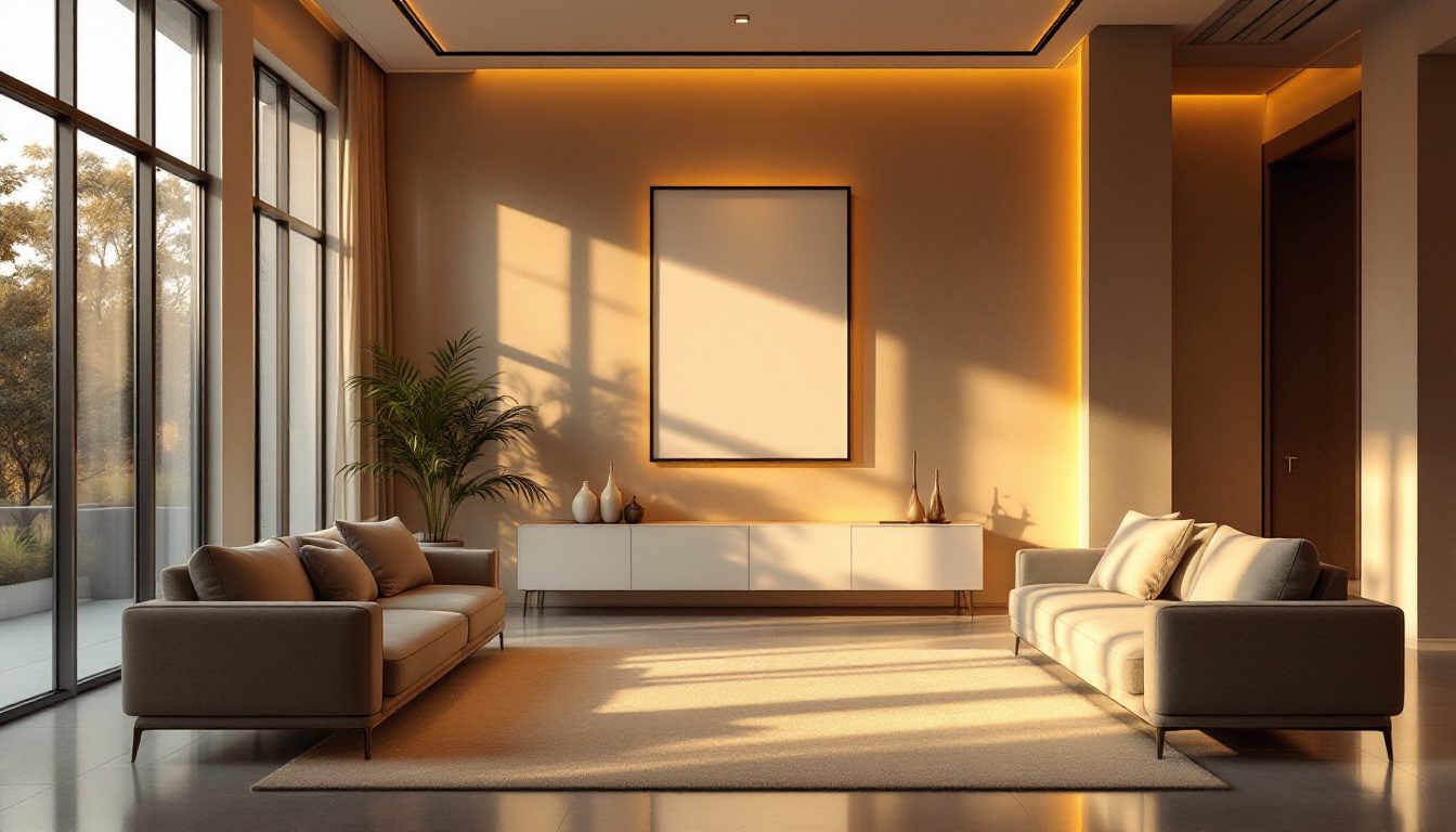
Once you have chosen the focal point, the furniture's whole job changes: it stops being a collection of objects placed against walls and becomes a frame that points at the subject. This single shift — from furniture lined up around the perimeter to furniture composed around a focus — is what makes a room feel arranged rather than merely furnished.
The principle is simple. Seating should face, flank or gesture toward the focal point, not turn its back on it. A sofa and two chairs angled toward a feature wall or a view create a conversational grouping that also reinforces where the eye should go. The classic symmetrical arrangement — two sofas facing each other on an axis that points at the focal point, or a sofa centred on the wall with a chair on each side — uses the furniture itself to build a frame, the way a procession of columns frames a temple's deity.

A few practical rules make this reliable, and most of them are about scale and spacing as much as direction:
- Centre the main piece on the focal point's axis. If the mandir niche or feature wall is off-centre, centre the sofa on the niche, not on the wall's geometric middle. The eye reads the relationship, not the room's symmetry.
- Leave the focal point room to breathe. Do not crowd furniture right up against it. A little empty floor or wall around the focus is what lets it register as special — emptiness is part of the frame.
- Match the furniture's weight to the focal point. A delicate jaali behind a heavy sectional looks overpowered; a grand feature wall above a row of low stools looks unsupported. Getting this balance right is the heart of our companion guide on scale and human comfort.
- Use the rug to draw the boundary. A rug under the seating grouping visually ties the frame together and separates it from the rest of an open-plan space.
When you are testing arrangements, it is far cheaper to do it on a plan than to drag a sofa across the floor a dozen times. The layout planner lets you place furniture against the room's real dimensions and check, from the doorway, whether the seating actually points at the focal point and leaves it room to breathe before you commit a single piece.
Reinforcing the focal point: light, colour, contrast, framing, symmetry
A focal point is not just chosen; it is amplified. Five tools do the amplifying, and they are most powerful used together, because each one is a different way of telling the eye "look here."
Light. Nothing pulls the eye like luminance contrast — the visual system is built to attend to the brightest thing in view. A wall-washer grazing a textured feature wall, a picture light over art, a warm pool of light in the mandir, or daylight flooding a framed window all make their target the brightest, most contrasted thing in the room, and therefore the figure. This is the single most effective amplifier, and the cheapest to add later.
Colour and contrast. A focal point reads as the figure when it differs from its surroundings — a deeper colour, a warmer tone, a richer material. The reason an accent wall works is pure figure–ground: it contrasts with the quieter walls around it. The corollary matters as much: the ground must stay quiet. You cannot have a strong focal point in a room where every wall is a different bold colour, because nothing can then stand out.
Framing. The eye is drawn to a thing that is enclosed or bounded. A niche, an arch, a moulding, a pair of tall plants, a recessed and lit alcove, or the negative space between two flanking elements all act as a frame that says "this is the subject." The jharokha and the jaali do this naturally; a built-in niche for the mandir does it deliberately.
Symmetry. A symmetrical arrangement — matched lamps, paired chairs, a centred composition — points unmistakably at its own centre, because symmetry creates an axis and the eye travels the axis to its focus. This is why so many strong focal points sit at the heart of a symmetrical frame. But symmetry is a tool, not a law; an asymmetrical, carefully balanced arrangement can also lead the eye to a focal point placed off the geometric centre, which is the whole subject of symmetry, asymmetry and balanced interiors.
| Amplifier | How it tells the eye "look here" | Indian example |
|---|---|---|
| Light | Luminance contrast; eye attends to the brightest point | Diya glow in the mandir; wall-washer on a stone feature wall |
| Colour / contrast | Figure stands out from a quieter ground | Deep teal accent wall behind a pale sofa |
| Material / texture | Richness draws attention against plainer surfaces | Carved teak, exposed brick, a textured lime-plaster wall |
| Framing | A boundary or enclosure marks the subject | Arched niche, jharokha, recessed alcove, flanking plants |
| Symmetry | An axis points the eye to its centre | Paired lamps and chairs around a centred mandir or art piece |
The television problem in the Indian living room
No discussion of focal points in India is complete without the television, because it is the single most common cause of confused, competing focal points in the modern Indian home. The flat-screen TV wants to be the focal point — it is large, dark, rectangular and the thing the family actually faces every evening. But it competes, usually badly, with two things that have a stronger claim: the view and the mandir.
The conflict plays out predictably. The window with the best light and outlook gets a sofa turned away from it so everyone can face the television on the opposite wall — the room's best natural asset is now behind your head. Or the television ends up on the same wall as, or diagonally across from, the pooja niche, so the eye is torn between a glowing temple and a glowing screen, two illuminated rectangles fighting for the same job. The result is a room that never feels resolved.

The resolution is not to ban the television but to demote it from competitor to a managed part of one focal zone:
- Let the strongest natural asset lead. If there is a genuine view, orient the seating so the view and the television share roughly the same direction — angle the layout so you turn your head, not your whole back, between them. A swivel television mount or a corner placement can let the screen serve the seating without stealing the room.
- Make the television recede when off. A dark screen on a dark, panelled, or fluted media wall reads as a quiet rectangle rather than a black hole. Frame-style televisions that show artwork when idle, or a screen tucked into joinery with flanking shelving, fold it into a feature wall instead of fighting it.
- Give the mandir its own zone and its own light. Keep the pooja niche off the television wall entirely, ideally in its own corner or alcove with dedicated warm light, so the two never compete in a single sightline. In Vastu terms the north-east placement usually pulls it well clear of the typical television wall anyway.
- Resolve it on a plan first. Use the layout planner to test orientations until the eye, entering from the door, lands somewhere intentional — and the television is present without being the loudest voice in the room.
Creating a focal point where the room hands you none
Many Indian flats are box rooms: four plain walls, an aluminium window onto another building, no fireplace, no view, no architecture to lean on. These rooms have no natural focal point, and that is precisely why they so often feel aimless. The solution is to manufacture one, which is easier and cheaper than people assume because a focal point is made of attention, not money.
The most reliable manufactured focal points, roughly in order of cost:
- An accent or feature wall. Paint one wall a deeper, warmer or richer colour than the others, and you have created a figure against a ground for the price of a litre of paint. Texture — lime plaster, microcement, a fluted panel, exposed brick, wallpaper — does it even more strongly.
- A statement of art or a gallery wall. A single large piece, or a tightly composed cluster, centred and lit, gives the eye an unambiguous subject. A picture light or a pair of wall lamps doubles its pull.
- A media or joinery wall. Built-in shelving and cabinetry around the (recessive) television turns the most-faced wall into a composed feature rather than a problem.
- A bold piece of furniture. A statement sofa, a sculptural chair, a carved swing (the oonjal of South Indian homes), or an antique cabinet can carry a room as its focus.
- A jaali, screen or partition. A laser-cut or carved screen, especially one that throws patterned shadow, is an irresistible focal point and an authentically Indian one.
- Light itself. A statement pendant or chandelier over a dining table, or a dramatic floor lamp in a reading corner, makes light the focus where nothing else volunteers.
The discipline in every case is the same as before: build one focal point, keep the rest of the room quiet enough to be its ground, and arrange the furniture and lighting to point at it. A box room with one well-made, well-lit feature wall and a sofa composed in front of it will feel more intentional than a room full of expensive furniture with nothing to look at.
What this means for your home
1. Find the focal point before you buy anything. Walk into each room from its main doorway and ask honestly where your eye lands first. If the answer is "nowhere," that is the problem to solve, and the cheapest one to fix.
2. Pick the strongest candidate and commit. A view almost always wins; then the mandir, a fireplace, the bed wall, or a strong piece of architecture. If none exists, choose where you will manufacture one.
3. Enforce one focal point per zone. Score your competing elements by visual pull and make sure one clearly leads. Demote the rest to a quiet supporting ground — especially the television.
4. Arrange furniture to face and frame it. Centre the main seating on the focal point's axis, leave the focus room to breathe, and use a rug to draw the frame. Test it on a plan, not by dragging furniture.
5. Amplify with light first, then colour, contrast, framing and symmetry. A single well-aimed light is the highest-impact, lowest-cost reinforcement you can add.
6. Resolve the TV-versus-view-versus-mandir fight deliberately. Let the best natural asset lead, make the screen recede when off, and give the mandir its own lit corner clear of the screen.
A focal point costs almost nothing and changes everything. It is the difference between a room that you have filled and a room that you have composed.
If you want to see your own room composed around a focal point before you commit, DesignAI can visualise your space with different feature walls, lighting schemes and furniture arrangements — so you can watch the eye land where you intend it to, and feel the difference between an aimless room and an intentional one, before a single thing is bought.
References
1. Wertheimer, M.; Koffka, K.; Köhler, W. — foundational Gestalt psychology (early 20th century), on figure–ground organisation and the perceptual grouping of a scene into subject and background.
2. Appleton, J. (1975). The Experience of Landscape — prospect–refuge theory, on the human preference for places offering both outlook and shelter.
3. Ching, F. D. K. Architecture: Form, Space, and Order — on emphasis, dominance, hierarchy and the centre of a composition.
4. Alexander, C., Ishikawa, S. & Silverstein, M. (1977). A Pattern Language — patterns on centres, "The Flow Through Rooms," and how rooms gather around a focus.
5. Arnheim, R. (1954, rev. 1974). Art and Visual Perception: A Psychology of the Creative Eye — on visual weight, balance and where the eye is drawn in a composition.
6. Lidwell, W., Holden, K. & Butler, J. Universal Principles of Design — entries on figure–ground, emphasis and visual hierarchy.
Part of the Studio Matrx Design Principles series. Continue with symmetry, asymmetry and balanced interiors, scale and human comfort, understanding spatial flow in home design, and the cluster anchor on why design principles beat magazine examples.
Export this guide
Related Guides — Deep-dive reading
The Architectural Psychology of Comfortable Spaces
Why some rooms feel right and others never do — the science of space and the human mind
Design EducationOrientation, Light & Views: Designing With Your Space, Not Against It
How reading your plot's sun, breeze and views — and placing each room on the right face — gives an Indian home that is cooler, brighter and quietly right, instead of one that fights its site forever.
Design PrinciplesAngles, Curves and Breaking the Pattern Intentionally
Why an Indian home should mostly stay a grid of right angles — and how a single deliberate curve, angle or arch, placed where it eases circulation, resolves an awkward plot or breaks a rhythm, becomes the most powerful move in the room.
Design PrinciplesRelated Tools — Try Free
Cross-Ventilation Analyzer
Estimate airflow and air changes per hour (ACH) from room size, window areas, layout, and local wind — with NBC 2016 Part 8 compliance check.
Ventilation CalculatorVastu Window Planner
Vastu guidance for window placement and size by wall direction and room — rating and remedies.
VastuWindow Orientation Planner
Pick the best window type, glass and shading by wall direction — north, east, south and west.
Window Tool