
Symmetry vs. Asymmetry: Composing a Balanced Interior
Balance is the goal, and symmetry, asymmetry and radial arrangement are three routes to it — here is how to read visual weight and choose the right one for every room in an Indian home.
Stand in the doorway of a formal drawing room in an old Lucknow house — matched settees facing each other, a console centred under a mirror, twin lamps, a chandelier dead in the middle — and something settles in you. Order. Dignity. A faint instruction to behave. Now walk into a young couple's rented Bengaluru flat where a long low sofa sits under a wall of mismatched frames, a tall plant leans in one corner and a single oversized pendant hangs off to the side. Nothing matches, yet the room does not feel wrong. It feels alive, casual, current. Both rooms work. Neither is an accident.
What both rooms share, underneath their very different looks, is balance. The matched room reaches it by mirroring; the mismatched room by counterweighting. Most people think the choice is between "neat" and "messy," or "traditional" and "modern." It is neither. The real choice is between two routes to the same destination — and learning to see balance as the destination, not symmetry as the rule, is the difference between a room that feels composed and one that feels either stiff or scattered.
Balance is the goal; symmetry and asymmetry are merely two roads to it. A room is balanced when visual weight is evenly distributed so no part pulls the eye harder than the whole can bear — and you can achieve that with perfect mirroring, with deliberate counterweighting, or with a circular pull around a centre.
Balance is the goal, not symmetry
Designers borrow the word "balance" from physics on purpose. Imagine the room as a see-saw and your eye as the thing trying to stay level. Every object has a visual weight — how strongly it tugs your attention — and balance is the state where those weights settle, where your gaze can rest instead of being yanked to one heavy corner. An unbalanced room is exhausting in a way people rarely name: you walk in, something feels "off," you keep adjusting cushions, you never quite relax — usually one side is loaded and the other empty.
There are three classic ways to reach that settled state, named the same way in design teaching for a century — drawn from the Gestalt psychologists' work on how the eye groups what it sees, and codified for interiors in texts like Francis Ching's Architecture: Form, Space, and Order.
| Type of balance | How it works | How it reads | Difficulty |
|---|---|---|---|
| Symmetrical (formal) | Mirror image either side of a central axis | Calm, dignified, orderly, traditional | Easy — but can feel stiff |
| Asymmetrical (informal) | Different objects of equal visual weight | Energetic, relaxed, modern, sophisticated | Hard — needs a trained eye |
| Radial | Elements arranged around a central point | Focused, ceremonial, dynamic | Medium — needs a strong centre |

The point of naming all three is freedom. Once you know symmetry is one tool and not the law, you stop apologising for the lamp that has no twin. And once you know asymmetry still obeys a discipline — equal weight, not equal shape — you stop mistaking "no rules" for "anything goes." The home that feels right, as we explore in a home that feels right, is almost never one where everything matches; it is one where everything is weighed.
Symmetrical balance: the dignity of the mirror
Symmetry is the oldest move in design, and the easiest to feel. Draw an invisible vertical line down the centre of a wall and place matching things either side — two chairs, two lamps, a centred bed with a matched nightstand on each flank — and the eye reads instant order. Nothing has to be calculated; the mirror does the balancing for you. This is why symmetry has always been the language of authority and ceremony: the Mughal charbagh garden quartered around a central channel, the temple garbhagriha approached straight down an axis, the bungalow's portico flanked by twin columns. Symmetry says this is important, this was intended, you may compose yourself.
There is a reason it reaches us so directly. Humans are powerfully tuned to symmetry, almost certainly for evolutionary reasons: the facial-attractiveness work by Randy Thornhill and Steven Gangestad in the 1990s found people consistently rate more symmetrical faces as more beautiful and healthier, because bilateral symmetry is a cue of sound development. We are born symmetry-detectors. A symmetrical arrangement reads as effortless to process, and that ease is itself a small pleasure — the Gestalt principle of Prägnanz, the mind's preference for simple, regular figures, at the scale of a room.
Symmetry is the easiest beauty to read, which is its gift and its trap: the eye relaxes at once, but if every wall is mirrored the room stops breathing and becomes a showroom nobody quite lives in.
So where does formal symmetry genuinely earn its place in an Indian home?
- The entrance and foyer. A centred console with a mirror above and objects flanking it gives an immediate sense of arrival and care. First impressions reward order.
- The mandir or pooja space. Symmetry here is not decoration but meaning. The deity sits on a central axis, flanked by matched lamps or diyas; the bilateral arrangement is part of the ritual order itself, and asymmetry would feel disrespectful, not merely casual.
- The formal living room. Where a room exists partly to receive guests and signal the family's care — still common in homes that keep a "good" sitting room — matched sofas facing across a centred coffee table read as gracious and composed.
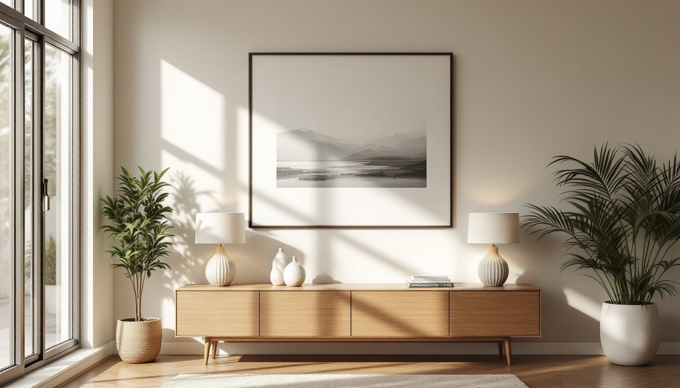
- The master bed wall. A bed centred on its wall with a matched nightstand, lamp and art on each side is the most reliable symmetrical move in the house, and the most restful — the mirroring soothes precisely where you most want calm.
The danger of symmetry is monotony. Because it is so easy to read, too much of it tips from "calm" into "lifeless." A whole home in perfect symmetry feels like a hotel lobby — correct, impressive, strangely unlovable. The eye, having nothing to discover, glazes over. Symmetry rewards the rooms that want gravity; it punishes the rooms that want life.
Asymmetrical balance: energy you have to earn
Asymmetrical balance is the harder, more sophisticated art: arranging different objects so their visual weights still even out, without any mirroring at all. A large painting on the left can be balanced by a cluster of three smaller frames on the right. A heavy sofa on one side can be answered by a tall plant, a floor lamp and a side chair on the other. Nothing is repeated, yet the see-saw stays level.
The mental model that makes this manageable is the see-saw: a fulcrum in the middle of the wall or room, with objects placed so the heavy thing near the centre is matched by lighter things spread further out. Just as a heavy child near the pivot balances a lighter child far out, a single weighty object can balance a group of light ones placed with more spread.

To use this, you need to read visual weight — and weight is not just physical size. Several things make an object pull harder on the eye:
| Property | Heavier (pulls the eye more) | Lighter (recedes) |
|---|---|---|
| Size | Large | Small |
| Colour | Dark, saturated, warm (red, terracotta) | Pale, muted, cool (sky, sage) |
| Contrast | High contrast against its background | Blends into the background |
| Texture and pattern | Busy, textured, patterned | Smooth, plain |
| Visual complexity | Detailed, ornate | Simple |
| Position | Isolated in space | Crowded among others |
This is why asymmetry is harder: you are constantly trading these against one another. A small, intensely red, isolated object can outweigh a large, pale, plain one; a single dark teak almirah can balance a whole pale wall of open shelving. When it lands, the reward is energy — asymmetry feels modern and intelligent precisely because it looks effortless while being anything but, telling the eye there is something to discover, the feeling of a room genuinely lived in rather than staged.
For most contemporary Indian homes — open-plan, mixing inherited and new pieces, rarely able to buy in matched pairs — asymmetry is also more honest. You have your grandmother's heavy carved chest and a flat-pack bookshelf; you cannot mirror them, but you can balance them.
Radial balance: composing around a centre
The third route is radial: arranging elements around a central point so the eye spirals in or out from the middle. It is less common in domestic interiors but unmistakable when it appears, and it carries a distinct charge — focus, gathering, occasion. The classic Indian instances are everywhere once you look: a round dining table ringed with chairs, the chandelier that crowns it, the circular rangoli at the threshold, the mandala that has organised sacred Indian art for millennia, the diyas placed in a ring at Diwali. Radial composition pulls people and attention toward a centre, which is why it suits spaces of coming-together — a dining room, a courtyard, low seating around a central rug.
Radial balance needs a strong, deliberate centre — a round table, a circular rug, a striking light fixture. Without that anchor it reads as merely scattered; with it, radial arrangements feel both stable (everything refers to one point) and dynamic (the eye keeps circling). It is the natural partner of a strong focal point, which is why it pairs so well with our guide on focal points and intentional rooms: a radial layout is, in effect, a focal point with the whole room arranged to honour it.
The psychology: why too much symmetry feels dead
Here is the paradox at the heart of balance. Humans find symmetry beautiful — the face research is unambiguous — and yet perfectly symmetrical interiors often feel cold, formal, even oppressive. Why would the thing we are evolved to find attractive become tiring at the scale of a room?
Because beauty and interest are not the same appetite. The brain rewards two opposite things: the ease of processing order (symmetry, pattern, repetition) and the stimulation of discovering complexity (variation, surprise, the slightly-off). Pure symmetry over-satisfies the first and starves the second. Daniel Berlyne's work in aesthetic psychology on arousal and the preference for intermediate complexity captures it: we most enjoy things ordered but not too ordered — enough regularity to feel safe, enough irregularity to feel alive. A blank symmetrical grid bores us; chaos overwhelms us; the sweet spot is structured variety.
This is why the best symmetrical rooms cheat a little. A perfectly mirrored room is relieved by one deliberate break — an asymmetric artwork over the mantel, an off-centre stack of books, a plant that leans. Designers call it "broken symmetry": the underlying order reassures, the small deviation rewards.
| Too much order | The sweet spot | Too much disorder |
|---|---|---|
| Everything mirrored and matched | Underlying balance with one or two deliberate breaks | Nothing relates to anything |
| Reads as cold, formal, staged | Reads as composed yet alive | Reads as cluttered, restless, anxious |
| Eye glazes over, nothing to find | Eye rests, then discovers | Eye cannot rest at all |
| Hotel lobby, showroom | A home that feels right | A storage unit |
The same logic explains why proportion matters to whether balance reads as graceful or merely correct — the ratios that govern where weight sits are the subject of our companion guide on the golden mean and proportion. Balance answers is the weight even?; proportion answers are the relationships between sizes pleasing? A room needs both.
The Indian context: formal homes, relaxed flats
Indian design carries both impulses in its bones, and the tension between them is partly generational, partly about what a room is for.
The traditional formal home leaned strongly symmetrical. Vastu-influenced planning privileges axes and centred zones; the brahmasthan (the centre of the home, ideally kept open) is a literal central point the plan defers to — a radial idea at the scale of the whole house. Temple architecture is axial by doctrine. The colonial and princely homes that shaped middle-class aspiration — the bungalow, the haveli's formal baithak — used matched furniture and flanking symmetry to signal status. For a generation raised in those rooms, "well-arranged" still means "matched": a three-piece sofa set placed symmetrically, identical curtains, a centred centre-table.
Contemporary homes lean the other way. Flats are smaller and open-plan, so a single living-dining-kitchen run cannot sustain three separate symmetrical set-pieces without feeling crowded and dull. Families furnish over years, mixing inherited heavy wood with new modular pieces — matching is neither affordable nor desirable. And a younger sensibility reads relaxed asymmetry as more personal, less "showroom." The honest modern Indian room is usually asymmetrically balanced: the inherited rosewood swing (oonjal) on one side answered by a gallery of family photographs and a tall plant on the other.
| Setting | Tends toward | Why | Watch out for |
|---|---|---|---|
| Foyer, mandir, formal living | Symmetry | Signals order, care, ceremony, respect | Letting it spread until the whole home feels staged |
| Master bedroom | Symmetry (bed wall) | Mirroring is deeply restful | Matching so thoroughly the room feels like a hotel |
| Open-plan living-dining | Asymmetry | One run cannot carry repeated set-pieces | Mistaking "no pairs" for "no balance" — it still must weigh out |
| Round dining, courtyard, pooja ring | Radial | Pulls people and attention to a centre | A weak centre that leaves it looking scattered |
| A home mixing old and new pieces | Asymmetry | You cannot mirror what you did not buy in pairs | Crowding heavy heirlooms on one side with nothing to answer them |

The smart approach is not to pick a side for the whole house but to assign the kind of balance room by room. Let the spaces that want dignity be symmetrical; let the spaces that want life be asymmetrically balanced; let the gathering spaces go radial. This is the same logic of matching a principle to a room's purpose that runs through a home that feels right and the broader design principles over magazine examples — the pillar this guide belongs to.
A practical method for any wall or room
You do not need an eye trained for decades; you need a method. First, find the axis or centre — drop an imaginary vertical line down a wall, or locate the focal point of a room — because everything is weighed against it. Then decide the balance type by what the room is for: ceremony and rest take symmetry, open-plan and mixed pieces take asymmetry, gathering takes radial. If symmetrical, mirror the big pieces, then break it once with a single off-centre note so it breathes. If asymmetrical, place the heaviest object off-centre and answer it across the fulcrum with lighter things spread wider. If radial, build the centre first and arrange the rest around it.
Above all, test by moving, not by buying — the single biggest saver of money and regret. Arrange and re-arrange before anything is wall-mounted, using the furniture layout designer to slide weights around a plan and feel where the see-saw tips. And use the squint test, the professional's secret: half-close your eyes and detail falls away, leaving only blocks of light and dark. In that blur, imbalance is obvious — one corner reads as a heavy mass with nothing answering it. Fix what the squint reveals and the room will feel right even to people who could never say why.
What this means for your home
1. Aim for balance, not symmetry. Symmetry is one way there; do not feel you have failed because your lamp has no twin.
2. Match the balance type to the room's job. Symmetry for the foyer, mandir, formal living and the bed wall; asymmetry for open-plan spaces; radial for round dining and gathering spots.
3. Never let perfect symmetry stand alone. Break it once, deliberately, so the room stays alive rather than tipping into showroom stiffness.
4. Learn to read visual weight, and use the see-saw model: dark, large, ornate, isolated objects pull hardest, and one heavy piece near the centre balances several light ones spread further out.
5. Honour inherited pieces by counterweighting, not hiding them, and always test by moving — squint, slide things around a plan — before you drill the wall or place the order.
If you want to see your own room balanced both ways before you commit, DesignAI can generate a symmetrical and an asymmetrical version of the same wall from a photo or plan — so you can feel the difference between the dignity of the mirror and the energy of the counterweight, and choose the one your room is actually for.
References
1. Ching, F. D. K. Architecture: Form, Space, and Order. — definitive treatment of symmetrical, asymmetrical and radial balance and of visual weight in composition.
2. Thornhill, R. & Gangestad, S. W. (1999). "Facial attractiveness." Trends in Cognitive Sciences, 3(12), 452–460 — on bilateral symmetry as a cue read by the eye as beauty and health.
3. Koffka, K. Principles of Gestalt Psychology (1935); and Wertheimer's earlier work — on Prägnanz and the mind's preference for simple, regular, balanced figures.
4. Berlyne, D. E. Aesthetics and Psychobiology (1971) — on arousal, complexity and the preference for intermediate, "ordered but not too ordered," stimulation.
5. Arnheim, R. Art and Visual Perception: A Psychology of the Creative Eye (1954) — on balance, the central axis, and the perceptual weight of visual elements.
6. Alexander, C., Ishikawa, S. & Silverstein, M. A Pattern Language (1977) — on hierarchy, centres and the organisation of space around significant points.
7. Vastu Shastra principles on the brahmasthan and axial planning — traditional Indian sources on the centred, symmetrical organisation of the home.
Part of the Studio Matrx Design Principles series. Continue with focal points and intentional rooms, the golden mean and proportion in interiors, a home that feels right, and the pillar guide on design principles over magazine examples.
Export this guide
Related Guides — Deep-dive reading
Why Scale Matters: Keeping Rooms Comfortable for Humans
How sizing furniture, art and lighting to the human body — not the showroom — keeps small Indian flats from feeling crushed and large halls from feeling empty.
Design PrinciplesHow to Design a Home That Feels Right — Beyond Just Looks
The invisible design decisions — order, scale, light, craft and memory — that make a home feel like home, not a showroom
Design EducationThe Golden Mean: The Secret Proportion Behind Beautiful Rooms
How the golden ratio, the rule of thirds and classic room proportions make a space feel resolved — and how India's vastu mandala and talamana traditions solved the same problem.
Design PrinciplesRelated Tools — Try Free
Interior Layout Planner — Printable Graph Grid
Printable graph grid to sketch room layouts to scale before committing to furniture placement.
Layout ToolApartment Furniture Size Chart
Standard furniture dimensions for Indian apartments — sofas, beds, tables, dining, storage.
Reference ChartVastu Shastra Compliance Checker
Score your home across 21 Vastu criteria with a weighted score, compliance band, and remedial guidance.
Vastu Scoring