
Why Corridor Width Matters
The most overlooked dimension in your home — how passage width decides comfort, flow and wasted space
You have felt it without naming it. The hallway in a relative's flat where you instinctively turn your shoulders to pass someone coming the other way. The strip of floor between your bed and the wardrobe where the door never quite opens fully. The gap behind the dining chairs that forces a guest to half-stand and shuffle whenever someone needs to leave the table. None of these are dramatic. They are tiny, daily, almost subliminal frictions — and they are all the same problem wearing different clothes.
This guide is about circulation width: the clear space your body moves through, between walls, around furniture, past doors. It is the single most overlooked dimension in an Indian home, partly because nobody sells it to you. Showrooms sell tiles, modular kitchens, false ceilings and sofas. Nobody sells you the 200 mm of corridor that decides whether your house feels gracious or grudging every single day for the next twenty years.
The core idea is this: circulation is invisible when it is right and exhausting when it is wrong — and the design goal is never "wide", it is the narrowest width that still feels generous. Too little and the home pinches you a hundred times a day. Too much and you have paid lakhs for floor you can stand on but never furnish.
Why width is the dimension nobody thinks about
Ask a homeowner what makes a home feel good and you will hear about light, ceiling height, ventilation, finishes, "vastu", maybe layout. You will almost never hear "the corridor was the right width". That is precisely why it goes wrong so often. Width is a silent variable. It does not announce itself in a brochure or a 3D render — renders are usually shot from the one angle where the squeeze does not show. It only reveals itself when you live in the space, body-first, day after day.
Circulation also has a peculiar economic curse. It is the only part of your home you pay to build, finish, clean and cool — and can never furnish. A bedroom earns its area by holding a bed; a corridor earns nothing. It is pure connective tissue. So there is a powerful, unconscious pressure to starve it: every millimetre you give the passage is a millimetre taken from a room you can actually use. Builders chasing carpet-area efficiency lean hard on this, and the result is the pinched-hallway flat that millions of Indians live in.
The trap is that the logic is half right. Circulation should be lean. The error is going past lean into mean — shaving the passage below the point where the body moves through it with ease, to save an area so small it changes nothing in the adjoining room. The whole craft of good planning sits in that narrow band: generous enough to disappear, lean enough not to waste. To find it, start with the body.
The ergonomics: what your body actually measures
A standard adult, shoulders relaxed, occupies roughly 450 to 550 mm across the shoulders, and a little more once you allow for arm-swing and a margin so you are not scraping the wall. The ergonomic literature — Neufert's Architects' Data is the standard reference — rounds this to about 600 mm of clear width to walk comfortably alone. That is not a corridor width; it is the bare channel one unhurried person needs. Go below it and you are turning sideways.
The moment you add anything, the number jumps. Carry a tray, folded clothes, a child on the hip, and your effective width balloons to 750 mm or more. This is why a corridor that is "fine when empty" becomes a daily annoyance the instant real life — laundry, food, luggage, a toddler — moves through it.
Now let two people pass. Two adults moving in opposite directions, neither turning sideways, neither breaking stride, need roughly 1200 mm. This is the single most useful number in the whole subject. It is the width at which a passage stops being a one-at-a-time bottleneck and becomes a space two people can share without negotiation. Below it, every encounter becomes a tiny social transaction — who waits, who turns, who steps into a doorway. Above 1200 mm you are paying for grandeur, not function.
And then there is the dimension that should anchor every long-term home: the wheelchair, the walker, the older parent who will one day need both. A wheelchair needs about 900 mm of clear width to travel straight, but it needs a full 1500 mm circle to turn around — and there is no point in a 900 mm passage a wheelchair can enter but never reverse out of. We will return to this, because "ageing in place" is not a niche concern in India; it is the default future of multi-generational homes.

The crucial subtlety in every one of these numbers is the word clear. Clear width is measured between finished surfaces — after the skirting, after the plaster, after the open wardrobe shutter, after the door leaf has swung. Drawings show you the masonry opening; your body lives in what is left after everything is installed. A passage drawn at 1000 mm can end up at 850 mm of real, usable width once skirting, switch plates and a slightly proud door frame are in. Always design to clear dimensions, and always subtract for what gets added later.
The standard widths: minimums, comfort, and when to widen
Codes give you a floor, not a target. The National Building Code of India (NBC 2016) sets passage and corridor minimums primarily for safe egress — it asks "can people get out in a fire?", not "does this feel nice?". For internal residential circulation, good practice lands well above the bare minimum. Here is the reference every homeowner should hold in their head.
| Path type | Minimum (mm) | Comfortable (mm) | Why this number |
|---|---|---|---|
| Internal corridor / passage | 900 | 1100–1200 | 900 lets one person pass cleanly; 1100–1200 lets two pass and stops the "tunnel" feeling |
| Doorway, clear opening | 800 | 900 | 800 fits a person plus a margin; 900 lets furniture and a wheelchair through |
| Kitchen work aisle (galley/parallel) | 1000 | 1100–1200 | Below 1000 two cooks collide and open oven/fridge doors block the aisle |
| Gap beside a bed | 600 | 750 | 600 lets you walk past; 750 lets you make the bed and open a side drawer |
| Clearance behind a dining chair | 900 | 1100 | 900 lets a seated person rise; 1100 lets another person walk behind |
| Balcony / utility access | 800 | 1000 | A threshold path used with hands full — laundry baskets, plants, mops |

Two of these deserve unpacking. The doorway clear opening is routinely misunderstood: a "900 mm door" is the leaf size, but once open the leaf sits in the opening and the clear passage drops to roughly 820 to 850 mm. For a genuine 900 mm clear opening — the universal-design target — you specify a wider frame. This matters the day a sofa, fridge or wheelchair must come through.
The clear width after a door swings is the quiet killer of small layouts. A bedroom door opening into a 900 mm passage blocks most of it while open; two doors opposite each other can foul one another. The fix is rarely a wider corridor — it is smarter door placement: hinge to the wall, swing into the room not the passage, or use a sliding/pocket door where space is tight. Plan the swings, not just the walls.
And the kitchen aisle is the dimension Indian homes get wrong most often, so it gets its own section.
The kitchen aisle: the one width you cannot fudge
In a galley or parallel kitchen — two counters facing each other, the dominant Indian apartment layout — the gap between the counter fronts is the work aisle, and it does more work than any corridor in the house. It must let you stand at the hob, bend to the lower cabinet, open the oven, pull out the fridge door, and accommodate a second person, because cooking here is rarely solo.
The minimum that functions is 1000 mm. Below that, an open oven door or a crouching person blocks the entire aisle. The comfortable target is 1100 to 1200 mm: enough to pass behind another cook and open opposing cabinet doors.
But there is a ceiling, too, and it is counter-intuitive. Push the aisle past about 1300 mm and the kitchen gets worse. The reason is the work triangle — sink, hob, fridge. In a galley, efficiency depends on pivoting between the two counters in a single step. Widen the aisle too far and every task becomes a walk. This is the clearest proof of the whole thesis: more width is not better — correct width is, and correct has both a floor and a ceiling.
Circulation is the only space in your home you pay to build, finish and cool — and can never furnish. So spend on it like a miser with taste: not a millimetre wasted, not a millimetre short.
The comfort psychology: why the wrong width wears you down
Width is not only an ergonomic fact; it is a psychological one. The environmental-psychologist Edward Hall, whose work on proxemics mapped how humans use space, showed that we carry an invisible "personal bubble" and read its compression as stress. A corridor that forces you within touching distance of another person triggers a low-grade tension every time — and multiplied by every hundred-times-a-day passage, a pinched corridor becomes a quiet tax on the nervous system. It is the same family of effects explored in the architectural psychology of comfortable spaces: the home that calms you does so by removing micro-frictions you never consciously register.
The narrow corridor fails in three ways at once. Physically, it bruises shoulders and forces the sideways shuffle. Spatially, it reads as a tunnel and the body reads constriction as threat. Socially, it makes every passing an awkward negotiation, dozens of times a day. The cumulative experience is not "my corridor is 200 mm too narrow"; it is a vague, persistent sense that the home is fighting you.
But the opposite failure is just as real, and Indian homeowners under-rate it because wide feels generous. A 1800 mm "grand" corridor in a flat where bedrooms are starved is a mistake dressed as luxury. You have converted scarce, expensive floor into a path you cannot put anything on, because furnishing a circulation route blocks the circulation. The grandeur lasts the thirty seconds a guest walks through; the cost is permanent. As Christopher Alexander argued in A Pattern Language, the feeling of "rightness" comes from fit, not excess. A corridor feels good when it is exactly enough.
The trade-off, costed: corridor as dead area
Make the waste concrete. Take a 4-metre internal corridor — a realistic run from a flat's foyer to its bedrooms. At a comfortable 1100 mm it occupies 4.4 m². Widen it to a "generous" 1800 mm and it eats 7.2 m² — an extra 30 square feet you can never furnish. At a modest ₹4,000 per square foot, that is roughly ₹1.2 lakh spent on a passage; in a premium build at ₹8,000+, ₹2.4 lakh to walk through air.

| Verdict | Corridor width | What it feels like | The cost |
|---|---|---|---|
| Too narrow | 750–850 mm | Pinched, claustrophobic; daily shoulder-turning and shuffling | Constant low-grade friction; the home "fights" you |
| Just right | 1000–1200 mm | Disappears — you stop noticing it; two can pass | Near-zero waste; the sweet spot |
| Too wide | 1700 mm+ | Grand for a moment, then merely empty | ~30 sq ft and ₹1–2.4 lakh of unfurnishable floor per 4 m run |
The smartest move of all is to question whether the corridor should exist. The cheapest, most generous corridor is the one you delete. Open planning — letting living, dining and kitchen flow into one another — eliminates the dedicated passage entirely; circulation happens through usable rooms rather than alongside dead ones. A "through-room" earns its area twice: a place to be and a route to elsewhere. This is the deeper subject of understanding spatial flow in home design, and avoiding the corridor-heavy plan is a big lever in the space-planning mistakes that make homes feel smaller. When a corridor is genuinely necessary — to give bedrooms privacy from the public zone — make it short, lit, and exactly wide enough.
Accessibility and ageing in place: design for the parent you will become
Indian homes are increasingly multi-generational, and even nuclear ones will host ageing parents and, eventually, ageing owners. Designing circulation only for a fit 30-year-old is short-term thinking. Universal-design standards — drawn from international accessibility codes and India's accessibility guidance — widen the assumption of who moves through the house.
| Need | Clear width / space (mm) | Note |
|---|---|---|
| Wheelchair straight travel | 900 | Absolute minimum to move along a passage |
| Two wheelchairs / wheelchair + walker passing | 1500–1800 | Needed only on primary routes |
| Wheelchair 360° turn | 1500 (circle) | Required in bathrooms, at corridor ends, in any dead-end |
| Doorway for wheelchair | 900 clear | Specify the frame wide, not just the leaf |
| Walking frame / walker user | 900 | Plus a clear, trip-free floor — no thresholds, no rugs |
The two figures to commit to memory are 900 mm clear for any door and primary passage, and a 1500 mm turning circle wherever a path dead-ends or a wheelchair must reverse — typically the bathroom and the end of the bedroom corridor. You need not make the whole house wheelchair-grade today; make the primary route — entrance, one bedroom, one bathroom — capable of it, so a future need never means demolition. This is the forward-looking logic behind good multi-generational home design.
Width by location: a tour of the home
Circulation is not one number; it is a different number in every room. A quick tour of where width quietly decides comfort:
The entry. The threshold path from door to inside should be at least 900 mm, ideally 1100 mm — it is used with hands full: bags, deliveries, removing shoes. A pinched entry sets a grudging first impression every time you come home.
Around the bed. The gap between bed and wardrobe wants 600 mm to pass and 750 mm to make the bed and open a drawer. The classic Indian-bedroom error is a wardrobe whose open shutters leave under 500 mm to the bed — so you can never open it and stand in front of it at once.
Around the dining table. Behind a pulled-out chair you need about 900 mm to rise, 1100 mm if someone must also walk behind. Dining sets crammed against a wall produce the everyone-stand-so-I-can-get-out manoeuvre.
Balcony and utility access. These hands-full routes — laundry, plants, mops — deserve 1000 mm and almost never get it.
Getting these right is the everyday craft of space-planning principles, and the fastest way to test them is to physically measure your own home with a tool like the room measurement utility and lay furniture against the real clearances with a furniture layout designer before anything is bought or built.
Width, light and length: why the worst corridor is long, narrow and dark
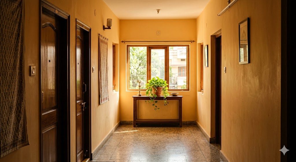
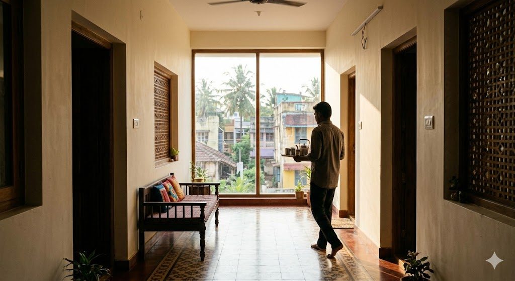
Width never acts alone. Its psychological effect is set by length and light. A 1100 mm corridor that runs 2 metres and ends in a sunlit window is a delight. The same 1100 mm corridor running 6 metres into a dark dead-end is oppressive — the eye reads it as a tunnel and no amount of paint fixes it. The longer and darker a passage, the wider it needs to feel — and the more it needs a destination.
The single most powerful corridor fix in architecture is to end it in light. A window, a glazed door, a framed view, a pool of lamplight — anything that gives the eye a destination converts a tunnel into a route. The corridor that fails ends in a blank wall or a closed door. This ties directly to why your home feels dark, and it works on proportion exactly as ceiling height does in the science of ceiling heights: the body reads the ratio of a space, not any single dimension.
Design fixes: how to get generous width without losing area
You rarely need a wider house. You need a smarter one. The professional moves:
Borrow width. A corridor flanked by a wardrobe niche or bookshelf recess reads as wider than its clear dimension, because the eye borrows the depth of the recess. The clear path stays at 1000 mm but the felt width is greater.
Widen at the nodes, pinch between. A passage need not be a constant width. Flare it where paths meet — outside a cluster of doors — and let it run lean between. The brain reads the generous moments and forgives the lean ones.
End every corridor in light or a view. Non-negotiable: a window, glazed door or bright artwork at the terminus.
Delete the corridor. Open-plan the public zone so circulation runs through usable rooms; reserve dedicated corridors for the private wing, where privacy earns the dead area.
Use sliding and pocket doors where swings steal clear width — a pocket door reclaims the entire arc a hinged door consumes.
Design to clear dimensions and subtract for finishes — skirting, switch plates, an open door, a proud frame.
What this means for your home — apply it, in order
1. Walk your current home with a tape. Measure your real corridors, kitchen aisle, bed-side gaps and dining clearances. Compare them to the reference table. You will instantly find the frictions you have been absorbing for years.
2. Set your corridor target at 1100–1200 mm, never below 900 mm clear, and treat anything above 1500 mm as a deliberate, costed luxury — not a default.
3. Protect the kitchen aisle at 1000 mm minimum, 1100–1200 mm ideal — and never exceed ~1300 mm in a galley, or you break the work triangle.
4. Specify 900 mm clear doorways on the primary route (entry, one bedroom, one bathroom) and a 1500 mm turning circle in that bathroom, so ageing in place never requires demolition.
5. Plan door swings, not just walls. Hinge doors to swing into rooms, away from passages; use sliding or pocket doors in tight spots.
6. End every corridor in light. A window, glazed door or bright view at the terminus — design this in before you fix the width.
7. Question every corridor's existence. Can open planning or a through-room delete it? The cheapest generous corridor is the one you never build.
8. Always design to clear, finished dimensions and subtract for skirting, frames and open shutters before you commit.
Circulation width is the discipline that separates a home that quietly serves you from one that quietly drains you — and it costs nothing but attention at the planning stage. DesignAI can help you test corridor and clearance widths against your actual plan, flag the pinch points before a wall is built, and show you where a through-room could delete a dead passage altogether — so you spend your floor area on living, not on walking.
References
1. Bureau of Indian Standards. National Building Code of India 2016 (NBC 2016), Part 4 — Fire and Life Safety (egress and passage minimums) and general building requirements.
2. Neufert, E. & Neufert, P. Architects' Data, 5th ed. Wiley-Blackwell — standard ergonomic clearances for human movement, passages, kitchens and circulation.
3. Hall, E. T. The Hidden Dimension. Anchor Books, 1966 — proxemics and the psychology of spatial compression.
4. Alexander, C., Ishikawa, S. & Silverstein, M. A Pattern Language. Oxford University Press, 1977 — patterns on "The Flow Through Rooms", short passages and circulation.
5. Ching, F. D. K. Architecture: Form, Space, and Order. Wiley — circulation, path-space relationships and spatial sequence.
6. ISO 21542 and Indian Harmonised Guidelines and Standards for Universal Accessibility — clear widths, turning circles and door clearances for accessible design.
7. Panero, J. & Zelnik, M. Human Dimension & Interior Space. Watson-Guptill — anthropometric clearance data for residential interiors.
Keep building your design literacy: read understanding spatial flow in home design, the science of ceiling heights, and the space-planning principles that make homes feel right.
Export this guide
Related Guides — Deep-dive reading
Designing Adaptable & Universal-Design Homes
Accessibility, Aging-in-Place, and the Multi-Stage Family — Code, Anthropometrics, and Plan-Stage Discipline for Indian Residential Architects
Room PlanningThe Architectural Psychology of Comfortable Spaces
Why some rooms feel right and others never do — the science of space and the human mind
Design EducationWhy Scale Matters: Keeping Rooms Comfortable for Humans
How sizing furniture, art and lighting to the human body — not the showroom — keeps small Indian flats from feeling crushed and large halls from feeling empty.
Design PrinciplesRelated Tools — Try Free
Apartment Furniture Size Chart
Standard furniture dimensions for Indian apartments — sofas, beds, tables, dining, storage.
Reference ChartCross-Ventilation Analyzer
Estimate airflow and air changes per hour (ACH) from room size, window areas, layout, and local wind — with NBC 2016 Part 8 compliance check.
Ventilation CalculatorVastu Window Planner
Vastu guidance for window placement and size by wall direction and room — rating and remedies.
Vastu