
Anatomy of a Good Neighborhood
What makes a neighbourhood a real place to live — Perry's neighbourhood unit, Jane Jacobs's eyes on the street, human scale, social infrastructure and legibility
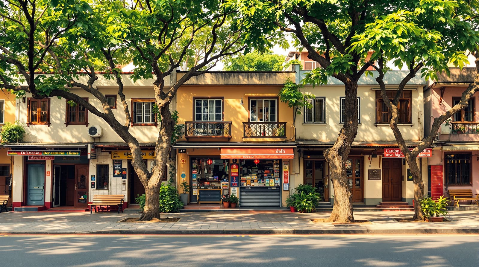
It is half past six on a Tuesday evening in an old quarter of Pune. The light is going amber. A grandmother sits on the low plinth outside her doorway shelling peas while two children chase each other around a parked scooter; the kirana owner across the lane is weighing dal for a customer he has known for thirty years; a knot of office-returnees has gathered at the chai stall on the corner, and somewhere a temple bell is being rung. Nobody planned this evening. It simply happens, the way it has happened on this street for decades, because the street is built so that it can.
Drive twenty minutes to the edge of the same city and you reach a brand-new gated layout — wide, smooth, geometrically perfect roads, generous plots, a clubhouse, a manicured central garden behind a locked gate. And it is silent. The footpaths are empty. The compound walls are tall and blank. People arrive home by car, the gate rolls shut, and the street outside dies. The layout works on paper, passes every regulation, and yet nobody is ever simply out in it. A good neighbourhood is not a layout that merely functions — it is a place engineered, deliberately or by inheritance, so that ordinary human life spills into the shared space between buildings and stays there.
The neighbourhood unit, and why it still matters
In 1929 the American planner Clarence Perry described the Neighbourhood Unit — and almost a century later it remains the cleanest diagram we have of a place built around people rather than traffic. His idea was simple and humane: organise a residential area around a centre — typically a primary school — that every child can walk to without crossing a major road. Keep the unit small enough that the school sits within a roughly five-minute walk of the furthest home. Distribute small parks and play spaces through it. Put local shops at the edges or corners where two units meet. And — crucially — let the fast, heavy traffic run around the perimeter on arterial roads, so that the streets inside stay calm and belong to residents, not through-traffic.

Perry's model has been justly criticised and updated — chiefly for the way it can turn a neighbourhood inward and isolate it from its neighbours, and for the Radburn-era assumption that separating people and cars completely is always good. The modern reading, through New Urbanism and Traditional Neighbourhood Development, keeps the walkable centre and the human catchment but stitches units together with a connected web of streets rather than walling each one off, and insists on a genuine mix of uses so daily errands stay close. The bones are still right, though: a walkable core, a clear edge, calm streets inside, fast roads outside. How those internal streets are sized and ranked is a craft of its own — see our companion guide on street hierarchy — but the placemaking instinct underneath is Perry's.
Eyes on the street: what Jane Jacobs taught us
If Perry gave us the plan, Jane Jacobs gave us the life. Writing in 1961 against the grain of the slum-clearance orthodoxy of her day, she observed something planners had missed entirely: that the safety, vitality and sheer pleasure of a neighbourhood came not from order imposed from above but from a dense, casual, self-organising street ballet — and that good physical design either invited it or killed it.
Her conditions are worth memorising because they translate almost perfectly to the Indian street:
- Eyes on the street. Buildings that face the street, with real doors and windows and balconies onto it and shops at ground level, mean there are always people casually watching. A street watched by a hundred unhurried glances is safe in a way no boundary wall and guard can match. The blank-compound-wall layout fails precisely here.
- Short, walkable blocks. Frequent corners and many route choices mean people circulate, paths cross, and shops at corners catch passing trade. Long superblocks ringed by walls do the opposite.
- A mix of uses. When homes, the kirana, a clinic, a tailor and a tuition class share a street, that street has people on it at different hours for different reasons — the morning milk queue, the lunchtime errand, the evening stroll. Mono-functional residential-only zones empty out.
- A mix of building ages and rents, so that the cheap old premises that incubate a new tea stall or a one-man repair shop survive alongside the new.
The older Indian mohalla satisfies every one of these almost by accident, which is why it feels alive. Much of what we should be doing in new layouts is rediscovering, on purpose, what the mohalla did by habit.
Human scale: the dimension that decides everything
Walk down a street that feels good and one that feels hostile, and the difference is usually measurable. The single most important number in placemaking is the ratio of building height to street width — the sense of enclosure. When buildings are too far apart relative to their height, a street feels like a windswept void and people hurry across it; when they are reasonably close, the street feels like an outdoor room you want to linger in. A comfortable enclosure, planners commonly suggest, sits somewhere around a 1:2 to 1:1 height-to-width relationship, though this varies with climate and use.

Enclosure is only half of it. The other half is the frontage — what the ground floor does to the person on the footpath. A street lined with doors, windows, verandahs, gates you can see through and the occasional shopfront is interesting and safe at walking pace; a street lined with blank parking podiums and three-metre walls is dead at any pace. In the Indian climate, two more ingredients turn a walkable street into a lovable one: continuous shade — ideally from large canopy trees, the way a banyan or a row of rain trees can make a whole street habitable through May — and a proper, level, unobstructed footpath wide enough to actually walk on. The detailed metrics of getting this right are the subject of our guide on walkable neighbourhood design; here the point is simpler. Human scale is not a luxury layered on at the end. It is the thing that decides whether anyone ever chooses to be outside.
Social infrastructure and the legible city
A neighbourhood becomes a community through a thousand tiny, repeated, low-stakes encounters — and those encounters need somewhere to happen. The sociologist's term is social infrastructure: the corner shop, the chai stall, the park bench, the temple or mosque or church, the school gate at pick-up time, the otla or plinth you can sit on, the maidan where boys play cricket and grandparents take the evening air. None of these are grand. All of them are where a neighbour becomes a familiar face becomes someone who would notice if you went missing. A layout that reserves only a locked ornamental garden and forgets the bench, the shaded corner, the small flat space where the festival pandal can go has supplied open space without supplying public life. The two are not the same — and getting the difference right is the heart of open-space planning.

Then there is identity — the quality that lets you say this place is somewhere, not anywhere. Kevin Lynch, in The Image of the City, showed that people carry mental maps built from five elements: paths (the routes you move along), edges (the boundaries — a railway line, a canal, a green belt), districts (areas with a shared character), nodes (the points where things converge — a junction, a market square) and landmarks (the temple spire, the old tree, the water tank you navigate by). A legible neighbourhood — one that is easy to read, remember and feel oriented in — is one that gives people these elements clearly. A layout of identical curving roads and identical plots, deliberately confusing to slow traffic, also leaves residents subtly lost and unattached. A memorable corner, a distinctive gateway, a real square does the opposite: it gives people a place to belong to.

The ingredients, and how a layout enables them
The frustrating truth for designers is that you cannot draw "community" onto a plan. What you can do is create — or destroy — the physical conditions that let it grow. This is where placemaking meets the drawing board.
| Ingredient | Why it matters | How a layout enables it |
|---|---|---|
| A walkable centre | Daily needs & the school within a short walk pull people out on foot, on the same paths, daily | Locate the school, a small market & a park at the core, within ~400–800 m of every home |
| Eyes on the street | Casual surveillance makes streets safe & sociable without guards or gates | Plot orientation & bye-laws that face doors, windows & balconies onto the street, not blank walls |
| Mixed use | Errands, work & home close together keep streets peopled at all hours | Permit kirana, clinics & tuition at corners & ground floors, not pure single-use zoning |
| Human scale & shade | Enclosure, frontage & tree cover decide whether anyone chooses to be outside | Sensible height-to-width ratios, active frontage rules, generous footpaths & canopy trees |
| Social infrastructure | The bench, chai stall, otla & place of worship turn neighbours into a community | Reserve small, distributed, usable gathering spaces — not one locked ornamental lawn |
| Identity & legibility | Landmarks, nodes & edges let people feel oriented & attached | Design memorable junctions, gateways & a real square; keep landmarks visible |
| Calm streets, fast edges | Through-traffic outside, slow streets inside, so the street is safe to live on | Arterials on the perimeter; narrow, low-speed local streets & lanes within |
In India: the mohalla, the gated layout, and the choice between them
India did not need to import placemaking — it had the mohalla, the galli, the pol of Ahmedabad, the agraharam street, the village square under the peepal tree. These grew organically and they are dense, mixed, walkable, shaded, watched and intensely social. The street there is not merely a way to get somewhere; it is the living room, the marketplace, the playground, the wedding hall and the festival ground. The informal economy — the kirana, the cart, the tailor, the cycle-repair man — is woven directly into residential fabric, supplying both livelihood and the "eyes on the street" that keep it safe. None of this is nostalgia: it is a working model, and one the 15-minute city idea (Carlos Moreno) and New Urbanism have essentially rediscovered and re-badged for the West.
The danger is that our new planned layouts often throw all of it away. Single-use plotted zoning bans the corner kirana that would have animated the street; high compound walls and setbacks turn frontages blank; the car becomes the only way to move; and the one reserved open space is locked behind the clubhouse gate. The regulatory machinery — layout approval by the local Town & Country Planning department or Development Authority (DTCP, BDA, CMDA, HMDA and the like), the master plan and zonal land-use, the Development Control Regulations, RERA registration for plotted developments, and the open-space reservation many states mandate at around ten per cent — guarantees that a layout is legal and serviceable. It does almost nothing to guarantee that it is lovable. That gap is the designer's responsibility, and it is closed not by adding amenities but by mixing uses, facing buildings outward, lowering walls, planting trees, scattering small social spaces and making the centre walkable. The full design discipline behind this lives in our layout planning principles and the step-by-step pillar guide on designing a residential layout; the broader vocabulary in urban design concepts. The aspiration is the same in all of them: build the new with the social intelligence the old mohalla had for free.
A good neighbourhood, in the end, is not measured by the width of its roads or the FSI it permits. It is measured on a Tuesday evening, by whether anyone is out on the street, and whether they look like they want to be.
References
1. Perry, Clarence. The Neighbourhood Unit (1929), in the Regional Survey of New York and Its Environs.
2. Jacobs, Jane. The Death and Life of Great American Cities (1961).
3. Lynch, Kevin. The Image of the City (1960).
4. Speck, Jeff. Walkable City: How Downtown Can Save America, One Step at a Time (2012).
5. Moreno, Carlos, et al. "Introducing the '15-Minute City'." Smart Cities (2021).
6. URDPFI Guidelines (2014), Ministry of Urban Development, Government of India.
7. Relevant State Town & Country Planning Acts and Development Control Regulations (vary by state).
Read this alongside our walkable neighbourhood design guide and the layout planning principles, and use DesignAI to plan and visualise a neighbourhood that people actually want to be out in.
Export this guide
Related Guides — Deep-dive reading
The Psychology of Outdoor Spaces — How People Use, Gather and Feel
The behavioural and social rules — prospect-refuge, proxemics, triangulation and defensible space — that decide whether an outdoor space fills with life or sits empty, read through India's own otla, chowk and maidan.
LandscapeDesigning for Views and Privacy
The site-level craft of capturing the good view while screening the neighbour's window three metres away — tuned for dense Indian plots.
Site PlanningFrom Space to Place: Turning Empty Rooms into a Home
How to transform a bare builder flat into a warm, lived-in home — through scale, zones, layering, retreat corners and flow
Design EducationRelated Tools — Try Free
Cross-Ventilation Analyzer
Estimate airflow and air changes per hour (ACH) from room size, window areas, layout, and local wind — with NBC 2016 Part 8 compliance check.
Ventilation CalculatorGarden Planning Toolkit
Get a tailored garden plan — planting layers, Indian species, features and a checklist — from your climate, space, sun and goals.
PlannerRainwater Tank Sizer
How big should your rainwater tank be? Computes annual harvest, recommended tank capacity in litres, water-bill savings, and payback — for 10 Indian cities.
RWH Calculator