
Quiet Luxury Interior Design
The understated, material-led aesthetic redefining Indian luxury homes
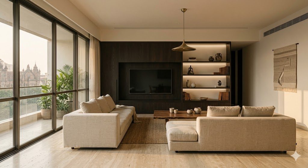
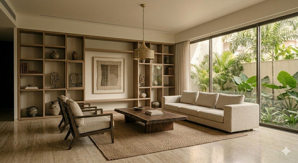
Walk into a certain kind of South Mumbai apartment and you might, at first, miss the money entirely. There is no chandelier dripping crystal, no wall of book-matched gold-veined marble, no monogrammed hardware glinting from the console. There is a wide travertine floor, honed soft. A long oak dining table with edges you want to run a hand along. Linen the colour of unbleached muslin. A single brushed-brass pendant, off to one side, doing quiet work. The room is expensive — profoundly so — but it refuses to say it out loud. That refusal is the entire point.
This guide is about that aesthetic: "quiet luxury", sometimes called "stealth wealth", and how it actually translates into an Indian home in 2026. We will cover where the idea came from, the six principles that hold it together, the exact palette and materials that make it real, how it differs from cold minimalism, what it honestly costs (a great deal — quiet is not cheap), how to brief a designer for it, and the mistakes that turn it into beige boredom. Throughout, we name real materials, real finishes and realistic ₹ bands.
The single idea to hold onto: quiet luxury moves the signal of wealth from the logo to the material. You stop buying things that look expensive and start buying things that are expensive to make — and then you let the craft, not the colour, do the talking.
Where "quiet luxury" came from
For two decades, luxury — globally and in India — meant visibility. Logo handbags, badge-engineered cars, marble lobbies that announced themselves. Interiors followed: high-gloss white, gold leaf, oversized crystal, veined stone used like wallpaper. The home was a billboard for the bank balance.
Around the early 2020s the cultural wind shifted. A generation that grew up with everything photographed began to find the loud signal slightly embarrassing. The new flex was the opposite: a cashmere with no logo that only another insider could price, a watch with a dial you had to know to read. In fashion this got the name "quiet luxury" or "stealth wealth". It moved into interiors almost immediately, because the home is the most intimate status object of all.
The Indian version arrives a little later and lands differently, which is exactly why it deserves its own treatment — our light, our families, our entertaining culture and our climate all reshape it. This piece sits inside our broader cluster on what defines luxury interiors in India; think of quiet luxury as one specific dialect of that larger language, the most restrained one.
The deeper root is older than any trend. Quiet luxury is really a return to a pre-industrial idea of wealth: that the truly rich never had to display, because everyone already knew. The displaying was for the newly arrived. What reads as fashion-forward in 2026 is, underneath, an old-money instinct — value lives in the object, not in the label stuck to it.
Loud versus quiet: the contrast
The fastest way to internalise the style is to put it beside its opposite. The same budget can build a "loud" luxury room or a "quiet" one — the money is identical, the language is inverted.

| Dimension | Loud luxury | Quiet luxury |
|---|---|---|
| Audience | Strangers, on first glance | Insiders, over time |
| Palette | High contrast, gold, gloss white | Tonal, matte, one warm family |
| Hero element | Chandelier, marble feature wall | Light, craft, negative space |
| Materials | Showy stone, lacquer, mirror | Travertine, oak, linen, lime plaster |
| Detail | Carved, ornate, maximal | Edge, joint, finish — minimal |
| Branding | Visible, deliberate | Absent, deliberate |
| Ages | Quickly; dates with the trend | Slowly; improves with patina |
| Photographs | Better than it lives | Lives better than it photographs |
That last row is the honest one. Loud luxury is built for the camera and the first impression. Quiet luxury is built for the people who live there at 7am on a wet Tuesday — and that is a harder, more expensive brief to meet.
The six principles
Quiet luxury is not a "look" you can buy in a single shopping trip; it is a set of disciplines. Hold all six together and the room sings. Drop the materials and craft but keep the beige, and you get an expensive-looking nothing.

1. Tonal, low-contrast palette. Everything lives in one warm family that runs from chalk through greige to taupe and warm stone. No colour pops, no cool grey, no high-gloss white. The eye should travel a wall and find almost no jump in value.
2. Real, natural materials. Solid timber, honest stone, undyed natural fibre, lime-based plaster, unlacquered metal. The materials are doing the heavy lifting, so they cannot be fakes. A printed "travertine" laminate kills the whole thing instantly.
3. Craft over ornament. Money goes into the things you only notice up close: a mitred stone corner, a perfectly aligned oak grain across a run of joinery, a hand-rubbed plaster finish. Never into carving, moulding or applied decoration.
4. Texture, not colour. Because the palette is flat, all the visual interest has to come from how surfaces feel and catch light — bouclé against slubby linen against brushed brass against honed stone. This is the principle most people miss.
5. Negative space as the flex. Empty, calm surfaces are the loudest statement of all. They say: I do not need to fill this room to prove anything. Restraint reads as confidence.
6. No visible branding. Nothing in the room announces a label. The quality speaks; the logo stays in the drawer. If a guest can identify the brand from across the room, it is too loud.
Quiet luxury is the only style where the most expensive decision is often to leave something out — and the most expensive material is the one no guest will ever consciously notice.
The Indian translation
Imported wholesale, Scandinavian or Belgian quiet luxury can feel thin and cold in an Indian home. Four local realities reshape it.
Indian light is strong and warm. Our sun is high, hard and golden for much of the year. A cool grey-beige palette that looks sophisticated in a Copenhagen winter goes flat and dirty under Bengaluru noon. The Indian quiet-luxury palette must skew warmer — more taupe and oat, less mushroom-grey — and lean on matte and honed finishes that absorb glare rather than bounce it. Lime plaster and honed travertine are quietly perfect here precisely because they soften strong light.
Joint families and real use. A quiet-luxury room in India often has to survive children, parents, daily pujas and constant footfall — it cannot be a museum. This pushes the style toward more durable honesty: oak and teak that take knocks and improve, leathers that patina, linens you can wash, stone that does not stain at the first spill. The "lived-in but immaculate" quality is harder, and more valuable, here.
Entertaining culture. Indian luxury homes entertain at scale and at short notice. Quiet luxury handles this beautifully — a calm, uncluttered, tonal room is the perfect neutral backdrop for twenty guests and a table laid with the good things. The room recedes; the people and the food are the colour.
Climate. Humidity, monsoon and dust are real. Natural materials need the right specification: kiln-dried hardwood, sealed (not polished-to-gloss) stone, breathable lime plaster that handles humidity better than gypsum, and brass that is allowed to develop a living patina rather than fighting it. This overlaps with the warmth-led thinking in our guides on warm minimal interiors and luxury minimalism in Indian homes.
The palette and material guide
Here is the working palette. The discipline is brutal: every material must sit in the same tonal family, so that the only real contrast in the room is texture, never colour.

| Material | Where it goes | What to specify | Typical 2026 band |
|---|---|---|---|
| Travertine (honed, unfilled) | Floors, vanity tops, coffee table | Honed finish, "unfilled" for texture; Italian or Turkish | ₹350–₹900 / sq ft (material) |
| Smoked / fumed oak | Floors, joinery, dining table | Engineered or solid; brushed, matt-oil finish, not lacquer | ₹650–₹2,200 / sq ft |
| Lime plaster (Tadelakt-style) | Feature walls, bathrooms | Polished lime / Marmorino; specialist applicator | ₹450–₹1,100 / sq ft applied |
| Linen & raw silk | Upholstery, drapery, cushions | Undyed or naturally dyed; heavy slub; washable for sofas | ₹900–₹4,500 / m (fabric) |
| Brushed / antique brass | Hardware, taps, light fittings, profiles | Satin or living-finish; never bright chrome or PVD gold | Fitting-dependent; premium over chrome |
| Bouclé & wool | Accent chairs, throws | Tonal, textural; for the "touch" layer | ₹1,200–₹6,000 / m |
| Microcement | Floors, wet areas (seamless) | Specialist-laid; warm pigment | ₹500–₹1,300 / sq ft applied |
A few brand and source notes for India:
- Stone. For travertine and warm limestone, the importers around Kishangarh (Rajasthan) and Mumbai's stone markets carry honed Italian and Turkish lots; insist on "honed, unfilled" in writing. Indian Kota and Jaisalmer stone, honed, can stand in beautifully at a lower band and are climate-proven.
- Engineered wood floors. Quick-Step, Kährs and Pergo cover the imported oak end; for solid and engineered Indian oak and teak, the better Bengaluru and Delhi joinery houses will source and finish to a brushed matt-oil rather than a film lacquer.
- Lime and microcement. Specialist applicators now exist in all metros for Marmorino, Tadelakt and microcement (brands such as Oikos and Ottocento appear in Indian projects). This is a craft finish — budget for the artisan, not just the bag of material.
- Fabrics. D'Decor, Sarom and the premium imported books (Romo, Designers Guild) all carry the heavy undyed linens and tonal bouclés the style needs. The detail that matters is weight and slub, not pattern.
- Hardware and taps. Specify satin or antique brass from the premium ranges (Jaquar's premium lines, Kohler, Hansgrohe Axor for the high end) — the finish, not the brand badge, is the point. See our premium kitchen hardware guide for the joinery-fittings angle.
On the perennial stone question — whether to spend on real Italian marble or use engineered quartz — the quiet-luxury answer leans toward honed natural stone for the way it ages, but the trade-offs are real and project-specific; we lay them out fully in Italian marble vs quartz in India. For the broader specification logic across floors, work the framework in our flooring finishes specification guide.
How it differs from minimalism
This is the distinction people get wrong most often, so it is worth being precise. Quiet luxury and minimalism share a love of restraint and clean lines — but they are not the same style, and confusing them is what produces cold, sterile rooms.
| Cold minimalism | Quiet luxury | |
|---|---|---|
| Emotional register | Sparse, austere, gallery-like | Warm, layered, tactile, lived-in |
| Materials | Often painted, smooth, cool | Natural, textured, warm, honest |
| Layering | Stripped back to the minimum | Many tonal layers — linen on wool on oak on stone |
| Colour | White, grey, black | Warm neutrals, near-zero contrast |
| Goal | Absence of clutter | Presence of quality |
| Feel underfoot / to hand | Hard, flat | Soft, varied, rewarding to touch |
Minimalism removes until nothing is left. Quiet luxury removes the noise but then adds depth back — through material, texture and light — until the room is rich without being busy. A minimalist room can be cheap to build and feel cheap. A quiet-luxury room is layered and warm and, done properly, never feels empty.
If you want the disciplined-but-warm middle ground in detail, our piece on minimalist architecture in the Indian context and the warm minimal interiors guide both sit right next to this one and are worth reading together.
The budget reality: quiet is not cheap
Here is the trap. Quiet luxury looks, in photographs, like it might be simple and therefore affordable. It is the opposite. Because there is no ornament, no colour and no pattern to hide behind, every single material and every single edge is fully exposed. There is nowhere for a mistake to hide. The plain oak panel has to be a beautiful piece of oak, perfectly finished, or it just looks like a plain cheap panel.
The money in quiet luxury goes where the camera does not obviously see it:
| Where the budget goes | Why it is non-negotiable |
|---|---|
| Genuine natural materials | Fakes read instantly when there is no pattern to distract |
| Specialist craft labour | Lime plaster, fine joinery and stone fabrication are artisan work |
| Tolerances and finishing | Exposed edges, shadow gaps and alignments must be near-perfect |
| Layered lighting | The whole mood depends on light, not on decorative objects |
| Bespoke, made-to-measure pieces | The look depends on fit, scale and anonymity, not catalogue furniture |
A realistic 2026 expectation: a properly executed quiet-luxury living-and-dining of around 500–700 sq ft, with honed stone, brushed-oak joinery, a lime-plaster wall, bespoke upholstery and layered lighting, will typically land in the ₹25–₹60 lakh band for the interiors fit-out, depending on city and the stone you choose — and the cheaper-looking ones in that range are usually the ones where someone economised on a material that had to be real. If your budget is tighter, our budget luxury interiors guide shows where it is safe to economise; the headline is that in quiet luxury the materials are exactly the wrong place to do it.
The paradox is worth stating plainly: quiet luxury is the most expensive style to do well and the easiest to do badly, because the very restraint that makes it elegant also removes every place a budget cut could hide.
How to brief a designer for quiet luxury
If you simply say "I want it luxurious", many designers will reach for the loud playbook — that is what most of the market still asks for. You have to brief the restraint deliberately.
Say these things explicitly:
- "Tonal and low-contrast. One warm neutral family. No colour accents, no high-gloss white, no cool grey."
- "Natural, honest materials only. Honed stone, matt-oil oak, lime plaster, undyed linen, brushed brass. No printed laminates pretending to be stone or wood, no chrome, no PVD gold."
- "Interest comes from texture and craft, not from colour or pattern. I want to feel the difference between four neutral materials with my eyes closed."
- "No visible branding on anything. Hide the labels."
- "I would rather have fewer, better, bespoke pieces and more empty space than a fully furnished catalogue room."
- "Spend the budget on materials, craft and lighting before decorative objects."
Then ask to see a physical material board — actual swatches of stone, wood, plaster and fabric laid together — not a Pinterest collage. If, when you hold any two swatches together, you can barely see a colour difference and only a texture difference, the palette is right. If you can pick out a clear colour winner, the board is still too loud. Run your favourites through our style finder to confirm "quiet luxury" really is your direction before you commit a designer to it.
Common mistakes
Mistaking beige-on-beige boredom for quiet luxury. This is the big one. A flat, lifeless, all-beige room is not quiet luxury — it is just beige. The difference is texture and craft. Quiet luxury earns its calm through layered materiality (linen, bouclé, oak, honed stone, plaster, brass all in one tonal family). Remove the texture and you are left with boredom that happens to be expensive.
Cheaping out on the materials that must be real. Because there is no pattern to hide behind, fakes are merciless here. A printed stone-look laminate, a film-lacquered "oak", a synthetic linen-look polyester — each one is instantly readable and collapses the whole effect. If a material is on display in a quiet-luxury room, it has to be genuine. Cut elsewhere, never here.
Going cold instead of warm. Reaching for grey, white and chrome and calling it restraint. That is cold minimalism. Indian light and Indian life both want warmth — taupe over grey, brass over chrome, oak over painted MDF.
Over-furnishing. Filling every corner because empty space feels "unfinished". In this style, the empty space is the luxury. Resist.
Forgetting the lighting. Because there are no decorative objects carrying the room, light has to. Flat, single-source overhead lighting flattens everything. You need layered, warm (2700K–3000K), dimmable light. Work it through our architectural lighting design guide.
Get it right, in order
1. Confirm the direction. Be sure quiet luxury — not loud luxury, not cold minimalism — is genuinely what you want, and that everyone in the household is on board with restraint and empty space.
2. Lock the tonal palette first. Choose one warm neutral family and hold a physical swatch board against it. Reject anything that introduces real colour contrast.
3. Specify the real materials. Honed unfilled travertine or warm limestone, matt-oil brushed oak, lime plaster, undyed linen and bouclé, brushed brass. Write "honed", "unfilled", "matt-oil", "undyed" into the schedule.
4. Budget craft and labour explicitly. Allocate separately for specialist plaster, fine joinery and stone fabrication. This is where the quality lives.
5. Layer the lighting. Warm, dimmable, multi-source. Make light the jewel of the room.
6. Curate, do not fill. Choose fewer, better, bespoke pieces. Protect the negative space.
7. Strip the branding. Final pass: hide or remove every visible label. Let the quality, not the logo, do the talking.
Getting quiet luxury right is fundamentally a materials, proportion and light problem — exactly the kind of thing that is hard to picture from a moodboard and easy to get wrong in a shopping trip. DesignAI lets you generate photoreal quiet-luxury interiors in your own room, swap travertine for limestone or smoked oak for teak, and test a tonal palette against your home's actual light before you commit a single rupee to stone or joinery. Use it to brief your designer with images, not adjectives — and to make sure the restraint reads as confidence, not as a budget that ran out.
References
- Bureau of Indian Standards (2016) IS 1130: Marble (Blocks, Slabs and Tiles) — Specification. BIS.
- Bureau of Indian Standards (2017) IS 712 & IS 6452: Building Limes — Specification. BIS.
- National Building Code of India (2016) Part 6: Structural Design and Part 8: Building Services. Bureau of Indian Standards.
- Pawson, J. (2006) Minimum. Phaidon Press.
- Pile, J. & Gura, J. (2013) A History of Interior Design. Laurence King Publishing.
- Postrel, V. (2003) The Substance of Style: How the Rise of Aesthetic Value Is Remaking Commerce, Culture and Consciousness. HarperCollins.
- Gauld, S. (2021) Bringing Nature Home / The Slow Home: Material and Craft in Contemporary Interiors. Design authorities and material institutes (Marble Institute of America; The Lime Centre, UK).
Continue across the Luxury Interiors cluster: read the pillar on what defines luxury interiors in India, then the companion pieces on luxury minimalism in Indian homes, warm minimal interiors, minimalist architecture in the Indian context and Italian marble vs quartz in India.
Export this guide
Related Guides — Deep-dive reading
Warm Minimal Interiors — A 2026 Style Guide for Indian Homes
Restraint with warmth · Oat & oak & linen · Curated negative space
Design StylesThe Trade-Offs Every Homeowner Has to Make
No one gets everything — every home is a stack of compromises. This is about the sacrifices: the cost-quality-time triangle, the recurring homeowner trades, and how to make your cuts on purpose instead of having them forced by a blown budget.
Planning Your ProjectWhat Defines Luxury Interiors Today?
Beyond price tags — the materials, craft, proportion, light and restraint that separate true luxury from expensive
Luxury InteriorsRelated Tools — Try Free
Apartment Furniture Size Chart
Standard furniture dimensions for Indian apartments — sofas, beds, tables, dining, storage.
Reference ChartFalse Ceiling Cost Estimator
Live ₹/sqft across 8 ceiling types — POP, gypsum, designer, metal, PVC, wooden — with cove and spot lighting for 20 Indian cities.
Cost CalculatorCross-Ventilation Analyzer
Estimate airflow and air changes per hour (ACH) from room size, window areas, layout, and local wind — with NBC 2016 Part 8 compliance check.
Ventilation Calculator