
Defining Luxury in Residential Architecture
Quality, Materiality, Craftsmanship, and Restraint — Beyond the Cost-Per-Square-Foot Fallacy
The luxury question is the single most contested conversation in Indian residential architecture, and it is also the conversation in which the architect has the least vocabulary. The client says "I want a luxury home"; the contractor says "that will cost ₹8,000 per square foot"; the architect, more often than not, defaults to the same vocabulary — Italian marble, double-height entrance, gold-finish handles, chandelier — and a project that costs four times as much as a thoughtful one is delivered with a fraction of the architectural quality.
This is not a budget problem. It is a vocabulary problem. The Indian residential market has been trained for two decades by builder-grade developers and aspirational lifestyle magazines to equate luxury with cost, and cost with material price-per-square-foot. The architect who accepts this equation has surrendered the most important conversation of the project before it begins — the conversation that decides whether the home will feel like a luxury hotel suite or like a place a family will love for thirty years.
The thesis of this guide is simple and old. Luxury in residential architecture is not the sum of expensive materials. It is the deliberate cultivation of a small set of architectural qualities — material honesty, craftsmanship, proportion, light, silence, restraint — that the body and the eye recognise as luxurious whether or not they cost more, and that the cheapest substitutes can never produce. The Italian marble in a poorly-proportioned room is a marketing photograph. The well-proportioned room with honest local stone is luxury.
This guide is intended for practising architects and interior designers who have to defend that position to clients, contractors, and themselves. It is the design-philosophy companion to the technical-specification guides on Materials & Finishes, Lighting Design, Flooring, and Engineered Wood Lifecycle Costing — those tell you what to specify; this tells you why it matters.
"Less is more — only when more is less. Otherwise less is just less." — Misattributed paraphrase, after the inversion of Mies van der Rohe (1886–1969) and Robert Venturi (1925–2018), capturing the central tension of architectural restraint

1. The Five Marketplace Confusions
The Indian residential luxury market in 2026 is structured around five recurring confusions that the architect must learn to disambiguate, both for the client and for themselves.
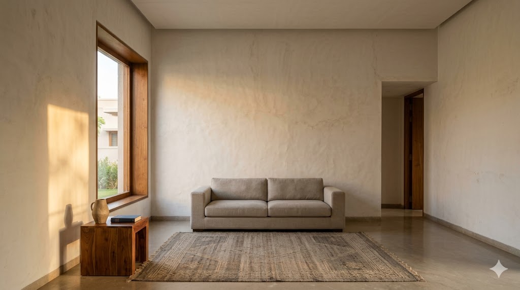
Confusion 1 — Luxury and expense. A 2-cm Statuario marble slab from Carrara at ₹1,800 per square foot is expensive; a 2-cm Statuario-look porcelain slab at ₹600 per square foot is cheap. Whether either is luxury depends on the joint detail, the lighting on the surface, the finish on the edge, and the room it sits in. Most builder-grade luxury homes have the expensive material with none of the architectural conditions that would make it read as luxury; most design-led modest homes have inexpensive materials with all of those conditions.
Confusion 2 — Luxury and rarity. A wall finished in a rare imported wood does not become luxurious by being rare. It becomes luxurious if the joinery is done well, the proportion of the panel to the wall is right, the light falls correctly across the grain, and the wood is allowed to age. A wall finished in widely-available Indian teak with all of these conditions met is more luxurious than the rare-wood wall that fails any of them.
Confusion 3 — Luxury and visibility. The single biggest mistake in Indian residential luxury is the tendency to put the luxury on display — gold-finish handles on every door, chandeliers in every room, marble veined intensely in every surface. Luxury that announces itself is, almost without exception, hospitality-industry vocabulary borrowed inappropriately into private residential space. The luxury hotel has to advertise itself in 30 seconds to a paying guest; the home does not.
Confusion 4 — Luxury and complexity. Highly-figured marble, intensely-grained wood, intricate plaster mouldings, ornate chandeliers — the marketplace consistently equates complexity with luxury. The architectural canon, from Adolf Loos in 1908 (Ornament and Crime) to Christopher Alexander in 1977 (A Pattern Language) to John Pawson in 1996 (Minimum), has consistently argued the opposite: that the highest forms of architectural luxury are characterised by the discipline of removal, not the appetite for accumulation.
Confusion 5 — Luxury and culture-of-origin. Italian marble, German cabinetry, Belgian glass, Brazilian veneer, French wallpaper — the marketplace prices a 30–60% premium on imported materials over their Indian equivalents, and clients absorb the premium as proof of luxury. In nearly every category, the Indian alternative — Rajasthan marble, Karnataka stone, Indian teak, Kerala rosewood, Bengal handloom — is competitive in quality, often superior in cultural fit, and significantly more economical. The premium is being paid for the story, not the substance.
The architect's first task in the luxury conversation is not to specify materials. It is to disambiguate these five confusions. Until the conversation is stripped to its substance, every later decision is corrupted.

2. Material Honesty — The First Pillar
The first architectural quality that the body recognises as luxurious is material honesty — the property of a material being what it appears to be, behaving as it should, and ageing as the original substance ages.
What Honesty Means in Practice
A solid teak handrail and a teak-veneer-on-MDF handrail can be photographed indistinguishably. The body distinguishes them within three seconds of touch. The solid teak is cool, dense, and slightly resilient; the MDF veneer is warm, hollow, and rigid. The eye distinguishes them across five years of use — the solid teak ages into deeper colour, the veneer chips and reveals its substrate.
This is not a snobbery argument. It is a perceptual argument. The body's recognition of what something actually is is sub-second and below the level of conscious processing. A home that consistently uses honest materials produces a sub-conscious, cumulative impression of substance. A home that consistently uses simulated materials produces a sub-conscious, cumulative impression of theatre.
The Hierarchy of Material Truth
Five tiers of material truth, in descending order:
1. Solid material in its native form — solid stone, solid wood, solid metal, solid brick. Behaves as the substance, ages as the substance, fails as the substance. Highest cost, highest perceived luxury.
2. Engineered material with a true face layer — engineered wood with a thick (3–6 mm) sawn-veneer face, stone composite with a thick stone face. Behaves nearly as solid, ages nearly as solid, but the substrate is different. Mid-cost, very-high perceived luxury when detailed correctly.
3. Faithful surrogate that does not pretend to be something else — porcelain tile that reads as porcelain (not as marble), terrazzo that reads as terrazzo (not as natural stone), bamboo that reads as bamboo. Mid-cost, mid-high perceived luxury if the design embraces the surrogate honestly.
4. Imitative surrogate — porcelain that pretends to be marble, laminate that pretends to be wood, vinyl that pretends to be stone. Low-to-mid cost, low perceived luxury at conscious inspection but often passes superficial photography.
5. Plastic surrogate — printed PVC sheets, vinyl wraps, photographic-print laminates, cheap polymer counters with stone-look print. Low cost, no perceived luxury once recognised.
The luxury conversation does not require Tier 1 across the board. A masterful luxury home can use Tier 2 for floors, Tier 3 for walls, Tier 1 for the few elements that the hand contacts daily — handrails, door pulls, switch plates, kitchen counter at the wash zone. The architect's discipline is to know which tier each application requires and to spend the budget there.
The Indian Material Hierarchy
In the Indian context, the indigenous material hierarchy is unusually deep. Indian residential architecture has access to Tier 1 versions of every major category at competitive prices — Rajasthan marble, Karnataka and Andhra granite, Kota stone, Kadappa stone, Indian teak, Kerala rosewood, Andhra teak, lime plaster, Athangudi tiles, terracotta, brass, copper. The marketplace's preference for Italian, German, and Brazilian alternatives is overwhelmingly a story-and-marketing premium, not a substance premium. Architects who are fluent in the Indian material library can deliver Tier 1 luxury at 40–60% of the imported-material budget.
The detailed treatment of materials, IS-code specifications, and lifecycle considerations is in the Engineered Wood Lifecycle Costing and Flooring & Finishes Specification guides; the Material Compare utility produces side-by-side cost-and-lifespan comparisons.
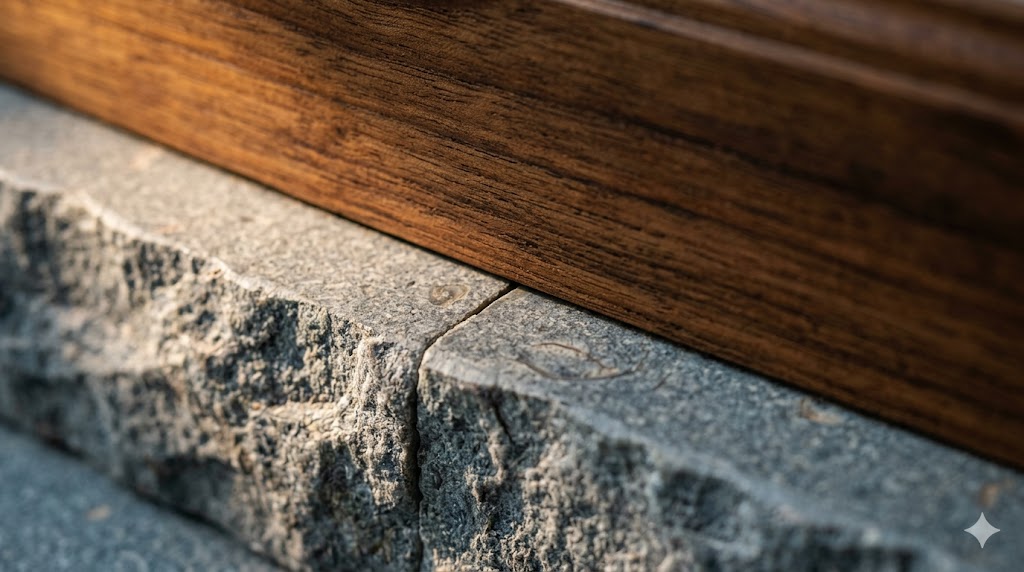
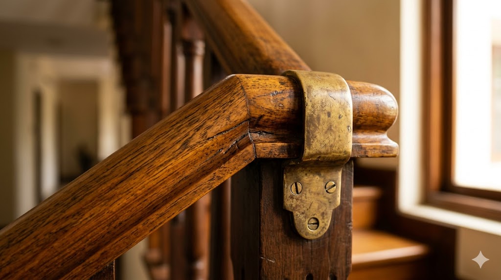
3. Craftsmanship — The Second Pillar
The second pillar is craftsmanship — the visible quality of the joinery, finish, fit, and detail. Craftsmanship is the only architectural quality that cannot be photographed. It can only be experienced by direct inspection, and it is the single most reliable indicator of luxury that survives the photograph-versus-reality test.

Visible Craftsmanship Indicators
A trained eye can assess the craftsmanship level of a residential interior in approximately 60 seconds. The diagnostics:
| Element | Mediocre Craftsmanship | Good Craftsmanship | Master-Level Craftsmanship |
|---|---|---|---|
| Door reveal | 5–8 mm uneven | 3–4 mm consistent | 2 mm consistent, perfectly aligned all four sides |
| Skirting joint at corner | Mitred, visible gap, caulked | Mitred, near-tight | Coped joint, no caulk, invisible |
| Tile grout line | 3–4 mm uneven, varied colour | 2 mm consistent | 1.5 mm consistent, colour-matched precisely |
| Stone slab joint | 3 mm visible joint | 1.5 mm joint, filled to match | Flush butt-joint, vein-matched book-leaf |
| Cabinet shutter gap | 4–5 mm uneven | 2–3 mm consistent | 2 mm gap, soft-close, perfect alignment |
| Switch plate alignment | Random rotations, 2–3 mm offset | Consistent rotation, < 1 mm offset | Plumbed to plaster line, tile course aligned |
| Wall paint at edge | Visible bleed onto adjacent surface | Clean line, slight irregularity | Razor-line, masked with adjacent surface protected |
| Hardware-to-substrate | Screws visible, panhead, off-axis | Screws consistent, recessed | Concealed fasteners or screws aligned to a grid |
These eight elements are reliable diagnostics because they test the invisible parts of the construction process — the parts where the contractor saved time by being approximate. A home with master-level craftsmanship across these eight has master-level craftsmanship throughout. A home that is mediocre in three of them is almost certainly mediocre in twenty more places that are harder to inspect.
The Site Supervision Lever
Craftsmanship is not bought; it is supervised. The contractor capable of master-level work is the same contractor who, without daily architectural supervision, will deliver mediocre work. The premium for master-level craftsmanship is not in the BOQ rates — it is in the architect's site visit time and the foreman's standards. The detailed treatment is in the Site Supervision Checklist guide; the operational consequence for the luxury conversation is that the architect's fees on a luxury project are roughly twice those on a builder-grade project for the same built-up area, and that doubling is what buys craftsmanship.
The relationship between fee structure and craftsmanship is treated in the Architect Fee Structures guide. The COA scale of charges anticipates the supervision-intensity premium for luxury work; the Studio Matrx Architect Fee Calculator utility produces project-specific fee proposals.
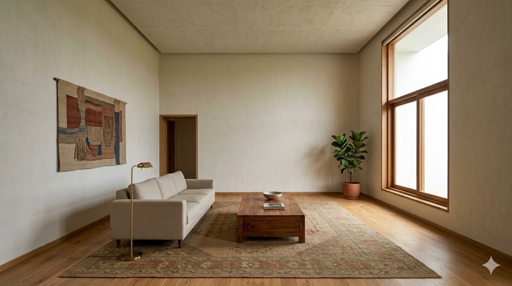
4. Proportion and Volume — The Third Pillar
The third pillar is proportion — the dimensional relationships between spaces, between elements, and between the body and the architecture. Proportion is the architectural quality with the highest leverage and the lowest cost. A poorly-proportioned room cannot be rescued by any quantity of expensive material; a well-proportioned room is recognisably luxurious in any material.

Ceiling Heights — The Critical Variable
The single dimension that most affects whether a residential interior reads as luxurious is the ceiling height. The standard Indian apartment delivers 2.7–2.9 metres clear ceiling. The threshold above which a room reads unmistakably as luxurious begins around 3.0 metres and increases sharply through 3.4 metres.
| Ceiling Height (clear) | Perceptual Effect |
|---|---|
| 2.4–2.6 m | Cramped; the room reads as a low-budget rental |
| 2.7–2.9 m | Standard; the room reads as adequate but not luxurious |
| 3.0–3.2 m | Generous; the room begins to read as luxurious |
| 3.3–3.6 m | Lofty; the room reads unmistakably as luxurious |
| 3.7–4.5 m | Grand; civic / institutional scale |
| > 4.5 m | Out of residential vocabulary; reads as cathedral or hotel lobby |
This is the most important dimension a residential architect controls in the early stages of design — and it is largely set by the structural floor-to-floor height, which is fixed at concept stage and very difficult to change later. A residential architect who routinely delivers 2.7 m ceilings in luxury work is producing a contradiction in terms; the body knows it is in a standard apartment, regardless of the marble.
The structural and FSI implications of ceiling height — and the trade-off against built-up area in FSI-constrained sites — are treated in the FSI/FAR Computation guide.
Room Aspect Ratios
Beyond ceiling height, the second proportion lever is room aspect ratio — the relationship between length, width, and height. Rooms that approach 1:1 or 1:1.6 (golden ratio) in plan, with ceiling heights at the upper end of the range, read as luxurious almost regardless of contents. Rooms with extreme aspect ratios (1:2.5+) read as corridors, even when they are bedrooms or living rooms.
| Room Type | Optimal Aspect Ratio (W:L) | Ceiling Height Multiplier |
|---|---|---|
| Master bedroom | 1:1.3–1:1.6 | 1.0× width, minimum |
| Living room | 1:1.4–1:1.8 | 0.9–1.1× width |
| Dining room | 1:1.2–1:1.4 | 1.0–1.2× width |
| Library / study | 1:1.0–1:1.4 | 1.0–1.4× width (taller is better) |
| Children's room | 1:1.1–1:1.4 | 1.0× width |
| Bathroom (master) | 1:1.0–1:1.5 | 1.0–1.2× width |
The architect's plan-stage discipline is to refuse the awkward room — the 8 ft × 16 ft bedroom, the 10 ft × 22 ft living room, the 5 ft × 12 ft bathroom — even when the structural grid encourages it. A re-arranged plan that produces fewer better-proportioned rooms reads as more luxurious than a denser plan with awkward proportions. This is a Stage-2 decision (per the COA Scope of Services framework), and once committed, it is essentially permanent.
The Body's Reference Dimensions
The reason proportion works as a luxury indicator is that the body has fixed reference dimensions. A 2.0-metre door height is felt as comfortable; a 2.4-metre door height is felt as generous; a 3.0-metre door height is felt as ceremonial. A 600-mm-wide passage is felt as restrictive; a 1100-mm passage is felt as comfortable; a 1600-mm passage is felt as gracious. These are not learned preferences — they are anthropometric responses, the same set of responses that drives the Storage Planning reach-zone discipline.
The luxury home is the home in which every doorway, every passage, every threshold, every counter, every step has been dimensioned not at the minimum that the building code permits but at the optimum the body recognises. The premium is approximately 8–12% of built-up area against the most efficient layout. It is the most important 8–12% in the project.
5. Light Quality — The Fourth Pillar
The fourth pillar is light. There are two layers — natural daylight, which is set by orientation, opening size and position, and façade treatment; and artificial light, which is the layered design treated in the Architectural Lighting Design guide.
Natural Light — The Primary Determinant
A room with abundant, well-modulated natural daylight is read as luxurious before any artificial light is switched on. The opposite is true: a room with poor natural daylight cannot be rescued by any amount of artificial light. The body's preference for daylight is biological; it is not aesthetic preference, and it cannot be argued with.
The architect's daylight discipline is to ensure that every primary occupied space — living, dining, master bedroom, study, kitchen prep zone — receives meaningful direct or diffused daylight for at least 6 hours per day, that the daylight is modulated by overhang, jaali, louvre, or planting (not raw glare), and that the daylight reaches the deeper part of the room (depth-to-window-height ratio under 2.5:1 for adequate, under 1.5:1 for generous).
The IS 2440 daylight factor specification, NBC 2016 Part 8 ventilation requirements, and the climate-zone-specific orientation strategy are treated in detail in the Passive Design — India Climate Zones and Daylight Factor guides. The Studio Matrx Sun Path Analyzer utility is the Stage-2 worksheet for site-specific daylight assessment.
Artificial Light — The Layered Discipline
Where natural light is the primary luxury determinant, artificial light is the secondary one. The diagnostic is layering — the presence of distinct ambient, task, accent, and decorative layers, each on independent dimming control, each addressing a specific perceptual function.
A single ceiling-mounted fluorescent panel in every room is the definitional anti-luxury lighting condition — and is, distressingly, the standard in most Indian residential projects. The luxury condition is the condition in which:
- The ambient layer washes the room without the source being visible
- The task layer addresses the working surfaces (kitchen counter, study desk, mirror, reading chair)
- The accent layer brings out the architectural elements (a textured wall, a niche, a ceiling cove)
- The decorative layer (the visible-source fixture) is the narrative element, not the only source
The four-layer model, lux levels per IS 3646, CCT and CRI specifications, and dimming protocols are detailed in the Architectural Lighting Design guide. The Lighting Planner utility produces room-by-room layering schedules.
6. Silence — The Fifth Pillar
The fifth pillar — and the one most consistently overlooked by Indian residential designers — is acoustic quality. The luxury home is quiet. The body's recognition of acoustic luxury is sub-conscious and powerful; a noisy home, no matter how visually beautiful, cannot read as luxurious.
What Acoustic Luxury Sounds Like
The luxury acoustic condition has four characteristics:
1. Low ambient noise floor — < 35 dBA in bedrooms, < 40 dBA in living spaces, with HVAC operating
2. High room-to-room isolation — STC 50+ between bedroom and living, STC 55+ between bedrooms
3. Controlled reverberation — RT60 of 0.4–0.6 seconds in living spaces; RT60 of 0.3–0.5 in bedrooms
4. No mechanical noise transmission — no plumbing audible, no chimney exhaust audible, no neighbour's HVAC compressor audible
The Indian standard residential project delivers — typically — STC 35 partition walls, no acoustic detail at the floor-ceiling junction, single-glazed windows, plumbing routed through unlined chases, and reverberation times of 0.8–1.2 seconds in hard-surfaced living rooms. The home is audibly a budget home, regardless of its visual presentation.
The Acoustic Specifications That Matter
The architect's acoustic discipline produces specifications at four points:
| Element | Standard Spec | Luxury Spec | Cost Premium |
|---|---|---|---|
| Internal partition | 100 mm AAC block, single | 150 mm AAC + 25 mm glass wool + 12 mm gyp board, double-sided | 30–45% |
| Floor-ceiling slab | RCC slab, no acoustic detail | RCC slab + 25 mm acoustic underlay + floating screed | 12–20% on flooring |
| Window | Single 5 mm float glass | Double-glazed 6+12+6 with acoustic interlayer | 60–80% on glazing |
| Plumbing chase | Open or filled with concrete | Lined with acoustic blanket + decoupled brackets | 8–15% on plumbing |
| HVAC duct | Bare GI duct | Internally-lined acoustic duct + duct silencer | 15–25% on HVAC |
The total project-level cost premium for luxury acoustic specification is approximately 4–6% of total construction cost — an unusually high return on investment for the perceptual lift it produces. The detailed acoustic engineering is a specialist sub-consultant's domain, but the architect's awareness of these five elements is what triggers the engagement.
The "Quiet Test"
A practical site-walk test for acoustic luxury: visit the project at night when neighbouring construction has stopped. Stand in the master bedroom with all doors closed. Have someone in the living room turn on a television at normal volume. The luxury home reads as silent in the bedroom. The standard home reads as muffled. The builder-grade home reads as audible at normal-conversation volume. This single 60-second test predicts post-occupancy satisfaction with bedroom comfort better than any visual diagnostic.
7. The Patina Test — Time as the Final Judge
The sixth and most demanding luxury test is the patina test. Time is the only honest critic of architectural choice. A home that looks well in the year-1 photograph but degrades by year 5 was never luxurious; it was photographed-luxury. A home that looks well in year 1 and better in year 15 is luxurious by the only measure that counts.
Materials That Patina Well
Materials that age into beauty:
- Solid wood — teak, rosewood, walnut, oak: darken, develop tonal richness, reveal grain over time
- Solid stone — marble, granite, limestone, sandstone: develop micro-patina from contact, soften slightly
- Brass and bronze — develop a warm patina that reads as "lived-with"
- Copper — develops a green-blue patina or, when polished, a deep reddish glow
- Lime plaster — develops a soft, slightly chalky surface that takes light beautifully
- Cotswold-style tile, terracotta, Athangudi — wear into a tactile finish over decades
- Hand-loomed natural-fibre textiles — soften, drape better, reveal the maker's hand more
Materials That Degrade
Materials that look well at year 1 and worse at year 5–10:
- Veneered MDF and particle board — chip, peel, reveal substrate at edges and impact points
- Laminate and HPL — surface scratches, edge delamination, photographic-print patterns reveal repetition
- Pre-finished engineered wood (thin face) — wear-through within 5–10 years on traffic paths
- PU-lacquer-finished wood — yellows, scratches, requires re-finishing every 7–10 years
- Stainless steel (lower grades) — fingerprints permanently, develops a "dull" finish that cannot be restored
- Vinyl flooring — softens, dents permanently, off-gases declining over time but never zero
- Cheap tiles with photographic print — show repetitive pattern, fade non-uniformly under sunlight
- Plastic switch plates — yellow, become brittle, crack at screw points
The luxury specification's discipline is to spend the budget on materials that pass the patina test, in the locations where the materials are touched and seen daily. The materials that do not pass the test can still be used — but only in locations where they are not exposed to wear, sunlight, or contact.
The Material Choice as a Long-Term Decision
A practical heuristic: the architect should specify every material with a 20-year visual horizon. If the surface or element will look worse in 20 years than at handover, it is the wrong specification for a luxury home. Apply this heuristic across kitchen counters, bathroom counters, flooring, doors, handrails, switch plates, hardware, and exposed timber — and the BOQ rewrites itself. The lifecycle costing methodology is treated in the Engineered Wood Lifecycle Costing and Material Decision Framework guides.
8. Restraint and Edit — The Discipline of Removal
The seventh quality is the most difficult to teach and the most reliable to recognise: the discipline of removal. Luxury is what is left after everything that does not belong has been edited out. The home that contains the right number of well-chosen elements reads as luxurious; the home that contains everything the budget could afford reads as crowded.
This is the lesson Adolf Loos articulated in Ornament and Crime (1908) and that Ludwig Mies van der Rohe formalised as less is more. It is the lesson Christopher Alexander rendered as the search for the quality without a name in The Timeless Way of Building (1979). It is the lesson John Pawson made architecturally explicit in Minimum (1996). It is, in every culture's architectural tradition, the same lesson: luxury arises in negative space, in the unfilled, in the carefully omitted.
Practical Restraint
The architect's restraint discipline operates at five levels:
1. Material count per room — three materials, not seven. Floor + wall + accent. Two more if the room has a kitchen counter or a particular feature element. A residential project with seven materials per room reads as a sample-board, not as architecture.
2. Pattern density — one busy pattern per room, surrounded by quiet surfaces. Veined marble + figured veneer + busy wallpaper + patterned rug = visual cacophony, regardless of individual element quality.
3. Decorative-light count — one chandelier per room, not three. The ambient and task layers do not need to be visible-source.
4. Hardware count — one or two hardware finishes throughout the project, not seven. The handle, the hinge, the tap, the switch plate — limit the palette to two metal finishes, applied consistently.
5. Object count — the photograph of the well-designed luxury room contains 3–5 objects on display surfaces, not 30. The discipline is to specify built-in storage so abundant that displayed-object count can be small by choice, not by lack of capacity.
The Edit Test
A practical edit test, conducted at Stage 4: print the working drawings at A1 and circle every element that exists. For each element ask: "Does removing this make the room worse?" If the answer is no, remove it. If the answer is yes, what does it contribute? Twenty percent of the elements in a typical residential plan can be removed without loss. Removing them is the act of architectural restraint that distinguishes luxury work.
9. The Indian Luxury Vocabulary
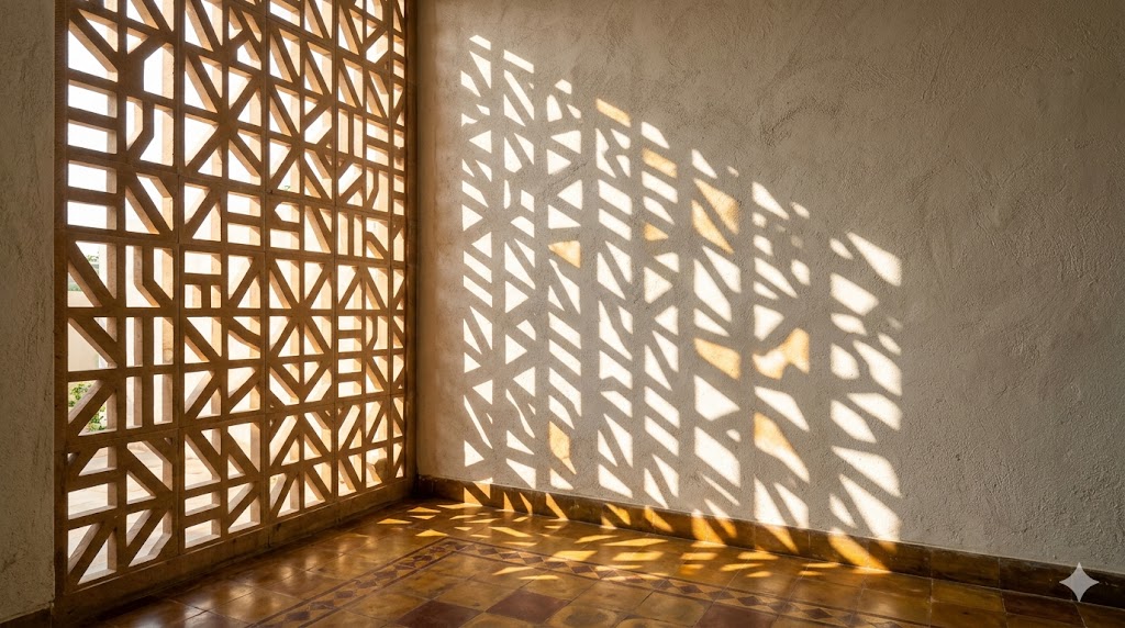
The Indian luxury vocabulary is unusually deep and unusually neglected. Indian residential architecture has, across two and a half millennia, developed a particular set of architectural elements that are simultaneously luxurious, climatically intelligent, and culturally specific:
- The courtyard — central to Chettinad, Kerala, Rajasthani, and Punjabi residential traditions. Daylight, ventilation, semi-public family space, and the slow rhythm of the seasons inside the home.
- The jaali (perforated stone or wood screen) — modulates daylight, provides privacy without opacity, allows ventilation, casts changing shadow patterns through the day. A Stage-1 architectural element, not a decoration.
- The columned verandah — transitional space between inside and outside, crucial in tropical and warm-temperate climates, intuitively luxurious for the body.
- The deep overhang (chajja) — climatic discipline that reads as architectural generosity.
- The tank or reflecting pool — passive cooling, sound (water trickling reduces perceived noise floor), reflective ceiling-light condition.
- Lime plaster (chunam) — soft, breathable, takes light beautifully, ages well. An indigenous Tier-1 wall finish that the marketplace has largely abandoned for synthetic emulsion paint.
- Athangudi tile — handmade, hand-pigmented cement tile from Tamil Nadu. Each tile slightly different, ages magnificently, India-specific.
- Indian teak, rosewood, sissoo, sal — solid hardwoods that the Indian climate has selected for over centuries.
- Copper, brass, bell-metal — traditional metals that develop honest patinas, take craftsmanship well, are recyclable indefinitely.
- Hand-loomed cotton, silk, wool — Indian textile traditions that the global luxury market repeatedly rediscovers.
The architect who is fluent in this vocabulary can deliver Indian luxury — a luxury that is recognisably Indian, climatically appropriate, culturally rooted, and economically competitive — without the imported-material premium. The work of Charles Correa (Kanchanjunga, Belapur housing), Geoffrey Bawa (his Sri Lankan residences), B.V. Doshi (Sangath, Aranya), and Bijoy Jain (Studio Mumbai's residential work) is the canonical contemporary demonstration that this vocabulary is a living tradition, not a heritage one.
The temptation, repeatedly, is to deploy this vocabulary as pastiche — a Chettinad column purchased from a salvage dealer and bolted into a modern apartment as decoration. This is not the same thing as designing in the tradition. The discipline is to use the vocabulary as Correa, Bawa, Doshi, and Jain used it: as architectural moves that solve specific climatic, programmatic, and proportional problems, with materials and detailing that earn their place. The biophilic-design framework is a useful structuring lens — see the Studio Matrx Biophilic Score utility.
10. Bespoke versus Catalogue — Where the Premium Pays
The luxury conversation will repeatedly produce the question: should we go bespoke? The honest answer is yes, in some categories; no, in others; it depends, in most. The architect's discipline is to know where bespoke pays and where it doesn't.
Where Bespoke Pays
- Built-in joinery — wardrobes, kitchen cabinets, library shelving, walk-in pantry, study desk. The dimensions are dictated by the architecture; catalogue modules will compromise the architecture. Bespoke premium of 25–60% is a competitive return.
- Hardware fittings unique to the project — entrance door handle, primary balustrade, master bath fittings. The hand contacts these daily; the bespoke premium is felt directly.
- The kitchen counter and bathroom counter — single slab if possible; the joint, the edge, the under-mount sink are bespoke moves.
- Loose furniture pieces with strong sightlines — the dining table, the master bed headboard, the principal living room sofa or coffee table. These define the room.
Where Catalogue Suffices
- Switch plates, sockets — well-designed catalogue product (Legrand, Gira, Häfele) is competitive with bespoke, far cheaper, and easier to service.
- Appliances — kitchen appliances, water heaters, air conditioners. Specified product, not bespoke.
- Sanitaryware — well-chosen catalogue (Kohler, Duravit, Gessi, Indian premium ranges) is competitive with bespoke at fractional cost.
- Door hardware (interior doors) — catalogue pulls and hinges, well-specified, are nearly indistinguishable from bespoke at the daily-use level.
- Loose furniture in secondary spaces — guest bedroom, study, children's room. Catalogue + good upholstery selection.
The Value-for-Bespoke Ratio
A practical heuristic: spend bespoke effort on the elements the body contacts daily and on the elements the eye returns to repeatedly from the principal sightlines of the home. Spend catalogue effort everywhere else. The typical luxury residential project has 5–8 bespoke elements; the rest is well-curated catalogue product. The appearance of an entirely bespoke home is achievable through this disciplined mix, at one-third the cost of a fully bespoke one. The cost-versus-value framework is treated in the Material Decision Framework utility.
11. Designing Luxury at Different Budgets
The previous sections have implied that luxury is a single concept; in fact, the levers shift at different budget bands. A residential project with a ₹3,000-per-square-foot construction budget cannot deploy the same luxury vocabulary as a ₹15,000-per-square-foot project — but it can deploy a luxury vocabulary, calibrated to its budget.
The Luxury Lever by Budget Band (FY 2025-26 reference)
| Budget Band (₹/sft, construction only) | Primary Luxury Lever | Material Strategy | Acoustic Strategy | Lighting Strategy |
|---|---|---|---|---|
| ₹2,500–3,500 | Proportion + restraint | Local Tier-2 + 1–2 Tier-1 hand-touch points | Standard partition; single-glazing | 2-layer (ambient + task) with good fixtures |
| ₹3,500–5,500 | Proportion + craftsmanship + restraint | Local Tier-1 floor + Tier-2 walls + Tier-1 hand-touch | Standard + window-side acoustic upgrade | 3-layer; dimmable LED |
| ₹5,500–8,500 | Full pillar set; high-end Indian materials | Tier-1 throughout with selective imported accent | Acoustic partitions in master suite; double-glazing in bedrooms | 4-layer with scene control |
| ₹8,500–14,000 | Full pillar set; bespoke joinery; specialist consultants | Mix of premium Indian Tier-1 and selected imported Tier-1 | Acoustic engineer engaged; full double-glazing | 4-layer with full home automation; landscape lighting |
| ₹14,000+ | Full pillar set; bespoke throughout; rare materials | Predominantly imported Tier-1; bespoke fabrication | Specialist acoustic engineer; tested STC values; floating floors | Specialist lighting designer engaged from concept stage |
The single-row-budget mistake is to attempt the ₹8,500-band material strategy with the ₹3,500-band proportion strategy. The result is the marble-clad apartment with 2.6 m ceilings and 8 ft × 16 ft bedrooms — the materials are luxurious, the architecture is not, and the body knows it. The rigour is to match all five levers to the budget band. A ₹3,500-band project that gets proportion, restraint, and a modest material strategy right will read as more luxurious than a ₹6,500-band project that fails any of the five.
The Studio Matrx Cost Calculator and Style Budget Calculator utilities produce band-aware cost estimates for residential projects.
12. Twelve Diagnostic Tests for Luxury
A working checklist that an architect can run on any residential project — own design or peer review — to verify that the luxury claim is defensible:
1. Ceiling height test — clear ceiling at 3.0 m or above in primary rooms?
2. Aspect ratio test — every primary room within 1:1 to 1:1.7 ratio?
3. Daylight depth test — depth-to-window-height ratio under 2.5:1 in every primary room?
4. Material count test — three or fewer materials per room?
5. Material truth test — solid material at every daily-touch point (handrails, pulls, counter at wash zone)?
6. Joint test — door reveals at 2 mm consistent? Skirting joints coped, not mitred-and-caulked? Tile grout at 1.5 mm?
7. Hardware palette test — two or fewer metal finishes throughout the project?
8. Lighting layer test — at least three layers (ambient, task, accent) in every primary room, on independent dimming?
9. Acoustic test — measured ambient noise floor under 35 dBA in master bedroom at night?
10. Quiet test — TV audible at conversation volume from living room not audible in master bedroom?
11. Patina forecast — every specified material defensibly better at year 20 than year 1?
12. Edit test — twenty percent of plan-stage elements removed without architectural loss?
A residential project that passes 10 or more of these is a luxury project at any budget band. A project that passes fewer than 6 is not — regardless of cost-per-square-foot — and the architect's first conversation with the client must be about which of the failing tests to address before any specification is finalised.
13. References and Further Reading
Architectural Theory and Philosophy
- Loos, A. (1908). "Ornament and Crime." Reprinted in Ornament and Crime: Selected Essays, Ariadne Press (1998). Foundational essay on architectural restraint.
- Mies van der Rohe, L. (1923). "Working theses." G: Material zur elementaren Gestaltung, Issue 1. Original "less is more" provenance.
- Alexander, C. (1979). The Timeless Way of Building. Oxford University Press. The "quality without a name" concept that grounds the search for non-stylistic luxury.
- Alexander, C., Ishikawa, S., & Silverstein, M. (1977). A Pattern Language. Oxford University Press. Patterns 145 (Bulk Storage), 158 (Open Stairs), 191 (The Shape of Indoor Space), and 251 (Different Chairs).
- Pallasmaa, J. (1996, 2nd ed. 2012). The Eyes of the Skin: Architecture and the Senses. Wiley. Defines the multisensory critique of vision-only architecture.
- Zumthor, P. (2006). Atmospheres: Architectural Environments — Surrounding Objects. Birkhäuser. Practical phenomenology of luxury.
- Pawson, J. (1996). Minimum. Phaidon. The discipline of removal.
- Day, C. (1990, expanded 2002). Spirit and Place: Healing Our Environment, Healing Environment. Architectural Press.
- Rybczynski, W. (1986). Home: A Short History of an Idea. Penguin. The historical construction of "comfort" and "luxury" as architectural categories.
- de Botton, A. (2006). The Architecture of Happiness. Hamish Hamilton.
Indian Architectural Tradition and Practice
- Correa, C. (1983). The New Landscape: Urbanisation in the Third World. Concept Media. Foundational on Indian residential typologies.
- Correa, C. (1996). A Place in the Shade: The New Landscape and Other Essays. Penguin. Includes the seminal essay on the courtyard.
- Doshi, B.V. (2018). Paths Uncharted. Mapin (Pritzker laureate's autobiography).
- Mehrotra, R. (Ed.) (2011). Architecture in India Since 1990. Pictor Publishing.
- Tillotson, G.H.R. (1989). The Tradition of Indian Architecture: Continuity, Controversy and Change since 1850. Yale.
- Bawa, G. & Robson, D. (2002). Geoffrey Bawa: The Complete Works. Thames & Hudson. (Sri Lankan but architecturally adjacent and frequently studied in Indian schools.)
- Studio Mumbai (2012). Studio Mumbai: Praxis. Verlag der Buchhandlung Walther König. Bijoy Jain's residential work as contemporary Indian luxury.
Acoustics and Perception
- Long, M. (2005). Architectural Acoustics. Academic Press. Reference for STC, RT60, and residential applications.
- Cavanaugh, W., Tocci, G., & Wilkes, J. (2009). Architectural Acoustics: Principles and Practice, 2nd ed. Wiley.
- IS 1950 (1962, Reaffirmed 2017) — Code of Practice for Sound Insulation of Non-Industrial Buildings. Bureau of Indian Standards.
Materials and Patina
- Mostafavi, M., & Leatherbarrow, D. (1993). On Weathering: The Life of Buildings in Time. MIT Press. Canonical text on architectural patina.
- Indian Standards governing residential materials: IS 303 (MR plywood), IS 710 (BWP plywood), IS 14587 (granite slabs), IS 1130 (marble blocks and slabs), IS 4101 Part 2 (stone facing tiles), IS 13753 (ceramic tiles), IS 15622 (vitrified tiles).
Lighting
- IS 3646 (Parts 1–4) — Code of Practice for Interior Illumination. Bureau of Indian Standards.
- CIE 29.2 (1986) — Guide on Interior Lighting. International Commission on Illumination.
- Descottes, H., & Ramos, C. (2011). Architectural Lighting: Designing with Light and Space. Princeton Architectural Press.
Companion Studio Matrx Guides
- The Architect's Scope of Services in India
- Architect Fee Structures in India
- Architectural Lighting Design for Indian Homes
- Engineered Wood Lifecycle Costing in India
- Flooring & Finishes Specification
- Storage Planning as a Design Discipline
- Passive Design — India Climate Zones
- Site Supervision Checklist for Indian Architects
Companion Studio Matrx Tools
- Material Compare — lifecycle and cost comparison
- Material Decision Framework — bespoke vs catalogue worksheet
- Lighting Planner — room-by-room layered lighting schedule
- Sun Path Analyzer — site-specific daylight strategy
- Biophilic Score — biophilic-design diagnostic
- Cost Calculator — band-aware construction cost estimation
- Style Budget Calculator — material-strategy budget allocation
Author's Note: The luxury conversation in Indian residential architecture is, at heart, a vocabulary problem. The marketplace has trained two generations of clients and contractors to equate luxury with material price; the architect's most consequential professional act is to refuse that equation. The discipline this guide describes — material honesty, craftsmanship, proportion, light, silence, patina, restraint, the indigenous vocabulary, calibrated bespoke, budget-aware levers — is not a higher-cost discipline. It is a higher-rigour discipline that, properly executed, produces homes that are recognisably luxurious at any budget band and that improve over the thirty years that follow.
Disclaimer: This article is for informational and educational purposes only. It does not constitute professional architectural or interior-design advice. Material, code, and cost references reflect 2026 Indian practice but may shift with statutory and market changes. Architects must verify against current standards, engage qualified consultants where required, and apply professional judgment to each project's specific context. Studio Matrx, its authors, and contributors accept no liability for decisions based on this guide.
Interactive · Luxury residential tier ladder
Premium · ₹15k-30k / sqft built-up
Typical buyer
HENRYs (high earner, not rich yet) — 30s-40s, IT/finance/SME owners.
Exemplar
Prestige Lakeside Habitat (BLR), Lodha World One (BOM lower floors).
Amenity stack
- ▸Private home theatre / lounge
- ▸Gym + reading room
- ▸Imported white-goods (Bosch/Liebherr)
- ▸Sound system pre-wire
- ▸Smart-home basics (Lutron / Crestron entry)
Materials
- • Imported large-format porcelain
- • Engineered wood + veneer
- • Quartz / engineered stone counters
- • Aluminium-framed glazing
Brands / suppliers
- • Hettich, Hafele hardware
- • Bosch, Liebherr appliances
- • Kohler, Grohe sanitaryware
Bands are 2025-26 indicative for tier-1 Indian cities. Cost includes finishes + amenities; excludes land. Tier definitions are market practice — there is no formal taxonomy.
Export this guide
Related Guides — Deep-dive reading
Flooring & Finishes Specification for Indian Architects
Performance Criteria, IS Codes, and Detailing for Residential Floors and Wall Finishes
Materials & FinishesSmart Storage Interiors — A 2026 Working Reference for Indian Homes
Inventory-driven · Floor-to-ceiling · Hardware-engineered · Zone-mapped
Room PlanningDesigning Adaptable & Universal-Design Homes
Accessibility, Aging-in-Place, and the Multi-Stage Family — Code, Anthropometrics, and Plan-Stage Discipline for Indian Residential Architects
Room PlanningRelated Tools — Try Free
Acoustic Privacy (STC) Visualizer
Indian healthcare acoustic visualizer — compare wall assemblies and noise sources, see received SPL after STC attenuation, and check FGI 2018 / IS 1950 / NABH speech-privacy compliance with live dual-canvas waveform.
Acoustic ToolBrise-Soleil Visualizer
Interactive horizontal-louvre cut-off angle calculator — sun altitude, louvre depth, and spacing inputs with a live shadow preview. Computes θ = arctan(spacing/depth) for façade shading, ECBC envelope compliance, hospital daylight design, and tropical sun-control detailing.
Sun Shading ToolCross-Ventilation Analyzer
Estimate airflow and air changes per hour (ACH) from room size, window areas, layout, and local wind — with NBC 2016 Part 8 compliance check.
Ventilation Calculator