
 Lesson 5.4
Lesson 5.4 · The Journey Through the Store
The Checkout & Point of Sale
The checkout is the last and most fragile step of the journey - where a full basket becomes a sale or an abandoned pile - and its location, queue design, till-zone impulse and, above all, its friction decide whether the shopper leaves happy or walks out empty-handed
A shopper with a full basket and a made-up mind can still walk out with nothing - if the queue is long enough.
It is the cruellest way to lose a sale. The window pulled them in, the path carried them round, the display sold them, the fitting room closed the decision - and now they stand in a slow, disorganised queue with a full basket, watch the line barely move, and put everything down and leave. Every stage of the store did its job, and the checkout undid all of it in the final ninety seconds. The point of sale is the last step of the journey and the most fragile: the one place where a shopper who has already decided to buy can still be lost, purely to friction.
That fragility is why the checkout deserves as much design care as the window, even though it earns none of the glamour. Its job is deceptively simple - take the money quickly, easily and pleasantly, and send the shopper off happy - but doing it well is a real design problem: where to put the till so it catches everyone leaving without clogging the exit; how to organise the queue so the wait feels fair and short; how to use the captive queue moment for one last honest impulse offer; and, above all, how to strip out every scrap of friction, because friction at the checkout is abandonment. This lesson treats the checkout as the closer's closer. (The point-of-sale technology itself - the systems, hardware and payments - we defer to Module 9 and the IT specialists; here it is the design of the checkout experience.)
Last step, most fragile. Friction = abandonment. Fair queue, honest last offer, brand-right farewell, sized for the peak.
The last and critical step - locating the till
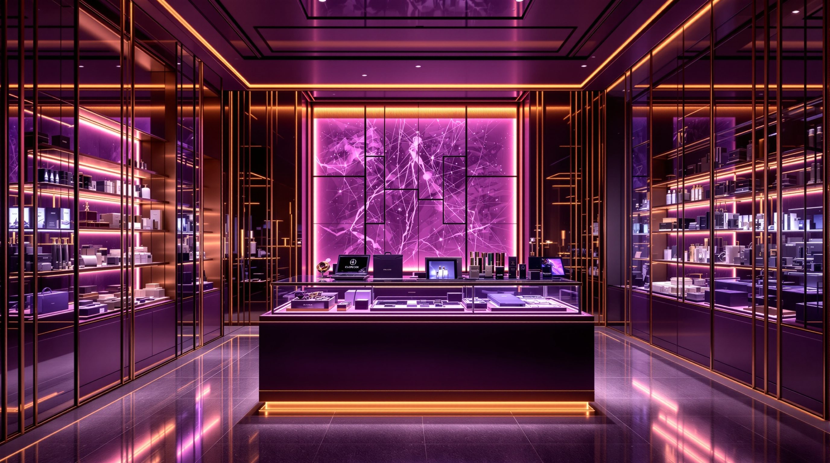
The checkout is where the whole journey is finally cashed in, and its location in the plan is a real design decision, not a default. In most stores the till sits near the entrance/exit, for sound reasons: it catches every shopper on the way out, it lets staff at the counter keep an eye on the door (a loss-prevention role), and it means the shopper does not have to backtrack to pay. But the exact placement is a balance. Put it too much in the decompression zone and it clutters the entrance and pressures shoppers at the very moment they should feel relaxed and unpressured; bury it too deep and shoppers cannot find where to pay, which is its own friction. The counter should be visible and easy to find from anywhere on the floor - a shopper ready to pay should never have to hunt for the till - while sitting where it commands the exit and does not choke the entrance flow.
Different formats place the checkout differently, and the designer calibrates to the type. A supermarket runs a bank of lanes across the exit, because everyone converges there with full trolleys. A boutique has a single, often beautifully designed counter that doubles as a service and brand touchpoint. A department store may use dispersed pay-points within each department so shoppers pay where they shop. Each solves the same problem - collect payment conveniently at the natural end of that store's journey - in the way that suits its scale and shopper. The counter is also a brand and service moment: it is the last thing the shopper touches, the place of the final human interaction, so its design, materials and the experience there leave a lasting impression and should express the brand as deliberately as the window did.
One hard constraint governs all of this: the checkout, its queue and its counter must never obstruct the exit route or the egress the fire strategy relies on. A queue that spills across the doors, a counter that pinches the escape path, till-zone displays that narrow the exit - these are life-safety failures, not just retail annoyances. So the checkout is located and sized in coordination with the egress design, and the binding clearances and exit widths come from the current code and the fire/life-safety specialist. Locate the till to catch, serve and brand the departing shopper - visibly, without clogging the entrance, and always clear of the exit route.
Catch everyone leaving, command the door, express the brand one last time - and never block the exit.
Queue design and the psychology of waiting
The queue is where checkouts most often fail, and its design is as much psychology as geometry, because the pain of waiting is only partly about the actual minutes. A central choice frames it: multiple parallel lanes (each queue to its own till) versus a single serpentine queue feeding several tills (next-available-server). The single queue, familiar from banks and airports and now many retailers, is usually fairer and often flows better: no shopper gets stuck behind one slow transaction while the next lane races, the wait feels more equitable, and perceived fairness matters enormously to how a wait is experienced. Parallel lanes can suit very high-volume grocery where a single queue would snake impossibly far, and they let shoppers pick a lane - but they create the maddening 'I chose the wrong line' feeling. The designer picks the model that fits the format's volume and calibrates the space for it, including where the queue physically forms without blocking aisles, displays or the exit.
The psychology of waiting gives the designer several levers beyond raw speed. Occupied time feels shorter than empty time - which is part of why a till-zone of things to look at helps. Unfair or unexplained waits feel far longer than fair, visible ones - so a single fair queue, or clear signage about which till is next, eases the pain. Uncertain waits feel worse than known ones - so anything that signals 'you are moving, this is nearly done' reduces frustration. And anxiety inflates perceived time - a shopper unsure they are even in the right line, or worried they will be stuck, suffers more than one who feels in control. Design the queue so the wait feels fair, finite, occupied and moving.
Above all, size the checkout for the peak, not the average, exactly as with fitting rooms - the weekend rush and the festive surge are when queues form and full baskets get abandoned, so the till count and staffing must hold up on the busiest hour, not the quiet Tuesday. Under-provisioning the checkout for the peak is one of the most expensive false economies in retail, because it loses fully decided sales at the very moment volume is highest. Provide enough tills, flex staffing to demand (open more at peak), design the queue to stay fair and orderly, and never let it become the bottleneck that undoes the whole store. Treat published throughput and lane-count figures as starting points to calibrate to the format and market, not rules.
Impulse at the till - the last honest suggestion
The queue creates a uniquely valuable selling moment, and using it well is a core part of checkout design. A shopper waiting at the till is captive, relaxed, wallet-ready and idle - they have decided to buy and have nothing to do but wait - which makes the till zone the single most effective impulse-merchandising location in the store. This is why supermarket checkouts are lined with sweets, batteries, magazines and gum, and why almost every counter carries a tray of small, cheap, tempting things: a share of waiting shoppers will add one, converting dead waiting time into extra sales at the very end of the trip. Designed well, the till-zone impulse strip also serves the earlier psychology point - something to look at makes the wait feel shorter - so it can genuinely improve the experience while it sells.
The craft is to stock the till zone with the right kind of product: small enough to add without a real decision, cheap enough to buy on a whim, relevant enough to be a welcome afterthought (a phone cable at an electronics till, a chocolate at a grocery till, a travel-size at a beauty counter), and easy to see and reach from the queue. Place it along the queue rail and on the counter at hand and eye height, keep it tidy and tempting, and refresh it. This is one of the highest-return few square feet in the whole store, and getting the assortment and placement right is a real merchandising skill.
But the till zone is also where the served-not-manipulated line is under the most pressure, because the shopper here is at their most captive and least resistant - and this course is clear that exploiting that is bad practice. The 'guilt lane' problem lives here: sweets at children's eye height in a queue nobody can leave, pushing pester-power and unhealthy impulse on a captive family, is exactly the manipulative end, and it draws real criticism and, in several markets, regulation restricting unhealthy-product placement at checkouts. The honest version offers a genuinely nice, relevant, reasonably priced last suggestion that a willing shopper is glad to spot; the manipulative version ambushes the trapped and the young. Design the till zone as a good final suggestion, never as an ambush - defer the binding placement restrictions to current regulation and the retailer's responsible-marketing standards.
Captive, relaxed, wallet out = the best impulse spot. A nice last suggestion, never a guilt-lane ambush.
Reducing friction - and the evolving checkout
Everything about the checkout finally comes down to friction, because at this last step friction is abandonment. A shopper with a full basket and a decided mind is the easiest sale in the store to complete and the easiest to lose, and they are lost to friction: a queue too long or unfair, a slow or fumbling transaction, a confusing pay process, a counter that is hard to find or awkward to use, a payment method they cannot use, being made to feel rushed or, conversely, kept waiting while staff chat. The design brief is to strip out every one of these: enough fast tills for the peak, a fair well-designed queue, a clear findable counter, a smooth quick transaction, wide payment acceptance, and a courteous, unhurried-but-efficient farewell. Every removed friction is a rescued sale and a better last impression - and the last impression is disproportionately what the shopper remembers of the whole store.
This relentless war on checkout friction is what drives the evolving checkout, one of retail's most visible current shifts. The traditional single manned till gives way to multiple tills with a single fair queue; then to self-checkout, which frees staff and speeds simple transactions but must be carefully designed (clear, forgiving, well-signed, with help on hand, or it adds friction and error rather than removing it); and increasingly to mobile and 'scan-and-go' or queue-less checkout, where the shopper pays on their phone as they shop or walks out while sensors and their account settle the bill - pushing checkout friction toward zero by, in effect, removing the checkout as a place. Each step down this ladder is really the same design goal: take the money with less friction and less waiting.
Two cautions frame the future checkout. First, the technology itself - the POS systems, hardware, sensors and payment integrations - belongs to Module 9 and the IT and payments specialists; the retail designer's job is the experience and the space, designing the checkout (whatever its technology) to be fast, clear, fair, secure and pleasant, and to fail gracefully when tech does. Second, removing the human from the checkout removes a service and brand moment, so the choice is a real trade-off: self and mobile checkout suit speed-and-convenience missions, while a served counter still matters where the farewell, advice or brand experience is part of the value (a boutique, a premium store). Design the checkout - manned, self, or invisible - as the frictionless, fair, brand-right last step it must be, and defer the device and payment specifics to the specialists and Module 9.
Egress at checkout & queues (NBC 2016)
Exit route clear of the counter, queue and till-zone displays; occupant flow
The checkout and its queue must never obstruct the exit or the egress the fire strategy relies on. Binding exit widths and clearances come from the current code + a fire/life-safety specialist.
Accessible checkout counter
A lowered/accessible pay-point, clear approach and reach, accessible self-checkout
Provide accessible pay-points to the current accessibility standards + an accessibility consultant. Self-checkout must be usable by all - binding heights and reach are set by the standards, not a rule of thumb.
POS technology & payments
Till systems, hardware, self/mobile checkout, payment and data security
Deferred to Module 9 and the IT/payments specialists. The designer shapes the experience and space; the systems, security and integrations are the specialists' domain.
Till-zone marketing rules & throughput benchmarks
Checkout impulse placement restrictions; lane-count and throughput figures
Some markets restrict unhealthy-product placement at checkouts - defer to current regulation and responsible-marketing standards. Treat throughput/lane figures as illustrative starting points to calibrate to the format and market.
Workshop - redesign a checkout against friction
The checkout is where a decided sale is most easily lost. In this workshop you will observe a real checkout, diagnose its friction and queue psychology, and redesign it as a fast, fair, honest, brand-right last step.
A store with a real queue to observe (busy is better) and a notebook or stopwatch. No POS hardware or code work needed - defer the tech to Module 9 and the binding egress/accessibility values to the standards and specialists.
Goal: diagnose and redesign a checkout as the frictionless last step
Inputs: a store with a queue you can observe (a busy supermarket or apparel store) + this lesson + a notebook
Time: ~60 minutes
- 1LOCATION: note where the till sits relative to the entrance/exit and the floor. Is it easy to find from anywhere, does it command the door, and does it avoid clogging the decompression zone or - critically - blocking the exit route?
- 2QUEUE: record the model (parallel lanes vs single serpentine) and time an actual wait against how long it FELT. Apply the psychology of waiting: was it fair, finite, occupied and moving, or unfair, uncertain, idle and stuck? Judge whether the till count would survive a festive peak.
- 3TILL IMPULSE: audit the till-zone merchandising - is the assortment small, cheap, relevant and a welcome last suggestion, or is it an exploitative guilt-lane ambush (e.g. sweets at children's eye height in a captive queue)? Note the served-vs-manipulated verdict.
- 4FRICTION & BRAND: list every friction you hit or observed - hard-to-find counter, slow process, limited payment options, a rushed or absent farewell - and judge the checkout as the last brand impression: what did it leave you feeling about the store?
- 5REDESIGN: propose the three changes that would most cut friction and lift completed sales (e.g. switch to a fair single queue, add a peak till, fix payment acceptance, humanise or speed the farewell), noting which need the egress/accessibility/IT specialists, and whether self or mobile checkout would suit this format.
You’ll walk away with
A one-page checkout diagnosis and redesign: its location, queue model and felt-vs-actual wait, its till-impulse verdict (served vs manipulated), its frictions and last-impression, and the three highest-impact changes to make it a fast, fair, honest, brand-right final step.
Three altitudes on the same idea
Read the band that fits you — or all three.
Your plan fixes where the checkout can live and how its queue and exit resolve. Locate the checkout zone to catch departing shoppers and command the door without clogging the decompression zone, give it enough envelope for the tills and queue the format needs at peak, and - critically - coordinate it with the egress strategy so the queue and counter never obstruct the exit route the fire code and life-safety specialist govern. Provide the power, data and any sensor infrastructure for the checkout technology in coordination with the IT/MEP consultants (the tech itself is Module 9), and design for future shifts - self and mobile checkout change how much fixed till space is needed. For rollout, the checkout module is part of the prototype kit. Binding exit widths, clearances and accessible-counter provision come from the code and specialists.
The checkout experience is yours to design as the store's fragile last step and final brand moment. You place and design the counter (findable, brand-expressive, an accessible lower section provided), choose the queue model - a fair single serpentine or parallel lanes - and shape where it forms without blocking aisles or the exit, and you apply the psychology of waiting so the wait feels fair, finite, occupied and moving. You design the till-zone impulse strip as an honest last suggestion (never a guilt-lane ambush), and you wage the war on friction: a smooth process, wide payment acceptance, a courteous farewell. Size for peak festive demand, and design self/mobile checkout to be clear and forgiving where used. Calibrate throughput and lane counts to the format, and coordinate the POS tech, payments and egress with the specialists.
The checkout is where you can feel a sale nearly slip away - so pay attention to your own queues. Notice next time: how easily you found the till, whether the queue was a fair single line or a lane-gamble, how long it felt versus how long it was, and what made the wait better or worse (something to look at, a sense of moving, a fair order). Notice the till-zone temptations and whether they felt like a nice last offer or a trap, especially for children. Notice how the payment and farewell left you feeling about the whole shop. Learn the core idea - at the last step, friction is abandonment, and the last impression outweighs its ninety seconds - and the direction of travel toward self, mobile and queue-less checkout. You are not specifying POS hardware (that is Module 9); you are learning to design a fast, fair, friction-free, brand-right final step.
“The checkout is just the place you pay - a functional counter at the end. As long as there is a till and someone to work it, the design barely matters; the selling has already happened.”
Do it yourself
No tools needed - reason it through.
- 1Why is the checkout described as the 'last and most fragile step', and how can a fully decided sale still be lost there?
- 2Compare a single serpentine queue with multiple parallel lanes: what are the trade-offs, and why does perceived fairness matter so much?
- 3Name three levers from the psychology of waiting a designer can use to make a queue feel shorter and less painful.
- 4Why is the till zone the most effective impulse location in the store, and where is the line between an honest last suggestion and a manipulative 'guilt lane'?
- 5Explain how self-checkout and mobile/scan-and-go checkout both pursue the same design goal, and one trade-off of removing the human from the checkout.
The one line to carry out
Peer-reviewed journals & authoritative standards
- 01Point of sale — Wikipedia - Point of sale, 2026.
- 02Self-checkout — Wikipedia - Self-checkout, 2026.
- 03Customer experience — Wikipedia - Customer experience, 2026.
- 04Retail technology — Wikipedia - Retail technology, 2026.
- 05Retail design — Wikipedia - Retail design, 2026.
That completes the journey through the store, from the guiding path to the final payment. Next, in Module 6, we turn from the route to the felt world it moves through - atmosphere and the senses: how light, material, sound and scent make a shopper feel, stay and belong to the brand.
The author
Amogh N P
Architect, interior designer, and creative polymath. Studio Matrx began in his notebooks — his vision of design made honest, useful, and open to everyone. Its Academy is written and taught in his memory, and free, forever.
More about Amogh →