
 Lesson 5.2
Lesson 5.2 · The Journey Through the Store
Destination, Impulse & Adjacency
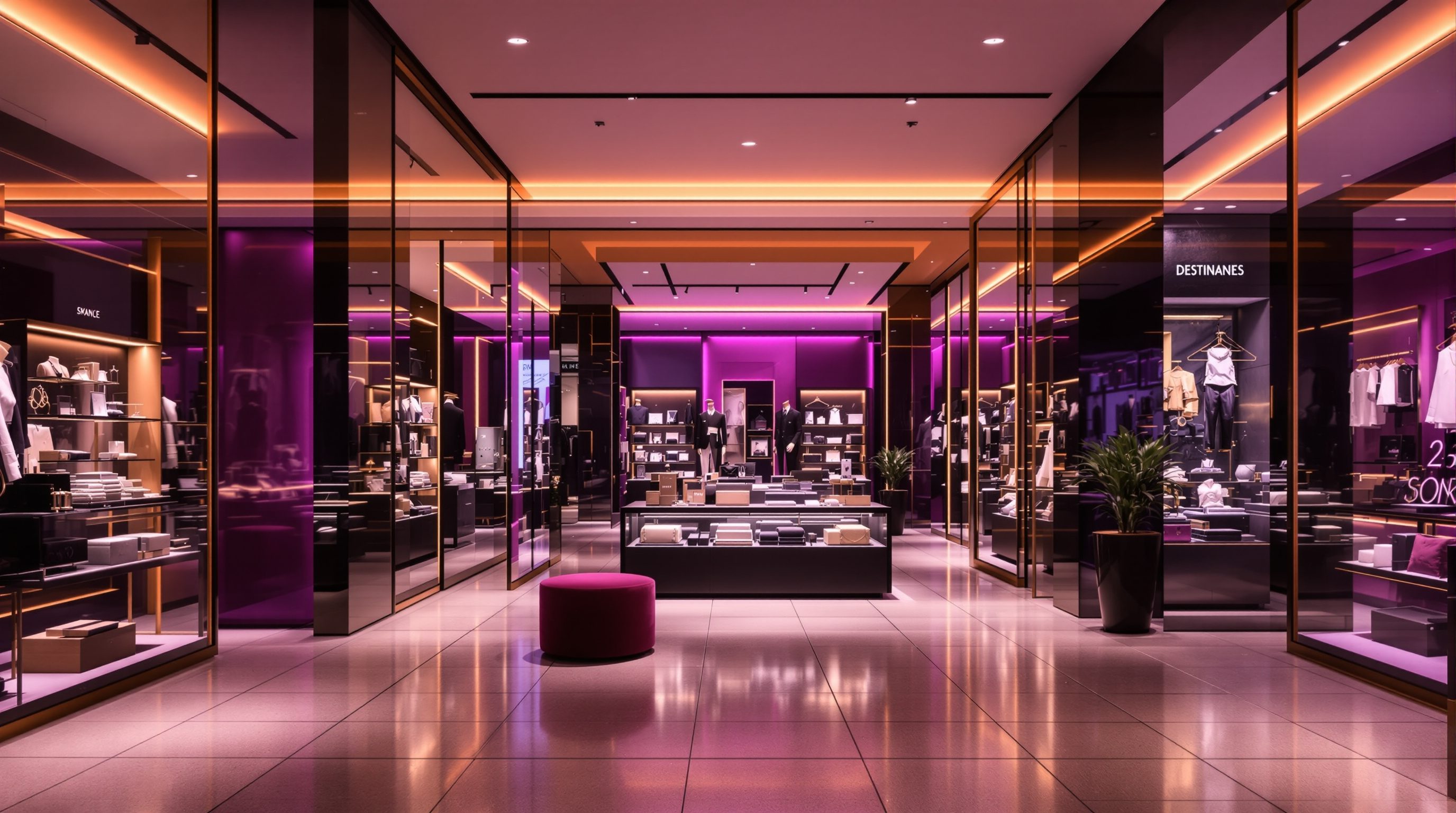
Where a product sits along the journey is a selling decision - destination goods placed deep to pull shoppers through, impulse goods set in the path and at the till to be grabbed, and adjacencies that let one want lead naturally to the next and quietly build the basket
You came in for one thing and left with five. Four of those were placed on your journey on purpose.
The item you actually came for was probably at the back, or deep in a far corner, and you walked a long way to reach it - past a table of the new season, a stack of the thing on offer, a rack that suggested the trousers to go with the shirt, and, at the very end, a wall of small tempting things beside the till. You bought the thing you came for. You also bought four things you did not plan to. None of that was luck. It was the store's most quietly commercial craft: deciding not just what to sell, but exactly where along your journey to place it.
Every product in a store plays one of a few roles. Some are destinations - the things people specifically come for - and their job in the plan is to be placed where they pull shoppers deep into the store past everything else. Some are impulse goods - things people did not plan to buy but will grab when they see them - and their job is to sit right in the path and at the till. And around all of them runs the logic of adjacency: placing products so that one want leads naturally to the next, so a shirt suggests a tie, a tent suggests a sleeping bag, tea suggests biscuits. Done cynically this manipulates; done well it genuinely serves the shopper with what they will want next while building a bigger, more satisfying basket. This lesson is about placing merchandise along the journey to sell - honestly.
Destination deep, impulse in the path + at the till, adjacency beside the hero. Bigger basket by serving better.
Destination goods: the magnets placed deep
Destination goods are the products shoppers come in specifically to buy - the milk and bread in a supermarket, the prescription at a pharmacy, the phone at an electronics store, the staple denim at a fashion retailer. Because people will seek these out and walk to reach them, their placement in the plan follows a counter-intuitive rule: put them deep, away from the entrance, so that the shopper's journey to the thing they came for carries them past as much other merchandise as possible. This is why the milk is at the back of the supermarket, the pharmacy counter is at the rear, and the most-wanted basics are rarely by the door. The destination good is a magnet, and the designer uses its pull to draw the shopper through the whole store.
This is one of retail's oldest and most reliable moves, and it is legitimate - shoppers broadly understand and accept it, and it lets the store show its range to people who would otherwise grab and go. Related is the loss leader: a destination product priced so keenly it barely profits (or loses money) precisely because its job is to pull footfall in and through, with the profit made on everything else the shopper passes and picks up. The design does not set the price, but it places the loss leader to maximise the journey, and it shapes the store so the trip past the rest of the range is rich and easy rather than a resented trek.
The designer's craft is to place destinations so they pull without frustrating. The mission shopper who wants only the one thing must still be able to find it - clear sightlines and wayfinding to the destination category matter - and reach it and leave without feeling trapped, even as the path exposes them to more (the guide-generously-never-trap line from the last lesson). And you can use multiple destinations as anchors around the store, each pulling shoppers to a different zone, so the whole floor gets footfall rather than just the route to one back corner. Placed well, destination goods are the engine of exposure: they are the reason shoppers travel the store at all, and everything else is merchandised along the journey they create. The specific placements are calibrated to the format and the shopper mission, not copied from a rule.
Destination = magnet. Put it deep so the walk to it sells everything else. But keep it findable.
Impulse goods: placed in the path, and at the till
If destination goods are what people come for, impulse goods are what they had no plan to buy but will pick up when they see them at the right moment - a chocolate bar, a phone case, a pair of socks, a scented candle, a magazine. Impulse purchases are made quickly, emotionally and with little deliberation, so the entire design task is one of placement and visibility: the product must appear in the shopper's path, at eye level or hand level, at a moment when they are receptive, and it must be cheap and easy enough to add without a real decision. Get an impulse product in front of a relaxed shopper and a share of them will simply take it; hide it in an aisle they must seek out and it will not sell, because nobody seeks out an impulse buy.
The prime impulse locations are well known. In the path - on the main aisle, on the speed-bump tables, on the end-caps that sit in the sightline - impulse goods catch shoppers already in a buying frame of mind. At the till is the classic impulse zone: the shopper has decided to buy, has their wallet out, and is waiting with nothing to do, so small, cheap, tempting products lined along the queue and the counter convert idle waiting into add-on sales. This is why supermarket checkouts are flanked with sweets and magazines and why almost every counter has a tray of small temptations. It is a genuinely powerful selling lever precisely because it meets the shopper at the moment of least resistance.
And it is exactly here that the served-not-manipulated line must be held most carefully. Placing sweets at child's-eye height by the till to trigger pester-power, or engineering unavoidable temptation traps, is the manipulative end that draws real criticism and regulation in some markets - the 'guilt lanes' debate is about precisely this. Good practice is to make impulse goods available and appealing to a willing shopper - a nice thing they are glad to have spotted - not to exploit fatigue, children or a trapped queue. So place impulse goods where receptive shoppers will happily notice them, keep them relevant and reasonably priced, and flag the exploitative versions as the bad practice they are. Impulse merchandising should feel like a good last suggestion, not an ambush.
Adjacency: let one want lead to the next
Adjacency selling is the art of placing products next to each other so that buying one naturally suggests buying another - and it is where placement stops being about single products and becomes about the shape of the whole basket. The logic is complementary need: a shopper buying a shirt plausibly wants a tie, a belt or trousers to go with it; a shopper buying pasta wants sauce and parmesan; a shopper buying a tent wants a sleeping bag, a mat and a lamp. Put those complements within easy reach of the hero product - on the same fixture, the next rack, the adjacent shelf - and you convert a single purchase into a coordinated set, lifting the basket while genuinely helping the shopper who would otherwise have to hunt for the matching pieces.
This is cross-merchandising, and it can be organised two ways, each valid for different goods. Stores can group by category (all the shirts together, all the ties together) which suits mission shopping and comparison; or they can group by occasion or solution (a whole 'weekend away' display mixing the tent, bag, lamp and stove; a styled outfit combining shirt, trousers and shoes) which suits inspiration and basket-building. Great retailers do both - a category home for the mission shopper plus solution displays and adjacencies that inspire the browser. The designer decides these placements in the planogram and the zoning plan, thinking not in isolated products but in chains of want: what did the shopper just decide to buy, and what will they most naturally want next, placed right there.
Adjacency is the most clearly win-win of the three levers when done honestly, because a good adjacency is a genuine service - it saves the shopper searching and completes what they came to do. It tips into bad practice only when the 'complement' is irrelevant or the pairing is a trick rather than a real convenience. The test is simple and human: would a helpful shop assistant, seeing what you are buying, sensibly suggest this next thing? If yes, the adjacency serves; if it is a random high-margin add placed to snag the unwary, it does not. Design adjacencies as the silent, generous version of that good assistant's suggestion, and the basket grows because the shopper is better served. Calibrate which adjacencies matter to the actual product and shopper, and let the data on what sells together refine the plan.
Would a good shop assistant suggest this next? If yes, the adjacency serves. If no, it's a trick.
The basket-building journey - the honest way to sell more
Put the three levers together and you get the basket-building journey: a sequence, designed into the plan, that takes a shopper from the door to a fuller, more satisfying basket than they arrived intending - destinations pulling them deep and exposing the range, impulse goods catching them in the path and at the till, adjacencies letting each want lead to the next. The commercial scoreboard for all of this is average basket size (or transaction value) and units per transaction - how much each shopper buys per visit - alongside the conversion and footfall metrics from earlier. A store that lifts basket size without lifting footfall has, in effect, been designed to sell more to the same people, and merchandise placement along the journey is the main lever for doing it.
The crucial framing this course holds is that a bigger basket and a better-served shopper are not opposites - the honest way to grow the basket is to serve the shopper better. A shopper who is shown the tie that completes the shirt, the sauce for the pasta, the accessory for the phone, and a nice small thing at the till they are genuinely glad to have spotted, leaves with a fuller basket AND a sense of having been helped and inspired, not fleeced. That shopper comes back. The manipulative shortcuts - irrelevant high-margin adds, exploitative till traps, mazes that force exposure - may bump one transaction but corrode trust and repeat custom, and increasingly they meet shopper resistance and regulatory scrutiny. Long-run retail rewards the generous version.
So design the journey as a series of genuine, well-timed suggestions rather than ambushes: destinations placed to expose while staying findable, impulse goods offered to receptive (never exploited) shoppers, adjacencies that a good assistant would endorse. Sequence them so the trip feels like an enjoyable, coherent shop that happens to end in a fuller basket, not a gauntlet. And measure honestly - if basket size rises while satisfaction and repeat custom hold or grow, the placement is serving; if returns, complaints or churn rise, you have crossed into manipulation and should pull back. The best retail placement is the store quietly doing what a great salesperson does: understanding what the shopper will want next and putting it helpfully within reach.
Basket & transaction metrics
Average basket size, units per transaction, attachment rate
Illustrative scoreboard for placement decisions - calibrate targets to the format and market, and read them alongside satisfaction and repeat custom, never in isolation.
Impulse-marketing ethics & rules
Till-zone temptation, marketing to children, 'guilt lane' restrictions
Some markets restrict unhealthy-product placement at checkouts and marketing to children. Defer the binding rules to current consumer-protection and advertising regulation; as a principle, avoid exploitative till traps.
Egress at checkout & queues
Exit routes past till-impulse displays and queue zones
Till-impulse merchandising and queues must never obstruct the exit route. Binding widths and clearances come from the current fire code + the life-safety specialist.
Brand assortment & planogram standards
The brand's destination/impulse/adjacency rules and planograms
For branded and rolled-out retail, placement is often prescribed by the brand's planograms and merchandising standards - design within them and feed sales-together learnings back.
Workshop - map the destination, impulse and adjacency of a store
Placement is invisible until you name it. In this workshop you will map how one store uses destination, impulse and adjacency along its journey, judge each against the served-not-manipulated line, and propose one honest basket-building improvement.
A store to observe and a plan sketch (reuse the one from lesson 5.1). No pricing or planogram software needed - this is about reading and improving placement along the journey.
Goal: read a store's placement strategy and improve it honestly
Inputs: a store you can visit or recall + a plan sketch (reuse your 5.1 plan) + this lesson
Time: ~60 minutes
- 1On a plan of the store, mark the DESTINATION goods (what people come for) and how deep they sit. Note whether the mission shopper can still find and reach them easily despite the pull-through placement.
- 2Mark every IMPULSE location - speed-bump tables and end-caps in the path, and the till zone. For each, judge: is this offered to a receptive shopper (serves) or an exploitative trap, e.g. child's-eye sweets in the queue (manipulates)?
- 3Map three ADJACENCIES - places where a hero product sits beside genuine complements (or should). For each, apply the test: would a good shop assistant sensibly suggest this next thing? Note any adjacency that is a real convenience and any that is a random high-margin add.
- 4Estimate the BASKET journey: trace a plausible shopper from the door and list what the placement adds to their basket beyond what they came for, marking each add as 'served' or 'manipulated'.
- 5Propose ONE honest improvement - a better adjacency, a relevant impulse offer, a more findable destination - and write two sentences on how it grows the basket by serving the shopper better, not by tricking them.
You’ll walk away with
An annotated plan mapping the store's destination, impulse and adjacency placements, each judged served vs manipulated, plus one honest basket-building proposal with a short justification tied to average basket size and shopper trust.
Three altitudes on the same idea
Read the band that fits you — or all three.
Placement is mostly an interiors and merchandising decision, but your shell sets what is possible. Where the entrance sits, how deep the plate runs and where the back-of-house and service points land determine where destination anchors can go and how long the pull-through journey can be - a shallow plate cannot place the milk far from the door. Give the retail team a plate that allows destinations to be sited deep with a clear, exposing route to them, room for end-caps and speed-bump zones in the main aisle, and a checkout position that supports a proper till-impulse zone without blocking egress. For rollout, the destination-and-impulse logic is baked into the prototype so every store repeats it. Coordinate any placement near exits and queues with the egress strategy - the till-impulse zone must never compromise the exit route, which the code and fire consultant govern.
This is core merchandising craft and it is yours: deciding what goes where along the journey to sell. You place the destination magnets deep, keep them findable with sightlines and wayfinding, set impulse goods in the path and design the till-impulse zone, and build the adjacencies and cross-merchandising - both the category homes and the solution/occasion displays - through the zoning plan and the planogram. Think in chains of want, not isolated products: what did the shopper just choose, and what will they naturally want next, placed right there. Hold the served-not-manipulated line hard here, because this is where dark patterns creep in - avoid exploitative till traps and irrelevant high-margin adds, and use the 'would a good assistant suggest this?' test. Calibrate to the real product mix and let sales-together data refine the plan.
Every shopping trip you take is a live lesson in placement - start noticing it. On your next trip, spot the destination good you came for and how far into the store it was; count the impulse things you passed in the path and at the till; and look for adjacencies - the complements placed right beside a hero product. Ask of each: did this serve me (a genuinely useful next thing, an item I was glad to spot) or manipulate me (an irrelevant add, a trap at the till)? Learn the three roles - destination, impulse, adjacency - and the one metric they serve, average basket size, and you will read a store's commercial mind. You are not setting planograms or prices yet; you are learning how placement along the journey builds the basket, and how to do it honestly.
“Putting essentials at the back and sweets by the till is just a cynical trick to squeeze more money out of shoppers - clever manipulation dressed up as store design.”
Do it yourself
No tools needed - reason it through.
- 1Define destination goods and impulse goods, and explain why each is placed where it is in the store.
- 2What is a loss leader, and how does its placement relate to the exposure job of the shopper journey?
- 3Explain adjacency selling with an example, and describe the difference between grouping merchandise by category and by occasion/solution.
- 4Which single commercial metric does destination/impulse/adjacency placement most directly serve, and why is a bigger basket not necessarily a worse-served shopper?
- 5Give one example each of impulse or adjacency placement that serves the shopper and one that manipulates them, and state the test you would use to tell them apart.
The one line to carry out
Peer-reviewed journals & authoritative standards
- 01Merchandising — Wikipedia - Merchandising, 2026.
- 02Visual merchandising — Wikipedia - Visual merchandising, 2026.
- 03Consumer behaviour — Wikipedia - Consumer behaviour, 2026.
- 04Planogram — Wikipedia - Planogram, 2026.
- 05Retail — Wikipedia - Retail, 2026.
Placement gets the right goods onto the shopper's path - but for clothing and much else, the decisive moment comes when they try the product. Next: the fitting room, where a huge share of purchase decisions are actually made or lost.
The author
Amogh N P
Architect, interior designer, and creative polymath. Studio Matrx began in his notebooks — his vision of design made honest, useful, and open to everyone. Its Academy is written and taught in his memory, and free, forever.
More about Amogh →