
 Lesson 6.1
Lesson 6.1 · Atmosphere & the Senses
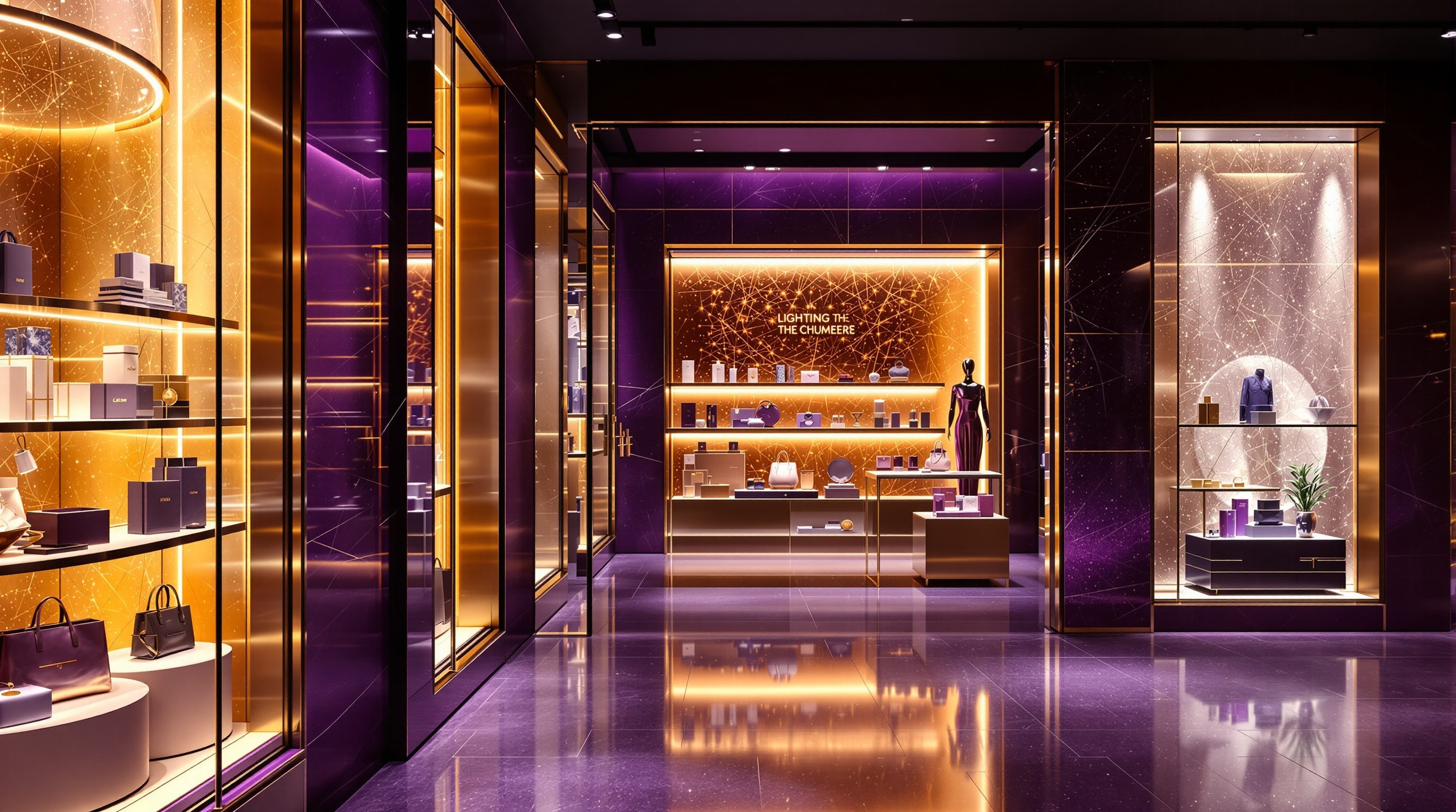
Lighting the Merchandise
Light is the single most powerful, and most underused, tool a retail designer has to make goods look desirable - layered, contrasted and colour-true so the right product leaps out and the shopper reaches for it
Turn the lights off in the finest store in the world and it becomes a warehouse. Light is what makes the goods worth wanting.
Of every atmospheric lever a retail designer can pull, light is the one with the most reach and the least cost per rupee of effect. It is the difference between a shelf of product and a shelf of desire. The same dress under flat, greyish office light looks cheap and dull; under a warm, well-aimed beam with true colour it looks like something you want to own. Nothing else you do to a store works this hard: light makes goods legible, makes them look their best, pulls the eye to what you want sold, sets the emotional temperature of the whole room, and carries a large share of the brand feeling - and shoppers register almost none of it consciously.
That invisibility is the point and the danger. Because good retail light feels like no design at all - it just feels like the store looks great and the product looks irresistible - it is easy to treat lighting as an afterthought, a grid of identical downlights switched on at one flat level. That is the single most common and most expensive mistake in store design. This lesson treats light as the number-one selling tool it is: the layers that build it, the contrast and colour that make product desirable, and how to light the displays and the window that do the most selling - while leaving the binding lux levels, energy loads and photometric calculations to a lighting designer and the code.
Three layers. Contrast, sparkle, true colour. Light the window, the hero wall, the path. Defer the lux to the specialist.
Light is the number-one tool to make goods desirable
Begin from the commercial reality: a shopper cannot want what they cannot see well, and they will not trust, or pay full price for, goods that look dull, grey or the wrong colour. Light is therefore not decoration sitting on top of the merchandise - it is the medium through which the merchandise is sold. In fashion, grocery, jewellery, furniture and food alike, the lighting scheme does more to make product desirable than almost any other single move, and it does so at a fraction of the cost of the fixtures, finishes or fit-out around it. This is why experienced retailers and their designers treat lighting as a core selling system, not a services afterthought bolted on at the end.
The mistake to unlearn is the idea that a store should be lit evenly and brightly, like an office or a car park - one flat level everywhere so everything is equally visible. A uniformly lit store is a store with no focus: nothing stands out, the eye has nowhere to land, and the space feels institutional rather than inviting. Good retail light is the opposite of uniform. It is deliberately uneven - brighter here, softer there - because the eye is drawn to the brightest, most contrasted thing in its field of view, and that pull is precisely the selling lever. Where you put the light is where you send the shopper's attention, and therefore a decision about what gets sold.
Think of light as doing four jobs at once, all of them commercial. First, visibility and trust: shoppers can see, compare and judge the goods. Second, desire: the right light makes product look its best - richer, fresher, more precious. Third, direction: brightness and contrast steer the eye and the feet, pulling people toward focal displays, the power wall and the back of the store (Modules 4 and 5). Fourth, feeling and brand: the overall warmth, level and drama of the light set the emotional temperature and signal the brand and price level before a single label is read. A designer who understands that light is doing all four jobs - and who lights the product rather than merely illuminating the room - has the single highest-leverage atmospheric tool in retail firmly in hand.
Uniform light = no focus. Light is where you want the eye to go. Light the product, not the ceiling.
Three layers: ambient, accent and feature
Good retail lighting is built in layers, not a single level, and naming the layers is the most useful discipline a designer can carry into a scheme. The first layer is ambient (or general) light: the soft, even base wash that fills the room, lets people move safely, and sets the lowest comfortable level. Ambient light is the stage, not the star - if it is too bright, nothing can stand out against it and the store flattens into that institutional evenness; if it is pitched a little lower than you instinctively expect, the accent layer above it can do its work. In many well-lit stores the ambient level is deliberately modest precisely so the product pools can shine.
The second layer is accent light: brighter, aimed beams - typically spotlights or track heads - that pick out specific merchandise, displays, mannequins and the power wall. This is the layer that sells, because it creates the contrast that pulls the eye. A common working figure, illustrative and to be calibrated to the brand and goods, is that accent light on a hero item runs roughly three to five times brighter than the surrounding ambient level; that ratio is what makes the product read as special rather than ordinary. Accent light is aimed, shaped and focused - it is a tool of emphasis, and deciding what to accent is deciding what to sell.
The third layer is feature (or decorative and architectural) light: the dramatic and expressive light that builds atmosphere and carries the brand - a glowing feature wall, a sculptural pendant, a backlit logo, a wash that grazes a textured material, light used as a wayfinding beacon to pull people deep into the store. This layer is where light becomes part of the brand's voice and the store's theatre. The craft is to compose the three layers together so the room reads as one considered whole: a calm ambient base, crisp accents on the goods that matter, and feature moments that give the store its signature and drama. A store lit in these three layers feels designed and sells harder; a store lit in one flat layer feels like a stockroom with the lights on. Deciding the balance between them - calm and even for a supermarket, low-ambient and high-contrast for a jeweller or a luxury boutique - is one of the most brand-defining choices in the whole scheme.
Contrast, sparkle and colour rendering (CRI)
Three qualities of light decide whether merchandise looks desirable: contrast, sparkle and colour rendering. Contrast is the relationship between the bright and the less-bright - the ratio between your accent light and your ambient wash. It is contrast, not absolute brightness, that makes a product stand out; a hero item does not need to be floodlit, it needs to be clearly brighter than its surroundings. The discipline is to spend contrast where it sells and withhold it elsewhere: if everything is high-contrast, nothing is, and the shopper's eye has no hierarchy to follow. A good scheme has a clear order of emphasis - hero, then supporting, then background - written in light.
Sparkle is the small, bright points of light - the glints and highlights - that certain goods need to come alive. Jewellery, watches, glassware, crystal, polished metal, bottles of spirits and anything with facets or gloss depend on sparkle: tiny, often low-voltage point sources that create the catchlights which make these products look precious and alive. Flat, diffuse light kills them; the stone looks dead, the glass looks plastic. Knowing which goods need sparkle, and which instead need soft, even, shadow-free light (fabric, skin in a fitting-room mirror, matte food packaging), is a core part of lighting merchandise well.
Colour rendering may be the most important quality of all, because it decides whether the product looks like its true self. The colour rendering index (CRI), and newer metrics, describe how faithfully a light source reveals colours compared with natural daylight. Low-CRI light makes reds go muddy, skin look sickly, whites turn grey and subtle colours collapse - fatal in fashion, cosmetics, fresh food, paint and anything where the shopper is judging colour and will feel cheated if it looks different at home. Retail generally wants high-CRI sources (commonly 90 and above, as an illustrative target to confirm with a lighting designer) so that goods look true and the shopper trusts what they buy. Alongside CRI sits colour temperature - the warmth or coolness of white light, measured in kelvin - which sets mood: warmer light flatters skin, timber, bread and a cosy or premium feel; cooler light reads as crisp, clean, clinical and is often used for electronics, bright value formats or fresh produce. Getting contrast, sparkle, CRI and colour temperature right is most of what separates light that sells from light that merely illuminates.
Lighting the key displays and the window - and deferring the lux to a specialist
Not every part of a store deserves equal lighting attention, and the designer's job is to spend the best light where it sells hardest. Three places earn a disproportionate share of the scheme. The window is lit to stop people on the street and pull them in (Module 3): it must out-compete daylight by day - which is why window lighting is often surprisingly powerful - and glow invitingly by night, with accent beams on the hero pieces and careful control of reflections and glare on the glass. The focal displays and the power wall (Module 4) get crisp, well-aimed accent light because they carry the season's message and the highest-margin or highest-appeal goods. And the path to the back of the store is lit with brightness and feature light as a lure, since shoppers move toward light and a dim rear kills the deep floor (Module 5). Light, in other words, is a planning and merchandising tool, not just an atmospheric one.
There are also places where light must simply be right rather than dramatic: the fitting room, where soft, flattering, high-CRI light close to daylight helps the shopper like what they see and buy with confidence (harsh overhead light that throws shadows loses sales); and the checkout, which needs clear, functional light for transactions and for the impulse goods around it. Across all of these, the through-line is the same: decide what each zone must make the shopper feel and do, then light for that - desire at the window and the hero wall, reassurance in the fitting room, clarity at the till.
And here the boundary of this course matters. A retail designer composes the lighting concept - the layers, the contrast, the mood, what to accent, the brand feeling - but the binding technical layer belongs to a lighting designer and the relevant codes. Actual lux levels and illuminance targets, glare limits, emergency and egress lighting, energy-efficiency and load limits, circuiting, controls and the photometric calculations that prove a scheme are specialist work, governed by standards (and in India by the National Building Code and energy codes) and coordinated with the electrical and services consultants. Treat the three-to-five-times accent ratio, the 90-plus CRI and the rest as illustrative figures to calibrate, as of 2026, to the brand, format and goods - and specify the intent, then defer the binding numbers to the specialist and the code. That division - you own the selling and brand intent of the light, the lighting designer owns the photometrics and compliance - is how good retail lighting actually gets delivered.
Best light on window, hero wall, path to back. Flattering light in the fitting room. Defer lux + loads to the lighting designer.
Illuminance, glare & emergency lighting
Lux targets, glare limits, emergency and egress lighting
Principles and intent here; every binding value from a lighting designer and the current code (NBC 2016 and fire/life-safety). Modules 3, 5, 9.
Energy & electrical loads
Lighting power density, controls, circuiting, cooling load
Accent-heavy schemes add heat and load - defer limits and compliance to the energy code, the MEP and electrical consultants. Coordinate early.
Accent ratio, CRI & colour temperature
Contrast ~3-5x, CRI 90+, kelvin for mood
Illustrative targets as of 2026 - calibrate to the brand, format and goods; confirm with the lighting designer, never copy a figure blindly.
Brand lighting standards
A chain's lighting specification and fitting schedule
Branded and rolled-out retail often prescribes fittings, levels and colour temperature - design within the brand's lighting standard. Modules 7, 10.
Workshop — relight a display in three layers
The fastest way to understand retail light is to take one real display and describe how to light it properly. In this workshop you will analyse the lighting of a store you know and then redesign the light for a single key display using the three-layer discipline.
A shop you know and a notebook. This is about learning to compose light in layers and to see contrast, sparkle and colour - no lux meter or software needed.
Goal: a three-layer lighting intent for one real display
Inputs: a shop you can recall or visit + this lesson + a notebook
Time: ~45 minutes
- 1Audit the store's light: is it lit in one flat level or in layers? Find the brightest spot - is it on hero product, the back wall or the path (where they want you to go), or just spread evenly? Note whether colours and skin look true or grey.
- 2Pick ONE key display (a mannequin, a power wall, a feature table, a window) and describe its current lighting: ambient only, or is there accent? Is there sparkle where the goods need it? Does the product look desirable or dull?
- 3Redesign it in three layers: specify the AMBIENT base (roughly, soft and modest), the ACCENT you would aim at the hero goods (and note the intended contrast, e.g. clearly brighter than ambient), and any FEATURE or sparkle the goods or brand need. Say what colour temperature and why.
- 4Name what you are deferring: list the binding items a lighting designer must set (lux levels, glare, emergency lighting, energy load) so your concept is buildable and compliant.
- 5Write a one-line verdict: how your three-layer relight would make that display sell harder than the flat version, and which single change matters most.
You’ll walk away with
A one-page three-layer lighting intent for one real display - ambient, accent and feature described, colour temperature and CRI called out, and the binding items flagged for the lighting designer - plus a one-line verdict on why it sells better.
Three altitudes on the same idea
Read the band that fits you — or all three.
You set the conditions in which retail light can work - and the services capacity it needs. Ceiling height and type (exposed services, a floating raft, a coffered plane) decide how track, recessed and feature fittings can be hung and aimed; floor-to-floor and plenum depth decide what is possible; the shopfront glazing and orientation decide how daylight and window lighting interact and how much solar gain and glare the scheme must fight. For multi-store rollout you help set a lighting kit-of-parts and the electrical and cooling loads it implies. Carry the heat and energy load of a high-accent scheme into the HVAC and electrical brief early, coordinate the lighting designer in from the start rather than bolting light on at the end, and defer lux levels, emergency lighting and energy-code compliance to that specialist and the code.
Lighting is one of your sharpest tools to make a store sell, and composing the layers is squarely your craft. You decide the balance of ambient, accent and feature; what gets accented and therefore sold; the contrast ratios, the sparkle on the goods that need it, the colour temperature that sets the mood and the high-CRI sources that keep product true; and how the window, the hero wall, the path and the fitting room are each lit for their job. Build the lighting concept alongside the layout, fixtures and materials - they are one atmosphere - and specify the design intent clearly. Then hand the binding photometrics, glare, emergency lighting and energy loads to a lighting designer and coordinate closely; your intent plus their numbers is how it gets built.
Start training your eye on light every time you enter a shop. Ask: is this store lit in one flat level or in layers? Where is the brightest light, and is that where they want me to look and go? Which products have crisp accent light on them, and which have sparkle? Do the colours look true and the skin look healthy in the mirror, or does everything look grey? Is the window brighter than the street? Learn the three layers - ambient, accent, feature - and the three qualities - contrast, sparkle, colour rendering - and you will start to see the selling machinery in the light itself. You are not expected to calculate lux or specify emergency lighting yet; you are expected to understand that where the light goes is where the selling happens, and that light is the number-one tool to make goods desirable.
“A store should be lit brightly and evenly so customers can see all the merchandise clearly - more light everywhere means everything is visible and nothing is hidden, which must be good for sales.”
Do it yourself
No tools needed - reason it through.
- 1Why is a uniformly, brightly lit store usually a weaker selling environment than a deliberately uneven, layered one?
- 2Name the three layers of retail lighting and say what each one does.
- 3What is colour rendering (CRI) and why does it matter so much for fashion, cosmetics and fresh food?
- 4Explain the difference between contrast and sparkle, and give a product type that depends on each.
- 5Which three places in a store deserve the best light, and which binding lighting items does a retail designer defer to a specialist?
The one line to carry out
Peer-reviewed journals & authoritative standards
- 01Lighting — Wikipedia — Lighting, 2026.
- 02Architectural lighting design — Wikipedia — Architectural lighting design, 2026.
- 03Daylighting — Wikipedia — Daylighting, 2026.
- 04Visual merchandising — Wikipedia — Visual merchandising, 2026.
- 05Retail design — Wikipedia — Retail design, 2026.
Light makes the goods desirable - but it falls on surfaces. Next we turn to the materials, colour and finishes that frame the merchandise, signal the brand and price, and must survive heavy footfall and frequent refit.
The author
Amogh N P
Architect, interior designer, and creative polymath. Studio Matrx began in his notebooks — his vision of design made honest, useful, and open to everyone. Its Academy is written and taught in his memory, and free, forever.
More about Amogh →