
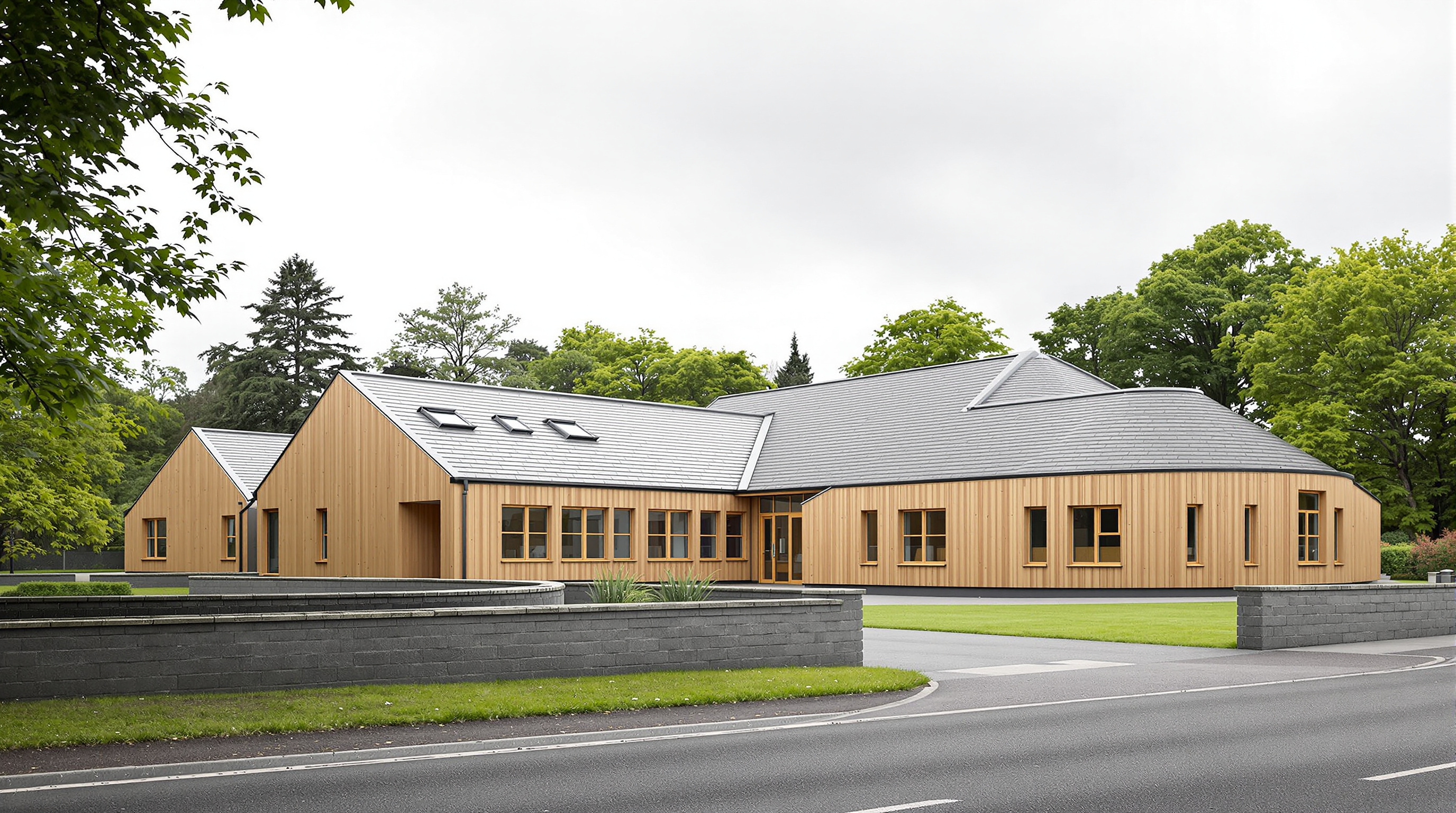
Hazelwood School: How Alan Dunlop Designed a Building You Read with Your Hands
In a Glasgow school for children who are both blind and deaf, Alan Dunlop and GM+AD replaced the sighted plan with a cork-clad 'trail rail' — a continuous sensory wall that teaches a curving building to be legible through touch, sound, warmth and smell rather than through the eye.
Most buildings are drawn for the eye. The architect composes a facade, frames a view, choreographs how light falls across a wall — and assumes a user who can see all of it. Hazelwood School, on a quiet green edge of Bellahouston Park in the Dumbreck district of Glasgow, was designed for children who cannot make that assumption. Its pupils are dual sensory impaired: each child lives with a combination of two or more of blindness, deafness, and mobility or cognitive impairment. For them, a beautifully composed elevation is invisible and a clever sightline is meaningless. The question the building had to answer was stranger and harder than any question about form: how do you design a school that a child who cannot see and cannot hear can still learn to navigate alone?
Alan Dunlop, then a partner at the Glasgow practice Gordon Murray + Alan Dunlop Architects (GM+AD), was awarded the commission in the mid-2000s, and the school opened in 2007. His answer is one of the most quietly radical buildings of its generation, and it belongs in any account of where architecture is going precisely because it refuses architecture's oldest bias — the tyranny of the visual — and asks what a building becomes when it is designed to be read by the whole body instead.
The ambition was to design a place of safety and ambition that would free the teacher and inspire the child — a bespoke school shaped entirely around how its pupils actually perceive the world.
The question it poses
Kushner's framing for The Future of Architecture is to ask what any single building tells us about where the discipline is heading. Hazelwood's answer is unusually direct: it tells us that the frontier of design is inclusion made spatial — not as a bolt-on ramp or a compliance checklist, but as the generating idea of the plan itself. If a building can be made fully legible to a child with almost no sight and no hearing, then every softer assumption architects make about "the user" is up for renegotiation. Hazelwood is a working proof that universal design need not mean the lowest common denominator; done well, it produces architecture of real sensory richness that happens to serve everyone.
The project also carried a social brief. It merged two existing Glasgow schools onto a single new campus, consolidating specialist provision for a very small, very high-need population — reported at up to around sixty pupils, aged from roughly two to eighteen. The school and its associated Life Skills House together measure about 2,665 square metres, a modest footprint for a building asked to do so much perceptual work.
The central move: a wall you can read
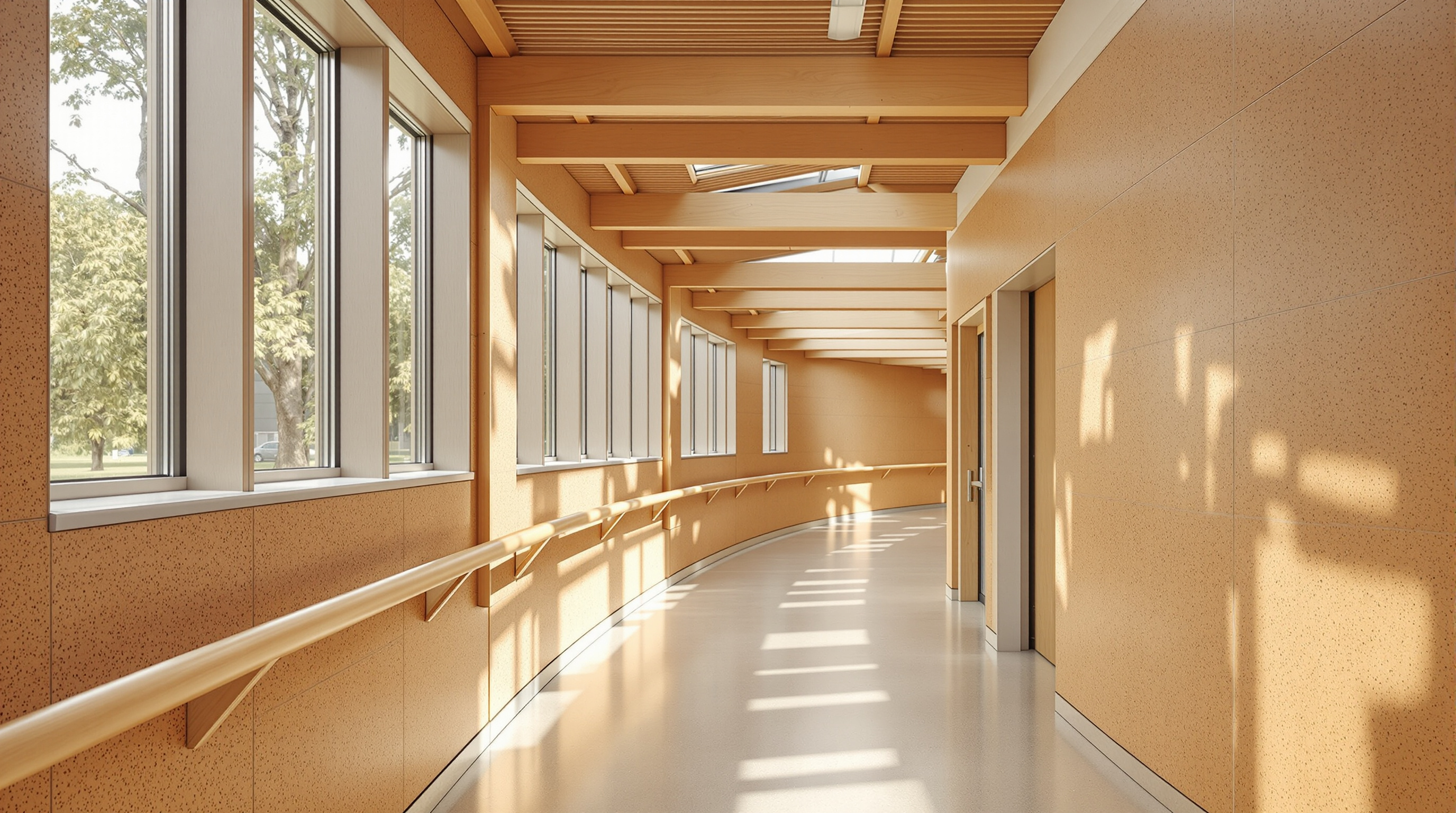
The heart of the design is a single, deceptively simple element: a continuous sensory "trail rail" wall that runs the length of the school's curving internal spine. Children are taught to trail — to keep a hand or shoulder in light contact with a surface as they move — and Dunlop turned that mobility technique into the building's organising system. The trail wall is clad in natural cork: warm to the touch, acoustically soft, and gentle when a child inevitably bumps into it. Along its length the wall carries tactile signifiers — changes of texture, recesses, and cues that tell a child where they are and what lies behind each opening, the way a sighted pupil reads a corridor of numbered doors.
Crucially, the same wall does double duty as storage. Children at Hazelwood carry and use a great deal of specialist equipment, and the deep trail wall swallows it, keeping the circulation route clear of the trip hazards and clutter that would make independent movement dangerous. One element solves navigation, safety, tactility and storage at once — an economy of means that is the mark of genuinely good design rather than merely well-meaning design.
The plan itself is not a neat rectangle. It curves — a gentle S-shaped spine that gives the trail wall its continuity and, just as importantly, lets the building thread between the site's mature trees, which were kept rather than felled. That curve is a pedagogical instrument. A straight corridor of identical doors is disorienting to a child who cannot see it; a curving route with a changing wall, each stretch subtly different underhand, becomes a sequence a child can memorise and eventually own.
A palette chosen by the hand, not the eye
If the trail wall is the concept, the material palette is its vocabulary — and every material was selected first for how it feels, sounds, smells and weathers, and only then for how it looks. This inverts the normal priority of architecture, and it produces a building of unusual tactile intelligence.
| Element | Material | Why it was chosen (sensory logic) |
|---|---|---|
| Trail / spine wall | Natural cork | Warm, soft, forgiving on contact; holds tactile cues; sound-absorbing |
| External cladding | Natural larch weatherboarding | Strong grain to trail along; silvers over time to match the trees' bark |
| Boundary / external walls | Slate | Distinctly harder underhand; south faces warm in sun — a heat cue for orientation |
| Structure | Exposed laminated timber (glulam) | Honest, warm, non-institutional; visible and touchable structure |
| Windows / screens | Timber frames | Good to touch; avoids the cold, clinical feel of metal |
The subtlety here rewards attention. Slate walls warmed by the southern sun become a navigation tool — a child can feel which way they are facing by the heat on their hand. Larch and cork give different textures so that inside-versus-outside, spine-versus-classroom, register through the skin. The structure is left exposed glulam partly for economy and honesty, but also so that the building never feels like the hard, hospital-like institution these children might otherwise be consigned to. Warmth, in every sense, is the design's governing value.
Light for low vision, not for the camera
Many of Hazelwood's pupils have some residual sight, and for them daylight is not atmosphere but function — the difference between a legible space and an anxious one. Dunlop pitched the classroom roofs up toward the north to carry large bands of clerestory glazing, pulling an even, glare-free wash of daylight deep into each room. North light is prized because it is consistent and free of the harsh contrast and hot spots of direct sun, which can dazzle and disorient a child with low vision. This is a piece of environmental design in the service of perception: the light is shaped to be usable by a partially sighted eye, not merely to look good in a photograph.
Where it sits in the canon of care
Hazelwood belongs to this book's third chapter — Get Better: Health, Care and Learning — the argument that architecture can be an active instrument of healing, care and education rather than a neutral container for it. It sits comfortably beside the chapter's other landmarks: MASS Design Group's Butaro Hospital, the Maggie's Centres network, the Alcabideche social complex. What Hazelwood adds to that company is a specific and demanding lesson about perception. Where a Maggie's Centre designs for the emotional state of a cancer patient, Hazelwood designs for the sensory apparatus of a child — a more literal, more measurable test of whether architecture can be shaped around a body that experiences space differently.
Its reputation reflects that. The Royal Institute of British Architects has cited Hazelwood among the finest school buildings in the world, and Architectural Record named it among the top schools of the twenty-first century; it also took top honours in the 2008 DesignShare awards for educational architecture. More telling than the trophies is its afterlife in research: Hazelwood recurs as a case study in the scholarly literature on inclusive and multi-sensory school design, studied for how its non-visual cues actually shape the spatial perception of visually impaired children (see Oteifa and colleagues, 2023). It is that rare award-winner that has also become a teaching text.
The house third position: honesty about limits
An honest account should resist turning Hazelwood into a feel-good story with no shadows. Three cautions are worth stating.
First, on the facts: the practice attribution is genuinely shared. The building is routinely credited to Alan Dunlop, but it was delivered by the partnership Gordon Murray + Alan Dunlop Architects, with Stacey Phillips as project director; crediting it to a single author, as canon-building tends to do, flattens a collaboration. Completion is usually given as 2007, though the design and consultation ran across the preceding years.
Second, on method versus formula: Hazelwood works because its solutions were derived from deep, sustained consultation with a specific school community — its teachers, its therapists, its children. The danger is that the images of the building — the cork wall, the curving plan — get copied as a style without the participatory process that made them right. A trail rail installed without understanding how a particular cohort actually moves is decoration, not access.
Third, on maintenance and reality: a building whose meaning lives in the fine grain of its surfaces is only as good as its upkeep. Cork wears, larch weathers, tactile cues can be painted over or cluttered by a busy staff. The design places an ongoing duty of care on the institution that inherits it — inclusion is not delivered at handover; it is sustained daily.
Studio Matrx's position is to hold the achievement and the caution together. Hazelwood is a landmark not because it is a beautiful object — though it is quietly handsome — but because it demonstrates, at full scale and under real constraints, that architecture can be authored for the hand, the ear and the skin. That is a genuinely expanded idea of what a building is for.
Why it points to the future
The mainstream of twenty-first-century architecture has been chasing the eye harder than ever — parametric spectacle, image-perfect renders, the building as photograph. Hazelwood points the other way, toward a haptic, multi-sensory architecture that is already re-entering the discipline through dementia-friendly design, neurodiversity-aware workplaces, and the wider turn to wellbeing. A generation of architects is rediscovering that people inhabit buildings with their whole bodies, and that texture, warmth, acoustics and smell are not decoration but information. Hazelwood got there early, and it got there not as theory but as a working school full of children learning to find their own way. Its future-facing claim is simple and profound: the most inclusive building is one you can understand without ever seeing it.
References
- Alan Dunlop Architect / GM+AD Architects. "Hazelwood School" — architect's project description and drawings. alandunloparchitects.com (primary source — architect's own account; note the shared GM+AD authorship)
- Architecture & Design Scotland (A&DS). "Case study: Hazelwood School." Public-body design review and case study. ads.org.uk (primary / institutional source)
- Oteifa, S. et al. (2023). "Inclusive School Design for Children with Visual Impairment: The Relation between Design Guidelines and Spatial Perception." (peer-reviewed; uses Hazelwood as a case study of non-visual spatial cues — retrieved via ResearchGate/Academia; verify final journal and volume before citing formally)
- HundrED Foundation. "Hazelwood School" — innovation profile (pupil profile, trail-rail and sensory-wall description). hundred.org (education-research NGO; secondary)
- "Hazelwood School / gm+ad architects." DesignShare / Architizer / e-architect project records (2008), including the ~2,665 m² area and up-to-60-pupil figures. architizer.com (architectural press / project database)
- Glasgow Architecture. "Hazelwood School Building, Dumbreck." Project data and photographs. glasgowarchitecture.co.uk (regional architectural press)
Part of The Future of Architecture in 300 Buildings — Studio Matrx's canon of the buildings asking where architecture goes next. Chapter 3: Get Better — Health, Care & Learning.
Export this guide
Related Guides — Deep-dive reading
Livsrum Cancer Counselling Centre: How EFFEKT Turned a Hospital into a Village of Houses
In Næstved, EFFEKT answered a cancer support brief not with another clinical wing but with a cluster of seven small gabled houses around two courtyards. It is one of the clearest built arguments that the future of care architecture is domestic, sensory and small — a reading of its village plan, its fibre-cement-and-timber skin, its place in the healing-architecture movement, and the questions the picture-book house cannot quite answer.
The Future of ArchitectureFuji Kindergarten: How Tezuka Architects Turned a Roof into a Racetrack
In a Tokyo suburb, Takaharu and Yui Tezuka built a single-storey oval whose roof is an endless running loop, whose classrooms have no walls, and whose oldest zelkova tree grows straight through the deck — a building that argues the future of the school is not a better classroom but no classroom at all.
The Future of ArchitectureThe Center for Discovery: How Turner Brooks Designed a Campus Without Right Angles
In the Catskill foothills, Turner Brooks built a living-and-learning campus for children with autism around a single radical premise — that the corner, the corridor and the sudden spatial change are forms of violence to a sensitive nervous system. This deep study reads its meandering plans, its low timber residences, its clustered woodland siting, and what a building shaped around neurodiversity tells us about where care architecture is going.
The Future of ArchitectureRelated Tools — Try Free
Cross-Ventilation Analyzer
Estimate airflow and air changes per hour (ACH) from room size, window areas, layout, and local wind — with NBC 2016 Part 8 compliance check.
Ventilation CalculatorWindow Orientation Planner
Pick the best window type, glass and shading by wall direction — north, east, south and west.
Window ToolConcept Generator
Get 3 AI-generated design concepts for any room with style, materials, and cost estimate.
DesignAI