
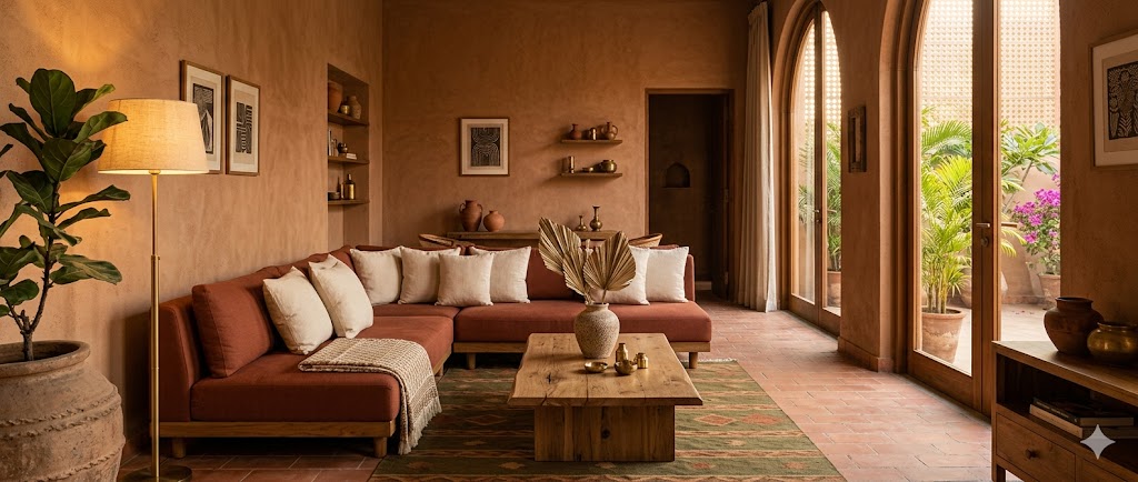
Earthy Interior Color Palettes for Indian Homes
Six palette families — terracotta, ochre, olive, rust, sand, walnut — with hex codes, material pairings, orientation guidance and 20 numbered ideas
Earthy palettes are not a trend. They are what happens when Indian interior design stops imitating Milan or Copenhagen and starts looking at what the land actually offers — terracotta from the kiln, ochre from the haldi jar, olive from the henna leaf, rust from the karahi, sand from Rajasthan, walnut from the kitchen cabinet. Every one of these tones was already in the room before the brief was written.
This guide is a working palette reference. It covers the earthy spectrum across six families, five composed palettes, the material pairing matrix, palette-to-orientation guidance, the composition rule that makes any earthy room work, and twenty numbered ideas across rooms. The intent is operational — colours you can specify, materials you can buy, and rules that hold from sample-board to site.
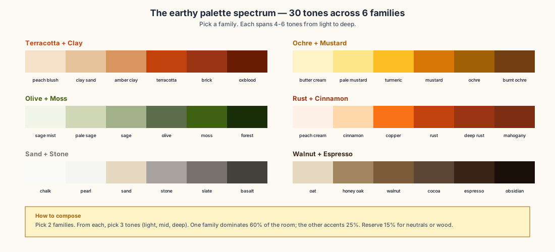
The Earthy Spectrum — Six Families, 30 Tones
Earthy palettes spread across six tonal families, each spanning four to six tones from light to deep:
1. Terracotta + Clay — from peach blush through clay sand, amber clay, terracotta, brick, to oxblood.
2. Ochre + Mustard — from butter cream through pale mustard, turmeric, mustard, ochre, to burnt ochre.
3. Olive + Moss — from sage mist through pale sage, sage, olive, moss, to forest.
4. Rust + Cinnamon — from peach cream through cinnamon, copper, rust, deep rust, to mahogany.
5. Sand + Stone — from chalk through pearl, sand, stone, slate, to basalt.
6. Walnut + Espresso — from oat through honey oak, walnut, cocoa, espresso, to obsidian.
A complete earthy palette typically picks three tones from one family (light, mid, deep) and one or two accent tones from a complementary family. Six families × five-tone picks each = enough vocabulary for an entire apartment without ever repeating a colour.
Five Composed Palettes
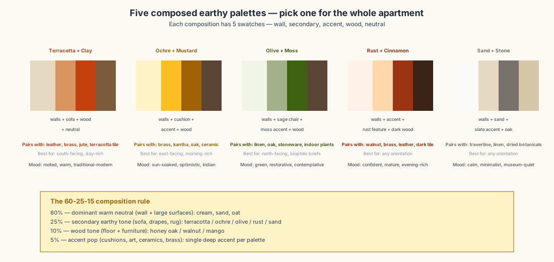
The full apartment doesn't need six families — it needs one well-composed palette. Below are five complete palettes you can adopt as-is:
Palette A — Terracotta + Clay
Walls #e6d9c2 + sofa #d99560 + accent #c2410c + wood #7c5b3a. Pairs strongly with leather, brass, jute, terracotta tile. Best for south-facing daylight-rich rooms. Mood rooted, warm, traditional-modern.
Palette B — Ochre + Mustard
Walls #fef3c7 + cushion #fbbf24 + accent #a16207 + wood #5b4636. Pairs strongly with brass, kantha quilts, oak, ceramic. Best for east-facing morning-rich rooms. Mood sun-soaked, optimistic, distinctly Indian.
Palette C — Olive + Moss
Walls #f1f5e8 + chair #a3b18a + accent #3f6212 + wood #5b4636. Pairs strongly with linen, oak, stoneware, indoor plants. Best for north-facing biophilic-leaning briefs. Mood green, restorative, contemplative.
Palette D — Rust + Cinnamon
Walls #fef2e8 + accent #fed7aa + feature #9a3412 + dark wood #3a2418. Pairs strongly with walnut, brass, leather, dark tile. Best for any orientation, particularly evening-rich rooms. Mood confident, mature, evening-rich.
Palette E — Sand + Stone
Walls #fafaf9 + sand #e6d9c2 + slate accent #78716c + oak #d6c6a8. Pairs strongly with travertine, linen, dried botanicals. Best for any orientation. Mood calm, minimalist, museum-quiet.
The 60-25-10-5 Composition Rule
| Layer | % of room | What it is |
|---|---|---|
| Dominant warm neutral | 60% | Wall paint, large surfaces, ceiling, drapes |
| Secondary earthy tone | 25% | Sofa, drapes, rug, large furniture |
| Wood tone | 10% | Floor, side tables, frames |
| Accent pop | 5% | Cushions, art, ceramics, brass |
Reverse the rule and the room becomes overpowering. Most earthy-room failures come from inverting these proportions — using a deep accent as the wall colour or pure neutrals as a five-percent garnish.
Material Pairings
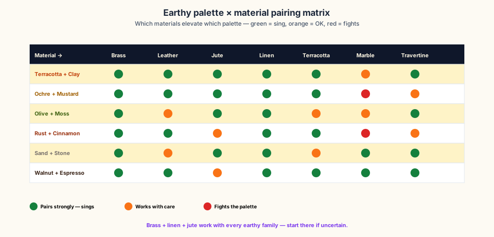
| Material | Pairs strongly with | Avoid with |
|---|---|---|
| Brass / patinated bronze | All six earthy families | Cool greys, chrome |
| Tan / cognac leather | Terracotta, ochre, rust, walnut | Cold-tone palettes |
| Jute, sisal, hemp | All earthy families | Pure white minimal |
| Linen + block-print cotton | All earthy families | Synthetic glossy fabric |
| Terracotta floor tile | Terracotta, ochre, rust palettes | Olive, sand-stone |
| Statuario / Calacatta marble | Sand-stone, walnut, terracotta (with care) | Ochre (clashes) |
| Travertine + limestone | All earthy families | Cool grey palettes |
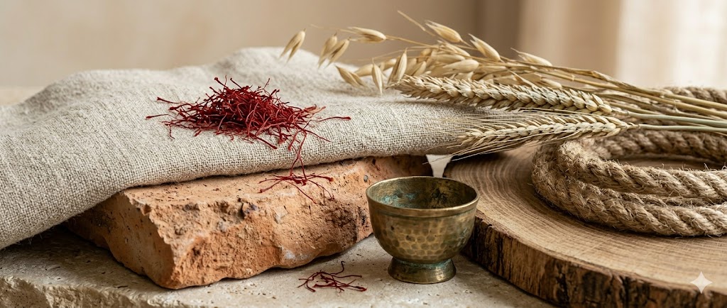
The single rule: brass + linen + jute work with every earthy family. If you are starting from scratch, anchor with those three before adding family-specific materials.
Palette by Room Orientation
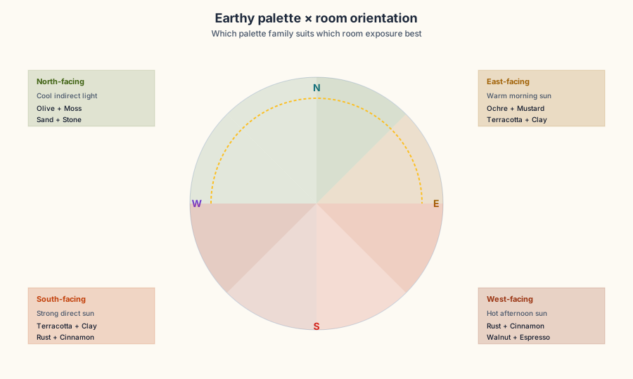
The single biggest palette failure is choosing by Pinterest, not by how much sunlight the room actually receives.
- North-facing — cool, indirect light. Pick Olive + Moss or Sand + Stone — these palettes do not fight the cool light, they accept it.
- South-facing — strong direct sun. Pick Terracotta + Clay or Rust + Cinnamon — these palettes need the strong light to feel warm rather than dirty.
- East-facing — warm morning sun, fades by noon. Pick Ochre + Mustard or Terracotta + Clay — both peak in golden hour.
- West-facing — hot afternoon sun. Pick Rust + Cinnamon or Walnut + Espresso — these palettes absorb evening intensity gracefully.
Twenty Earthy Palette Ideas
The twenty ideas below are organised by palette family — four per family across living, bedroom, dining, and accent spaces.
Terracotta + Clay (Ideas 1-4)
1. Clay-plaster headboard — Deep terracotta lime plaster behind the bed, cream linen, oak side tables. The headboard wall is the palette.
2. Terracotta-tile entry — Unglazed terracotta floor tile in the entry, cream-plaster walls, brass coat hooks, a single brass bench-light. Indian-craft anchor.
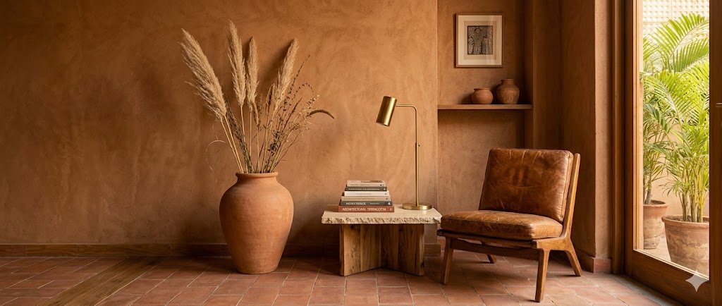
3. Tan-leather lounge — Terracotta accent wall, cream sofa with a single tan leather lounge chair, jute rug, brass floor lamp. The leather is the personality.
4. Clay-pot collection — Cream walls, oak shelf, eight handmade clay pots in varying sizes as the wall art. Mood instead of decoration.
Ochre + Mustard (Ideas 5-8)
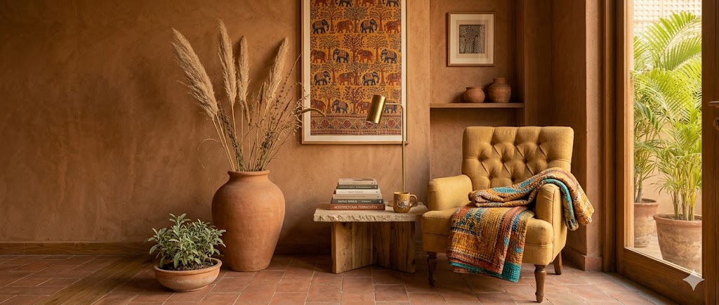
5. Ochre accent wall living — One ochre-painted accent wall, mustard linen sofa with cream cushions, brass floor lamp, sage potted plant. Single-wall commitment.
6. Mustard velvet armchair — Cream living room with a single mustard velvet armchair as the colour anchor. Brass side table, dark walnut floor.
7. Kantha-quilt bedroom — Cream walls, oak bed, white linen, single hand-stitched kantha quilt with mustard + indigo block print folded at the foot.
8. Ochre-glazed lamp — Cream walls, oak side table, two ochre-glazed ceramic table lamps as the visual anchors. Strong and quiet.
Olive + Moss (Ideas 9-12)
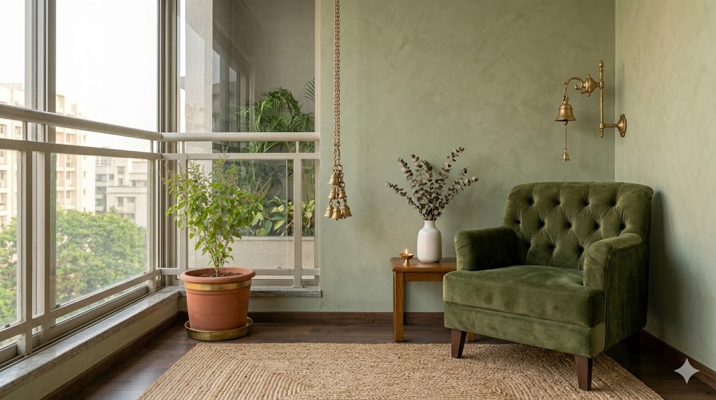
9. Sage accent wall bedroom — Cream walls + one olive plaster headboard wall, cream linen bed with sage throw, oak floor, single white ceramic vase with dried eucalyptus.
10. Moss-green velvet chair — Sage walls, cream sofa, a single moss-green velvet armchair as the deep accent, oak coffee table.
11. Plant-wall living — Cream walls, oak floor, a single plant-wall feature (5-6 trailing plants) as the green anchor. Brass watering can on the floor.
12. Sage-glazed crockery — Cream-and-sage dining, oak table, white linen napkins, sage-glazed stoneware crockery as the visual signature.
Rust + Cinnamon (Ideas 13-16)
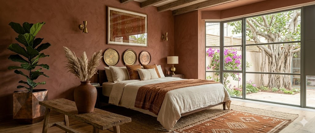
13. Rust-plaster bedroom — Soft rust lime-plaster headboard wall, cream linen bed with one rust throw, dark walnut bedside tables, brass parchment-shade lamps.
14. Cognac-leather sofa living — Cream walls, cognac leather 3-seater sofa, walnut coffee table, jute rug, single brass floor lamp.
15. Rust-accent dining — Cream walls, walnut dining table, four rust-coloured linen chairs, brass pendant. Concentrated accent.
16. Mahogany-shelf library — Cream walls, mahogany built-in bookshelves on one wall, brass shelf lights, leather reading chair. Old-world warm.
Sand + Stone (Ideas 17-18)
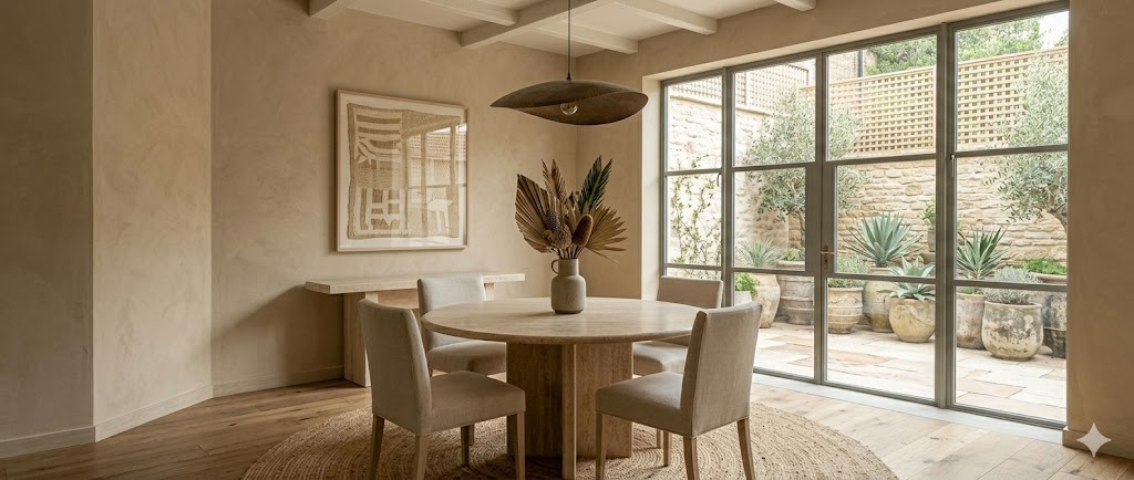
17. Travertine-and-linen living — Cream walls, travertine coffee table, cream bouclé sofa, single dried-palm arrangement in stoneware vase, oak floor.
18. Sand-stone dining — Cream walls, travertine dining table for four, linen-upholstered chairs, bronze pendant low, dried-grass arrangement.
Walnut + Espresso (Ideas 19-20)
19. Walnut-accent living — Oat walls, walnut media console, brass-finish drawer pulls, cream sofa with single espresso throw, jute rug.
20. Espresso-floor master bedroom — Oat walls, dark espresso-stained oak floor everywhere, cream linen bed, light oak side tables to bridge the contrast.
Common Mistakes
1. Inverted proportion — using accent at 60% and neutral at 5%. The room becomes oppressive within a week.
2. Two competing accents — one terracotta accent plus one rust accent plus one mustard accent = visual chaos. Pick one accent per palette.
3. Cool-grey contamination — one cool-grey cushion in an earthy palette breaks the entire scheme. Audit honestly.
4. High-gloss surfaces — earthy palettes need matte. High-gloss laminate, polished marble, chrome — all kill the warmth.
5. Plastic accents — synthetic vase, faux-leather cushion, vinyl plank floor. Synthetic always undermines earthy.
References:
1. Bureau of Indian Standards. IS 12923 — Paint Colour Reference Charts.
2. Council of Architecture (India). Conditions of Engagement — Interior Design Scope.
3. Pantone. Colour of the Year Reports 2020-26 (for cultural context).
4. International Council of Indian Crafts. Indian Material Palette Reference 2024.
5. Indian Council of Agricultural Research (ICAR). Indoor Plant Selection by Light Exposure.
6. Indian Concrete Institute. Lime Plaster + Pigment Application Practice.
7. Vastu Vidya Pratisthan. Colour Theory in Vastu Shastra — Modern Application, 2024.
8. CIBSE LG09. Lighting Guide — Colour Rendering and Tonal Quality.
9. Royal Institute of British Architects (RIBA). Plan of Work — Stage 4 Technical Design.
10. Interior Designers' Association of India. Material + Finish Cost Schedule — 2025 update.
Related Guides
- /guides/warm-minimal-bedroom-ideas-india — adjacent warm-minimal palette guidance with overlapping palette logic
- /guides/wardrobe-finish-ideas — material reference for wardrobes — which finishes pair with which earthy palette
- /guides/architectural-lighting-design-india — colour-temperature decisions that shape how earthy palettes read at night
- /guides/japandi-apartment-ideas-india — adjacent style with shared restraint and natural materials, narrower palette
- /guides/scandinavian-indian-home-ideas — adjacent style with cooler default that benefits from earthy 10-15% accent
Interactive · Earthy palette builder
Terracotta + Clay · Rooted, warm, traditional-modern Indian
Living room preview
Wall
#e6d9c2
Sofa
#d99560
Accent
#c2410c
Wood
#7c5b3a
The most-adoptable earthy palette — clay accents on a sand canvas. Reads warm without screaming for attention.
Pairs strongly with
- ▸Leather (tan, cognac)
- ▸Brass + bronze hardware
- ▸Jute, sisal, hemp rugs
- ▸Terracotta floor tile
- ▸Travertine + sandstone
Avoid with
- ×High-polish white marble
- ×Chrome / nickel fittings
- ×Cool grey upholstery
Best orientation
South-facing, daylight-rich rooms
Composition rule — 60% wall, 25% secondary (sofa/drapes), 10% wood, 5% accent (cushions, art, ceramics).
Export this guide
Related Guides — Deep-dive reading
Earthy Interior Palette — A 2026 Style Guide for Indian Homes
Rooted · Regional · Biophilic · Indian craft-anchored
Design StylesJapandi Apartment Ideas for Indian Homes
Japanese restraint meets Scandinavian warmth — seven principles, low-furniture proportions, material palette, and 20 numbered ideas across the apartment
Design StylesWarm Minimal Bedroom Inspirations for Indian Homes
Oat, terracotta, mushroom, olive and espresso palettes — five pillars, lighting layers, dimensions, and 20 numbered ideas
Design StylesRelated Tools — Try Free
Apartment Furniture Size Chart
Standard furniture dimensions for Indian apartments — sofas, beds, tables, dining, storage.
Reference ChartColour Palette Generator
5 harmonious colour palettes with hex codes, Asian Paints and Berger shade names — by room and mood.
PaletteMaterial Schedule Generator
Generate a room-wise finish schedule — walls, floors, ceilings, trim, and joinery by location.
Material Schedule