
Choosing the Right Style for Your Home
Why the right design style is not the trend you copy or the package you are sold, but the one that emerges from how you live, what you respond to, and where in India you are.
Ask someone what their design style is and watch them reach for a label that is not really theirs. "Modern," they say, or "minimalist," or "a bit of everything." Then they go to a showroom, get sold a package called "Luxe Contemporary," and end up with a living room that could belong to any of forty thousand other flats in the same city. Six months later something nags at them. The room photographs beautifully and feels like nobody lives there. It has a style. It does not have them in it.
This guide is about the opposite move: finding a style that is genuinely yours rather than chasing a label or copying a trend. Style is not a costume you put on a house, and it is not a dropdown menu you pick from. It emerges from how you actually live, what you instinctively respond to, the climate and culture you are in, and the story you are quietly trying to tell. We will build that style from images you already love and from the way your family really uses a room — and only then put names to it.
The right style for your home is not the one trending on Pinterest or stacked in the showroom; it is the one that fits how you live, what you are drawn to, and where you are — and the fastest way to find it is to study your own instincts before you study any catalogue.
Style is an outcome, not a starting point
The single biggest mistake homeowners make is treating style as the first decision. They pick "Japandi" or "modern Indian" before they have thought about how they cook, who lives with them, how the light falls, or what makes them feel at home. Then every later choice gets bent to serve the label instead of serving them.
Reverse it. Style should be the last thing you name, not the first. It is the natural by-product of a hundred honest decisions about function, comfort, context and feeling. Get those right and a coherent style appears almost on its own — and it will be yours, not a borrowed one. This is the central argument of our pillar guide on why principles beat magazine examples: a copied look fails the moment your life differs even slightly from the photo, while a principle adapts to you.
There is real psychology behind why borrowed styles feel hollow. Environmental psychologists describe place attachment — the bond people form with spaces that reflect their identity and memory. A room assembled entirely from a trend has nothing of you to attach to. The designer Ilse Crawford built a whole practice ("A Frame for Life") on the idea that a home should be designed around human well-being and the senses rather than around a visual signature. Style, in this reading, is what is left over after you have honestly answered "how do we want to feel and live here?" — explored further in our sibling guide on building a home that feels right.
A style you choose from a menu sits on top of your home like a costume. A style that grows out of how you live becomes the skin of the place — you stop noticing it is a style at all.
The save-and-look-for-the-pattern exercise
Here is the most reliable method we know for discovering your real style, and it costs nothing. Over two or three weeks, save every interior image that makes you stop scrolling — from Instagram, Pinterest, magazines, a friend's house, a hotel you loved. Do not curate. Do not ask "is this my style?" Just save anything that produces a small involuntary yes. Aim for thirty to fifty images.
Then lay them all out together and stop looking at the rooms. Start looking for the pattern across the rooms. You are not asking "what do I like?" — you are asking "what do these images quietly agree on?" Almost everyone is shocked to find their instincts are far more consistent than they assumed.

Run your saved images through these questions and write down what recurs:
| What to look for | The question to ask your images | What the answer reveals |
|---|---|---|
| Palette | Are these warm or cool? Saturated or muted? Light or dark and moody? | Your true colour temperament, not your stated one |
| Materials | Wood, stone, metal, rattan, plaster, glass — what repeats? | The textures you actually respond to |
| Light | Bright and airy, or dim and intimate? Hard or soft? | The mood you are drawn to live in |
| Fullness | Are the rooms spare and edited, or layered and full? | Whether you are calmed or comforted by stuff |
| Era and feeling | Crisp and contemporary, or old and storied? | How much history and patina you want around you |
| The odd one out | What surprises you in your own saves? | The accent that will make your home not generic |
The pattern that emerges is your style, described in your own evidence rather than someone else's label. You might find you have saved twenty warm, woody, softly-lit, lightly-layered rooms — and only later realise that adds up to something the world calls "warm minimal" or "Japandi." The name comes after the truth, not before it. This is exactly the exercise our Style Finder quiz automates: it shows you images, watches your involuntary yeses, and surfaces the pattern you could not quite name yourself. If you would rather do it by feel first, the design quiz is a gentler on-ramp to the same insight.
Timeless versus trendy: how to tell them apart
Not everything you are drawn to deserves to be built in. Some of what you love is a deep, stable preference; some is a passing fashion you will tire of in three years. Confusing the two is how people end up regretting a ₹2 lakh feature wall. The discipline is to separate the timeless (worth committing to in fixed, expensive elements) from the trendy (best expressed in cheap, swappable accents).
A useful rule: spend permanently on what you have loved for a long time, and spend lightly on what arrived recently. Your flooring, your kitchen carcass, your wall colour, your big upholstery — these are five-to-fifteen-year commitments and should reflect stable preferences. Cushions, throws, a paint accent, light fittings, art — these can chase the trend, because replacing them is cheap.
| Element | Lifespan | Treat as | Why |
|---|---|---|---|
| Flooring, kitchen carcass | 10–20 years | Timeless | Ruinously expensive to redo; commit only to what you are sure of |
| Wall colour, large sofa | 5–10 years | Mostly timeless | Sets the mood of the whole room; change is disruptive |
| Curtains, rugs, lighting | 3–7 years | Semi-flexible | Trend here is affordable and reversible |
| Cushions, art, decor objects | 1–3 years | Trendy is fine | Cheapest place to experiment and refresh |
The hardest part is being honest about which is which. A reliable test: imagine the element ten years old and slightly worn. A timeless choice ages into character — solid wood, natural stone, lime plaster, brass and handloom textiles all earn patina. A trendy choice ages into embarrassment — high-gloss laminate, rose-gold everything, the live-edge resin table, the "millennial grey" that already signals a date. The Japanese idea of wabi-sabi, the beauty of age and imperfection, is essentially a bet on materials that improve as they wear. Choose those for the permanent layer and you buy a style that does not expire.
The major style families, briefly, and what each is really about
Once you have your pattern, it helps to know the families so you can borrow intelligently. But read each one for its underlying idea, not its surface look — because the idea is what you can adapt to your life, while the surface is what makes a copy.

| Style family | What it looks like | What it is really about |
|---|---|---|
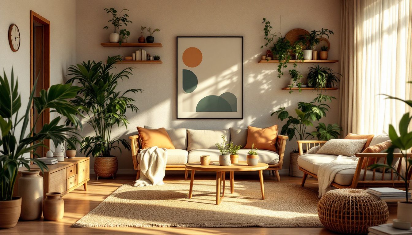
| Warm minimal | Few objects, natural textures, warm neutrals, lots of light | Calm through editing — every object earns its place |
| Japandi | Japanese restraint plus Scandinavian warmth; low furniture, wood, muted tones | Quiet craft and imperfection; wabi-sabi meets hygge |
| Modern / contemporary Indian | Clean lines softened by Indian materials, crafts, jewel accents, jaali, brass | Global form, local soul — rooted contemporaneity |
| Mid-century modern | Tapered legs, teak, organic curves, optimism, 1950s–60s palette | Honest function and clean optimism; form follows use |
| Traditional Indian | Carved wood, rich colour, layered textiles, jharokha, antiques, ornament | Heritage, abundance, the family's continuity made visible |
| Industrial | Exposed brick, concrete, steel, raw and unfinished surfaces | Honesty of structure; nothing hidden, everything shown |
| Eclectic | A confident mix of eras, origins and textures, held together by one thread | Personality over purity; coherence through a controlling logic |
The crucial insight: most beautiful Indian homes are not pure anything. They are a dominant idea with intelligent borrowing. "Modern Indian" itself is really warm-minimal restraint carrying Indian craft and colour — a hybrid, not a monolith. So do not feel you must pledge allegiance to one column; find the family closest to your saved-image pattern, understand its central idea, and let the others contribute accents. For a deeper tour of these families with Indian examples, the interior styles hub is the place to wander.
Mixing styles coherently: the 80/20 rule
The fear that stops people from making a personal home is "won't mixing styles look messy?" It will — if you mix without a hierarchy. It will not, if you obey one simple discipline borrowed from interior practice and from basic Gestalt grouping psychology: let one style dominate, and let the others be accents. Roughly 80 percent of the room speaks one language; 20 percent introduces tension, contrast and personality.

The 80 percent is your foundation — flooring, walls, large furniture, the overall palette. It carries the dominant style and creates the calm, unified field the eye reads first. The 20 percent is your story — the carved Chettinad door repurposed as a table, the grandmother's brass urli, one jewel-toned silk cushion against the oatmeal sofa, a single bold contemporary artwork in a traditional room. Because the field is unified, the accents read as deliberate punctuation rather than chaos.
Three rules keep a mix coherent:
- One dominant, no more than two accents. A room with three equal voices has no voice. Pick the lead and demote the rest.
- Find a common thread. A shared undertone (everything warm), a repeated material (wood throughout), or a repeated colour pulled across the accents stitches disparate pieces into one family. Gestalt psychology calls this grouping by similarity — the eye forgives variety when it can find a uniting rule.
- Contrast on purpose, not by accident. An antique in a minimal room is powerful because it contrasts. Two near-identical mid-tone wooden styles fighting quietly is just muddle. Make the difference big enough to read as intentional.
This is the same balance-and-tension logic explored in our guide on symmetry, asymmetry and balanced interiors — coherence is not sameness, it is a controlled relationship between order and surprise.
Matching style to your home and to the Indian context
A style does not float free; it has to make peace with two stubborn realities — the architecture you already have, and the country you live in.
Match the style to the bones of the building. A 1970s house with terrazzo floors, teak windows and rounded arches is begging for a mid-century or warm-traditional treatment and will fight a cold industrial loft look. A glass-and-concrete new-build apartment carries minimalism and contemporary Indian effortlessly. Working with the building's existing language is cheaper, faster and almost always more convincing than overriding it. The architecture is a collaborator, not a blank slate.
Then match it to the Indian context, which quietly rewrites every imported style:
| Indian reality | What it does to imported styles | The smart adaptation |
|---|---|---|
| Dust and high pollution | Open shelving and pure-white minimalism become a cleaning nightmare | Closed storage, mid-tone surfaces that hide dust, washable textiles |
| Heat, humidity, monsoon | Heavy carpets, untreated metal and certain woods suffer | Cotton and jute over wool, treated wood, stone and tile that breathe |
| Joint and extended family | Spare minimalism that seats four fails when fifteen visit | Flexible, generous seating; rooms that expand for gatherings |
| Festivals and rituals | A rigid all-white scheme cannot absorb marigold, rangoli, diyas | A calm base that welcomes seasonal colour rather than fighting it |
| Love of colour | Strict Scandinavian neutrals can feel cold and alien | Warm neutrals as a canvas, with rich Indian colour in the accents |
| Bare feet and floor-sitting | Western furniture-only layouts ignore how Indians use floors | Low seating, durable warm floors, baithak and cushion options |
This is why a literal copy of a Copenhagen apartment rarely feels right in Chennai. The principle of restraint travels; the specific pure-white, wool-heavy execution does not. Adapt the idea to the heat, the dust, the family and the festivals and you get something better than the original — a style that is both contemporary and genuinely of here. Our guide on nostalgia and what makes a home feel like home goes deeper into how memory and cultural belonging shape what "right" feels like for an Indian family.
The showroom-package trap
A word of warning, because this is where most personal style goes to die. The full-home "interior package" sold by many large firms is engineered for the firm's efficiency, not your individuality. It bundles a fixed catalogue of laminates, a standard false-ceiling-and-cove template, the same three "themes" every client sees, and a glossy 3D render that looks impressive and feels anonymous. You get a finished home fast; you rarely get your home.
The trap is seductive because it removes decision fatigue and comes with a single price. But your hundred honest decisions get replaced by the firm's twelve standard ones, and the result is the homogenised look you have seen in every other show flat — the obligatory backlit "feature wall," the all-grey-and-white palette, the gloss laminate everywhere, the absence of anything old, inherited, or that could only be yours.
You do not have to refuse professional help to escape this — you have to direct it. Come to any firm with your saved-image pattern, your timeless-versus-trendy list, your dominant style and your 20 percent accents already decided. Make them build your brief, not sell you theirs. A good designer welcomes a client who knows their own taste; only a package-mill resents it.
What this means for your home
1. Do not name your style first. Build it from evidence. Save thirty to fifty images you love, then read them for the pattern instead of the picture.
2. Run the exercise honestly. Note the recurring palette, materials, light, fullness and the surprising odd-one-out. That cluster is your style, before any label.
3. Sort timeless from trendy. Commit money and permanence to what you have loved for years; express the fashions in cushions, art and paint you can swap cheaply.
4. Pick a family for its idea, not its look. Find the style family closest to your pattern, learn its central principle, and borrow from the others as accents.
5. Mix with the 80/20 rule. One dominant language, no more than two accents, a common thread holding it together, contrast made on purpose.
6. Bend the style to your building and your context. Work with the architecture you have; adapt for dust, heat, joint family, festivals and your love of colour rather than against them.
7. Refuse the anonymous package. If you hire a firm, arrive with your own brief and make them execute it. Direct the help; do not be sold by it.
There is no single right style — only the right fit. The home that will still feel right in ten years is not the one that matched a trend the year you built it; it is the one that matched you. If you want a shortcut into your own pattern, let the Style Finder surface it in a few minutes, then put names to what you find at the interior styles hub.
How Studio Matrx helps
Discovering your style is one thing; seeing it in your actual rooms is another. DesignAI lets you take the pattern you have uncovered — your palette, materials, dominant style and accents — and visualise it in your own space before you spend a rupee. Generate your living room in warm minimal versus contemporary Indian, test an 80/20 mix with an inherited piece as the accent, and feel which one is genuinely yours rather than guessing from a showroom render. Begin with the Style Finder to name your instincts, then bring them to DesignAI to see them come home.
References
1. Crawford, I. (2014). A Frame for Life: The Designs of Studioilse. Rizzoli. (On designing homes around human well-being and the senses rather than a visual signature.)
2. Low, S. M. & Altman, I. (1992). Place Attachment. Plenum Press. (Environmental-psychology foundation for why identity-reflecting spaces feel like home.)
3. Koren, L. (1994). Wabi-Sabi: For Artists, Designers, Poets & Philosophers. Stone Bridge Press. (The aesthetics of age, imperfection and materials that improve with wear.)
4. Wertheimer, M.; and Koffka, K. — foundational Gestalt psychology on grouping by similarity and proximity, the basis of visual coherence in mixed schemes.
5. Alexander, C., Ishikawa, S. & Silverstein, M. (1977). A Pattern Language. Oxford University Press — patterns on the home as an expression of the people who live in it.
6. Pile, J. F. & Gura, J. (2013). A History of Interior Design. Laurence King — on the origins and core ideas of the major style movements.
7. Ching, F. D. K. Interior Design Illustrated — on materials, palette and the composition of coherent rooms.
Part of the Studio Matrx Design Principles series. Continue with why principles beat magazine examples, building a home that feels right, and nostalgia and what makes a home feel like home.
Export this guide
Related Guides — Deep-dive reading
Don't Be a Slave to the Magazine: Why Design Principles Beat Copied Examples
Pinterest rooms and readymade house plans are someone else's answer; learn to read the principle behind an image you love and re-apply it to your own plot, light, climate and family.
Design PrinciplesThe Importance of Nostalgia in Making a House Feel Like Home
Why a perfectly styled room can feel like a hotel while a home full of inherited objects, ageing materials and ritual feels alive — the psychology of place attachment, and how to design for memory in the Indian home.
Design PrinciplesJapandi Apartment — A 2026 Style Guide for Compact Indian Homes
Japanese restraint × Scandinavian function · Low furniture · Two-wood discipline
Design StylesRelated Tools — Try Free
False Ceiling Cost Estimator
Live ₹/sqft across 8 ceiling types — POP, gypsum, designer, metal, PVC, wooden — with cove and spot lighting for 20 Indian cities.
Cost CalculatorCross-Ventilation Analyzer
Estimate airflow and air changes per hour (ACH) from room size, window areas, layout, and local wind — with NBC 2016 Part 8 compliance check.
Ventilation CalculatorDesign Style Finder Quiz
Answer 10 visual questions to discover your Indian interior style profile with materials and colours.
Interactive Quiz