
Photography & Documentation for Architecture Students: Models, Site Visits & Portfolio
How to photograph your models, spaces and process on a student budget — camera basics, lighting, angles and editing — and organise it all into a portfolio that opens doors.
Here is a quiet truth that nobody tells you in first year: your buildings will rarely get built, your models will eventually fall apart in a hostel cupboard, and the late nights you spent perfecting a junction detail will be invisible to everyone unless you photograph them. Documentation is not an afterthought you do the night before submission. It is how your work survives the jury, fills your portfolio, wins you internships and M.Arch seats, and quietly records how much you grew between first year and thesis. Years from now, the only proof that your second-year museum model ever existed will be a folder of photographs. Treat that folder as part of the design.
The good news, and please believe this, is that skill beats kit every single time. A phone held steady in soft window light, with the verticals straight and the exposure correct, will beat an expensive DSLR used carelessly. Half the "professional" model photos you admire on Instagram were shot on a mid-range phone with a desk lamp and a sheet of white chart paper. The expensive part of photography is not the camera. It is learning to see light, to choose an angle, and to be patient. All of that is free, and all of it is learnable on whatever device is already in your pocket.
This guide is written for the real conditions of an Indian architecture student: phones are your default camera, gear gets borrowed the night before a deadline, budgets are tight, and you are shooting in a crowded studio or a dim hostel room with one tube light. We will start with your kit and the camera fundamentals, then spend most of our time on the heart of it all, photographing models and working with light, before moving on to documenting your process, organising your files so you never lose them, and finally building a portfolio that opens doors. Let's begin.
Your kit on a student budget
The phone is a serious camera, if you treat it like one
Stop apologising for shooting on a phone. Modern phone cameras have excellent sensors and computational processing that genuinely rivals entry-level cameras for the kind of work you do. The problem is never the phone; it is how most people use it. Here is how to use yours properly.
Turn on the grid. In your camera settings, enable the gridlines (a 3x3 grid). This single switch transforms your photography. It lets you keep horizons level, place your subject thoughtfully using the rule of thirds, and most importantly for architecture, keep your vertical lines vertical. Your columns, walls and model edges should run parallel to the vertical gridlines. Once you start noticing tilted verticals, you cannot unsee them, and neither can a jury.
Lock focus and exposure. Tap and hold on the part of your subject that matters until you see "AE/AF Lock" (or the equivalent on Android). Now the camera will not refocus or rebrighten every time you move slightly. After locking focus, you can usually drag a small sun or brightness slider up or down to fine-tune how bright the shot is. This is your single most powerful manual control. For a model on a white sweep, the camera often overexposes; pull the brightness down a touch so the whites stay clean and not blown out.
Avoid the ultra-wide lens for serious shots. Most phones now have a 0.5x ultra-wide camera. It is tempting because it fits everything in, but it badly distorts straight lines, bows your walls outward, and stretches anything near the edges. For architecture and models, shoot with the main (1x) lens, and if you have a 2x or 3x telephoto, use it for detail shots; the longer lens actually flatters models by reducing distortion. Only reach for the ultra-wide when a cramped site genuinely leaves you no room, and then expect to straighten it later.
Keep verticals straight at capture. The cleanest way to keep verticals parallel is to hold the camera flat and level, not tilted up or down. Imagine the back of your phone is a sheet of glass that you want perfectly parallel to your building's facade or your model's front. When you tilt up to fit a tall building, the verticals converge ("keystoning") and the building looks like it is falling backwards. We will fix this in editing later, but getting it close at capture saves you cropping away precious resolution.
Clean the lens. This sounds trivial and it is the most common reason student photos look hazy and low-contrast. Your phone lives in a pocket, a bag, against oily fingers. Wipe the lens with a soft cloth (a cotton kurta corner works in a pinch) before every shoot. You will be amazed how much sharpness and contrast returns.
When to borrow or buy a "real" camera
For 90% of your studio life, a phone is enough. But there are moments, your thesis panels, a competition entry, a portfolio you will send abroad, when a dedicated camera earns its place. You do not need to own one. Most colleges have a camera you can sign out, a senior who will lend a body, or a friend in the photography club. Borrowing is the Indian student's superpower; use it shamelessly and return gear clean and on time so you can borrow again.
If you do invest, a used entry-level DSLR or mirrorless body with the kit zoom lens (typically an 18-55mm) is plenty. The kit lens is unfairly maligned; at f/8 it is sharp enough for any model or interior. You do not need expensive glass. What a real camera gives you over a phone is true control over aperture (for depth of field), a larger sensor (cleaner in low light), and RAW files that survive heavy editing. That is it. None of those matter if you have not learned light and angle first, which is why we are spending so little time on gear.
The two cheap accessories that change everything
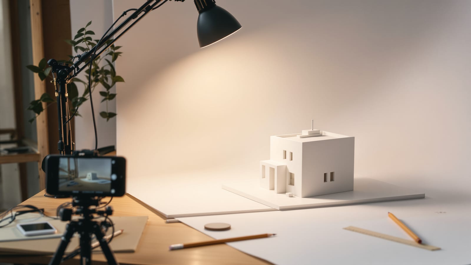
- A tripod. A basic aluminium tripod, or even a flexible mini "gorillapod" style clamp for your phone, costs little and is the difference between blurry and razor-sharp model shots. A tripod lets you use a low ISO and a slow shutter in dim studio light without any blur, frame precisely, and shoot a consistent series of a model from identical heights. If you cannot afford one, stack books and rest the camera, or prop the phone against a wall. Steady beats handheld every time.
- A desk lamp. Your study lamp is a studio light in disguise. An adjustable-arm LED desk lamp, the kind every hostel desk already has, is your key light for model photography. We will use it constantly in the next sections.
Add a sheet or two of white chart paper (for backdrops and bounce cards) and some butter paper or tracing paper (for diffusion), and you have a complete model studio for under the cost of a single canteen lunch a week.
The exposure triangle, explained simply
Every photograph is made by three controls working together. Understanding them, even loosely, lets you stop fighting your camera and start directing it.

Aperture is how wide the lens opening is, written as f-numbers like f/2.8 or f/11. A confusing quirk: a small f-number (f/2.8) means a wide opening that lets in lots of light and gives a shallow depth of field (only a thin slice is sharp, the background blurs). A large f-number (f/11) means a narrow opening, less light, and a deep depth of field (lots is sharp front to back). For documentation, especially of models, you almost always want everything sharp, so you want a larger f-number like f/8 or f/11.
Shutter speed is how long the sensor is exposed, like 1/250th of a second or a full second. Fast shutters freeze motion; slow shutters let in more light but blur anything that moves (including your shaky hands). For static models and buildings on a tripod, you can use slow shutters happily, which means you can keep the other two settings clean.
ISO is the sensor's sensitivity. Low ISO (100 or 200) gives the cleanest image. High ISO (3200, 6400) lets you shoot in the dark but adds grainy "noise" that muddies fine details, exactly the textures you worked hard to model. Keep ISO as low as the situation allows.
Here is the trade-off in one table:
| Control | Turn it "up" | What you gain | What you pay |
|---|---|---|---|
| Aperture (toward f/11) | Smaller opening | More front-to-back sharpness | Needs more light |
| Shutter (toward 1 sec) | Longer exposure | More light gathered | Blur if anything moves |
| ISO (toward 100) | Lower sensitivity | Cleaner, less grain | Needs more light |
Notice that two of the three "clean" choices, small aperture and low ISO, both need more light. That is why a tripod (which lets you use a slow shutter freely) is so liberating: with the camera locked still, you can shoot at f/11 and ISO 100 in a dim studio and just let the shutter stay open longer. The whole game of documentation photography is: control your light, then keep aperture and ISO clean, and let the shutter do the work on a tripod.
On a phone, you may not have full manual control, but most have a "Pro" or "Manual" mode (sometimes in the native app, sometimes you install a free one). Even without it, the brightness slider after locking exposure is your manual control, and the tripod logic still applies: steady the phone and it will choose a cleaner ISO automatically.
Photographing your models
This is the make-or-break student skill. A well-photographed average model reads better in a portfolio than a brilliant model shot badly under tube light on a cluttered desk. Master this section and you are ahead of most of your batch.
Build a sweep, not just a backdrop
The single biggest upgrade to your model photos is a seamless sweep: a backdrop that curves smoothly from vertical to horizontal with no visible corner line behind your model. That hard line where the desk meets the wall instantly screams "shot in a hostel room." A sweep makes the model appear to float in clean, infinite space.
To make one for free: take a sheet of white chart paper or a larger roll of plain paper, tape the top to a wall or a stack of books, and let it curve gently down onto the desk so there is no crease, just a soft bend. White is the safe default and keeps attention on the model. A mid-grey or warm neutral can look more sophisticated and hides dust better. For a contextual story, you can also shoot the model against a relevant background, a sky-blue sheet for an outdoor structure, or even outdoors on real grass for a landscape project, but start with a clean neutral sweep until you are confident.

Light it with one key, plus a fill
You do not need a lighting kit. You need one main light and a way to soften the shadows it casts.
The key light is your main, directional light, your desk lamp. Place it to one side of the model and slightly above, at roughly a 45-degree angle. Side light is what reveals form, texture and depth; it makes your massing read as solid volumes rather than a flat cutout. Light coming straight from the camera (like a phone flash) is the enemy: it flattens everything and throws ugly shadows. Never use the on-camera flash for models.
The fill softens the dark shadow the key light creates on the opposite side, so detail does not vanish into black. The cheapest fill is a bounce card: a sheet of white chart paper propped on the shadow side, angled to catch spill from the key light and throw a gentle glow back into the shadows. No second lamp needed. If your shadows are still too harsh, diffuse the key light by taping a sheet of butter paper or tracing paper a few centimetres in front of the lamp (not touching the hot bulb). This turns a small, harsh point of light into a soft, large source, exactly like a window on an overcast day. Soft light is almost always more flattering for models.
The best free light of all is a north-facing window on an overcast or shaded day. Soft, even daylight from a large window is gorgeous and costs nothing. Set the model on a table near the window, use a bounce card opposite for fill, and you have studio-quality light. We will return to natural light in the next section.
A note on mixed light: do not mix a warm yellow desk lamp with cool daylight in the same shot; the two colours fight and you cannot fix the white balance for both. Pick one source, or match them.
Camera height and angle are the message
Where you put the camera tells the viewer what the model means. Decide deliberately.
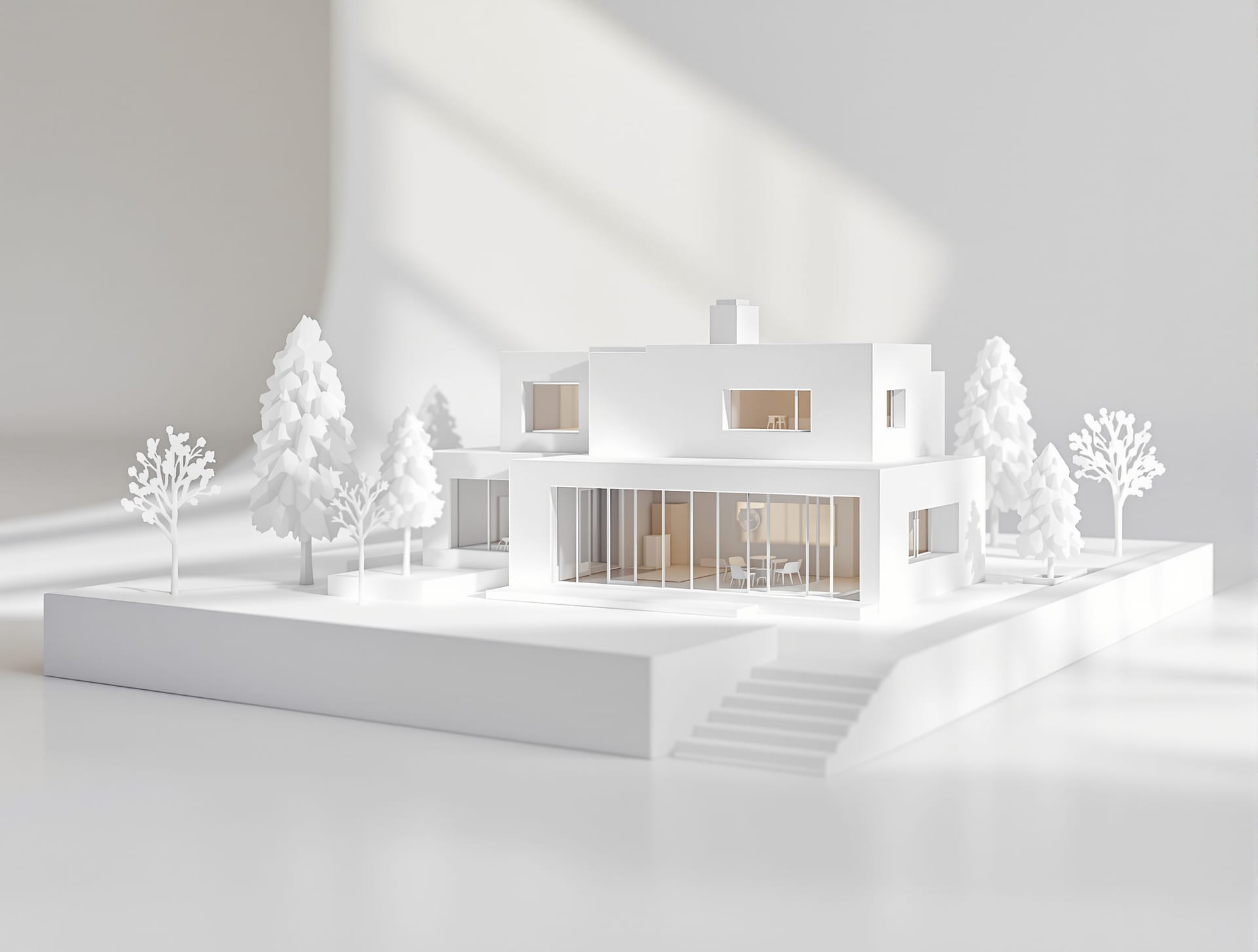
- Eye level (model's eye level, not yours). Lower your camera so it sits at the height a person would stand inside or beside the model, at roughly the height of the model's "doors and windows." This gives a realistic, immersive, "you are there" view and is the most honest, persuasive angle for showing how spaces feel. This is the workhorse shot. You will often be crouching or putting the tripod low to the desk.
- Low, worm's-eye angle. Drop even lower and tilt up slightly for drama and monumentality, making the structure tower over the viewer. Use sparingly, for a hero shot, not for the whole series.
- Top-down (plan view). Shoot straight down from directly above for a plan-like read that shows your layout, circulation and site planning. Climb on a chair, hold the camera level and parallel to the desk, and use the grid to keep it square. This is invaluable for urban and landscape projects.
The classic three-quarter eye-level view, camera low, looking at a front corner so you see two faces of the massing at once, is the most informative single angle and a great default hero shot. Walk around the model and shoot it from several considered angles; you can choose the best later, but you cannot reshoot a model after it has been recycled into next semester's chipboard.
Get it sharp front to back
A model is small, and your camera is close, which means depth of field is shallow and the back of the model can blur while the front is sharp, or vice versa. Two fixes:
1. Use a small aperture (f/8 to f/16) to deepen the zone of sharpness. On a phone, "Portrait mode" does the opposite (it blurs background on purpose), so avoid it for models; use the normal photo mode.
2. Focus stack when even f/16 is not enough. On a tripod, take several identical shots, focusing on the front of the model in one, the middle in the next, the back in the last, then blend the sharp parts together in a free app or even Photoshop on a lab computer. This is how people get those impossibly sharp, deep model photos. It only works if the camera does not move between frames, hence the tripod.
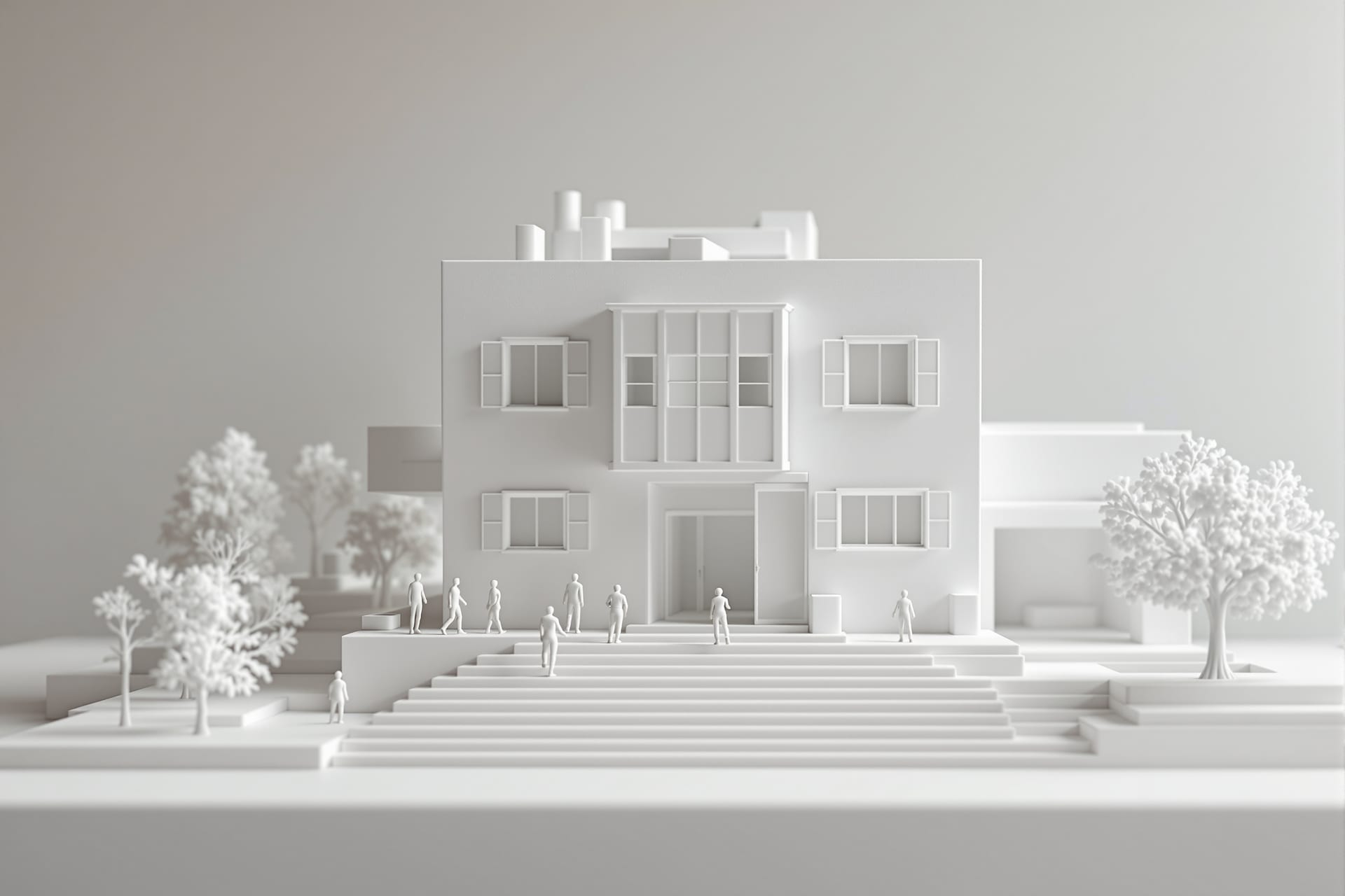
Add a scale figure, tell the truth
Drop a small, correctly-scaled human figure (or a few) into your model before photographing. A scale figure does two magical things: it instantly tells the viewer how big the building is, and it makes the model read as a real, inhabited place rather than a craft object. Place figures naturally, at an entrance, on a stair, in a courtyard, not in a stiff row. Scale cars, trees and furniture help too. This one habit separates convincing portfolio shots from school-project snapshots.
Shoot a clean, consistent series
A portfolio of a model is a series, not one lucky shot. Aim for a small, deliberate set: one hero three-quarter view, one or two eye-level interior or street-level views, one top-down plan view, and a couple of detail shots of a junction or a façade you are proud of. Keep the lighting, background and editing consistent across the whole series so they sit together as a coherent set on a panel or page. Consistency reads as professionalism.
Working with light
If you remember only one thing from this guide, let it be this: photography is the craft of seeing and shaping light. The camera is almost incidental. Here is how to make light your ally on a student budget.
Natural light is free and beautiful
For both models and real spaces, daylight is your best and cheapest tool, but not all daylight is equal.
- Golden hour, the hour after sunrise and the hour before sunset, gives warm, soft, low, raking light that makes everything look three-dimensional and lovely. For a site visit or a building's exterior, plan to be there at golden hour if you possibly can. The harsh white light of 1 pm is the worst time to shoot a building's exterior.
- Soft window light is your studio for models. North-facing windows give the most consistent, shadow-friendly light through the day. A large window close to your subject is a large, soft source.
- Overcast days are your friend, not a disappointment. A cloudy sky is a giant softbox: it spreads even, gentle light with no harsh shadows, perfect for showing material and texture honestly. Many professional photographers wait for overcast skies. So when the monsoon greys the sky, grab your model and a window, it is ideal light.
The enemy is harsh, patchy light: hard midday sun throwing pitch-black shadows and blinding bright spots across your subject, or a single bare tube light. These extreme contrasts hide detail and look amateurish. When you cannot avoid harsh sun, move into open shade (the shadow side of a building, under a tree) where the light is soft and even.
White balance: keep your whites white
Different light sources have different colours: tube lights are often green-cyan, old bulbs are orange, daylight is neutral to cool, golden hour is warm. White balance is your camera's attempt to make white objects look white regardless. When it gets it wrong, your concrete model goes orange or your white sweep goes blue. Set the white balance to match your light source (there are sun, cloud, tungsten and fluorescent presets), or shoot RAW and correct it later. The simplest student fix: include a small piece of plain white paper in one test shot, then in editing, tap the "white balance picker" on that paper and everything corrects. Above all, do not mix light sources with different colours in one frame.
Bounce and diffuse for free
You already met these, but they deserve their own checklist because they are the cheapest, highest-impact tools you own:
- White card (chart paper) as a bounce to fill shadows. Angle it to throw light back into the dark side of your subject.
- Butter paper or tracing paper as a diffuser, taped in front of a lamp or over a too-bright window, to soften harsh light into something gentle.
- A dark sheet (black chart or cloth) does the opposite, "negative fill," deepening shadows on one side for more drama and contrast when a model looks too flat.
Turn a desk lamp into a key light
To recap the hostel-room studio, because it is the single most useful setup you will build: place your adjustable desk lamp to one side of the model, raised and angled down at about 45 degrees. Tape butter paper in front to soften it. Prop a white chart-paper bounce on the opposite side for fill. Put the model on a clean sweep. Put the camera on a tripod (or book stack) at the model's eye level. Lock focus and exposure, pull the brightness so whites stay clean, small aperture for sharpness, low ISO, and let the shutter stay open as long as it needs. That setup, costing almost nothing, produces images that look like they came from a studio.
Angles and composition
A photograph is a set of decisions about where to stand and what to leave out. Composition is how you turn a record into an image with intent.
Verticals straight, camera level
We keep returning to this because it is the defining mark of architectural photography: vertical lines must stay vertical. Columns, door frames, walls and model edges that lean or converge make a building look unstable and the photo look amateurish. The fix at capture is to hold the camera dead level (parallel to the subject), not tilted up or down. Use your grid. If you must tilt to fit a tall building, accept that you will straighten it later, and leave a little extra room at the edges so there is something to crop into.
Use perspective on purpose
A strong one-point perspective, standing in the centre of a corridor, a courtyard or a long axis of your model and shooting straight down it, creates depth and pulls the eye powerfully into the image. Symmetry, where it exists, is satisfying; centre your camera carefully and let the lines converge to a single vanishing point. This is one of the most reliable compositions in architecture, and it works equally for a real building and a model.
Capture both scale and detail
A complete document of any building or model needs two kinds of shots:
- Context shots that show the whole, its setting, its massing, how it sits on the site. These give the overall read.
- Detail shots that show a material, a junction, a handrail, a window reveal, the grain of a brick, the way two surfaces meet. These show care and craft.
A portfolio that only has wide shots feels distant; one that only has details feels fragmentary. You need both, and the rhythm between them is what makes a project page feel rich.
Document a site visit systematically
Site visits are gold for your learning and your portfolio, but only if you shoot them methodically instead of grabbing random snaps. Follow the visitor's journey and shoot a deliberate sequence:
1. The approach. How do you arrive? What do you see first? Photograph the building as it reveals itself from a distance and on approach.
2. The entry. The threshold, the doorway, the transition from outside to inside, this is where architects make decisions; capture it.
3. Plan-legible overall shots. Stand back and capture views that let a viewer understand the layout: the main spaces, the circulation, how rooms relate. A top-down or elevated view if you can find one.
4. Materials and details. Walk close. Photograph the materials, the textures, the joints, the craftsmanship. Note how they age and meet the ground.
5. How light moves through it. Spend time watching and shooting how daylight enters, where it falls, how shadows move, how a space changes through the day. This is the soul of architecture and the hardest thing to capture, so give it patience.
If you shoot every building you visit in this five-part way, you will build an extraordinary personal reference library and train your eye faster than any lecture can.
Techniques worth learning
A handful of techniques, all achievable on a phone with free apps, will lift your work from "documented" to "well-photographed."
Bracketing and HDR for bright windows
The classic architectural problem: you are inside a room with a bright window. Expose for the room and the window blows out to pure white; expose for the window and the room goes black. Our eyes handle this range; cameras struggle. The fix is bracketing: take several shots at different exposures (one dark, one normal, one bright) and blend them so both the room and the view through the window are visible. Most phones do a version of this automatically when you turn on "HDR." Use HDR for high-contrast interiors and exteriors against bright sky, but keep it subtle; over-cooked HDR with grey halos and unnatural colour looks worse than a simple honest exposure. Natural, not cartoonish, is the goal.
Panoramas for spaces that won't fit
When a space or a long model is too big for one frame and you cannot back up further, shoot a panorama: your phone's pano mode stitches a sweep into one wide image. Hold steady, move slowly and evenly, and keep the camera level as you pan. Useful for interiors, streetscapes and wide site contexts. Just know that panoramas distort straight lines, so they are for context, not for a clean elevation.
Fix perspective and straighten verticals in free apps
This is the technique that will most often save your shots. Two free, excellent mobile apps do it beautifully:
- Snapseed (free): its "Perspective" tool lets you correct converging verticals and straighten a tilted building in seconds. Pull the building upright until the verticals are parallel. There is also a "Tune Image" tool for exposure and white balance.
- Lightroom mobile (free tier): its "Geometry" tools, including "Guided Upright," let you draw lines along your verticals and have the app straighten them automatically, plus full control over exposure, white balance and cropping.
Straightening verticals after the fact crops a little off your image, which is why you left room at the edges when shooting. This single edit makes amateur photos look professional.
Focus stacking a model
We covered this above; the technique is worth naming again as a skill to practise. On a tripod, shoot a sequence focused at different depths of your model, then blend the sharp regions. Even a free tool or a lab computer's Photoshop can stack them. It is how you get a tiny model tack-sharp from the nearest corner to the farthest.
Edit simply and honestly
Editing is finishing, not faking. A good edit is invisible. Stick to this short list, in roughly this order:
1. Crop and straighten for a clean composition and level horizon.
2. Correct perspective so verticals are vertical.
3. Exposure and contrast, nudge brightness so it reads correctly, add gentle contrast for life.
4. White balance, make whites white and remove colour casts.
5. A light hand on highlights and shadows to recover a blown window or open up a dark corner.
That is it. Resist the cranked-up saturation, the heavy filters, the fake skies. And here is the line you do not cross: do not fake what you did not build. Do not photoshop in a context you never designed, do not paste your model into a glossy render and pass it off as a photograph, do not invent a finish that the model does not have. Honesty is not just ethics; juries and recruiters who have seen thousands of portfolios can smell a fake, and it costs you their trust on everything else. Document what you made, beautifully and truthfully.
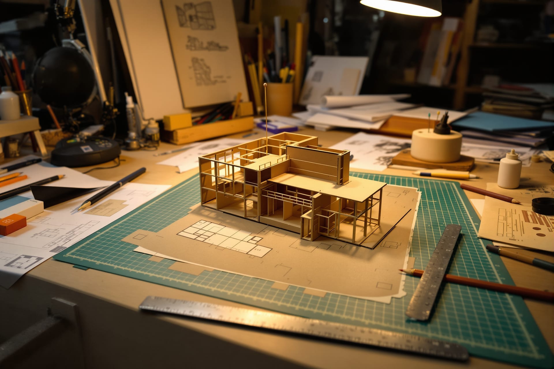
Documenting your design process
Your finished model and your final sheets are only the visible tip of months of work. The thinking, the sketching, the iterations, the dead ends, the model-making, that journey is often what juries, interviewers and M.Arch panels most want to see, because it shows how you think. And almost every student forgets to photograph it until it is gone.
Make it a habit to document as you go:
- Sketches and study models. Photograph your concept sketches, your napkin diagrams, your quick study models, even the bad ones. The contrast between an early scribble and the final scheme is one of the most compelling stories you can tell.
- Iterations. Lay out your successive plan options or massing studies and shoot them together. Showing version 1 next to version 5 proves you explored, tested and decided rather than landing on the first idea.
- Diagrams. Photograph or scan your concept diagrams, circulation studies and analysis. Flat, even light (or a flatbed scanner in the lab) keeps them legible.
- The model-making. Shoot the chipboard being cut, the glue and pins, the messy desk, your hands at work. These process shots are honest, human and surprisingly powerful in a portfolio.
- The studio wall. When your pin-up is on the wall, photograph it straight-on, level, in even light. It is a complete snapshot of where the project stood.
A lovely extra: shoot a quick time-lapse of a model build. Prop your phone on a tripod overlooking your desk, set it to time-lapse, and let it run while you work. A thirty-second clip of a model assembling itself is mesmerising, makes a great portfolio or social-media piece, and costs you nothing but pressing record. Even simpler, take one photo of the model at the end of every work session from the same fixed spot; strung together later, they tell the build story.
Trust me on this: at portfolio time, in your final year, you will be desperately grateful to past-you for the folder of process photos, and miserable about every undocumented project. Build the visual record now, while it is happening.
Organising and never losing your work
You will, across a five-year course, generate tens of thousands of files. The difference between a student who can pull up any image in thirty seconds and one who loses their entire third-year folder to a corrupted pen drive is not luck. It is a simple system, set up once and followed.

A folder per project
Use one clear, consistent structure: a folder per project, nested under year and semester (for example, Architecture / Year-3 / Sem-5_Museum), and inside each project the same five-folder skeleton:
| Sub-folder | What goes in it |
|---|---|
| 01_RAW | Untouched camera originals |
| 02_Selects | Your chosen keepers |
| 03_Edited | The edited finals |
| 04_Process | Sketches, iterations, model-making shots |
| 05_Final-Sheets | Final output sheets and panels |
When every project looks identical, your brain stops hunting and you find things instantly, even three years later.
Name files so they sort and search
Random names like IMG_4821 are useless. Rename your keepers with a consistent pattern so they sort chronologically and tell you what they are at a glance — for example, 2026-06-20_Sem5-Museum_model_eye-level_01.jpg. Lead with the date in year-month-day order (so files sort correctly), then the project, then what it shows. You do not need to rename every RAW, only your selects and finals. A free batch-rename tool, or even your file manager's rename function, does dozens at once.
Keep your metadata
Your camera already stamps each photo with the date, time and settings (this is EXIF metadata), do not strip it out. It quietly answers "when did I shoot this?" and "what settings worked?" for years. For your most important images, you can add keywords or a short caption in your phone's photo app or in Lightroom, which makes searching your library trivial later.
Cull before you archive
After every shoot, spend ten minutes culling: delete the obvious failures (blurry, badly exposed, duplicates) and copy the keepers into your Selects folder. Storage is cheap but your future attention is not; a folder of 40 chosen shots is far more useful than 400 unsorted ones.
Back up with the 3-2-1 idea
This is the rule that saves careers. The principle: keep 3 copies of anything you cannot bear to lose, on 2 different kinds of storage, with 1 copy somewhere else (offsite). For a student that translates simply to:
- Copy 1: on your laptop.
- Copy 2: on a cheap external hard drive or a pen drive (a different device).
- Copy 3: in the cloud (Google Drive, OneDrive, etc.), which is automatically "offsite."
Free cloud tiers are usually enough for your selects and finals; back up everything important the same week you shoot it. The students who lose work always say the same thing: "I was going to back it up." A corrupted pen drive the night before a thesis submission is a real, recurring tragedy. Do not be that story.
Version so you can show evolution
Keep your iterations rather than overwriting them. When you revise a sheet or a model photo, save a new file (v1, v2, v3) instead of saving over the old one. This protects you from a bad edit, and more importantly, it preserves the evolution of your thinking, which, as we said, is exactly what a portfolio loves to show.
Building your portfolio
Everything so far has been quietly building toward this. Your portfolio is the single document that gets you internships, jobs, and M.Arch seats. It is not a dump of everything you made; it is a curated argument for who you are as a designer. Here is how to assemble it from the photographs you have been carefully collecting.
Select ruthlessly
The hardest and most important skill is leaving things out. A portfolio is judged by its weakest piece, not its best, so include only your strongest work and your strongest images of that work. Three excellent projects beat eight mediocre ones. For each project, choose a small set of images that, together, tell the story: a hero shot, the context, a couple of telling details, the key process moments. If an image is technically weak or redundant, cut it, no matter how attached you are.
One consistent visual treatment
Apply the same editing style, the same crop ratios, the same restraint, across every image. A consistent visual treatment makes a portfolio of varied projects feel like the coherent work of one confident designer. Mismatched colour casts, wildly different brightness, and inconsistent backgrounds make even good work feel scattered. Consistency is a signal of professional control.
Sequence each project as a story
Lay out each project so a viewer who knows nothing about it understands it in order: typically the concept and site, then the process and iterations, then the resolved design (plans, sections, the model photos you worked so hard on), ending on a hero image. Lead with strength, close with strength. Within the whole portfolio, open with your single best project and end with another strong one, your weaker pieces, if any, go in the middle.
Caption with intent
A short, plain caption under each image, the project name, the brief, your role, the year, guides the viewer and saves them guessing. Captions are also where you state facts that a photograph cannot: the scale, the material, the studio brief. Keep them brief and honest.
Formats for applications
Tailor the output to where it is going:
- A PDF portfolio is the universal currency for internship, job and M.Arch applications. Keep the file size reasonable (compress images sensibly so it emails and uploads without trouble) while keeping enough resolution to look crisp on screen.
- A print portfolio for in-person interviews benefits from larger, fewer, higher-resolution images.
- An online portfolio (a simple personal site, or a well-organised platform profile) is increasingly expected; it lets recruiters find you.
Whatever the format, design it cleanly. Generous white space, a quiet typeface, consistent margins. Let the work breathe. The portfolio's own design is itself a sample of your design sensibility, so do not clutter it.
Be honest about authorship
This matters more than any technique. Credit collaborators and be truthful about group work. If a project was done in a team, say so and state clearly what you did, the concept, the model, the drawings, the analysis. Claiming a team's work as solo is the fastest way to lose a recruiter's trust, and the architecture community in India is smaller than you think; word travels. Honest, specific authorship ("model and physical documentation by me; plans developed with a teammate") reads as confident and mature, not as a weakness. Owning your real contribution, including in a group, is more impressive than a vague claim of doing everything.
Keep going
You now have everything you need to document your work like a professional, on a student budget, starting with the phone in your pocket and a desk lamp. The only thing left is to practise, and the best way to practise is to make work worth photographing and then put it in front of people. Deepen your craft through the Academy, and when you have a project you are proud of, enter the monthly Student Prize and aim, in time, for the Studio Matrx Awards, photographing your work well is exactly how you make those entries shine.
And as you grow, when a phone and a desk lamp start to feel like training wheels, graduate to the professional companion, architectural and interior photography (pro guide), to learn the studio-grade techniques that working photographers use. But that is for later. For now, clean your lens, find some soft window light, set your model on a clean sweep, and go make something worth remembering. Your future self, flipping through a full and beautiful portfolio, is already grateful.
Export this guide
Related Guides — Deep-dive reading
Architectural & Interior Photography & Documentation: A Professional's Field Guide
Camera, light, angle and technique for built work that publishes and wins — plus documentation, drone rules, post-processing and the India rights you must get in writing.
Design EducationModel-Making for Architecture Students
The 2026 Working Reference for B.Arch Studios in India — Five Model Types, Scale-to-Material Map, Tool Kit, Indian Material Sources, Workshop Discipline (Including Laser-Cutter and 3D-Printer Access), Lighting and Photography for Jury Showings, Storage & Transport, Five-Year Skill Build, and Common Failure Modes
Student FoundationsAngles, Curves and Breaking the Pattern Intentionally
Why an Indian home should mostly stay a grid of right angles — and how a single deliberate curve, angle or arch, placed where it eases circulation, resolves an awkward plot or breaks a rhythm, becomes the most powerful move in the room.
Design PrinciplesRelated Tools — Try Free
Cross-Ventilation Analyzer
Estimate airflow and air changes per hour (ACH) from room size, window areas, layout, and local wind — with NBC 2016 Part 8 compliance check.
Ventilation CalculatorInterior Layout Planner — Printable Graph Grid
Printable graph grid to sketch room layouts to scale before committing to furniture placement.
Layout ToolApartment Interior Planning Checklist
51-item checklist across structural, ceiling, lighting, furniture, storage, electrical, kitchen, bathroom.
Checklist