
 Lesson 2.3
Lesson 2.3 · Store Planning & Layout
Zoning & Merchandise Adjacencies
A store is not a flat field of products but a set of zones, and the art is grouping the merchandise so it makes sense to the shopper - putting complementary things together, placing what people came for deep enough to pull them past what they didn't, and using the back wall as the great draw
Why is the milk at the very back of the supermarket? Because the walk to fetch it is worth more than the milk.
A store looks, at first, like a flat field of products - but a well-planned one is nothing of the sort. It is a set of deliberate zones, each grouping a kind of merchandise, arranged in an order and an adjacency that has been thought about hard. The everyday proof is the supermarket: the milk, the bread, the eggs - the things almost everyone comes for - sit at the far corners and the back, not by the till where they would be convenient, but as far into the store as possible. The reason is pure store planning. Those staples are destination purchases people will walk for, so placing them deep drags the shopper through the whole store, past hundreds of things they did not come for but might now buy.
That single move - deciding what goes where, and beside what - is zoning and adjacency, and it is where the layout from lesson 2.1 gets filled with actual merchandise logic. Group the goods so the store makes instant sense to the shopper; place complementary things together so one purchase suggests the next; use the pull of destination goods and the back wall to draw the walk deep; and choreograph the sequence of categories so the journey feels natural while exposing the shopper to as much as possible. Done well it serves the shopper - things are where they would expect, and what goes together is together - while lifting the basket. Done cynically it becomes the frustrating maze nobody wants. This lesson teaches the honest craft of both zoning and adjacency.
Zones the shopper can read. Complements together. Destination deep, impulse on the path, hero on the back wall.
Zoning - grouping the goods so the store makes sense
Zoning is the act of dividing the selling floor into areas, each dedicated to a category, a brand, a use-occasion or a shopper mission, so that the store reads as a set of legible neighbourhoods rather than an undifferentiated field of stock. It is the bridge between the layout and the merchandise: the layout (lesson 2.1) sets the shape of the walk, and zoning decides what the shopper actually meets at each point along it. Good zoning is, first and most importantly, an act of service - it makes the store instantly understandable. When menswear is clearly one zone and womenswear another, when electronics are grouped and homeware is grouped, a shopper can orient in seconds, find what they came for, and sense where to explore. A store with weak or illogical zoning - categories scattered, similar things far apart, no clear neighbourhoods - forces the shopper to hunt, and hunting shoppers get frustrated and leave.
Zones can be organised on several logics, and choosing the right one is a design decision tied to how the shopper thinks. You can zone by product category (the default: shirts here, shoes there), by brand (the concession or shop-in-shop model, common in department stores and beauty), by use-occasion or mission (a 'back to school' zone, a 'party' zone, a 'weeknight dinner' zone that cuts across categories the way a shopper's task does), by price or tier (an entry zone and a premium zone), or by lifestyle or theme (grouping disparate products around a way of living). The best choice mirrors how the target shopper actually approaches the trip - a hardware store zones by trade and task, a supermarket by food type, a lifestyle brand by the world it sells.
Zoning also carries the brand, not just the logic. The size, generosity, materials and atmosphere you give a zone signal its importance and its positioning - a spacious, richly finished zone reads as premium and hero; a dense, plain zone reads as value and volume. So zoning decisions are simultaneously about legibility (help the shopper find and understand), commerce (give space and prominence in proportion to a category's value and role) and brand (let each zone feel right for what it sells). Get the neighbourhoods clear and well-judged and the shopper moves through a store that feels considered and easy; get them muddled and even beautiful merchandise is lost.
Zones = neighbourhoods. Category, brand, occasion, tier, lifestyle. Pick the logic the shopper thinks in.
Adjacencies - what sits beside what
If zoning decides the neighbourhoods, adjacency decides which ones share a fence - and placing the right zones and products next to each other is one of the quiet multipliers of retail. The core idea is complementary adjacency: goods that go together should sit together, because one purchase naturally suggests the next and the pairing serves the shopper's real need. A tie beside the shirts, a belt beside the trousers, pasta beside the sauce, chargers beside the phones, cushions beside the sofas - each adjacency both helps the shopper (they are reminded of, and can complete, what they actually need) and lifts the basket (the second item is bought that would otherwise have been forgotten). This is not a trick; it is arranging the store around how the shopper's task really hangs together. The strongest retail adjacencies feel obvious in hindsight precisely because they match a genuine relationship between the products.
Adjacency works across scales - between whole zones (put the paint zone beside the hardware zone, the wine beside the deli) and between products within a fixture (the accessories on the shelf beside the hero item). It also has a sequencing dimension: because shoppers move in a rough order through the store, you can place a category so that the shopper meets it *after* the thing it complements, catching the impulse at the right moment. And it interacts with the destination-versus-impulse idea in the next section: complementary impulse goods placed along the path to a destination purchase are a classic, legitimate way to lift the basket while genuinely helping the shopper complete a task.
A quick honesty check keeps adjacency on the right side of the line. Complementary adjacency that serves a real shopper need - reminding them of the tie for the shirt - is good practice; it makes the store more useful. Manufactured or manipulative adjacency - exploiting anxiety, burying necessities to force exposure to unrelated high-margin goods, dark patterns that trick rather than help - is poor practice and this course flags it as such. The test, as always: does the adjacency serve the shopper's genuine task and make the store more useful, or does it merely extract from them? Design for the former, and the basket grows because the shopper is better served.
Destination, impulse and the journey through the categories
The deepest planning idea in zoning is the distinction between destination and impulse purchases, because it governs where things go. A destination purchase is one the shopper specifically came for and will actively seek out and walk to - the milk, the prescription, the new phone, the sofa. An impulse purchase is one they had no plan to make but buy because they encountered it at the right moment - the chocolate at the till, the scarf by the coats, the seasonal display. The master move of store planning follows directly: place destination goods deep - at the back, in the far corners, up the store - so that the walk to reach them drags the shopper past a maximum of other merchandise, and place impulse goods along that path and at natural pause points where the primed shopper will meet them. The supermarket milk at the back is the textbook case; the chocolate and magazines at the checkout queue are its bookend.
This is how the layout, the zones and the adjacencies combine into a journey through the categories - a choreographed sequence in which the shopper is drawn deep by what they came for and exposed, along the way, to complementary and impulse goods they are now in a mood to consider. Done with care it is genuinely good for the shopper: the destination items are findable (once you know the logic, deep placement is consistent and learnable), and the impulse encounters are relevant and well-timed rather than random. Done cynically - burying essentials purely to trap, forcing an exhausting route with no shortcuts - it becomes the manipulative maze that breeds resentment, and it is poor practice. The honest version guides generously: the destination goods are deep, yes, but the store stays legible, the route stays pleasant, and shortcuts and exits stay clear.
Sequencing the journey is where a planner earns their keep. You decide the order in which categories are met so the walk feels natural (related zones flow into each other), so exposure is maximised (the path passes the most merchandise), and so the emotional rhythm works (arresting displays and draws at intervals to keep the shopper moving and engaged rather than flagging). The shopper should feel they are exploring a store that makes sense, discovering things as they go - not being marched through a gauntlet. That felt ease, married to deep destination placement and well-timed impulse and complementary goods, is the whole art.
Destination deep = the magnet. Impulse on the path + at pauses = the catch. Guide, keep it legible, never trap.
The back wall - retail's great long-distance draw
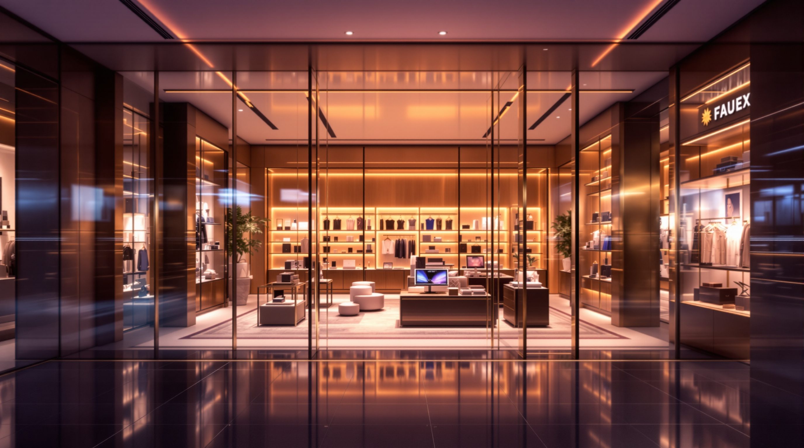
One zone deserves a lesson to itself, and it is the back wall - the wall of the store directly opposite the entrance, at the far end of the sightline from the door (lesson 2.2). It is one of the most valuable pieces of real estate in the whole shop, for a simple reason of physics and psychology: it is the largest surface a shopper sees on entering, it sits at the end of the primary sightline, and a strong back wall therefore acts as a long-distance draw that pulls the walk right through the store from the moment the shopper crosses the threshold. Whatever you put on the back wall is seen by nearly everyone who enters, and it drags them past everything in between to reach it. This is why the back wall - often called the power wall when it is used for a hero display - is prime, and why it typically carries destination categories, hero products, the newest and most desirable goods, or a powerful brand or seasonal statement.
The back wall works hand in hand with everything else in this module. It is the far anchor of the sightline the entrance composes, the deep destination that the journey through the categories is drawing toward, and the reason the perimeter and the walk to the back are so heavily travelled. Designing it well means giving it something genuinely worth the walk - a compelling, well-lit, well-composed draw rather than dead stock or storage - and making it visible from the door over low front fixtures. A wasted back wall (blank, cluttered, hidden behind tall gondolas, or used for a back-of-house door) throws away the store's single best pull; a strong one sets the whole walk in motion. Module 4 returns to the power wall as a display in its own right; here it is the keystone of the plan.
Hold the humane line to the end. The back wall pulls the shopper deep, and deep placement of destinations exposes them to more merchandise - but the point is to reward the walk, not to punish it. Give the shopper a back wall worth reaching, a journey that makes sense, zones they can read, adjacencies that help them complete real tasks, and a route that stays legible with clear exits. Then the plan does the two things this whole course insists go together: it serves the shopper with a store that is easy, sensible and rewarding to move through, and it sells well because a well-served shopper, drawn deep and shown the right things at the right moments, simply buys more.
Legible routes & egress through zones
Circulation between zones, clear widths, accessible and escape routes
Deep destination placement and dense zoning must never compromise legible, accessible, code-compliant routes and exits. Defer binding widths and egress to the current code, accessibility standards and the fire/life-safety specialist.
Adjacency & destination benchmarks
Which adjacencies lift basket, how deep to place destinations
Illustrative principles and figures as of 2026 - calibrate to the brand, format, market and real shopper data (basket analysis), never copy a rule.
Category & space allocation
Space and prominence given to each zone
Guided by category value and role and, in mature retail, by space-productivity data (lesson 2.4) - a commercial judgement to calibrate, not a fixed ratio.
Brand zoning & planogram standards
The retailer's standard zoning, adjacencies and planograms
Branded and rolled-out retail often prescribes zoning and planograms; design within the brand's design standards. Modules 4 and 10.
Workshop - zone a store and defend the adjacencies
Zoning is best learned by doing it against a real brief and then justifying every neighbourhood. In this workshop you take the floor plate from lesson 2.1, carve it into zones, set the adjacencies, place the destinations and the back wall, and defend the plan as both good service and good selling.
Your lesson 2.1 plate, paper or a drawing app, and a real retailer's brief you understand. No specialist software needed.
Goal: turn a layout into a zoned, well-adjacent merchandise plan
Inputs: your floor plate from lesson 2.1, a retailer brief, this lesson, paper or a tablet
Time: ~60 minutes
- 1State the zoning logic that fits your shopper - category, brand, occasion, tier or lifestyle - and list the zones your store needs.
- 2Place the zones on the plan, sizing each to its value and brand role, and mark the decompression zone as open.
- 3Identify your destination categories and place them deep (back and far corners); identify impulse and complementary goods and place them along the path and at pause points.
- 4Draw the key complementary adjacencies (which zones and products sit side by side) and write one line each on the real shopper task the adjacency serves.
- 5Design the back wall: decide what draw goes on it and check it is visible on the sightline from the door over low front fixtures.
- 6Stress-test for the humane line: is the store still legible, are routes and exits clear, and is any adjacency manipulative rather than helpful? Fix anything that traps rather than guides, and flag route widths and egress for the specialists.
You’ll walk away with
A zoned merchandise plan of your store showing the zones and their logic, the destination and impulse placement, the key adjacencies with the shopper task each serves, and the back-wall draw - plus a short note defending it as both good service and good selling, with any manipulative moves removed and egress flagged.
Three altitudes on the same idea
Read the band that fits you — or all three.
Zoning depends on the shell giving each category the space, prominence and adjacency it needs - and on the back wall being usable. The plan's depth, the column grid, the position of the core, services and back-of-house, and where the entrance sits all determine which zones can go deep, whether the destination-at-the-back logic even works, and whether the all-important back wall is a clean, visible surface or is broken up by a service door, a column or a stockroom entry. Give the retail plan a strong, uninterrupted back wall on the primary sightline, depth to place destinations far from the door, and a structure that lets zones be sized to their value. Coordinate early with the retail and interior designers on the zoning intent, and keep the binding egress and accessibility of the resulting routes with the specialists.
Turning the layout into legible, well-adjacent, well-sequenced zones is the heart of your planning craft. You choose the zoning logic that matches how the shopper thinks, size and finish each zone to its value and brand role, set the complementary adjacencies that help the shopper complete real tasks, place destination categories deep and impulse and complementary goods along the path and at pauses, and make the back wall a genuine draw. Do it as service first - a store that is easy to read and where things that go together are together - and the basket grows honestly. Keep the route legible and the exits clear rather than building a trap, flag manipulative adjacencies as bad practice, and coordinate the resulting circulation clearances, accessibility and egress with the specialists. Module 4 will take the power wall and fixtures further.
Zoning and adjacency are gloriously readable in any shop, and the supermarket is the best textbook you will ever get for free. On your next grocery trip, find where the milk, bread and eggs are - almost certainly deep at the back and corners - and understand why: they are destination goods placed to pull you through everything else. Notice the impulse goods at the till and along the main aisles, and spot the complementary adjacencies (pasta by sauce, chargers by phones). Read the zones: what logic groups them - category, brand, occasion, tier? Then look straight ahead on entering and see what is on the back wall. Doing this trains you to see the merchandise logic beneath every store, and to tell the honest, helpful version from the manipulative maze.
“Merchandise should be arranged mainly for the shopper's convenience - put the things people buy most often near the entrance and the till so they can grab them quickly and leave happy.”
Do it yourself
No tools needed - reason it through from the shopper's task and the merchandise logic.
- 1What is zoning, and name three different logics on which a store's zones can be organised.
- 2Explain complementary adjacency with two examples, and why it serves the shopper as well as the basket.
- 3Distinguish destination from impulse purchases and explain the placement rule that follows from the difference.
- 4Why is the back wall such valuable real estate, and what is typically placed on it?
- 5Where is the honest line between helpful adjacency and manipulative placement, and give one example of each?
The one line to carry out
Peer-reviewed journals & authoritative standards
- 01Merchandising — Wikipedia - Merchandising, 2026.
- 02Visual merchandising — Wikipedia - Visual merchandising, 2026.
- 03Planogram — Wikipedia - Planogram, 2026.
- 04Consumer behaviour — Wikipedia - Consumer behaviour, 2026.
Zoning and adjacency decide where merchandise goes; the last planning question is how hard every part of the floor is working. Next we put numbers to it - sales per square foot, the value of the hot and cold zones, and how to balance selling space against experience.
The author
Amogh N P
Architect, interior designer, and creative polymath. Studio Matrx began in his notebooks — his vision of design made honest, useful, and open to everyone. Its Academy is written and taught in his memory, and free, forever.
More about Amogh →