
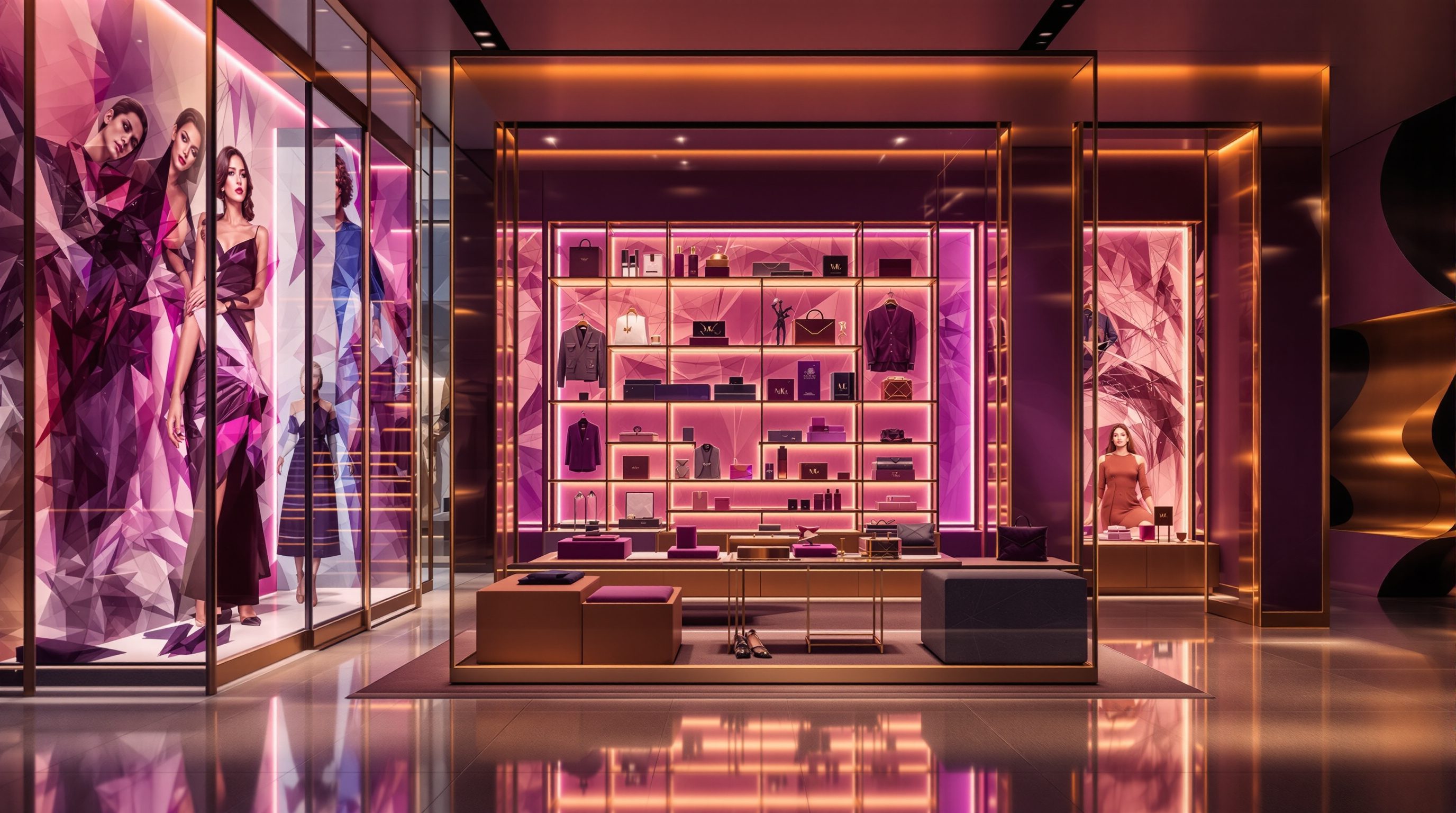
 Lesson 2.4
Lesson 2.4 · Store Planning & Layout
Space Productivity & Sales per Square Foot
Retail floor space is among the most expensive real estate there is, so every square foot must earn its keep - and the planner's final job is to make the whole floor work hard, reading the hot zones and dead corners, and balancing pure selling against the space that experience and circulation need
The rent falls on every square foot equally. The selling does not - and the gap between those two facts is where the plan is won or lost.
Retail floor space is some of the most expensive real estate there is. A store pays a premium rent for a high-footfall location, and it pays that rent on every single square foot, evenly, whether that foot is a heaving front table or a forgotten corner behind a pillar. But the selling is anything but even: some parts of the floor throw off sales all day while others barely earn their keep. That gap - equal cost, wildly unequal earning - is the hard arithmetic beneath every plan, and closing it is the planner's final job in this module.
The industry measures it with a deceptively simple number: sales per square foot - the revenue a store, or a zone, or a fixture generates per unit of floor area over a period. It is retail's headline productivity metric, the scoreboard that tells you whether space is working, and a designer who understands it can plan a floor that earns far more without feeling any more crowded. But - and this is the balance the lesson insists on - space productivity is not a licence to cram. A store packed to the last square foot with stock may score well on paper today and drive shoppers away tomorrow, because the space given to a generous entrance, a clear main aisle, a bit of experience and room to breathe is what makes people come, stay and buy at all. This lesson teaches the metric, the map of hot and cold space, and the honest balance between selling every foot and keeping the store worth walking into.
Every foot costs the same; few earn the same. Make it work by selling well, not cramming. Calibrate the number.
Sales per square foot - retail's productivity scoreboard
Sales per square foot is the single most important space-productivity metric in retail: total sales over a period divided by the selling area, giving revenue earned per unit of floor. (In India you will hear it as sales per square foot or per square metre; the idea is identical.) It matters because floor space is a store's biggest fixed cost after stock and staff, so how much each foot earns largely decides whether the store is profitable. It is used at every scale - to compare whole stores in a chain, to compare formats, to judge which departments and zones deserve more or less space, and even to assess an individual fixture or display. When a retailer asks whether a store is 'working', sales per square foot is usually the first number they reach for, alongside conversion, basket size and dwell.
For the designer, this metric is not an intrusion from the finance department; it is the scoreboard the plan is playing on, and understanding it changes how you design. It reframes space as a scarce, costly resource to be allocated - every square foot you give to one thing is a foot you cannot give to another, so the question behind every planning move becomes 'is this the best earning (and experience) use of this space?'. It tells you to give more space and prominence to categories and zones that earn it and less to those that do not - space allocation guided by productivity, refined in mature retailers by real sales data. And it gives you a way to judge your own decisions: a good plan lifts sales per square foot not by cramming, but by exposing merchandise better, guiding the walk to more of it, and converting more browsers into buyers.
Two cautions keep the metric honest. First, it is a benchmark to calibrate, not a rule - typical sales-per-square-foot figures vary enormously by category, format, location and market, so any number you cite is illustrative as of 2026 and must be calibrated to the specific brand, format and market rather than copied. A luxury jeweller and a discount grocer live in different worlds. Second, sales per square foot alone can mislead: it rewards density and can punish the very open, experiential and circulation space that makes a store attract and convert shoppers in the first place, which is why it must always be read alongside conversion, dwell and the health of the experience - the balance the last section returns to.
Sales/sq ft = revenue per foot. The scoreboard, not the enemy. Allocate space to what earns it - and calibrate the number.
The value map - hot spots, warm walls and dead corners
Because shoppers move through a store in patterns (the circulation and zoning of the last three lessons), the floor is not uniformly valuable - it has a value map of hotter and cooler zones, and reading it is central to space productivity. The hottest space is generally near the front and along the main aisle, where nearly every shopper passes and attention is high, and the window and front zone in particular command a premium of visibility (even as the immediate decompression zone must stay open). The perimeter and the back wall are warm-to-hot, because shoppers travel the edges heavily and the back wall draws the walk from the door. The centre of the floor is typically cooler, seen and traversed less, which is why island displays and strong sightlines are needed to activate it. And every store has dead corners - the far low-traffic corners, the space behind columns, the tucked-away pockets, the tops of tall fixtures - where footfall and attention drop away and merchandise languishes.
Good planning works *with* this map rather than against it. You put the merchandise that most needs to sell, or most needs to be seen, in the hot zones - new arrivals, hero products, high-margin and impulse goods along the main aisle and front - and you use the warm perimeter and back wall for destination categories and draws (the logic of lesson 2.3). The cooler centre you activate deliberately with focal islands, feature displays and sightlines so it is not wasted. And the dead corners you either rescue - by placing a destination category there (a service counter, a highly-sought range) precisely to pull traffic into the cold zone, by turning a corner into a feature or a moment of experience, or by using it for lower-productivity but necessary functions like fitting rooms, services or considered-purchase areas that benefit from calm - or you accept as the store's necessary quieter ground. The one thing you must not do is squander a hot zone on dead stock, or bury a hero product in a cold corner.
Reading and shaping the value map is where circulation, zoning and productivity fuse into one skill. The plan can even *change* the map - a strong main aisle, a compelling back wall, a well-placed destination can warm up a cold zone by redirecting the walk, which is exactly how a planner lifts the productivity of the whole floor rather than just loading the naturally hot spots. The goal is a floor where the hot space carries what most deserves it and the cold space is either warmed, purposefully used or honestly accepted - so the whole plate works, not just its best few metres.
Hot: front + main aisle. Warm: perimeter + back wall. Cool centre - activate. Dead corners - rescue or accept.
Selling space versus experience and circulation
Here is the balance that makes space productivity a design discipline rather than a spreadsheet: not all valuable space is selling space. A store that maximised sales per square foot in the crudest way - filling every foot with fixtures and stock, shrinking the aisles, cramming the entrance - would score well on a snapshot and fail as a store, because it would be unpleasant, hard to move through, off-putting at the door, and stripped of any reason to visit rather than buy online. The space given to a generous entrance and decompression zone, to wide and legible main aisles, to focal displays and feature moments, to a bit of experience and simple room to breathe is not wasted selling space - it is the space that makes shoppers come in, stay longer, feel good and buy more. It earns its keep indirectly, through footfall, dwell, conversion and brand, even though it holds no stock.
So the real target is not raw density but productive balance: enough dense, well-exposed selling to make the space pay, and enough open, experiential and circulation space to make the store attract and convert. Where that balance sits depends entirely on the brief. A discount grocer or a value format rightly runs dense - shoppers want efficiency and low prices, and the model lives on volume and tight space productivity. A luxury or experiential brand rightly runs sparse - generous, gallery-like space signals the positioning, slows the considered purchase, and the higher margins pay for the emptiness. Most retail sits between, and the same store varies internally: a spacious, experiential front of house and a denser, efficient back for basics and volume. The metrics must be read together - sales per square foot tells you if space is earning, but conversion, dwell and the felt quality of the experience tell you whether you have cut experience and circulation too far in chasing it.
This is the module's through-line arriving at its sharpest point. Serving the shopper and selling well are not opposed; over-cramming to chase a snapshot number betrays both, and the space that serves the shopper - room to enter, to move, to browse, to enjoy - is usually the space that makes the store sell over time. The planner's job is to make every square foot work, yes - but 'work' means contributing to a store that attracts, guides, serves and sells, which for some feet means dense merchandising and for others means being deliberately, productively empty.
Planning to the number - calibrate, balance, defer
How do you actually plan for productivity without becoming its slave? Start by treating benchmarks as calibration, not commandments. Whatever figures you have - sales per square foot for the category and format, space-to-sales ratios, fixture densities - are illustrative starting points as of 2026 to be calibrated to this specific brand, format, market and location, and in a mature retailer to that retailer's own data. Use them to sense-check your plan and to allocate space in rough proportion to what each category earns and needs, not to impose a universal density. A useful discipline is the space-to-sales principle: broadly aim to give a category floor space in proportion to the sales (and the strategic role) it delivers, then adjust for experience, brand and the value map - a hero or high-margin category may earn extra prominence, a declining one less.
Then design to lift the number the honest way. You raise sales per square foot not by cramming but by the moves this whole module has taught: a strong main aisle and circulation that draw shoppers deep past more merchandise; zoning and adjacency that expose the right goods at the right moments; destinations and a back wall that pull the walk through the store; hot zones carrying what most deserves them; cold corners rescued or purposefully used; and a plan that converts more browsers by being easy, legible and pleasant. Every one of those lifts productivity by serving the shopper better, which is the only kind of productivity gain worth designing for.
Finally, balance and defer. Hold selling density against the experience and circulation the brief needs, read productivity alongside conversion, dwell and the felt experience rather than alone, and remember that a store is refitted often, so a plan's productivity is judged over its life, not on opening day. And keep the binding matters where they belong: the space productivity chase must never eat into the clear aisle widths, accessible routes and egress that the accessibility standards and the fire and life-safety specialist govern - a foot you are tempted to reclaim from an escape route is not yours to sell. Plan to the number, humanely and within the code, and you close the gap this lesson opened with: expensive space that earns its keep by being a store people actually want to walk into.
Sales per square foot & benchmarks
Sales per sq ft/metre, space-to-sales ratios, fixture densities
Illustrative figures as of 2026 that vary enormously by category, format, location and market - calibrate to the specific brand and, in mature retail, to the retailer's own sales data. Never copy a number.
Egress & accessible routes are not sellable
Clear aisle widths, accessible routes, exit capacity
The productivity chase must never reclaim space from the clear widths, accessible routes and egress the current code, accessibility standards and fire/life-safety specialist govern. See the Fire & Life-Safety course.
Space allocation & the value map
How much space and prominence each zone gets
Allocate broadly in proportion to sales and strategic role, then adjust for experience, brand and hot/cold zones - a commercial judgement to calibrate, not a fixed ratio.
Brand space & productivity standards
The retailer's standard densities, ratios and productivity targets
Branded and rolled-out retail often sets space-to-sales and productivity standards; design within the brand's design standards and targets. Module 10.
Workshop - map the value and balance the floor
Space productivity becomes real when you map a floor's hot and cold zones and then defend how you have allocated and balanced it. In this workshop you take your zoned plan from lesson 2.3, draw its value map, and judge whether it makes every foot work without over-cramming.
Your lesson 2.3 zoned plan, coloured pens or a drawing app, and the brief you have been carrying through the module. No specialist software needed.
Goal: read a floor's productivity and balance density against experience
Inputs: your zoned plan from lesson 2.3, this lesson, coloured pens or a tablet
Time: ~55 minutes
- 1On your plan, shade a value map: mark the hot zones (front, window, main aisle), the warm perimeter and back wall, the cooler centre, and the dead corners.
- 2Check the fit: is the merchandise that most needs to sell or be seen in the hot zones, and is anything valuable stuck in a cold corner? Note the mismatches.
- 3Rescue the dead corners: for each, decide whether to pull traffic in with a destination, turn it into a feature, use it for a lower-productivity function, or accept it.
- 4Judge the balance: is the store dense enough to pay and open enough to attract and convert, given the brief? Mark where you would add or remove selling density.
- 5Sanity-check with the metric mindset: name one honest move that would lift sales per square foot (better exposure, flow or conversion) rather than by cramming.
- 6Protect the non-negotiables: confirm no productivity move has eaten into clear aisle widths, accessible routes or egress, and flag those for the specialists.
You’ll walk away with
A value-mapped floor plan showing hot, warm, cool and dead zones with your merchandise fit-check, your rescue plan for the dead corners, a judgement on the density-versus-experience balance for the brief, and one honest productivity-lifting move - with egress and accessible routes confirmed untouched.
Three altitudes on the same idea
Read the band that fits you — or all three.
Space productivity starts with the shell's efficiency - how much of the leased area you can turn into productive, well-shaped selling floor. The plate's shape and depth, the column grid, the floor-to-floor height, the size and position of the core and back-of-house, and the entrance location all determine the ratio of usable selling space to unusable or awkward space, and they create or avoid dead corners before a fixture is placed. An efficient, well-proportioned shell with minimal dead space, a strong back wall and a plate that suits the intended circulation gives every later productivity move a head start; for multi-store retailers, a space-efficient prototype multiplies across the estate. Design the shell for productive, legible selling area - but never at the cost of the clear widths, accessible routes and egress the code and the fire and life-safety specialist govern.
Making the floor productive without cramming it is the culmination of your planning craft. You allocate space in proportion to what each zone earns and needs, place the right merchandise in the hot front and main aisle, warm perimeter and back wall, activate the cooler centre with focal islands, and rescue or purposefully use the dead corners. Crucially, you hold the balance: you protect the generous entrance, legible aisles, focal moments and experiential space that make the store attract and convert, because that space is productive too even though it holds no stock. Lift sales per square foot the honest way - better exposure, flow and conversion - read it alongside dwell and conversion, treat every benchmark as calibration, and never reclaim selling space from the accessible routes and egress the specialists govern.
Space productivity is the idea that turns a store from a picture into a business in your mind - and you can practise reading it anywhere. In any shop, ask which parts are working hardest: where is the merchandise densest and most trafficked (usually the front and main aisle), where are the quiet dead corners, and what has the store done with them? Notice which stores feel crammed and unpleasant and which feel generous - and which of those you would rather buy in. Learn the headline metric, sales per square foot, and the key balance: making every foot work does not mean filling every foot, because the open, experiential space is what makes people come and stay. Hold density and experience together in your head from the start, and treat every benchmark number you meet as a figure to calibrate, never a rule.
“Since retail space is so expensive and every square foot is judged on sales per square foot, the goal of a good plan is to fit in as much merchandise as possible - the denser the selling floor, the more productive and profitable the store.”
Do it yourself
No tools needed - reason it through from the cost of space and the shopper's experience.
- 1Define sales per square foot and explain why it is retail's headline space-productivity metric.
- 2Describe a store's value map - name the hot, warm, cool and dead zones and why each is valued as it is.
- 3Why can maximising sales per square foot by simple cramming actually harm a store?
- 4Give two honest ways a designer can lift sales per square foot without cramming more stock in.
- 5How should the density-versus-experience balance differ between a discount grocer and a luxury brand, and why?
The one line to carry out
Peer-reviewed journals & authoritative standards
- 01Retail floor space — Wikipedia - Retail floor space, 2026.
- 02Retail — Wikipedia - Retail, 2026.
- 03Space planning — Wikipedia - Space planning, 2026.
- 04Retail design — Wikipedia - Retail design, 2026.
That completes the plan: the layout, the threshold, the zoning and the productivity of the floor. With the store planned, the shopper must first be drawn in from the street - so the next module turns to the storefront, the window and the entrance that stop people and pull them through the door.
The author
Amogh N P
Architect, interior designer, and creative polymath. Studio Matrx began in his notebooks — his vision of design made honest, useful, and open to everyone. Its Academy is written and taught in his memory, and free, forever.
More about Amogh →