
 Lesson 2.1
Lesson 2.1 · Store Planning & Layout
Layout Types & Circulation
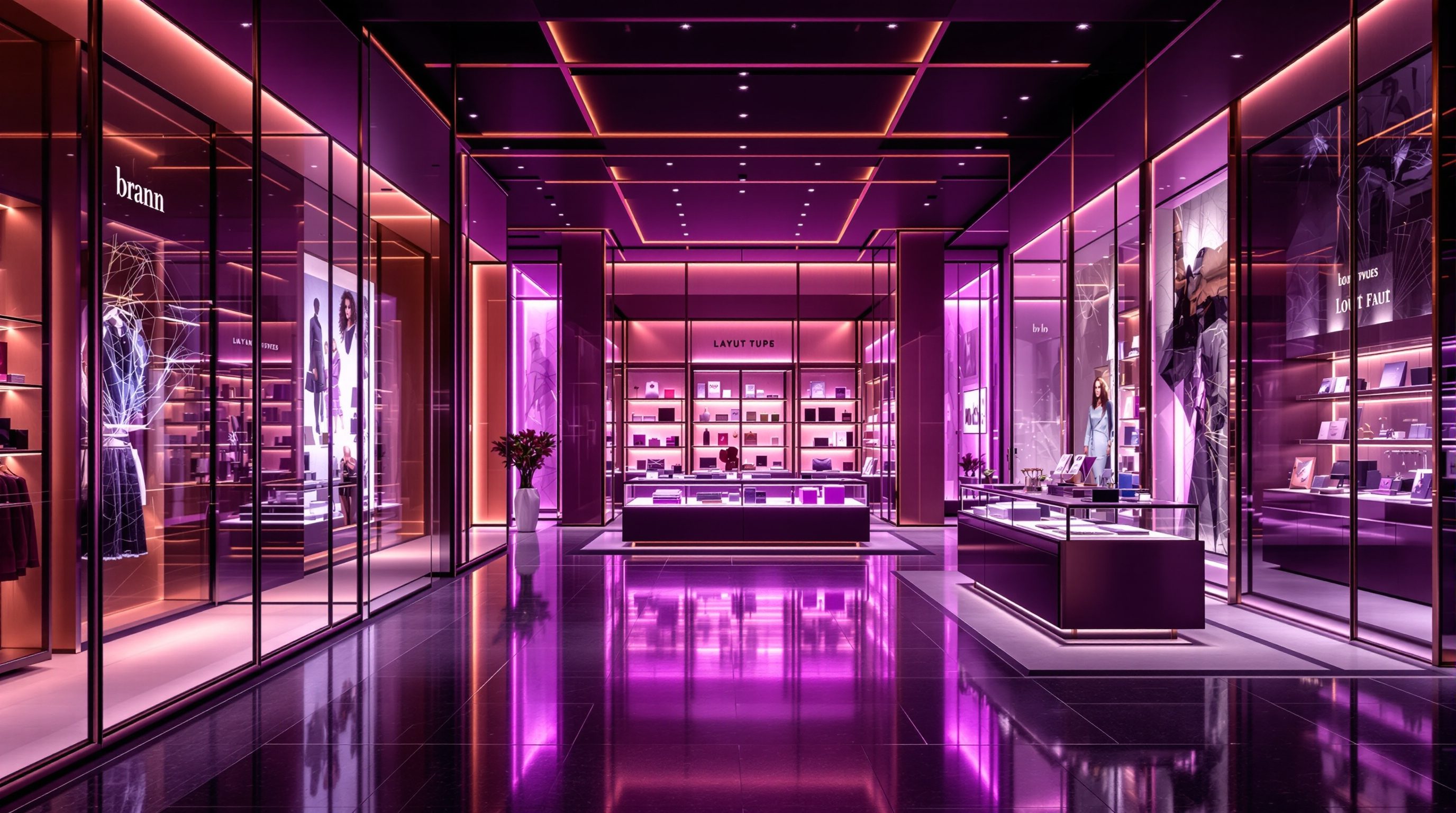
The plan is the store's first and biggest selling decision - the layout you choose sets the path every shopper walks, how much merchandise they pass and how the place feels, from the rigid efficiency of the grid to the wandering pleasure of the boutique
Choose the layout and you have already decided, before a single shelf is placed, where the shopper will walk and how much they will see.
Long before you pick a finish, a fixture or a light, you draw the plan - and that plan is the single most consequential selling decision in the whole store. The layout sets the route every shopper will take, the order in which they meet the merchandise, how much of it they pass, where they slow and where they speed up, and whether the place feels brisk and efficient or calm and exploratory. A supermarket and a jewellery boutique are not decorated differently so much as planned differently, because they want the shopper to move in completely different ways.
Retail has evolved a handful of classic layout families - the grid, the racetrack or loop, free-flow, the boutique or shop-in-shop, and countless hybrids of them - and each is a different answer to the same question: how do we guide this shopper past these goods, in this kind of store, so that they see the most, enjoy the walk and buy well? This lesson teaches the layouts not as styles to copy but as tools with known behaviours - what each does to movement, what retail each suits, and how circulation and the main aisle turn a plan into a guided walk. Get the plan right and everything that follows has a fighting chance; get it wrong and no amount of beautiful fit-out will rescue the selling.
Four layouts = four walks. Control-to-freedom, efficiency-to-experience. Main aisle is the spine. Choose from the brief.
The grid and the racetrack - planned, efficient paths
The grid is the layout most of us know best because it runs the supermarket, the pharmacy, the bookshop and the hardware store - long parallel aisles of gondola fixtures, set at right angles, with a clear circulation aisle around the edge. Its genius is efficiency and legibility: it packs the maximum sellable fixture run into a floor plate, it is cheap and fast to fit out and replicate, and shoppers understand it instantly, so they can find and re-find goods with little thought. That predictability is exactly what a weekly grocery shop or a quick pharmacy run wants. The grid's price is emotional flatness - rigid rows feel functional, not seductive, and they make it easy for a shopper to march to one aisle, grab one thing and leave without passing much else, which is why grocers fight back by placing staples like milk and bread at the far corners so the walk exposes more merchandise on the way.
The racetrack (or loop) answers the grid's weakness. Instead of letting shoppers cut straight across, it lays a single defined main path - often a visually distinct floor finish - that loops through the store and past every department before returning to the front. Department stores and larger fashion and lifestyle formats use it because it does the one thing the grid struggles with: it exposes the shopper to the whole store in a deliberate sequence, like a curated tour, while still feeling open. The designer choreographs what the shopper meets and in what order, placing draws and focal points along the loop to keep them moving. IKEA's famous one-way path is the racetrack taken to its fullest, almost forcing a complete circuit.
Both are planned-path layouts: the designer, not the shopper, largely decides the route. That control is their strength - more of the store gets seen, the sequence can build a story, and the plan is easy to standardise and roll out across many stores. It is also their risk: pushed too far, a forced path tips from helpful guidance into the dark pattern of a maze a shopper cannot escape, which breeds resentment and is poor practice. The craft is to guide generously - to make the intended route the easiest and most pleasant one, not the only one - so the shopper feels led, not trapped.
Grid = efficient rows, shopper chooses. Racetrack = one loop, designer chooses the order. Guide, never trap.
Free-flow and the boutique - open, browse-led space
Where the grid and racetrack plan the path, free-flow hands much of it back to the shopper. Fixtures - tables, rounders, islands, low gondolas - are arranged in a looser, more organic composition with open space between them, and the shopper is invited to wander wherever the eye is pulled. There is no single enforced route; instead the designer choreographs movement softly, through sightlines, focal displays and the placement of draws, trusting the shopper to meander. Free-flow feels relaxed, generous and discovery-led, which is why fashion, lifestyle, homeware and better apparel lean on it - browsing is part of the pleasure and the purchase is considered, not routine. Its costs are real: open space is less productive per square foot than dense aisles, it is harder to keep legible as the store grows, and a weak free-flow plan can leave shoppers disoriented, unsure where to start or whether they have seen everything. It demands strong sightlines and focal points to work (the subject of Module 5).
The boutique, or shop-in-shop, layout goes further still, breaking the floor into a series of distinct, semi-enclosed zones or 'rooms', each with its own character, product edit and atmosphere. Small luxury stores use it to feel intimate and curated; large department stores and flagships use it to give brands or categories their own identity within one roof - the concession or shop-in-shop. Each room becomes a little world the shopper steps into, which is powerful for brand storytelling and for slowing the considered, high-value purchase. The trade-off is productivity and flexibility: partitions eat space and cost, sightlines across the store are deliberately broken, and a boutique plan is harder to refit and roll out than a clean grid.
The honest way to hold these four is as a spectrum from control to freedom and from efficiency to experience. Grid and racetrack trade emotional richness for exposure, legibility and productivity; free-flow and boutique trade some productivity and control for atmosphere, discovery and brand. Neither end is 'better' - the right point on the spectrum is set by what the store sells, how the shopper decides, and what the brand wants the visit to feel like. A ₹20-a-litre grocery run and a considered designer-wear purchase simply want different walks.
Circulation and the main aisle - turning a plan into a walk
A layout family is only half the plan; the other half is circulation - the network of aisles and pathways that actually carries bodies through the space. The single most important piece of it is the main aisle (sometimes the 'power aisle' or 'runway'): the primary route that leads from the entrance deep into the store and invites the shopper to follow it in. A strong main aisle does a lot of quiet work - it pulls shoppers past the decompression zone and into the selling floor, it sets the rhythm of the walk, and it acts as the spine off which departments and secondary aisles branch. Make it generous and clearly the main route, often with a distinct floor finish, good width and a visible draw at its far end, and shoppers follow it almost without noticing.
Beside it sits the well-known tendency for shoppers to travel the perimeter loop - the path around the walls - more heavily than the centre of the floor, which is why the perimeter and the high-value back wall are prime real estate and why fresh food, new arrivals and hero categories so often live there to draw the walk right through the store (the adjacency logic of lesson 2.3). Aisle widths are a real design variable: too narrow and shoppers feel crowded, collide with trolleys and suffer the dreaded 'butt-brush' effect that makes them flee a fixture; too wide and you waste costly selling space and the store feels empty. A main aisle is generously wide, secondary aisles narrower - but every specific dimension, and above all the clear widths needed for accessibility and fire egress, must come from the current codes, the accessibility standards and a fire and life-safety specialist, never from a rule of thumb.
Good circulation also means resolving the tension between exposure and ease. You want the shopper to pass plenty of merchandise, but a walk that feels like a forced march or a confusing tangle backfires. So design the intended route to be the most natural and pleasant one, keep the plan legible so shoppers always sense where they are and where the goods they want might be, and leave clear, visible exits. The best circulation is felt as effortless wayfinding - the shopper is guided deep past the goods and never once feels managed.
Main aisle = the spine that pulls them in. Perimeter + back wall = prime. Widths + egress: code + specialist.
Choosing and combining - layout follows the brief
In practice, few real stores are a single pure layout; most are hybrids that apply different families to different parts of the floor, and choosing and combining them well is the planning skill this module is building toward. A supermarket runs a grid through its packaged centre aisles but wraps a racetrack-like perimeter of fresh departments around it and drops free-flow 'islands' of promotions and seasonal goods into the wider aisles. A department store threads a racetrack loop through floors that are themselves carved into boutique concessions. A fashion store opens with a free-flow, experiential front of house and tightens to a more gridded, efficient back for basics and sizes. The layout is assembled to suit each zone's job.
So how do you choose? Start, as always in this course, from the brief - the shopper, the goods and the brand. Ask how the shopper decides: routine, price-driven, high-frequency buying (groceries, pharmacy, convenience) rewards the efficient, legible grid; considered, pleasure-led, lower-frequency buying (fashion, furniture, jewellery, gifts) rewards free-flow and boutique. Ask what the goods need: many SKUs that must be easy to find and restock favour the grid; fewer, higher-value, story-rich products favour open and roomed layouts. Ask what the brand wants the visit to feel like - brisk and value-led, or immersive and premium - because the layout is one of the loudest brand signals the shopper reads. And weigh the hard constraints: the floor plate's shape and depth, the columns and core, the budget, and whether this is a one-off or a format to roll out across dozens of stores, where a standardised, repeatable plan earns its keep.
Throughout, keep the commercial and the humane in balance. The plan should expose merchandise and lift sales per square foot, yes - but it does that best by serving the shopper: an easy, legible, pleasant walk that helps them find what they came for and discover a little more. Guide generously, never trap; leave the store readable and its exits clear; and let the layout express the brand honestly. A plan that does all of that is the foundation every later lesson - the decompression zone, zoning, display, light - is built on.
Aisle widths & clear circulation
Main and secondary aisle widths, clearances around fixtures
Principles and comfort ranges here; every binding clear width - especially for accessibility and egress - from the current codes, the accessibility standards and a fire/life-safety specialist. Never design a public aisle to a rule of thumb.
Accessibility & fire egress (NBC 2016)
Barrier-free routes, exit widths, travel distance, escape
A layout must keep clear, accessible, code-compliant escape routes and exits. Defer all binding values to the current code, accessibility guidelines and the fire/life-safety consultant. See the Fire & Life-Safety course.
Retail layout benchmarks
Fixture densities, perimeter vs centre productivity, main-aisle widths
Illustrative figures as of 2026 to calibrate to the brand, format and market - never copy a figure. Lesson 2.4 treats space productivity in depth.
Brand design standards
The chain retailer's standard layout and kit-of-parts
For branded or rolled-out retail, a standard plan and fixture system often govern the layout - design within them. Module 10.
Workshop - plan the same shop four ways
The fastest way to feel how a layout shapes the walk is to plan one floor plate four different ways and watch the shopper's path change. In this workshop you take a single simple store and lay it out as a grid, a racetrack, a free-flow and a boutique, then judge which fits the brief.
Grid paper or a simple drawing app, a pencil, and a real store whose brief you understand. No CAD needed - this is about the logic of the plan, not the drawing.
Goal: feel how layout choice changes the shopper's walk
Inputs: a rough floor plate (say 12m x 18m, one entrance), this lesson, grid paper or a tablet
Time: ~60 minutes
- 1Pick a retailer you know and note its brief in one line: what it sells, how the shopper decides (routine vs considered), and what the brand wants the visit to feel like.
- 2Draw the same plate four times and lay it out as (a) a grid, (b) a racetrack loop, (c) a free-flow, and (d) a boutique of rooms - fixtures, a clear entrance, and the till in each.
- 3On each plan, draw the main aisle and the route you expect a shopper to actually walk, and mark the perimeter loop and the back wall.
- 4For each layout, write one line on what it does well and badly for this brief - exposure, legibility, productivity, feeling - and flag any forced-maze or blocked-exit risk.
- 5Choose the best-fitting layout (or a hybrid that mixes families by zone), and write two sentences justifying it from the shopper, the goods and the brand.
- 6Mark where you would defer binding aisle widths, accessibility routes and exits to the code and a specialist rather than guessing a dimension.
You’ll walk away with
Four annotated layout sketches of one store plus a short written verdict choosing the best-fitting plan (or hybrid) and justifying it from the brief - with the code-and-specialist dimensions flagged, not guessed. Keep it; you will reuse this plate as the base for the next three lessons.
Three altitudes on the same idea
Read the band that fits you — or all three.
The layout lives or dies by the shell you give it, so the architect's early moves quietly pre-decide which plans are even possible. The floor plate's shape, depth and frontage, the structural grid and column spacing, the position of the core, services and back-of-house, the floor-to-floor height and the entrance location all set the canvas the retail plan is drawn on - a deep, narrow plate fights a free-flow layout and wants a strong main aisle driving front to back; a wide, shallow plate suits a racetrack. For multi-store retailers you may be standardising a base-build and a layout kit-of-parts to roll out across many sites. Plan the shell so the intended circulation works, coordinate early with the retail and interior designers, and defer clear aisle widths, accessibility dimensions and egress to the current codes, the accessibility standards and a fire and life-safety specialist.
Choosing, combining and detailing the layout is squarely your craft - it is where the plan becomes a walk. You pick the layout family (or hybrid) that fits the shopper, goods and brand; you set the main aisle and secondary circulation; you place the fixtures, sightlines and focal points that make a free-flow or racetrack actually guide people; and you tune the widths, finishes and rhythm that make the walk feel effortless and on-brand. Design the intended route to be the easiest and most pleasant one rather than a forced maze, keep the plan legible so shoppers always know where they are, and build for the refit cycle. Coordinate the binding aisle clearances, accessibility and egress with the specialists, and work within the brand's design standards where one exists.
Layouts are the easiest part of retail design to study in the wild - every shop you enter is a layout decision you can read. Next time you shop, notice the family: are you walking rigid parallel aisles (grid), following one looping path (racetrack), wandering an open floor (free-flow) or stepping between rooms (boutique)? Trace where the main aisle leads you and whether you drifted to the perimeter and the back wall. Ask why this store chose this plan - what it sells, how you were deciding, what the brand wanted you to feel. Sketch the plan from memory. Do this across a supermarket, a fashion store and a small boutique and the spectrum from efficient-and-controlled to open-and-experiential will become second nature - the foundation you will build every later skill on.
“The store layout is mostly a practical, behind-the-scenes matter of fitting the shelves in efficiently - arrange the fixtures to hold the most stock and leave room to walk, and the real design work is the finishes, displays and lighting that go on top.”
Do it yourself
No tools needed - reason it through from the shopper, the goods and the brand.
- 1Describe the grid and the racetrack layouts and explain why each suits the retail it is typically used for.
- 2What does free-flow hand back to the shopper that the grid and racetrack control, and what does that cost in productivity?
- 3What is the main aisle and what work does it do in the shopper's walk?
- 4Why do the perimeter loop and the back wall count as prime real estate, and how do retailers exploit that?
- 5A new D2C fashion brand is opening its first physical store to feel premium and discovery-led. Which layout family (or hybrid) would you lean to, and why?
The one line to carry out
Peer-reviewed journals & authoritative standards
- 01Retail design — Wikipedia - Retail design, 2026.
- 02Circulation in architecture — Wikipedia - Circulation (architecture), 2026.
- 03Space planning — Wikipedia - Space planning, 2026.
- 04Retail floor space — Wikipedia - Retail floor space, 2026.
A layout decides the walk, but the walk begins at a very particular place - the few metres just inside the door where the shopper is still in transition. Next we study the decompression zone and why what you do at the entrance sets up everything that follows.
The author
Amogh N P
Architect, interior designer, and creative polymath. Studio Matrx began in his notebooks — his vision of design made honest, useful, and open to everyone. Its Academy is written and taught in his memory, and free, forever.
More about Amogh →