
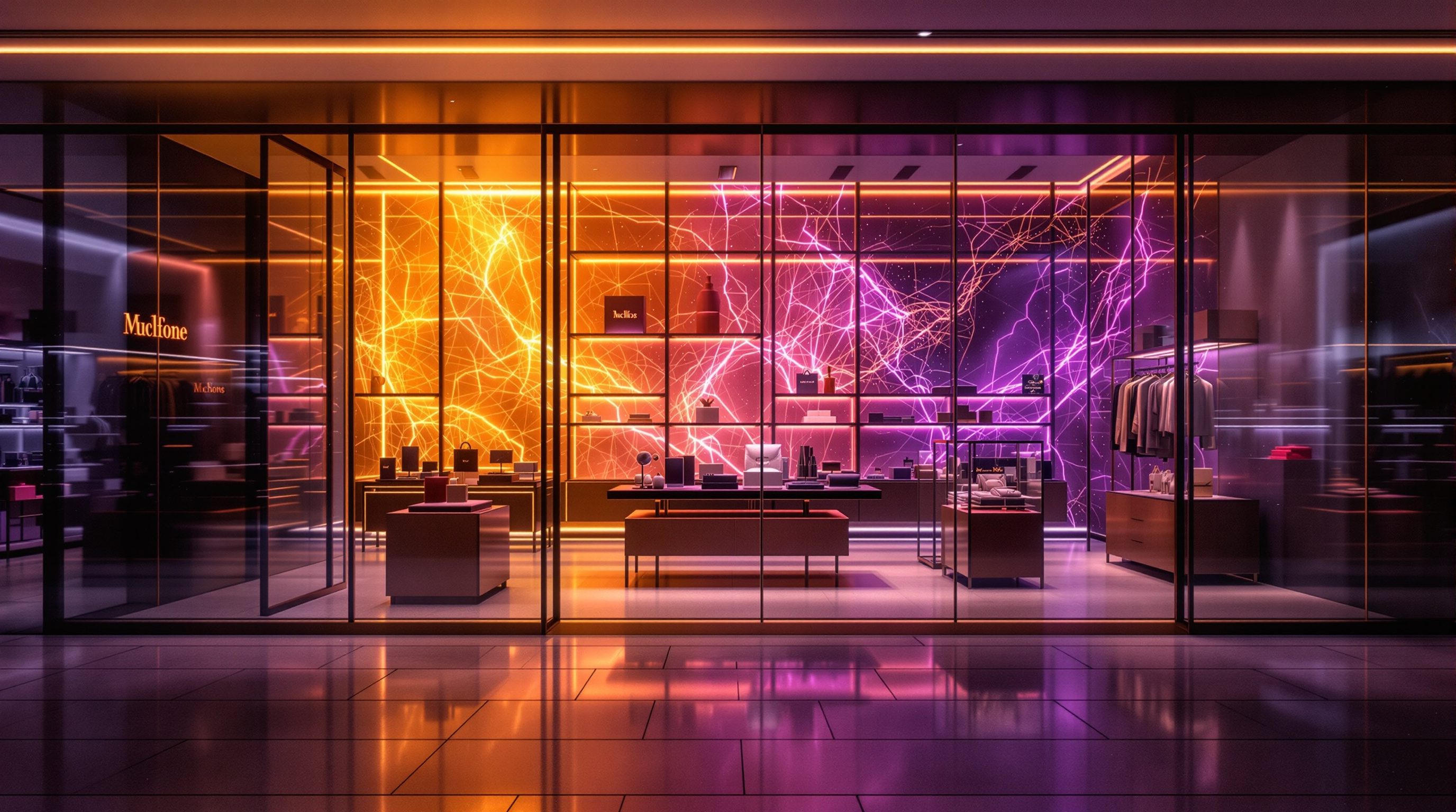
 Lesson 2.2
Lesson 2.2 · Store Planning & Layout
The Decompression Zone & Entrance Flow
The first few metres inside the door are the most important and most wasted space in the store - shoppers arrive in transition, noticing almost nothing, so the entrance must be kept open to let them land before the selling can begin
The most valuable few square metres in your store are the ones where you must sell nothing at all.
Watch people enter a shop and you will see the same small drama every time. They cross the threshold, and for a moment they are somewhere else entirely - adjusting from the pavement's noise and light to the store's, getting their bearings, slowing from a walking pace, taking the place in as a whole before any single thing. In that moment they barely register the merchandise at all. A beautifully dressed display, a key product, a promotional table placed right there in the doorway is, to a shopper still in transition, almost invisible - and worse, it can make the entrance feel cramped and pressured, which is exactly the feeling that turns a person back out onto the street.
Retail has a name for the stretch where this happens: the decompression zone - the transitional threshold just inside the entrance where shoppers are not yet really shopping. Understanding it is one of the great counter-intuitive lessons of store planning, because the instinct is to use this prime frontage to sell hard, and the truth is the opposite: you must keep it open, calm and low-pressure, and let the shopper land, because only once they have decompressed does the selling begin to land too. This lesson explains the zone and what it wants, the outsized power of the entrance, and the sightline from the door that, in the first glance, sets up the entire walk through the store.
Welcome, read, pull. Keep the threshold open - let them land. The sightline does the selling the zone must not.
Shoppers arrive in transition - so they notice almost nothing
The decompression zone rests on a simple truth about human attention: a person who has just walked in from the street is not yet a shopper. They are mid-transition - physically adjusting from outside light, temperature, noise and pace to the store's, and mentally shifting from street-mode to browse-mode. In those first steps their attention is taken up with the big picture (what kind of place is this, where do I go, is it busy, is it for me) and almost none is left for the particular - a specific product, a price, a carefully composed display. This is why the industry observes that merchandise placed in the immediate entrance is, in effect, largely unseen: the shopper walks past it while still landing. The exact depth of this zone is not a fixed number - it varies with the store's size, format, pace and entrance, and any figure is illustrative, to calibrate to the specific store - but the behaviour is reliable, and planning around it is one of the most useful moves in the whole module.
The practical consequence is blunt and counter-intuitive: do not put your hardest-working selling here. Key products, hero displays, important promotions and dense, detailed merchandising are largely wasted in the decompression zone because the shopper is not yet ready to receive them - and crowding them in also makes the entrance feel tight and pushy, which backfires. Instead, the zone's job is to let the shopper decompress: to slow, adjust, orient and commit to coming in properly. That means keeping it relatively open, uncluttered and welcoming - room to pause and take the store in, a clear sense of where the floor opens up, and an easy, unpressured invitation inward.
There is a humane point buried in this, true to the course's through-line. The decompression zone is not a trick; it is respect for how people actually arrive. A store that gives shoppers space to land feels generous and calm, and a calm shopper who feels welcomed stays, relaxes and buys. A store that assaults them at the door with clutter and hard-sell feels stressful, and stressed shoppers leave. Serving the shopper and selling more point the same way again: give them the room to decompress, and they will give you the rest of the store's attention.
First steps = still in transition, eyes on the big picture. Sell here and it is wasted. Keep it open - let them land.
The power of the entrance - welcome, read, decide
If the decompression zone is where you must not sell, the entrance as a whole is still one of the most powerful moments in the store - because in those first seconds the shopper forms the judgements that shape everything after. They decide, largely unconsciously, whether the store feels welcoming or forbidding, for them or not for them, worth exploring or not - and whether to walk in properly or drift back out. The entrance is where the brand delivers its physical first impression, where the shopper reads the price level and personality from the materials, light and spaciousness before a single tag, and where the store either earns the walk or loses it. That is enormous power, and the decompression principle is precisely how you wield it: by not squandering the moment on hard-sell clutter that makes the place feel cramped and pushy.
Several things make an entrance work. Openness matters most - a sense of room to enter and pause, sightlines that let the shopper see into the store and understand it, and an absence of physical or psychological barriers right at the door (a wall of fixtures, a staff member looming, a narrow pinch point all push people back out). Transition of light, sound and temperature matters - a comfortable, inviting shift from street to interior rather than a jarring one. And a clear, gentle invitation inward matters - the decompression zone should quietly point the shopper toward where the real store begins, usually via the main aisle and a visible draw deeper in (the subject of the next section).
This is also where accessibility and safety are non-negotiable, and where the design principle hands over to the specialist. The entrance must be genuinely barrier-free and its doors, levels, widths and any thresholds must meet the current accessibility standards; it is also part of the store's egress, so its dimensions and the way it works in an emergency are governed by the fire code and the life-safety consultant, not by a designer's sense of proportion. Design the entrance to welcome, read and invite - and defer every binding dimension of access and escape to the standards and the specialists.
The sightline from the door - one glance sets the walk
The single most strategic thing about the entrance is what the shopper sees the instant they step in, because that first glance sets up the entire walk. The sightline from the door - the primary line of view a shopper gets on entering - is a tool the designer actively composes. Give the shopper, at the end of that line, something worth walking toward - a strong focal point, a compelling display, the draw of the back wall, a clear and inviting main aisle leading deep into the store - and you have pulled them in and oriented them in a single moment, without a word. Leave that sightline blank, blocked or confusing and the shopper lands with nowhere obvious to go, hesitates, and is far more likely to make a token loop and leave.
Composing the sightline is a real design act. It usually means keeping fixtures near the entrance low so the eye can travel across and into the store rather than hitting a wall of tall gondolas; placing a deliberate focal point - a hero display, a feature, an arresting piece of the brand's world - in the eyeline where it will be seen once the shopper has decompressed just past the threshold; and using the back wall as a long-distance draw, since a visible, attractive back wall pulls the walk right through the store past everything in between (the adjacency logic of the next lesson). The sightline and the main aisle work together: the aisle gives the feet a route, the sightline gives the eye a reason to take it.
There is a neat reconciliation here of the two ideas in this lesson. You keep the immediate decompression zone open and unsold, *and* you use the sightline across and beyond it to place the store's first real draw at the point where the shopper, now landed, is ready to receive it. So the first few metres are calm and clear; the eye, travelling over them, lands on something that says 'this way, there's more, come and see'. Done well, the shopper crosses the threshold, decompresses, looks up, and is drawn naturally and willingly into the selling floor - guided, welcomed and already moving, all in the space of a glance.
Sightline = the free pull. Low fixtures up front, a focal point in the eyeline, the back wall as the long draw.
Designing the threshold - calm front, clear pull
Pulling the three ideas together gives a practical recipe for the threshold, though every value in it is a judgement to calibrate, not a rule to copy. Keep the decompression zone genuinely open - resist the commercial pressure to fill your most visible frontage with product, and give shoppers room to land. How deep that open zone runs depends on the store: a small boutique needs only a breath of space, a large-format store needs more, and a busy, fast-paced entrance needs more than a calm one. Watch real shoppers if you can - where they naturally start to slow, look around and engage tells you where the zone effectively ends.
Use the zone to welcome and orient, not to sell. This is the place for the brand's calm opening statement, for clear wayfinding into the store, for a baskets-and-trolleys point, for a greeting - the things that help a shopper commit to coming in. It is not the place for the hero product or the detailed promotion. A useful test: if a display in the entrance is doing subtle brand or orientation work it can belong; if it is trying to make a sale right there, it is probably wasted and in the way.
Compose the sightline to pull them in. Keep front fixtures low, put a genuine draw in the eyeline just beyond the zone, and make the back wall and main aisle visibly invite the walk deeper. Think of the entrance as a three-beat sequence - *welcome* (a calm, open landing), *read* (the shopper takes in what kind of store this is and whether it is for them), *pull* (the eye finds a draw and the feet follow the main aisle in) - and design each beat.
Finally, hold the commercial and the humane together, as ever. Surrendering prime frontage to an open zone feels like giving up selling space, and the space-productivity lesson (2.4) will return to that trade-off honestly - but it pays, because a shopper who is allowed to land, feels welcomed and is gently pulled in converts far better than one who is crowded and pushed. And keep the binding matters where they belong: the entrance's accessibility, its door and threshold detailing, and its role in escape are for the standards, the accessibility consultant and the fire specialist, not for a rule of thumb. Get the threshold right and the shopper is already, willingly, on their way in.
Accessibility at the entrance
Barrier-free access, door widths, thresholds, level changes
The entrance must be genuinely accessible; every binding dimension and detail from the current accessibility standards, local bye-laws and an accessibility consultant - not from a sense of proportion.
Entrance egress & fire safety (NBC 2016)
The entrance as part of the escape route, exit widths, doors
The entrance is part of how the store is evacuated; its dimensions and emergency behaviour are governed by the current fire code and the life-safety specialist. See the Fire & Life-Safety course.
Decompression-zone depth
How deep the open transitional zone should run
No fixed number - an illustrative, calibrate-to-the-store judgement that varies with size, format, pace and entrance. Observe real shoppers rather than copying a figure.
Brand entrance standards
The retailer's standard entrance, greeting and first-statement
Branded and rolled-out retail often prescribes the entrance experience - design the threshold within the brand's design standards. Module 7.
Workshop - read and redesign an entrance
Because you can feel the decompression zone in your own body, the best workshop is observational: study how a real store handles its threshold, then redesign it. You will watch shoppers land (or fail to), map the zone and the sightline, and propose a better entrance.
A store to observe, a notebook or tablet, and your own attention to how you feel crossing the threshold. No drawing software needed.
Goal: see the decompression zone at work and improve one entrance
Inputs: a store you can visit or recall vividly, this lesson, a notebook and a stopwatch or phone
Time: ~50 minutes (ideally part in-store)
- 1Stand just outside a store and walk in slowly, noticing your own transition: at what point do you stop adjusting and actually start shopping? Mark roughly where that is - the effective end of the decompression zone.
- 2If you can, watch five other shoppers enter: where do they slow, orient or hesitate, and does anyone retreat? Note what the entrance does well or badly at welcoming them.
- 3Sketch the entrance plan and shade the decompression zone; mark anything placed in it (product, promotion, clutter, barriers) and judge whether it is wasted or in the way.
- 4From the door, record your sightline: what does your eye land on first, is there a focal draw and a visible main aisle, or is the view blocked or blank?
- 5Redesign the threshold: show what you would clear from the zone, how you would keep it open and welcoming, and where you would place the first real draw and compose the sightline to pull shoppers in.
- 6Note which entrance dimensions - accessible access, door widths, egress - you would hand to the accessibility and fire specialists rather than deciding yourself.
You’ll walk away with
A before-and-after of one store entrance: an annotated plan of the existing decompression zone and sightline with your observations, and a redesign that keeps the zone open, welcomes and orients the shopper, and composes the sightline to pull them in - with access and egress flagged for the specialists.
Three altitudes on the same idea
Read the band that fits you — or all three.
The entrance and its decompression zone are shaped by architectural moves you make early and cannot easily undo. Where the door sits on the frontage, how wide and how many the entries are, the lobby or airlock and any level change, the depth of plan available before the selling floor can begin, the incoming light and the transition from street to interior - all of these set how well the store can welcome and let shoppers land. A door jammed into a corner, or a plan so shallow there is no room to decompress, fights the retail design before it starts. Give the retail plan a generous, legible entrance with room to land and a long sightline into the store, and defer every binding dimension of accessible access and emergency egress at the entrance to the current accessibility standards and the fire and life-safety specialist.
Making the threshold welcome, land and pull the shopper is your craft - and resisting the pressure to sell in it is part of the job. You decide how open the decompression zone reads, what (little) goes in it, how the light, materials and brand statement greet the shopper, and how the sightline and front fixtures are composed so the eye travels to a draw and the feet follow the main aisle. Hold the line against cramming product into the most visible frontage; keep it calm, orienting and on-brand, and place the store's first real selling draw just beyond the zone where the landed shopper is ready for it. Coordinate the entrance's accessibility and its behaviour in an emergency with the specialists, and work within the brand's entrance standards where one exists.
The decompression zone is the most satisfying retail idea to test for yourself, because you can feel it every time you walk into a shop. Notice the moment just inside the door when you are still adjusting - barely seeing the merchandise, taking in the whole place, deciding if it is for you. Notice which stores give you room to land and which crowd you and make you want to leave. Then look up and catch your sightline: what did your eye find across the store, and did it pull you in? Watch other shoppers slow, orient and commit (or retreat). Doing this trains the counter-intuitive instinct at the heart of good entrances - that the most valuable frontage is the space where you sell nothing and simply let the shopper arrive.
“The space right inside the front door is the most valuable selling space in the shop - everyone walks through it, so you should fill it with your best products, your biggest promotion and a knockout display to grab shoppers the moment they arrive.”
Do it yourself
No tools needed - reason it through from how people actually arrive.
- 1What is the decompression zone, and why do shoppers there notice individual merchandise so little?
- 2Explain the counter-intuitive rule that you should not place key products or big promotions in the entrance.
- 3Why is the entrance still one of the most powerful moments in the store, even though you sell little in it?
- 4What is the sightline from the door, and how does the designer use it to pull shoppers in?
- 5How do you reconcile keeping the decompression zone open with placing a strong draw near the front of the store?
The one line to carry out
Peer-reviewed journals & authoritative standards
- 01Retail design — Wikipedia - Retail design, 2026.
- 02Consumer behaviour — Wikipedia - Consumer behaviour, 2026.
- 03Storefront — Wikipedia - Storefront, 2026.
- 04Customer experience — Wikipedia - Customer experience, 2026.
Once the shopper is landed and pulled onto the selling floor, the question becomes what they meet and in what order. Next we group the merchandise into zones and plan the adjacencies - which categories sit beside which, and why the back wall is such a powerful draw.
The author
Amogh N P
Architect, interior designer, and creative polymath. Studio Matrx began in his notebooks — his vision of design made honest, useful, and open to everyone. Its Academy is written and taught in his memory, and free, forever.
More about Amogh →