
 Lesson 7.1
Lesson 7.1 · Brand, Identity & Experience
The Store as Brand
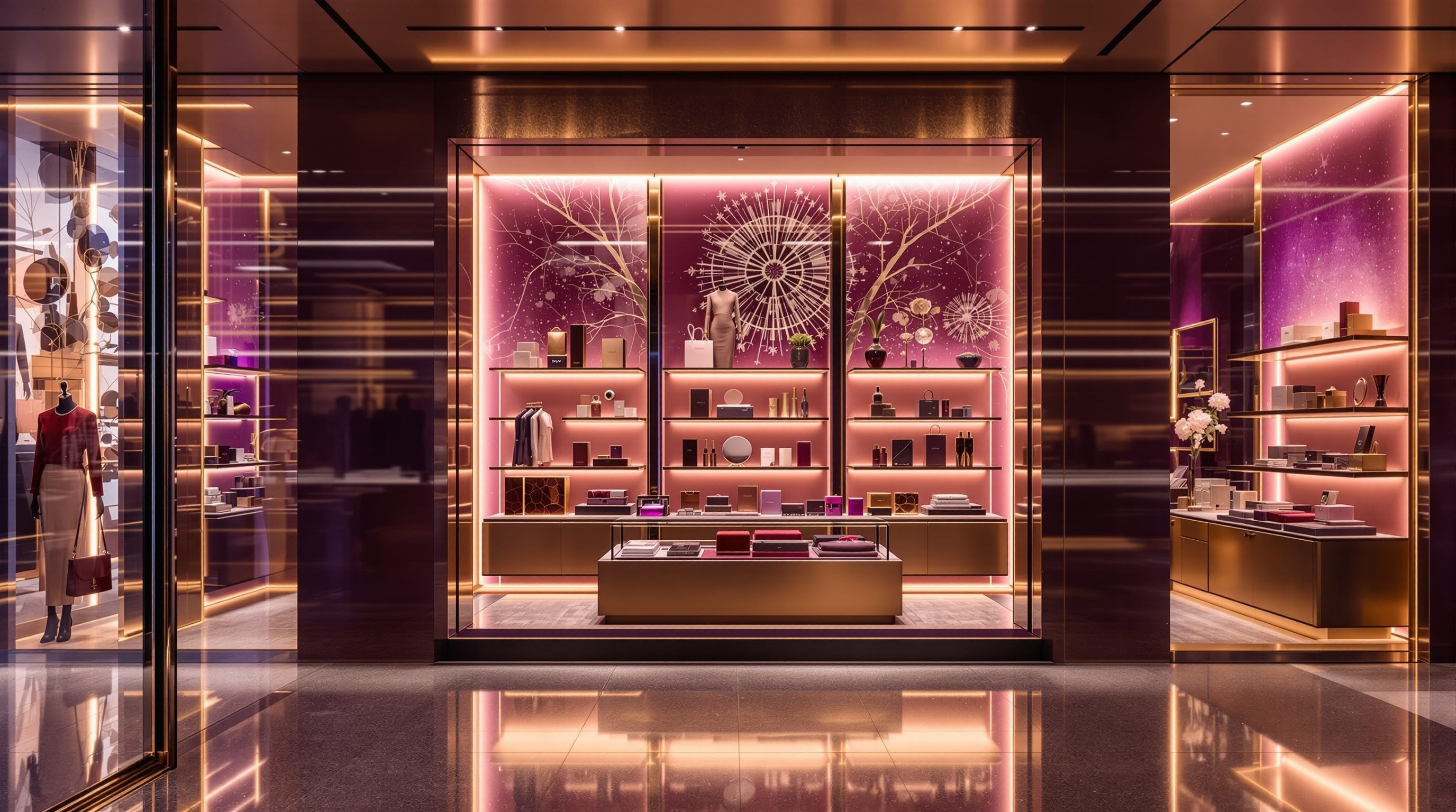
The store is the only place a customer can walk inside a brand - so it is the most powerful, immersive proof a brand has, built from every material, light and gesture in the room
You can see a brand a thousand times. You can only walk inside it in the store - and that is where people decide whether to believe it.
A brand lives most of its life as a flat thing: a logo on a screen, an ad between videos, a box on a doorstep. The customer sees it, maybe likes it, but keeps it at arm's length. The store is the one moment that collapses that distance. Here the brand is no longer a picture of a promise - it is a room you are standing in, a handle you are holding, a light falling on your skin, a person looking you in the eye. You read it with your whole body, and you read it faster and more honestly than any slogan can talk.
That is why the store is a brand's most powerful and most dangerous asset at once. Done well, a few minutes inside can build more belief than a year of advertising, because the shopper proves the promise to themselves. Done carelessly, the same few minutes quietly dismantle it - the luxury brand with the grubby fitting room, the "artisanal" shop full of laminate, the wellness label under harsh fluorescent glare. This lesson is about making the store tell the truth the brand wants to tell: translating values into material, light and behaviour, and keeping every touchpoint consistent and authentic so the brand made physical is one the shopper can believe.
Store = brand made physical. Translate the promise, keep every touchpoint honest, build only what you can keep.
The store is the brand made physical
Of all the places a customer meets a brand - an ad, a logo, a website, a parcel on the doorstep - the store is the only one they can walk into, touch, smell and spend time inside, and that makes it the most powerful, immersive expression a brand has. Everywhere else the brand is a picture or a promise; in the store it becomes a place, and the shopper reads it with their whole body. They feel the door handle, hear the floor under their shoes, see how the light falls on a product, watch how staff move and speak, breathe the scent of the room. In those few minutes the brand stops being something the company says about itself and becomes something the shopper experiences for themselves - which is why a great store can do more to build belief in a brand than a year of advertising, and a poor one can quietly undo it.
This is the central idea of the module: the store is the brand made physical, and every surface is either building the brand or leaking it away. A brand is, at heart, a promise about who you are, what you value and what the customer can expect. The store's job is to make that promise true in three dimensions - to prove it in material, light, layout, sound and behaviour, not merely assert it on a wall. When the physical experience matches the promise, the brand feels real and trust compounds; when it contradicts the promise, the shopper believes what they can see and feel over what the marketing claims, and the gap reads as phoniness.
For the designer this raises the stakes of every decision made in the earlier modules. The window (Module 3), the layout and decompression zone (Module 2), the fixtures and display (Module 4), the path and checkout (Module 5), the light, material and scent (Module 6) are not only selling levers - they are the brand speaking. The same shelf, lit two different ways, says "premium edit" or "clearance bin." The same greeting, delivered two ways, says "we are glad you came" or "please buy and leave." Retail design at this level is brand-making you can walk through, and the rest of this lesson is about doing that translation deliberately rather than by accident.
Every surface is either building the brand or leaking it away. There is no neutral surface.
Translating brand values into space, material and behaviour
A brand arrives at the designer as words - a set of values, a personality, a positioning, perhaps a tagline and a mood board. The craft of this module is translation: turning "honest craft" or "calm luxury" or "warm and local" into decisions a builder can quote and a shopper can feel. A value is not a slogan to be printed on the wall; it is a series of choices about material, finish, light, colour, layout, density, sound, scent and the way staff behave. "Honest craft" might translate into raw, visible timber with its joints shown rather than hidden, a workbench where products are repaired in view, handwritten tickets and exposed, well-made edges. "Calm luxury" might translate into a sparse edit with generous space around each piece, pools of soft warm light rather than flat brightness, quiet acoustics and unhurried staff. The value is the brief; the material and behaviour are the proof.
The honest way to do this is to start from the brand and let it drive the palette, not to pick finishes you like and rationalise them afterwards. A useful discipline is to write the two or three core values down and, for each, ask a blunt question: what would a shopper have to see, touch, hear and be treated like to believe this, before they read a single label? If the value is "affordable and cheerful," polished marble and hushed reverence would lie about it; bright open light, robust friendly fixtures, clear pricing and upbeat staff would tell the truth. If the value is "expert and serious," a circus of signage and loud music would undercut it. Each value should cash out into concrete moves, and moves that serve no value are usually decoration that dilutes the message.
Behaviour matters as much as material, and designers too often forget it. The brand is delivered partly by people, and the design shapes how they can behave: a service bar invites conversation where a fortress counter forbids it, a seating nook invites lingering advice where a narrow aisle hurries people along, good back-of-house lets staff restock without disrupting the room. Design the space so the desired behaviour is the easy, natural one, and brief the brand standard so staff know the part they play. The store sells and speaks through both its stuff and its people, and the designer composes both. Defer the binding specifics - accessibility dimensions, fire and signage rules - to the codes and the brand's own design standards, but own the translation of values into a felt, coherent whole.
Consistency and authenticity across the experience
Once the values are translated, the next discipline is consistency - making every touchpoint sing the same note. A shopper assembles their sense of a brand from dozens of small signals: the window, the entrance, the materials underfoot, the lighting, the fixtures, the signage, the music, the scent, the packaging at the till, and above all the staff. When these all point the same way, the brand feels whole and convincing; when one of them contradicts the rest, the shopper does not average them out - they believe the cheapest, most telling signal, the way a beautiful room with a dirty toilet is remembered for the toilet. A luxury boutique with a grubby fitting room, a wellness brand piping harsh fluorescent light, an "artisanal" cafe with mass-printed laminate menus: each is a crack that leaks the brand away. The designer's job is to audit every touchpoint against the promise and close the gaps.
Consistency is not uniformity, though. A brand expressed identically in every corner becomes monotonous, and consistency across a fleet of stores (the subject of lesson 7.4) is a different problem again. What you are after is coherence - many different elements, clearly members of the same family, varying in the ways the brand allows and holding steady in the ways it must. A good test is whether a shopper dropped blindfold into any part of the store, or handed just the bag, could tell whose it was. That recognisability, earned through a consistent material and behavioural language rather than a logo stamped everywhere, is what makes a brand feel designed rather than assembled.
The deeper requirement is authenticity. Shoppers, and especially younger Indian and global shoppers, are fluent readers of retail and quick to smell a fake. A store that borrows the signals of craft, sustainability or luxury without the substance - reclaimed-look timber that is printed vinyl, "handmade" goods that are obviously mass-produced, a sustainability wall above a wasteful operation - reads as costume, and the backlash is worse than never having claimed it. The design should express what the brand genuinely is and can stand behind, at its real price and positioning, rather than cosplaying a more expensive or more virtuous brand. Authentic modesty beats fraudulent grandeur. Expressed honestly and consistently, the physical store becomes the brand's most trusted proof - the place where the promise is kept in front of the customer's own eyes.
Could a shopper, handed only the bag, name the brand? If yes, the language is coherent.
Designing the brand you can actually keep
The final judgement in this lesson is commercial and ethical at once: express a brand you can actually keep, at the price and effort the business can sustain. It is easy to design a dazzling brand moment for a launch photo; it is hard to design a brand expression that still rings true on a wet Tuesday two years in, after the fittings have scuffed, the staff have turned over and the budget for fresh flowers has been cut. The store is the brand in its everyday, operated state, not its opening-night state, so the honest designer specifies finishes that age well rather than shabbily, displays that ordinary staff can actually maintain, and experiences that survive real footfall and a real operating budget. A brand promise the operation cannot keep is worse than a humbler promise kept, because the shopper meets the broken version daily.
This is also where brand expression meets the commercial scoreboard the whole course runs on. Brand-building space - a generous threshold, a storytelling wall, a craft demonstration, a lounge - is space not directly selling product, so it must earn its keep by deepening belief, dwell and loyalty, not by charming the designer. The way to defend it is to tie it to the brand and the shopper: this moment exists because it proves the promise, draws the right customer, makes them stay longer and return, and those are measurable over time. Brand and sales are not opposed here - a store that convincingly is what it claims to be converts better, commands its price and earns repeat visits - but the brand investment still has to be argued in commercial terms, especially to a client counting sales per square foot.
Crucially, expressing a brand powerfully does not require a flagship budget. A small D2C brand opening its first physical shop, a kirana modernising, a regional label in a mall concession can all express a clear, authentic brand on a modest budget through a tight, coherent palette, good light, honest materials, well-briefed staff and a consistent voice - often more convincingly than a lavish store that spends heavily but says nothing. The lesson to carry forward is that the store is the brand made physical; design it as a deliberate, honest, consistent and sustainable translation of what the brand truly is, and it becomes the most powerful thing the brand owns. Next we turn that brand-rich store into a reason to make the trip at all - experiential and destination retail.
Brand design standards
The brand's own rulebook for materials, colour, fixtures, signage, lighting and behaviour
For branded retail the design standard governs much of the expression - design within it and keep it authentic. Lessons 7.4, and Module 10 on rollout.
Signage & shopfront regulations
Facade signage size, illumination and heritage/precinct controls
The brand's largest physical statement is also regulated - defer dimensions and permissions to local bye-laws and an authority. Module 3.
Accessibility (barrier-free)
Inclusive access is itself a brand signal of respect
Express the brand for all shoppers; defer barrier-free dimensions to the current accessibility guidelines and a consultant. Module 5.
Workshop — translate a brand into a store
Brand expression is a craft of translation, and you learn it by doing it. In this workshop you will take a real brand, distil its values, and design the concrete moves that would prove each value in the physical store - then stress-test your store for consistency and authenticity.
A brand you know and a sketchbook. This is about learning to translate values into space; no software needed.
Goal: a one-page brand-to-space translation for a real brand
Inputs: a brand you know well (any category) + this lesson + a sketchbook
Time: ~60 minutes
- 1Distil the brand: write down its two or three core values and its positioning (who it is for, roughly what it costs) in plain words - not its slogan, but what it actually promises. If you are unsure, infer it from how the brand already behaves.
- 2Translate each value into concrete moves: for every value, list what a shopper would have to see, touch, hear and be treated like to believe it - the materials, finishes, light, colour, layout density, sound, scent and staff behaviour. Make the value cash out into buildable decisions.
- 3Sketch the key brand moment: draw one element of the store - the window, the entrance, the power wall or the service point - that would express these values most vividly, and label why each choice proves the promise.
- 4Audit for consistency: list the main touchpoints (window, materials, lighting, signage, packaging, scent, staff) and mark any that would contradict the others or the promise. Fix the cracks, because shoppers believe the cheapest signal.
- 5Authenticity and sustain check: ask whether the brand could honestly stand behind this expression at its real price, and whether it would still ring true on a wet Tuesday two years in after scuffs, staff turnover and a real budget. Revise anything that is costume or unsustainable.
You’ll walk away with
A one-page translation: the brand's values, the concrete spatial-material-behavioural moves that prove each, one sketched brand moment, and a short consistency-and-authenticity verdict. Keep it - it is the method you will use on every real retail brief.
Three altitudes on the same idea
Read the band that fits you — or all three.
The architect sets the vessel the brand will be poured into, and the brand should be in the brief from the first sketch. The shopfront and facade are the brand's first and largest physical statement; the volume, daylight, ceiling height and structure set whether a calm, lofty, premium feel or a dense, busy, value feel is even possible; the entry sequence and sightlines stage the first brand impression. Treat brand values as design drivers for the shell, not decoration added later, and coordinate early with the brand and interior designers so the bones support the story. For multi-store brands, the base-build must express the brand consistently across very different sites - the theme of lesson 7.4. Defer facade signage permissions, accessibility and fire specifics to the bye-laws, the brand's design standards and the specialists.
This is the heart of your craft: you translate brand values into the felt, material reality of the room. Every lever from Modules 2 to 6 - layout and density, fixtures and display, material and finish, light and colour, sound and scent - is also a brand signal, and you compose them into one coherent voice. Start from the written values, make each one cash out into concrete moves, audit every touchpoint for consistency and authenticity, and design for the everyday operated state, not the launch photo. Specify finishes that age gracefully and displays ordinary staff can maintain, so the brand the shopper meets on a wet Tuesday still rings true. Work within the brand's design standards and argue brand-building space in commercial terms.
Learn to read the brand in any store you enter - it trains the most valuable eye in retail. Walk in and, before reading a label, ask what the materials, light, density, sound and staff are telling you about who this brand is and what it costs, then check whether the labels and prices confirm it. Notice the cracks - the one touchpoint that contradicts the rest - because that is where brands leak. Practise the translation exercise yourself: take a brand you know, write its two or three values, and design the moves that would prove each one. You are not expected to run a brand standard yet; you are expected to see that a store is a brand made physical and that every surface either builds it or betrays it.
“Branding a store means putting the logo, brand colours and a nice tagline in the right places - get the signage and the palette on-brand and the store is branded.”
Do it yourself
No tools needed - reason it through.
- 1Explain why the store is called the most powerful, immersive expression of a brand, compared with an ad, a logo or a website.
- 2What does it mean to 'translate' a brand value into the store? Take one value and give three concrete spatial, material or behavioural moves that would prove it.
- 3Why do shoppers 'believe the cheapest signal' when one touchpoint contradicts the others, and what does that imply for the designer?
- 4Distinguish consistency from uniformity in a store's brand expression, and explain the 'handed only the bag, could you name the brand?' test.
- 5Why must a brand expression be one the business can actually keep, and how would you defend brand-building space to a client counting sales per square foot?
The one line to carry out
Peer-reviewed journals & authoritative standards
- 01Brand — Wikipedia — Brand, 2026.
- 02Sensory branding — Wikipedia — Sensory branding, 2026.
- 03Retail design — Wikipedia — Retail design, 2026.
- 04Customer experience — Wikipedia — Customer experience, 2026.
If the store is the brand made physical, the next question is why anyone should make the trip to experience it at all. Next: experiential and destination retail - giving people a reason to visit that a website cannot.
The author
Amogh N P
Architect, interior designer, and creative polymath. Studio Matrx began in his notebooks — his vision of design made honest, useful, and open to everyone. Its Academy is written and taught in his memory, and free, forever.
More about Amogh →