
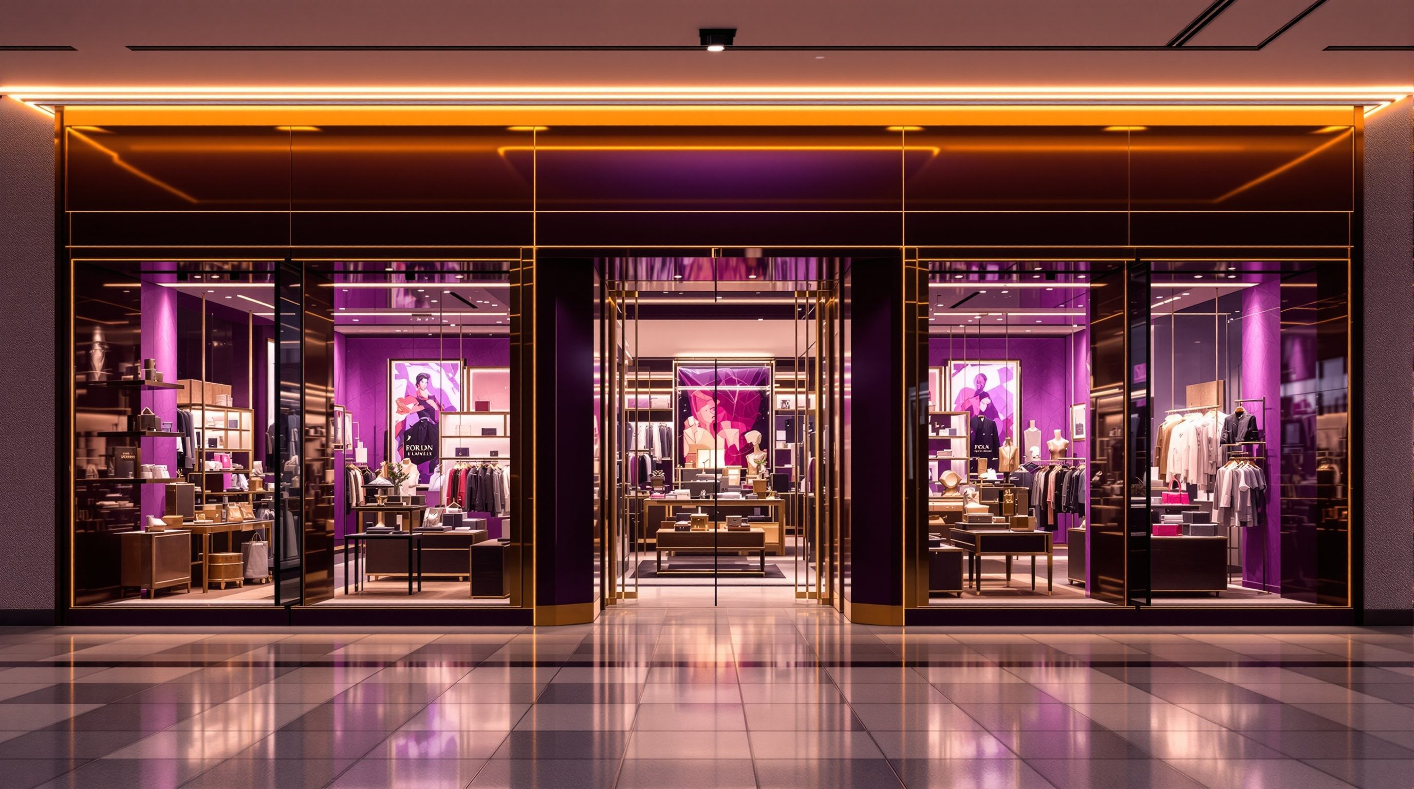
 Lesson 3.1
Lesson 3.1 · The Storefront & Entrance
The Shopfront & Facade
The shopfront is the store's face and its single biggest draw from the street - a billboard, a window and a door all at once - and how much it shows versus hides, and how loudly it speaks, decides whether a passer-by ever becomes a shopper
A passer-by gives your store about five seconds and one glance. The shopfront is what has to win them.
Before a shopper sees your layout, your lighting or a single product on a shelf, they see your shopfront - and they see it at walking or driving speed, out of the corner of one eye, while thinking about something else entirely. In those few seconds the frontage has to do an enormous amount of work: announce what you sell and who it is for, express the brand's price and personality, show enough of the inside to tempt, and say plainly "you are welcome to come in." Get it right and a stranger breaks stride, turns, and crosses your threshold. Get it wrong and they walk on, never knowing what they missed - and no amount of brilliant interior design ever gets the chance to work on them.
That is why the shopfront is the most commercially loaded surface in the whole store: it is the single biggest draw the building has, the point where footfall on the street converts into footfall inside, and the face the brand turns to the world. It is a billboard, a window and a door fused into one architectural move, and it must perform as all three at once. This lesson treats the shopfront as exactly that - the store's selling face - and works through the big decisions that shape it: how transparent or enclosed to be, what statement the brand should make, how the job changes between an open street and a shopping mall, and how to design for the brutally short five-second read that decides everything.
The shopfront is the face. Billboard + window + door. Win the glance or lose the shopper.
The single biggest draw the store has
Every store has one surface that matters more than any other for getting people in, and it is the shopfront. The interior can only sell to people who are already inside; the shopfront is what turns the river of passers-by outside into the trickle of shoppers within. That makes it the most commercially important elevation a retail designer ever draws - the place where the store's whole job of attraction either happens or fails. A beautifully designed interior behind a dull, closed or confusing frontage is a tragedy the business pays for every single day in lost footfall.
It helps to see the shopfront as doing three jobs simultaneously. It is a billboard - from a distance it must announce, in an instant, what this store is and who it is for, through its sign, its materials, its lighting and its whole visual pitch. It is a window - from closer up it must let the eye in, showing merchandise, display and a glimpse of the world inside that tempts the passer-by to want more. And it is a door - it must clearly, generously say "come in, you are welcome," rather than presenting a barrier. A shopfront that nails all three - instantly legible, genuinely tempting, obviously open - is a selling machine working at its very first and most important lever.
Think of the range you already know. The corner kirana opens almost entirely to the street, its goods spilling toward the footpath, no real threshold at all - maximum transparency and invitation, minimum ceremony. A luxury jeweller does the opposite: a narrow, controlled, richly finished frontage, a single perfect object in a pool of light behind thick glass, a discreet door - enclosure and exclusivity as the pitch. Both are right, because each frontage is tuned to its brand, its goods and its shopper. The designer's task is never to copy a look but to ask what this particular store must say, show and signal in five seconds from the street, and then to build a face that does it. The shopfront is the store's face, and the face is where the selling starts.
Billboard + window + door, all in one surface. The most commercial elevation you will ever draw.
Transparency versus enclosure
The biggest single decision in a shopfront is how much of the inside to reveal - the choice between transparency and enclosure - and it is a genuine trade-off, not a matter of more-glass-is-always-better. Transparency (large, clear glazing, an open or glazed door, a shallow see-in zone) pulls the street inside: it shows the merchandise, the activity, the other shoppers, and the life of the store, all of which are powerful draws. A busy, visible interior is itself an advertisement - people are drawn to where other people already are - and transparency lowers the psychological barrier to entry because a shopper can see what they are walking into before they commit. For most everyday retail, generous transparency is the friendliest and most selling-effective default.
But enclosure has real uses too, and good designers deploy it deliberately. A more closed, solid frontage with smaller, framed openings creates mystery, focus and a sense of occasion - you cannot see everything at once, so you must come in to discover. It signals exclusivity and control (the luxury boutique, the speakeasy-style concept), it protects the interior from glare, heat and street noise, and it gives the designer a curated frame through which to present a single hero story rather than the whole shop at once. The risk is obvious: too much enclosure reads as closed, intimidating or "not for me," and can kill footfall - a blank or shuttered-looking frontage is the enemy of a street.
Most real shopfronts are a calibrated mix: a large transparent display and see-in zone to tempt and reassure, balanced by solid elements - the stallriser at the base, the fascia above, returns and piers - that frame it, protect it and carry the brand. The right balance depends entirely on the brand and goods: a supermarket or fast-fashion store wants maximum openness and visible abundance; a fine jeweller or a couturier wants controlled enclosure and a single jewel of a view; a cafe-bookshop wants warmth and visible life glowing out onto an evening street. Decide transparency versus enclosure first, because it sets the whole character of the face - and remember that security shutters, glare, privacy and display-backing all pull against pure glass, so resolve them in the design rather than bolting them on later.
Glass invites and reassures; solid frames and intrigues. Most fronts are a tuned mix - decide it first.
The brand statement on the street
A shopfront is never neutral - it makes a brand statement whether the designer intends one or not, and a passer-by reads that statement faster than any words. Before anyone parses the sign, the materials, proportions, lighting and level of polish of the frontage have already told them the store's price level, personality and who it is for. Polished stone, bronze, deep shadow and a single spotlit object say "expensive, exclusive, considered." Bright, open glazing, bold colour, visible abundance and a big clear sign say "accessible, busy, good value, come on in." Warm timber, plants, soft light and a hand-lettered board say "independent, human, crafted." The frontage is the brand's handshake, and it is offered to thousands of people a day who never come in - so it is also the brand's most-seen advertisement.
This is why the shopfront must be designed with the brand, not decorated onto it afterwards. The materials and finishes should be the brand's materials; the colour should be the brand's colour; the typography of the fascia should be the brand's typography; the level of light and the density of what is shown should match the brand's positioning. A mismatch is jarring and costly: a premium brand behind a cheap, cluttered frontage loses credibility, while a value brand behind an intimidatingly austere frontage loses the very customers it needs. The face has to tell the truth about what is inside, pitched to the people the store is for.
The frontage also has to hold its own among its neighbours and over time. On a street or in a mall it competes in a row of other faces, so it must be distinctive enough to be noticed and recalled - a recognisable colour, a signature element, a consistent look a shopper learns across a chain of stores. And because retail frontages are refitted far more often than most architecture - brands evolve, leases turn over - the shopfront should be designed to refresh without a full rebuild where possible, and a chain's frontage is usually governed by a brand design standard that keeps every store recognisably the same. Wherever the frontage touches the public realm - its size, projection, materials, illumination and signage - there are also local regulations and bye-laws, and heritage or conservation controls in older streets, which this course always defers to the current rules and the relevant authority. Design the statement; verify the permissions.
Frontage in a street versus a mall, and the five-second read
Context changes the shopfront's job profoundly, and the two great contexts are the open street and the enclosed mall. On a street, the frontage competes with a row of neighbouring shops and with everything else pulling at a pedestrian or a driver - it is seen at speed, at an angle, in daylight and in weather, often from across a road. So the street shopfront leans on the elements that carry at a distance and a glance: a strong, legible fascia sign; a recognisable brand colour and form; a window that reads from several metres; good illumination for evening and overcast days; and, crucially, clear weather protection, security and a real door, because a street store must shut and secure itself every night. Curb appeal, visibility from both directions of approach, and standing out in the street wall are the game.
A mall frontage plays a different game. Shoppers arrive already inside, strolling a climate-controlled concourse at browsing pace, passing a dense run of stores one after another. Here the front typically opens wide - often with no door at all - to pull the stream of browsers straight off the concourse and into the store with zero friction; the threshold becomes a line on the floor rather than a barrier. The competition is the immediate neighbours and the pace of the walk, so the store must make its pitch in the few metres as a shopper passes the opening: an open, inviting front, a strong focal display visible from the concourse, and clear branding overhead. Malls also impose their own tenant design criteria - a rulebook governing frontage zones, projections, materials, signage and illumination - which the designer works within alongside the brand's own standards.
Both contexts share one unforgiving constant: the five-second read. A passer-by, on foot or in a car, gives the frontage only a glance, so everything essential must be graspable almost instantly - what the store is, that it is open and welcoming, and one tempting reason to come in. This is the discipline the whole shopfront serves: a clear hierarchy (sign, then window story, then detail), high legibility, one strong focal point rather than visual noise, and a genuinely open invitation. If a stranger cannot tell what you sell and that they are welcome within five seconds, the frontage has failed - however handsome it is. Design for the glance first, the lingering look second, and you turn the street into shoppers.
Street = compete, be legible at speed, secure at night. Mall = open wide, no door, catch the stream. Both win or lose in 5 seconds.
Shopfront & signage bye-laws / heritage controls
Frontage size, projection, materials, illumination, signage, conservation areas
Principles here; every binding permission and dimension from the local bye-laws, the planning/municipal authority and any heritage control. Defer - do not assume. Lesson 3.4.
Glazing safety & structural facade (NBC 2016 + specialists)
Safety glass, structural glazing spans, security shutters, wind/impact
Defer glazing-safety, structural and security-device specifics to the current code and the facade/structural specialist.
Mall tenant design criteria
Frontage zone, lease line, projections, open-front rules, sign band
In a mall the landlord's tenant design criteria govern the frontage - design within them alongside the brand standard.
Brand design standard
Fascia, materials, colour, typography, frontage kit-of-parts
For branded / rolled-out retail the brand standard governs much of the frontage - design within it. Illustrative benchmarks calibrate to brand, format and market.
Workshop — design a shopfront for the five-second read
The best way to learn the shopfront is to design one against the five-second test. In this workshop you will take a small store brief and compose a frontage that announces, tempts and invites, then pressure-test it from the street.
Paper and pen or any simple drawing tool, and a store type and brand to design for. No CAD needed - this is about the idea and the read, not the detail.
Goal: a shopfront elevation that wins the five-second glance
Inputs: a chosen store type + brand (real or invented), this lesson, paper or a simple drawing tool
Time: ~60 minutes
- 1Write the brief in one line: what the store sells, the brand's price level and personality, and whether the site is an open street or a mall unit. This decides everything that follows.
- 2Decide transparency versus enclosure on purpose: how much of the inside should the frontage reveal, and how much should it frame or withhold? Justify the choice against the brand and the goods.
- 3Sketch the shopfront elevation and label its parts - fascia / sign band, glazed display and see-in zone, bulkhead, stallriser, entrance. Place ONE clear focal point (a hero display, a strong sign) that reads from a distance.
- 4State the brand statement it makes: name the materials, colour, typography and lighting, and say in a sentence what a passer-by will read about price and personality before entering.
- 5Pressure-test the five-second read: imagine a stranger glancing once at walking speed. Can they tell what you sell, that you are open and welcome, and get one reason to enter? Note one change that would sharpen the glance, and one regulation you would need to verify (sign size, projection, glazing safety).
You’ll walk away with
A labelled shopfront elevation with a one-paragraph rationale: the brief, the transparency-versus-enclosure decision, the brand statement, and how the frontage wins the five-second read - plus the code/brand items you would verify before building.
Three altitudes on the same idea
Read the band that fits you — or all three.
The shopfront is where retail design is most architectural - it is facade, structure, enclosure and public-realm interface at once, and it is largely your remit. You set the frontage width and height, the structural frame and glazing spans, the entrance position, weather protection, security (shutters, glazing), servicing of the facade and how it meets the pavement or mall line. These bones decide how transparent, how open and how distinctive the store can be, and they are costly to change later, so resolve transparency-versus-enclosure, the fascia zone and the entrance early and with the brand. For chains you may be designing a frontage system to roll out across many sites and formats. Defer structural, fire/egress, glazing-safety, shopfront/signage bye-law and heritage specifics to the codes, the local authority and the relevant specialists, and coordinate closely with the interior and brand designers.
The shopfront is the first act of the interior - the window display, the see-in zone, the fascia finish and the threshold are your canvas, and they set up everything inside. You design what the passer-by sees through the glass (the display and the first few metres of store), the materials and lighting of the frontage, the brand statement it makes, and the calibration of transparency versus enclosure that suits the goods. Tune the frontage to read in five seconds and to match the brand's price and personality, light it for evening and overcast pull, and make sure the inside visible through the glass is worth the glance. Work within the brand's design standard and the mall or street constraints, and coordinate glazing, security, lighting and signage with the architect and specialists.
The shopfront is the easiest piece of retail design to study, because you pass hundreds every day - start reading them. Stand across the street from a shop and time yourself: in five seconds, can you tell what it sells, who it is for, and whether you are welcome? Notice how transparent or enclosed each front is and what that does to your urge to enter; notice how the materials, sign and light tell you the price level before you read a word; notice how different a street shop is from a mall unit with no door. Sketch a shopfront elevation and label its parts - fascia, glazing, bulkhead, stallriser, entrance. You are not expected to detail structural glazing or sign bye-laws yet; you are expected to understand the shopfront as the store's face and its biggest draw, and to design one that wins the five-second glance.
“The shopfront is really just where you put the sign and the company logo - pick a nice facade material, mount a good sign, add some glass, and the job is done.”
Do it yourself
No tools needed - reason it through.
- 1Explain why the shopfront is called the store's single biggest draw, and the three jobs it does at once.
- 2What is the trade-off between transparency and enclosure, and give one store type suited to each end of the scale.
- 3In what sense does a shopfront make a brand statement even before the sign is read? Name three things that carry it.
- 4How does the frontage's job differ between an open street and a mall, and why does a mall unit often have no door?
- 5What is the five-second read, and name three things a frontage must convey within it.
The one line to carry out
Peer-reviewed journals & authoritative standards
- 01Storefront — Wikipedia — Storefront, 2026.
- 02Facade — Wikipedia — Facade, 2026.
- 03Retail design — Wikipedia — Retail design, 2026.
- 04Shopping mall — Wikipedia — Shopping mall, 2026.
The frontage gets a stranger to slow down and look - but it is the window, framed within that frontage, that does the tempting. Next we turn to the art of the window display: how a well-dressed window stops people, tells a story and sells.
The author
Amogh N P
Architect, interior designer, and creative polymath. Studio Matrx began in his notebooks — his vision of design made honest, useful, and open to everyone. Its Academy is written and taught in his memory, and free, forever.
More about Amogh →