
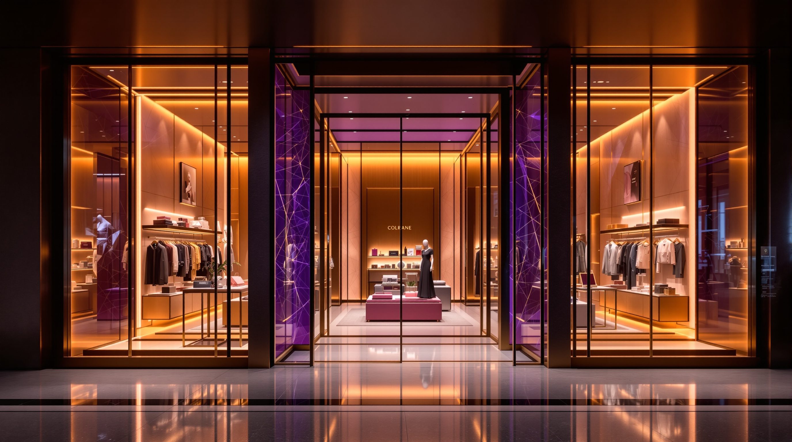
 Lesson 3.3
Lesson 3.3 · The Storefront & Entrance
The Entrance & Threshold
The entrance is the moment a looker becomes a shopper, and the threshold is the line they must be persuaded to cross - so the whole job of the entry is to lower every barrier and turn a clear, generous, barrier-free invitation to come in
The window's whole job is to bring a stranger to your door. The door's whole job is not to lose them there.
There is a precise, fragile moment in every sale that the designer can win or lose in an instant: the moment a person who has been looking decides whether to step inside. They are standing at the edge, half-persuaded, and in front of them is a line - the threshold - that separates the public street from your private, committing, obligation-tinged interior. Crossing it is a bigger psychological act than it looks. It says "I am going in, I might be approached, I might be expected to buy." A surprising number of people, brought right to the door by a great shopfront and window, turn away at exactly this line - and every one of them is a sale the store never gets the chance to make.
So the entrance has one overriding job: to make crossing that line as easy, as natural and as low-commitment as possible. Everything about a good entry is designed to lower the barrier - to say, without words, "come in, you are welcome, there is no obligation, this is for you." That means an entrance that is open and inviting rather than closed and forbidding; a threshold that signals welcome rather than exclusion or friction; a considered choice between a door and an open front; and an entry that is genuinely barrier-free, which is at once a warm welcome and a duty owed to every shopper. This lesson is about that decisive line and the art of drawing people across it - the hinge on which the shopfront's whole effort turns into footfall inside.
Threshold = a line with a felt cost. The entrance is an invitation. Lower the barrier; let everyone in.
The entrance is an invitation, and the barrier is real
The single most useful idea about a store entrance is that it is an invitation, and its quality is measured by how easy it makes saying yes. A person outside your store is weighing a small but real decision, and it carries a psychological cost the designer must respect. Stepping inside means leaving the anonymity of the street for a bounded, semi-private space where they may be greeted, watched or served, where they might feel obliged to buy, and from which leaving empty-handed can feel awkward. That felt cost is the barrier to entry, and much of entrance design is simply the art of lowering it.
This is why an open, generous, welcoming entrance sells and a closed, narrow or forbidding one does not - even when nothing behind it has changed. Anything that raises the felt cost of entering loses shoppers at the line: a heavy or hard-to-open door, a dark or dead-looking interior, a doorway so narrow it feels like a commitment to run a gauntlet, a hovering guard or salesperson visible right at the mouth, a step or a jumble to negotiate, or a threshold so grand and hushed it says "you probably cannot afford this." Each of these is a small "keep out" sign the designer did not mean to hang, and each quietly turns lookers away.
The opposite moves lower the barrier and pull people in. A wide, open, clearly-marked entrance says entering is easy and normal. A bright, active, visibly-welcoming interior glimpsed through and beyond the door reassures - people enter readily where they can see life and other shoppers, and hesitate at a dark unknown. Keeping the immediate entry uncluttered and low-pressure - no hard sell at the mouth, room to pause and adjust - tells the shopper there is no obligation. Even small human signals help: an open door propped back on a fine day, a genuinely warm greeting placed a little inside rather than pouncing at the line, clear "open" cues. The through-line of this course applies exactly here: good design lowers the barrier by serving the shopper's real hesitation, not by trapping or pressuring them - dark patterns like confusing exits or a doorway you can enter but not easily leave are bad, short-sighted practice. Make entering feel easy, welcome and free of obligation, and far more of the people the window caught will actually come in.
Entering has a felt cost. Every barrier at the line loses shoppers. Lower it - openly, without pressure.
The threshold and what it signals
The threshold is the actual line between outside and inside - the doorway, the change of floor, the plane the shopper physically crosses - and though it is only a strip of the plan, it carries an outsized amount of signalling. In that short passage the store tells the shopper what kind of place this is and whether they belong, and it does so faster than any sign. A grand, formal, richly finished threshold with a doorman and a hush signals exclusivity and expense - deliberately raising the barrier to filter for a certain customer, which is right for a luxury house and wrong for almost everyone else. A wide, bright, level, busy threshold that flows straight from the street signals accessibility, welcome and "everyone in" - right for mass and value retail. The threshold is a message, so design it to say what the brand actually wants to say to the people it wants.
The threshold is also a genuine transition, and handling that transition well matters. A shopper crossing it shifts from the pace, light, temperature and noise of the street to those of the store, and an abrupt or awkward transition is jarring while a graded one feels natural. This is the role of the decompression zone - the first area just inside the door (studied in depth in Module 2) where the arriving shopper decelerates, adjusts their eyes to the light, gets their bearings and mentally arrives before the store asks anything of them. A good entrance provides this breathing space: the threshold and the few metres past it are kept relatively open, uncluttered and low-pressure, so the shopper can cross the line and then ease in, rather than being hit by merchandise, a queue or a hard sell the instant they step through. Crowding the threshold with goods or staff is a classic error - it converts a welcome into a wall.
Practical signals at the threshold matter as much as symbolic ones. It should be obvious where the entrance is and that the store is open - clear cues, light spilling out, an unmistakable way in - because a shopper who has to hunt for the door, or who cannot tell whether the place is open, often simply gives up. The threshold should be level and unobstructed: a step, a lip, a slippery or awkward surface, or a heavy door is both a physical trip and a psychological one, and it excludes some shoppers entirely. And it should manage the real physical transition - weather, draught, dust, glare, the eye's adjustment from bright street to interior - so that crossing the line is comfortable as well as easy. The threshold is small in area and large in effect: design it as the considered hinge between street and store that it is.
Doors versus open fronts
A concrete decision sits at the heart of the entrance: is there a door, or is the front open? It is really a question of how much barrier the store needs versus how much flow it wants, and both ends of the spectrum are valid when chosen for the right reasons. The choice shapes footfall, comfort, security, cost and the whole feel of the entry, so it deserves a deliberate answer rather than a default.
A door is a controllable barrier, and sometimes control is exactly what the store needs. A door lets the store seal itself for climate control (essential for air-conditioning in a hot climate, and increasingly for energy efficiency), keep out dust, noise, weather and pests, secure the premises when closed, and, in a luxury or high-value context, create a deliberate moment of arrival and a degree of filtering. The cost is that every door is a barrier: it must be opened, it can feel like a commitment to cross, and a heavy, stiff, unclear or intimidating door measurably loses shoppers. So if there is a door, the craft is to make it as low-barrier as possible - fully glazed so the inside is visible, easy to open or automatic, generously wide, clearly marked as an entrance, and often propped or held open during trading hours precisely to neutralise its barrier while keeping its benefits when closed.
The open front removes the barrier almost entirely: with no door, or a fully retractable one, the store flows straight into the street or mall concourse, the threshold becomes a mere line on the floor, and shoppers drift in with no decision to make. This maximises footfall and gives the most open, generous, welcoming feel, which is why it is the default for mall units, many food and grocery stores, and market-style retail. Its costs are the flip side of the door's benefits - no climate seal (a serious issue for air-conditioning and dust in much of India, though a mall's controlled concourse solves it), harder security, and exposure to weather and noise. Hence the many hybrids: fully glazed doors held open while trading, air curtains that let a store feel open while limiting air and dust exchange, wide shutters or folding fronts that open the shop right up by day and secure it by night, and recessed or covered open fronts that shelter the threshold. The right answer follows the brand, the goods, the climate and the setting - reach for openness to maximise flow and welcome, reach for a door where climate, security or a controlled arrival demand it, and use hybrids to get much of both. And note that the entrance is also part of the store's fire escape and egress strategy - how people get out in an emergency - which is a binding matter this course always defers to the current code and a fire/life-safety specialist.
Door = control (climate, security, arrival) but a barrier. Open front = flow + welcome but no seal. Hybrids get both.
Drawing people across the line - and letting everyone in
Beyond removing barriers, a good entrance actively draws people across the line, and several design moves do this. Sightlines are powerful: if a shopper standing at the door can see an inviting focal point deeper inside - a compelling display, a pool of warm light, an interesting vista - their eye is pulled in and their feet tend to follow; a good entrance offers the eye somewhere tempting to go. The recessed entrance is a classic device: by pulling the doorway back from the street into a shallow bay, it draws the approaching shopper in under cover before they have consciously decided to enter, shelters them from weather, gives more glazed window to look at on the way, and creates a gentle funnel toward the door. Light draws people too - a store that glows warmly, especially against dusk, pulls people toward it the way a lit doorway pulls you across a dark evening. And visible life and activity inside are among the strongest draws of all, because people are drawn to where other people already are.
The entrance must also work for the flow it creates and receives. It should be scaled to the footfall it must carry without crowding or queuing at the mouth, and it should manage the meeting of people coming in and going out so the doorway does not jam - a congested entrance is both a poor welcome and, past a point, a safety issue. Where security or payment systems sit near the entry (anti-theft gates, a greeter, a basket point), they must be handled so they do not read as a checkpoint that raises the barrier - a lesson developed further in Modules 5 and 9.
Finally, and non-negotiably, a good entrance lets everyone in. A genuinely welcoming entry is barrier-free - usable by a person in a wheelchair, a parent with a pram, an older shopper, someone with a stick, someone carrying much - which in practice means a level or ramped, unobstructed, adequately wide entrance with a door that is easy or automatic to operate. This is at once a commercial good (excluding people excludes their custom, and accessible stores are easier for everyone), a matter of basic dignity and welcome, and, importantly, a legal duty: accessibility is governed by binding standards, and this course teaches the principle of barrier-free welcome while deferring every specific dimension, gradient and provision to the current accessibility guidelines, the National Building Code and an accessibility consultant. Draw people in with sightlines, light and life; carry the flow gracefully; and make sure the invitation is genuinely open to all - that is an entrance doing its whole job.
Pull with a sightline to a focal point, warm light, visible life. Barrier-free = welcome + duty (defer dims to code).
Accessibility / barrier-free access (guidelines + NBC 2016)
Level/ramped entry, clear widths, door operation, thresholds
Principles here; every dimension, gradient and provision from the current accessibility guidelines, the code and an accessibility consultant. Barrier-free is a duty, not an option.
Fire escape & egress (NBC 2016 + fire specialist)
Entrance as an exit, door swing, egress width, shutters
The entrance is part of the escape strategy - defer occupant load, exit and door-swing requirements to the current code and a fire/life-safety specialist. See the Fire & Life-Safety course. Module 9.
Climate seal & entry systems
Air-conditioning seal, air curtains, dust control, automatic doors
Illustrative in a hot, dusty climate - specify seal, air-curtain and door automation with the MEP/services specialist; calibrate to setting and format.
Brand & mall entrance standards
Entrance treatment, lease-line rules, open-front permissions
For branded / mall retail the brand standard and the landlord's tenant criteria govern the entrance treatment - design within them.
Workshop — design an entrance that lowers the barrier
The entrance is best learned by feeling the barrier and then designing it away. In this workshop you will study a real threshold, then design an entrance for a chosen store that makes crossing the line easy, welcoming and open to all.
Paper and pen, and a real store to observe. No software needed - this is about the invitation and the line, with binding dimensions deferred to the code.
Goal: an entrance designed as a low-barrier, barrier-free invitation
Inputs: a real store to observe + a store type and brand to design for, this lesson, paper
Time: ~60 minutes
- 1Observe first: stand outside a real store and note your own hesitation and what causes it - the door, the light inside, clutter at the mouth, how welcoming it feels. Watch a few others cross or turn away.
- 2For your chosen store and brand, decide door versus open front (or a hybrid) and justify it against flow, welcome, climate, security and setting.
- 3Design the threshold and decompression zone: keep it level and unobstructed, make the way in obvious, and leave an uncluttered, low-pressure breathing space just inside - no hard sell at the mouth.
- 4Add the pull: place a tempting focal point on the sightline from the door, and note where warm light and visible activity draw the eye inside.
- 5Make it barrier-free and check the duties: describe how a wheelchair user, a parent with a pram and an older shopper enter easily, and list the binding items you would verify with the code and specialists (accessibility dimensions, egress, climate seal).
You’ll walk away with
A sketch plan and section of an entrance with a short rationale: the door/open-front choice, how the threshold and decompression zone lower the barrier, the sightline that draws people in, and how the entry is barrier-free - plus the accessibility and egress items you would verify.
Three altitudes on the same idea
Read the band that fits you — or all three.
The entrance is architecture and life-safety at once, and its bones are largely yours to set. You fix the entrance position and width, whether it is a door or an open front, any recess or covered bay, the level threshold, the glazing and the way the store meets the pavement or mall lease line - and you carry the entrance's role in the fire-escape and egress strategy and in barrier-free access. These are hard to change later and are bound by code, so resolve door-versus-open-front, threshold levels and entrance widths early with the brand and interior designers and the fire and accessibility specialists. Design the entrance to lower the barrier while meeting climate, security and egress needs, and for chains make it a repeatable, compliant system. Defer all egress, fire-shutter, accessibility-dimension and public-realm specifics to the current codes, the authority and the relevant specialists.
The felt experience of arriving - the invitation, the threshold, the decompression zone and the pull inside - is your craft. You shape how open and welcoming the entry feels, what the threshold signals about the brand and its price, the uncluttered low-pressure breathing space just inside, and the sightlines, lighting and focal points that draw a hesitating shopper across the line. Keep the mouth of the store free of hard sell and clutter, glimpse warm light and visible life through the door, and design the entry to say welcome and no-obligation. Make it barrier-free in spirit and detail, coordinate with the accessibility and fire specialists on the binding requirements, and work within the brand's entrance standards and any mall criteria.
The threshold is a wonderful thing to study because you can feel the barrier yourself - notice your own hesitation. Next time you pause outside a shop, ask what is making you hesitate or making it easy: is the door heavy or open, the inside bright or dark, the mouth clear or cluttered, the place obviously welcoming or a bit forbidding? Watch other people at the line and see how many are drawn in or turn away. Compare a mall unit with no door to a shop with a heavy closed door, and a warm glowing entrance to a dim one. Then sketch an entrance that lowers the barrier - open, level, clearly the way in, with a tempting sightline to a focal point beyond. You are not detailing egress widths or ramp gradients yet - defer those to the code - but you should understand the entrance as an invitation, and barrier-free welcome as both good design and a duty.
“The entrance is mostly a technical detail - pick a good-looking door, make sure it locks and meets the exit rules, and the design work is basically done.”
Do it yourself
No tools needed - reason it through.
- 1Why is crossing the threshold a bigger psychological act than it looks, and what is the 'barrier to entry'?
- 2Name three things that raise the felt barrier at an entrance and three that lower it.
- 3What does the threshold signal, and why is the decompression zone important right at the entry?
- 4Compare a door and an open front - one benefit and one cost of each - and give a store type suited to each.
- 5Why is a barrier-free entrance both good commercial design and a duty, and where does this course say the binding dimensions come from?
The one line to carry out
Peer-reviewed journals & authoritative standards
- 01Accessibility — Wikipedia — Accessibility, 2026.
- 02Universal design — Wikipedia — Universal design, 2026.
- 03Storefront — Wikipedia — Storefront, 2026.
- 04Customer experience — Wikipedia — Customer experience, 2026.
An open, welcoming entrance gets the shopper across the line - but they still need to know, from the street and once inside, whose store this is and where to go. Next we turn to signage and the storefront brand: the fascia, legibility and wayfinding that name the store and guide the shopper.
The author
Amogh N P
Architect, interior designer, and creative polymath. Studio Matrx began in his notebooks — his vision of design made honest, useful, and open to everyone. Its Academy is written and taught in his memory, and free, forever.
More about Amogh →