
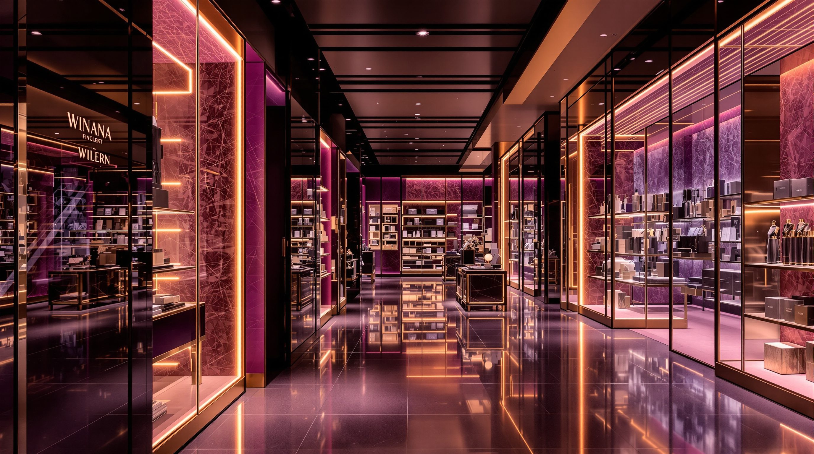
 Lesson 5.1
Lesson 5.1 · The Journey Through the Store
The Path & Sightlines
A store has an invisible hand that guides the shopper - laid into the layout, the aisles and the visual anchors - and the designer's job is to set that route so it exposes the whole store while feeling entirely like the shopper's own wandering
Nobody tells the shopper where to go. Yet almost everybody goes the same way - because the design told them, silently.
Watch people enter a well-designed store and you see a strange uniformity: most pause a beat at the door, drift slightly to the right, follow the open floor toward something bright at the back, and trace a broad loop around the edges before the middle. No sign said any of this. No arrow pointed the way. The route was written into the layout, the aisles and the things that catch the eye - an invisible hand that moves thousands of people along roughly the same path while each one feels they are simply wandering where they please.
That invisible hand is one of retail design's most powerful and most responsible tools. Get the path right and the store quietly exposes its whole range, carries shoppers past merchandise they did not come for, slows them where it matters and speeds them where it does not - and it does all this while feeling open, easy and free. Get it wrong and you get dead corners nobody reaches, a crush at the door, a range half the shoppers never see, and a nagging sense of being herded. This lesson is about designing that route: the path the feet take, the sightlines that pull the eye, the anchors that draw people deeper, and the rhythm of speed bumps and pauses that turns a walk-through into a shopping trip.
Eye first, feet follow. Loop the path, light the back wall, bump the stride, protect the pause. Guide, never trap.
The invisible hand: a path laid into the plan
Every store has a path whether the designer intended one or not. People do not move randomly through space; they follow openings, light, width and the pull of what they can see, and a good retail plan works with those tendencies to set a deliberate route. The classic device is the perimeter loop - a broad, obvious aisle that sweeps shoppers around the edge of the store past the high-value departments, with the middle filled by lower fixtures they dip into from the loop. Supermarkets run fresh produce, dairy and other draws around this perimeter for exactly this reason; fashion stores use a wide 'racetrack' that circles the floor. The loop feels like the natural way through, and that is the whole point: the designer has chosen the route, then made it the path of least resistance so the shopper takes it freely.
Two well-observed human tendencies shape how you lay this out. First, most shoppers entering a store drift to the right and travel anti-clockwise (in right-hand-traffic cultures), so the front-right is prime real estate and the loop is often set up to turn that way. Second, people avoid narrow, cramped or cluttered openings and gravitate to wide, clear, well-lit routes - so aisle width is not a neutral dimension but an instruction: a generous main aisle says 'come this way', a tight side aisle says 'only if you must'. You guide without a single sign by making the route you want the easiest and most inviting one.
The discipline is to design this route in plan before you place a single fixture: where do people enter, where do you want them to end up, what must they pass on the way, and where are the quiet corners you must actively pull them into? Then you shape the aisles, the fixture heights and the openings to carry them along it. Benchmarks for aisle widths exist - a comfortable main aisle, a two-trolley passing width in grocery - but treat them as figures to calibrate to the format and market, and defer the binding minimums for egress and accessible routes to the current code, the fire strategy and an accessibility consultant. The path must sell and it must let everyone move safely; both are non-negotiable.
Wide + bright + open = 'come this way'. Narrow + dim = 'skip this'. Width is an instruction.
Sightlines: the eye leads the feet
If the path is what the feet do, sightlines are what the eye does - and the eye leads the feet. A shopper moves toward what they can see and want; so the single most important question at the entrance is: standing at the door, what does the shopper's eye land on? The answer should not be a blank wall, a column or the backs of fixtures, but a composed view that reveals the store and throws the gaze deep into it - a bright, confident focal point on the back wall, a strong display at the end of the main aisle, a visual promise that there is something worth walking toward. This is why the back wall is such prized real estate and why it so often carries the season's hero product or a bold graphic: it is the magnet that pulls people the full depth of the store.
Good sightline design layers these anchors so the shopper is never without a next thing to move toward. From the door, the back wall; from halfway, a focal display off to one side; from there, another draw further on - a chain of visual anchors that keeps the eye, and so the feet, travelling. Fixture height is the key tool: by keeping fixtures low across the middle of the floor and reserving height for the perimeter and end-caps, you let the shopper see across the whole store from the entrance, understand it at a glance, and spot the anchors that will lead them. A store you cannot see into feels closed and confusing; a store whose depth and range are revealed in one sweep feels open, generous and easy to shop.
There is a commercial logic to every sightline. A clear view to the back exposes more merchandise and makes shoppers comfortable (people dislike not being able to see where they are going). Anchors at the ends of aisles - end-caps - are among the most productive spots in any store precisely because they sit in the sightline of passing shoppers. And revealing the store honestly, rather than hiding the exits or burying the range in a maze, is the served-not-manipulated line this course holds: design sightlines to help people find and enjoy the range, not to trap them. A store that shows itself clearly sells more and respects the shopper at the same time.
Speed bumps and pauses: the rhythm of the trip
A path that moved everyone smoothly and quickly from door to till would be a failure - shoppers would glide past the merchandise and buy only what they came for. The art is to give the route a rhythm: stretches where people move briskly, moments where they are slowed, and zones where they stop, dwell and decide. The device for the slow-down is the speed bump - a display, often a table or a low feature stack set in or just off the main path, that breaks the shopper's stride and makes them look. You see it the moment you enter many stores: a table of the newest or most tempting product placed right in the flow, deliberately interrupting the walk so the eye catches and the hand reaches. It works because a shopper in motion is hard to sell to; one who has paused is open.
Equally important is designing for the pause - the places where the trip should slow to a stop. Decisions take space and time: comparing two products, reading a label, holding a garment against yourself, discussing with a companion. If the aisle is too tight or the flow too relentless, the shopper cannot pause without blocking others, so they move on without buying. A good plan builds in room to stand and consider at the high-decision points - the pause zones - with enough width, a place to set a basket, perhaps a mirror or a seat. Dwell time is one of retail's quiet metrics because, within reason, a shopper who lingers buys more; the design earns that dwell by making it comfortable to stop.
The opposite failure is the bottleneck and the dead zone - the unintended pause where people jam up (a too-narrow pinch point, a badly placed fixture, a queue spilling into the aisle) and the unintended speed-through where people race past a whole area nobody stops at. Both lose sales. So the rhythm is designed on purpose: fast where value is low and you just need to move people along, slowed at the speed bumps, paused at the decision points, and never jammed. Remember the decompression zone at the very entrance is the one place you deliberately keep clear and slow-free - shoppers need a few steps to adjust from the street before they can be sold to, so no speed bump belongs in the first stride. Rhythm, not uniform flow, is what turns a walk into a shop.
A shopper in motion is hard to sell to. A shopper who has paused is open. Build the pauses.
Exposing the whole store - naturally, not by force
The ultimate job of the path is exposure: to carry shoppers past as much of the range as possible so the store has the chance to sell it, while keeping the experience feeling like free, pleasant wandering rather than a forced march. This is the tension at the heart of circulation design. Retailers want maximum exposure - it is why the milk is at the back, why the loop is long, why the path winds past tempting categories. Shoppers want ease, clarity and freedom - they resent being herded, trapped or confused. The great path resolves the tension by making the high-exposure route also the most natural and enjoyable one, so the shopper covers the store because it is the pleasant thing to do, not because they were cornered into it.
This is exactly where good retail design parts company with dark patterns. It is entirely legitimate to place destination goods deep so people pass other merchandise, to loop the path around the perimeter, to seed anchors that draw people on - these serve the shopper with a clear, rich, easy-to-shop store as much as they serve the retailer. It crosses the line when the design manipulates rather than guides: a deliberately confusing maze you cannot escape (the criticised end of some big-box layouts), hidden exits, forcing people through departments with no easy way past, removing sightlines so shoppers get lost. Those tactics irritate people, damage the brand and, increasingly, do not even work - shoppers resent them and shop elsewhere. The principle this course holds is simple: guide generously, never trap.
In practice, test a plan by walking it in your mind as three different shoppers. The mission shopper who wants one thing fast: can they get in, find it and get out without a fight, even though the layout gently exposes them to more on the way? The browser with time: does the path offer a rich, rewarding loop with anchors, speed bumps and pauses that reveal the whole range? The shopper with access needs or a pram: is the main route genuinely wide, level and navigable (verify against the accessibility standards and the code, with the specialist)? A path that serves all three - exposing the store to each without frustrating any - is a path that sells. Design the invisible hand to be generous, and hide your hand entirely.
Egress & travel distance (NBC 2016)
Exit access, aisle and corridor widths, travel distance, occupant load
The selling path and the life-safety path must be the same route. Every binding width, distance and exit count comes from the current code + a fire/life-safety specialist - never from a retail aisle benchmark. See the Fire & Life-Safety course.
Accessible routes & clear width
Barrier-free main circulation, level changes, turning space
The main path must be navigable by a wheelchair or pram. Defer dimensions, ramp gradients and turning circles to the current accessibility standards, local bye-laws + an accessibility consultant.
Aisle-width & dwell benchmarks
Main vs secondary aisle widths, passing widths, dwell targets
Illustrative starting points as of 2026 - calibrate to the format (grocery trolley vs boutique), brand and market. A benchmark is a place to begin, not a rule to copy.
Brand circulation standards
The chain's prescribed path, loop and fixture-height rules
For branded and rolled-out retail, the brand's design standards often fix the circulation logic and sightline rules - design within them and feed learnings back to the prototype.
Workshop - trace and redesign a store's path
The invisible hand becomes visible once you look for it. In this workshop you will trace the actual path and sightlines of a store you can visit or recall, judge how well they expose the range without herding, and redesign the weakest stretch.
Graph paper or a drawing app and a store you can observe. No measuring to code needed - this is about reading and shaping the route; defer binding aisle and egress widths to the standards.
Goal: read a real store's path and sightlines, then improve it
Inputs: a store you can visit or clearly recall + graph paper or a tablet + this lesson
Time: ~60 minutes
- 1Sketch the store in plan from memory or on a visit: the entrance, the main aisle/loop, the fixture blocks, the back wall and the till. Mark north/the street so you can see which way shoppers drift.
- 2Stand (really or mentally) at the door and record the SIGHTLINE: what does your eye land on first? Is there a back-wall focal point and a chain of anchors pulling you deep, or a blank wall, a column or fixture backs? Draw the sightline cone.
- 3Walk the store and draw the PATH you actually take - the loop, where you slowed, where you sped up, where you stopped. Mark every speed bump (a display set in your way) and every pause zone, plus any bottleneck or dead corner.
- 4Judge EXPOSURE vs FRICTION: roughly what share of the range did the path carry you past, and did any of it feel like herding, a maze or a trap? Note one stretch that under-exposes the store and one that frustrates the shopper.
- 5Redesign the weakest stretch: re-draw it with a better sightline or anchor, a repositioned speed bump, a widened pause zone or an unblocked route - and write two sentences on how your change raises exposure WITHOUT reducing the sense of free, easy wandering.
You’ll walk away with
An annotated before/after plan of one store: its real path and sightlines, the speed bumps, pauses and dead zones you found, and a redesigned stretch with a short note on how it lifts exposure while staying generous, not manipulative.
Three altitudes on the same idea
Read the band that fits you — or all three.
You set the bones the path runs on: the entrance position, the floor-plate depth and frontage, the column grid, the cores and the back-of-house edge - and these decide what circulation is even possible. A shallow, wide plate paths differently from a deep, narrow one; a badly placed column or core can block the sightline to the back wall or force an awkward pinch in the main aisle. Give the retail and interior designers a plate that allows a clear entrance sightline to a back-wall focal point, a generous main circulation route, and no structure stranding dead corners. For multi-store rollout, the path logic becomes part of the prototype kit. Coordinate the egress strategy and accessible routes with the fire and accessibility consultants early - the selling path and the life-safety path must be one and the same, and the binding widths and travel distances come from the code, not from a retail benchmark.
The path and sightlines are yours to compose, and they are among the most powerful moves you make. You choose the loop, set the aisle widths that say come-this-way or skip-this, keep fixtures low across the floor so the store reveals itself, place the back-wall focal point and the chain of anchors that lead the eye, seed the speed bumps that break the stride, and protect the pause zones where decisions happen. Work in plan first - draw the route you want before you place fixtures - then tune fixture heights and openings to carry it. Keep the decompression zone clear, never build a maze, and walk the plan as the mission shopper, the browser and the shopper with access needs. Calibrate every width and depth to the brand, format and market, and coordinate the binding egress and accessibility dimensions with the specialists.
This is the most trainable retail skill there is, because you can practise it in every shop you enter. Stop at the door of your next store and ask: where does my eye go, and where do my feet go next? Notice the drift to the right, the pull of the bright back wall, the table of product set right in your way, the wide main aisle versus the tight side ones. Sketch the loop you actually walked. Then ask which moves served you - showed you the range, made it easy - and which felt like herding. Learn to separate the legitimate invisible hand (guiding generously) from the dark pattern (trapping and confusing). You are not yet sizing egress widths or aisle minimums to code; you are learning to read and then design the silent route that carries a shopper through a store.
“A good store layout just needs clear, logical aisles and signage so customers can find everything easily - the straighter and simpler the better, like a well-organised warehouse.”
Do it yourself
No tools needed - reason it through.
- 1Explain the idea of the 'invisible hand' in a store layout, and name three design devices that guide the shopper's path without a single sign.
- 2Why is the back wall such valuable real estate, and how do fixture heights across the floor support the sightline to it?
- 3What is a 'speed bump' in retail layout, and why is a shopper in motion harder to sell to than one who has paused?
- 4Distinguish legitimate guidance of the shopper path from a manipulative 'dark pattern'. Give one example of each.
- 5Why must the selling path and the life-safety/accessible path be designed as one route, and whose job is it to fix the binding dimensions?
The one line to carry out
Peer-reviewed journals & authoritative standards
- 01Retail design — Wikipedia - Retail design, 2026.
- 02Circulation (architecture) — Wikipedia - Circulation (architecture), 2026.
- 03Space planning — Wikipedia - Space planning, 2026.
- 04Consumer behaviour — Wikipedia - Consumer behaviour, 2026.
- 05Wayfinding — Wikipedia - Wayfinding, 2026.
The path carries the shopper past the merchandise - but some goods are placed deep to pull them through and others sit in the path to be grabbed on impulse. Next we look at destination, impulse and adjacency: how what you sell is placed along the journey to build the basket.
The author
Amogh N P
Architect, interior designer, and creative polymath. Studio Matrx began in his notebooks — his vision of design made honest, useful, and open to everyone. Its Academy is written and taught in his memory, and free, forever.
More about Amogh →