
 Lesson 4.4
Lesson 4.4 · Merchandising & Display
The Power Wall & Focal Points
Not every surface in a store carries equal weight - the wall the shopper meets first and the focal points that pull the eye and feet deeper do the heaviest selling, and a store is composed as a deliberate hierarchy of emphasis
A store cannot shout everywhere at once. The art is choosing the few surfaces that will shout - starting with the one wall the shopper sees before anything else.
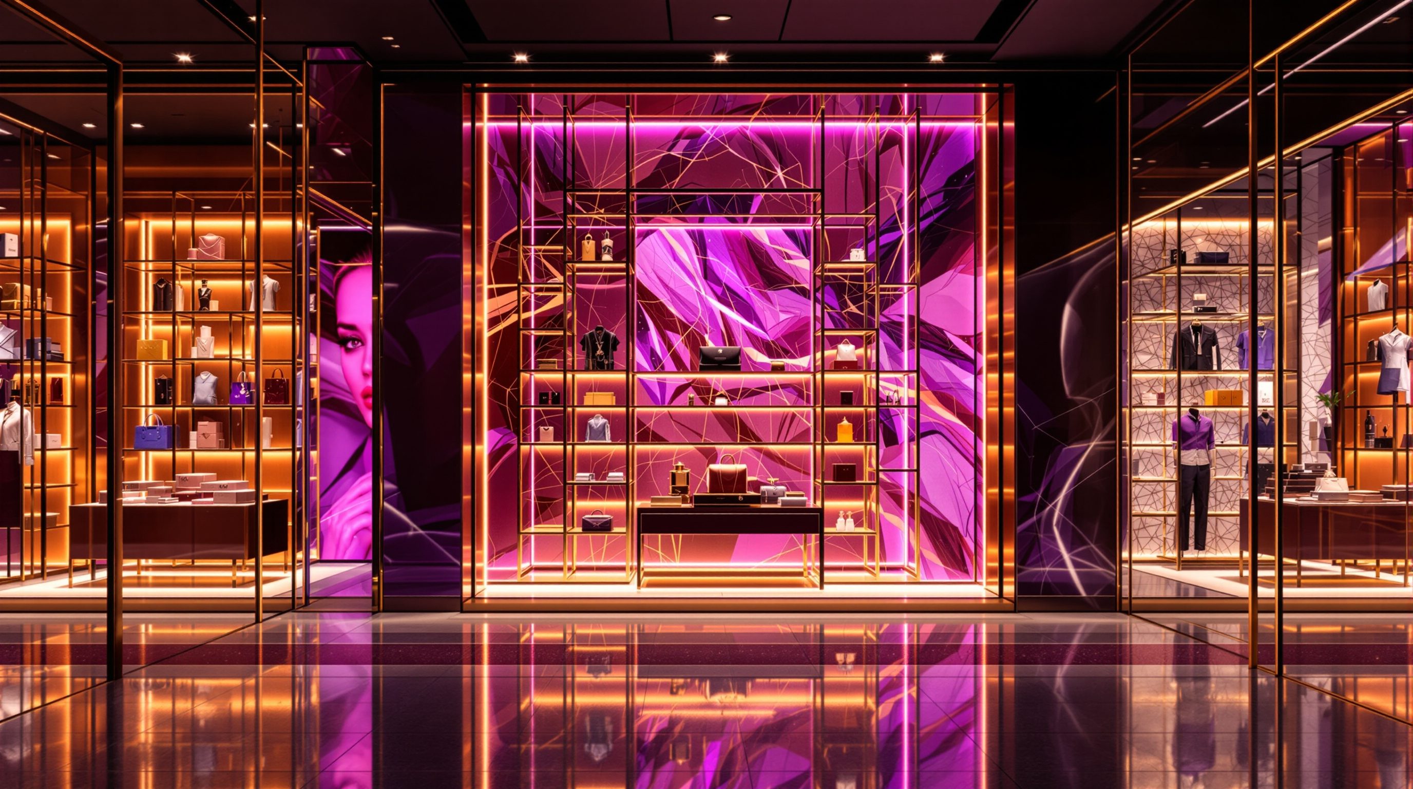
Every store has surfaces that sell hard and surfaces that merely hold stock, and the difference is not accident - it is where the shopper's eye lands and where their feet are drawn. The single most valuable surface is the one they meet first: because most shoppers, on entering, drift to the right, the wall to the right of the entrance is the power wall - the first big statement the store makes - and retailers give it their strongest, most desirable, most brand-defining merchandise. Squander it on dull stock and you waste the store's best selling moment; use it well and you set the tone and pull people in from the very first step.
Beyond that first wall, the store must keep the shopper moving, and it does so with focal points - feature displays, hero moments and visual magnets placed down the sightlines and at the ends of aisles, each one pulling the eye and then the feet to the next, drawing shoppers deep into the store rather than letting them stall near the door and leave. Composing these is a matter of hierarchy: a store cannot emphasise everything, because if everything is a feature then nothing is, so emphasis is rationed - a few heroes, a strong second tier, and a calm background - and spent at the hot spots where attention naturally gathers and converts into sales. This lesson is about that composition of emphasis: the power wall, the chain of focal points, the hierarchy that ranks them, and the hot spots where it all pays off.
Power wall = the handshake. Focal points = a chain of magnets. Ration emphasis; warm the cold corners.
The power wall - the store's first and best statement
Watch people enter a store and a pattern emerges: after the decompression zone at the threshold (Module 2), most shoppers drift to the right. It is a well-observed tendency - variously attributed to right-handedness and to driving-on-the-left or -right habits, and it does vary by culture and layout - but reliably enough that retailers plan around it. The consequence is that the wall to the right of the entrance is the first large surface the shopper's eye and body encounter, and so it becomes the power wall: the store's opening line, its first big statement, and one of its most valuable pieces of real estate. What goes there is seen by nearly everyone, early, when attention is freshest.
Because of that, the power wall earns the store's strongest merchandise and its clearest brand message. This is where a fashion store puts the season's hero looks, where a grocer might put fresh produce or a compelling offer, where an electronics store puts the launch product - the goods most likely to stop, impress and draw the shopper in, dressed with the most care, the best light and the boldest display. The power wall sets expectations for the whole visit: a strong one says 'there is good stuff here, come and see', builds the brand in the first seconds, and gives the shopper a reason to commit to the store rather than turning back out. A weak power wall - dull stock, poor light, no statement - wastes the single best selling moment the store gets.
The designer's job is to recognise and equip the power wall in the plan. Identify where shoppers will first look given the entrance and likely turn direction, make that wall visible and impactful from the door, give it the light, the fixtures and the flexibility to carry a changing hero story, and protect it from being cluttered with signage, back-of-house doors or dead corners. In practice the exact position depends on the specific layout, frontage and market - the right-turn tendency is a strong default, not a law, and a corner site, a central entrance or a different culture can shift it - so observe the real store and confirm where the first, best gaze actually falls. Then spend that surface deliberately. The power wall is the store's handshake; make it a confident one.
Most shoppers turn right - so the right-hand wall is the store's opening line. Give it your best.
Focal points - visual magnets that pull the eye and feet deeper
Getting a shopper through the door is only the start; the store must then draw them deep inside, because a shopper who lingers near the entrance and leaves has seen almost nothing and bought less. The tool for this is the focal point: a feature display, a hero grouping, a striking mannequin, a lit vitrine, a bold end-cap - anything visually arresting enough to act as a magnet for the eye and then the feet. Placed thoughtfully, focal points work as a chain: the first one, visible from the entrance, pulls the gaze in; as the shopper reaches it, a second focal point further on catches the eye and draws them on; and so, magnet by magnet, the store leads them through its full depth, past merchandise they would otherwise never have seen.
The classic placements follow the shopper's sightlines and path. A strong focal point on the back wall, visible straight down the store from the entrance, pulls people all the way through - which is why supermarkets famously put staples, or an appealing fresh department, at the back. The ends of aisles (end-caps) are prime focal positions, seen by everyone circulating the perimeter, and among the highest-selling spots in the store. Junctions and decision points, where a shopper pauses to choose a direction, are natural places for a feature that both rewards the pause and points the way. Each focal point should be composed with the display principles of the last two lessons - edited, pyramidal, well-lit, telling a story - because it has to earn the eye against everything around it.
Crucially, focal points must serve, not trap. Good practice uses them to help shoppers discover things they will be glad to find, to make the store enjoyable to move through, and to expose the range fairly; it draws people deeper by reward, not by hiding the exit or forcing a maze (a dark pattern, and poor practice this course rejects). A well-composed chain of focal points feels like an invitation - 'oh, what's that? and that?' - a store that reveals itself pleasurably. The designer plans this chain in the layout: establishing the key sightlines, reserving the focal positions (back wall, aisle ends, junctions), giving each the light and flexibility to carry a changing feature, and sequencing them so the eye is always being offered somewhere good to go next. Compose the magnets well and the shopper walks the whole store because they want to.
The hierarchy of emphasis - because if everything shouts, nothing is heard
The power wall and the focal points only work because the rest of the store is quieter than they are - and that points to the deepest principle in composing a store's merchandising: the hierarchy of emphasis. A store cannot emphasise everything at once. If every wall is dramatic, every fixture piled and lit and shouting, every surface a 'feature', then the shopper's eye has nothing to grab and nothing to rest on; the drama cancels out into noise, and paradoxically nothing stands out at all. Emphasis only exists by contrast, so it must be rationed - spent on a few things and deliberately withheld from the rest.
In practice this means composing the store in tiers. At the top sit a small number of hero focal points - the power wall, the main feature displays, the window - which get the most drama, the best light, the most space and the boldest display. Below them sits a strong second tier of feature displays, end-caps and styled tables that carry emphasis but do not compete with the heroes. And forming the majority is a calm, legible background of working fixtures - grouped, ordered, well-stocked, easy to shop, but deliberately restrained so it does not fight the features. This calm background is not a failure of ambition; it is what makes the heroes possible, the visual equivalent of the quiet that lets a melody be heard. A store where the background knows its place is a store where the eye is guided; a store where everything competes is exhausting and sells less.
This hierarchy is a conscious design act, not something that emerges on its own - left alone, commercial pressure pushes every surface toward 'more', and the hierarchy flattens into uniform loudness. So the designer must decide the ranking: what are the two or three things this store most wants to say and sell, which surfaces will carry them, which will support, and which will stay quiet - and then hold that discipline against the constant temptation to promote everything. It is the same 'edit, do not pile' discipline from the display lesson, now applied at the scale of the whole store. Rank ruthlessly, spend emphasis where it counts, protect the calm that makes it read, and the store composes into something a shopper can effortlessly navigate and enjoy - led from statement to statement instead of drowned in an undifferentiated shout.
Hot spots and cold spots - spending emphasis where it converts
Emphasis is precious, so it should be spent where it will do the most good - and stores have predictable geographies of attention. Hot spots are the naturally high-traffic, high-visibility positions: the power wall and the area just inside the entrance (past the decompression zone), the ends of aisles, the main path and the natural sightlines, the junctions where shoppers pause, and the run up to and around the till where everyone must go. These are the places where attention is abundant and most readily converts into sales, so they earn the strongest merchandise, the feature displays, the focal points and the impulse goods (the subject of Module 5). Putting a hero on the power wall or a high-margin impulse buy at the till is spending emphasis where the shopper is already looking.
Cold spots are the opposite: the low-traffic, low-visibility places shoppers tend to miss - back corners away from any focal draw, the left side near the entrance if shoppers turn right, dead ends, and the awkward zones behind columns or beside back-of-house doors. Left untreated, cold spots hold stock that barely sells. The designer's job is twofold: first, minimise cold spots through good layout and sightlines so as little of the store as possible is dead; and second, treat the unavoidable ones deliberately - by placing a strong focal point there to pull traffic in and warm the spot up, by siting destination products (things people will seek out and walk to, like the pharmacy counter or a specific brand) that create their own traffic, or by accepting them for stock that does not need footfall. Turning a cold corner warm with a well-placed magnet is one of the satisfying craft moves of store planning.
Underpinning all of this is the reminder that runs through the whole course: these are principles and observed tendencies, calibrated to the real store, not universal laws. The right-turn habit, the hot- and cold-spot map, the value of end-caps - all vary by culture, format, layout and market, and the honest way to use them is to observe how shoppers actually move in the specific store and confirm where attention truly falls before spending your emphasis. Benchmarks like end-cap uplift or the proportion of sales from hot spots are figures to calibrate, as of 2026, to the brand and market. And the ethical line holds: use hot spots to serve shoppers with things they will value, warm cold spots by reward and discovery, and never by trapping or hiding. Spend emphasis where attention lives, warm what is cold, and the whole store earns its keep - which is exactly where Module 5 picks up, following the shopper's path from this composed store to the fitting room and the till.
Hot spots (power wall, aisle ends, till run) get the heroes; warm cold corners with a magnet. Calibrate, don't copy.
Shopper-flow tendencies & hot-spot maps
Right-turn habit, end-cap value, hot/cold spots
Observed tendencies, not laws - they vary by culture, format and layout. Calibrate to the real store and market, as of 2026; confirm by observation. Modules 2, 5.
Egress, sightlines & clear widths (NBC 2016)
Focal points and power walls must not block exits or access
Feature displays and drawn paths must keep egress and accessible routes clear. Defer binding dimensions to the code and specialists. Module 2.
Brand standards & honest layout
Power-wall use, focal schemes, no dark-pattern mazes
Apply within the brand's design and VM standards, and draw shoppers deep by reward and discovery, never by trapping or hiding exits. Modules 7, 10.
Workshop - map a store's power wall, focal points and hot spots
The composition of emphasis is best learned by mapping it in a real store. In this workshop you will diagram a shop you can recall or visit as a hierarchy of emphasis - finding its power wall, tracing its focal chain, and marking its hot and cold spots.
A store you can observe and paper to sketch a rough plan. No measuring or software needed - this is about reading the composition of emphasis.
Goal: read a real store as a deliberate composition of emphasis
Inputs: a store you can recall or visit + this lesson + paper
Time: ~50 minutes
- 1Sketch a rough PLAN of the store with the entrance marked. Note which way you (and other shoppers) turned on entering, and identify the POWER WALL - the first big wall you saw. Record what the store chose to put there and whether it was strong or wasted.
- 2Trace the FOCAL CHAIN: mark every feature display, hero moment or magnet that caught your eye, in the order it pulled you, and draw the path they led you along. Did a chain draw you deep, or did you stall near the door? Note any strong back-wall or aisle-end focal points.
- 3Rank the HIERARCHY: label the store's surfaces as hero, second-tier feature, or calm background. Is there a clear order of emphasis, or does everything shout? Judge whether the background is calm enough to let the heroes read.
- 4Map HOT and COLD spots: mark the high-attention positions (power wall, aisle ends, till run) and the dead zones (missed corners, the side away from the turn). Note whether the store warmed its cold spots with a magnet or destination, or left them dead.
- 5Write a one-paragraph verdict: how well the store composes its emphasis, where it wastes its best surfaces or lets areas go cold, and the single change to the power wall, focal chain, hierarchy or hot-spot use that would most improve how it pulls and sells.
You’ll walk away with
A one-page emphasis map of a real store: its power wall and what it holds, the focal chain and path, the hierarchy of emphasis, the hot and cold spots, and a one-line verdict with the highest-impact change.
Three altitudes on the same idea
Read the band that fits you — or all three.
The power wall, the focal chain and the hot-spot map are set, or wasted, by the plan you draw. Where you place the entrance and how the frontage reads decide which wall becomes the power wall and where the shopper first looks; the sightlines you open from the door determine whether a back-wall focal point can pull people through; the aisle layout fixes where the end-caps and junctions - the hot spots - fall; and the position of back-of-house doors, columns and services either protects the key selling surfaces or creates cold spots. Plan the store so its best surfaces are visible and impactful and its dead zones are minimised, and give the power wall and focal positions the light and flexibility to carry changing features. For a rollout, embed this emphasis geography in the prototype, and defer egress and clear-width rules around it to the code.
Composing the store's emphasis - the power wall, the focal points, the hierarchy - is core to your craft. Identify and dress the power wall as the store's strongest first statement; design a chain of focal points down the sightlines and at aisle ends that pull the shopper deep; and above all compose a clear hierarchy of emphasis - a few heroes with the most drama and light, a strong second tier, and a calm, legible background that lets them shine. Spend emphasis at the hot spots where attention converts, and warm cold spots with well-placed magnets and destination products. Give the power wall and focal points flexible lighting and fixtures so they can carry changing VM, hold the discipline against promoting everything, keep it serving not trapping, and calibrate every tendency to the real store.
This lesson gives you three things to spot in every store you enter. First, find the power wall: which way did you turn on entering, and what did the store put on the first big wall you saw - its best, or its dullest? Second, trace the focal points: what caught your eye from the door, what pulled you deeper, and did a chain of magnets lead you through the whole store or did you stall near the entrance? Third, read the hierarchy: is there a clear order of emphasis - heroes, features, calm background - or does everything shout at once? Then map the hot and cold spots and notice how the store warmed (or wasted) its dead corners. You are learning that a store is a composition of emphasis, and that the skill is choosing what shouts.
“To maximise sales you should make every part of the store as eye-catching and heavily merchandised as possible - more features, more displays, more emphasis everywhere means more selling.”
Do it yourself
No tools needed - reason it through.
- 1What is the power wall, why is it usually to the right of the entrance, and what kind of merchandise belongs on it?
- 2Explain how a chain of focal points draws shoppers deep into a store, and name three classic focal-point placements.
- 3Why can't a store emphasise everything, and what are the three tiers of the hierarchy of emphasis?
- 4Define hot spots and cold spots, and give one way to 'warm' a cold spot rather than leaving it dead.
- 5How should the right-turn tendency and hot-spot maps be treated - as laws or as something else - and why?
The one line to carry out
Peer-reviewed journals & authoritative standards
- 01Visual merchandising — Wikipedia - Visual merchandising, 2026.
- 02Retail design — Wikipedia - Retail design, 2026.
- 03Consumer behaviour — Wikipedia - Consumer behaviour, 2026.
- 04Shopping — Wikipedia - Shopping, 2026.
- 05Retail floor space — Wikipedia - Retail floor space, 2026.
With the store composed as a field of emphasis, the final question is how the shopper actually travels through it. Module 5 follows the journey - the path and sightlines, impulse and adjacency, the fitting room and the checkout.
The author
Amogh N P
Architect, interior designer, and creative polymath. Studio Matrx began in his notebooks — his vision of design made honest, useful, and open to everyone. Its Academy is written and taught in his memory, and free, forever.
More about Amogh →