
 Lesson 4.2
Lesson 4.2 · Merchandising & Display
Principles of Display
There is a craft to arranging goods so they sell - grouping, repetition, colour, the pyramid and the rule of odds - and at its heart sits the hardest discipline of all, which is to edit rather than pile
Put the same products on the same shelf in two different arrangements and one will outsell the other, often by a wide margin. The difference is display - and it follows rules.
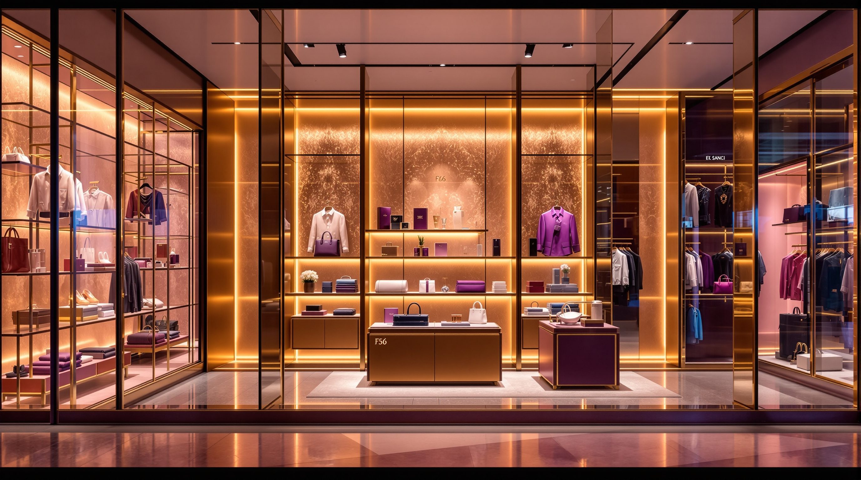
Most people imagine display is an eye - a gift some have for making things look good. There is a gift, but underneath it sits a teachable craft with surprisingly firm principles, the same moves a window dresser, a greengrocer stacking oranges and a luxury visual merchandiser all reach for. Arrange goods into a triangle and the eye travels up to a peak and settles; repeat one item a dozen times and it gains a confident punch a single piece never has; block things by colour and a jumble becomes a legible field; use three of something rather than four and it feels alive rather than static. None of this is decoration for its own sake - each move is a way of helping the shopper see, understand and want the goods.
And behind all the positive moves sits one hard, counter-intuitive discipline that separates a display that sells from a shelf that merely holds stock: edit, do not pile. The instinct under commercial pressure is always to show more - more choice, more stock, more filled space. But a display that says too much says nothing; the eye cannot settle, nothing looks special, and the good products drown. The best display shows less, shown beautifully, and sells more for it. This lesson lays out the toolkit - grouping, repetition, colour, the pyramid and triangulation, the rule of odds, showing products in use - and the editing discipline that makes them work, so you can arrange any goods, anywhere, to sell.
Group, repeat, colour-block; pyramid + triangulate; odds; show in use. Then edit, edit, edit.
Grouping, repetition and colour - making the offer legible
Display begins not with beauty but with legibility: the shopper must be able to grasp, in a glance, what is on offer and find their way to what they want. The first three moves all serve that. Grouping gathers like with like - all the blue shirts together, all the ceramics on one table, the whole coffee range in one run - so the store reads as an ordered set of clear offers rather than a jumble. A grouped display lets a shopper who wants a frying pan go straight to cookware, compare the options side by side, and decide; an ungrouped one forces a frustrating hunt and loses the sale. Grouping is the grammar of a shoppable store, and it is why zoning (Module 2) and display are really the same instinct at different scales.
Repetition takes a single item or a tight family and shows it many times over - a stack of identical folded tees, a wall of the same mug in a grid, a rail of one dress in every size. Repetition does two things at once: it creates visual impact (a mass of one thing is arresting in a way a single piece is not), and it signals confidence and abundance - 'we believe in this, and there is plenty.' It is the greengrocer's pyramid of oranges and the Apple table of identical laptops alike. Used on a hero product it says 'this is the one'; used across a wall it builds a bold, graphic field out of ordinary stock.
Colour blocking organises merchandise by hue into clean fields rather than scattering colours at random. A rail graded from light to dark, a wall arranged in bands of colour, a table where each pile is its own tone - colour blocking turns visual noise into order, makes the display read as composed and deliberate, and helps shoppers who are shopping by colour (which, for clothing and homeware, is most of them) find their way instantly. It also creates drama: a single bold block of red in an otherwise muted store pulls the eye across the room. These three moves - group, repeat, block - are the foundation. They do not yet make a display beautiful, but they make it legible, and a legible display is already selling because the shopper can see the offer and act on it. Everything else builds on this clarity.
Group (like with like), repeat (impact + confidence), colour block (order from noise). Legible sells.
The pyramid, triangulation and the rule of odds - composing the eye's path
Once the offer is legible, composition makes it compelling - and the oldest, most reliable composition move in display is the pyramid. Arrange a group of objects into a triangle, with a clear peak and a broad base, and you give the eye an effortless path: it climbs to the apex, which becomes a natural focal point, and settles, reading the whole arrangement as composed and intentional. A flat line of items at one height, by contrast, reads as stock on a shelf - the eye scans along it and keeps going. The pyramid is why a window dresser builds up to a single hero piece, why a table display rises to a central object, and why even a stack of folded jeans looks better stepped than squared off. It gives a display a top, and a top gives the eye somewhere to go.
Triangulation scales the idea across a larger display. Instead of one triangle, you create several peaks - a tall object here, a raised grouping there, a lifted feature beyond - and the eye travels between them in a satisfying zig-zag rather than a flat scan. Triangulation is how you compose a long table, a whole wall or a window with multiple products: link the high points so the gaze moves in a rhythm across the whole piece, taking in everything on the way, never getting stuck or skipping ahead. It is the difference between a display the eye reads as one lively composition and a display it reads as separate unrelated lumps.
The rule of odds is the quiet helper behind both. Groups of an odd number - three, five, seven - almost always look more natural, dynamic and pleasing than even numbers, which the eye tends to pair off into something static and symmetrical. Three candles, five vases, a trio of mannequins: odd numbers create a gentle tension and a natural focal point (the middle one), while a pair or a four sits flat. It is not a law of physics, just a robust observation about how we see, and it costs nothing to apply. Together, the pyramid, triangulation and the rule of odds are the composition grammar of display: they take a legible but flat arrangement and give it a path, a peak and a pleasing rhythm - turning stock into something the eye wants to travel across and the shopper wants to reach into. This is where display stops being tidy and starts being seductive.
Show how it is used - helping the shopper picture owning it
A product sitting alone on a shelf asks the shopper to do imaginative work: to picture how it would look worn, used, combined, at home. The most persuasive display move does that work for them - it shows the product in use and in context. A dressed mannequin shows how the jacket looks on a body, what it pairs with, how to wear it - and sells the whole outfit, not just the jacket. A styled room-set shows the sofa with a rug, a lamp, cushions and a coffee table, so the shopper sees a life, not a piece of furniture. A cookware display with the pan on a styled hob, or a camping tent pitched and kitted out, does the same: it collapses the gap between 'that is a nice object' and 'I can see myself with it', which is the gap where purchases are won.
This is powerful for three reasons. It makes the product aspirational and relatable at once - the shopper sees a better version of their own life and wants in. It sells the story and the combination, lifting basket size, because the cushions and lamp and rug around the hero sofa become things to buy too (the cross-merchandising of the next lesson). And it reduces risk - seeing the thing in use answers the silent questions ('will it suit me? what goes with it? how big is it really?') that otherwise stall a decision. A good styled display is a silent, tireless salesperson making the case in pictures.
The discipline is to style honestly and aspirationally without deceiving. Showing the product at its genuine best - well lit, well combined, in a realistic context the shopper can believe and achieve - is exactly the designer's job and serves the shopper by helping them imagine truthfully. Styling that misrepresents the product, implies it comes with things it does not, or sets a fantasy the product cannot deliver is a dark pattern that wins a sale and loses a customer. The test is whether the shopper who buys because of the styling will be glad when they get it home. In India, room-sets and styled vignettes are doing more and more of this work as D2C and lifestyle brands move into physical space, teaching shoppers how to use and combine products they meet for the first time on the floor. Show the life, truthfully, and the product sells itself.
Edit, do not pile - the master discipline
All the moves so far assume one thing that does not come naturally: restraint. The deepest principle of display is also the hardest to practise - edit, do not pile - and it runs against every commercial instinct. Faced with empty space, pressure to show the whole range, and the feeling that more stock must mean more sales, the untrained response is always to add: another item, another facing, another SKU, until the display is full. But a display that tries to say everything says nothing. The eye has nowhere to rest, nothing looks special because everything competes, the good products drown among the ordinary, and the shopper, overwhelmed, disengages. A piled display looks busy and sells badly.
Editing is the opposite move, and it takes nerve. It means choosing the few products that will carry the display - the heroes, the season's story, the best sellers - and giving them space, light and a clear composition, while the rest of the range sits in the ordered, dense working fixtures behind (grouped and legible, but not fighting for the spotlight). An edited display has a clear subject and a clear hierarchy: you know instantly what it is about and where to look. It reads as confident and considered - 'we have chosen these for you' - which is exactly the feeling that makes a shopper trust and buy. Less, shown beautifully, outsells more shown badly, almost every time.
This does not mean every store must be sparse - a dense, abundant format can still be edited in the sense that matters: within the abundance, the feature displays, the ends of aisles, the tables and the hero moments are tightly edited and composed, even as the working shelves run full. Editing is not about emptiness; it is about hierarchy and intention - deciding what the display is for, what carries it, and ruthlessly removing what only clutters and distracts. The window, the power wall (lesson 4.4), the feature table: these earn their power precisely by being edited. The skill to build, over a career, is the confidence to take things away - to trust that a focused, well-composed display of fewer things will pull harder and sell more than a crammed one. Edit, compose, light, repeat. That is display.
A display that says everything says nothing. Choose the heroes, give them space + a peak, bin the rest.
Clear circulation & safe display heights (NBC 2016)
Space around feature displays, stable stacking, egress
Composed displays and plinths must not block exits or topple. Keep clear widths and stable heights per the current code and fire consultant. Module 2.
Honest representation & consumer protection
Styling that shows the product truthfully
Show products at their genuine best, never misrepresenting what is included or how it performs. Deceptive styling is a dark pattern and poor practice; follow consumer-protection norms.
Brand visual-merchandising standards
The chain's display and styling rulebook
Branded retail usually prescribes how displays are composed and styled - apply the principles within the brand's VM standards. Module 10.
Workshop - redisplay a shelf from pile to pyramid
The principles of display are best learned by fixing a real display. In this workshop you will find a flat or piled display in a shop you know, diagnose it against the principles, and redesign it as an edited, composed arrangement that would sell harder.
A real display to study (a quick photo helps) and paper to sketch. No software needed - this is about training judgement.
Goal: turn a stock-like display into a selling one using the principles
Inputs: a shop display you can recall or photograph + this lesson + paper
Time: ~45 minutes
- 1Find a FLAT or PILED display - a crammed table, a flat row of identical items, a jumble of colours, a feature that is just full. Sketch or photograph it as it is, and note your honest first reaction to it.
- 2DIAGNOSE against the principles: is it grouped and legible? Is colour used or scattered? Is there a pyramid or any focal peak, or is it all one height? Odd or even groupings? Is anything shown in use? And crucially - is it edited or piled?
- 3EDIT first: decide what this display is really for and choose the few hero products that should carry it. Mentally (or on paper) remove everything that only clutters and send it to the working fixtures behind.
- 4COMPOSE the edit: rebuild it as a pyramid or triangulated arrangement with a clear peak, group and colour-block the supporting pieces, use odd numbers, and add a styled 'in use' element (an outfit, a room-set, a set table) if it suits.
- 5Write a short before-and-after note: what the display did wrong, the specific principles you applied, and why the edited version would pull the eye and sell harder than the piled original.
You’ll walk away with
A before-and-after of one real display: the piled original, a diagnosis against the principles, and an edited, composed redesign with a clear hero and focal peak - plus a note on why it sells harder.
Three altitudes on the same idea
Read the band that fits you — or all three.
You rarely arrange a pyramid, but you build the stage on which display happens. The sightlines your plan creates decide whether a composed feature display is seen from the door or hidden behind a column; the ceiling height and the lighting positions you set determine whether a hero grouping can be lit and topped with a focal peak; and the feature-display and window zones you reserve in the plan are what let the merchandisers edit and compose rather than fill every surface. For a rollout, make sure the prototype's plan protects these display moments so every store can apply the principles, not just the flagship. Coordinate display lighting and power early, keep key sightlines clear, and defer egress and clear-width rules around displays to the code.
The principles of display are the daily grammar of your craft and the fixtures you specify must support them. Design fixtures and feature zones that allow grouping, repetition and colour blocking; build in raised plinths, stepped tables and varied heights so merchandisers can make pyramids and triangulate; reserve edited feature moments - tables, ends, plinths, windows - amid the denser working stock; and light them so the peaks read. Brief and enable the visual merchandising team, create room-sets and styled vignettes that show products in use honestly, and above all design for the edit: resist the client pressure to fill every surface, because a composed, edited display pulls harder than a crammed one. Keep the styling truthful, and leave clear-width and safety around displays to the standards.
These principles are visible in every good shop, market stall and window - start reading them. In any display, name the moves: is it grouped, is anything repeated for impact, is colour blocked, is there a pyramid with a clear peak, does triangulation lead your eye across it, are the groupings odd-numbered, is a product shown in use? Then make the harder judgement: is this display edited or piled - does it have a clear subject and somewhere for your eye to rest, or is it a wall of everything? Sketch a flat, crammed display and then redraw it edited into a pyramid with a hero and space around it, and feel the difference. You are learning that display is a teachable craft, and that its hardest, most valuable rule is to take things away.
“Good display is about showing as much of the range as possible in an attractive way - fill the fixtures, make it look nice and tidy, and give shoppers plenty of choice to pick from.”
Do it yourself
No tools needed - reason it through.
- 1Explain how grouping, repetition and colour blocking each make a display more legible, and why legibility is already selling.
- 2Describe the pyramid and triangulation, and why a flat row of identical items 'reads as stock' while a triangle 'reads as a display'.
- 3What is the rule of odds, and why do odd-numbered groupings tend to look more natural and dynamic than even ones?
- 4Why does showing a product in use (a dressed mannequin, a styled room-set) sell harder than the product alone - and where is the line into deceptive styling?
- 5'Edit, do not pile.' Explain why a display that tries to show everything often sells less than one that shows fewer things well.
The one line to carry out
Peer-reviewed journals & authoritative standards
- 01Visual merchandising — Wikipedia - Visual merchandising, 2026.
- 02Merchandising — Wikipedia - Merchandising, 2026.
- 03Retail design — Wikipedia - Retail design, 2026.
- 04Mannequin — Wikipedia - Mannequin, 2026.
- 05Consumer behaviour — Wikipedia - Consumer behaviour, 2026.
These principles govern a single display. Scaled up to the whole store - coordinated across every surface, planned by season and driven by data - they become a discipline in their own right. Next: visual merchandising.
The author
Amogh N P
Architect, interior designer, and creative polymath. Studio Matrx began in his notebooks — his vision of design made honest, useful, and open to everyone. Its Academy is written and taught in his memory, and free, forever.
More about Amogh →