
 Lesson 4.1
Lesson 4.1 · Merchandising & Display
Fixtures & Fittings
The racks, shelves, rails, tables and wall systems are not neutral furniture - they are the instruments that set how much a store can hold, how freely it can change and, above all, where the shopper's eye and hand meet the goods
Before a single product is displayed, the fixtures have already decided where your eye will go, how much the store can hold, and whether it can change next season without a demolition crew.
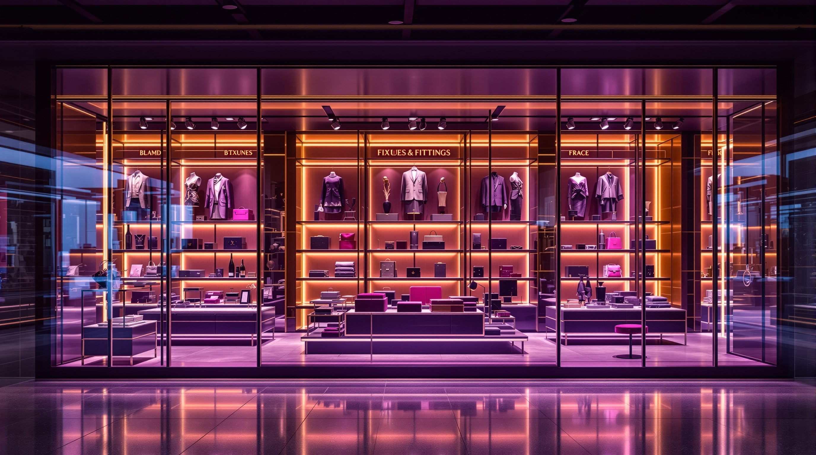
Walk into any shop and you are surrounded by furniture you were never meant to notice: the double-sided shelving running down the middle, the lined wall behind it, the rail of shirts, the table piled with folded sweaters, the lit glass case at the till. This is the store's skeleton and its hands at once - the fixtures and fittings - and it is the single biggest thing a merchandising designer controls. Choose it well and the goods look abundant yet clear, priority stock lands exactly at eye level, and the store can be re-dressed for a new season overnight. Choose it badly and the same merchandise looks cramped or thin, the best products hide on a top shelf nobody reaches, and every change needs a contractor.
Fixtures are not neutral. Each type has a personality and a job - mass capacity, browsable density, feature display, or a curated hero moment - and the mix a designer selects quietly sets the store's density, its flexibility and its entire feel before a single item is placed. This lesson gives you the working vocabulary of retail fixtures and the three principles that matter most: flexibility and modularity, the height zones that govern where merchandise sells hardest, and the constant balancing act between density (more to sell) and clarity (so it sells at all). Get the fixtures right and everything downstream - display, visual merchandising, the power wall - has a fighting chance.
Fixtures are instruments, not furniture. Pick the kit, build the module, own the strike zone, tune the density.
The vocabulary of retail fixtures
Every store is assembled from a surprisingly small kit of fixture types, and learning to name them is the first step to specifying them. The gondola is the workhorse of the middle of the floor: a free-standing, usually double-sided unit of shelves that you arrange in rows to build aisles, giving enormous capacity per square metre - it is why a supermarket or a pharmacy looks the way it does. The perimeter wall system lines the room, typically running floor to near-ceiling on slotted uprights (a slatwall, a gridwall or a proprietary bracket system) that accept shelves, arms, rails and faceouts in any combination; because the wall is the first thing a shopper sees across the store, it does heavy display duty as well as storage.
Rails (or rods) carry hung garments and are the densest way to hold apparel - a straight rail packs volume, a round or 'waterfall' rail invites browsing, and an arm or faceout turns a single garment to face the shopper as a feature. Tables and plinths sit low and open, holding folded stacks, a curated edit of a few products, or a single hero object; they slow shoppers and pull them off the path because you can approach them from all sides. Display units and bespoke fixtures are the feature pieces - a lit vitrine, a branded island, a made-to-measure joinery run - that carry the most value or the strongest brand story. Around these sit the fittings: brackets, hooks, shelf supports, sign holders, price strips and lighting tracks that do the invisible work.
The craft is not knowing the names but knowing the jobs. A store that is all gondolas reads as a cheap, high-volume format; one that is all bespoke islands reads as luxury and holds almost nothing. The designer chooses a mix - perhaps dense wall systems for range, a few gondolas or rails for working stock, and a scatter of tables and feature units for the hero products and the brand moments - and that mix is itself a design decision that signals price, positioning and how the store wants to be shopped. In India you will specify everything from mass-produced modular steel systems for a value chain to hand-made timber and brass joinery for a boutique, and the fixture kit is where brand, budget and selling all meet the floor.
Gondola, wall, rail, table, unit - a small kit. The MIX you pick is already a brand statement.
Flexibility and modularity - design for change
Retail is the most restless building type there is. The stock changes weekly, the display changes with the season, and the whole store may be re-dressed for a festival, a sale or a new collection several times a year - and then refitted entirely every few years as the brand evolves. A fixture system that cannot keep up is a liability, however handsome, because it turns routine merchandising into a construction job. So the governing principle after 'what is it for' is flexibility: can this fixture be re-shelved, re-height-ed, re-arranged and re-dressed quickly, cheaply and by the store's own staff?
The answer, almost always, is modularity. The best retail fixture systems are built on a repeated module - a standard bay width, a standard upright with slots at fixed increments, a standard shelf and a standard set of accessories that clip in anywhere. This buys three things at once. First, adaptability: shelves move up and down to suit the product of the moment, a rail becomes a shelf becomes a faceout, and a wall of dense shelving becomes a sparse feature wall without tools. Second, economy of rollout: a chain that standardises on one module can order in volume, hold spares, and fit out a new store from a known kit of parts (the discipline of Module 10). Third, a coherent rhythm: because everything is on the same grid, the store reads as ordered even as its contents churn.
Modularity is not the enemy of character. A luxury store can have a bespoke, beautifully detailed system that is nonetheless modular underneath; the grid is a discipline, not a look. What you are designing for is a long life of constant change - specify robust, repairable, reconfigurable fixtures, agree the module early, and resist the one-off fixture that can only ever hold one thing, unless it earns its rigidity as a true hero piece. A useful test on any fixture: 'when the merchandise changes next month, what does it take to re-dress this - five minutes and a staff member, or a contractor and a closed store?' The honest answer separates a fixture system that serves retail's restlessness from one that fights it. Build the change in.
Height zones and the eye-level strike zone
Of all the things a fixture controls, the most commercially loaded is height - because where a product sits on a fixture largely decides whether the shopper ever sees or reaches it. Retail thinking divides a fixture into rough horizontal bands. The stretch zone, above roughly 1800mm, is hard to reach and easy to miss, so it takes light, aspirational or pure-display stock. The eye-level zone, around 1100 to 1600mm, is where the eye naturally lands and the hand reaches without effort - this is the famous strike zone (retailers say 'eye level is buy level'), and it is the most valuable real estate on any fixture. The touch zone below it handles easy browsing and, importantly, sits at a child's eye line - which is why sweets and toys appear low on a supermarket gondola. The stoop zone, below roughly 600mm, forces a bend, so it carries bulk, refills and heavy stock that shoppers will stoop for deliberately.
The design move follows directly: put the priority stock in the strike zone. In a grocer that might be the highest-margin or the brand-partner product; in a boutique it is the look you most want to sell; on a wall system it is the face of the collection. Bulk and cheap staples go low, light and display-only goods go high, and the eye-level band is treated as precious and never wasted on dead stock. Cross-merchandising and impulse items ride the strike zone near decision points. This is also where honesty matters: using the strike zone to serve the shopper - making the thing they most likely want easiest to find - is good practice; burying essentials low to force a longer hunt past tempting goods is a dark pattern, and poor, short-sighted retail.
Two cautions keep this from becoming a rule. First, the exact heights are illustrative, as of 2026 - calibrate to the actual shopper and the product: a children's range, a wheelchair user, a market of shorter or taller shoppers all shift the zones, and accessibility reach ranges are a matter for the current standards and an accessibility consultant, not a number you invent. Second, the strike zone is finite, so not everything can live there - merchandising is the art of deciding what earns it. Get the height logic right and an ordinary fixture sells; get it wrong and the best product in the store hides in plain sight.
Density and capacity - abundance versus clarity
The last principle a fixture embodies is density - how much merchandise you pack into a given space - and it is a genuine trade-off that every retailer must consciously strike, not a setting to max out. High density means more capacity: more stock on the floor, more to sell, fewer refills, and a look of abundance that in the right format (a value store, a bazaar, a festive sale) reads as 'plenty here, great prices, dig in' and actively drives sales. Low density means fewer items given more space, air and light - a curated look that reads as considered, premium and easy to shop, where each piece is treated as worth seeing.
Neither is right in the abstract; the right density is the one that fits the brand, format and price level. A discount warehouse piling stock high and tight is expressing its brand correctly, and so is a luxury boutique showing twelve pieces in a room - swap their densities and both fail. The danger is the unconscious drift to ever-higher density under commercial pressure: the temptation to add one more shelf, one more rail, one more SKU, because empty space feels like wasted rent. Past a point this backfires - an over-packed fixture looks cheap whatever the brand, hides the good products in the noise, makes the store hard and tiring to shop, and actually lowers the sales the extra stock was meant to add. Clarity sells; clutter only looks like it does.
So the fixture designer works capacity and clarity together. Decide the target density from the brand and format, then specify fixtures that hold that amount well - enough shelves and rails for the range, but with the spacing, facings and breathing room that let each product be seen. Leave deliberate gaps and feature moments even in a dense store so the eye can rest and priorities can shine. And remember that capacity is not only the sales floor: what will not fit at the right density belongs in the stockroom (Module 9), feeding the floor, not crammed onto it. The goal is the honest sweet spot - as full as the brand wants to feel, never so full that the store stops selling. Density is a dial you tune to the brand, not a tap you leave running.
Abundance vs clarity is a DIAL, not a tap. Full enough to feel right; never so full it stops selling.
Accessibility reach ranges & aisle widths
Reachable shelf heights, clear circulation between fixtures
Strike-zone and aisle figures here are illustrative, as of 2026. Defer binding reach ranges and clear widths to the current accessibility standards, local bye-laws and an accessibility consultant. Module 2.
Fixture structural stability & floor loading (NBC 2016)
Anchoring tall wall systems, point loads, safe stacking
Tall and loaded fixtures must not topple and must suit the floor. Verify anchoring, loading and safe heights with the structural engineer and the current code.
Merchandise density & capacity benchmarks
Items per bay, facings, target density
Density is a dial set by brand, format and market - never a figure to copy. Calibrate to the specific store. Module 8.
Brand fixture standards
The chain's approved fixture kit & module
Branded and rolled-out retail usually prescribes an approved fixture system and module - design within it. Module 10.
Workshop - audit a store's fixtures and its strike zone
Fixtures are easiest to understand by reading a real store's kit and heights. In this workshop you will audit the fixtures of a shop you can recall or visit, naming the kit, testing the module, and checking what the retailer put in its most valuable real estate - the strike zone.
A shop you can observe and a notebook. This is about reading fixtures as instruments - no drawings or measuring required.
Goal: read a store as a fixture system, not a pile of stock
Inputs: a shop you can recall or visit + this lesson + a notebook
Time: ~45 minutes
- 1Inventory the KIT: walk the store and list every fixture type you see - wall systems, gondolas, rails, tables, feature units - and note which dominates. What does that mix say about the brand's price level and how it wants to be shopped?
- 2Test the MODULE: look for the repeated bay width and the slotted uprights. Could a staff member re-shelve, re-height or re-dress these fixtures in minutes, or would changing the store need tools and a contractor? Note how flexible the system really is.
- 3Find the STRIKE ZONE: pick two or three fixtures and identify the eye-to-chest band. What did the retailer choose to place there, and what got buried low or floated high? Judge whether the strike zone is used for priority stock or wasted.
- 4Judge the DENSITY: does the store feel abundant or curated, and does that match the brand? Spot one fixture that is over-packed to the point of hiding its goods, and one that breathes and lets products be seen.
- 5Write a one-paragraph verdict: does this fixture system serve the merchandising and the brand, where is it strongest and weakest, and the single change to the kit, module, heights or density that would most improve how the store sells.
You’ll walk away with
A one-page fixture audit of a real store: its fixture kit and what the mix signals, how flexible its module is, what lives in its strike zone, a density judgement, and a one-line verdict with the highest-impact change.
Three altitudes on the same idea
Read the band that fits you — or all three.
The shell and services you set govern what the fixture kit can ever do. Floor-to-ceiling height decides how tall wall systems and stretch zones can go; the structural grid and column positions constrain where gondola runs and feature islands land; the floor loading and finish must take heavy fixtures rolled and re-rolled for every refit; and the lighting track, power and data you rough in must align to the fixture grid so displays can be lit and tills and screens placed anywhere. For a rollout client, coordinate the base-build to a standard fixture module so one kit of parts fits many shells. Leave generous, accessible circulation between fixture runs, and defer binding aisle-width, egress and accessibility-reach dimensions to the current codes and an accessibility consultant.
Specifying and arranging the fixture kit is squarely your craft, and it is where merchandising is won or lost. Choose the mix - wall systems, gondolas, rails, tables and feature units - to express the brand's density and price level, and build the whole system on a clear module so the store can be re-dressed endlessly by its own staff. Design the height logic deliberately: priority stock in the strike zone, bulk low, display high, and breathing room even in a dense store. Specify robust, repairable, reconfigurable fixtures that survive heavy public use and frequent refit, and detail the fittings - brackets, price strips, sign holders, integrated light - that do the invisible work. Tune density to the brand, and leave the code-bound reach and clearance dimensions to the standards and specialists.
Train your eye on the furniture nobody is supposed to notice. In any shop, name the fixtures - gondola, wall system, rail, table, feature unit - and ask what each is for and what its mix says about the brand's price and positioning. Then read the heights: find the strike zone on a fixture and check what the retailer chose to put there, what they buried low and what they floated high. Look for the module - the repeated bay, the slotted upright - that lets the store change, and judge the density: does it feel abundant or curated, and does that fit the brand, or has it tipped into clutter that hides the goods? You are learning that fixtures are instruments, not furniture - the first lever of merchandising.
“Fixtures are just the shelving and furniture you buy to hold the stock - pick something sturdy and good-looking, fill it up, and the merchandising happens on top of it.”
Do it yourself
No tools needed - reason it through.
- 1Name five retail fixture types and give the primary job of each (capacity, browsable density, feature display, and so on).
- 2Why is modularity so important in retail fixtures, and what three things does a standard module buy a designer?
- 3Explain the strike zone and why 'eye level is buy level' - and where you would place bulk stock, display-only goods and priority stock.
- 4Density is 'a dial, not a tap.' Explain the trade-off, and why pushing density too high can actually lower sales.
- 5Give one honest and one manipulative use of the strike zone, and say why the manipulative one is poor retail practice.
The one line to carry out
Peer-reviewed journals & authoritative standards
- 01Visual merchandising — Wikipedia - Visual merchandising, 2026.
- 02Planogram — Wikipedia - Planogram, 2026.
- 03Furniture, fixtures and equipment — Wikipedia - Furniture,_fixtures_and_equipment, 2026.
- 04Retail design — Wikipedia - Retail design, 2026.
- 05Merchandising — Wikipedia - Merchandising, 2026.
With the instruments in hand, the question becomes how to play them. Next we turn from the fixtures themselves to the principles of display - how to arrange goods on and around them so they actually sell.
The author
Amogh N P
Architect, interior designer, and creative polymath. Studio Matrx began in his notebooks — his vision of design made honest, useful, and open to everyone. Its Academy is written and taught in his memory, and free, forever.
More about Amogh →