
Vastu for Curtains: Colours, Directions and the Honest Take (India 2026)
Curtain colours by direction, room-by-room Vastu suggestions — and an honest line on where the advice tracks real daylight and heat physics versus where it is simply cultural convention.
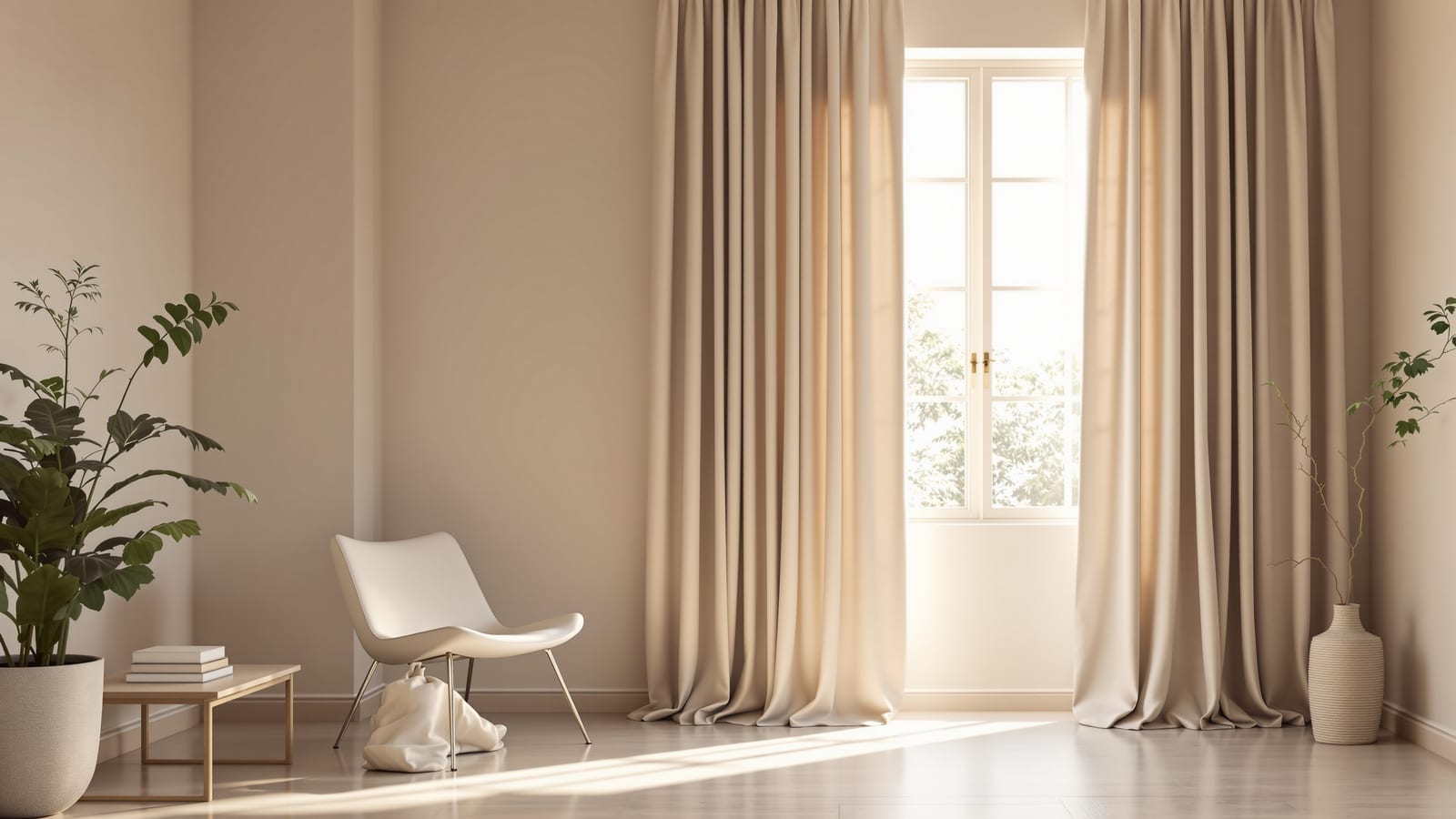
Search "vastu for curtains" and you will find confident lists: green or blue for the north, light shades for the east, earthy reds in the south, heavy dark fabric in the south-west, and a firm rule never to block the morning sun. Some of this advice is genuinely good — not because of cosmic energy, but because it accidentally describes how daylight and heat behave in an Indian house. Some of it is pure cultural convention, harmless and meaningful if you value it, but with no effect on comfort. The trouble is that the lists never tell you which is which.
This guide does. It lays out the common Vastu curtain guidance plainly and respectfully, room by room and direction by direction, and then, for each piece, gives you the honest take: follow it where it overlaps real physics; treat it as optional preference where it does not — and never let it override light, heat or privacy control on a window that needs them.
Vastu curtain advice is worth listening to where it quietly tracks daylight and heat, and worth holding lightly where it is convention. The one rule that is never optional: a curtain must first do its job — light, heat, privacy — before it obeys a colour chart.
If you are still choosing the cloth itself, start with the Complete Curtain & Window Treatment Guide, which covers layers, fabric and light control — the things that decide comfort regardless of any tradition.
Curtain colours by direction: the common guidance
Here is the colour-and-direction guidance you will see repeated across Vastu sources, gathered in one place. Read it as the tradition states it; the honest commentary follows in the next section.
| Direction | Suggested curtain colours | Common reasoning given |
|---|---|---|
| North | Greens, blues, light shades | Linked to water and prosperity; keep it light and open |
| East | Light sheers, white, soft greens | Welcome the morning sun; never block east daylight |
| North-east | Very light, white, pale blue, sheers | The most "sacred" zone; keep it bright and unobstructed |
| South | Reds, oranges, earthy terracotta, warm tones | Fire zone; warm, grounding colours |
| South-west | Heavier, darker, deep earthy browns and reds | Stability and weight; heavier fabric is encouraged |
| West | Earthy, neutral, blues or greys | Balance; moderate light control |
| North-west | Whites, light greys, neutrals | Air zone; airy, lighter dressing |
The pattern underneath is consistent: lighter, sheerer treatments toward the east and north-east; heavier, darker, weightier treatments toward the south and south-west. Hold that shape in mind, because it is exactly where the tradition and the physics quietly agree.
Where the advice is actually physics — follow it
Strip away the symbolism and a surprising amount of this guidance describes good daylighting and heat management for an Indian home. These parts are worth following on their own merit:
- "Keep the east window light and unobstructed." In India, the east morning sun is gentle, low and warm — pleasant light with little heat. Letting it in with light sheers rather than blocking it with heavy blackout is genuinely good design: free morning daylight, a brighter room, less artificial light. The tradition and the physics point the same way here.
- "Heavier, darker treatments toward the south and south-west." The south and especially the south-west take the harshest, hottest afternoon sun in most of India. A heavier, lined, darker curtain on those windows is real thermal protection — it cuts glare and heat gain through the worst part of the day. Vastu calls it stability; a building physicist calls it shading the hot façade. Either way, do it.
- "Lighter dressing toward the north." North light is soft, even and cool, with almost no direct heat. It rarely needs heavy blocking, so light or sheer curtains there make practical sense — you keep the lovely diffuse light without fighting heat.
When Vastu says "light to the east, heavy to the south-west," it is describing, in older language, exactly what a daylighting consultant would advise: welcome the cool morning sun, shade the hot afternoon façade. That part, follow gladly.
These overlaps are not coincidence — the tradition grew up in the same Indian climate you live in, so its better instincts encode real observations about sun and heat. The Window Treatment Selector and the Vastu Window Planner both work from your window's actual orientation, so you can see where the climate-smart choice and the Vastu suggestion line up.
Where it is convention, not physics — optional
The colour assignments themselves — green for north, red for south, pale blue for the north-east — are cultural and symbolic, not climatic. A north-facing window does not behave differently because its curtain is green rather than grey; the fabric's weight, weave and fade-resistance decide comfort, while the hue is purely aesthetic and personal.
So treat the colour chart as preference, not requirement:
- If a green curtain in the north or an earthy red in the south feels right and brings you peace, choose it freely — it is a lovely, coherent palette and there is no reason not to.
- If you prefer a calm neutral everywhere, or a deep teal on a south window, that is equally valid. You lose nothing in comfort.
- Never pick a pale, light curtain for a blazing west or south-west window only because a colour rule suggested "light" — on that façade you need weight and fade-resistance more than you need a particular hue.
The honest line: enjoy the colour symbolism as meaning and tradition; do not let it overrule the physics on a hard-working window. For a method to choose colour on its own merits — undertone, light versus dark, fade-resistance — see the Curtain Colour Selection Guide.
Room by room, the Vastu suggestions
Translating the directional ideas into the rooms you actually dress:
- Living room. Often placed in the north, east or north-east, so the guidance favours light, airy, welcoming treatments — sheers plus a light dim-out, in greens, blues or neutrals. This happens to be excellent advice: a layered sheer + dim-out living room is the most flexible setup anyway, letting in daytime light while keeping a night layer.
- Master bedroom. Traditionally the south-west, where Vastu encourages heavier, darker, grounding curtains. Here tradition and sleep science agree completely: a bedroom wants blackout for proper rest, and a south-west room takes hot afternoon sun, so a heavy lined curtain is both Vastu-friendly and physically right. The deep colour is optional; the blackout layer is not — see Sheer Curtains for why bedrooms still benefit from a sheer behind the blackout for daytime.
- Kitchen. Often south-east (the "fire" zone). Vastu suggests warm tones; physics asks for easy-clean, flame-aware short fabrics near the hob. Follow the safety rule first, pick any colour you like second.
- Pooja / north-east. Kept light and bright — white or very pale sheers. Easy to honour, and it keeps a naturally well-lit corner luminous.
- Children's and guest rooms. Lighter colours are commonly suggested. Choose by the room's window orientation and the child's need for sleep darkness; the colour is yours to decide.
The thread through every room: let the room's real job — sleep, cooking safety, daylight — lead, and let the Vastu colour preference ride along where it does no harm.
The one rule that is never optional
If you take a single sentence from this guide, take this: never block the east morning sun, and never under-protect the hot west and south-west windows, for the sake of a colour chart. Those two are where convention can quietly hurt you if followed blindly:
- Hanging heavy blackout on a lovely east window to chase a colour scheme throws away the best free light in the house.
- Hanging a thin, pale curtain on a furnace-hot west window because a rule said "light" leaves you with glare, heat and a fabric that fades to streaks within a year.
Get the function right first — light where you want it, heat blocked where it is fierce, privacy by day and night — and then let Vastu guide the colours and the room placement to your heart's content. The two are not in conflict as long as physics leads.
A balanced way to use Vastu for curtains
Put it together and you get a respectful, practical method:
1. Note each window's orientation and what it actually needs — cool morning light to welcome, hot afternoon sun to block, privacy to manage.
2. Follow the Vastu guidance where it matches the physics — light and sheer to the east and north-east, heavier and shaded to the south and south-west. This is the easy, no-cost win.
3. Treat the colour assignments as optional preference — adopt the greens, blues and earthy reds if they bring you meaning, or choose freely if they do not.
4. Never override light, heat or privacy control for a colour or direction rule. Function first, symbolism second.
5. Layer anyway — a sheer plus a heavier curtain satisfies almost every Vastu suggestion and every climate need at once, in every room.
The honest caveats
Three things to hold in mind. First, Vastu curtain guidance is a tradition, not a measured science — where it helps comfort, that is because it echoes real daylight and heat behaviour, not because colour carries energy. Respect it as culture and meaning, and you lose nothing; treat it as building physics, and you may shade the wrong window. Second, screens and showrooms lie about colour — whatever shade you choose, Vastu-led or not, test a swatch on your own wall in your own morning and evening light before buying metres of it; the Curtain Fabric Guide explains why the fibre, not the hue, decides how a colour ages. Third, the function is non-negotiable: a curtain must control light, heat and privacy for the window it hangs on, and any colour or direction preference simply rides on top of that. Honour the tradition, by all means — just never at the cost of a comfortable room.
Dress your windows the Studio Matrx way — meaningful and comfortable. Let the Window Treatment Selector match your room, orientation and preferences to a shortlist, check direction-by-direction ideas with the Vastu Window Planner, and price your choice per window with the Curtain Cost Calculator. For the full picture, read the Complete Curtain & Window Treatment Guide, and browse the whole Window Treatments cluster.
Export this guide
Related Guides — Deep-dive reading
Curtain Colour Selection Guide: How to Choose the Right Shade (India 2026)
Blend with the wall or contrast for a statement, pull from the rug, light vs dark, warm vs cool — a practical method for choosing curtain colour in Indian homes.
Window TreatmentsUnderstanding Sun Path Analysis for Your Home
How the sun actually moves over an Indian site through the day and the year — and why that single fact quietly decides where your kitchen, bedroom and living room should sit.
Site PlanningHome Office Curtains: Screen Glare & Light Control (India 2026)
The WFH window done right — kill screen glare and video-call backlight without going dark, with a sheer-plus-roller combo, the orientation rules that decide everything, and honest Indian costs.
Window TreatmentsRelated Tools — Try Free
Cross-Ventilation Analyzer
Estimate airflow and air changes per hour (ACH) from room size, window areas, layout, and local wind — with NBC 2016 Part 8 compliance check.
Ventilation CalculatorWindow Orientation Planner
Pick the best window type, glass and shading by wall direction — north, east, south and west.
Window ToolCurtain Cost Calculator
Get the fabric metres you need plus the total curtain cost by window size, fabric, pleat, lining and hardware.
Curtain Calculator