
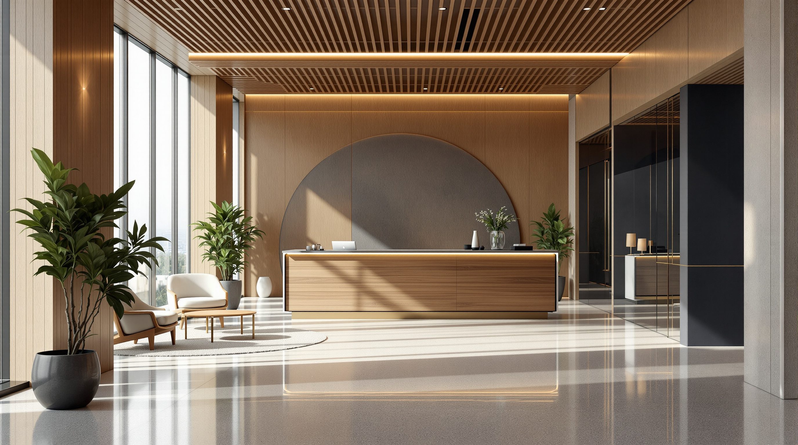
 Lesson 5.1
Lesson 5.1 · Amenities & Support Spaces
Arrival, Reception & First Impressions
Long before anyone reaches a desk they have already read the organisation - in the approach, the door, the security line and the welcome - and the first thirty seconds say more about a workplace than any brochure ever could
Nobody decides what they think of an office at the desk. They decide it at the door - and you have about thirty seconds to shape that verdict.
Think of the last unfamiliar office you walked into. Before you met a single person or saw a single desk, you had already formed an opinion - from the street sign you could or could not find, the door you were unsure how to open, the guard who either greeted you or eyed you, the lobby that felt grand or grubby, the person at reception who looked up or did not. That opinion formed fast, mostly below conscious thought, and it coloured everything that followed. Arrival is the office's first sentence, and most organisations write it by accident.
This lesson treats arrival as a designed sequence rather than a single room - the journey from the street to the desk, through a set of thresholds each of which sends a message. We will walk that sequence threshold by threshold: the approach and signage, the entrance and the security it must reconcile with welcome, the lobby and its pause, the reception point and the human who staffs it, and the experience of the visitor who waits. The through-line of the whole course applies sharply here: the office is a destination people choose, and the arrival is where it first has to earn that choice. Get the first thirty seconds right and you set the tone for the whole building; get them wrong and no amount of beautiful workspace upstairs will quite undo it.
The door writes the first sentence. Make the rest of the building keep its promise.
The arrival sequence: street to desk
The single most useful shift in thinking about reception is to stop designing a *room* and start designing a *journey*. From the moment someone turns off the street to the moment they sit down, they pass through a series of thresholds, and each one is a small act of communication. The approach comes first: can people find the building and the right entrance at all? Signage that assumes you already know the way, an entrance hidden around the side, a lobby shared with five other tenants and no indication which lift serves which floor - these fail before the visitor has even arrived, and they fail staff every single morning too. Good arrival design begins outside the door, with legible wayfinding and an entrance that announces itself.
The threshold itself - the door, the transition from outside to in - is where the building changes register. In the Indian climate this is also a real environmental break: the jump from heat, glare and street noise into cool, calm, controlled air is part of the welcome, and a well-designed entry buffers it with a lobby or vestibule rather than dumping the visitor straight from pavement into open-plan. Then comes the pause - the lobby or waiting zone where a person orients themselves, finds reception, and catches their breath - followed by the welcome at the reception point, and finally the passage deeper in, through security or a turnstile and up to the floor.
What makes this a design problem rather than a checklist is that the sequence has a *rhythm*. A good arrival compresses and releases: the compression of the entrance and security, then the release of an open, calm lobby; the formality of the threshold, then the warmth of a human greeting. A bad arrival is all friction and no release - queue, checkpoint, cramped lift lobby, fluorescent corridor - or all grandeur and no function, a double-height marble void with nowhere to sit and no one to ask. Map the sequence as a line of thresholds, ask what each one says and how it feels, and you have the spine of a reception design. Everything else - the desk, the finishes, the art - hangs off that spine.
Design the journey, not the desk. Every threshold from street to seat says something.
Reception, security and the welcome-control tension
Reception has to do two things that pull against each other: make people feel welcome, and keep the organisation secure. Resolving that tension gracefully is the central craft of front-of-house design. Lean too far toward control and the entrance becomes a checkpoint - barriers, badges, suspicious glances, a visitor made to feel like a threat before they have said hello. Lean too far toward welcome and you have an open, charming lobby that anyone can walk straight through into sensitive space. The goal is a welcome that is also, quietly, secure - and a security layer that is firm without being hostile.
The way to achieve this is layering. Rather than one hard wall between public and private, think in zones of decreasing publicness: a fully public approach and outer lobby anyone may enter; a reception threshold where you are greeted, registered and your business established; and a controlled boundary - the access-controlled door, turnstile or lift - beyond which only authorised people and escorted visitors go. The reception desk sits at the hinge of that layering, positioned so the person staffing it naturally oversees who comes and goes without a barricade. Access control, cameras and visitor management then do the hard security work *behind* a warm human face, rather than replacing it.
The human at reception matters as much as the layout. A staffed desk with a person who looks up, smiles and helps is worth more than any quantity of marble; an unstaffed lobby with a tablet and a lanyard dispenser can feel efficient but cold, and struggles when a delivery, a confused visitor and a fire drill happen at once. Many Indian offices, with front-desk and security staff readily available, can make the welcome genuinely human - use that. Design the desk so one person can greet, see the entrance, reach the visitor-badge system and not feel exposed. And remember dignity runs both ways: the receptionist is on display all day, so give them good light, a comfortable setting, somewhere to put a bag, and relief from glare and draught. Binding specifics - secure egress, the fire interface of any turnstile, accessible routes past the barrier - defer to the code and the security and life-safety specialists.
The visitor experience and the waiting moment
Most visitors to an office are nervous in some small way - an interview candidate, a client about to pitch, a vendor hoping for a contract, a new joiner on day one. The arrival experience either soothes that or sharpens it, and thoughtful design soothes. Start with the practical anxieties and design them away. Can the visitor find the building and the right door (signage, a pin that actually works, clear instructions in the meeting invite)? Do they know where to go the moment they step in, or do they stand lost, scanning for a clue? Is there somewhere to sit, a glass of water, a clean washroom, reliable guest wi-fi, a place to charge a phone, a clock? These are small things, and their absence is exactly what a nervous visitor notices.
The waiting moment deserves real design attention because it is often the longest single span of the arrival, and it is pure perception. Five minutes in a comfortable, well-lit lounge with something to look at passes pleasantly; five minutes on a hard bench in a draughty lobby with nothing to do feels like twenty. Give the wait a good seat, a clear sightline to where the host will appear (so the visitor is not anxiously watching the wrong door), and something that rewards attention - the organisation's work on display, a view, good material up close. This is also where an office can tell its story honestly: what it does, what it values, who it is, shown rather than stated. Avoid the trophy wall of logos that says nothing; show the actual work, the people, the purpose.
Finally, design for the *range* of visitors, not just the VIP. The courier with a heavy parcel, the candidate in a wheelchair, the client who does not speak the local language, the parent who has brought a child - all of them arrive here. An accessible, barrier-free route to and through reception is non-negotiable and its dimensions come from the accessibility standards and consultant, not from a guess. A good reception works for the anxious, the hurried and the differently-abled alike, and makes each of them feel expected rather than tolerated. That feeling - *you were expected, you are welcome here* - is the whole job of the front of house.
A nervous visitor notices the small misses. Seat, water, washroom, wi-fi, a clear sightline to the host.
What the first thirty seconds say
Everything in the arrival sequence adds up to a single, fast, largely unconscious judgement: *what kind of place is this?* The first thirty seconds are a compressed reading of the whole organisation's character, and people are remarkably accurate at it. A reception that is warm, calm and well-kept reads as an organisation that has its act together and cares about people. One that is grand but cold reads as status-obsessed. One that is chaotic, grubby or indifferent reads as exactly that, whatever the website claims. The arrival is where the gap between an organisation's stated values and its real ones becomes visible - and design either closes that gap or exposes it.
This is why reception design is a branding and cultural exercise as much as a spatial one, and why it must be done *with* the organisation rather than imposed. A law firm, a design studio, a manufacturing company and a young tech startup should each feel distinct at the door, because each is genuinely different, and a generic hotel-lobby reception serves none of them well. The material palette, the lighting, the art, the furniture, the degree of formality, even the smell and sound of the space, all carry the message. The question to keep asking is not *is this impressive?* but *is this true?* - does the arrival tell the honest story of who this organisation is and how it treats people?
There is a trap worth naming: the temptation to spend the whole budget on a spectacular lobby and starve the workspace upstairs. A dazzling reception above a mediocre floor is a lie the building tells for thirty seconds and then retracts for eight hours, and staff who pass through the spectacle daily on their way to a grim desk feel the hypocrisy most of all. Reception matters enormously, but it is the opening sentence, not the whole book. The best arrivals are congruent - the welcome at the door is confirmed, not contradicted, by everything beyond it. Design the first thirty seconds to tell the truth about a good place, and then make sure the rest of the building keeps the promise the door just made.
Accessibility (NBC / Harmonised Guidelines)
Barrier-free approach, entrance, reception and route past the secure boundary
An accessible route to and through reception is non-negotiable; take all dimensions and provisions from the current standards and an accessibility consultant. Module 8.
Fire safety & egress (NBC 2016)
Exit routes, the fire interface of turnstiles and access-controlled doors, secure egress
Any security barrier must not compromise egress; resolve the interface with the current code and a fire and life-safety specialist.
Security & access control
Visitor management, access layers, surveillance at the public-to-private boundary
Principles here; the specific access-control, screening and surveillance scheme comes from the organisation's security policy and a security specialist.
Reception area benchmarks
Lobby size, waiting seats, desk positions relative to visitor volume
Illustrative figures only - calibrate to the real peak visitor and delivery volume, never copy a number from a book.
Workshop - read an arrival sequence threshold by threshold
The best way to learn reception design is to experience an arrival slowly and deliberately, noticing what you normally feel only unconsciously. In this workshop you will walk one real arrival - an office, but a good hotel, clinic or civic building works too - as a sequence of thresholds and read the message each one sends.
An entrance you can observe, a phone or notebook, and about forty-five minutes. No measuring or software needed - this is about reading experience.
Goal: a threshold-by-threshold read of one real arrival, ending in a redesign idea.
Inputs: an entrance you can visit or remember vividly + a phone for notes or photos + this lesson.
Time: ~45 minutes.
- 1Start on the street. Note how easy it was to find the building and the right entrance, and how the approach and signage made you feel before you touched the door. Write one honest line.
- 2Cross the threshold and pause. Describe the transition from outside to in - climate, light, noise, the sense of arriving somewhere - and whether there was a buffered lobby or you were dumped straight into working space.
- 3Find the welcome-control balance. Where was the security or access layer, how did it feel (hostile, invisible, well-judged), and was there a human who greeted you? Mark where the desk sat relative to the entrance and the secure boundary.
- 4Sit in the waiting zone if there is one and time a notional five-minute wait. Note the seat, the sightline to where a host would appear, what there was to look at, and whether guest essentials (water, washroom, wi-fi, charging) were obvious.
- 5Write the thirty-second verdict: in one sentence, what kind of place did this arrival say it was - and then name whether the spaces beyond it confirmed or contradicted that message.
- 6Propose the single highest-impact change to the sequence: the one move that would most improve the welcome without necessarily costing the most.
You’ll walk away with
A one-page 'arrival read' of a real entrance: the message of each threshold, the welcome-control balance, the quality of the waiting moment, the thirty-second verdict, and the single highest-impact change. Keep it as a model for briefing any future reception.
Three altitudes on the same idea
Read the band that fits you — or all three.
The arrival sequence is largely set by base-build decisions you make or inherit, long before any fit-out. Where the entrance sits on the street, how the approach reads, the size and height of the lobby, the position of the core and lifts, the route from the front door to the secure boundary, and the relationship between a shared building lobby and the tenant's own reception - all of these shape what arrival can ever become, and most are hard to change later. Brief and shape them around the sequence this lesson describes: a legible approach, a buffered threshold suited to the Indian climate, a lobby with room to pause, and a clean line from public to controlled space. Coordinate the secure-egress and turnstile interface with the fire and security specialists, and keep the accessible route to and through reception central, with dimensions from the accessibility standards and consultant.
Reception is one of the most scrutinised rooms you will ever design, and it is where your planning, material and lighting judgement all show at once. Your job is to turn the given shell into a welcome: position the desk at the hinge of the welcome-control layering so one person can greet, oversee and reach the visitor system without a barricade; design a waiting setting that is genuinely comfortable with a clear sightline to the host; choose a material, lighting and furniture palette that tells the organisation's honest story rather than a generic hotel look; and specify the guest essentials - seating, water, washroom access, wi-fi, charging - that nervous visitors notice. Resist the trophy-lobby trap: keep the reception congruent with the workspace beyond. Calibrate any area or seat-count benchmark to this client's real visitor volume, and defer accessible-route dimensions to the standards and consultant.
Reception is a perfect lesson in designing experience rather than objects, so study it as a sequence. Next time you enter any office, hotel or clinic, notice the order of your own experience: how you found the door, how the threshold felt, whether you knew where to go, how the wait passed, what the place said about itself in the first few seconds. Train yourself to feel the welcome-versus-control tension - where was it hostile, where was it too loose, where did it get the balance right? Then practise the core move of this lesson: map any arrival as a line of thresholds and ask what each one communicates and how it feels. Understanding that a first impression is built from many small, designed moments - not one grand gesture - is a skill that will serve you in every project, not just offices.
“A great first impression is about an impressive, expensive lobby - double-height space, marble, a dramatic desk - so the way to get reception right is to spend big on the entrance.”
Do it yourself
No tools needed - reason it through from the lesson.
- 1Why is it more useful to design arrival as a sequence of thresholds than as a single reception room?
- 2Describe the welcome-versus-control tension, and explain how layering zones of decreasing publicness resolves it.
- 3Name three small guest essentials a nervous visitor notices, and say why the waiting moment deserves real design attention.
- 4What does it mean to say an arrival should be 'congruent', and why is a spectacular lobby over a mediocre floor a problem?
- 5If the first thirty seconds are a reading of 'what kind of place is this', what should a designer ask instead of 'is this impressive?'
The one line to carry out
Peer-reviewed journals & authoritative standards
- 01Reception (office) — Wikipedia - Reception (office), 2026.
- 02Wayfinding — Wikipedia - Wayfinding, 2026.
- 03Employee and visitor experience — Wikipedia - Employee experience management, 2026.
- 04Accessibility — Wikipedia - Accessibility, 2026.
Reception welcomes people into the building; the next space draws them together once they are in. We turn to the pantry and cafe - the social heart of the modern office and its most powerful magnet.
The author
Amogh N P
Architect, interior designer, and creative polymath. Studio Matrx began in his notebooks — his vision of design made honest, useful, and open to everyone. Its Academy is written and taught in his memory, and free, forever.
More about Amogh →